
A ListView is a fundamental Cascades control because it gives you an efficient way of displaying to the user hierarchical data on a screen where the real estate is relatively limited. List views are therefore one of the most flexible controls available in the Cascades framework and provide you lots of options for specifying how your data will be rendered as list items. Another important aspect of list views is their ability to clearly separate your data from its visual appearance by using the model-view-controller pattern. As illustrated in Figure 6-1, the ListView plays the role of a controller, which handles—among other things—user interactions; the DataModel represents your data; and, finally, a ListItemComponent is a QML template defining visual controls for rendering your data. You can also define multiple ListItemComponents for different data item types (I will tell more about types in the “Data Models” section. For the moment, simply keep in mind that a data model can define a type, which is used by the ListView to render a data item.).

Figure 6-1. ListView MVC architecture (image source: BlackBerry)
Also, as briefly mentioned in the previous chapter, you can use a ListView as your main UI control for data-centric apps.
This chapter will initially concentrate on the visual and user interaction aspects of a list view, and at a later stage, will explore how data models are implemented. You cannot completely separate both concepts, but it is useful not to initially focus too much on the intricacies of data models.
After having read this chapter, you will have a good understanding of
- How to use list views in your own applications to display hierarchical data to the user.
- Create navigation-based apps using a ListView as the main UI control.
- Use the standard data models provided by Cascades to display data in a ListView.
- Implement your own “custom” data models for data types or sources not supported out of the box by Cascades.
List Views
A ListView aggregates a data model and its visual representation. This section will mostly focus on the visual aspects and touch interactions of the ListView, and the next section will give you a more detailed description of data models. Listing 6-1 illustrates a minimal ListView control added to a Page control.
Listing 6-1. ListView
import bb.cascades 1.2
Page {
    ListView {
        id: listview
        dataModel: XmlDataModel {
            id: people
            source: "people.xml"
        }
    }
}
The ListView’s dataModel property defines the data to be displayed in the ListView (in the example shown in Listing 6-1, we are using an XmlDataModel, which loads its data from an XML file; Listing 6-2 gives you the sample XML content).
Listing 6-2. XML File Representing Actors and Presidents
<people>
    <category value="Actors">
        <person name="John Wayne"/>
        <person name="Kirk Douglas"/>
        <person name="Clint Eastwood"/>
        <person name="Spencer Tracy"/>
        <person name="Lee Van Cleef"/>
    </category>
    <category value="US Presidents">
        <person name="John F. Kennedy"/>
        <person name="Bill Clinton"/>
        <person name="George Bush"/>
        <person name="Barack Obama"/>
    </category>
</people>
And Figure 6-2 illustrates the resulting ListView.
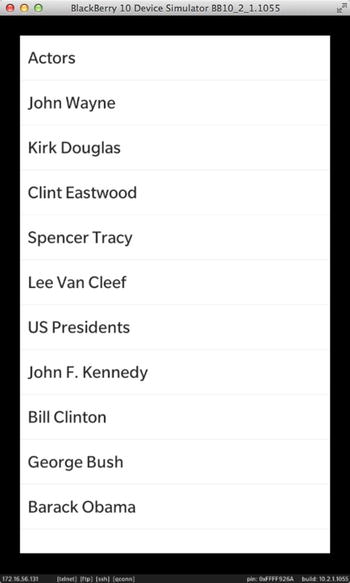
Figure 6-2. Flat list of items
As illustrated in Figure 6-2, the list view’s items have been successfully loaded from the XML document; however, the hierarchical structure of the XML document has been “flattened,” which is not what we want (the Actors and US Presidents categories should, in fact, appear as header items, with actors and presidents displayed under the corresponding headers).
ListItemComponent Definition
A ListItemComponent is a kind of factory, which contains a QML component definition. The actual component is a visual control (or simply a visual) responsible for rendering data items of a given type. In other words, a ListView uses a ListItemComponent to create a visual representation of its data items. The following properties are used in the component definition:
- QString ListItemComponent::type(): The data item type that this component definition should be used for.
- QDeclarativeComponent* ListItemComponent::content(): The QML component definition used for creating the visuals responsible for rendering the data item whose type is ListItemComponent::type(). (Note that a QDeclarativeComponent is very similar in nature to a ComponentDefinition, which is used to define QML components for dynamic creation, see Chapter 5). content is also ListItemComponent’s default property (see Chapter 2 for an explanation of default properties).
Listing 6-3 shows you how to use a ListItemComponent in practice.
Listing 6-3. ListItemComponent Definition with Container As a Root Visual
import bb.cascades 1.2
Page {
    ListView {
        id: listview
        dataModel: XmlDataModel {
            id: people
            source: "people.xml"
        }
        listItemComponents:[
            ListItemComponent {
                type: "category"
                Container{
                    id: container
                    Label {
                        id: myLabel
                        text: container.ListItem.data.value // equivalent to ListItemData.value
                    }
                }
            }
        ] // ListItemComponents
    } // ListView
}
As illustrated in Listing 6-3, you can add a ListItemComponent to the ListView’s listItemComponents property (in a moment, you will see that you can define multiple ListItemComponents corresponding to different data item types in the data model). At runtime, the ListView uses the component definition to instantiate the visuals for rendering its data items (therefore, in the previous code, the visuals created at runtime are the Container, which is the root visual, and the Label). The ListView also dynamically attaches the ListItemattached property to the root visual, which is the Container. (An attached property is a mechanism for dynamically adding a property, which was not part of a control’s initial definition.) Finally, the Labeluses the Container’s ListItem property to access the data item.
There is still one point that needs to be clarified in Listing 6-3: How is the current data node type determined by the ListView to select the correct ListItemComponent component definition? In the “Data Models” section, you will see that the data model provides the type information. For example, in the specific case of an XmlDataModel, the returned type corresponds to the name of the tag in the XML document. Therefore, the XmlDataModel will return the category type for the corresponding XML tag shown in Listing 6-2.
The root visual’s ListItem property also defines the following properties, which you can use in your component definition (note that you have already used the data property in Listing 6-3 to access the data item):
- ListItem.initialized: States whether the root visual is initialized or not. The initialized property is true when the initialization of the root visual is finished (in other words, all properties have been updated to reflect the current item). Otherwise, the property is false. For performance reasons, ListViews « recycle » ListItems. The data model should therefore only be updated when the ListItem is initialized. For example, if a CheckBox is used for updating a corresponding item status in the data model, the onCheckChanged() slot should check the ListItem’s initialized property before propagating the change to the data model. If the ListItem is not initialized, you could potentially corrupt the data model’s state.
- ListItem.data: The data item returned by DataModel::data(). Common values are QString, QVariantMap, and QObject*. Note that in QML you can use the mapname.keyname and objectname.propertyname syntax to access individual data items exposed by a map or an object, respectively. Also, as mentioned previously, the ListItem property is only defined on the root visual. You will therefore have to use the <rootId>.ListItem.data notation to access the data property from any visual located further down the tree. As a convenience, the ListView also provides the ListItemData alias, which is a context property accessible from anywhere in the visual tree (equivalently, instead of setting the Label’s text property using container.ListItem.data.value, you could have used ListItemData.value).
- ListItem.indexPath: The index path identifying this item in the data model.
- ListItem.view: The ListView in which this item is visible.
- ListItem.component: The ListItemComponent from which this visual has been created.
- ListItem.active: true if the visual is active (in other words, the user is pressing on it).
- ListItem.selected: true if this visual is selected. An item is typically selected if the user intends to perform an action on the item or access details for the item (the “Detecting Selection” section will give you more information about handling selection).
Note The visuals created from a ListItemComponent definition do not share the same document context as main.qml, where the ListView has been declared. This means that only the properties defined in the ListItem attached property are visible to the root visual at runtime. In other words, you can’t access by id as you would usually do for any of the controls declared in main.qml. You will see how to circumvent this problem in the “Context Actions” section.
Header Definition
Cascades provides standard controls that you can use for rendering list items. For example, you could use a standard Header control instead of a Label in order to render items of type category. A Header control has title and subtitle properties that you can set using the ListItemData property (see Listing 6-4; note that only the Header’s title is set).
Listing 6-4. Header Visual
import bb.cascades 1.2
Page {
    ListView {
        id: listview
        dataModel: XmlDataModel {
            id: people
            source: "people.xml"
        }
         listItemComponents:[
            ListItemComponent {
                type: "category"
                Header {
                    title: ListItemData.value
                }
            }
        ] // listItemComponents
    } // ListView
} // Page
Figure 6-3 illustrates the resulting UI.
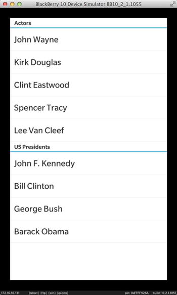
Figure 6-3. List of people with header items
StandardListItem Definition
Let’s now modify the XML document shown in Listing 6-2 to include additional information such as the person’s date of birth, a picture, and name of spouse (see Listing 6-5).
Listing 6-5. Updated XML Data Source
<people>
    <category value="Actors">
        <person name="John Wayne" born="May 26, 1907" spouse="Pilar Pallete" pic="wayne.jpg"/>
        <person name="Kirk Douglas" born="December 9, 1916" spouse="Anne Buydens"
            pic="douglas.jpg"/>
        <person name="Clint Eastwood" born="May 31, 1930" spouse="Dina Eastwood"
            pic="eastwood.jpg"/>
        <person name="Spencer Tracy" born="April 5, 1900" spouse="Louise Treadwell"
            pic="tracy.jpg"/>
        <person name="Lee Van Cleef" born="January 9, 1925" spouse="Barbara Havelone"
            pic="vancleef.jpg"/>
    </category>
    <category value="US Presidents">
        <person name="John F. Kennedy" born="May 29, 1917" spouse="Jacqueline Kennedy"
            pic="kennedy.jpg"/>
        <person name="Bill Clinton" born="August 19, 1946" spouse="Hillary Rodham Clinton"
            pic="clinton.jpg"/>
        <person name="George Bush" born="July 6, 1946" spouse="Laura Bush" pic="bush.jpg"/>
        <person name="Barack Obama" born="August 4, 1961" spouse="Michelle Obama"
            pic="obama.jpg"/>
   </category>
</people>
If you try to display the updated XML document given by Listing 6-5, the resulting UI will be similar to Figure 6-4, which is not what you want (only the person’s date of birth is displayed).

Figure 6-4. List of people displayed incorrectly
In fact, just as with Header items, you need a way to tell the ListView how to render items of type person. You can achieve this in several ways, but I will first show you how to use the StandardListItem visual (see Listing 6-6).
Listing 6-6. StandardListItem Visual
import bb.cascades 1.2
Page {
    ListView {
        id: listview
        dataModel: XmlDataModel {
            id: people
            source: "people.xml"
        }
        onTriggered: {
        }
        listItemComponents:[
            ListItemComponent {
                type: "category"
                Header {
                    title: ListItemData.value
                }
            },
            ListItemComponent {
                type: "person"
                StandardListItem {
                    title: ListItemData.name
                    description: ListItemData.born
                    status: ListItemData.spouse
                    imageSource: "asset:///pics/"+ListItemData.pic
                }
            }
        ] // ListItemComponents
    } // ListView
}
A StandarListItem is a control with a standard list of properties to be displayed in a ListView. The properties are title (displayed in bold text), description, status, and imageSource (all properties are optional). For example, the code in Listing 6-6 uses a StandardListItem control to render an item of person type by using the corresponding XML attributes provided by the data model. Figure 6-5 illustrates the resulting UI (note that the person’s picture is loaded from the application’s assets folder).

Figure 6-5. Updated list with each person’s details
CustomListItem Definition
You can even further customize the list item rendering by using a CustomListItem visual. The CustomListItem defines a highlight, a divider, and a user-specified control for rendering a data item. The highlight, which is defined by the highlightAppearance property, determines what the list item looks like when it is selected. The divider, which is defined by the dividerVisible property, determines if a divider should be shown in order to separate the list item from adjacent items. Finally, the content property used for rendering the list item can be any Cascades control you decide to use (note that if you use a Container, you will be able to aggregate several controls). To illustrate how to use a CustomListItem in practice, Listing 6-7 shows you how to customize the list’s headers with a CustomListItem.
Listing 6-7. CustomListItem Visual
import bb.cascades 1.2
Page {
    ListView {
        id: listview
        dataModel: XmlDataModel {
            id: people
            source: "people.xml"
        }
        listItemComponents:[
            ListItemComponent {
                type:"category"
                CustomListItem {
                    dividerVisible: true
                    Label {
                        text: ListItemData.value
                        // Apply a text style to create a large, bold font with
                        // a specific color
                        textStyle {
                            base: SystemDefaults.TextStyles.BigText
                            fontWeight: FontWeight.Bold
                            color: Color.create ("#7a184a")
                        }
                    } // Label
                } // CustomListItem
            },
            ListItemComponent {
                type: "person"
                StandardListItem {
                    title: ListItemData.name
                    description: ListItemData.born
                    status: ListItemData.spouse
                    imageSource: "asset:///pics/"+ListItemData.pic
                }
            }
        ] // listItemComponents
    }
}
The CustomListItem illustrated in Listing 6-7 uses a Label control to apply text styling to the header element (see Figure 6-6 for the resulting UI).
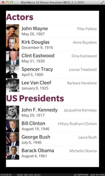
Figure 6-6. Custom headers
There is no obligation to use the predefined controls mentioned earlier as the content property of a ListItemComponent. As a matter of fact, you can simply use any Cascades control to display the data item to the user. For example, in the case of a rich data model, you could add multiple Cascades controls—such as a CheckBox, a Label, and an ImageView—to a Container playing the role of the root visual (the main advantage of leveraging the stock Header, StandardListItem, and CustomListItem controls is to provide a smooth Cascades look and feel across your applications).
Detecting Selection
Displaying an item and customizing its visual is one aspect of ListView programming. However, you will also need to detect item selection so that your users can interact with the ListView. The following topics will be discussed in this section:
- Detecting the selected item when the user performs a single tap in the ListView.
- Using item selection to navigate from a master view to a details view.
- Handling context actions when the user performs a long press on an item.
- Handling multiselection by defining a MultipleSelectActionItem control. Multiselection enables the user to select multiple items before triggering a context action on the selected items.
You can handle a single tap on an item in a ListView by responding to the ListView’s triggered() signal:
- triggered(QVariantList indexPath): Emitted when the user taps an item with the intention to execute some action associated with it. The signal will not be emitted when the ListView is in multiselection mode. The indexPath parameter identifies the tapped item.
Listing 6-8 gives you an example of how to use the triggered()signal in practice: the ListView’s onTriggered slot uses the implicit indexPath variable to select an item in the ListView (note that the code clears any previous selections before selecting the current item). In QML, an index path is an array of integers. I will tell you more about index paths when we discuss data models. For the moment, you can simply consider that an index path identifies the tapped item. An index path is also a kind of pointer to the data node in the data model. In other words, you can use the index path to access the data node corresponding to the tapped item.
Listing 6-8. ListView, onTriggered( ) Slot
ListView {
    id: listview
    dataModel: XmlDataModel {
        id: people
        source: "people.xml"
    }
    onTriggered: {
        listview.clearSelection();
        select(indexPath);
    }
    listItemComponents: [// ... code omitted]
}
Note that when the item is selected (either programmatically or in multiselection mode), the ListView emits the selectionChanged() signal:
- selectionChanged(QVariantList indexPath, bool selected): Emitted when the selection state has changed for an item (in other words, the item has been either selected or deselected). You can use the selected parameter to determine if the item is selected (true) or not (false).
Referencing an Item in an Action
A user-triggered action can use the index path of the currently selected item to get to the corresponding data node (see Listing 6-9).
Listing 6-9. Using Selected Item in Action
Page {
    actions: [
        ActionItem {
            ActionBar.placement: ActionBarPlacement.OnBar
            title: "Share"
            onTriggered: {
                if(listview.selected().length > 1){
                    var dataItem = listview.dataModel.data(listview.selected());
                   // share data item.
                }
            } // onTriggered
        }
    ]
    ListView {
        id: listview
        dataModel: XmlDataModel {
            id: people
            source: "people.xml"
        }
        onTriggered: {
            listview.clearSelection();
            toggleSelection(indexPath);
        }
        listItemComponents: [// ... code omitted]
    } // ListView
} // Page
The code shown in Listing 6-9 uses the “Share” action’s triggered() signal to retrieve the data node corresponding to the current selected item in the ListView. See Figure 6-7. Because we are only interested in person type data items, the code checks whether the item’s index path size is bigger than 1 before accessing the data node. (The index path of the root node in the data hierarchy is an empty array; header items, which correspond to the category type, have an index path of size 1, and “leaf” items, which correspond to the person type, have an index path of size 2.) Also, if you need to define multiple actions on an item, it is usually better to use context actions (see the following section for more information on context actions).

Figure 6-7. Share action on selected item
Navigating a Master-Details View
You can use a single tap on an item to implement master-details navigation. To illustrate this, let’s “retrofit” the ListView in a navigation pane (see Listing 6-10).
Listing 6-10. ListView Navigation
import bb.cascades 1.2
NavigationPane {
    id: nav
    attachedObjects: [
        ComponentDefinition {
            id: itemPageDefinition
            source: "PersonDetails.qml"
        }
    ]
    onPopTransitionEnded: {
        page.destroy();
    }
    Page {
        ListView {
            id: listview
            dataModel: XmlDataModel {
                id: people
                source: "people.xml"
            }
            onTriggered: {
                if (indexPath.length > 1) {
                    var person = people.data(indexPath);
                    var personDetails = itemPageDefinition.createObject();
                    personDetails.person = person
                    nav.push(personDetails);
                }
            }
            listItemComponents: [
                // ...code omitted
            ]
        } // ListView
    }// Page
} // NavigationPane
If you look at Listing 6-10 carefully, you will notice that it is very similar to the code generated by the list view template introduced in Chapter 5 (see Listing 5-3). In other words, by simply rearranging the QML document, and by adding a NavigationPane, you have managed to create a navigation-based application using a ListView as the main UI element. The navigation from the ListView to the details page is initiated by the ListView’s triggered() signal. The details page is defined by the PersonDetails control, which I will explain shortly. Note that before pushing a new PersonDetails page on the NavigationPane’s stack, you need to initialize the PersonDetails’s person property with the selected data node (because the data node will be used by PersonDetails to initialize its controls).
The PersonDetails page definition is shown in Listing 6-11.
Listing 6-11. PersonDetails.qml
import bb.cascades 1.0

Page {
    property variant person;
    Container {
        verticalAlignment: VerticalAlignment.Center
        horizontalAlignment: HorizontalAlignment.Center
        topPadding: 50
        ImageView {
            horizontalAlignment: HorizontalAlignment.Center
            imageSource: "asset:///pics/"+person.pic
            preferredWidth: 400
            preferredHeight: 400
        }
        Label {
            textStyle.base: SystemDefaults.TextStyles.BigText
            horizontalAlignment: HorizontalAlignment.Center
                 text: person.name
        }
        Label {
            textStyle.base: SystemDefaults.TextStyles.SubtitleText
            horizontalAlignment: HorizontalAlignment.Center
            text: "date of birth: "+person.born
        }
    } // Container
} // Page
As mentioned previously, the person property corresponds to the selected node in the data model and is used to initialize the controls located on the page (the data node is a map and you can use its keys to retrieve the underlying data). To navigate back to the ListView, the user can use the Back button on the action bar. Figure 6-8 illustrates the corresponding UI when the details view is shown.

Figure 6-8. Details view showing JFK (Back button will return to list view)
Context Actions
You can define context actions on the root visual located in a ListItemComponent definition. The actions will then appear in a context menu when the user performs a long press on an item (see Listing 6-12).
Listing 6-12. Context Actions
ListItemComponent {
    type: "person"
    StandardListItem {
        id: standardListItem
        title: ListItemData.name
        description: ListItemData.born
        status: ListItemData.spouse
        imageSource: "asset:///pics/" + ListItemData.pic
        contextActions: [
            ActionSet {
                DeleteActionItem {
                    onTriggered: {
                        var myview = standardListItem.ListItem.view;
                        var dataModel = myview.dataModel;
                        var indexPath = myview.selected();
                        // data model must support item deletion.
                        dataModel.removeItem(indexPath);
                    }
                }// DeleteActionItem
            }// ActionSet
        ] // ContextActions
    } // StandardListItem
} // ListItemComponent
Actions are covered in full detail in Chapter 5. You can therefore refer to that chapter if the code in Listing 6-12 does not seem clear to you. Also, looking at the DeleteActionItem’s onTriggered() slot, you will notice that the code is accessing the ListView using the root visual’s ListItem property (typically, you would use the ListView’s id directly). Once again, this would not work because the ListView’s id has been defined in a different document context and is not visible to the DeleteActionItem. Instead, you must use the StandardListItem’s ListItem attached property to get to the view.
Accessing the Application Delegate
If you review ListItem’s properties, you will notice that ListItem does not provide a property to reference the application delegate (or, as a matter of fact, any other object added to main.qml’s document context). As mentioned in Chapter 3, document contexts are hierarchical in nature. Therefore, if you set a property in the root context created by the QML declarative engine, it will be visible to all document contexts (because the root context is inherited by all document contexts). This is very similar to a global variable, which will be visible anywhere in your code. As illustrated in Listing 6-13, the standard way of setting the application delegate was to use the main.qml document context (see Chapter 3 for more details about document contexts).
Listing 6-13. Application Delegate Set on main.qml Document Context
// Create scene document from main.qml asset, the parent is set
// to ensure the document gets destroyed properly at shut down.
QmlDocument *qml = QmlDocument::create("asset:///main.qml").parent(this);
qml->documentContext()->setContextProperty("_app", this);
Therefore, to make sure that the app delegate is visible from all contexts, you will need to use the root document context instead of main.qml’s document context (see Listing 6-14).
Listing 6-14. Application Delegate Set on the Root Context
QDeclarativeEngine* engine = QmlDocument::defaultDeclarativeEngine();
QDeclarativeContext* rootContext = engine->rootContext();
rootContext->setContextProperty("_app", this);
Finally, if you need to access a specific control defined in main.qml, you will have to declare a property alias referencing the original property in the ListView (see Listing 6-15).
Listing 6-15. ListView Property Alias
TextField{
    id: myfield
}

ListView {
    id: listview
    property alias text: myfield.text; // accessible as ListItem.view.text
}
Multiple Selection Mode
In multiple selection mode, the user can quickly select multiple items in the ListView and then use a context action to process those items (note that the action will appear in a special overflow context menu and will only be visible when multiple selection mode is active). Listing 6-16 shows you how to implement multiple selection mode.
Listing 6-16. Multi-Selection Mode
Page {
    actions: [
        MultiSelectActionItem {
            multiSelectHandler: listview.multiSelectHandler
        }
    ]
    ListView {
        id: listview
        dataModel: XmlDataModel {
            id: people
            source: "people.xml"
        }
        multiSelectHandler {
            status: "0 items selected"
            actions: [
                ActionItem {
                    title: "Share"
                    onTriggered:{
                       // handle share items}
                    }
                } // ActionItem
            ] // actions
        } // multiSelectHandler
        onSelectionChanged: {
            listview.multiSelectHandler.status =
                listview.selectionList().length + " items selected";
        }
        onTriggered:{
           // code omitted
        }
        listItemComponents:[
            // code omitted
        ]
    }  // ListView
}  // Page
The previous code first defines a MultiSelectActionItem using the Page’s actions property (this will effectively create a “Select items” action in the overflow menu; see Figure 6-9). Then the Page’s MultiSelectActionItem has to reference a MultiSelectHandler, which is defined using the ListView’s multiSelectHandler property. In other words, the MultiSelectActionItem is a special type of ActionItem that references a MultiSelectHandler, which actually defines ActionItems (the ActionItems will be displayed only when multiselection mode is active). Also note that in multiselection mode, the ListView’s triggered() signal is not emitted when an item is selected. Instead, if you need to determine which item has been selected, you will need to use the ListView’s selectionChanged() signal. Finally, a MultiSelectHandler can also display a status and a cancel button (see Listing 6-16 and Figure 6-10).
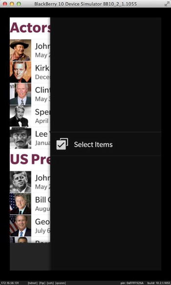
Figure 6-9. Multiselection (step 1)

Figure 6-10. Multiselection (step 2)
Figure 6-9 and Figure 6-10 illustrate the steps involved in multiple selection mode.
You can also define a MultiSelectActionItem directly in the ListView (Listing 6-17) by setting the ListView’s multiSelectAction property (in this case, the multiple selection mode will be available as a context action; in other words, it will appear after a long press on a ListView item).
Listing 6-17. multiSelectionHandler in ListView
Page{
    ListView {
        id: listview
        dataModel: XmlDataModel {
            id: people
            source: "people.xml"
        }
        multiSelectAction: MultiSelectActionItem {
            multiSelectHandler: listview.multiSelectHandler
        }
        multiSelectHandler {
           // same as before
        }
    }
}
Layout
In all the examples provided until now, you have used the ListView’s default layout, which is a StackListLayout. You can, however, customize the layout by using a GridListLayout, which will display the list items in a grid. I am not going to get into specifics of the GridListLayout, but I will mention that you can use it to display list items as image thumbnails. For example, Listing 6-18 shows you how to use an ImageView to display image thumbnails.
Listing 6-18. GridListLayout
import bb.cascades 1.2
import bb.data 1.0

Page {
    Container {
        ListView {
            id: listview
            layout: GridListLayout {
            }
            dataModel: XmlDataModel {
                id: datamodel
                source: "people.xml"
            }
            listItemComponents: [
                ListItemComponent {
                    type: "person"
                    ImageView {
                        imageSource: "asset:///pics/" + ListItemData.pic
                        scalingMethod: ScalingMethod.AspectFill
                    }
                } // LisitItemComponent
            ]
        } // ListView
    } // Container
} // Page
Figure 6-11 illustrates the resulting UI.

Figure 6-11. Image thumbnails
Note that for the thumbnails to be displayed correctly in the ListView, the data model has to be flat (see Listing 6-19).
Listing 6-19. Flat XML Model
<people>
    <person name="John Wayne" pic="wayne.jpg"/>
    <person name="Kirk Douglas" pic="douglas.jpg"/>
    <person name="Clint Eastwood" pic="eastwood.jpg"/>
    <person name="Spencer Tracy" pic="tracy.jpg"/>
    <person name="Lee Van Cleef" pic="vancleef.jpg"/>
    <person name="John F. Kennedy" pic="kennedy.jpg"/>
    <person name="Bill Clinton" pic="clinton.jpg"/>
    <person name="George Bush" pic="bush.jpg"/>
    <person name="Barack Obama" pic="obama.jpg"/>
</people>
Before getting into the details of data models in the next section, I want to quickly mention that you can create visuals in C++ using the ListItemProvider class. Note that a recurring theme in this book has always been to use the declarative power of QML to create your UI, and that C++ should be exclusively used for your app’s business logic. Therefore, ListItemProvider is mentioned here for the sake of completeness without getting into the implementation details (the techniques shown in the previous sections based on ListItemComponent objects should be preferred in most cases in practice).
ListItemProvideris essentially a factory interface for creating visuals in C++. For your own ListItemProvider subclass, you must implement the following pure virtual functions:
- VisualNode* ListItemProvider::createItem(ListView* listview, const QString& type): A factory method for creating a VisualNode. Returns a visual for the listview for an item of the given type. Note that the ListView will take ownership of the VisualNode instance.
- void ListItemProvider::updateItem(ListView* listView, VisualNode* visual, const QString& type, const QVariantList& indexPath, const QVariant& data): Updates the specified list item based on the provided item type, index path, and data.
A VisualNode is the parent class of all Cascades controls, including custom controls. You can therefore create your own custom control in C++ and return it from ListItemProvider::createItem() (or alternatively, you could use a Cascades Container as the root visual).
Note that VisualNodes are kept in an internal cache and « recycled » by the ListView to improve performance. You should therefore be aware that you can’t store a data model’s state in a VisualNode and access it at a later time. You must always make sure that an item’s state is updated and stored in the data model directly (I will tell you more about recycling in the following section).
Finally, the visual node returned by the ListItemProvider instance can optionally implement the ListItemListener interface, which is called by the ListView to handle focus and item states:
- ListItemListener::select(bool select): Called by the ListView when an already visible item becomes selected. select is true when the item is selected; it is false otherwise.
- ListItemListener::activate(bool activate): Called by the ListView when an already visible item is active. An item is active while a user is pressing the item.
- ListItemListener::reset(bool selected, bool activated): Called by the ListView when an item is about to be shown. If selected is true, the item should appear selected. If activated is true, the item should appear active.
Note For examples of how the previous classes can be used in practice, you can refer to the cascadescookbookcpp project, which can be found on GitHub at https://github.com/blackberry/Cascades-Samples/tree/master/cascadescookbookcpp. Look in the project’s src folder for the RecipeItemFactory and RecipeItem classes, which respectively provide implementations for ListItemProvider and ListItemListener classes.
Data Models
Now that you have a good overview of the UI aspects of a ListView, it is time to consider what happens behind the scenes in a data model. A data model not only encapsulates data but also specifies how it will be mapped to the contents of a list view. The data model can be an arbitrarily complex tree structure, but the list view will always display at most a two-level deep hierarchy. You can, however, set any node in the list view as the root of the hierarchy. It is also important to emphasize that the data model does not care about any visual adornments of the data. In other words, a data model is all about data description (the actual data presentation and formatting is taken care of by the visuals described in the “List Views” section). Finally, the Cascades framework comes out of the box with several standard data models than you can readily plug into your own applications.
Before actually delving into the details of a data model’s implementation, you need to understand how data nodes are located in the data model using index paths (which is the topic of the next section).
Index Paths
An index path is simply an array of integers identifying an item in the DataModel. The root node of a data model always has an empty index path. The items immediately under the root node have an index path of size 1. The items two levels down have an index path of size 2, and so on. For example, Figure 6-12 illustrates a hypothetical data model for fruits and vegetables.

Figure 6-12. Visual representation of index paths (image source: BlackBerry)
As illustrated in Figure 6-12, an index path is an ordered list of integers. The last integer in the list always represents the ordering of the item relative to its siblings, starting at 0 (the preceding integers point to the item’s parent). For example, “Empire” is the third child item of “Apples,” and therefore the last integer’s value will be 2 (the preceding values will be [0,1], which point to “Empire’s” parent, “Apples”). In QML, you can access the individual index values of an index path using a JavaScript array (in C++ an index path is defined as a QVariantList of integers).
Standard Data Models
Cascades comes out of the box with a few standard data models that you can immediately use in your own applications. You have already used the XmlDataModel, which is a great drop-in model for prototyping the visual aspects of your ListView. However, XmlDataModel has its own set of limitations: for example, you can’t update the data by adding or removing items. Therefore, in practice, you will have to use one of the other standard data models or take the extra step of implementing your own DataModel instance from scratch. You can also broadly categorize data models as sorted and unsorted models (a sorted data model will use a key for sorting its data items). In this section, I concentrate on the ArrayDataModel and GroupDataModel.
ArrayDataModel
An ArrayDataModel is an unsorted flatDataModel (in others words, the ArrayDataModel’s hierarchy is only one level deep, immediately below the root node). An ArrayDataModel is useful when you want to manage a list of items and manipulate their order manually. You can easily insert, remove, and shuffle items. The items must be QVariants in order to insert them in an ArrayDataModel. An interesting characteristic of the ArrayDataModel is that if a QVariant contains a QObject*, the ArrayDataModel will take ownership of the object if it does not already have a parent (in other words, the ArrayDataModel can handle memory management of the objects for you).
The following summarizes the most important operations on ArrayDataModel:
- ArrayDataModel::append(const QVariant& value): Inserts value at the end of this model.
- ArrayDataModel::append(const QVariantList& values): Inserts a list of values at the end of this model.
- ArrayDataModel::insert(int i, const QVariant& value): Inserts value at the position defined by i. If i is 0, the value is preprended, and if i is ArrayDataModel::size(), the value is appended.
- ArrayDataModel::move(int from, int to): Moves the value from one index position to another index position. The index positions have to be in the range [0,ArrayDataModel::size()]. This method has no effect if the indexes are out of range. Note that this is practically equivalent to an insert. The element already at the to position is not removed.
- ArrayDataModel::swap(int i, int j): Swaps the values given by index positions i and j.
- ArrayDataModel::removeAt(int i): Removes the value at index position i. If the value is a QObject* owned by the ArrayDataModel, it will also be deleted.
- ArrayDataModel::replace(int i, const QVariant& value): Replaces the item at specified index position i with value. If the previous value at position i is owned by the ArrayDataModel, it will be deleted.
Note that these descriptions have essentially provided you with a C++ perspective of the ArrayDataModel. You can nevertheless call the previous functions from QML because they are all marked as Q_INVOKABLE in C++ (for example, Listing 6-20 shows you how to use an ArrayDataModel in QML).
Listing 6-20. ArrayDataModel
import bb.cascades 1.2
Page {
    Container {
        ListView {
            id: listview
            dataModel: ArrayDataModel {
                id: arrayDataModel
            }
            listItemComponents: [
                ListItemComponent {
                    type: ""
                    StandardListItem {
                        title: ListItemData
                        description: "Fruit"
                        status: "Good for you!"
                    }
                }
            ]
            onTriggered: {
                listview.clearSelection();
                listview.toggleSelection(indexPath);
            }
        } // ListView
        onCreationCompleted: {
            var values = ["apple", "banana", "peach", "tangerine"]
            arrayDataModel.append(values);
            arrayDataModel.append("mango");
        }
    } // Container
} // Page
By default, an ArrayDataModel will always return an empty string for the type property. You will therefore have to also define an empty string for ListItemComponent’s type property in the previous example so that the ListView matches the ListItemComponent to the ArrayDataModel’s items.
Finally, the StandardListItem’s title property is bound to ListItemData, which directly corresponds to a data node in the ArrayDataModel (unlike some of the previous examples in this chapter, where the returned data node was a map and you had to use ListItemData.<keyname> to access the actual data value).
Let’s now consider the case where the list of fruits is stored in a JSON file, rather than creating them in the onCreationCompleted() slot (see Listing 6-21). In that case, you will have to use a DataSource to load the JSON content and append the values to the ArrayDataModel (a DataSource loads data from a local source such as a JSON or XML file or an SQL database). (You can also use the DataSource’s query property to specify an SQL query statement or an XML path. Finally, the DataSource’s source property specifies a local file or a remote URL from which the data is loaded.)
Listing 6-21. fruits.json
[
    {
        "name" : "apple",
        "description" : "fruit"
    },
    {
        "name" : "banana",
        "description" : "fruit"
    },
    {
        "name" : "peach",
        "description" : "fruit"
    },
    {
        "name" : "tangerine",
        "description" : "fruit"
    },
    {
        "name" : "mango",
        "description" : "fruit"
    }
]
Listing 6-22 shows you how to use a DataSource to load the JSON document shown in Listing 6-21 in an ArrayDataModel.
Listing 6-22. DataSource
import bb.cascades 1.2
import bb.data 1.0
Page {
    Container {
        ListView {
            id: listview
            dataModel: ArrayDataModel {
                id: arrayDataModel
            }
            listItemComponents: [
                ListItemComponent {
                    type: ""
                    StandardListItem {
                        title: ListItemData.name
                        description: ListItemData.description
                        status: "Good for you!"
                    }
                }
            ]
            onTriggered: {
                listview.clearSelection();
                listview.toggleSelection(indexPath);
            }
        } // ListView
        attachedObjects: [
            DataSource {
                id: dataSource
                source: "asset:///fruits.json"
                onDataLoaded: {
                    for (var i = 0; i < data.length; i ++) {
                        arrayDataModel.append(data[i]);
                    }
                }
            }
        ]
        onCreationCompleted: {
            dataSource.load();
        }
    } // Container
} // Page
As illustrated in Listing 6-22, you need to add the import bb.data 1.0 statement before using the DataSource control in QML. Also, as shown in the code, the ListView’s onCreationCompleted slot loads the data in the DataSource. As soon as the loading process has completed, the DataSource triggers the dataLoaded() signal, which is used to populate the ArrayDataModel (the signal passes an implicit data parameter, which is either an array if the root element in the JSON document is an array, or a map if the root element is an object).
GroupDataModel
GroupDataModelis a sorted data model where you can specify keys to sort the model’s items. Data items can be QVariantMap objects and/or QObject* pointers (you might recall from Chapter 3 that a QVariantMap is a typedef QMap<QString, QVariant>). If the data item is a QVariantMap, a GroupDataModel will try to sort it by matching its own keys with corresponding keys in the QVariantMap. If the item is a QObject*, it will try to match the keys with object properties. Obviously, to sort an item correctly, it must contain a corresponding key or property. You can also specify multiple keys for the GroupDataModel. In that case, the items will be sorted by applying the sorting criteria in the order the keys have been defined.
Items can also be automatically grouped by setting the GroupDataModel::grouping property. When grouping is enabled, a two-level hierarchy is automatically created for you and passed to the list view for display. The first level (with an index path of size 1) corresponds to the grouping headers and is generated by a GroupDataModel. The second level (with an index path of size 2) corresponds to the data items. Finally, a GroupDataModel’s type property will return “header” for header items and “item” for all other items).
The following summarizes the most important operations on GroupDataModel:
- GroupDataModel::GroupDataModel(const QStringList& keys, QObject* parent=0): Constructs a new GroupDataModel with the specified sorting keys.
- GroupDataModel::insert(QObject* object): Inserts the QObject* in the GroupDataModel. If the object has no parent, the GroupDataModel will take ownership of the object.
- GroupDataModel::insert(const QVariantMap& item): Inserts the QVariantMap in this GroupDataModel.
- GroupDataModel::insertList(const QVariantList& items): Inserts the QVariantList in this GroupDataModel. The items can be either instances of QVariantMap or QObject*.
- GroupDataModel::setGrouping(bb::cascades::ItemGrouping::Type itemGrouping): Sets the grouping logic for this GroupDataModel. ItemGrouping::Type can be ItemGrouping::None (items are not grouped), ItemGrouping::ByFirstChar (items will be grouped by first character), and ItemGrouping::ByFullValue (items are grouped using entire strings).
- GroupDataModel::setSortAscending(bool ascending): If true, items are sorted in ascending order; otherwise, items are sorted in descending order.
Once again, these methods are all accessible from QML (see Listing 6-23 for an example showing how to use a GroupDataModel in QML; note how the sorting keys are defined in the onCreationCompleted() slot).
Listing 6-23. GroupDataModel
import bb.cascades 1.2
import bb.data 1.0
Page {
    Container {
        ListView {
            id: listview
            dataModel: GroupDataModel {
                id: groupDataModel
            }
            listItemComponents: [
                ListItemComponent {
                    type: "item"
                    StandardListItem {
                        title: ListItemData.name
                        description: ListItemData.description
                        status: "Good for you!"
                    }
                }
            ]
            onTriggered: {
                listview.clearSelection();
                listview.toggleSelection(indexPath);
            }
        } // ListView
        attachedObjects: [
            DataSource {
                id: dataSource
                source: "asset:///fruitsandvegetables.json"
                onDataLoaded: {
                    for (var i = 0; i < data.length; i ++) {
                        groupDataModel.insert(data[i]);
                    }
                }
            }
        ]
        onCreationCompleted: {
            dataSource.load();
            groupDataModel.sortingKeys = ["name", "description"];
        }
    } // Container
} // Page
Finally, Figure 6-13 shows you a ListView with an updated version of the JSON, which includes vegetables. This mainly illustrates how items are clustered and sorted by the GroupDataModel (once again, keep in mind that the GroupDataModel automatically generates the header items).

Figure 6-13. Sorted GroupDataModel
Mapping Item Types
The ListView essentially uses a DataModel’s item type to select the corresponding visual for rendering the item. You can further refine the way data items are mapped to types by using one of the following techniques:
- In QML, you can define a JavaScript « mapping » function in the ListView. The function will have to return a string specifying the type of a given data item and an index path.
- You can choose to override a DataModel::itemType(const QVarianList & indexPath) in C++ so that it returns a meaningful type (for example, you could define a MyArrayDataModel class, which inherits from ArrayDataModel and overrides the ArrayDataModel::itemType(const QVarianList & indexPath) method to return something other than the empty string).
- You can implement the ListItemTypeMapper interface in C++ and then assign it to the ListView using ListView::setListItemTypeMapper(ListItemTypeMapper* mapper).
Defining a JavaScript Mapping Function
In QML, you can define a JavaScript “mapping function” in the ListView’s body declaration, which will « override » the DataModel::itemType(const QVariantList& indexPath) method provided by the DataModel. For example, Listing 6-24 shows you how to override the default « item » and « header » types returned by a GroupDataModel using a JavaScript.
Listing 6-24. JavaScript Mapping Function
import bb.cascades 1.2
import bb.data 1.0
Page {
    Container {
        ListView {
            id: listview
            dataModel: GroupDataModel {
                id: groupDataModel
            }
            function itemType(data, indexPath) {
                return (indexPath.length == 1 ? "myheader" : "myitem");
            }
            listItemComponents: [
                ListItemComponent {
                    type: "myheader"
                    CustomListItem {
                        dividerVisible: true
                        Label {
                            text: ListItemData
                            textStyle {
                                base: SystemDefaults.TextStyles.BigText
                                fontWeight: FontWeight.Bold
                                color: Color.create("#7a184a")
                            }
                        }
                    }
                },
                ListItemComponent {
                    type: "myitem"
                    StandardListItem {
                        id: standardListItem
                        title: ListItemData.name
                        description: ListItemData.description
                        status: "Good for you!"

                    }
                }
            ]
        } // ListView
        attachedObjects: [
            DataSource {
                id: dataSource
                source: "asset:///fruitsandvegetables.json"
                onDataLoaded: {
                    for (var i = 0; i < data.length; i ++) {
                        groupDataModel.insert(data[i]);
                    }
                }
            }
        ]
        onCreationCompleted: {
            dataSource.load();
            groupDataModel.sortingKeys = [ "name", "description" ];
        }
    } // Container
} // Page
The code shown in Listing 6-24 is very similar to Listing 6-23, except that a JavaScript mapping function has been introduced. The rendering has also been customized so that items of type « myheader » are rendered in bold (see Figure 6-14).

Figure 6-14. Sorted GroupDataModel with custom headers
Implementing ListItemTypeMapper
The ListItemTypeMapper interface can be used in C++ to map a data item to an item type. Here again, the main disadvantage of using a ListItemTypeMapper is that you will have to reference the ListView from C++, which is something you should try to avoid in practice because it adds tight coupling between your QML UI and C++ business logic (note that to access the ListView from C++, you will also have to set its objectName in QML). On the other hand, A ListItemTypeMapper cleanly separates the type mapping logic from the actual data model implementation. In other words, by implementing a ListItemTypeMapper class, you can save yourself the necessity of extending one of the standard data model classes to override DataModel::itemType().
Listing 6-25 shows you how to set a ListView’s ListItemTypeMapper in C++ (for illustration purposes, MyListItemTypeMapper’s methods have been defined inline).
Listing 6-25. ListItemTypeMapper
#include <bb/cascades/Application>
#include <bb/cascades/QmlDocument>
#include <bb/cascades/AbstractPane>
#include <bb/cascades/ListItemTypeMapper>
#include <bb/cascades/ListView>

using namespace bb::cascades;

class MyListItemTypeMapper : public ListItemTypeMapper, QObject{
public:
    MyListItemTypeMapper(QObject* parent) : QObject(parent){};
    ~MyListItemTypeMapper(){};
    QString itemType(const QVariant& data, const QVariantList& indexPath){
        return (indexPath.length() == 1 ? "myheader" : "myitem");
    }
};

ApplicationUI::ApplicationUI(bb::cascades::Application *app) :
    QObject(app)
{
    QmlDocument *qml = QmlDocument::create("asset:///main.qml").parent(this);

    // Create root object for the UI
    AbstractPane *root = qml->createRootObject<AbstractPane>();
    ListView* listView = root->findChild<ListView*>("listview");
    MyListItemTypeMapper* mapper = new MyListItemTypeMapper(listView);
    listView->setListItemTypeMapper(mapper);

    // Set created root object as the application scene
    app->setScene(root);
}
Implementing a Custom Data Model
You might need to implement your own data model if you are trying to access a complicated data structure, which is not easily readable with one of the data models discussed previously. In this case, you can opt for extending the abstract DataModel class (see Listing 6-26).
Listing 6-26. DataModel Interface
class DataModel : public QObject {
    Q_OBJECT

public:
    Q_INVOKABLE virtual int childCount(const QVariantList &indexPath) = 0;
    Q_INVOKABLE virtual bool hasChildren(const QVariantList &indexPath) = 0;
    Q_INVOKABLE virtual QVariant data(const QVariantList &indexPath) = 0;
    Q_INVOKABLE virtual QString itemType(const QVariantList &indexPath);

signals:
    void itemAdded(QVarianList indexPath);
    void itemRemoved(QVariantList indexPath);
    void itemUpdated(QVariantList indexPath);
    // itemChanged() omitted
};
As shown in Listing 6-26, DataModel defines the following methods for which you will have to provide an implementation:
- int DataModel::hasChildren(const QVariantList& indexPath): Returns true if the data item identified by indexPath has children; it is false otherwise. This is a pure virtual function.
- int DataModel::childCount(const QVariantList& indexPath): Returns the number of children of the data item specified by indexPath.
- QVariant DataModel::data(const QVariantList& indexPath): Returns the data item that is associated with indexPath wrapped as a QVariant.
You will also need to override the DataModel::itemType() function that is used by the ListView to match the corresponding ListItemComponent for creating the item visuals (or alternatively, provide a ListItemTypeMapper implementation to the ListView, as illustrated in the previous section):
- QString DataModel::itemType(const QVariantList& indexPath): Returns the type of the data item identified by the indexPath. By default, the method returns an empty string.
DataModel also defines the following signals that you can use to notify the ListView when the DataModel’s state changes:
- void DataModel::itemAdded(QVariantList indexPath): Emitted when a new item has been added to this DataModel. indexPath gives the index path of the new item.
- void DataModel::itemRemoved(QVariantList indexPath): Emitted when an item has been removed from this DataModel. indexPath is the index path of the removed item.
- void DataModel::itemUpdated(QVariantList indexPath): Emitted when an item has been updated. indexPath is the index path of the updated item.
A fourth signal, DataModel::itemChanged(), is not covered here, but it can be used for notifying bulk operations such as multiple additions and removals (the signal can be used in practice to optimize notifications, rather than emitting multiple-times more granular signals, such as DataModel::itemAdded() and DataModel::itemRemoved()).
Finally, you should keep in mind that your DataModel can return to the ListView any kind of data that can be contained in a QVariant (however, the typical data types packaged as QVariants are QString, QVariantMap, and QObject*).
To illustrate a DataModel implementation in practice, let’s replace the XmlDataModel used in Listing 6-6 with our own custom model. Also, let’s switch the data source format from XML to JSON. Listing 6-27 gives you an equivalent JSON representation of the XML document provided in Listing 6-5 (note that unlike the XML document, the JSON format is nonhierarchical. However, a new job attribute has been introduced to differentiate an Actor from a President).
Listing 6-27. people.json
[
    {
        "name" : "John F. Kennedy",
        "born" : "May 29, 1917",
        "spouse" : "Jacqueline Kennedy",
        "pic" : "kennedy.jpg",
        "job" : "president"
    },
    {
        "name" : "Bill Clinton",
        "born" : "August 19, 1946",
        "spouse" : "Hillary Rodham Clinton",
        "pic" : "clinton.jpg",
        "job" : "president"
    },
    {
        "name" : "John Wayne",
        "born" : "May 26, 1907",
        "spouse" : "Pilar Pallete",
        "pic" : "wayne.jpg",
        "job" : "actor"
    },
    // more presidents and actors in no particular order.
]
The data model class definition is in Listing 6-28.
Listing 6-28. MyDataModel.h
#ifndef MYDATAMODEL_H_
#define MYDATAMODEL_H_

#include <QObject>
#include <bb/cascades/DataModel>
#include <bb/data/JsonDataAccess>

class MyDataModel: public bb::cascades::DataModel {
Q_OBJECT

Q_PROPERTY(QString source READ source WRITE setSource NOTIFY sourceChanged);
public:

    MyDataModel(QObject* parent = 0);
    virtual ∼MyDataModel();

    Q_INVOKABLE int childCount(const QVariantList& indexPath);
    Q_INVOKABLE QVariant data(const QVariantList& indexPath);
    Q_INVOKABLE bool hasChildren(const QVariantList& indexPath);
    Q_INVOKABLE QString itemType(const QVariantList& indexPath);
    Q_INVOKABLE void removeItem(const QVariantList& indexPath);

signals:
    void sourceChanged();

private:
    QString source();
    void setSource(QString source);
    void load(QString filename);

    QString m_source;
    QVariantList m_presidents;
    QVariantList m_actors;
};

#endif /* MYDATAMODEL_H_ */
The MyDataModel class definition declares a source property, which can be set in QML to identify the source file containing the JSON data. The m_presidents and m_actors member variables are used to store the data items loaded from the JSON file. Finally, all virtual functions declared in the DataModel interface are overridden (the function definitions are discussed next).
The setSource() method is called when MyDataModel’s source property is set in QML (Listing 6-29). The method updates the corresponding m_source member variable and then calls the load() function, which is responsible for loading the JSON data from the file system.
Listing 6-29. MyDataModel::setSource( )
void MyDataModel::setSource(QString source) {
    if (m_source == source)
        return;
    m_source = source;
    this->load(source);
    emit sourceChanged();
}
The load() function given in Listing 6-30 uses a JsonDataAccess object to load the contents of the JSON file (note that the function assumes that the file is located in the application’s assets folder). Because the root object in the JSON file is an array, we try to “cast” the QVariant returned by the JsonDataAccess.load() method into a QVariantList object. Finally, the function uses the job attribute for each data entry to determine the appropriate member container to update (either m_actors or m_presidents).
Listing 6-30. MyDataModel::load( )
void MyDataModel::load(QString source) {
    bb::data::JsonDataAccess json;
    QVariantList entries =
        json.load(QDir::currentPath() + "/app/native/assets/" + source).toList();
    if (!json.hasError()) {
        for (int i = 0; i < entries.length(); i++) {
            QVariantMap entry = entries[i].toMap();
            if (entry["job"] == "actor") {
                m_actors.append(entry);
            }
            else {
        m_presidents.append(entry);
            }
        }
    }
}
Let’s now concentrate on the functions declared in the DataModel interface.
The hasChildren() method shown in Listing 6-31 returns true for the root and header nodes, and false otherwise (the root node’s index path size is 0; the header node’s index path size is 1).
Listing 6-31. MyDataModel::hasChildren( )
bool MyDataModel::hasChildren(const QVariantList &indexPath) {
    if ((indexPath.size() == 0) || (indexPath.size() == 1))
        return true;
    else
        return false;
}
The childCount method shown in Listing 6-32 returns the children of a given data node. Since we want to keep the same hierarchical structure as the one defined in the original XML structure, the childCount() method will return 2 for the root item (this corresponds to the header items “Actors” and “US Presidents”. Also note that the header items do not actually exist in the JSON file; the data model will dynamically create them). For items two levels deep in the data hierarchy with an index path of size 1, we return the number of elements in the m_actors and m_presidents list, respectively.
Listing 6-32. MyDataModel::childCount( )
int MyDataModel::childCount(const QVariantList &indexPath) {
    if (indexPath.size() == 0) {
        return 2; // for headers "Actors" and "US Presidents"
     } else {
        if (indexPath.size() == 1) {
            if (indexPath.at(0).toInt() == 0) {
                return m_actors.size();
            } else if (indexPath.at(0).toInt() == 1) {
                return m_presidents.size();
            }
        } else {
            return 0;
        }
    }
}
The data node given by an index path is returned by the data() method (see Listing 6-33). The data nodes corresponding to header items—with an index path of size 1—are dynamically created. The data nodes—with an index path of size 2—are returned from the m_actors and m_presidents member variables (also, we keep the same structure as the original XML document by returning the Actors’ values before the US Presidents values).
Listing 6-33. MyDataModel::data( )
QVariant MyDataModel::data(const QVariantList &indexPath) {
    if (indexPath.size() == 1) {
        if (indexPath.at(0).toInt() == 0) {
            QVariantMap actorsHeader;
            actorsHeader["value"] = "Actors";
                return actorsHeader;
            } else {
                QVariantMap presidentsHeader;
                presidentsHeader["value"] = "US Presidents";
                return presidentsHeader;
            }
        } else if (indexPath.size() == 2) {
            if (indexPath.at(0) == 0) {
                return m_actors.at(indexPath.at(1).toInt());
            } else {
                return m_presidents.at(indexPath.at(1).toInt());
        }
    }
    QVariant v;
    return v;
}
Finally, the itemType() method shown in Listing 6-34 returns the data type of the node given by an index path.
Listing 6-34. MyDataModel::itemType( )
QString MyDataModel::itemType(const QVariantList &indexPath) {
    if (indexPath.size() == 1)
        return "category";
    if (indexPath.size() == 2)
        return "person";
    return "";
}
We can also add methods to our data model implementation to update its items. For example, a MyDataModel::removeItem(const QVariantList& indexPath) method can be associated with a DeleteActionItem to remove an item (see Listing 6-35).
Listing 6-35. MyDataModel::removeItem( )
void MyDataModel::removeItem(const QVariantList& indexPath){
    if(indexPath.size() == 2){
        if(indexPath.at(0) == 0){
            m_actors.removeAt(indexPath.at(1).toInt());
        }else{
            m_presidents.removeAt(indexPath.at(1).toInt());
        }
        emit itemRemoved(indexPath);
    }
}
Note how the itemRemoved() signal is emitted in Listing 6-35 for notifying the ListView that the data model has changed (if you omit the signal, the ListView’s visual appearance would not be updated). In a similar way, you could implement methods for adding and updating items.
Before actually using the MyDataModel in QML, you will need to register it with the QML type system in main.cpp (see Listing 6-36).
Listing 6-36. main.cpp
#include <MyDataModel.h>

Q_DECL_EXPORT int main(int argc, char **argv)
{
    qmlRegisterType<MyDataModel>("ludin.datamodels", 1, 0, "MyDataModel");

    Application app(argc, argv);

    // Create the Application UI object, this is where the main.qml file
    // is loaded and the application scene is set.
    new ApplicationUI(&app);

    // Enter the application main event loop.
    return Application::exec();
}
Finally, you can replace XmlDataModel with MyDataModel in main.qml (see Listing 6-37).
Listing 6-37. main.qml
import bb.cascades 1.2
import ludin.datamodels 1.0

Page {
    id: page
    Container {
        ListView {
            id: listview
            dataModel: MyDataModel {
                source: "people.json"
            }
            listItemComponents: [
                ListItemComponent {
                    type: "category"
                    CustomListItem {
                        id: customListItem
                        dividerVisible: true
                        Label {
                            text: ListItemData.value
                            // Apply a text style to create a large, bold font with
                            // a specific color
                            textStyle {
                                base: SystemDefaults.TextStyles.BigText
                                fontWeight: FontWeight.Bold
                                color: Color.create("#7a184a")
                            }
                        } // Label
                    } // CustomListItem
                },
                ListItemComponent {
                    type: "person"
                    StandardListItem {
                        id: standardListItem
                        title: ListItemData.name
                        description: ListItemData.born
                        status: ListItemData.spouse
                        imageSource: "asset:///pics/" + ListItemData.pic
                        contextActions: [
                            ActionSet {
                                DeleteActionItem {
                                    onTriggered: {
                                        var myview = standardListItem.ListItem.view;
                                        var datamodel = myview.dataModel;
                                        var indexPath = myview.selected();
                                        datamodel.removeItem(indexPath);
                                    }
                                } // DeleteActionItem
                            } // ActionSet
                        ] // ContextActions
                    } // StandardListItem
                } // ListItemComponent
            ] // ListItemComponents
        } // ListView
    } // Container
} // Page
Asynchronous Data Models
A ListView must be responsive and be able to display its items as fast as possible. You must therefore ensure that the data model’s methods covered in the previous section are very fast and nonblocking. In practice, a method could block because you are trying to load a very large or a remote data set. As an immediate consequence, the Cascades UI will also freeze or behave extremely sluggishly. Therefore, to avoid any of these negative impacts on your Cascades UI, you will have to use asynchronous data model methods combined with signals such as DataModel::itemAdded()to update the ListView.
I will not show you how to create an asynchronous data model in this chapter because it is a relatively advanced concept. The subject is covered in the online documentation, however (and it is important to keep in mind that there are techniques for handling very large data sets). The following are pointers to the developer’s documentation, which also provide a complete asynchronous data model example:
- Asynchronous data processing is covered by the document found at http://developer.blackberry.com/native/documentation/cascades/ui/lists/asynch_data.html.
- Managing very large data sets is covered by the document found at http://developer.blackberry.com/native/documentation/cascades/device_platform/data_access/data_manager.html.
By default, none of the standard data models have methods for loading data nodes from the file system or saving them back to the file system (XmlDataModel is an exception: you can load an XML document by specifying the XmlDataModel’s source property, but you cannot save the document). Again this is not a limitation because you can easily subclass a data model to add persistence.
Updating Data Items with Cascades Controls
Items in a data model can be updated by using Cascades controls. For example, let’s suppose that we have extended the JSON document given in Listing 6-21 to include the availability of a given fruit or vegetable (see Listing 6-38).
Listing 6-38. fruitsandvegetables.json
[
    {
        "name" : "apple",
        "description" : "fruit",
        "available" : "false"
    },
    {        "name" : "ananas",
        "description" : "fruit",
        "available" : "true"
    },
    {        "name" : "avocado",
        "description" : "fruit",
        "available" : "false"
    },
    {
        "name" : "banana",
        "description" : "fruit",
        "available" : "false"
    },
    {         "name" : "broccoli",
        "description": "vegetable",
        "available" : "true"
    },
    // more fruits and vegetables
]
In your QML UI, you can also include a check box to update the availability of a given fruit. In that case, you will have to also handle the checkChanged() signal emitted by the check box and update the data model accordingly (see Listing 6-39).
Listing 6-39. main.qml
import bb.cascades 1.2
import bb.data 1.0

Page {
    Container {
        ListView {
           id: listview
           objectName: "listview"
           dataModel: GroupDataModel {
               id: groupDataModel
           }
           listItemComponents: [
               ListItemComponent {
                   type: "myheader"
                   CustomListItem {
                       dividerVisible: true
                       Label {
                           text: ListItemData
                           textStyle {
                               base: SystemDefaults.TextStyles.BigText
                               fontWeight: FontWeight.Bold
                               color: Color.create("#7a184a")
                           }
                       }
                   }
               },
               ListItemComponent {
                   type: "myitem"
                   CustomListItem {
                       id: customItem
                       Container {
                           verticalAlignment: VerticalAlignment.Center
                           layout: StackLayout {
                               orientation: LayoutOrientation.LeftToRight
                            }
                            CheckBox {
                                id: checkBox
                                checked: ListItemData.available
                                onCheckedChanged: {
                                    if (customItem.ListItem.initialized) {
                                        var index = customItem.ListItem.indexPath;
                                        console.log("Changing " + index);
                                        var dataModel = customItem.ListItem.view.dataModel;
                                        var val = dataModel.data(index);
                                        val.available = checked;
                                        dataModel.updateItem(index, val);
                                        console.log("after update: "
                                                    +dataModel.data(index).name+
                                                    ", available: "
                                                    +dataModel.data(index).available);
                                    }
                                } // onCheckedChanged
                            }
                            Label {
                                text: ListItemData.name
                            }
                        } // Container
                    } // CustomListItem
                } // ListItemComponent
            ] // ListItemComponents
        } // ListView
        attachedObjects: [
            DataSource {
                id: dataSource
                source: "asset:///fruitsandvegetables.json"
                onDataLoaded: {
                    for (var i = 0; i < data.length; i ++) {
                        groupDataModel.insert(data[i]);
                    }
                }
            }
        ]
        onCreationCompleted: {
            dataSource.load();
            groupDataModel.sortingKeys = [ "name", "description" ];
        }
    }
}
As shown in Listing 6-39, you need to make sure that the ListItem is initialized before handling the state update (otherwise, the ListView might be in the process of recycling the visual and the check box might be in a transient state). If the ListItem is effectively initialized, you can proceed by updating the data model. You can achieve this by first getting a copy of the data item, then updating the copy, and finally, replacing the original item with the copy in the data model (data items are returned as QVariants by the data model, and therefore you can only get a copy the original data item, as opposed to a reference to the original data).
Figure 6-15 illustrates the resulting UI.

Figure 6-15. Sorted GroupDataModel with CheckBox
Summary
This chapter introduced the ListView, which is one of Cascades’ most flexible controls. You can use a ListView to display arbitrarily complex hierarchical information as a succinct list of items. ListViews conveniently separate data from presentation using the MVC pattern. The ListView plays the role of a controller. A DataModel handles application data, and ListItemComponents define the visuals in charge of rendering a data item. Cascades also gives you standard visuals, such as StandardListItem and Header, to ensure a consistent look and feel across Cascades applications.
A ListView communicates with its DataModel using a tree abstraction, where each node in the tree is identified by an index path. The root node’s index path is an empty array. The ListView will, at most, render two sublevels of your data under the root node. You can, however, set the root node anywhere in your data model, giving you effectively deeper than two levels of interaction.