
An important step in designing your Cascades application is to plan how you will organize or structure the application’s pages and navigation. In order to make sure that you will not face any design problems, you need to clearly understand your application flow by asking yourself the following questions:
- Is a single screen sufficient or should you use multiple screens? If your application requires multiple screens, how should you organize them (for example, should you use tabs in order to switch from one screen to another or should you build a navigation hierarchy)?
- Is your application data-centric? In that case, do you need to drill down through the data?
- What are the actions the user needs to perform?
The preceding list is certainly not exhaustive, but answering these questions at the very start will help you have a clear understanding of the structural elements of your application.
You will see in this chapter that Cascades provides you with all the necessary tools to help you design your application in order to provide the best possible user experience.
Application Templates
The Momentics IDE’s New BlackBerry Project wizard is a great starting place for selecting your application scaffolding. You have the choice between four project templates, which basically cover most, if not all, of your needs in designing Cascades applications:
- Standard empty project: This is the template you have been using until now for designing your applications. It provides you a single Page where you can add your own Cascades controls.
- List view: Creates an application where the main UI element is a ListView displaying a list of items. The data for the list items is provided by an instance of a DataModel (we will study DataModel and ListView in detail in Chapter 6).
- Tabbed pane: Creates an application where the user can switch between Tabs. Each Tab contains an instance of an AbstractPane (in practice, you can only add a Page or a NavigationPane to the Tab).
- Navigation pane: Creates an application that uses a NavigationPane to display screens. Navigation is triggered when the user selects an action, which can be contextual or located on the Action bar (I will tell you more about actions and action bars in a moment).
Note that both the List view and the Navigation pane templates use navigation, which is a way to transition from one screen to another, in order to implement their functionality.
Let us now have a look at the main.qml files generated by each template (I am going to omit the standard empty project because you are already quite familiar with it).
The main.qml file generated by the Tabbed Pane template is given in Listing 5-1.
Listing 5-1. Tabbed Pane Template, main.qml
import bb.cascades 1.0

TabbedPane {
    showTabsOnActionBar: true
    Tab { //First tab
        // Localized text with the dynamic translation and locale updates support
        title: qsTr("Tab 1") + Retranslate.onLocaleOrLanguageChanged
        Page {
            Container {
                Label {
                    text: qsTr("First tab") + Retranslate.onLocaleOrLanguageChanged
                }
            }
        }
    } //End of first tab
    Tab { //Second tab
        title: qsTr("Tab 2") + Retranslate.onLocaleOrLanguageChanged
        Page {
            Container {
                Label {
                    text: qsTr("Second tab") + Retranslate.onLocaleOrLanguageChanged
                }
            }
        }
    } //End of second tab
}
A tabbed pane is an extremely convenient way of organizing your application in multiples screens. Each Tab can contain an instance of an AbstractPane (in other words, you can use a Page or a NavigationPane as a child control). Figure 5-1 illustrates a resulting UI where the second tab has been selected.

Figure 5-1. Tabs on Action bar with second Tab selected
You can specify how a TabbedPane will appear on the Action bar by setting its ShowTabsOnActionBar property. If you change the property to false (or if you don’t set it at all), the resulting layout will be identical to Figure 5-2.
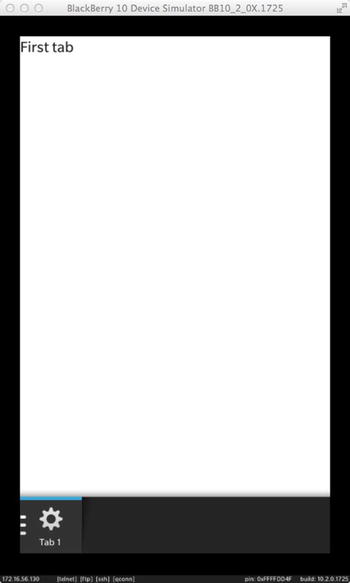
Figure 5-2. Tabs in overflow menu
By touching the Tab1 icon, you will reveal the other tabs. Obviously, this layout is preferable if you have lots of tabs in your application.
Navigation Pane Template
Listing 5-2 gives the main.qml file generated by the Navigation pane template.
Listing 5-2. Navigation Pane Template, main.qml
import bb.cascades 1.0

NavigationPane {
    id: navigationPane

    Page {
        titleBar: TitleBar {
            // Localized text with the dynamic translation and locale updates support
            title: qsTr("Page 1") + Retranslate.onLocaleOrLanguageChanged
        }

        Container {
        }

        actions: ActionItem {
            title: qsTr("Second page") + Retranslate.onLocaleOrLanguageChanged
            ActionBar.placement: ActionBarPlacement.OnBar

            onTriggered: {
                // A second Page is created and pushed when this action is triggered.
                navigationPane.push(secondPageDefinition.createObject());
            }
        }
    }

    attachedObjects: [
        // Definition of the second Page, used to dynamically create the Page above.
        ComponentDefinition {
            id: secondPageDefinition
            source: "DetailsPage.qml"
        }
    ]

    onPopTransitionEnded: {
        // Destroy the popped Page once the back transition has ended.
        page.destroy();
    }
}
You can use the Navigation pane template to build drill-down applications. In Listing 5-2, a ComponentDefinition object is used to dynamically load a QML object defined in DetailsPage.qml (you will learn about ComponentDefinition in a moment). The root control is an instance of NavigationPane (this is a departure to a standard empty project, which contained a Page control as the root container). The NavigationPane provides the NavigationPane::push(bb::cascades::Page*) and bb::cascades::Page* NavigationPane::pop() methods in order to implement navigation. If a page is pushed on the navigation stack, it will be displayed to the user. The opposite effect is achieved by popping the page off the stack. In this case, the new page located at the top of the stack is displayed. An ActionItem triggers the actual navigation from one page to another.
List View Template
Listing 5-3 gives the main.qml generated by the List view template. (Listing 5-4 defines the page that is displayed when a ListView item is selected. Listing 5-5 defines the data to be loaded in the ListView.)
Listing 5-3. List View Template, main.qml
import bb.cascades 1.0
NavigationPane {
    id: nav
    Page {
        Container {
            ListView {
                dataModel: XmlDataModel {
                    source: "data.xml"
                }
                onTriggered: {

                    if (indexPath.length > 1) {
                        var chosenItem = dataModel.data(indexPath);
                        var contentpage = itemPageDefinition.createObject();

                        contentpage.itemPageTitle = chosenItem.name
                        nav.push(contentpage);
                    }
                }
            }

        }

    }
    attachedObjects: [
        ComponentDefinition {
            id: itemPageDefinition
            source: "ItemPage.qml"
        }
    ]
    onPopTransitionEnded: {
        page.destroy();
    }
}
Listing 5-4. List View Template, ItemPage.qml
import bb.cascades 1.0

Page {
    property alias itemPageTitle: titlebar.title
    titleBar: TitleBar {
        id: titlebar
    }
    Container {

    }
}
Listing 5-5. data.xml
<root>
    <header title="Header 1">
        <item  name="Item 1"/>
        <item  name="Item 2"/>
        <item  name="Item 3"/>
        <item  name="Item 4"/>
        <item  name="Item 5"/>
    </header>
    <header title="Header 2">
        <item  name="Item 1"/>
        <item  name="Item 2"/>
        <item  name="Item 3"/>
        <item  name="Item 4"/>
        <item  name="Item 5"/>
        <item  name="Item Gorilla"/>
    </header>
</root>
Here are the most important aspects of the code to consider:
- The root control is an instance of NavigationPane (again, this is a departure from the standard empty project that contained a Page control as the root container). The NavigationPane provides the NavigationPane::push(bb::cascades::Page*) and the bb::cascades::Page* NavigationPane::pop() methods in order to implement navigation. If a page is pushed on the navigation stack, it will be displayed to the user. The opposite effect is achieved by popping the page off the stack. In this case, the page located at the top of the stack is displayed. You should note that a List view template is essentially a special case of a Navigation pane template where navigation is triggered by selecting data items in a ListView.
- A ListView uses a DataModel in order to load its data. The ListView component has been designed around the MVC pattern. The DataModel implements the model part, the ListView plays the role of the controller, and a ListItemComponent handles the list view’s visuals (you will see how the components interact in the next chapter).
- The navigation pane’s attached object property includes a ComponentDefinition declaration, which is used to dynamically load a QML component (in this case, an instance of ItemPage, which is defined in ItemPage.qml, located in the same folder as main.qml). When you actually need to create the object, you will have to call ComponentDefinition.createObject().
- Notice how the indexPath array length is checked before navigating to ItemPage to ensure that the user has selected an item element and not a header. I will provide you with more details in the next chapter on how index paths are evaluated. For the moment, suffice to say that the array is used to uniquely locate a data element in the DataModel.
- The root element index path will be the empty array. The header elements will have a one-element index path array and the item elements will have an index path array containing two elements.
Figure 5-3 illustrates the resulting application and Figure 5-4 UI when Item 2 is selected from the list.

Figure 5-3. Master view
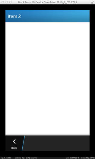
Figure 5-4. Details view
By touching the Back icon, you will pop the current page from the NavigationPage’s stack and display the ListView, which will once again be at the top of the stack.
Defining the Application Structure
In a very broad sense, application structure defines the way you organize your application to manage actions, menus, tabs, and, of course, navigation. You will see that BlackBerry 10 provides you lots of flexibility in the way the application flow and controls are visually organized and presented to the user. You are, however, encouraged to follow the BlackBerry 10 UI guidelines in order to guarantee the best user experience. You can also use the BlackBerry 10 wireframe design slides to plan your application screens and navigation. The previous chapter reviewed the essential controls for creating BlackBerry 10 UIs. This section reviews the additional controls used to create a supporting structure for your application out of those controls. If you consider a spoken language analogy, controls would be words and application structure would be the sentences built with those words (and hopefully “grammatically correct sentences” dictated by the BlackBerry 10 UI guidelines).
You will find the UI Guidelines for BlackBerry 10 at http://developer.blackberry.com/devzone/design/bb10/.
The wireframe design slides can be downloaded from http://developer.blackberry.com/devzone/design/bb10/prototyping.html.
Before looking at different application structures, I want to explain the action bar: the Action bar is located at the bottom of the screen and can contain actions, tabs, and menus. You can choose to display Tabs directly on the action bar as we did in Listing 5-1, or rather regroup them under a common Tab Menu, which will appear on the far left side of the Action bar. For example, in Figure 5-5, the Tabs are regrouped, and touching the Hub icon will reveal the remaining ones.

Figure 5-5. Action bar
The Action menu is located on the rightmost side of the Action bar. By pressing the icon with three vertical dots, the overflow menu is displayed with the corresponding Actions. Finally, Actions can appear directly on the action bar, which is the case of the Search and Compose Actions shown in Figure 5-5.
A single Page application is entirely built around a unique Page at the root of the scene graph. You have been essentially designing single Page applications until now. The biggest advantage of the single Page application structure is not only its simplicity, but also the capacity to provide the user a single screen where all content and Actions are presented in an extremely focused way during the entire application lifetime. You might think that building your application around a single Page might lack the flexibility required for more complex interactions. You will, however, see that you can provide a very enticing user experience based on the single Page design using the controls presented in the following sections (you will also be able to extend very naturally the concepts introduced for single Page applications to multiple Page or navigation-based apps).
Actions
I have informally mentioned Actions when I discussed the Action bar. This section will show you how to implement them in practice in your own applications. There are several places where you can define Actions:
- You can add Actions to a Page by setting the Page’s Actions property. You can also specify whether the Actions are displayed on the Action bar or in the Action overflow menu (by default, page Actions are located in the overflow menu and only the most used Actions should appear on the Action bar).
- You can add context Actions to a UIControl, which will be displayed in a context menu when the user touches and holds the control in your app.
- Finally, you can add Actions to a TitleBar.
An ActionItem object represents the actual Action. You can specify the following properties when declaring an ActionItem:
- ActionItem::title: A text string that will be displayed with the Action (for example, on the Action bar or in a menu).
- ActionItem::imageSource: A URL specifying the image set on the Action.
When the user triggers the Action, the ActionItem::triggered() signal is emitted. You can therefore use the onTriggered: handler in QML in order to react to user Actions.
Page Actions
Listing 5-6 illustrates how Actions are added to a Page control.
Listing 5-6. Actions
import bb.cascades 1.0
Page {
        actions: [
        ActionItem {
            id: action1
            title: "action1"
            onTriggered: {
                actionLabel.text = action1.title
            }
        },
        ActionItem {
            id: action2
            title: "action2"
            onTriggered: {
                actionLabel.text = action2.title
            }

       }
       ]
    Container {
        Label {
            id: actionLabel
            text: "Hello Actions"
            textStyle.base: SystemDefaults.TextStyles.BigText
            horizontalAlignment: HorizontalAlignment.Center
        }
    }
}
Figure 5-6 shows the action bar when all Actions are located in the overflow menu.

Figure 5-6. Actions overflow menu
And Figure 5-7 displays the expanded overflow menu.

Figure 5-7. Expanded overflow menu
If you want to display actions directly on the Action bar, you need to set the ActionItem’s ActionBar.placement property to ActionBarPlacement.OnBar (see Listing 5-7 and Figure 5-8).
Listing 5-7. Actions on Action Bar
import bb.cascades 1.0

Page {
        actions: [
        ActionItem {
            id: action1
            title: "action1"
            ActionBar.placement: ActionBarPlacement.OnBar
            onTriggered: {
                actionLabel.text = action1.title
            }
        },
        ActionItem {
            id: action2
            title: "action2"
            ActionBar.placement: ActionBarPlacement.OnBar
            onTriggered: {
                actionLabel.text = action2.title
            }
        }
        ]
    Container {
        Label {
            id: actionLabel
            text: "Hello Actions"
            textStyle.base: SystemDefaults.TextStyles.BigText
            horizontalAlignment: HorizontalAlignment.Center
            contextActions:[

        }
    }
}
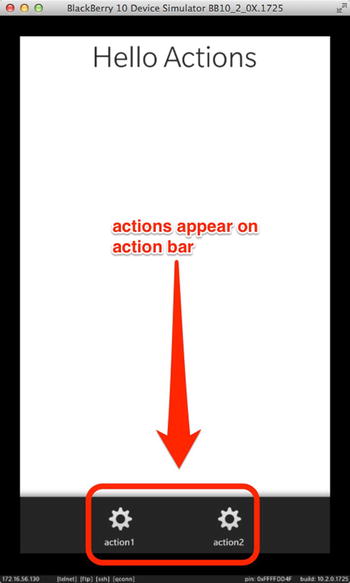
Figure 5-8. Actions on Action bar
You can also associate actions to a UIControl by setting the UIControl::contextActions property (see Listing 5-8).
Listing 5-8. Context Actions
import bb.cascades 1.0

Page {
    Container {
        Label {
            id: actionLabel
            text: "Hello Actions"
            textStyle.base: SystemDefaults.TextStyles.BigText
            horizontalAlignment: HorizontalAlignment.Center
            contextActions: [
                ActionSet {
                    Title:
                    ActionItem {
                        id: action1
                        title: "action1"
                        ActionBar.placement: ActionBarPlacement.OnBar
                        onTriggered: {
                            actionLabel.text = action1.title
                        }
                    }
                    ActionItem {
                        id: action2
                        title: "action2"
                        ActionBar.placement: ActionBarPlacement.OnBar
                        onTriggered: {
                            actionLabel.text = action2.title
                        }

                    }
                }
            ]
        }
    }
}
You need to touch and hold the Label in order to display the context Actions. Notice how the Actions are grouped in an Action set. (You can specify multiple Action sets, but at the moment, Cascades will take only the first one into account. This might change in future releases.)
You might have noticed that we mentioned menus in our discussion of Actions, but never actually had to define one. The reason is that Cascades will implicitly add Actions to predefined menus, depending on the Action’s type. There are three predefined menus available in BlackBerry 10: the Actions menu appearing on the Action bar, the context menu displayed when you touch and hold a control, and the application-wide menu, which will be displayed when the user swipes down from the top of the screen (see Figure 5-9).
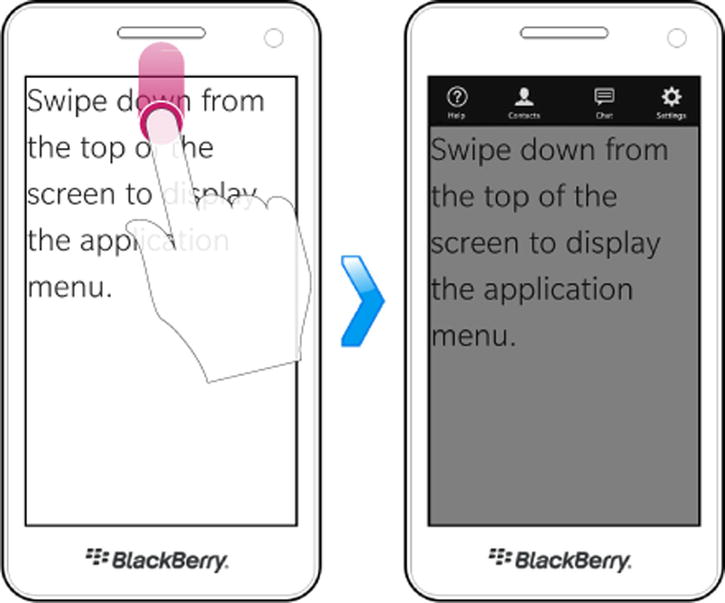
Figure 5-9. Displaying the Application menu (image source: BlackBerry web site)
The only case where you actually use a menu definition is when you need to add application-wide Actions, representing Actions that are not tied to a specific Page or control in your application. To build the application menu, you will use the MenuDefinition class, which lets you specify the following properties:
- MenuDefinition::helpAction: An instance of HelpActionItem that gives the user access to help functionality. You will have to display a help screen when this Action’s triggered() signal is emitted.
- MenuDefinition::settingsAction: An instance of SettingsAction that gives the user access to application-wide settings. You will have to display a settings screen when this Action’s triggered() signal is emitted.
- MenuDefinition::actions: A list of ActionItems to be displayed on the application menu.
The application menu will always display the HelpAction on the left most of the screen and the SettingsAction on the rightmost. The remaining Actions will appear in between. (However, a maximum of five Actions can appear on the menu. All of these items have also Internationalization enabled and are automatically translated.)
Listing 5-9 extends Listing 5-8 by adding Actions to the application menu.
Listing 5-9. Application Menu
import bb.cascades 1.0

Page {
    Menu.definition: MenuDefinition {
        settingsAction: SettingsActionItem {
            onTriggered: {
                actionLabel.text = "Settings selected!"
            }
        }
        helpAction: HelpActionItem {
            onTriggered: {
                actionLabel.text = "Help selected!"
            }
        }
        // Specify the actions that should be included in the menu
        actions: [
            ActionItem {
                title: "Action 1"
                onTriggered: {
                    actionLabel.text = "Action 1 selected!"
                }
            },
            ActionItem {
                title: "Action 2"
                onTriggered: {
                    actionLabel.text = "Action 2 selected!"
                }
            },
            ActionItem {
                title: "Action 3"
                onTriggered: {
                    actionLabel.text = "Action 3 selected!"
                }
            }
        ] // end of actions list
    } // end of MenuDefinition
    Container {
        Label {
            id: actionLabel
            text: "Hello Actions"
            textStyle.base: SystemDefaults.TextStyles.BigText
            horizontalAlignment: HorizontalAlignment.Center
            contextActions: [
                ActionSet {
                    title: "Label Actions"
                    ActionItem {
                        id: action1
                        title: "action1"
                        ActionBar.placement: ActionBarPlacement.OnBar
                        onTriggered: {
                            actionLabel.text = action1.title
                        }
                    }
                    ActionItem {
                        id: action2
                        title: "action2"
                        ActionBar.placement: ActionBarPlacement.OnBar
                        onTriggered: {
                            actionLabel.text = action2.title
                        }
                    }
                }
            ]
        }
    }
}
And the resulting menu is displayed in Figure 5-10.

Figure 5-10. Application menu
Because the application menu is application-wide, you should always specify the menu definition at the root of your scene graph, whether it is a page, navigation pane or a tabbed pane.
Segmented Control
A segmented control provides the user with a list of options, which are presented horizontally on the screen. You can use the option selection logic in order to dynamically modify the Page contents. Figures 5-11 and 5-12 illustrate the process where Buttons are dynamically switched depending on the selected option (in a real-world scenario, you would switch entire containers of controls, but the concept stays the same).
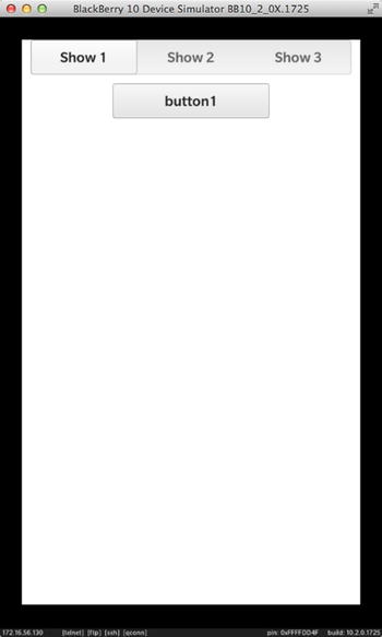
Figure 5-11. Segmented control

Figure 5-12. Segmented control
It is important to emphasize that the segmented control is not a container itself but rather enables you to respond to option selections. The corresponding code is shown in Listing 5-10.
Listing 5-10. Segmented Control
import bb.cascades 1.0
Page {
    Container {
        SegmentedControl {
            id: segmented
            Option {
                text: "Show 1"
                value: 1
            }
            Option {
                text: "Show 2"
                value: 2
            }
            Option {
                text: "Show 3"
                value: 3
            }
            onSelectedOptionChanged: {
                var value = segmented.selectedValue
                switch(value){
                        case 1:
                           container.replace(0, button1);
                           break;
                        case 2:
                           container.replace(0, button2);
                           break;
                        case 3:
                           container.replace(0, button2);
                           break;
                        default:
                           break;

                }

            }
            onCreationCompleted: {
                container.add(button1);
                segmented.selectedIndex = 0;
            }
            attachedObjects: [
                Button {
                    id: button1
                    text: "button1"
                },
                Button {
                    id: button2
                    text: "button2"
                },
                Button {
                    id: button3
                    text: "button3"
                }
            ]
        }
        Container {
            verticalAlignment: VerticalAlignment.Center
            horizontalAlignment: HorizontalAlignment.Center
            id: container
        }
    }
}
The Title bar is yet another way of extending your single Page application. If used judiciously, a TitleBar can really improve your application’s user experience with minimal effort. The TitleBar really shines by giving you the ability to completely customize the controls that will appear on it. For example, you have already seen a plain TitleBar in Figure 5-4, where the ListView’s selected item’s “details” are displayed in the Navigation view. You can also include richer controls, as shown in Figure 5-13 (when you add controls to the TitleBar, the TitleBar can be expanded to display them).
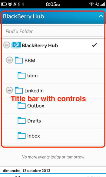
Figure 5-13. BlackBerry Hub TitleBar
In practice, you customize the TitleBar by setting its Kind property:
- TitleBarKind.Default: Allows “accept” and “dismiss” Action buttons to be displayed on the TitleBar.
- TitleBarKind.Segmented: Allows a SegmentedControl to appear on the TitleBar.
- TitleBarKind.FreeForm: Allows controls to be placed freely on the TitleBar.
Listing 5-11 shows how to add actions to the title bar.
Listing 5-11. TitleBar with Actions
Page {
    titleBar: TitleBar {
        title: "Create Task"
        kind: TitleBarKind.Default
        acceptAction: ActionItem {
            title: "OK"
            onTriggered: {
                // handle task creation here.
            }
        }
        dismissAction: ActionItem {
            title: "Cancel"
            onTriggered: {
                // handle task creation here
            }
        }
    }

    Container {
        //Todo: fill me with QML
        Label {
            horizontalAlignment: HorizontalAlignment.Center
            text: qsTr("Hello World") + Retranslate.onLocaleOrLanguageChanged
            textStyle.base: SystemDefaults.TextStyles.BigText
        }
    }
}
The resulting UI is shown in Figure 5-14.
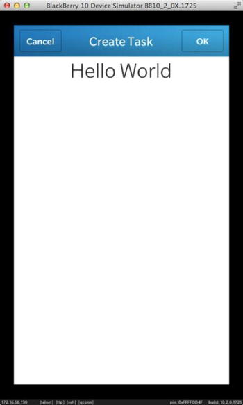
Figure 5-14. TitleBar with Actions
Using a segmented control is just as easy. I have rewritten the example provided in Listing 5-10 by setting the segmented control on the TitleBar, as shown in Listing 5-12.
Listing 5-12. TitleBar with Segmented Control
import bb.cascades 1.0
Page {
    titleBar: TitleBar {
        id: titlebar
        kind: TitleBarKind.Segmented
        options: [
            Option {
                text: "Show 1"
                value: 0
            },
            Option {
                text: "Show 2"
                value: 1
            },
            Option {
                text: "Show 3"
                value: 2
            }
        ]
        onSelectedOptionChanged: {
            var value = titlebar.selectedValue
            switch (value) {
                case 0:
                    container.replace(0, button1);
                    break;
                case 1:
                    container.replace(0, button2);
                    break;
                case 2:
                    container.replace(0, button3);
                    break;
                default:
                    break;
            }
        }
    }
    Container {
        topPadding: 50
        id: container
        onCreationCompleted: {
            container.add(button1);
            titlebar.selectedIndex = 0;
        }
        attachedObjects: [
            Button {
                horizontalAlignment: HorizontalAlignment.Center
                id: button1
                text: "button1"
            },
            Button {
                horizontalAlignment: HorizontalAlignment.Center

                id: button2
                text: "button2"
            },
            Button {
                horizontalAlignment: HorizontalAlignment.Center

                id: button3
                text: "button3"
            }
        ]
    }
}
The resulting UI is shown in Figure 5-15.

Figure 5-15. TitleBar with segmented control
Finally, you can customize the TitleBar so that it displays any set of controls on it. Listing 5-13 shows how to achieve this.
Listing 5-13. TitleBar with DateTimePicker
import bb.cascades 1.0
Page {
    titleBar: TitleBar {
        kind: TitleBarKind.FreeForm
        kindProperties: FreeFormTitleBarKindProperties {
            Container {
                layout: StackLayout {
                    orientation: LayoutOrientation.LeftToRight
                }
                leftPadding: 10
                rightPadding: 10
                Label {
                    text: "Hello title bar"
                    textStyle {
                        color: Color.White
                    }
                    verticalAlignment: VerticalAlignment.Center
                    layoutProperties: StackLayoutProperties {
                        spaceQuota: 1
                    }
                }
                TextField {
                    verticalAlignment: VerticalAlignment.Center
                    layoutProperties: StackLayoutProperties {
                        spaceQuota: 2
                    }
                }
            }
            expandableArea {
                content: DateTimePicker {
                    horizontalAlignment: HorizontalAlignment.Center
                    expanded: true
                }

            }
        }
    }

}
The resulting UI is shown in Figure 5-16.

Figure 5-16. TitleBar with DateTimePicker
A sheet provides the user an alternative flow in your application. Visually, it is displayed as a layer on top of the current screen. When the user completes the alternative flow, the sheet is closed and the main screen is displayed again. For example, in a task management application, the main screen could display the list of current tasks and you could use a sheet in order to create a new task (see Figures 5-17 and 5-18).
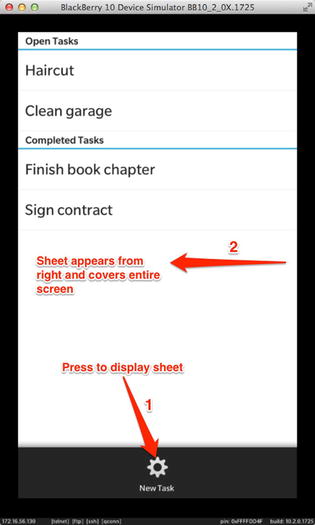
Figure 5-17. Sheet

Figure 5-18. Sheet, expanded
Listing 5-14 shows the QML document corresponding to Figure 5-17 and Figure 5-18.
Listing 5-14. Sheet
import bb.cascades 1.0
NavigationPane {
    id: nav
    Page {
        actions: ActionItem {
            title: "New Task"
            ActionBar.placement: ActionBarPlacement.OnBar
            onTriggered: {
                newTask.open();
            }
        }
        Container {
            ListView {
                dataModel: XmlDataModel {
                    source: "data.xml"
                }
            }
        }
    }
    attachedObjects: [
        Sheet {
            id: newTask
            Page {
                titleBar: TitleBar {
                    title: "Create Task"
                    kind: TitleBarKind.Default
                    acceptAction: ActionItem {
                        title: "OK"
                        onTriggered: {
                            // handle task creation here.
                            newTask.close();
                        }
                    }
                    dismissAction: ActionItem {
                        title: "Cancel"
                        onTriggered: {
                            // close sheet without creating new task
                            newTask.close();
                        }
                    }
                }
                Container {
                    topPadding: 10
                    leftPadding: 10
                    rightPadding: 10
                    Container {
                        layout: StackLayout {
                            orientation: LayoutOrientation.LeftToRight
                        }
                        Label{
                            text:"Name:"
                            verticalAlignment: VerticalAlignment.Center
                        }
                        TextField {
                            id: taskname
                            hintText: "Enter task name"
                        }
                    }
                }
            }

        }
    ]
}
All UIObjects have an attachedObjects property, which corresponds to a list of QObjects owned by the UIObject (formally, an attachedObjects property is defined as QDeclarativeListProperty<QObject> in C++). You will usually add to the list of attached objects business logic components that you need to access in the subnodes of the UIObject (you can also add visual controls as I did in Listing 5-12). The following are the most common usages of the attachedObjects property:
- Accessing QObject-derived classes (such as QTimer) from the QML layer. You can also use this approach to access your own custom C++ classes as long as they are derived from QObject (see Chapter 3).
- Declare component definitions using the ComponentDefinition class (see Listing 5-2).
- Define a FilePicker, SystemPrompt or SystemDialog that you can selectively hide or show.
There are several reasons why you would want to dynamically create QML components:
- Modularity and reusability: Using a single QML document is fine when you design relatively simple UIs. As your applications evolve and the UIs become more complex, you will realize that managing a large monolithic QML document can quickly become untractable. QML is an extensible component-based language (see Chapter 2). You can therefore construct your UI by assembling modular and reusable components that you can load dynamically.
- Improving application start-up: Loading a large QML document can take a long time during application start-up. In order to accelerate the process, you can initially load the essential UI elements (for example, the main screen) and then dynamically load the rest of the UI during the application lifetime.
- Effective memory management: A large QML document can consume memory unnecessarily. Therefore, being able to dynamically create and destroy QML objects can optimize memory and resource management (you have actually already seen this in action in Listing 5-4, where the ItemPage component is dynamically created and destroyed). For example, in the case of an application with many tabs, it would make sense to only load a tab’s contents when it is selected by the user, and unload the contents when the user switches to another tab.
If you have decided to dynamically manage your UI, you actually need a method to instantiate QML objects. In this case, you can use instances of ComponentDefinition or ControlDelegate as QML objects factories. Both objects fulfill the same role: a ComponentDefinition is the imperative instantiation method (using JavaScript); a ControlDelegate and a Delegate are the declarative way. (In particular, you can use a Delegate to dynamically load a tab’s content. I will illustrate this in the section about Delegate objects.)
A ComponentDefinition class is used to define QML Components so that they can be dynamically created. You can define components “inline” or by loading content from a QML file identified by an URL. You have actually seen the latter used in Listings 5-2 and 5-3 to switch pages during navigation.
You can define both visual and nonvisual objects using a ComponentDefinition. A definition can also be provided inline in the QML document using the ComponentDefintion’s content property, or reference another QML file using the ComponentDefintion’s source property.
A ControlDelegate is the declarative way of dynamically loading QML objects. A ControlDelegate plays the role of a placeholder in your main QML document scene graph. The ControlDelegate will then load in-place its QML content as soon as you set the ControlDelegate.delegateActive property to true. Listing 5-15 illustrates how to use control delegates in practice (the example is based on the segmented control described in Listing 5-10; but this time, the controls are dynamically loaded).
Listing 5-15. ControlDelegate
import bb.cascades 1.0
Page {
    Container {
        SegmentedControl {
            id: segmented
            Option {
                text: "Show 1"
                value: 1
            }
            Option {
                text: "Show 2"
                value: 2
            }
            Option {
                text: "Show 3"
                value: 3
            }
            onSelectedOptionChanged: {
                var value = segmented.selectedValue
                switch (value) {
                    case 1:
                        // probable QML engine bug. If braces are not included, only the
                        // first statement is executed and the others ignored.
                        {
                            controlDelegate.source = "Control1.qml"
                            var control = controlDelegate.control;
                            if (control != undefined) {
                                control.message.connect(textfield.handleMessage);
                            }
                        }
                        break;
                    case 2:
                        controlDelegate.source = "Control2.qml"
                        break;
                    case 3:
                        controlDelegate.source = "Control3.qml"
                        break;
                    default:
                        break;
                }
            }
            onCreationCompleted: {
                segmented.selectedIndex = 0;
                controlDelegate.source = "Control1.qml"
                var control = controlDelegate.control;
                if (control != undefined) {
                    control.message.connect(textfield.handleMessage);
                }
            }
        }
        ControlDelegate {
            id: controlDelegate
            horizontalAlignment: HorizontalAlignment.Center
            delegateActive: true
            onError: {
                console.log("Error while loading the delegate: " + errorMessage)
            }
        }
        TextField {
            id: textfield
            // A custom JavaScript function to handle the
            // message signal emitted by Control1
            function handleMessage(message) {
                textfield.text = message;
            }
        }
    }
}
Depending on the selected option in the segmented control, the corresponding QML control will be dynamically loaded by the ControlDelegate.
The running application is shown in Figures 5-19 and 5-20.
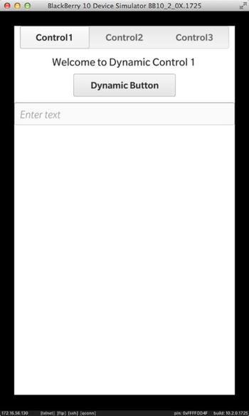
Figure 5-19. Control1 loaded ControlDelegate

Figure 5-20. Control2 loaded by ControlDelegate
The corresponding control implementations are given by Listings 5-16 and 5-17.
Listing 5-16. Control1.qml
import bb.cascades 1.0
Container {
    id: root
    signal message(string s);
        Label{
            text: "Welcome to Dynamic Control 1"
            horizontalAlignment: HorizontalAlignment.Center
        }
        Button{
            id: button
            text: "Dynamic Button"
            onClicked:{
                root.message(button.text);
            }
        }
}
Listing 5-17. Control2.qml
import bb.cascades 1.0
Container {
    Label {
        text: "Welcome to Dynamic Control 2"
        horizontalAlignment: HorizontalAlignment.Center
    }
    DateTimePicker {
        horizontalAlignment: HorizontalAlignment.Center

    }
}
A Delegate is used to dynamically create or delete an object from QML. The Delegate exposes an active property, which specifies whether the source QML component should be loaded (active: true) or unloaded (active:false). The Delegate’s source property defines the source QML component. For example, Listing 5-18 shows you how to dynamically load a Tab in a TabbedPane using a Delegate.
Listing 5-18. Dynamic Tab
TabbedPane {
   Tab {
      id: tab1
      delegate: Delegate {
          id: tabDelegate
          source: "sourcetab1.qml" // tab1 contents is loaded from sourcetab1.qml
      }
      delegateActivationPolicy: TabDelegateActivationPolicy.Default
  }
}
The TabDelegateActivationPolicy enumeration can take one of the following values:
- TabDelegateActivationPolicy.Default: Cascades chooses the activation policy (typically, the source object is loaded when a tab is selected).
- TabDelegateActivationPolicy.None: You control when the source object is created or deleted.
- TabDelegateActivationPolicy.ActivatedWhileSelected: The tab content is loaded when it is selected, and deleted when it’s no longer selected (this improves application start time, but can slow down tab switches).
- TabDelegateActivationPolicy.ActivatedWhenSelected: The tab content is loaded when selected and never deleted during the lifetime of the tab.
- TabDelegateActivationPolicy.ActiveImmediately: The tab content is loaded as soon as the source property is set. The content is unloaded when the source property is cleared.
Pages are essentially the building blocks for more complex application structures. For example, navigation-based and tabbed-based applications are essentially an aggregation of Pages. In other words, you can reuse the concepts introduced for single Page applications in the broader context of navigation-based or tabbed-based applications.
Navigation-Based Application
You can build a navigation-based applicationby using a NavigationPane as the root control in your scene graph. This class represents a set of pages—arranged in a stack—that users can navigate. In order to display a page, you need to push it on the NavigationPane’s stack. The NavigationPane will always display the page on the top of the stack.
You will notice that the stack metaphor is particularly well-suited for implementing drill-down or “master-detail” views. When you need to navigate back from the detail view to the master view, you simply pop the pages from the NavigationPane’s stack (see Figure 5-21).
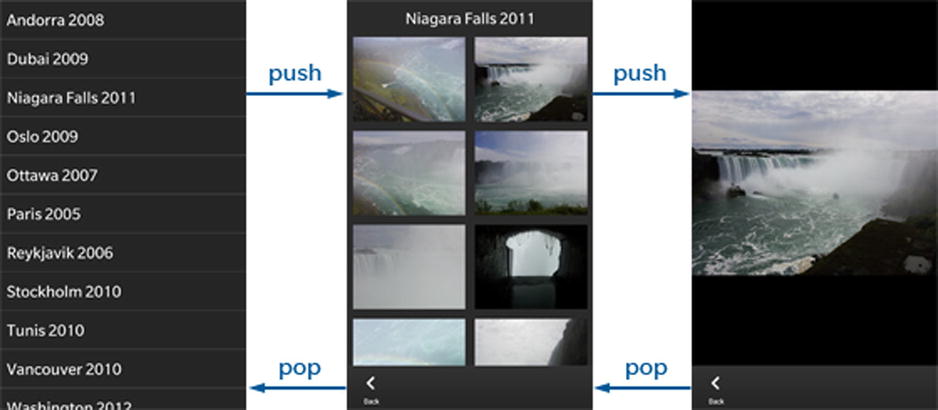
Figure 5-21. Drill-down navigation (image source: BlackBerry web site)
You can use the following NavigationPane methods to implement navigation:
- NavigationPane.push(child): Pushes a Page on the stack of this NavigationPane.
- Page NavigationPane.pop(): Pops the top of the stack from this NavigationPane. The NavigationPane keeps the ownership of the Page.
- List NavigationPane.navigateTo(targetPage): Navigates to targetPage if it is present in the stack of this NavigationPane. Any pages above the one navigated to in the stack will be removed from the stack.
When a page is popped from the NavigationPane’s stack, the NavigationPane::popTransitionEnded(Page* page) signal is emitted. The NavigationPane still keeps ownership of the Page, but you can delete it if it’s no longer needed (see Listing 5-2).
Tab-Based Application
A tab-based application’sUI is designed around tabs, which can either contain a Page or a NavigationPane. The user taps a tab to display the associated screen. Tabs either appear directly on the action bar or are located in the tab menu on the leftmost side of the action bar. In practice, the possibility to add a Page or a NavigationPane to tabs enables you to design complex navigation structures.
The root control of a tab-based application is the TabbedPane. You will usually use the following properties and methods in order to manage the TabbedPane:
- TabbedPane.activePane: The AbstractPane (a Page or a NavigationPane), which is currently shown by the TabbedPane.
- TabbedPane.showTabsOnActionBar: If true, tabs will be placed on the Action bar; otherwise, tabs will be placed in the Tab Menu on the left of the Action bar.
- TabbedPane.tabs: The list of tabs added to the TabbedPane.
- TabbedPane.activeTab: The tab that is currently active in the TabbedPane.
- TabbePane.add(tab): Adds a Tab to the TabbedPane.
Note that in order to add your Page or NavigationPane to the TabbedPane, you first need to add the Page or NavigationPane to a Tab and then add the Tab to the TabbedPane.
- Tab.setContent(content): Sets the content of this Tab, which has to a NavigationPane or Page. Ownership of the content is transferred to this Tab. If this Tab already has content, the old content is still owned by this Tab.
Summary
This chapter explained how to use the templates available in the New BlackBerry Project wizard as a starting point for your own applications. The Page control was introduced as a fundamental building block for customizing application screens with Actions and Menus. Techniques such as dynamic loading of QML components using ControlDelegates, ComponentDefinitions, and Delegates showed you how to not only optimize your application performance but also introduced additional possibilities for providing an enticing and rich user experience.
A ControlDelegate plays the role of a placeholder in your QML document for a control that you can dynamically load using a ComponentDefinition (a ComponentDefinition can also be used from JavaScript to dynamically load a component using its load method). A Delegate object can be used to dynamically load a Tab object in a TabbedPane.
Finally, application structure was defined as your app’s supporting elements—such as menus, actions, and navigation—used for enhancing your app’s user experience. Application structure is also governed by the BlackBerry 10 UI guidelines, which can be found at http://developer.blackberry.com/design/bb10/.