
Swing provides separate implementations of both the JRadioButton and the JCheckBox. A check box has two states, and within a group of check boxes, any number can be selected or deselected. Radio buttons should be grouped into aButtonGroup object so that only one radio button of a group can be selected at a time.
Both radio buttons and check boxes can be instantiated with an image as well as a title, and both can have rollover icons. The JCheckBox component is derived from the simpler JToggleButton object. JToggleButton is a button that can be switched between two states by clicking but which stays in that new state (up or down) like a two-state check box does. Further, the JToggle Button can take on the exclusive aspects of a radio button by adding it to a ButtonGroup.
     //create radio buttons in the right panel
     JRadioButton Rep, Dem, Flat;
     right.add(Rep   =  new JRadioButton("Republicrat"));
     right.add(Dem   =  new JRadioButton("Demmican"));
     right.add(Flat  =  new JRadioButton("Flat Earth"));
     ButtonGroup bgroup = new ButtonGroup();
     bgroup.add(Rep);        //add to a button group
     bgroup.add(Dem);
     bgroup.add(Flat);
If you neglect to add the radio buttons to a ButtonGroup, you can have several of them turned on at once. It is the ButtonGroup that assures that only one button at a time can be turned on. The ButtonGroup object enforces this only-one-on protocol by keeping track of the state of all of the radio buttons in the group. This is an example of the Mediator pattern discussed in Chapter 20.
The JToolBar is a container bar for tool buttons of the type you see in many programs. Normally, the JDK documentation recommends that you add the JToolBar as the only component on one side of a BorderLayout (typically the North side) and that you not add components to the other three sides. The buttons you add to the toolbar are small JButtons with picture icons and without text. The JToolBar class has two important methods: add and addSeparator.
JToolBar toolbar = new JToolBar();
JButton Open = new JButton("open.gif");
toolbar.add(Open);
toolbar.addSeparator();
By default the JButton has a rectangular shape. To make the usual square-looking buttons, you need to use square icons and set the insets of the button to zero. On most toolbars, the icons are 25 × 25 pixels. Following is a ToolButton class that handles both the insets and the size:
public class ToolButton extends JButton {
    public ToolButton(Icon img) {
        super(img);
        setMargin(new Insets(0,0,0,0));
        setSize(25,25);
    }
}
You also can detach the JToolBar from its anchored position along the top side of the program and attach it to another side, or you can leave it floating. This allows some user customization of the running program but otherwise is not terribly useful. It also is not particularly well implemented and can be confusing to the user. Thus we recommend that you use the setFloatable(false) method to turn this feature off.
The JToggleButton class is actually the parent class for check boxes and radio buttons. It is a two-state button that will stay in an up or down position when clicked, and you can use it just like a check box. While toggle buttons look rather strange on most screens, they look very reasonable as part of toolbars. You can use individual toggle buttons to indicate the state of actions that the user might select. By themselves, toggle buttons behave like check boxes, so you can click on as many as you want and uncheck, or raise, toggle buttons by using the setSelected(false) method.
You can also add toggle buttons to a ButtonGroup so that they behave like radio buttons; that is, only one at a time may be indented. However, once a ButtonGroup object is mediating them, you can't raise the buttons using the setSelected method. If you want to be able to raise them but still allow only one at a time to be indented, you need to write your own Mediator class to replace the ButtonGroup object.
Figure 29.1 illustrates a program that has check boxes, radio buttons, toolbar buttons, and toggle buttons.
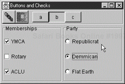
Note that the "b" JToggleButton stays depressed until another button is selected, as toggle buttons are supposed to do. While the user can select any number of organizations in which he holds memberships using the JCheckboxes, he can select only one political party from the JRadioButtons.