
7.1 Presenting Graphs Effectively
7.2 Customizing Graphs for Presentation
7.3 Placing Graphs into PowerPoint or Word
7.4 Creating and Sharing Animated Graphs in PowerPoint
7.5 Sharing Dynamic Graphs with HTML5
7.6 Publishing Reports in JMP Public (and JMP Live)
7.7 Creating Interactive Dashboards
7.8 Using Scripts to Save or Share Work
This chapter focuses on common ways you can customize and share JMP graphs with others whether you are presenting those findings yourself, placing them in a document, sending a file, or sharing them on the web. We also provide some advice for effectively doing so.
One of the most important things a JMP user can do is communicate results (data, statistics, and graphs) clearly and accurately. Most people recognize that it can be easy to manipulate results or create a graph that does not tell the whole story. The first section of this chapter is devoted to some principles of effective communication with graphs.
If you want to annotate a graph with comments or change colors or other settings before moving it into another document, JMP provides several convenient tools introduced in Section 7.2.
We will work with three types of graphical output in this chapter:
1 Fixed or static graphs (Section 7.3).
2. Animated graphs, which perform like movies. Simply press go and watch (Section 7.4).
3. Dynamic or interactive graphs, which enable you to manually click on points to highlight (Section 7.5).
Moving static graphs into other applications, such as Microsoft Word and PowerPoint, is a straightforward operation in JMP. We illustrate some options in Section 7.3 that enable you to edit the results in other applications.
Moving dynamic and animated graphs into HTML and onto the web is now a simple operation which we will walk through in Sections 7.4 through 7.6.
Further, you might want to combine graphs into an interactive dashboard and share it with others. We cover the essentials of these features in Section 7.7.
7.1 Presenting Graphs Effectively
Presenting statistical graphics in a report or presentation is a common task for many JMP users. As such, it is critical that you do this well. By well, we mean that you rely upon the data to tell the story, be succinct, and, most importantly, present an accurate and valid interpretation (visual, numeric, verbal). It helps to keep the following in mind when presenting statistical graphics:
• Understand your data and its limitations. Time spent with your data before you present it prepares you for the questions that may emerge.
• Focus on the important factors. (See Note.) What columns are core to the problem or question at hand?
• Provide the simplest expression of the data to convey the most complete description of it.
• Present graphs accurately. Do not reduce ranges in graphs to magnify changes or increase ranges to hide trends.
• Let graphs speak for themselves and avoid using unnecessary background colors or dimensions that distract from the core information that you are conveying. Make sure the graph can be seen by your audience.
|
Note |
|
How do you determine which variables or columns are most important? The methods described in Chapter 6 can help you identify important columns of interest. For example, the Partition platform (Section 6.1) can help you find out which columns are the key factors affecting another variable. |
An important feature of JMP is that it helps you follow these principles and commonly accepted standards. JMP can provide many different types of appropriate graphs of your data, so how do you know which is the most effective way to communicate your information? You will find that using common sense goes hand-in-hand with effective presentation of data and graphical integrity.
In recent years, there have been a number of books on the subject of presenting quantitative graphs and visualizing data effectively. Perhaps the best-known of these are books by Edward Tufte, whose beautifully crafted works have won wide acclaim and illustrate the core principles of presenting quantitative information effectively. These books and those by Stephen Few and others (see the Bibliography) are highly recommended if you use graphs extensively.
7.2 Customizing Graphs for Presentation
There are many features in JMP that provide you with the ability to customize graphs for presentation. Sometimes you would like to annotate a graph by pointing out a key attribute of the graph. Or, you might want to use color or markers to enhance other columns and attributes, as described in Section 2.6.
This section introduces the common tools needed to prepare your graphs and results before moving them into another application or document.
Most of JMP’s formatting options appear by simply right-clicking on the area that you would like to customize (for example, on a graph or its axis). When customizing your graphs, it is often easier to make changes within JMP before pasting or exporting them into another application. The first step, however, is to look at a powerful set of tools called the JMP Toolbar that we will begin with in this section.
Example 7.1 SAT by Year
We will be using the SATByYear.jmp data table to illustrate the concepts in this chapter. SAT by Year is data representing SAT and ACT test performance by college-bound students in the United States covering the years 1992 to 2004. The tests serve as an important admission metric for colleges and universities.
The data consists of 17 columns and 408 rows of data and includes the following columns:
● State: Students’ state of residence
● Expenditures (1997): State expenditures per pupil
● Student/Faculty ratio (1997): Ratio of students to faculty
● Salary (1997): Mean salary of teachers (in thousands)
● %Taking (2004): Percent taking the SAT exam in 2004
● Population: Population of the state
● % Taking (1997): Percent of students taking the SAT in 1997
● ACT Score (2004): Mean test scores by state in 2004
● ACT % Taking (2004): Percent taking ACT in 2004
● ACT Score (1997): Mean test scores by state in 1997
● ACT %Taking (1997): Percent taking ACT in 1997
● Year: Year of the tests
● SAT Verbal: Mean SAT Verbal test score by state
● SAT Math: Mean SAT Math test score by state
● Region: Region in which state resides
You can access this data at Help Sample Data Open the Sample Data Directory SATByYear.jmp.
Using the JMP Toolbar
When JMP graphs are generated, the Toolbar contains several tools that help you copy, annotate, and share them (Figure 7.1).
Figure 7.1 JMP Toolbar
![]()
Once a tool is selected, your mouse is transformed into its corresponding function. If these do not appear on your home window, select View Toolbars Tools. Many of these tools have familiar functions:
The Selection tool ![]() enables you to select graphs or reports (or portions of them) to be copied and pasted into Word, PowerPoint, or other applications.
enables you to select graphs or reports (or portions of them) to be copied and pasted into Word, PowerPoint, or other applications.
Within the Toolbar, the following functions enable you to add comments or highlight areas of your graphs:
• Annotate ![]() enables you to add a text box and comments in your graphs.
enables you to add a text box and comments in your graphs.
• Lines ![]() enables you to draw lines on your graphs. For example, an arrow drawn from a text box to a point on a graph.
enables you to draw lines on your graphs. For example, an arrow drawn from a text box to a point on a graph.
• Polygon and Simple Shape ![]() enable you to draw shapes in your graphs.
enable you to draw shapes in your graphs.
Note: The Toolbar features are also available from the Tools menu that appears at the top of the JMP window.
Figure 7.2 is an example of what these tools can do for you. You can summarize key aspects of your data with the Annotate tool and create pointers using the Lines tool to call out this information. Interpretation of this kind can provide valuable direction when you are not there to guide the report recipient. To generate these graphs in the SATByYear data table, select Analyze Distribution Student/Faculty Ratio and ACT Score (1997), Y, Columns OK.
Figure 7.2 JMP Results Window with Annotations

To create these features in JMP, do the following:
1. Select the Annotate tool ![]() from the JMP Toolbar.
from the JMP Toolbar.
Click on your report where you want to add an annotation. Type your comment and then left-click outside the annotation box. You can then move or resize the box as you would any text box or change the color of the background by right-clicking on the box.
2 To add lines or pointers, select the Lines icon ![]() from the Toolbar and draw the line. Once the line has been drawn, right-click to access the options for pointers, thickness, style, and color.
from the Toolbar and draw the line. Once the line has been drawn, right-click to access the options for pointers, thickness, style, and color.
Using Color
Changing the colors of your graphs is simple. Just right-click within the graph area. (See Figure 7.3.) In the Distribution platform, select Histogram Color and select a color. The method of accessing color options varies slightly by platform but generally can be found by right-clicking on the graph or through the red triangle. If you want your graphs to always use the same color, you can change the JMP defaults by selecting File Preferences Platforms and specifying the color, or File Preferences Graphs. (On the Mac, preferences are found under the JMP menu.) For more information about setting preferences, see Chapter 1.
Figure 7.3 Changing Histogram Color

Coloring a graph in this manner does not affect graphs where individual rows are color-coded by a column value within the data table. (See Section 2.6 for more information about how to use color to denote a category or range within a graph.)
Background Color
You can change the background color of any graph by right-clicking in a graph area and selecting Background Color. (See Figure 7.4.) When using background colors, be mindful not to distort, distract, or obscure the information in the data.
Figure 7.4 Changing Background Color

Horizontal Layout
Within the Distribution platform, the default display places the histograms in a vertical format (and side-by-side when there is more than one histogram generated). Clicking on any bin (or bar) within one histogram highlights those values in the remaining histograms. This is especially useful when you are exploring relationships among two or more columns and don’t want to scroll down.
Sometimes, however, you would like to see the histogram in the more traditional horizontal format. Rotate the display by simply selecting Display Options under the red triangle after you have created a histogram and then selecting Horizontal Layout. (See Figures 7.5 and 7.6.)
Figure 7.5 Specifying Horizontal Layout

Figure 7.6 Horizontal Layout Result

|
Note |
|
If you want to stack multiple histograms horizontally, one on top of the other, you can use the Stack command under the Distributions red triangle (immediately above Salary’s red triangle illustrated in this example). |
Axis
JMP enables you to easily change the axis of any graph by simply grabbing the axis with your cursor and moving it. Alternatively, you can right-click or double-click on the axis to access the following menu. (See Figure 7.7.)
Figure 7.7 Axis Settings

By selecting Axis settings, you access the Axis Specification window. (See Figure 7.8.) In it, you can customize the range, increment, and other axis options.
Figure 7.8 Axis Settings Window

7.3 Placing Graphs into PowerPoint or Word
Copying a fixed or static JMP graph into Word or PowerPoint is simple. You just need to use the Selection tool to select what you want and then copy and paste the graph into your document.
|
Note |
|
If you would like to move several graphs or output into PowerPoint, JMP also has a handy export option by simply selecting File Save, select Save as type PowerPoint Presentation from the desired results window. (On Mac, it is File Export, and select PowerPoint Presentation). |
Let’s illustrate this with the following example. Say you want to move the graph in Figure 7.9 from JMP into PowerPoint.
Figure 7.9 Moving a Graph

1. Select the Selection tool. (See Figure 7.10.)
Figure 7.10 Use the Selection Tool

2. Click on the upper left corner of the graph, as shown, to capture the entire picture. (See Figure 7.11.)
Figure 7.11 Selecting Graph Components

Alternatively, you might want to copy only selected elements of the graph, in which case you click and drag the cursor (or shift-click) to select the elements that you would like to copy.
3. Right-click and select Copy. (See Figure 7.12.)
Figure 7.12 Copy the Graph

4. Open the desired application (PowerPoint in this case), open the presentation and create a slide with the desired layout, right-click, and select Paste. (See Figure 7.13.)
Figure 7.13 Pasting the Graph in PowerPoint

|
Note |
|
When using JMP’s default paste function, the object can be re-sized in the new application, but the contents are fixed. |
Special Paste Functions
JMP also provides additional paste formats and functions. Sometimes you might want to edit the results or graph, or you need to provide the graph in a specific format. JMP has some options for you:
● Use Paste Special. This enables you to paste a .bmp or metafile. (See Figures 7.14 and 7.15.)
o Metafile is a vector art graphics format that can be edited in detail by Word and PowerPoint on Windows.
Figure 7.14 Paste Special

Figure 7.15 Paste Special Options

● If you want to change the formatting options of the graphs that you want to paste, change your preferences to reflect this:
1. Select File Preferences.
2. Select Windows Specific (or MAC OS Settings).
3. Under Copy/Drag Graphic Formats, check the formats that you want as options or remove options by unchecking them. (See Figure 7.16.)
Figure 7.16 Changing Formatting Options

|
Note |
|
If you simply want to save your results in a certain file type, such as a JPEG, EPS, PDF, or HTML, you can simply select Save As type from the File menu. (On Mac, File Export.) As an example, we will describe how to save an interactive HTML file in an upcoming section. |
7.4 Creating and Sharing Animated Graphs in PowerPoint
Animated graphs are used to express trends among column/variable relationships. JMP provides the means to communicate a clear impression from a complex model. With the Bubble Plot and Profiler, you can export these to other environments such as HTML5 and PowerPoint or publish them to JMP Public, which is described later in this chapter. Unlike other graphs that are static or require direct interaction, this class of graphs brings an added dimension to your presentation by enabling you to view changes in data relationships over time, range, or category – very much like a movie.
We will use the Bubble Plot and time series data to illustrate what we mean by animation in this section. We will then show how you can save it as an animated GIF file and place it in a PowerPoint presentation. Animated GIF files are also available for any graph that uses a Local Data Filter or Column Switcher with the animation option selected.
Creating Exportable Animated Graphs
The Bubble Plot is found in the Graph menu. The window is shown in Figure 7.17. As you see, the Bubble Plot enables you to visualize up to six variables at once, including X and Y axes, time, size of bubble, color gradient, and By. JMP enables you to also select a second subgroup for your points. For example, if you have sales data that contains both individual territories and regional information, you might want to toggle between Region and Territory. This feature enables you to see the graph for the region and to split that region into its territories on the fly to see their individual performance.
1. Open your data file and select Graph Bubble Plot. Select columns to match desired roles (described in the following box). Only Y and X are required, but you will want to do more with this platform. (See Figure 7.17.)
Figure 7.17 Bubble Plot Launch Window

2. Using our chapter example SAT by Year, assign these columns to their corresponding roles:
|
Column |
Role |
|
|
SAT Verbal |
> |
Y |
|
SAT Math |
> |
X |
|
Region |
> |
ID |
|
State |
> |
ID |
|
Year |
> |
Time |
|
% Taking (1997) |
> |
Sizes |
|
Region |
> |
Coloring |
3. After selecting OK (see Figure 7.18), locate and click on the blue play button in the lower left corner to see the animation over time.
Figure 7.18 Bubble Plot Results

Now that you have created your animated graph, you will likely want to share that with others. There are a few ways to do this, including saving it as a GIF file and placing that in PowerPoint, which we will discuss in this section. There are other ways to share it such as with a JMP file with a built-in script (Section 7.9), as an HTML5 file (covered in the next section), or published to JMP Public (Section 7.6).
Note that the following instructions for creating a GIF format and placing that movie in PowerPoint is available only on the Windows version of JMP. Let’s first record our animated bubble plot.
Picking up where we left off, you will also notice in the lower left corner of the Bubble Plot report window a red record button. Next to it, there is a save button that looks like an old floppy disk. (See Figure 7.19.) The record button will record what you play, and the save button will save that recording to a user-specified location.
Figure 7.19 Bubble Plot Recording Controls

4. Click Play Record, and then the Record button a second time to stop recording. Click the Save button (the floppy disk button). Name the file and save it in a memorable location. (See Figure 7.20.) It might take a few seconds to save.
Figure 7.20 Saving Bubble Plot Recording

5. Open a PowerPoint presentation file and create a new slide with the desired layout. (Title and Content layout is recommended.)
6. With the empty slide, select Insert Media Video Video on my PC. Be sure to select All Files where it filters on file type. Select the file and Insert. It might take a few seconds to display. Once it appears, add a title. To play in PowerPoint, click the Slide Show button and it will automatically play. (See Figure 7.21.)
Figure 7.21 Bubble Plot Recording in PowerPoint

7.5 Sharing Dynamic Graphs with HTML5
Because JMP’s graphs are dynamic and enable you to interact with them to see interesting things, it is reasonable that you would want to share these insights with others – including those who might not have a copy of JMP. JMP has an important way to share your discoveries with others by letting you save your reports as interactive HTML5. HTML5 is a standard format recognized by all browsers and enables you to save your results, which maintain much of the same interactivity that you get within JMP.
To save a report as HTML5, simply generate the results that you would like to share, go to File Save, select Interactive HTML with Data (under Save as Type), rename and locate your file as desired, and select Save.
You can simply send this file, which can then be opened with any browser (Figure 7.22). Note that at the time of publication, Interactive HTML has been implemented in most, but not all, platforms in JMP.
Figure 7.22 Interactive HTML5 Output in a Browser
|
Note |
|
When a file is saved in the HTML5 file type, the data accompanies the graph. Although it might not be obvious, the data cannot be encrypted in this format and can be extracted from the file. Thus, we caution users to be careful with sensitive or confidential data. Internal presentations might not be at issue, but sending Interactive HTML files externally can compromise confidentially. |
7.6 Publishing Reports in JMP Public (and JMP Live)
A new way to share your discoveries with the world is through JMP Public (public.jmp.com) and JMP Live if your institution is so equipped. Unlike sharing results through a file, when we refer to publishing your results, we mean just that, to broadcast the results to the public or to select groups within an organization. JMP Public (and JMP Live) is accessed through your internet browser, so it uses HTML5 as we described in the previous section.
JMP Public is a free hosted site where you can publish results and their data if you so choose. JMP Public provides an added level of interactivity by allowing the viewer to not only interact with graphs but to also filter both graphical and numerical results and have them automatically recalculated. This automatic recalculation is made possible through a JMP instance located on the server. JMP Public also provides some controls to limit access to the underlying data but know that what is published on JMP Public is open to all JMP Public users to see.
In addition to the free and open JMP Public, JMP also offers JMP Live, which can be licensed and installed on secure company servers or through cloud hosting providers. JMP Live adds the ability for organizations to run regularly scheduled reports and dashboards and to provide security around group access. To illustrate JMP Public, we will continue with the completed Bubble Plot example from the previous section.
1. Go to File Publish. This launches a window (Figure 7.23). The window provides options to select the report that you want to publish, where to publish it and whether you want to also publish the accompanying data. Name your file and select Next.
Figure 7.23 Publish Window

2. In the next screen you will see a thumbnail and have the option to edit the title and add a description to your report. (See Figure 7.24.) Once you are satisfied, select Build Report.
Figure 7.24 Preview of Published Report

The report will now be published to the specified desired location. Note that with JMP Public, the posting will be reviewed prior to being posted.
|
Note |
|
A local copy of JMP is required to create and publish reports but only a compatible browser is required to access, view and interact with published reports. |
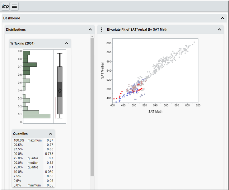
7.7 Creating Interactive Dashboards
One of the fundamental features of JMP is its ability to dynamically link multiple graphs and view selected rows or observations in any number of graphs. Placing multiple graphs and filters in a single window, or dashboard, is the subject of this section. (See Figure 7.25.) JMP includes a variety of dashboard templates enabling you to simply drag and drop your graphs of choice into a template to build your dashboard.
Dashboards can be shared with others who also have JMP, shared in a variety of formats such as PowerPoint or as an interactive HTML5 file, or published to JMP Public or JMP Live as described in the previous section. Let’s revisit the SATbyYear data table. In this data set, we would like to better understand SAT Math scores spatially in a map, but also in relationship with SAT Verbal scores.
Figure 7.25 Example of a JMP Dashboard

The first step in creating a dashboard is to create the individual graphs.
● In this example, we created a Map in Graph Builder (Graph Graph Builder) by dragging the State column into the lower left box titled “Map/Shape” and then dragging SAT Math into the resulting US map.
● We created distributions of SAT Math and Region by using the Distribution platform (Analyze Distribution) and placing SAT Math and Region into the Y Columns role and selecting OK.
● We created the scatterplot of SAT Math and SAT Verbal by using Fit Y by X (Analyze Fit Y by X) and casting SAT Math into the Y role and SAT Verbal into the X role and selecting OK.
Once we have created the three graphs (which will initially appear in separate windows), our next task is to combine them into a single Dashboard.
1. File New Dashboard launches the Dashboard builder that offers several template options (but you can also customize dashboards to your needs). For the purpose of illustration, select the 2x1 Dashboard template. (See Figure 7.26.)
Figure 7.26 Dashboard Builder

2. You will notice that the graphs you created earlier appear under Reports. From here you simply click and drag the reports to the preferred area of the dashboard template (Figure 7.27).
Figure 7.27 Selected Results in Dashboard Builder

3. At the top of the window, select Run Dashboard. JMP will automatically generate the interactive dashboard. You will notice that if you select any point, range, or area of a graph within the dashboard, the corresponding observations in other graphs will also be selected (Figure 7.28).
Figure 7.28 Completed Dashboard

You can now save the Dashboard to run on new observations or share it as a JMP file, save it to PowerPoint or HTML5, or publish the results to JMP Public or JMP Live as described earlier in this chapter.
7.8 Using Scripts to Save or Share Work
In this chapter, we have covered a variety of ways of moving JMP graphs or output into other applications. However, on many occasions you will want to save or share your results in a manner that enables you to generate the same results again. JMP scripts capture steps, procedures, or actions which enable you to reproduce your past work, perhaps on new data. For example, you may want to generate a variety of graphs and output before deciding which ones are most useful. Or perhaps you would like to go back to an analysis that you have done and possibly add additional rows to your data table and re-run the analysis or even share your work with another JMP user who can pick up where you left off.
One of the things that even experienced JMP users might not realize is that JMP has a built-in scripting language (often referred to as JSL for JMP Scripting Language). JSL is always available and running in the background to capture the work that you have done so that you can easily reproduce it. It is available by simply clicking on the menu.
From the red triangle of any platform or graph is a Script option. When selecting the Script option, you see a submenu.
1. Save Script to Data Table translates this work into a script and places it in the Table panel of the Data Table. (See Figure 7.29.)
|
Note |
|
If you ever find yourself needing to quickly exit and save all your work at once (including all open data sets and results in a session) and pick up where you left off later, select File Save Session Script. This saves all of your work to a specified location. |
Figure 7.29 Saving a Script to a Data Table

2. Once selected, a window gives you the option of re-naming the title of the script that might be more meaningful (Figure 7.30).
Figure 7.30 Window for Saving a Script to the Data Table

3. Go to the Data Table. You now see an item with the title specified in the Table panel with a green “play” button (Distribution of SAT Math, Region in this case). Click on the green play button, and you should now see exactly what you developed before. You can edit, save, and share these scripts (within the Data Table, in this case). (See Figure 7.31.)
Figure 7.31 Script on the Data Table

4. As the previous steps illustrate, you can use the JMP Scripting Language or JSL to capture and regenerate your work without looking at any code. If you are interested in seeing the code associated with the script or want to further customize the script, right-click on the green arrow of the script and select Edit. (See Figure 7.32.)
Figure 7.32 Simple Script

|
Note |
|
If you would like to learn more about the JMP Scripting Language, go to Help JMP Documentation Library JMP Scripting Guide or the JSL Syntax Reference. For a comprehensive index of JSL functions, example code and linked help, go to Help Scripting Index. |
In this chapter, we learned about communicating with graphs and about sharing JMP graphs and files and moving them into other applications. We only scratched the surface in this chapter, but we tried to address the most common and basic functionality. As mentioned, there are excellent reference materials available, both within JMP and from books dedicated to these topics. For more information, see the Bibliography section in this book.