
Chapter 6: Problem-Solving with Multiple Columns
6.2 Comparing Multiple Columns
6.3 Filtering Data for Insight
6.4 Model Fitting, Visualization, and What-If Analysis
The previous chapter focused on problem-solving when you have one or two columns of interest. This chapter builds on the previous chapter’s framework for problem-solving and introduces a method to understand multiple column and group relationships.
We introduce advanced analytics including Partition, Fit Model, and Prediction Profiler to help us understand the multi-column/variable relationships in the data. Most real-world problems involve more than one- or two-column relationships, so these methods will usually be needed for any real data analysis problem.
We also introduce the Data Filter for on-the-spot slicing of the data. The Data Filter enables easy inference testing and hypothesis development by excluding, hiding, and marking selected observations across any number of column ranges or groups.
The Predictive Modeling platforms include, among other methods, the tree-based Partition model, which allows us to explore making partitions in the data to explain a response. The Fit Model platform includes several modeling personalities, including Multiple Regression. Unlike the two-column analysis (one Y and one X) we introduced in the last chapter, Partition and Multiple Regression enable you to use additional X columns. We briefly introduce these topics at the end of the chapter, along with a very powerful model visualization tool, the Prediction Profiler.
As we explained in the previous chapter, the transformation of data into information can be advanced using a few basic JMP platforms including Distribution and Fit Y by X, which are found in the Analyze menu. Table 6.1 provides a review of the tool name, how many columns it supports, and its common statistical identity. The process of discovery starts with univariate/one-column analysis using the Distribution platform to explore the single-column/variable properties and proceeds to bivariate/two-column relationships using the Fit Y by X platform. As in life itself, these analyses can often lead to more complex questions involving more than two columns, which is the subject of this chapter.
In Table 6.1, we add Fit Model and Predictive Modeling to the items on the Analyze menu column. Partition and Multiple Regression are associated with these menus and are added to the table framework. These methods support multivariable or multi-column relationships.
Table 6.1 Tool Name, Columns Supported, and Statistical Terms
|
Analyze Menu |
How Many Columns |
Statistical Terminology |
|
Distribution |
Single column |
Univariate methods, histograms, box plots, quantiles, descriptive statistics, and more |
|
Fit Y by X |
Two columns |
Bivariate, contingency, logistic, oneway ANOVA, nonparametrics, linear regression, and more |
|
Fit Model |
Multi-Column |
Data mining, multiple regression, logistic regression, stepwise variable reduction, and more |
|
Predictive Modeling |
Multi-Column |
Data mining, partitioning, neural networks, and more |
Remember, JMP’s goal for this menu framework is to introduce you to methods in a logical order, enabling you to learn about your data progressively without forcing you to first understand statistical jargon or the conditions required to implement them. The process of digging deeper into your data is built into the menu structure.
6.2 Comparing Multiple Columns
We now want to know whether there are important multiple-column relationships (looking at more than two columns) that might be present in the data. Complex products or systems often have these relationships. In fact, sometimes to see the forest for the trees, you need these methods so that you can focus on only those columns that drive your learning from the data.
Example 6.1: Financial
We will be using the Financial.jmp data file to illustrate the steps in this chapter. The data is from companies in the Fortune 500, selected from the April 23, 1990 Fortune magazine issue. This data includes columns for:
● Type: type of company
● Sales($M): yearly sales in millions of dollars
● Profit($M): yearly profits in millions of dollars
● #emp: number of employees at time of measurement
● Profits/emp: profits per employee in thousands of dollars
● Assets($Mil.): assets in millions of dollars
● Sales/emp: sales per employee in thousands of dollars
● Stockholder’s Eq($Mil.): stockholder’s equity in millions of dollars
You can access this data at Help Sample Data Library Financial.
|
Note |
|
Statistical modeling in practice is both art and science, and simply adding more complexity to your model is not always better. Real-world models often include more than two columns, and sometimes adding too much complexity will undermine the usefulness of the model when it is used on new data. There are tools built into JMP to help you decide how much complexity to include in a model. JMP Pro includes many state-of-the-art platforms and tools to validate your models and generalize them for new data and prediction. |
You should have the Financial.jmp data table open from the previous chapter. If you do not, you can open it at: Help Sample Data Library Financial.jmp. (See Figure 6.1.)
Figure 6.1 Financial Data Table

Preparing Data by Grouping
Before we perform an analysis, let’s create a new column that simply identifies each company as being profitable or not. (We will, in effect, be making a new profit column that indicates whether it meets a certain profit threshold and will be treated as nominal.) Our intention is to identify profitable companies based on all the other columns. We want to select companies whose profits are sufficient to provide us with solid returns, so we want to identify companies whose profits are above $10 million and store them in a new column. The $10 million mark is an arbitrary breakpoint (it could be any value), but it is based on the idea that companies with higher profits in general will probably be larger and less volatile. For purposes of illustration, we will use $10 million as a reasonable and conservative strategy.
|
Note |
|
We do not need to change the profit column to a nominal type to use Partition. Output columns like profit can be either continuous, nominal, or ordinal in the Partition platform as well as any input columns. We made this change only to simplify the interpretation of our analysis for illustration purposes. |
Let’s make our new Profit column by deriving what we need from the existing Profits($M) column:
1. Click the Rows menu.
2. Select Row Selection.
3. Click Select Where… (Figure 6.2). This generates the Select Rows window. (See Figure 6.3.)
Figure 6.2 Select Where to Generate the Select Rows Window

Figure 6.3 Select Where Profit is Greater Than $10M

4. Select Profits($M).
5. Select is greater than.
6. Enter 10. (The data is expressed in millions.)
7. Click OK.
Rows that meet the condition of Profits being greater than $10 million are now highlighted in the data. (See Figure 6.4.)
Figure 6.4 Selected Rows are Highlighted

8. Now select Rows Row Selection Name Selection in Column… (Figure 6.5).
Figure 6.5 Select Name Selection in Column

9. Type the new column name and labels for the Selected and the Unselected rows exactly as shown (see Figure 6.6) and click OK.
Figure 6.6 Name Selection in Column

We will henceforth refer to this new column as “Profits grouped…”. A new column is created that identifies profitable and not profitable companies for each row in the table, with companies at $10 million and higher deemed to be “profitable.” (See Figure 6.7.) This is called recoding the data. In this case, we are making two groups where one group is labeled “Profitable” above a certain threshold and one group “Not Profitable” below that threshold. Not having to write any code to do this is very handy. To learn about another method to accomplish data recoding using the Recode command on the Cols menu, see Section 2.4.
Figure 6.7 New Profits Grouped Column

Let’s move on with the analysis.
Consider the data table in Figure 6.8. More than one column might be related to the Profits grouped column: for example, Sales($M), #emp, and Assets($M) may explain or influence a company’s profitability. With more than two columns to investigate, we need to move farther down the Analyze menu. There are many methods to investigate this type of relationship. Let’s look at one of these with a tool called Partition.
Figure 6.8 Grouped Profits

|
Note |
|
You might find these multi-way relationships by simply (but laboriously) producing distributions or examining output from Fit Y by X. We use Partition because it is a powerful and quick method for finding these relationships when you have more than two potential relationships in your data. Further, relationships among the predictors can be found using Partition; these are called interactions. In general, Partition results are usually easier to interpret than looking at distributions and examining output from Fit Y by X. |
Mining Data Using Partition
The Partition platform enables you to determine which columns in a data table most influence or predict the outcome of another column (profits, in our example). It achieves this by searching all of your selected X columns and finding a set of splits or subgroups within them whose values best predict your Y value. These splits (or partitions) of the data are done recursively (starting with the best predictor), forming a tree of decision rules.
In our example, Profits grouped is our column of interest (Y Column) and we want to determine which of the remaining columns (X Column) in our data table most influence or predict Profit. (See Figure 6.9.)
The Partition method introduced here is one of a set of methods that is sometimes termed data mining because you are mining relationships in your data to find which columns most relate to or predict profits.
Figure 6.9 Determine Which Columns Affect Profit Grouped (Outputs Versus Inputs)

|
Note |
|
The Partition technique is introduced here to enable quick exploration of your data. This topic is an advanced analytical technique. We recommended that you familiarize yourself with the underlying concepts by using the question mark tool to call up the relevant chapters in the documentation. Because these tools often require greater sophistication in their interpretation, we recommend that you seek out experienced data analysts for assistance when necessary. |
To use Partition, we will move farther down the Analyze menu to the Predictive Modeling menu. (See Figure 6.10.)
Figure 6.10 Analyze Modeling Menu

Because we have already explored profits compared with the type of company, we might now ask other questions.
Framing Our Analysis
Questions That Involve Multiple Columns
Are there relationships between profits and other columns?
What are the best predictors of profit?
What column conditions contribute to the biggest differences found between company profits?
How can we use the information in our many columns to choose the most profitable companies?
These are just a few of the questions that can be answered using the Modeling platforms.
1. Select Analyze Predictive Modeling Partition (Figure 6.11).
Figure 6.11 Analyze Modeling Partition

2. Select Profits grouped for Y, Response. (See Figure 6.12.)
Figure 6.12 Partition Window Selections

3. And for X, Factor, select Type, Sales($M), #emp, Assets($Mil.), and Stockholder’s Eq (see Figure 6.12).
Click OK.
|
Note |
|
We left out the column Sales/emp above because the column contains a calculated ratio of two other columns already used in the analysis. When exploring data using Partition and other tree-based methods, try to avoid using columns that are derived from other X columns used in the analysis. Using these columns will lead to a condition called collinearity, which is when two variables describe the same thing. |
You now see profits for all the companies represented by a (mostly) random scattering of dots in the partition graph (see Figure 6.13).
Figure 6.13 Profits Before Split

The horizontal black line that is perpendicular to the Y axis is the dividing point, above which are the Profitable companies, and below which are the Not Profitable companies.
Specifically, the companies that are above the line are those that we have labeled as “Profitable” according to the $10 million cutoff, and those below are “Not Profitable, having profit less than $10 million. So, looking at where the line crosses the Y axis on the scatterplot, about 13% of the companies are not profitable and about 87% are profitable. Your graph might look slightly different because the dots representing the data points are randomly arranged in the plot (or, in statistical terms, jittered).
You can see those very high values (outliers) to which we assigned a red X marker from the previous chapter. We saved these in the table as row properties previously. If you don’t see the red Xs, it is okay. We can go forward without them.
Now let’s try something.
4. Click Color Points. It is the button next to Split and Prune. (See Figure 6.13.)
Companies determined to be profitable (by our definition) are now displayed as blue. Red points represent those companies that are not profitable. Remember that the point of this analysis is to understand the multiple-column relationships between profits and the other columns in the data table, so seeing these contrasted by color is helpful.
If you still have the row states applied from the previous chapter, you can see that the X markers (for our high outliers on profit) have all turned blue, because they are all in the Profitable group.
5. Select Split and new output appears (Figure 6.14).
Figure 6.14 First Split of Profits

What happened? Partition went through all the columns you selected as Xs and found that the best predictor of Profits grouped was number of employees (#emp). Remember, you also included a half-dozen other columns in your model, but the first to be selected was the #emp column. The Partition algorithm selected this #emp column and made the split at 1,816 employees. This tells us that the companies with greater than or equal to 1,816 employees have a much different rate of being Profitable than do the companies with less than 1,816 employees. In fact, splitting the data into the two groups (“#emp >= 1816” and “#emp < 1816”) is the BEST split to make in order to get the biggest difference in probabilities of Profitable between the two categories. That is how the Partition algorithm found this column and made the split at 1,816 – it searched all the columns and all of the places that it could make splits on all of those columns, and this split makes the biggest difference in predicting “Profitable” versus “Not Profitable.”
Partition works similarly when we have a continuous Response, like the actual Profit amount. In that case, we find a split that pushes the average profit in the two groups as far apart as possible, instead of pushing apart the probability of group membership. Want to know more about the analytical method used by Partition? Go to Help JMP Documentation Library Predictive and Specialized Models Partition Models.
Let’s express the splits as probabilities. Go to the red triangle:
6. Select Display Options.
7. Select Show Split Prob (Figure 6.15).
Figure 6.15 Select Show Split Prob

Turning on Show Split Prob renders the groups as percentages that will aid you in finding the most and least profitable combinations.
|
Note |
|
Partition trees are useful when you have large amounts of unexplored data. Partition trees are also flexible to your column modeling types. The output column (Profits grouped in our example) can be either continuous, nominal, or ordinal, AND the input columns (in our example, #emp and Type among others) can be any combination of continuous, nominal, and ordinal. However, you should be cautious on drawing conclusions from partition trees when the data sets are small, sparse, or messy, especially as you continue to split. Starting in JMP 11, enhancements were made to many modeling methods, including Partition, to use the information value of missing data in improving model accuracy. Methods to measure the usefulness of a partition model are also supported in JMP. To learn more about the Partition platform, go to Help JMP Documentation Library Predictive and Specialized Models Partition Models. |
Figure 6.16 Probabilities for Each Split

The partition tree output now also shows the probabilities for each split. (See Figure 6.16.) Out of the total group of companies (before splitting) we found about 13% of them are not profitable and about 86% of them are profitable.
Now, after making some splits, where is most of the blue? (Reminder: Blue is profitable!) It is mostly on the left branch of the tree. These blue bars have been circled for you. It shows that 90% of these companies are profitable and therefore about 10% are not profitable. This branch defines companies with employees greater than or equal to 1,816. On the right side, the branches define companies where the number of employees was less than 1,816 or we were missing the information about the number of employees. You see more red on the right side of the tree. (Reminder: Red is unprofitable by our definition.) So, we conclude that the best single predictor of profit is the #emp column, where about 90% of the companies that have more than 1,816 employees meet our criteria for profitable companies. In comparison, for smaller companies (and companies who failed to report the number of employees), only about 31% of the companies are profitable.
Note that in the output, JMP has taken Missing or not Missing into account in the model. The information value of missing data can result in improved models. Go to Help JMP Documentation Library Predictive and Specialized Models Partition Models and the “Informative Missing” section to learn more.
Based on what we just learned from the first split, we probably want to look for companies with more than 1,816 employees if we want the best chance of identifying Profitable companies. Now what additional information can we learn by splitting our tree again?
Let’s continue growing the tree.
8. Select Split again. Another branch appears on the report (Figure 6.17).
Figure 6.17 Probabilities for Each Split After Second Split

Where are the most profitable groupings after your last split? (See Figure 6.17.) Hint: Follow the blue. On what side of the tree did the split happen? Can you find the combination where >99% of the companies are profitable? We find these where the number of employees is greater than 1,816 AND the Type is Beverages, Drugs, Oil, and Soap. The best branches in the tree are circled for you.
You have now identified the most likely combination of predictor values for profitable companies so far. Let’s make that easier to see in the Leaf Report.
9. From the red triangle for partition, select Leaf Report (Figure 6.18).
Figure 6.18 Select Partition Leaf Report

The Leaf report assembles your discoveries in a table format that mirrors the tree format we just covered. (See Figure 6.19.) Looking at the Leaf report and reading the Leaf Label from left to right, we can see which split combinations are most or least desirable. What combination looks the most risky so far? It appears to be where the number of employees is less than 1,816 (or we are missing the information about how many employees the company has). Almost 69% of companies in that group do not achieve our definition of profitable.
Figure 6.19 Leaf Report

What group looks most profitable?
The most profitable group appears to be where the number of employees is greater than or equal to 1,816 and the type of companies are Beverages, Drugs, Oil, and Soap. In our example, 99% of companies in this group are profitable. Remember this group because we will be using it in the Using Data Filter section a bit later.
10. Back to our tree, click Split again.
Where did the next split happen? (See Figure 6.20). We have found another leaf where companies have a very high probability of being Profitable.
Figure 6.20 Results Showing Third Split

The combination of Aerospace and Computer companies and Number of Employees greater or equal to 95,000 contains nine companies that are profitable. All of the companies in that combination are Profitable. This profitable set has been circled for you. (See Figure 6.20.)
You can now see this last split in the updated Leaf report that appears in Figure 6.21.
Figure 6.21 Third Split Leaf Report

In Figure 6.21 at the top (Response Prob), we see that, for the third leaf in the list, defined by #emp is greater than or equal to 1816 or the company did not report employee counts and the type of company is Aerospace, Computer, and the number of employees is less than 95,000 and employee count was not missing, the probability of expecting a company to be Profitable is 0.7052. From the bottom (Response Counts), we see that there are 21 Profitable companies in this group, and nine Not Profitable companies. You might notice that the listed Probabilities are not exactly the Number Profitable/Total Number in that group. JMP is using an adjustment for calculating these probabilities that works better, in practice, for estimating the true probabilities rather than just the in-sample probabilities. (In other words, just because for the second leaf in the list, nine of nine companies were Profitable, it does not guarantee that every company in the world that falls into that leaf’s characteristics will be Profitable. So, we adjust the probability slightly away from 100% to account for the chance of just randomly sampling nine Profitable companies when we chose nine companies.)
How do we decide when to stop splitting the tree? This is a very important question! The best way to answer it is to go back to the beginning of this analysis and split our data into two groups: one group of data to build the Partition, and one group to test the resulting model. To learn more about this important idea go to Help JMP Documentation Library Predictive and Specialized Models Partition Models Validation.
6.3 Filtering Data for Insight
Drilling down or filtering your data is an important objective in data analysis and can be accomplished in several ways with JMP. In this section, we will show you three distinct ways this can be done with our example including commands from the Tables menu, the Data Filter platform, and Lasso tool. You will find that each filtering approach provides unique benefits and is suited to the context of the analysis that you are performing.
Using a Table Command to Extract a Subset
Now let’s identify those nine companies:
1. Select the red triangle within the tree node where #emp>=95000 not Missing
2. Select Select Rows. (See Figure 6.22.)
Figure 6.22 Select Rows on the Partition Node

3. Select the Tables menu.
4. Select Subset (Figure 6.23).
Figure 6.23 Tables Subset

5. In the window, select Selected Rows and All Columns as shown, and click OK. (See Figure 6.24.)
Figure 6.24 Tables Subset Selected

A new data table appears. (See Figure 6.25.) You have identified a subset of desirable and profitable companies that are from the computer and aerospace categories and that have sales above $10 million. These companies can now be submitted for further study and consideration for the investment portfolio. This subset step saves you time from finding them in the data table.
Figure 6.25 New Data Table Showing Profitable Subset

Using Data Filter
The Data Filter command from the Rows menu is a powerful means to visualize a subset of your data interactively. The Data Filter is especially useful when you are visualizing large data tables where graphs are packed with data points and it is difficult to see meaning in them. The Data Filter enables you to easily select rows (which can be ranges or categories) within any column of interest and hide or exclude all other rows in your data table (see also section 2.5).
We will use the Data Filter to identify the best of the best from among the groups you already identified using Partition.
Early in the last section, recall that a promising group of companies were from the Type column (Soap, Oil, Beverages, and Drugs) where the number of employees is greater than or equal to 1,816. We want to restrict the next analysis only to this promising subset. Here’s how:
1. We need to bring the Financial data table to the front again. Select Window Financial.
2. From the Rows menu, select Data Filter. (See Figure 6.26.)
Figure 6.26 Select Rows Data Filter
The Data Filter window appears (Figure 6.27).
Figure 6.27 Data Filter Window

3. Select Type and click ![]() , which adds it to the filter. A change to the Data Filter appears, showing the different company types. (See Figure 6.28.)
, which adds it to the filter. A change to the Data Filter appears, showing the different company types. (See Figure 6.28.)
Figure 6.28 Data Filter Type

4. Now, press and hold the CTRL key and select Beverages, Drugs, Oil, and Soap. Click the AND button. (The results are shown in Figure 6.29).
Figure 6.29 Data Filter Beverages, Drugs, Oil, and Soap

5. Select the #emp column and click ![]() . (The results with #emp slider control are shown circled in Figure 6.30).
. (The results with #emp slider control are shown circled in Figure 6.30).
Figure 6.30 Select Number of Employees

A histogram appears under the number of employees showing the values of the column to be between 560 and 383,220. Recall that the dividing point discovered in the Partition platform earlier favored companies with a number of employees greater than or equal to 1,816.
6. Click and enter 1816 where you see 560 on the left side of the histogram. Click away from the edited value. (See Figure 6.31.)
Figure 6.31 Data Filter

7. Now select the Show and Include check boxes. (See the circled area in Figure 6.32.) This restricts the analysis to those same profitable companies identified in the partition and leaf report earlier in this chapter.
Figure 6.32 Select Show and Include

8. Let’s look at the result of this exercise by returning to the data table. Select Window Financial (Figure 6.33).
Figure 6.33 Bring Financial Window to Front

Take a look at the data table and notice what has happened. It now shows groups of rows that are selected and included for profitable rows. (See Figure 6.34.)
Figure 6.34 Data Table Showing Rows Hidden and Excluded

As we covered in Section 2.5, the rows that are hidden (and that will not appear in graphs) feature a mask icon in the row, while rows that are excluded (not used in any analysis) feature a circle icon with a strike-through symbol.
Rows that are still included and selected (highlighted) are those that meet the criteria for selection that we established from our Partition example. They are now selected with the Data Filter.
The Data Filter is a terrific tool for exploring your data visually by enabling you to see subsets of your data in any JMP graph. These subsets can be derived from a prior analysis as demonstrated here or can simply be used to restrict your analysis to any subset you want. As you will see in the next few pages, the Data Filter will be used to further subset the most desirable companies in our example.
Now let’s save the Data Filter for the future:
9. From the red triangle on the Data Filter, select Save Script To Data Table… (Figure 6.35). Select OK to complete the action.
Figure 6.35 Save Script to Data Table

In the upper left panel of the data table, a new item appears named Data Filter. It is circled for you. (See Figure 6.36.) The Data Filter item has created a JMP script that stores the steps needed to reproduce the subset that you selected.
Figure 6.36 Data Filter Script in Data Table

Let’s rename it something more descriptive so that we can remember what it does.
10. Right-click on Data Filter and select Edit. Rename it BevDrugOilSoap, EMP >= 1816 in the window that appears. (See Figure 6.37.)
Figure 6.37 Data Filter Script Renamed

11. Click OK.
The Data Filter script is now renamed BevDrugOilSoap, EMP > = 1816 in the upper left panel of the data table. (See Figure 6.38.)
Figure 6.38 Data Filter Renamed in Table

Now we can reuse the filter if we want to apply this criterion to the data. It’s easy with the new script that applies the filter. You simply click the ![]() in the upper left panel of the data table.
in the upper left panel of the data table.
|
Note |
|
The script also acts upon any new data that you add or merge into the data table. If you add or change data in the data table, you might want to create a new subset. If that is true, use Partition again to analyze it and then use Data Filter again to apply it. |
You have now filtered your data to only the best performers, so our task is to select only the very best from this group for our portfolio. There are many methods to finding high performers from among the groups that we selected. We will go back and use the Fit Y by X platform (that we introduced in the previous chapter) along with the Lasso tool to visually select individual points. We find that using Lasso in this context easily enables visual selection of points that meet our performance requirements. The goal is to select the most profitable companies by industry type. In this example, we will use the continuous representation of profits, Profits($M), as it allows us to distinguish with more precision among this group of high performers.
Recall that we also identified profitable companies from the Aerospace and Computer types in the partition Analysis and we used the subset command to extract those. Because these companies also had the requirement of having sales over $10 million, we could have used a conditioning statement (such as an “and” or “or” statement) in the Data Filter or merged that group with the one illustrated above to create one data table. To simplify this illustration, we have omitted these steps. To learn about how to merge data tables, see Help JMP Documentation Library Using JMP Reshape Data and the topic Concatenate.
12. Select Analyze Fit Y by X. (See Figure 6.39.)
Figure 6.39 Analyze Fit Y by X

13. In the launch window, select Profits($M) as the Y, Response and select Type for the X, Factor. (See Figure 6.40.)
Figure 6.40 Fit Y by X Profit by Type

14. Click OK.
The Oneway graph (Figure 6.41) shows profits from one of the best performing groups that you identified in your partition analysis and selected using the Data Filter. All of the other companies have been excluded and hidden from this analysis. It is from these included companies that we want to identify the very best of these performers.
Figure 6.41 Oneway ANOVA Report

15. From the red triangle, select Means and Std Dev. (See Figure 6.42.)
Figure 6.42 Select Means and Std Dev from Red Triangle

The result appears in Figure 6.43a.
Figure 6.43a Oneway Means Std Dev Lines

We want to select companies that are exceptional performers. Let’s define that by looking for companies that are at least one standard deviation above the mean within each Type. Notice that the wide blue horizontal lines that appear in each type mark the values at the mean plus and minus one standard deviation. (See Figure 6.43b.)
Figure 6.43b Mean Error Bars

The smaller blue vertical lines with horizontal whiskers denote mean error bars (see Figure 6.43b), indicating the values one standard error from the mean. Use the question mark tool from the Tools menu and click on the Oneway plot to review standard deviations and other options.
We are interested in the companies performing better than one standard deviation above the mean Profit within each Type (in other words, above the blue horizontal lines for each Type) because they are exceptional performers within their type in terms of profit. Let’s try a new method to select them.
Using Lasso to Select Individual Points
1. From the toolbar, select the Lasso tool. (See Figure 6.44.)
Figure 6.44 Select Lasso Tool

2. Now move the cursor (which should look like a little lasso) to the Oneway result. Left-click and draw a circle around the points above the top whiskers of the error bars (see Figure 6.45), making sure that you close the circle around the points before releasing the button.
Figure 6.45 Lasso Around Points

There should be about seven selected rows in your table. It’s okay if the count is not exact. Now we just need to extract these very best historical performers (with respect to their Type) from the rest.
|
Note |
|
To help make these easier to see, the size of the graph has been increased by clicking and dragging the lower right corner to enlarge the graph. |
3. From the Tables menu, select Subset. (See Figure 6.46.)
Figure 6.46 Tables Subset

4. In the launch window, select Selected Rows and All Columns. (See Figure 6.47.)
Figure 6.47 Select Selected Rows and All Columns

5. Click OK.
The resulting data table (Figure 6.48) contains the seven most promising companies out of the 97 original companies. The most profitable companies are mostly oil companies, though soap, drugs, and beverage companies each made a showing among the most profitable. Note that we have not necessarily chosen the seven most profitable companies – rather, we have chosen the seven companies that, within their Types, are more profitable than the one standard deviation cutoff. This might mean that we have chosen a Soap company that technically performs with slightly less Profit than an Oil company that we rejected; however, this can be a benefit in diversifying our choices. You could also just choose the seven most profitable companies, regardless of Type, if you are not concerned about diversifying among several company Types. We now have some potential portfolio selections for further study or investment.
|
Note |
|
You might not get exactly seven. This is okay because some of the best performing companies might be challenging to grab using the lasso tool. |
Figure 6.48 Data Table Showing Most Profitable Companies

6.4 Model Fitting, Visualization, and What-If Analysis
In this section, we will extend many of the JMP skills and concepts that you have learned thus far into the insight you will need to articulate your findings effectively. We will now combine our models with the Data Filter in order to better understand the data. We will also introduce the Prediction Profiler for interactive visual what-if analysis.
Consider for a moment a thought experiment. Some old radios have an analog tuner dial on them. Imagine you turn on the radio and hear noisy static. You slowly turn the tuner dial through the frequencies until you hear a transmission. Sometimes you might tune past the station, but you slowly tune back to obtain the optimal signal. Your ear hears the difference between the signal and the background noise. The Profiler and Data Filter (as described in the previous section) can be used as just such a tuner, but instead of using your ears, you use your eyes. The next section shows you how.
Let’s test the idea that a positive relationship exists between profits and the number of employees in all of our companies. To do this, we need to use two things you already learned: Fit Y by X and the Data Filter.
1. Select Rows Clear Row States. (See Figure 6.49.)
Figure 6.49 Clear Row States

This clears the row selections, the markers, and the hidden and excluded rows from the last section.
Now let’s build a simple model of the relationship between profits and number of employees.
2. Select Analyze Fit Y by X. Select Profit($M) as the Y, Response role and #emp as the X, Factor role. (See Figure 6.50.)
Figure 6.50 Fix Y by X Profit Employees

3. Click OK. A bivariate fit appears (Figure 6.51).
Figure 6.51 Bivariate Plot

From the red triangle for the bivariate fit, select Fit Line and Fit Mean. (See Figure 6.52.)
Figure 6.52 Select Fit Line

A red line appears in the data that extends generally from the lower left of the graph to the upper right of the graph. A green line appears that represents the mean of the response or average profit. (See Figure 6.53.)
Figure 6.53 Bivariate Profits by Employee with Fit Line

This red line shows that, in general, as the number of employees increases, so do the profits. Notice how sparse the data is for companies above 150,000 employees. Because there are few companies or rows of data above 150,000 employees, it might suggest that the relationship is not as well defined in that region. An unusually large and profitable company in the upper right is influencing the slope of the line as well.
|
Note |
|
This is a simple or linear least squares regression fit, which fits a straight line through the points in a manner that balances the differences between those points above and below the line. |
Let’s see whether graphics can help us interpret this relationship:
4. Select the red triangle item next to the line labeled Linear Fit and select Confid Shaded Fit (Figure 6.54). A red shaded boundary around the line appears. (See Figure 6.55.)
Figure 6.54 Conf Shaded Fit

Figure 6.55 Conf Shaded Fit Displayed

The curves appearing on the graph are 95% confidence curves. The shaded area around the line gets wider where data is sparser and the farther away from the mean of X. This is a visual indication that where data is sparse and far away from the mean of X, the estimates are less precise. The converse is also true: where data is denser and closer to the mean of X, the confidence curves are narrower, and estimates are more precise. Thus, we can be more confident that the line better represents a more precise relationship where the confidence curves are narrower than where they are wider where the relationship is less precise. This might indicate that the relationship between profits and number of employees is more precise up to about 150,000 employees because the confidence curves start to widen there, which would indicate the relationship is less precise.
Notice, too, that a lot of the data points are pretty far away from the line. That’s curious. It appears especially true for companies with more than 50,000 employees. Maybe even more than one pattern is present. How might we explore this?
Let’s start by exploring if the positive relationship between profits and number of employees holds across all company types. The Data Filter acts like a tuner as it toggles through the company types. Here’s how.
5. Select Rows Data Filter. (See Figure 6.56.)
Figure 6.56 Select Rows Data Filter

6. In the Data Filter window, select the Type column (see Figure 6.56) and click ![]() .
.
Figure 6.57 Select Data Filter Type

7. Put a check mark next to the Select, Show, and Include check boxes. (See Figure 6.58.)
Figure 6.58 Data Filter with Select, Show, and Include Selected

8. Now return to your Fit Y by X results. From the red triangle, select Redo Automatic Recalc. (See Figure 6.59.)
Figure 6.59 Automatic Recalc

Automatic Recalc updates the scatterplot and fit based on the new row states controlled by the Data Filter. Alternatively, you could leave Automatic Recalc off and re-fit the trend line iteratively for multiple views, but this takes more time to do.
Now you should see two floating windows. (See Figure 6.60.)
Figure 6.60 Bivariate Fit Y by X and Data Filter
|
|
|


46. From the red triangle of the Data Filter, select Animation. (See Figure 6.61.) Animation controls now appear in the Data Filter window that looks like the controls on a DVD player.
Figure 6.61 Data Filter Animation

9. Click on ![]() (the step forward control). (See Figure 6.62.)
(the step forward control). (See Figure 6.62.)
Figure 6.62 The Step Forward Control

Each time you click the step forward control, you filter on just one of company groups within the Type column, and you will see these highlighted in the Data Filter window.
Now click sequentially through the company types and notice what happens to the graph each time you click. Toggle through several times. Can you see the one type that is different from the rest? Figure 6.63 includes the series of graphs that you should be seeing as you toggle through each company type.
Figure 6.63 Results of Clicking Through Company Type

Which graph is most different from the rest? Which graph has a fit line that is almost flat? You might have noticed that Beverages shows a line that is much flatter than the others, which indicates that the number of employees or size of the company has less influence on the profitability. Notice that, in general, the other company types show a reasonably strong correlation between profits and number of employees.
Notice also that Beverages is the sparsest fit. It has only seven data points widely dispersed, so the confidence bands also flare out widely. Also notice that the green mean line for Beverages is completely inside the confidence curves. This is another indication that the correlation for Beverages is not strong. At least for the beverage company type, we can conclude that the greater number of employees does not predict greater profits in this sparse sample.
10. Select Rows Clear Row States for next section.
Conducting What If Analysis
The Prediction Profiler is a different type of graphical tuner for your data and provides a clear picture of your model. The Prediction Profiler is an interactive graph that produces estimates of your Y column of interest (profits, in our example) subject to your predictors, or X, columns (such as number of employees from the last example). The interactive feature enables you to drag and change the settings of any column to see the estimated effect on the other columns. The following example shows you how the Prediction Profiler is used in the context of a Linear Model.
The advantage of the Prediction Profiler is that it lets you try what-if scenarios dynamically and get immediate estimates on any column of interest. Very cool!
The simplest version of the prediction profiler can be seen in the Fit Model platform when fitting a line as we did with the Fit Y by X platform.
11. To create a profiler, you first need to create a model to describe the relationships in your data. Using the same Financial data table with the row states cleared, select Analyze Fit Model. (See Figure 6.64.)
Figure 6.64 Analyze Fit Model

12. In the Fit Model window, select Profit($M) as the Y column. Then select #emp and click on the Add button to place it in the Construct Model Effects window. (See Figure 6.65.)
Figure 6.65 Fit Model Window

13. Select the pop-down menu for Emphasis and change it to Effect Screening. (See Figure 6.66.) This just changes the format of the results shown in the output window (Figure 6.67).
Figure 6.66 Fit Model with Effect Screening Emphasis

14. Click Run.
Figure 6.67 Fit Model Screening Results

15. The results are the same as those shown in the Fit Y by X platform earlier.
16. Scroll down the window until you see the Prediction Profiler.
The Prediction Profiler displays the relationship between profits and number of employees. (See Figure 6.68.) In the case of this simple linear regression, the graph is the same as the Regression Plot shown above. However, confidence intervals have been added as have the red dotted lines. These red dotted lines are interactive and provide use with a kind of X-ray vision into the relationships between the columns.
Figure 6.68 Prediction Profiler

As you drag the red dotted line for number of employees to 100,000, notice the estimate for profits increases to around 865. (See Figure 6.69.) You might find it difficult to get the exact value when dragging the line. This is okay. You can also click on the red value and enter the new desired value (100,000 in this case).
Figure 6.69 Adjusted Prediction Profiler
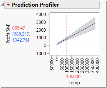
Look at the angle of the fitted line in the plot. The angle of the fitted line gives us clues as to the relationship between the predictor (number of employees in this case) and the profit. A steeper line suggests that small changes in X (number of employees) will have significant changes in Y (profit). If the line were flatter, this would indicate that changes in X will not change Y very much (if at all).
While the Prediction Profiler is interesting for this simple linear regression case, its real power is for cases where there are multiple predictor variables because it enables you to see the effect of all of the X variables at the same time. Recall the earlier example that used the data filter to look the relationship between the number of employees and profit for each of the types of companies. This can also be done with the prediction profiler in the Fit Model platform.
17. Select Analyze Fit Model.
18. In the Fit Model window, select Profit($M) as the Y column. Hold the control key down on your keyboard, then select #emp and Type. With both columns selected, click on the Macros button and select Full Factorial. This adds both columns and the interaction between them to the Construct Model Effects window.
19. Change the emphasis to Effect Screening. (See Figure 6.70.)
Figure 6.70 Fit Model Window

20. Click the Run button.
Examine the Regression Plot in the results window. (See Figure 6.71.)
Figure 6.71 Regression Plot in Fit Model Results

As you can see in the Regression Plot, a separate line is fit for each type of company. This becomes even more clear in the Prediction Profiler. (See Figure 6.72.)
Figure 6.72 Prediction Profiler with Type = Aerospace Selected

As you click on each of the company types in the left panel, you can see the right panel change to reflect the relationship between profit and number of employees for the company type selected. (See Figures 6.72 and 6.73.)
Figure 6.73 Prediction Profiler with Type = Computer Selected

|
Note |
|
There is some statistical advantage to fitting a single model (as is done here) as opposed to the earlier approach using the data filter. While discussion of this is beyond the scope of this book, the reader is encouraged to consult a statistics text. |
Previously we used a full factorial model, which allowed the slope of #emp to change for the different company Types. We could also include interactions, or even more complicated effects from these columns here, but we will instead stick to a simpler model for the sake of a simpler interpretation. In practice, you will probably want to try models with more interactions because these interactions often truly exist, and you cannot discover the evidence for them unless you include them in the model. Stepwise and other variable reduction methods can help you start with a complicated set of predictors and narrow it down to a simpler final model.
Here, we begin with a simple model and we will look at several continuous variables that might impact Profit.
1. Select Analyze Fit Model.
2. In the Fit Model window, select Profit($M) as the Y column and then select Sales($M), #emp, Assets($Mil.), and Stockholders Eq($Mil.). Click Add to place them in the Construct Model Effects Window.
3. Change the Emphasis setting to Effect Screening. (See Figure 6.74.)
Figure 6.74 Fit Model Window

Now we are ready to run the model to test the relationships between profits and the other columns that we have selected. This approach using the Fit Model platform uses a method called multiple regression. We could choose to add the type of company to this model, but we will exclude it for now because we will use it later with the data filter to investigate differences.
4. Click Run and examine the results window. (See Figure 6.75.)
Figure 6.75 Fit Model Results
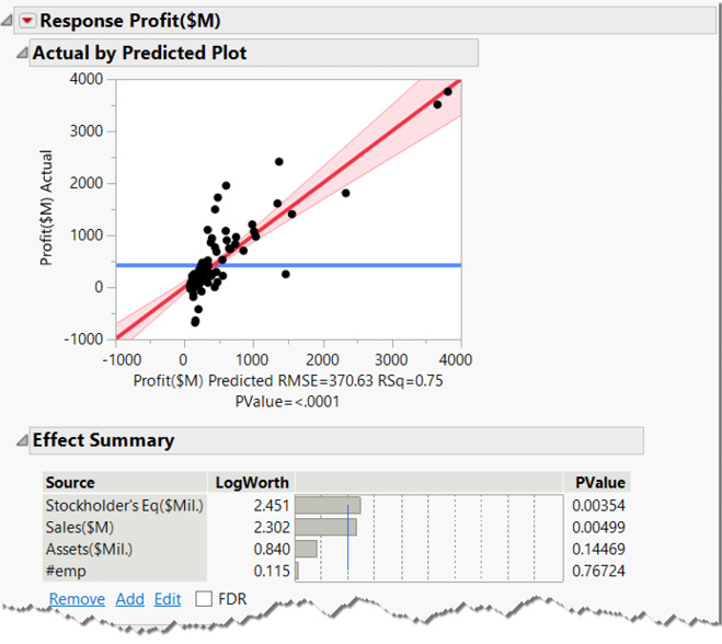
The Actual by Predicted Plot indicates there is a strong, positive relationship between profits and the columns you chose because of the angle of the red fit line relative to the blue mean line. Just as in the earlier example, the blue mean line is not within the confidence bands, indicating a strong relationship. There are additional technical indicators of the quality of the relationships in other report items, including those available from the red triangle menu under Regression Reports. You can turn some of those reports on from the menu and use the question mark tool (?) to learn more about the results.
5. Scroll down the window until you see the Prediction Profiler. (See Figure 6.76.)
As mentioned before, the Prediction Profiler enables you to see visual relationships between profits and sales, number of employees, assets, and stockholder equity (X columns) as depicted by the fitted solid black lines.
Figure 6.76 Prediction Profiler for multiple regression model

The angle of the fitted line in the plots with the Prediction Profiler give us clues about their influence on Profit in the presence of the other variables. A steeper line suggests that small changes in X (sales for example) will have large changes in Y (profit).
With sales, for example, this is an indication that our column of interest (profits) changes a lot when we move the red dotted vertical line associated with Sales($M). Thus, the steeper the line, the greater effect a change has on our Y column of interest. Lines that are flat or nearly flat (such as number of employees), mean that changes in these columns have little impact on our Y column (profits). With the Profiler, you can conduct dynamic, interactive what-if analyses.
We previously learned that profits varied among some company types. However, the model we just created did not include the Type column. Let’s explore how each type of company might impact profits in this model. Here we will use the Data Filter to accomplish this; however, we could instead add the Type column to the model.
1. Select Rows Data Filter. (See Figure 6.77.)
Figure 6.77 Rows Data Filter

2. In the Data Filter window, select Type and click ![]() . Select Show and Include. (See Figure 6.78.)
. Select Show and Include. (See Figure 6.78.)
Figure 6.78 Data Filter Type and Show and Include
|
|
|


We need the report window to respond to the Data Filter dynamically using automatic recalculation. To do this, follow these steps:
3. From the red triangle (within the report window that contains the Prediction Profiler), select Redo Automatic Recalc. The Prediction Profiler now responds to changes you make in the Data Filter.
4. In the Data Filter window, click on the red triangle and select Animation. (See Figure 6.79.)
Figure 6.79 Data Filter Animation

5. Click on ![]() (the step forward control). (See Figure 6.80.)
(the step forward control). (See Figure 6.80.)
Figure 6.80 Data Filter Animation Step Control

Each time you click the step forward control, you are filtering the Fit Model analysis to just one of the company groups within the Type column, and you will see these highlighted in the Data Filter window.
6. Now click the step forward control again (which toggles through the company types). Watch what happens to the Prediction Profiler with each click as it steps through the company types.
Have you noticed that some of the fitted lines in the profiler flip directions as the company type changes? How would you interpret these changes? We will summarize the first few of the profilers that you see as you click through the company types. We will also provide a brief interpretation of each profile. Within each type, we can still drag the red dotted lines to investigate the sensitivity analysis or relationships within the model for that company type.
Aerospace
As the number of employees and stockholder equity increases, profits increase. (See Figure 6.81.) As Sales and Assets increase, profits decrease. Only Stockholder’s Equity is likely to have a statistically significant relationship, however, because this is the only column for which the confidence bands do not include the straight flat horizontal line. We can confirm the statistical significance by looking at the p-value in the model report. The other relationships, having confidence bands that include the horizontal line, indicate that, although they do slope slightly in the positive or negative relationship, that slope is not big enough, compared to the general variability in the data, to be definitive. We are not confident that the true relationship, in new but similar data, would have that same direction for the slope.
Figure 6.81 Prediction Profiler for Aerospace

Beverages
The confidence bands are so far away from the fit that we must be very cautious about trusting the profiler for Beverages. (See Figure 6.82.)
Figure 6.82 Prediction Profiler for Beverages

Computer
As sales increase, profits increase (but only just barely statistically significantly). (See Figure 6.83.) As the number of employees increases, profits decrease slightly in these data (but not statistically significantly, so we shouldn’t assume this relationship for new data). As assets increase, profits decrease steeply. As stockholder’s equity increases, profits increase (but not statistically significantly).
Figure 6.83 Prediction Profiler for Computer

Soap
As sales increase, profits increase. (See Figure 6.84.) Because the line (or trace) for employees is flat, a change in the number of employees does not change profits.
As assets increase, profits decrease. As stockholder’s equity increases, profits increase.
Figure 6.84 Prediction Profiler for Soap

Now it’s your turn. On your computer screen, try reading the Prediction Profiler for Oil using what you have learned.
Most real-world problems are complex and involve multiple columns. The Partition platform is a flexible tool for solving many types of problems that involve multiple columns and rapidly identifies the key relationships in the data.
Tools like Data Filter and Lasso enable quick identification and extraction of interesting subsets of data. The Data Filter also provides an exploration method using animation that lets you tune in to just the slice of the data that best supports an inference or hunch.
The Profiler using the Fit Model platform offers a powerful way to understand the relationships among columns in your models. The ability to manipulate values (using the red dotted lines) within a column and immediately see their effect on other columns provides the means to conduct visual what-if analyses. With the Data Filter, you can drill down to subcategories or ranges of columns to discover those nuggets of insight that are often hidden at first glance.
This chapter and the Chapter 5 have presented an approach to problem-solving that is unique to JMP. The approach underscores the progressive nature of discovery that tends to build from simple descriptions of one column of data to complex relationships among many columns. This problem-solving process leads to a better understanding of your data and, in turn, to the insights and answers that you seek. This process might not only go in one direction from simple to complex. As discoveries are made with the more advanced multi-column tools, confirmation and further analysis can be made with the simpler ones, Distribution and Fit Y by X, from where our journey began.