
In this chapter, we will cover:
window.onerrorUsing ECMAScript 5 methods
New HTML5 input types
Inline SVG
position:fixedoverflow:scroll
Mobile Safari on iOS 5 has introduced a series of improvements that makes mobile Safari one of the most advanced mobile browsers. A lot of cutting edge HTML5 features—ECMAScript 5 as well as mobile-specific features — were added to allow more functionality with mobile and boost the performance:
Web forms has been introduced to help with a better user interface for the Web, making interface prototyping much quicker and easier.
Inline SVG allows greater scalability on mobile browsers; this could be useful for responsive design.
ES5 allows greater control over the objects created, and large and complex features can be built in pure JavaScript.
Mobile-specific properties such as scrolling CSS were added. On mobile Safari, it was once painful to achieve the native scrolling, but now mobile-specific properties have been added to make it pain free for web developers to develop web apps that have the same performance as native applications.
Target browsers: iOS 5
In iOS 5, there is a newly added event handler: window.onerror. This event handler is for error events sent to the window.
window.onerror = funcA;
Enter the following code and test it in the browser:
<!doctype html>
<html>
<head>
<title>Mobile Cookbook</title>
<meta charset="utf-8">
<style>
</style>
</head>
<body>
<script>
window.onerror=function(){
alert('An error has occurred!')
}
</script>
<script>
document.write('hello world'
</script>
</body>
</html>
You should see a pop-up alert saying an error has occurred.
The error occurred because we didn't close the bracket in document.write:
<script>
document.write('hello world'
</script>
If you close the bracket and try again, the error will disappear:
<script>
document.write('hello world');
</script>
The default window behavior is to prevent error dialogs from displaying. It overwrites the default behavior:
window.onerror = null;
The Browser Object Model
(BOM) is a collection of objects that give you access to the browser and the computer screen. These objects are accessible through the global objects window and window.screen. To find out more about BOM, visit:
http://javascript.about.com/od/browserobjectmodel/Browser_Object_Model.htm
Target browsers: iOS 5
ECMAScript 5 is replacing ECMAScript 3.1. ECMAScript 5 provides a great enhancement to object interaction. Starting with iOS 4, Safari introduced many new ECMAScript 5 features; iOS 5 brought even greater support for ECMAScript 5.
The following are the newly introduced Object methods:
Object.seal/Object.isSealed
Object.freeze/Object.isFrozen
Object.preventExtensions/Object.isExtensible
Function.prototype.bind
Enter the following code and test it in the browser:
/*** freeze ***/
var dog = {
eat: function () {},
hair: "black"
};
var o = Object.freeze(dog);
// test if dog is frozen
assert(Object.isFrozen(dog) === true);
// can't alter the property
dog.hair = "yellow";
// can't remove property
delete dog.hair;
// can't add new property
dog.height = "0.5m";
/*** seal ***/
var human = {
eat: function () {},
hair: "black"
};
human.hair = "blonde";
var o = Object.seal(obj);
// changing property works
human.hair = "grey";
// can't convert
Object.defineProperty(obj, "hair", { get: function() { return "green"; } });
// silently doesn't add the property
human.height = "1.80m";
// silently doesn't delete the property
delete human.hair;
// detect if an object is sealed
assert(Object.isSealed(human) === true);
/*** preventExtensions ***/
ECMAScript 5ECMAScript 5testingvar nonExtensible = { removable: true };
Object.preventExtensions(nonExtensible);
Object.defineProperty(nonExtensible, "new", { value: 8675309 }); // throws a TypeError
assert(Object.isExtensible(nonExtensible) === true);
/*** bind ***/
var x = 9;
var module = {
x: 81,
getX: function() { return this.x; }
};
module.getX(); // 81
var getX = module.getX;
getX(); // 9, because in this case, "this" refers to the global object
// create a new function with 'this' bound to module
var boundGetX = getX.bind(module);
boundGetX(); // 81
Freeze
As the name says, freeze freezes an object. Nothing can be added to or removed from freeze; you can't even alter the content. It makes an object immutable and returns a frozen object:
// can't alter the property
dog.hair = "yellow";
// can't remove property
delete dog.hair;
// can't add new property
dog.height = "0.5m";
To test if an object is frozen, use isFrozen:
// test if dog is frozen
assert(Object.isFrozen(dog) === true);
// silently doesn't add the property
human.height = "1.80m";
// silently doesn't delete the property
ECMAScript 5ECMAScript 5object, freezingdelete human.hair;
Seal
If you seal an object, the object properties can no longer be added or removed. You might ask, what is the difference between freeze and seal? The difference is that for seal, you can still change the value of the present properties:
// changing property works
human.hair = "grey";
To test if an object is sealed, use isSealed:
// detect if an object is sealed
assert(Object.isSealed(human) === true);
preventExtensions
By default, an object is extensible, but with preventExtensions, we can prevent an object from extending. This means no new properties can be further added to the object.
/*** preventExtensions ***/
var nonExtensible = { removable: true };
Object.preventExtensions(nonExtensible);
Object.defineProperty(nonExtensible, "new", { value: 8675309 }); // throws a TypeError
assert(Object.isExtensible(nonExtensible) === true);
Function.prototype.bind
Another extremely useful feature introduced is bind. It allows greater control of the this value. In our example, no matter how the function is called, it is called with a particular this value.
From the example, we can see there is a global variable x, and its value is modified in the module object:
var x = 9;
var module = {
x: 81,
getX: function() { return this.x; }
};
module.getX(); // 81
When extracting the method getX from the object, later call that function and expect it to use the original object as this, but at this time, the object is global, and so it returns 9.
var getX = module.getX;
getX(); // 9, because in this case, "this" refers to the global object
By using bind, we create a new function with this bound to module:
// create a new function with 'this' bound to module
var boundGetX = getX.bind(module);
boundGetX(); // 81
The default window behavior is to prevent error dialogs from displaying. It overwrites the default behavior:
window.onerror = null;
Object.freeze/Object.isFrozen:
Object.seal/Object.isSealed:
preventExtensions/isExtensible:
Function.prototype.bind:
New input types are useful features for web forms. iOS 5 now supports: date, datetime, month, time, range, and more.
Enter the following code and test it in the browser:
<!doctype html>
<html>
<head>
<title>Mobile Cookbook</title>
<meta charset="utf-8">
</head>
<body>
<input type="date">
<input type="datetime">
<input type="month">
<input type="time">
<input type="range">
</body>
</html>
On iOS 5, date and datetime will be rendered as follows:

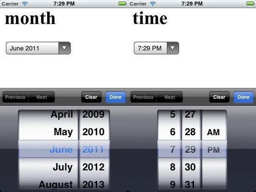
Once rendered on iOS Safari, the month and time input type will look like the following screenshot:
The slider input type will look like the following screenshot:

Target browsers: iOS 5
Scalable Vector Graphics (SVG) can be used in an HTML document with the support of inline SVG.
Enter the following code and test it in the browser:
<svg width="500" height="220" xmlns="http://www.w3.org/2000/svg" version="1.1">
<rect x="2" y="2" width="496" height="216" stroke="#000" stroke-width="2px" fill="transparent"></rect>
</svg>
HTML inline SVG has to be rendered with a MIME type Content-Type: text/xml. You can create this by ending the document with .xml instead of .html.
There are several ways to embed SVG in HTML pages:<object>, <embed>, <iframe>.
To find out more about SVG support in different browsers, visit (under section Embed SVG code directly into the HTML):
Target browsers: iOS 5
position:fixed is now supported in iOS 5. It's now much easier to create fixed positioned toolbars for web apps.
Before iOS 5, position:fixed didn't work in mobile Safari. If we wanted to create a toolbar or a fixed positioned header or footer, something like the following hack was needed:
<div id="fixedDiv">
</div>
<script>
window.onscroll = function() {
document.getElementById('fixedDiv').style.top =
(window.pageYOffset + window.innerHeight - 25) + 'px';
};
</script>
With the release of iOS 5, the hack is no longer needed, we could simply use CSS style the way we normally use it for other browsers:
<style>
#fixedDiv { position:fixed; }
</style>
<div id="fixedDiv">
</div>
We register the onscroll event to the window object, when the scrolling event happens, the div will always be at the bottom of the page.
Target browsers: iOS 5
One big difference between mobile and desktop is the way people interact with the browser. If you have a scrolling action on the desktop browser, it can be done by a mouse wheel or a scrollbar. On mobile browser, there isn't a scrollbar or a mouse wheel, so the entire scroll interaction is done by finger action. For a long time, overflow:scroll wasn't supported by iOS, but now it's supported by iOS 5!
Now if you want to make an area scrollable, use the following code:
<!doctype html>
<html>
<head>
<title>Mobile Cookbook</title>
<meta charset="utf-8">
<meta name="viewport" content="width=device-width, initial-scale=1.0">
<style>
div {
width:200px;
height:200px;
margin:0 auto;
border:1px solid black;
overflow: scroll;
-webkit-overflow-scrolling: touch;
}
</style>
</head>
<body>
<div>
<p>Lorem Ipsum</p>
<p>Lorem Ipsum</p>
<p>Lorem Ipsum</p>
<p>Lorem Ipsum</p>
<p>Lorem Ipsum</p>
<p>Lorem Ipsum</p>
<p>Lorem Ipsum</p>
<p>Lorem Ipsum</p>
<p>Lorem Ipsum</p>
<p>Lorem Ipsum</p>
<p>Lorem Ipsum</p>
<p>Lorem Ipsum</p>
<p>Lorem Ipsum</p>
<p>Lorem Ipsum</p>
<p>Lorem Ipsum</p>
</div>
</body>
</html>
By defining overflow as scroll and -webkit-overflow-scrolling as touch, one can scroll content on a mobile Safari page without any additional code.
In the past few years, there have been many hacks used to fake the native scroll behavior. The never-released web framework PastryKit by Apple inspired many frameworks to do this. Some notable ones are:
Sencha touch: http://www.sencha.com/products/touch/
iScroll: http://cubiq.org/iscrollScrollability: https://github.com/joehewitt/scrollability/
jQuery mobile: http://jquerymobile.com/
There is an old saying "Fake it till you make it". And now Apple has finally made it possible to do so natively. And performance-wise, it's pretty solid and could perform better than any previous frameworks.