
2. Grouping, Text-Level, and Redefined Semantics
In the previous chapter, you learned about several new HTML5 elements. Those elements enable you to create the main structure of the page. In this chapter, you will learn about more new HTML5 elements (namely, figure, time, details, and mark), as well as some elements that have been redefined (address, s, cite, ol, dl, small, b, strong, i, em, abbr, and hr). You will also look at new block-level links and WAI-ARIA. These elements are known as grouping or text-level elements and deal with the content of the page.
Beginner Recipe: Marking Up Figures and Captions with the figure and figcaption Elements
The figure element allows you to wrap an image and give it a description. Previously, you would have had to use a div or something similar and then add the text to the page, and doing this meant there was no link between the image and the caption. But now with figure, you can associate images with a caption, using figcaption.
Also, figure does not always have to include an image; it could be sections of code, tabular data, audio, or video. Typically, however, figure would be used for an image; Figure 2.1 shows an example. The code used to create Figure 2.1 is provided in Listing 2.1.
Figure 2.1 figure element used to display a graph and a caption

Listing 2.1 Image with Caption
<figure>
<img alt="Bar chart" src="analytics.gif" />
<figcaption>
Website analytics for October 2010
</figcaption>
</figure>
There has been confusion over whether alt text (a text alternative for browsers that do not support graphics) is still needed in a figure element. Outside of figure, an img always needs an alt. If the image is purely presentational and it does not need to be identified by assistive technology, then an empty alt attribute can be applied. With figure, if the caption is a suitable description, then no alt is needed. However, because of lack of browser and assistive technology support, this currently hinders accessibility.
We suggest erring on the side of caution here and provide an alt anyway. In Listing 2.1, the caption is straightforward enough, but to someone using a screen reader, it is unknown how the analytics will be represented, so the alt text supplies this information.
Also, even though the example uses an image of a graph, there is no reason why you could not use a graph created through Canvas or SVG.
Note
Originally, the specification stated to use the (already existing) legend element rather than a new element (figcaption), but because of cross-browser styling problems, legend was scrapped in favor of figcaption.
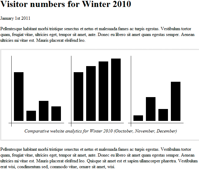
As Figure 2.2 shows, you are not limited to just one image with figure; you can use the figure element to display multiple images. The code for Figure 2.2 is in Listing 2.2.
Figure 2.2 figure element used to display three images, which share the one caption
Listing 2.2 Multiple Images Within figure
<figure>
<img alt="October 2010 data in bar chart format" src="analytics-october.jpg" />
<img alt="November 2010 data in bar chart format" src="analytics-november.jpg" />
<img alt="December 2010 data in bar chart format" src="analytics-december.jpg" />
<figcaption>
Comparative website analytics for Winter 2010
(October, November, December)
</figcaption>
</figure>
Should you always use figcaption when displaying such content? If the image (or chart, table, and so on) is for purely presentational reasons, then just use a normal img tag. However, if it has additional information and is beneficial to the content, then it will likely require a description to go with it, so in this case, use figure and figcaption. Finally, figure can have only one figcaption.
Beginner Recipe: Marking Up the Date and Time with the time Element
The time element allows you to code dates and times that are readable by machines but are displayed to users in a readable fashion. So, with this you can timestamp things such as publishing dates or events that can populate other technologies (a calendar being the obvious example). The time element has two optional attributes:
• datetime: The end user will see the content inside the time tag, but a machine will be able to read the datetime value: datetime="2011-04-01T16:00Z". The time part of this value (T16:00) is optional. You can also add a time zone offset: T16:00+04:00. The Z represents Universal Coordinated Time (UTC), which is the same as adding a time zone offset of +00:00.
• pubdate: pubdate is a Boolean attribute. It indicates the date, and possibly time, of the publication of its nearest parent article element. If there is no parent article element, then the pubdate refers to the whole document. Each article element must have only one time element with a pubdate.
The time element is intended to show precise dates, such “22nd January 2011,” not vague dates such as “Some point in 2011.” The datetime attribute must be in the format of the Gregorian calendar: YYYY-MM-DD, with the time coded as T00:00.
The following are some examples:
<article>....
<footer>
<p>This news article was published on <time pubdate datetime="2011-04-01T16:00">1st April 2011 at 4pm</time> by <a href="#">Tom Leadbetter</a></p>
</footer>
</article>
<article>
<h1>Christmas day family photo</h1>
<p>It was lovely to have the family here for <time pubdate datetime="2010-12-25">Christmas Day 2010</time></p>
<figure>
<img alt="" src="000001.jpg" />
<figcaption>The Leadbetter family on Christmas morning</figcaption>
</figure>
</article>
<p>HTML6 release date is due on <time datetime="2040-01-04">April 1<sup>st</sup> 2040</time></p>
Beginner Recipe: Making a Native Toggle Widget with the details Element
At the time of writing, only Chrome 13+ supports the new details element. We hope other browsers will support it sooner rather than later.
The details element creates an interactive open/close toggle effect, without the need for JavaScript and/or CSS. The summary element can be used within details to represent the summary of the content.
details has an optional attribute: open. If this is true, it will show the details element open by default; otherwise, the details element will be shut, and the summary will be displayed. The summary is the clickable part that will open/close the details.
Figure 2.3 shows what a brief author bio looks like, with the top one open by default. Listing 2.3 shows the code.
Figure 2.3 The details element with one section open viewed in Chrome

Listing 2.3 Example of the details Element
<details open>
<summary>Tom Leadbetter</summary>
<figure>
<img alt="" src="images/tom-and-luce.jpg" />
<figcaption>Tom and Lucy Leadbetter</figcaption>
</figure>
<p>Pellentesque habitant morbi tristique senectus et netus et malesuada fames ac turpis egestas.</p>
<p>Pellentesque habitant morbi tristique senectus et netus et malesuada fames ac turpis egestas.</p>
<p>Pellentesque habitant morbi tristique senectus et netus et malesuada fames ac turpis egestas.</p>
<p>Pellentesque habitant morbi tristique senectus et netus et malesuada fames ac turpis egestas.</p>
</details>
<details>
<summary>Chuck Hudson</summary>
<figure>
<img alt="" src="chuck.jpg" />
<figcaption>Chuck Hudson</figcaption>
</figure>
<p>Pellentesque habitant morbi tristique senectus et netus et malesuada fames ac turpis egestas.</p>
</details>
Another example is using the details element to show/hide a table of contents. Depending on the styling of the page and the amount of content, it could be useful to have the table of contents always in the top corner, and the user can click to expand it and navigate to a different section of the page. Listing 2.4 has the code for this, with the details element closed by default.
Listing 2.4 Creating a Collapsible Table of Contents
<article>
<h1>A massive document with lots of juicy content</h1>
<details>
<summary>Table of contents<summary>
<nav>
<ul>
<li><a href=#chapter1>Chapter 1</a></li>
<li><a href=#chapter2>Chapter 2</a></li>
</ul>
</nav>
</details>
<section>
<h1 id="chapter1">Chapter 1</h1>
</section>
<section>
<h1 id="chapter2">Chapter 2</h1>
</section>
....
</article>
Beginner Recipe: Using the address Element for Contact Information
The specification defines the address element as a “sectioning” element, like nav or article. However, we have put it in this chapter because we think it is more appropriate as a “text-level” semantic because its use concerns text content, rather than layout.
For many years, the address element has been used incorrectly by web developers. It is not supposed to be used as a generic postal address (often on a “Contact us” page). So, this code is incorrect:
<address>
Tom Leadbetter
1 My Street
United Kingdom
</address>
HTML5 attempts to clear the confusion by intending the address element be used for contract information for its nearest article or body element.
So, what does that mean? It means you should use the address element for contact information for the author of the current article or of the web page as a whole. Because you can use address inside an article, it means address can potentially be used several times on a site. The content of an address element can be an email address, website, phone number, postal address, or any other sort of contact information.
Because it is for contact information, it is common to use address within a footer. Listing 2.5 uses the address element two times: one for the author of the main page content and the other for the authors of the whole site.
Listing 2.5 Multiple Uses of the address Element
<article>
<header>
<h1><a href="#">My amazing blog entry</a></h1>
<p>12.12.2011</p>
</header>
<p>Pellentesque habitant morbi tristique senectus et netus et malesuada fames ac turpis egestas...</p>
<footer>
This blog entry was written by
<address><a href="me.htm">Tom Leadbetter</a></address>
</footer>
</article>
<footer>
This site is owned by
<address>
<a href="me.htm">Tom Leadbetter</a> and
<a href=mailto:[email protected]>Chuck Hudson</a>.
</address>
</footer>
Beginner Recipe: Highlighting Text with the mark Element
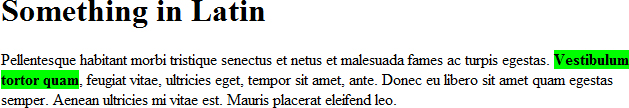
The mark element gives the document author a chance to highlight, or bring attention to, some text in the document.
If a user searches a site and is taken to a separate page, the term they searched for might be highlighted for their reference. We would use a mark here, rather than a strong or em because we are not giving the term any importance or emphasis, simply highlighting it for the user. Figure 2.4 shows how you can use it. Listing 2.6 shows the HTML and CSS.
Figure 2.4 The mark element used to highlight text for a user
Listing 2.6 The mark Element with Additional CSS
<style>
mark {background-color: #0F0; font-weight:bold;}
</style>
<article> <header>
<h1>Something in Latin</h1>
</header>
<p>Pellentesque habitant morbi tristique senectus et netus et malesuada fames ac
turpis egestas. <mark>Vestibulum tortor quam</mark>, feugiat vitae,
ultricies eget, tempor sit amet, ante. Donec eu libero sit amet quam
egestas semper. Aenean ultricies mi vitae est. Mauris placerat eleifend
leo.</p>
</article>
Beginner Recipe: Using the s Element to Show Inaccurate or Irrelevant Content
Previously the s element was specifically for strikethrough text. In HTML5, it has been redefined and is now used to represent content that is no longer correct or relevant.
What does this mean exactly? You could use the s element to represent the original retail price of a product that now has a different price, as shown in Figure 2.5. Depending on the context, it may not always be correct to display out-of-date information. However, in this case, it can come in handy to a user. Listing 2.7 shows where to use the element.
Figure 2.5 The s element used to display an old price

<h1>Tom Leadbetter's Autobiography</h1>
<p><s>Recommended retail price: £45.99</s></p>
<p><strong>Now selling for just £5.99!</strong></p>
In HTML 4, the s element defined strikethrough text, so by default browsers will style the s element with a strikethrough.
If document text has been edited or removed, do not use the s element; use the del element instead.
Changes to Existing Elements
In the first chapter, you learned about new elements that can be used to create the layout of the page and add content. Previously in this chapter, you saw more new HTML5 elements, but they were concerned with the content itself, such as images. Just because there has been a lot of focus on new elements does not mean existing elements have been neglected. In fact, several have had their roles changed.
The cite Element
The cite element has been tweaked in HTML5. In HTML4, the cite allowed content developers to mark up the name of a speaker/author of a quote:
<cite>Julies Caesar</cite> once said, <q>I came, I saw, I conquered.</q>
It was also used inside blockquote, which was technically incorrect in HTML 4 but nonetheless was commonly used:
<blockquote>
<p>Pellentesque habitant morbi tristique senectus et netus et malesuada fames ac turpis egestas. Vestibulum tortor quam, feugiat vitae, ultricies eget, tempor sit amet, ante.</p>
<cite>A Person who spoke Latin</cite>
</blockquote>
However, in HTML5, cite represents the title of a work, such as a book or a song. The HTML5 specification specifically says that a person’s name is not the title of a work. So, you could use something like the following:
<p>One of my favourite books is <cite>The Day of the Jackal</cite> by <b>Frederick Forsyth</b></p>
(The HTML5 specification suggests using the b element for author names.)
This change in HTML5 to disallow cite from author names has caused a bit of a stir. Well worth a read is http://24ways.org/2009/incite-a-riot by Jeremy Keith; it goes into great depth about the issue. To sum it up, the cite element in HTML5 is no longer backward compatible and instead the HTML5 specification suggests using the b element for names, though this tag has no semantic meaning even though the content is meaningful.
So, you have a decision to make: Do what the specification says or, as many continue to do, use cite for names. It is worth keeping an eye on the cite element to see whether its definition changes.
Note
In July 2011, there was discussion that might allow the use of footer in blockquote, which would create the perfect opportunity to add information about the quote, such as the author. So, keep an eye on this development.
The ol Element
The ol element, used to create an ordered list, has been redefined, so it now has three acceptable attributes:
• start
• reversed
• type
Used in Listing 2.8, the reversed attribute is new to HTML5 and will, when at least one browser chooses to implement it, enable you to reverse a list that counts down to one.
Listing 2.8 Reversed Ordered List
<h1>My favorite colors</h1>
<ol reversed>
<li>Red</li>
<li>Green</li>
<li>Blue</li>
</ol>
Currently, no browser supports this, but if supported, it would render like this:
My favorite colors
3. Blue
2. Green
1. Red
The start attribute was deprecated in HTML 4 and so the page would fail validation if start was used. This proved an annoyance, but thankfully it is now back and perfectly acceptable in HTML5. So, if you are required to start an ordered list at the second item, use the following:
<ol start="2">
<li>here we go</li>
....
</ol>
Also back from the dead is the type attribute. Previously, if you wanted to change the display of the list types, say to Roman numerals (for example, I, IV, X), you had to use CSS. But you can do this again in HTML5. The Listing 2.9 markup shows an example.
Listing 2.9 Nested Ordered Lists
<ol>
<li>Lorem ipsum dolor sit amet, consectetuer adipiscing elit.
<ol>
<li>Lorem ipsum dolor sit amet, consectetuer adipiscing elit.</li>
<li>Aliquam tincidunt mauris eu risus.</li>
<li>Lorem ipsum dolor sit amet, consectetuer adipiscing elit.
<ol>
<li>Aliquam tincidunt mauris eu risus.</li>
<li>Vestibulum auctor dapibus neque.</li>
</ol>
</li>
<li>Vestibulum auctor dapibus neque.</li>
</ol>
</li>
<li>Aliquam tincidunt mauris eu risus.</li>
<li>Vestibulum auctor dapibus neque.</li>
</ol>
The previous code would create this:
1. Lorem ipsum dolor sit amet, consectetuer adipiscing elit.
1. Lorem ipsum dolor sit amet, consectetuer adipiscing elit.
2. Aliquam tincidunt mauris eu risus.
3. Lorem ipsum dolor sit amet, consectetuer adipiscing elit.
1. Aliquam tincidunt mauris eu risus.
2. Vestibulum auctor dapibus neque.
4. Vestibulum auctor dapibus neque.
2. Aliquam tincidunt mauris eu risus.
3. Vestibulum auctor dapibus neque.
Using the type attribute, you can change the type of numbering you get on the lists, without the need for CSS. You can choose from five types:
type=“1” = 1, 2, 3,4, 5
type=“a” = a, b, c, d, e
type=“A” = A, B, C, D, E
type=“i” = i, ii, iii, iv, v
type=“I” = I, II, III, IV, V
If you change the ol type to any of these, then the bullet points will render as follows:
1. Lorem ipsum dolor sit amet, consectetuer adipiscing elit.
a. Lorem ipsum dolor sit amet, consectetuer adipiscing elit.
b. Aliquam tincidunt mauris eu risus.
c. Lorem ipsum dolor sit amet, consectetuer adipiscing elit.
i. Aliquam tincidunt mauris eu risus.
ii. Vestibulum auctor dapibus neque.
d. Vestibulum auctor dapibus neque.
2. Aliquam tincidunt mauris eu risus.
3. Vestibulum auctor dapibus neque.
Using the different types, in the content you could refer to item 1.b.ii, rather than 1.3.2. Browsers will correctly implement the type attribute, but at the time of writing, it causes a validation error.
The dl Element
In HTML4, dl was a definition list, which should have contained a term and then a definition, but its own definition and use was never very clear and so was misused or ditched in favor of another element.
In HTML5, it has been repurposed as a description or association list. It is easier to get an understanding of this element by diving into some examples. Listing 2.10 uses dl to create a glossary. We have put the glossary in an aside because we can assume here that it is inside an article, likely about web development.
Listing 2.10 Creating a Glossary
<aside>
<h2>Glossary</h2>
<dl>
<dt>HTML</dt>
<dd>HTML, which stands for HyperText Markup Language, is the predominant markup language for web pages.</dd>
<dt>PHP</dt>
<dd>PHP: Hypertext Preprocessor is a widely used, general-purpose scripting language that was originally designed for web development to produce dynamic web pages.</dd>
</dl>
</aside>
Listing 2.11 uses a dl to mark up movie credits.
Listing 2.11 Adding Movie Credits
<h1>The Shawshank Redemption</h1>
<dl>
<dt>Director:</dt>
<dd>Frank Darabont</dd>
<dt>Writers:</dt>
<dd>Stephen King</dd>
<dd>Frank Darabong </dd>
<dt>Cast</dt>
<dd>Tim Robbins</dd>
<dd>Morgan Freeman</dd>
<dd>Bob Gunton</dd>
...
</dl>
The previous code uses multiple values (dd) to the one key (dt). It might be argued that each section of credits (director, writers, and so on) could be in a section of its own, as shown here:
<article>
<header>
<h1>The Shawshank Redemption</h1>
<time>1994</time>
</header>
<section>
<h1>Director</h1>
<h2> Frank Darabont</h2>
<p>(bio)</p>
</section>
<section>
<h1>Writers</h1>
<h2>Stephen King</p>
<p>(bio)</p>
<h2> Frank Darabont</h2>
<p>(bio)</p>
</section>
</article>
It really depends on your content and how you want your content to be structured.
Tip
The dl element has been used in the past to mark up dialogue, but the spec now tells us that using a dl is inappropriate. Originally, in HTML5 there was a dialog element, but that was axed in late 2009. Instead, you should use p elements for this requirement, and if you wanted to style the name of the speaker, you should use either a span or a b. The following is an example:
<p><b>John</b>: Can you use HTML5 yet?</p>
<p><b> Jane</b>: Yes, you definitely can! </p>
The small Element
In HTML4, the small element was used to reduce the size of text. However, this was and is a presentational issue, so CSS is used for this purpose. Now, in HTML5, the small element is used for displaying small print, such as copyright information, terms and conditions, or license/legal information:
<p><small>This site is licensed under a <a href="http://creativecommons.org/licenses/by-nc/2.0/uk/">Creative Commons Attribution-Non-Commercial 2.0</a> share alike license. Feel free to change, reuse modify and extend it.</small></p>
Because small is inline content, you can embed it within another element if necessary, such as strong, which would give importance to this small print:
<p><strong><small>This content belongs to me! Don't steal it, otherwise there will be serious, serious trouble.</small></strong></p>
The b and strong Elements
In HTML 4, the b element was for bold, but that has changed. Now it is purely presentational; it should be used to style a section of text that does not convey any particular importance.
You will often see the first paragraph of a blog entry is styled differently, often in bold text:
<h2>Dark energy and flat Universe exposed by simple method</h2>
<p><b class="lead">Researchers have developed a simple technique that adds evidence to the theory that the Universe is flat.</b></p>
<p>Moreover, the method - developed by revisiting a 30-year-old idea - confirms that "dark energy" makes up nearly three-quarters of the Universe.</p>
You would not use a strong element because you do not want to add importance to the first paragraph; you are just styling it differently. However, you could also use some CSS (p:first-of-type or h2+p) to style this instead of using b. Listing 2.12 uses b to add color styles to some of the text.
<style>
b.red {color: red;}
b.green {color: green;}
b.blue {color: blue;}
</style>
<h1>My favourite colours</h1>
<ol reversed>
<li><b class="red">Red</b></li>
<li><b class="green">Green</b></li>
<li><b class="blue">Blue</b></li>
</ol>
The strong element shows text with strong importance, so you now normally use this to generate the bold effect, and you can nest strong to increase the importance of the content:
<p><strong>Do not eat my cookies</strong> and <strong><strong>do not drink
my milk</strong></strong></p>
The i and em Elements
The i element was, in HTML 4, for styling text in italics. Now, though, it represents text that is in an alternative voice or mood. The HTML5 specification gives some examples of its use, which include a dream, a technical term, a thought, or a ship name:
<p>I'm having fish tonight <i>(and then I think I'll have cookies, I haven't had cookies for ages)</i>.</p>
In contrast, the em element represents emphasis that changes the meaning of a sentence. Depending on what word (or words) should be emphasized, wrap it in the em element, but moving the em element would cause the sentence to change its meaning:
<p>I thought I was meeting friends at 8pm but my wife says it's <em>9pm</em></p>
<p><em>I</em> thought I was meeting friends at 8pm but my <em>wife</em> says it's 9pm</p>
The abbr Element
The abbr element is not new in HTML5, and it has not been redefined. So, why bother mentioning it? Well, abbr has been merged with acronym. Now, the abbr element represents an abbreviation or an acronym. You can use the title attribute to expand the abbreviation, which normally means a tooltip for the user:
<p><abbr title="HyperText Markup Language">HTML</abbr> is the best thing since sliced web</p>
An abbreviation is different from an acronym; NATO is an acronym, while BBC is an abbreviation. In HTML 4, both tags were available, but because of confusion by content authors over which to use, acronym has been scrapped, so now use abbr for both.
The hr Element
The hr element was used to create a horizontal line in a document. Its definition has been tweaked slightly, so it now represents a break, after a paragraph, such as a scene change in a book. Usually this will be styled to display a line or a fancy graphic between sections. It is not used very often these days because CSS can be used to add space/a graphic/a line/decoration at the bottom or top of necessary sections, such as a p, div, article, or section.
Elements That Are No More
HTML5 has gotten rid of several elements, so say bye-bye to the following elements:
• acronym (use abbr; see earlier)
• applet (use object)
• basefont (use CSS for presentation)
• big (use CSS for presentation)
• center (use CSS for presentation)
• frame (though iframe still exists)
• frameset
• noframes
• font (use CSS for presentation)
• strike (depending on the content, use s or del)
• tt (use CSS for presentation)
• u (use CSS for presentation)
That is all there is to say, really. We will not be mourning those elements, and if you are using them now, please stop straightaway!
Beginner Recipe: Wrapping Links Around Elements
A handy new feature of HTML5 is the ability to group several elements into one link. This gives you a much wider click area, something that you may have in the past used JavaScript or a combination of tags to do the job.
In HTML 4, if you were marking up a news or blog home page, with several articles to link to, you may have previously used something like the code in Listing 2.13 to make each item clickable.
Listing 2.13 Wrapping Links in HTML 4
<div class="article">
<h2><a href="article.htm"><img alt="article thumbnail" src="thumb.jpg" height="100" width="100" /> My article title</a></h2>
<p><a href="article.htm">Pellentesque habitant morbi tristique senectus et netus et malesuada fames ac turpis egestas.</a></p>
</div>
Listing 2.14 shows that in HTML5 you can wrap all of that in one a.
Listing 2.14 Wrapping Links with HTML5
<article>
<a href="article.htm">
<h2><img alt="article thumbnail" src="thumb.jpg" height="100" width="100" /> My article title</h2>
<p>Pellentesque habitant morbi tristique senectus et netus et malesuada fames ac turpis egestas.</p>
</a>
</article>
You are able to wrap the article in an the a element as well; however, this has been known to cause a couple of browser issues, so we advise against that approach.
Intermediate Recipe: Adding Semantic Information with Microdata
The Microdata specification allows authors to add labels to pieces of content to make it machine-readable. Using the Microdata formatting in theory helps “machines” like Google return more accurate information about pages.
You can treat Microdata as a custom element, so you can use it to label things such as a business, a person, products, or an event. Because there is no book element, you can apply Microdata attributes to your existing elements.
Microdata has five attributes: itemid, itemprop, itemref, itemscope, and itemtype. Listing 2.15 shows a basic example, which describes a person.
Listing 2.15 Microdata Example
<article itemscope itemtype="http://data-vocabulary.org/Person">
<h1 itemprop="name">Tom Leadbetter</h1>
<p><span itemprop="address" itemscope itemtype="http://data-vocabulary.org/Address">I live in <span itemprop="region">Liverpool</span>, <span itemprop="country-name">UK</span>.</p>
<p>I am a <span itemprop="title">Space Cowboy</span> at <span itemprop="affiliation">Space Cowboy Inc.</span>. I also have a website: <a href="http://www.tomleadbetter.co.uk" itemprop="url">tomleadbetter.co.uk</a></p>
</article>
Listing 2.14 says that you have a person whose name is Tom Leadbetter, who lives in the United Kingdom and is a Space Cowboy working for Space Cowboy Inc.
When itemscope is used on an element, the element becomes a Microdata item. itemprop is a property of this Microdata item, and it describes what the content is. The example has two itemscope attributes: one for the overall piece of content (Person) and another for the address itemtype within.
The itemprop values in the example come from http://data-vocabulary.org, which suggests the names for various data types (events, products, and so on). You can make your own values, but for consistent results you should use standard, recognized names. Google also has examples and suggestions at http://google.com/support/webmasters/bin/answer.py?answer=99170. Using the Google webmaster Rich Snippets Testing Tool, you can check your Microdata to see how Google might render it in a search results page, as shown in Figure 2.6.
Figure 2.6 Google search preview

Figure 2.7 shows the other information that Google now has about the content.
Figure 2.7 Additional information Google knows

This was only a small Microdata example, but there are lots of useful options. Check out the Google pages mentioned earlier for more examples of what can be created. Along with Google, there are a couple of tools that might help when you are creating Mircodata: http://foolip.org/microdatajs/live and http://microdata.freebaseapps.com.
In June 2011, http://schema.org was launched, a collaboration of shared schemas from Bing, Google, and Yahoo! Schema.org has several examples and a huge selection of example data. In Listing 2.15, we are linking to http://data-vocabularly.org because this is currently supported in the Rich Snippets Testing Tool, but shortly you will be able to use http://schema.org in your Microdata, and it will likely be the destination for developers looking to learn what markup to use.
Note
Microformats and RDFa are two other ways of extending your HTML to describe specific information. There are a bit of politics with these options that we will not go into, but both have their strengths and weaknesses. You can actually combine Microdata with Microformats, and although Microdata is the emerging standard, Microformats is currently more popular.
Intermediate Recipe: Using WAI-ARIA with HTML5
Web Accessibility Initiatives Accessible Rich Internet Applications (WAI-ARIA), also known just as ARIA, is a draft specification (http://w3.org/TR/wai-aria) that improves the accessibility of web applications and web pages. ARIA enables developers and content authors to develop rich Internet applications and content that can be recognized and used by assistive technology. More often than not, assistive technology does not know what a widget is and rarely are widgets accessible with a keyboard. Also consider when content is updated with an Ajax call, assistive technology does not know that the content has been updated, and so it cannot inform the user. Although we will not be talking about all the possible solutions that ARIA offers, we will be covering the Landmark Roles section of ARIA and how you can add these new roles to your HTML5 document.
Landmark Roles are regions of the page used as navigational landmarks. There are more than 50 of them listed in the specification (http://w3.org/TR/wai-aria/roles#landmark_roles), but here are the more commonly used landmark roles:
• role="article"
• role="banner"
• role="contentinfo"
• role="form"
• role="heading"
• role="main"
• role="navigation"
• role="search"
You can add these to your markup easily like this:
<form role="search">
....
</form>
This signifies that this particular form (there might be several forms on the page) is used for searching.
Looking through the previous list, you can see that some have obvious pairings with new HTML5 elements, and when you add them to the main page structure from the previous chapter, you get a layout similar to that in Figure 2.8.
Figure 2.8 Basic website layout with ARIA roles

Because you are using a logical structure to this markup, along with ARIA roles, one day assistive technology will be able to navigate easily to certain areas of the page content. However, at the moment, there is limited screen reader support not only for HTML5 but also for ARIA elements.
You are encouraged to use skip links at the top of a document, very often hidden with CSS, which allow people navigating with a screen reader, keyboard, or another assistive technology to quickly “skip” or “jump” to important areas, usually the main navigation or the main content. The code would look similar to this:
<ul>
<li><a href="#menu">Skip to navigation</a></li>
<li><a href="#content">Skip to content</a></li>
</ul>
But with ARIA, the landmarks will be highlighted to a user so they can cycle through the options.
HTML5 validation accepts ARIA roles, and you can use the ARIA roles in HTML 4. They will cause a validation error.
These roles also provide you with a nifty CSS hook that adds to your arsenal of selectors. You may have several headers or footers on a page, but you want to style the main page header and footer differently, and you can target them in CSS like this:
/* to style all headers */
header {background: red; border: 5px dotted black;}
/* to style our main header, which likely has the site logo */
header[role=banner] {background: black; border: 5px solid red;}
/* to style all footers */
footer {background: blue; border: 5px dotted green;}
/* to style our site footer, which likely has copyright info */
footer[role=contentinfo] {background: green; border: 5px solid blue;}
You do not necessarily have to use CSS this way, but it is a nice option to have.
There is so much more to the WAI-ARIA spec and HTML5 accessibility, so we encourage you to do some further reading at the following sites:
• http://html5accessibility.com
• http://paciellogroup.com/blog
Advanced Recipe: Marking Up an Article Page with Comments
Listing 2.16 has the code needed to create an article page with comments (Figure 2.9). It uses several of the new techniques covered in this chapter.
Figure 2.9 Website article with comments

Listing 2.16 Article with Comments
<!DOCTYPE html>
<html lang="en">
<head>
<meta charset="utf-8">
<title>Blog comments</title>
<style>
[role=banner] h1 {background: #333; color: #fff; padding: 5px;}
[role=main] h1 {border-bottom: 2px dotted #333; color: #333;}
b {float: left; font-family:"Palatino Linotype", Palatino, serif; font-size: 2.5em; font-style: italic; font-weight: bold; line-height: 1; margin: 0 5px 5px 0;}
</style>
</head>
<body>
<h1 role="banner">>Tom's blog</h1><article role="main">
<header>
<h1>Title of my article</h1>
<time pubdate datetime="2010-12-12">Sunday, 12th December 2010</time>
<p><b>P</b>ellentesque habitant morbi tristique senectus et netus et malesuada fames ac turpis egestas. Vestibulum tortor ...p>
</header>
<section>
<h2>Comments</h2>
<ol reversed>
<li>
<article>
<h3><time datetime="2010-12-13T11:15Z">13/12/2010 11:15</time></h3>
<footer>Comment by<address><a href="http://tomleadbetter.co.uk">Tom Leadbetter</a></address></footer>
<p>What a splendid article!</p>
</article>
</li>
<li>
<article>
<h3><time datetime="2010-12-16T11:15Z">16/12/2010 11:15</time></h3>
<footer>Comment by anonymous</footer>
<p>That was rubbish.</p>
</article>
</li>
</ol>
</section>
</article>
</body>
</html>
Listing 2.15 uses some of the ARIA landmark roles, and we have used these to help style the h1 tags. We also use the b element to style the first letter of the article, to make it a bit fancier. When styling the h1 and b elements, you do not necessarily have to use the previous CSS, because there are other ways to target those elements, but it is nice to have options.
The new time element is used several times, once for the main article, with a pubdate, and then within each comment. In the previous chapter, you read that a user comment is an article, so we have used that here, and in this instance we have used the time and date as its heading. We could have used the author of the comment, but we do not want duplicate headings in the outline, and using the date and time gives it a unique identifier. This is a personal preference; there is nothing stopping you from using, for example, the comment author as the heading.
Also used is an ordered list so that each comment has a number that not only gives us an order of the comments but gives us a style option as well. We used the reversed attribute on the ol because in this case we want the latest comment to be at the top. We could potentially then have an “order by date” toggle switch and, using JavaScript, add or remove the reversed attribute. Again, you do not have to do this way, there are loads of alternatives, and the design of the comments might mean you have to consider other options.
Summary
In this chapter, you learned about a wide range of new elements and other elements that have been tweaked slightly in HTML5. New elements such as figure and details are sure to make developers’ lives easier in the future, and along with new ARIA roles, you can structure your documents with greater semantics and greater accessibility. And you can add even further information to your HTML using Microdata so that search engines can provide richer, more accurate data.