A BRIEF HISTORY OF DATAVIZ
THE ART AND SCIENCE THAT BUILT A NEW LANGUAGE
HERE’S A BREAKNECK SYNOPSIS of data visualization’s development from simple communication tool to burgeoning cross-disciplinary science.
ANTECEDENTS
The first data visualization was probably drawn in the dirt with a stick, when one hunter-gatherer scratched out a map for another hunter-gatherer to show where they could find food. If data is information about the world, and if communication is conveying information from one person to another, and if people use five senses to communicate, and if, of those five senses, sight accounts for more than half our brain activity, then visualization must have been a survival tactic.1 Far from being a new trend, it’s primal.
For a long time, visualization was probably limited to cave paintings; eventually maps, calendars, trees (for example, genealogies), musical notation, and structural diagrams followed. In a sense, an abacus provides a visualization of data. No matter, I’m flying forward: Tables arrived in the late 17th or early 18th century and created spatial regularity that made reading many data points much less taxing. Ledgers were born. For two centuries, tables dominated.
What we think of as data visualization today—charts and graphs—dates to the late 1700s and a man named William Playfair, who in 1786 published The Commercial and Political Atlas, which was full of line charts and bar charts. He later added pie charts. Histories of infographics often start with a celebrated 1861 diagram by Charles Minard that shows the decimation of Napoleon’s army during his doomed Russian campaign. Praise also goes to Florence Nightingale’s “coxcomb diagrams” of British casualties in the Crimean War, published about the same time as Minard’s famous chart. Nightingale’s work is credited with improving sanitation in hospitals because it showed how disease, above all, was what killed soldiers.


William Playfair, Florence Nightingale, and Charles Minard, the big three of early modern charting.
BRINTON TO BERTIN TO TUKEY TO TUFTE
It’s no accident that charting began to take off with the Industrial Revolution. Visualization is an abstraction, a way to reduce complexity, and industrialization brought unprecedented complexity to human life. The railroad companies were charting pioneers. They created some of the first organizational charts and plotted operational data such as “revenue-tons per train mile” (line chart) and “freight car-floats at a railroad terminal” (dual-axis timeline).2 The work of their skilled draftsmen was a prime inspiration for what can be considered the first business book about data visualization: Graphic Methods for Presenting Facts, by Willard C. Brinton, published in 1914.

Willard Brinton’s Graphic Methods for Presenting Facts provided advice to chart makers and critiques of charts in the early 20th century.
Brinton parses railroad companies’ charts (and many others) and suggests improvements. He documents some rules for presenting data and gives examples of chart types to use and types to avoid. Some of his work is delightfully archaic—he expounds, for example, on the best kind of pushpin for maps and how to prepare piano wire for use as a pin connector (“heated in a gas flame so as to remove some of the spring temper”).
Then again, many of his ideas were in the vanguard. Brinton lays out the case for using small multiples (he doesn’t call them that), currently a popular way to show a series of simple graphs with the same axes, rather than piling lines on top of one another in a single graph. He shows examples of bump charts and slope graphs, styles many people assume are more modern inventions. He looks askance at spider graphs (they should be “banished to the scrap heap”), and he questions the efficacy of pie charts a century ahead of today’s gurus.
Eventually, Brinton lays out a system for creating “curves for the executive” which can “tell the complete story [of the business] in every detail if placed in proper graphic form.”
By mid-century, the US government had become a complex and data-driven enterprise that demanded abstraction in unprecedented volume. Fortunately for the feds, they employed Mary Eleanor Spear, a charting pioneer who worked for dozens of government agencies and taught at American University. She produced two books in the spare, directive prose of someone who has a lot of work to do and not a lot of time to explain. Charting Statistics (1952) arose as a response to “problems encountered during years of analyzing and presenting data” in government. Practical Charting Techniques (1969) was an update and expansion on the previous. Spear’s books, like Brinton’s, are filled with commonsensical advice, along with some now-obsolete passages of her own (she expertly lays out how to apply various crosshatching patterns to distinguish variables on black-and-white charts). And she engaged in some ahead-of-her-time thinking—in 1952 she included tips and techniques for presenting charts on color TV.
Jacques Bertin, a cartographer, wanted to ground all this practical advice about chart making in some kind of theoretical foundation. So he formed a theory of information visualization in his watershed 1967 book, Sémiologie graphique. Rather than focus on which chart types to use and how to use them, Bertin describes an elemental system that still frames and provides the vocabulary for contemporary dataviz theory. He broadly defines seven “visual variables” with which we “encode” data: position, size, shape, color, brightness, orientation, and texture.3
Bertin also established two ideas that remain deeply influential to this day. The first is the principle of expressiveness: Say everything you want to say—no more, no less—and don’t mislead. This is a reasonably universal idea: It’s editing. Writers, composers, directors, cooks, people in any creative pursuit, strive (okay, struggle) to pare down their work to the essential.
The second is the principle of effectiveness: Use the best method available for showing your data. That is, choose the visual form that will most efficiently and most accurately convey the data’s meaning. If position is the best way to show your data, use that. If color is more effective, use that. This second principle is obviously trickier, because even today, determining the “best” or “most appropriate” method isn’t easy. Often, what’s best comes down to convention, or taste, or what’s readily available. We’re still learning, scientifically, what’s best, and the process is complicated by the fact that in a world of digital interactivity and animation, what’s best may change from page to screen, or even from screen to screen.
Bertin was followed in the 1970s by John Tukey, a statistician and scientist who was making 3-D scatter plots way back in the mainframe era. Tukey can be credited with popularizing the concepts of exploratory and confirmatory visualization—terms I’ll borrow to use later in this book.
Jock Mackinlay built on Bertin’s work in his influential 1986 PhD thesis.4 Mackinlay focused on automatically encoding data with software so that people could spend more time exploring what emerged in the visuals and less time thinking about how to create them. He also added an eighth variable to Bertin’s list: motion. Working in computer science at the dawn of the PC era, he could see animation’s powerful application for communicating data.
If Brinton is modern data visualization’s first apostle, and Spear and Bertin its early disciples, Edward Tufte is its current pope. With disciplined design principles and a persuasive voice, Tufte created an enduring theory of information design in The Visual Display of Quantitative Information (1983) and ensuing tomes. For some, Display is visualization gospel, its famous commandments oft repeated. For example: “Above all else show the data” and “Chartjunk can turn bores into disasters, but it can never rescue a thin data set.” Even though his work was rooted in scientific precision, Tufte is to the design-driven tradition what Bertin was to the scientific. A generation of designers and data-driven journalists grew up under the influence of Tufte’s minimalist approach.5
While Tufte was declaring the best ways to create beautiful, effective charts, researchers were learning how people read them. In 1984 William S. Cleveland and Robert McGill took on “graphic perception” by testing how well people could decipher simple charts.6 Pie charts have seemingly been under assault as long as they’ve existed, but Cleveland and McGill provided the first evidence that people find the curved area of pie slices more difficult to parse than other proportional forms. The two instigated a decade-plus of research aimed at understanding how we read charts and applying the results to a burgeoning visual grammar.7 They felt duty-bound to challenge accepted wisdom: “If progress is to be made in graphics,” they concluded, “we must be prepared to set aside old procedures when better ones are developed, just as is done in other areas of science.” A few old procedures were set aside; a few new ones were developed.8 This research deeply influenced the rapidly developing computer science community. Foundational texts that emerged from this era were Cleveland’s The Elements of Graphing Data (1985) and The Grammar of Graphics (1999) by Leland Wilkinson.
Viz communities grew apart. Computer scientists increasingly focused on automation and new ways to see complex data, scientific visualization using 3-D modeling, and other highly specialized techniques. They were comfortable with visualizations that didn’t look great. (In some ways this was unavoidable; computers weren’t very good at graphics yet.) Meanwhile, designers and journalists focused on capturing the mass market with eye-catching, dramatic visuals and infographics.
Then the internet happened and messed up everything.
REFORMATION
Tufte couldn’t have anticipated when he published Display that the PC, which debuted about the same time as his book, would, along with the internet that runs through it, ultimately overwhelm his restrained, efficient approach to dataviz. This century has brought broad access to digital visualization tools, mass experimentation, and ubiquitous publishing and sharing.9
The early twenty-first century’s explosion of infoviz—good and bad—has spurred a kind of reformation. The two traditions have dozens of offshoots. The followers of Tufte are just one sect now, Catholics surrounded by so many Protestant denominations, each practicing in its own way, sometimes flouting what they consider stale principles from an academic, paper-and-ink world.
Some offshoots have mastered design-driven visualization in which delight and attractiveness are as valuable as precision.10 Others view dataviz as an art form in which embellishment and aesthetics create an emotional response that supersedes numerical understanding.11 There are new storytellers and journalists who use visualization to bolster reporting and to lure and engage audiences.12 Some use it as a means of persuasion, in which accuracy or restraint may be counterproductive.13
The point is, no one owns the idea of what data visualization is or should be anymore, because everyone does.


Once the province of a few experts and specialists, visualization now belongs to everyone, including designers, artists, journalists, and scientists.
This transfer of ownership from experts to everyone has diminished the influence of scientific research from the 1980s and 1990s. Cleveland and McGill’s results are sound, but most of their work focused on learning how people see static, mostly black-and-white charts, and it was limited to simple tasks such as identifying larger and smaller values. In a full-color, digital, interactive world, new research is needed.
Additionally, two assumptions were embedded in that early research: The first is that chart makers already have the undivided attention of the person decoding the chart. They don’t. You need only look at a Twitter feed, or at all the faces staring down at smartphones during presentations, to know that every chart must fight to be seen. Early research didn’t test how charts gain attention in the first place, which requires different and possibly conflicting techniques from the ones that show data most effectively. For example, complexity and color catch the eye; they’re captivating. They can also make it harder to extract meaning from a chart.
The second assumption is that the most efficient and effective transfer of the encoded data is always our primary goal when creating a visualization. It’s not. Our judgments may not be as precise with pie charts as they are with bar charts, but they may be accurate enough. If one chart type is most effective, that doesn’t mean others are ineffective. Managers know they must make trade-offs: Maybe the resources required to use the best chart type aren’t worth the time or effort. Maybe a colleague just seems to respond more positively to pie charts. Context matters.
AN EMERGING SCIENCE
The next key moment in the history of dataviz is now. This disruptive, democratizing moment has fractured data visualization into a thousand different ideas, with little agreed-upon science to help put it back together. But a group of active, mostly young researchers have flocked to the field to try. While honoring the work of the 1980s and 1990s, they’re also moving past it, attempting to understand dataviz as a physiological and psychological phenomenon. They’re borrowing from contemporary research in visual perception, neuroscience, cognitive psychology, and even behavioral economics.
Here are some important findings from this new school of researchers:
Chartjunk may not be so bad. Chartjunk is Tufte’s term for embellishment or manipulation—such as 3-D bars, icons, and illustrations—that doesn’t add to data’s meaning or clarity. It has long been scoffed at, but new research suggests that it can make some charts more memorable.14 Other studies are evaluating the role of aesthetics, persuasiveness, and memorability in chart effectiveness. The findings aren’t yet definitive, but they won’t all align with the long-held design principles of the past. Some research even suggests that if you have only a few categories of information, a pie chart is probably fine.15
A chart’s effectiveness is not an absolute consideration. Of course, reality is turning out to be far more complicated than “Don’t use pie charts” or “Line charts work best for trends.” Personality type, gender, display media, even the mood you’re in when you see the chart—all will change your perception of the visualization and its effectiveness.16 There may even be times to forgo visualization altogether.17 Research shows that charts help people see and correct their factual misperceptions when they’re uncertain or lack strong opinions about a topic. But when we understand a topic well or feel deep opposition to the idea being presented, visuals don’t persuade us. Charts that present ideas counter to our strongly held beliefs threaten our sense of identity; when that happens, simply presenting more and more visuals to prove a point seems to backfire. (The research goes on to suggest that what’s more persuasive in those situations is affirmation—being reminded that we’re good, thoughtful people.18) The takeaway here is that if you’re looking for a key to tell you what chart to use when, it doesn’t exist and won’t exist for the foreseeable future.
Visualization literacy can be measured. Some researchers are attempting to create standard visual literacy levels. Early results suggest that most people test just below what could be considered “dataviz literate,” but that they can be taught to become proficient or even fluent with charts and graphs.19 This research also shows that we don’t trust our judgments of charts as much as we should: even when we correctly identify the idea a chart conveys, we want to check whether we’re right.
Our visual systems are quite good at math. In some cases we can process multiple cues simultaneously, and when we’re looking at charts with multiple variables (say, color and size), our ability to identify average values and variability is more precise than when we’re looking at numbers. This suggests that representation is sometimes a more intuitive and human way to understand values than statistics is.20
This idea that we sense values visually—that we do math with our eyes—is buttressed by breakthrough findings from Ronald Rensink of the University of British Columbia. Rensink has demonstrated that our ability to detect change in charts seems to follow a fundamental rule of sensory perception known as Weber’s law.
Weber’s law states that “a noticeable change in stimulus is a constant ratio of the original stimulus.”21 Imagine a perfectly black room. Light a match, and you’ll notice a big change in how bright the room is. But if you start with three lamps turned on, lighting a single match won’t make the room seem brighter. The more light that exists to begin with, the more light you need to add to notice any change in brightness.
The key to Weber’s law is that the relationship between starting state and new state is predictable and linear—twice as much original light means you need to generate twice as much new light to create a “just noticeable difference” or JND. We perceive change in the world in this linear way with light and color, scent, weight, sound, even how salty something tastes.
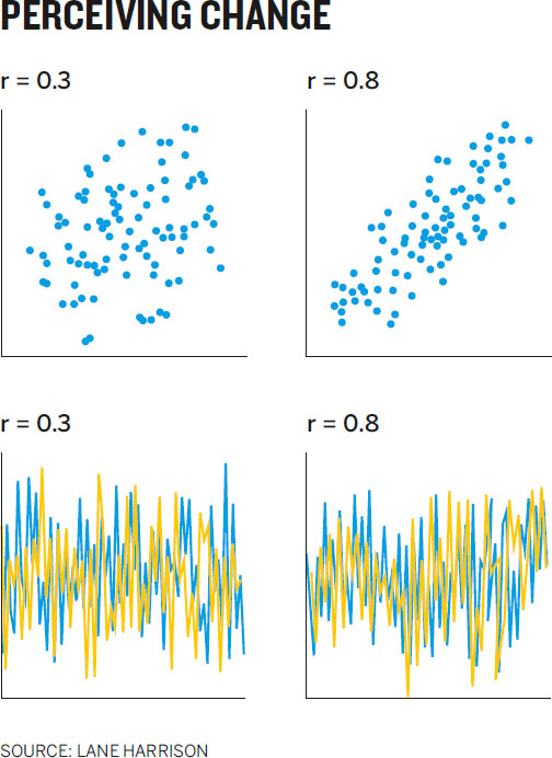
Rensink has discovered that we perceive change in correlation in scatter plots the same way.22 For example, in scatter plot pair A, with a correlation near 1, you notice a big change when just a few dots are moved.

But pair B has a correlation around 0.5, so you don’t notice much change in correlation when the same number of dots as before are moved. Weber’s law tells you how much change you’d need to show before someone noticed a difference: twice as much, as shown in pair C.
Rensink’s breakthrough has been replicated and applied to other types of correlative (and negatively correlative) charts by Lane Harrison and a group at Tufts University. The implications of a predictable pattern to seeing correlation are profound, for two reasons. First, if Weber’s law applies to an instance of higher-order thinking, not just fundamental physical stimuli like light, then maybe we’re not reading data at all, but rather “encoding down,” as Harrison puts it, to something much more fundamental, such as shape, angle, and space, which we then “calculate” visually to find correlation.
Second, although the relationship between perception and correlation is linear for all types of charts the researchers tested, the linear rate varies between chart types. As shown in the Perceiving Change chart, people see a difference between 0.3 and 0.8 correlations much more easily in a scatter plot than they do in a line chart.23
That means we can begin to measure and rank order the effectiveness of various chart types for showing correlation (and negative correlation)—which Harrison has done, and others have built on. The results of their work is shown in the Ranking Methods matrix.24

Researchers have studied how readily we perceive change in both positive and negative correlation in a number of chart types and categorized them by their relative effectiveness.
Rensink, too, is using this discovery to test the effectiveness of chart forms. He has discovered that we see correlation changes in strip plots and color plots as well as or better than we do in scatter plots.


Many in the dataviz world believe in space über alles, the idea that spatial relationships are the best way to plot data. But these effective forms use space only on the x-axis, making them more compact than charts with traditional spatially oriented y-axes. Because we descry correlation here as well as or better than in scatter plots, these underutilized chart types could be valuable. Perhaps, as Cleveland and McGill said, new procedures are being discovered, and old ones will be set aside.
Researchers next want to see whether other data representations such as outlier detection and cluster detection follow the same predictable scheme. If they do, Harrison can imagine being able to develop intelligent visualization systems in which we know, scientifically, which charts will be most effective for the task at hand.
As the grammar of graphics evolves (and it will continue to evolve, just as linguistic grammar does), visualization will remain what it always has been—an intermingling of the scientific and design traditions. It will be a mash-up of art and science, of taste and proof. But even if the grammar were already fully developed, understanding it alone wouldn’t ensure good charts, just as knowing the rules for prepositions and the passive voice doesn’t ensure good writing. The task at hand remains the same: We must learn to think visually, to understand the context, and to design charts that communicate ideas, not data sets.
And the best way to start learning how to produce good charts is to understand how people consume them. That starts by understanding some of the basics of visual perception.
A BRIEF HISTORY OF DATAVIZ
Visual communication is primal, but what we now think of as data visualization started just two centuries ago. The history of visualization provides a foundation for learning and helps dispel several misconceptions about the practice. Above all, it allows us to dismiss the myth that dataviz is a fully formed science with rules that must be obeyed. In fact, dataviz is a craft that relies on both art and science, in which experimentation and innovation should be rewarded, not punished.
A TIMELINE OF SOME KEY MOMENTS:
Late 1700s
William Playfair produces what are often considered the first modern charts, including line charts, bar charts, pie charts, and timelines.
1858
Florence Nightingale produces “coxcomb diagrams” that show the devastating effect of disease on the British army.
1861
Charles Minard publishes a diagram showing the toll taken on Napoleon’s army by his march on Russia.
1914
Willard Brinton publishes Graphic Methods for Presenting Facts, the first book about visualization for business.
1952
Mary Eleanor Spear publishes Charting Statistics, a book of chart-making best practices based on decades of work with many groups in the US government.
1967
Jacques Bertin publishes Sémiologie graphique, the first overarching theory of visualization, and one that remains deeply influential. Bertin describes seven “visual variables”: position, size, shape, color, brightness, orientation, and texture. He also establishes two core principles: the principle of expressiveness (show what you need to; no more, no less) and the principle of effectiveness (use the most efficient method available to visualize your information).
1970s
John Tukey pioneers the use of visualization with computers and popularizes the concepts of exploratory and confirmatory visualization.
1983
Edward Tufte publishes The Visual Display of Quantitative Information, combining statistical rigor with clear, clean design principles and inspiring two generations of information designers and data journalists.
1984
William Cleveland and Robert McGill publish the first of several research papers that attempt to measure “graphic perception,” setting off two decades of research into what makes visualizations effective.
1986
Jock Mackinlay publishes his highly influential PhD thesis, which carries Jacques Bertin’s work into the digital age.
1990s–2000s
The computer-driven, scientific visualization community and the design-driven, journalistic visualization community diverge in their approaches to dataviz.
2010s
The social internet, cheap and easy-to-use software, and massive volumes of data democratize the practice of visualization, creating mass experimentation. Viz is no longer the province of a small community of experts; it’s an internet phenomenon.
2010
Ronald Rensink publishes research suggesting that our perception of correlation in a scatter plot follows what’s known as Weber’s law and, for the first time, that a method for calculating a chart type’s effectiveness may exist.
2014
Lane Harrison replicates Rensink’s findings and applies them to additional chart types. He creates a ranking of chart-type effectiveness for showing correlation. Harrison’s work is part of a new generation of research into establishing science around graphic perception, which draws on many other disciplines, including psychology, neuroscience, and economics.
Today
Experimentation continues across a broad spectrum of disciplines. Tools for visualizing increasingly improve. They create better charts faster and allow for interactivity and dynamic updating of visuals.
ANDRIS ZOLTNERS
THE VISUALIZATIONS THAT LAUNCHED A COMPANY
“ZS exists because of visualizations that solved a tough problem.”
The ZS Zoltners is referring to is ZS Associates, a global sales consultancy he founded, which now employs more than 3,500 people. The visualizations were maps and some simple line charts. The tough problem was assigning sales territories.
That may seem like a small thing, but in the late 1970s, it wasn’t. “You have two problems you have to solve,” says Zoltners. “Where do I put the salesperson? And then what customers, accounts, and prospects do I assign to him?” Companies would spend three to six months sketching out sales territories on paper maps by hand. It was a major challenge to get it right.
The territory problem became a chapter in Zoltners’s dissertation. For a time it went no further than that, but he never stopped thinking about the problem. While teaching at the University of Massachusetts, he decided to take it up again; this time he worked with a Springfield, Massachusetts, company with 57 salespeople to see if he could solve its territory problem.
“I was messing around with optimization and discovered you could get math to solve the problem,” he says. “You could create some search algorithms that did a good job aligning the sales force.” Problem solved, right? Actually, no. “When I proposed the results, they didn’t like it. We had good criteria for alignment. We created roughly the same workload for all the salespeople. But when I presented them with the results, it was a table. Names on paper that listed what counties the salespeople would call on.”
The company didn’t buy in.
Zoltners moved on to Northwestern and ended up in the B-school’s marketing department. While he was searching for some tenure-track research, the alignment issue popped up again. This time, Eli Lilly was trying to solve the riddle. It was a tremendous challenge, because the pharma company relied on thousands of salespeople calling on hundreds of thousands of doctors in more than 40,000 zip codes.
By this time, the early 1980s, computers had arrived. Zoltners saw an opportunity. He and his colleagues—and a small army of grad students—built a massive (at the time) geographic database of state, county, and road maps of the entire United States. Then they wrote software that would allow them to trace out sales territories with a light pen. “We could just change the boundaries, right there on the map, with this light pen,” he says.
In addition to the map, Zoltners created charts. “Our algorithms could predict for any sales force size what sales and profitability would be. When we hit the optimizer button, we’d generate this very simple chart. On the x-axis was the size of the sales force, and on the y was some measure like sales or profits. And we’d just show where they were now and where the alignment would put them. There was nothing like this at the time.”
Reaction to the visualizations was immediate and visceral. “One man came up to me after we demonstrated it, and he just said, so earnestly, ‘I’ve been waiting my whole life for this.’
“It was a bonanza. It started the company.”
What had previously taken companies months now took a few weeks. (Part of Zoltners’s business was providing a change process to implement the realignment.) Zoltners never advertised, but, he says, the phone never stopped ringing. One executive called and said, “I heard what you got. I have to see it.” Zoltners apologized and said he was all booked. The executive said, “Make time for me. I’ll come on Sunday.” He did. And he bought in.
Another time, Zoltners flew from Chicago to Syracuse for a demo late in the week. He remembers fondly lugging his Apple II and a monitor on the plane as carry-on. When he arrived, a blizzard hit. Dozens of executives were expected, but only two people showed up. Back in Chicago that weekend, he told people in his growing office that there was no way they’d get business from the trip.
Both people who had shown up called that Monday, ready to buy. Since those early days, ZS has done more than 10,000 sales force alignments in 50 countries.
As he recalls the company’s rocket trajectory, Zoltners is by turns excited and reverential. “Look, no one can get the kick we got in those days,” he says. “You couldn’t believe it. Every time we showed someone the maps and charts, they signed up.”
Zoltners points out that the visuals didn’t actually change the alignment algorithms he had worked out and used in Springfield, where he presented tables and lists of counties and zip codes. But they affected people in a way the raw information couldn’t. “Without the visualizations,” he says, “I could have optimized till the cows came home and we couldn’t have done this. We’d get zero buy-in. Visuals helped with buy-in. It put them in control over choosing a solution, by seeing it. We were able to do what no one else could: we showed them what their options looked like.”