BETTER CHARTS IN A COUPLE OF HOURS
A SIMPLE FRAMEWORK
MOST OF THE STRESS MANAGERS feel about creating charts relates to picking the right kind, which often amounts to scanning preset options in Excel or Google Sheets and trying out a few until one looks right or just seems pleasing. They might adorn it with a few more clicks—3-D, color. The tools make it so easy to produce a visualization that the biggest challenge in crafting good charts is overcoming the inclination—temptation, really—to just click and build. It seems hardly worth putting more time and effort into the process.
Of course, that’s flat wrong. That approach might be fast, and it might spruce up the look of a chart, but it doesn’t refine the ideas that the chart conveys. Recall the Good Charts matrix in the introduction that crosses design execution with context setting: Good charts are a positive combination of those two elements. Even if software programs automatically generated well-designed charts (most of them don’t), none sets context to any meaningful degree; a spreadsheet doesn’t know the chart’s audience or purpose. Programs visualize data. People visualize ideas.
So instead of jumping right to chart types and design, you need more inputs to help define your context and identify the visual approach that will be most effective. This isn’t a waste of time and effort; it’s the antidote to unthinking, automatically generated charts. With just a little effort we can turn these bar charts—which are charts from a real presentation by a consultant to clients—into the line charts below them.


An upgrade like that doesn’t take as much time or effort as you might suspect. This one took 45 minutes. In some cases you can make major gains in the quality of your visual communication in less time than that. In others you may spend an afternoon on a chart. On average, you can radically improve your charts in an hour or so.
Here’s how. Let’s start with these steps and time frames:

Prep time usually doesn’t take more than a few minutes. But as you might expect, ensuing steps’ time will vary according to the type of visualization and the complexity of the project. For one or two good charts, start with this time distribution.
PREP
Cooks would call this mise en place—all their ingredients and their kitchen organized to prepare for cooking. Do these three things:
Create three kinds of space.
• Mental space: Block out time on your calendar. Turn off e-mail and social channels. Focus.
• Physical space: If you’re in an open-concept office, get a room. Even if you have an office, find a quiet, closed-off area away from your desk to minimize interruptions. You’ll be seeking others’ ideas and opinions, but you don’t want random, unsolicited comments from passers-by.
• White space: Bring plenty of paper and whiteboards. A rolling whiteboard will allow you to take notes back to your desk. If you can’t get one, bring a phone to snap pictures of your sketches. It’s helpful to have markers and pens in three or four colors.
Put aside your data. This may seem counterintuitive, but it’s key to allowing for more-expansive thinking. Don’t ignore the data—make sure you understand it—but don’t lead with it. “When you start with the data set in mind, it limits how you think,” says Jeff Heer, an associate professor of computer science who teaches data visualization. “First you need to step back and think more broadly.”
Focusing on the cells of data can lead to banal results—charts that just convert tables to visual form. If you start with a more open point of view, you may discover ways to make your idea come through more strongly by introducing new data, or crunching the data you have.
Here’s a simple example. A general manager for an e-commerce site is looking at customer purchase activity by time of day. Visualizing the data from one of his spreadsheet’s columns yields this:
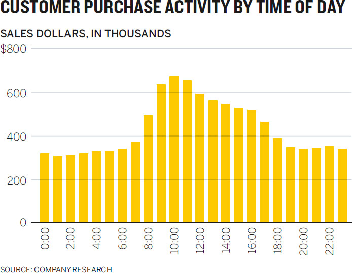
This is not bad, and it was simple to execute. But if the manager had put aside the data and talked through what he was trying to show (a process I’ll get to in a minute), he’d have realized that the data was normalized to Eastern Standard Time, in the location where the purchase was registered, not to time in the location where the purchase was made. It would be more useful to show volume of sales by the purchaser’s time of day:

Starting from what he wanted to show rather than from what data he had on hand led to a different, more useful chart.
Write down the basics. You’ve created space. Now document a few key pieces of information on your paper or whiteboard to help frame your thinking. Include:
• who it’s for
• what setting it will be used in
• which of the four types of visualization you’re creating
• where on the Good Charts Matrix between context and design you should aim
For example, take a look at the Sales Team Performance sketches below.

Add keywords and notes as prompts and reminders. This will serve as a launching point, or as a buoy you can return to if you drift off in the talking and sketching you’re about to do (which should be encouraged; think expansively).
TALK AND LISTEN
If you want your charts to get better, talk about what you’re trying to show, listen to yourself, and listen to others. Conversations contain a trove of clues about the best way forward. Words and phrases will steer you to the data you need, the parts of it to focus on, and possible chart types to use.
Of all the things you do to make better charts, this will be the most revelatory, but also possibly the least natural. It takes getting used to. Practice doing these three things:
Find a colleague or friend. Although you can talk out loud to yourself or take notes, having someone to chat with works better. Who? That depends. If you feel uncertain about your approach, ask an outsider, someone who doesn’t know much about either the data or what you’re doing, whose reactions will be free from the assumptions and biases of those who are familiar with the data and its audience. That will force you to explain even basic information, organize your ideas, and provide context. It will feel like brainstorming.
Conversely, if you’re confident about your approach but you want to refine it or to make sure that it’s sound, connect with someone closer to the project who knows more about the data and may even be part of the audience. This will feel more like a gut check.
Talk about specific questions. Don’t wander into the conversation without a plan. Start with these questions:
• What am I working on?
• What am I trying to say or show (or prove or learn)?
• Why?
The first question is straightforward and factual, most useful if your counterpart is an outsider. It gives rise to necessary exposition; his ensuing questions may signal when you’re making assumptions that he’s not and help you notice when you’re veering off topic.
Imagine starting one of these conversations this way:
I’m working on showing the bosses we have an opportunity to invest in new HR programs—
Wait—smaller programs for the upcoming fiscal year, or more like big, long-term investments?
Already the conversation is forcing you to focus more precisely on what you want to show.
The second question will vary according to whether you’re in the declarative space (What am I trying to say or show?) or the confirmatory or exploratory space (What am I trying to prove or learn?). Notice that you’re still explicitly avoiding your data. You don’t want to ask, What does the data say? Even if you’re reasonably certain that your viz will be a straight translation of some of your data, this is your chance to think more broadly about your approach, which may in turn lead you to seek out other data or information to incorporate into your visualization.
It will help with subsequent activities if, while you’re talking, you find and jot down a short phrase or sentence that becomes the working answer to What am I trying to say? Here’s a conversation that arrives at such a statement:
I’m trying to show my boss that we’re doing better than she thinks in terms of customer retention.
Why does she think you’re doing poorly?
Well, our retention rate has fallen for three straight quarters. I know it looks bad right now, and everyone is panicking.
So how is it better than she thinks?
Well, it’s not what we’re doing, as far as I can tell—it’s what’s happening in the industry. Although our retention rate is falling, it’s not falling nearly as dramatically as our two main competitors’. Something systemic is going on, I’d guess.
Ah!
If I can show her that clearly, I can tell her that we should focus our worry, our energy, on figuring out what’s going on in the market, not on changing how we’re executing as a company.
The manager has found a visual starting point. He starts by suggesting that what he wants to tell his boss is “We’re doing better than you think.” His partner recognizes that as a qualitative statement, and does well to press the manager into explaining. This leads the manager to a description of what he can show to prove it to his boss: “Although our retention rate is falling, it’s not falling nearly as dramatically as our two main competitors’.”
The third question is the most difficult and, frankly, the most annoying. Keep asking “Why?” and encourage the person you’re speaking with to challenge you as well. If you become exasperated, find yourself unable to come up with a good answer, or hear yourself saying “Just because!” that’s a good sign that you need to think more critically about what you’re trying to show. This conversation and its litany of “Why?” forces a manager to admit that she’s not prepared to create the declarative she’s proposing:
I want to compare financial results to key productivity data like time spent on e-mail and in meetings.
Why? What’s the connection there?
It just seems like there’s probably a relationship between the two. Revenues are down. I ask myself, Why? We’re in meetings so much now. We never have time to work!
But don’t you get work done in meetings? Why are they the problem?
I mean, I know I’m getting less done because of all this time spent on other stuff.
Why does one lead to the other, though? How can you actually prove that more meetings and e-mails equals lower revenue?
I’m not sure, but of course there’s some connection there. There has to be!
Why? What if they’re helping you get work done, too?
Just because! I’m sick of sitting in meetings!
If you’re trying to create a declarative dataviz and you can’t adequately answer the “Why?” you might want to stop, form a few hypotheses, and test them with exploratory visuals to see what emerges.
Listen and take notes. As you talk, listen to your counterpart, but listen to yourself, too. Pick out visual words and phrases that describe how you see the ideas and information and write them down. If, for example, you hear yourself using words like distributed and spread out over, or different types and clusters, they are clues to your potential approach. Listen for metaphors: The money’s flying out of our department. We saw a huge dip. Revenues fell off a cliff. It’s a crazy maze of choices. They evoke powerful imagery that could inform how you design your information.
Take this statement: “I want to compare the number of job postings to hires to see what the ratio is for different types of jobs.” That sentence contains enough information to suggest a strong visual approach. Here it is again, with the visual cues emphasized:
I want to compare the number of job postings to hires to see what the ratio is for different types of jobs.
Compare the number suggests a chart that plots data points along a numbered axis. The ratio tells you you’re comparing one number with another. Different types suggests that you can repeat the comparison across several categories, and maybe create subgroups. (You may also notice some of the other nouns describe potential variables: Postings, hires, and jobs are all important categories of data. Note these, too.)
Let’s skip ahead for a moment. Pulling those keywords from that one sentence could bring the manager to the following final visualization. Reread the sentence the manager captured: It’s all reflected in the chart:

Here’s another example, this one of a sales manager who wants to do some exploratory visualization of his teams’ sales performance. “It’s not clear,” he says to his friend, “that there’s any regular pattern to our sales. I’m really trying to understand how and when they make sales—how sales are happening over time. Is it mostly smooth, or are there bursts of sales with periods of nothing? Is it the same month to month or not? Are different seasons showing different sales patterns?”
If he’s been doing this for a while, he will have jotted down several keywords and phrases from his chat:
It’s not clear there’s any regular pattern to our sales. I’m really trying to understand how and when they make sales—how sales are happening over time. Is it mostly smooth or are there bursts of sales with periods of nothing? Is it the same month to month or not? Are different seasons showing different sales patterns?
It’s a bit strange at first, listening to yourself talk in such an active way, but it’s undeniably valuable. Time and again I’ve watched people’s eyes light up as someone utters a phrase that creates a Eureka! moment. Suddenly they realize how they’ll visualize something. A favorite example comes from when I worked with the venerable business professor Clay Christensen. He wanted to visualize the fact that his Harvard Business Review feature article “The Capitalist’s Dilemma” was the product of dozens of ideas that people had posted to an online discussion forum created in part by IDEO.1 The forum allowed participants to note which posts had influenced their own, and tracked how many people read a post and how many commented on it. I’m paraphrasing him here, but in effect he said, “I want to show how a network of contributors helped shape this article into its final form.”
Christensen’s team created a rough sketch of what they thought might work to show the interconnections in the conversations. It looked like a cross between a constellation and a flow chart and was peppered with quotations from the forum discussion. A version of it is displayed here:

It was a start. It conveyed the idea of interconnectedness, but it also felt somewhat haphazard. What did the colors mean? What did the dots represent? We wanted to improve it. We spent 30 minutes in a conference room talking and listening. I jotted down many keywords and metaphors from the session, including network of ideas, interconnectedness, back-and-forth exchange, over time, crowdsourced, big influencers. Eventually, as Christensen continued to explain how the forum helped him write the article, he said (again paraphrasing), “All the ideas from the forum flowed into the article.” Flowed into. That was it. We had hit on a good visual metaphor, and we started sketching rough versions of two types of charts that represent flows: alluvial and Sankey diagrams. We continued to talk, until someone in the small group (there were five of us) uttered another keyword when he mentioned how the conversation in the forum cascaded.
That was enough to begin building the chart. Ultimately, it became this interactive visualization in which flow and cascade over time are plainly evident.2

When you’re talking and listening, force yourself to answer that fundamental question out loud: What am I trying to show or say (or learn, or prove)? More than you may suspect of the answer to that question lurks in a brief conversation. Once you extract those words, it’s time to draw.
SKETCH
Finally, you’re drawing. You should come out of this step with an approach and a rough draft that can be refined. Here’s how to start:
Match keywords to approaches. The words you wrote down can now be put to use. Start drawing examples of the visual words you captured. Match those words to types of visual forms. You can match them to the types of visualizations that typically best show what they describe.
You may have seen or used a chart cheat sheet like Andrew Abela’s. The university provost and former dean of the business school at Catholic University of America, he has written books about effective presentations.3 Abela’s guide, shown below, organizes typical charts well, but it comes with caveats. For instance, not everyone will agree on which chart types should be included and which excluded. Some people will take exception, for example, with Abela’s inclusion of pie charts and spider charts (Abela calls spiders “circular area charts” here), which they consider difficult or suboptimal. Others will ask why unit charts and slope graphs aren’t included. And what about tables?
ABELA’S CHART TYPE HIERARCHY

Also, a guide like this could narrow our thinking at a stage when we should be broadening it. It’s something like pouring out a bucket of Legos in front of a child and then telling her she can make only the ten things in the instruction booklet. At the beginning of the sketching phase, we’re better off just messing around with the Legos.
Still, Abela’s guide is here for two reasons. First, it’s as good as any typology out there (an online search will yield many more) at helping us understand categories of forms—comparison versus distribution, for example. Remember that no cheat sheet will encompass all options. Under every common chart type shown here is a remarkable diversity of variations. New chart species are being spawned all the time. Trying to identify and document every variation of every chart type would be a quixotic effort at best.
It’s better to just learn basic categories and types and then become a collector. Look around; collect examples of infoviz that appeal to you or that you find exceptionally effective. Make notes about what you think works well or caught your eye. Visit websites devoted to infoviz and follow people on Twitter who post new charts daily. (Shortcut: make a list for #dataviz, #visualization, #viz.)
The second reason I’m showing Abela’s chart is that I’ve adapted it. The variation below matches typical keywords you may find yourself jotting down during the talk and listen stage to the types of charts you might try to sketch.

This transforms Abela’s decision machine into more of an inspirational guide. I’ve simplified the categories and types but added conceptual forms, such as networks and hierarchies, that don’t appear in Abela’s chart. (Ironically, the type of visualization Abela used to create his typology—a hierarchical decision tree—isn’t listed on the typology, because he shows only data-driven forms.) To use this guide, take a look at the keywords you recorded during your talk and listen stage and start in that quadrant. For instance, if you wrote down proportion and a percentage of, you might consider starting with stacked bars or a pie.
Keep in mind that this chart is neither complete nor definitive. It’s not meant to tell you what chart type to use, only what types to play with as you start sketching. You may find that some projects, for example, can benefit from multiple chart types or hybrids (say, a bar chart overlaying a map). It’s just meant to help you get started.
Start sketching. Sketching is the bridge between idea and visualization. Good sketches are quick, simple, and messy.4 Don’t think too much about real values or scale or any refining details. In fact, don’t think too much. Just keep in mind those keywords, the possible forms they suggest, and that overarching idea you keep coming back to, the one you wrote down in answer to What am I trying to say (or learn)? And draw. Create shapes, develop a sense of what you want your audience to see. Try anything.
Sometimes the form will seem so obvious that you won’t feel the need to sketch a lot of alternatives. A basic comparison between categories can often result in a bar chart. Trends over time are usually plotted as line charts. Still, don’t forgo the exercise altogether. Hannah Fairfield, a graphics editor behind some of the most celebrated data visualizations in the New York Times, always tries out at least two completely different forms to check her assumptions about the best approach and to stay creatively open.
For an article comparing the price of various Apple products to median monthly household income, my coauthor on that piece, Walter Frick, and I thought we’d show a simple bar chart, with one bar for the cost of a product and the other for income.
It would have been a natural choice, because we were comparing values within categories. The bar chart is valid. But, in keeping with Fairfield’s advice to always sketch a couple of options, we decided to look for other ways to show the comparison. One phrase kept recurring while we sketched: how much monthly income the cost of an Apple product would take up. This led us to think about the product’s cost as a piece of monthly income, rather than just a comparative value. Eventually, we settled on the less likely but arguably more effective approach of mini treemaps. Sketches of both the simple approach and the alternative are below.


Even if you think a standard chart type will work for your visual, sketch an alternative to check your assumptions and stay creatively open. Sometimes it will lead to a better form.
Even if you’re confident that you should be using a simple line chart or a scatter plot, sketching these basic forms is still important. Just as rough drafts improve even staff memos and other prosaic writing, sketches will make even simple charts better.
Remember the manager in chapter 2 who wanted to show her boss that customer service performance was declining in spite of, not because of, a website outage? She could have thrown together a basic line chart showing the data she’d collected: customer service calls and customer service performance. As a reminder, that chart is shown here.

But when she sketched the basic chart, she saw that the dramatic shape of the call volume would probably fight for attention with the performance trend. So she spent a few minutes drawing alternatives, looking for ways to increase the focus on customer service performance.

She kept referring back to the statement she had jotted down to describe what she wanted to communicate to her boss: Even when service was restored after a website outage, customer service ratings continued to decline. And they started declining before the outage.
The breakthrough came when she realized that her statement didn’t mention customer service calls at all. The data was there, and she had plotted it unthinkingly. So she sketched a version without the outage data and immediately felt it was better. Then she added two key points that were reflected in her statement: after service was restored and before the outage.
As she sketched, she didn’t try to portray the data accurately; she knew the trend was downward—that was good enough for the time being. She added notes about possible treatments, such as magnifying and shading. But few decisions were actually made. The most important decisions at the sketching phase are what not to pursue and what form to use. This is illustrative brainstorming. In 15 minutes the manager went from visualizing some cells of data to visualizing what she wanted to say.
Sometimes sketching lasts longer. The sales manager from earlier in the chapter who was looking for seasonal and month-to-month patterns in his team’s sales performance noted some keywords from his conversation with a friend about his project:
It’s not clear there’s any regular pattern to our sales. I’m really trying to understand how and when they make sales—how sales are happening over time. Is it mostly smooth, or are there bursts of sales with periods of nothing? Is it the same month to month or not? Are different seasons showing different sales patterns?
Looking at his notes, he saw that he was really talking about two things here: patterns and time. He actually used a phrase that was the potential visual approach: sales over time. He sketched those two variables as axes and then started to think about how to use them.

Line graphs are usually a good starting point for trends. So he drafted one of those over a year. From there his sketches reflect an effort to find the right set of line graphs based on some of his words—seasons, periods, and month to month—which suggested ways to organize his visuals. As he proceeded, his approach came into focus; but again, his charts weren’t accurate or to scale. He was just homing in on the approach.
Sketching is also useful to help us try different approaches to complex stories. Here’s part of a conversation from the talk and listen stage for an economics student. The student extracted lots of keywords from his conversation:
I’m trying to show a lot of things, actually. I want to see where the greatest growth is in jobs in the coming decade, compare sectors that are strong or weak. But also how is pay in those jobs relative to the total number of jobs that will be created? That’s the tricky part, because it’s easy to show a super high growth of jobs, but if it’s growing from 10 jobs being available to 20, what does that percent growth really mean? If high-growth jobs are low-paying ones, what does that mean? What about manufacturing versus knowledge work? Could I divide the data that way? There’s just a lot going on in the data.
Why is it important to show so many things?
That’s just it. Many times you see one piece of this data highlighted and it ignores these other factors, so it’s like, “Look at all that job growth,” but it doesn’t take into account pay or raw numbers of jobs. I’m looking for a holistic picture, a smarter look at this.
It’s silly to think the student could extract one chart style or approach from this conversation. On this page, sketching is meant to explore options for organizing this student’s holistic picture.

Whether it takes five minutes to confirm the approach you sensed you should use, or an hour of slogging to find a good way to organize your information, sketching is a crucial habit to form. For many professional designers and dataviz pros, it ranks at or near the top of their list of activities that improve visual communication.
PROTOTYPE
At some point, you’ll have done enough sketching and will be ready to start making more-realistic pictures. But when? Watch out for these signs that you can begin to prototype:
• Your sketches reasonably match your What am I trying to say or show? statement.
• Your sketches are becoming refinements of one idea, rather than broad stabs at different ideas.
• You find yourself plugging actual data or axes and labels into your sketches.
• You find yourself designing the charts, focusing on color, titles, and labels.
• You feel that you don’t have any more ideas.
Sketching is generative; it’s meant to bring up ideas. Prototyping is iterative; it’s meant to hone good ones. Prototypes should incorporate real data, or realer data. Don’t try to be perfect with your plotting, but use realistic axis ranges and approximate values that give a sense of what the actual shape of the thing will be. Often, it’s useful to prototype on the basis of a small subset of the data to create accurate pictures without feeling the burden of having to prototype everything. The manager plotting seasonal sales data might focus on one season for his prototypes.
Prototypes should also begin to incorporate broad design decisions such as use of color, and the media you’ll be building it for. Compare the sketch and the prototype below to see the difference between the two stages.


The prototype, which plots only three categories even though the final chart will catalog many more, is cleaner and more realistic than the quick sketches. It uses real labels and includes a key. It also raises questions—Will this x-axis range work, given the data? Should color be used for categories—that can be addressed in ensuing iterations.
Most prototyping you’ll do falls into one of three categories:
• Paper, done on paper or a whiteboard
• Digital, done in software or on the web
• Paired, done with a partner who has skills you lack, such as programming or design
Paper prototyping requires virtually no setup beyond what you’ve already done. Even if you plan on doing digital prototypes, a paper prototype is a good transition from sketching; a first paper prototype is like a final-draft sketch. Paper prototyping is good for simpler data sets (or subsets of larger data sets) and simpler visualizations, because it’s slow. A chart with ten categories could become difficult and tedious to draw by hand. It’s also harder to maintain clean plotting on paper as the amount of information piles up.
Digital prototyping is much faster than drawing and manages more information more cleanly. Here you can use tools built into the software where your data exists (such as Excel or Google Sheets) to quickly build visuals, or you can upload some data to a website that offers the ability to try multiple approaches. Digital prototyping is rapid prototyping. It’s especially powerful for confirmatory and exploratory dataviz.
The good news for managers is that the number of tools suited to digital prototyping is exploding—they are part of the democratizing moment that’s making these tools affordable and easy to use. Their functionality and requirements vary considerably. A primer on some of the popular tools is provided here.

Some of these programs have been designed such that the default color and labeling on their output makes it potentially good enough to use as a final draft; certainly it’s suitable for exploratory work that’s not meant to be presented to others. Those that generate vector graphics (SVG) output can be imported into Adobe Illustrator and other designer’s programs for refinement. Many of them generate HTML output that is by default interactive, such that when you hover over data points, their values appear. But right now they all still work best as a way to rapidly tweak and hone a visualization.
The four Sales by Time of Day prototypes below were created with Datawrapper in less than ten minutes of exploring online sales traffic data.


That you can move a visualization so far in ten minutes demonstrates the power of digital prototyping. You can almost read the manager’s thoughts in the iterations: This is way too much information crammed into a single chart. The trend is what matters anyway, so let’s try a line chart. Mobile and tablet can go together, and it’s simpler to have just the two trends to compare. Now let’s zoom in on this interesting slice of the data that I want to focus on.
It has its drawbacks, though. For one, the tools that do most of what you want to do in digital prototyping well are the ones you need training to use. The free online ones have a lower learning curve but more-sporadic feature sets. Each has its strengths and weaknesses, so you may find yourself jumping from tool to tool depending on your project or even within a project. Digital prototyping may also be overkill for simple visualizations in which paper prototypes get you to where you need to be. And few of these tools are designed to help prototype conceptual forms, which often require more sketching and prototyping than data-driven ones. When working on conceptual graphics, paper and whiteboard are probably your best options. Still, you’ll find yourself using these tools often.
Paired prototyping is something else altogether. The previous techniques are defined by the tools you use. Paired prototyping is defined by the way in which you work: with an expert partner. The concept is based on a system of data analysis called paired analysis, which itself borrows from a method called extreme programming and other sources.5 In each of these the idea is to pair a subject matter expert—that’s you, the manager—with a tools expert who can manipulate data and visuals to suit your needs.
Brian Fisher and David Kasik cocreated the method at Boeing.6 “This turns out to be highly effective,” Kasik says. “The key is to have them actually sit and work together, not throw things over the wall.”
Paired analysis has proved powerful at Boeing. In one case, the company used it for some deep exploratory sessions in which a team of two wanted to visualize information about bird strikes on airplanes. Bird strikes are a serious safety issue (a strike by Canada geese on an Airbus A320 passenger jet caused the notable “Miracle on the Hudson” water landing in New York in 2009)—at the time of the analysis, the cost of bird strikes was estimated at anywhere from $123 million to $615 million a year, but very little was known about the patterns of bird strikes and how they might be mitigated.
Little was known in part because the data analysis required to understand bird strikes was a tedious process of finding and reading through thousands of records from dozens of sources, correlating them, and then updating the results as new events occurred. To speed things up, Boeing paired a subject matter expert (an aviation safety specialist) with a tools expert (in this case, an expert in both Tableau and IN-SPIRE visualization software). They worked together over several days. The following example shows the workflow. Think of the images as responses from the tools expert to requests from the subject matter expert. Obviously, in a real-life setting they’d be discussing each of these steps in depth before the person visualizing went ahead and created charts.
We need a way to identify and extract data on bird strikes from XYZ data sources. And once you have that system set up, we really want to see when bird strikes happen, by both month and time of day.

That’s good, but is there a way to map this by geography? I’d like to know where the most bird strikes happen. And can each spot break down the type of bird that was involved?

Wow. Great. Can we combine those two? Time of day and location? But less detail. I want to be able to show this to management and discuss the findings.

Can we also see altitude versus speed? Maybe see if there’s any pattern there.

Great. Finally, for the presentation, we should show frequency of where on planes birds strike. Something simple.

Obviously, this is a radically simplified and abbreviated version of the work the two put in on the project. But it shows how the subject matter expert focused on articulating the problems and explaining the context he was trying to create. The tools expert, meanwhile, drew on his knowledge of good visualization techniques to give his partner what he needed.
Kasik says this process brought new insights faster than other methods and has led to design improvements to shield airplanes and better pilot training to recognize and react to bird strikes.8
You can borrow this framework to achieve similarly powerful results with your prototyping: You are the subject matter expert. Recruit a tools expert, someone with expertise in some aspect of visualization that you don’t have. That could be:
• A developer who can create interactivity with complex programs like D3—the most popular JavaScript visualization library for programmers
• A designer who can help you visualize a complex or unusual form using professional design tools like Adobe Illustrator
• A data analyst who knows how to find, scrape, clean, and manipulate data in business intelligence and visualization software systems like Tableau or QlikView so that you can find patterns and relationships that you’d otherwise miss.
Sit together. Describe to the expert what you’re trying to achieve. Talk. (More talking!) Show the expert your sketches, the keywords you jotted down; clarify your ideas. Then begin the back-and-forth exchange. Even better, you can go through the whole development process with the expert.
As far back as Willard Brinton’s foundational Graphic Methods for Presenting Facts (1914), some form of paired analysis was implicitly understood to be a prerequisite for creating good charts. In 1914, no one expected a manager to learn a draftsman’s trade. In 1969, Mary Eleanor Spear likewise assumed that charting was a team effort. She even laid out how a “communicator,” a “graphic analyst,” and a “draftsman” would work together on charts.
It wasn’t until the 1980s, with the arrival of software that could automatically spit out charts, that companies de-emphasized the value of professional visualization output in favor of efficiency. Excel charts became “good enough,” and visualization became the job of the manager.
Paired prototyping techniques, and recent increased investments in information design, show that the pendulum is swinging back. Today, Spear’s graphic analyst may be a business analyst, and the draftsman may be a programmer, but the collaborative approach is similar. Encourage your company to invest in specialized talent. Many companies now contract with “data designers” and programmers who specialize in visualization. Even if your company doesn’t use specialists, set aside some budget to have your own small team on call. Routine projects may not call for paired prototyping or design, but complex data sets, large projects, and visualizations for which you want to go beyond the standard chart forms will benefit from a team and free you up to focus on the ideas. You’ll use paired analysis less often than paper and digital prototyping, but when you’re set on finding profound new insights, or you want people to see something in a powerful new way, it’s a worthwhile investment.
Here’s an example of thinking through a visualization from beginning to end. Lisbeth is a marketing manager at a company that provides streaming music services. The company is trying to understand what other activities customers engage in while they’re streaming music. Data collected by the company will help shape its multimillion-dollar marketing strategy.
Lisbeth has seen the data. She’s even quickly generated a pie chart from her spreadsheet program, just to see at a high level what was there:

She knows that even a cleaned-up, well-labeled version of this pie won’t be effective. She’s having trouble herself extracting any meaning from it other than users do a lot of different things while streaming music. She blanches at the idea of presenting this to the marketing department as a visual aide to a multimillion-dollar investment decision. She decides to make it better.
Prep: 5 minutes. Lisbeth finds a small workroom with a whiteboard and a few color markers. She brings coffee for herself and a friend she has invited to help. First she spends just a few minutes framing her effort at the top of the whiteboard. In addition to plotting her work in the declarative, data-driven quadrant (everyday dataviz) of the Four Types chart in chapter 3, she plots what will make this chart “good” on the Good Charts Matrix that crosses context and design, in the introduction. Her sketches are shown here.

Her chart should look good, but she’s willing to forgo time refining the design to focus on getting the context as close to perfect as possible. After all, she’s presenting to her unit, where people will have deep knowledge and opinions on the topic and data. She makes a brief note that if this chart gets it right, she may have to make a better-designed one for other, more formal presentations.
Talk and listen: 20 minutes. Her friend—who’s not part of this project—arrives. Lisbeth wants not only to talk through her idea but also to check her assumptions with someone who doesn’t have much knowledge or bias about the project.
So, I need to show my department what people do while they’re using our service. I want to be able to show any trends or dominant activities, for sure, but there are a dozen different things they do, and it all seems pretty random.
Why can’t you tell your team there’s no dominant activity?
We can’t market to everyone; we have to figure out who we want to target and know why. Plus I’m not convinced that it’s trendless. I just think I haven’t figured out the way to group the data that will expose the trends.
Is there a category of activity, or a couple of categories you can focus on, like exercising?
Maybe. Actually, the data wasn’t grouped, but that’s something to look at.
Their conversation goes on for about ten minutes. Later Lisbeth spends ten more minutes chatting up a colleague who’ll be at the meeting. Here’s part of what she says to this friend:
So the big meeting is coming up, and I know Tom is going to give me the “So what?” because it’s not entirely clear we’ve found one or two dominant activities that we can focus on. Plus I get frustrated when we just put up these percentages and don’t think about the individuals. You can’t just market to some 60% because they’re all doing the same thing. You have to think about people. Anyway, I’m looking for ways to organize the information so it’s not just random. But I also think it’ll be more effective if we get people in a mind-set to think about talking to people, not just these aggregate groups.
Sketching: 20 minutes. Even as Lisbeth captures the conversations, she starts sketching as shown above. She knows right away that grouping the activities in general categories will help make a pie chart more accessible, so she looks over the activities again and assigns each to one of three categories. Although she’s pretty sure a pie won’t work, she sketches one anyway. She sketches bars and tries out a Venn diagram, with circles for each category overlapping with some of the activities. She scribbles. The word individuals keeps staring back at her from the whiteboard. She really wants to make the information feel more personal and less like a generic stat. She draws a few icons of people, remembering a dataviz she found online that went viral called “If Twitter were 100 people,” which used a similar technique to show a percentage breakdown of that service’s audience.9
She writes, “Activity of 1,000/10,000? What would that look like?” And she jabs the whiteboard with dots. Could she put thousands of dots on the screen in her presentation? A unit chart might work.
Prototyping: 65 minutes. Lisbeth likes the idea of a unit chart and recruits another friend who can do some light programming to create some, paired-prototyping style. In 30 minutes they have multiple unit charts to evaluate—each showing proportional numbers of participants in activities—including this version:

Lisbeth recognizes that 10,000 dots, although decidedly stunning, is somewhat impractical for a presentation. It’s hard to see any values or differences in values in the picture. She asks her programmer to try versions with 1,000 dots. She asks him if he can “make it so the differences in value are easily seen.” He iterates. They need just 15 more minutes to produce versions with 1,000 dots, including these two:

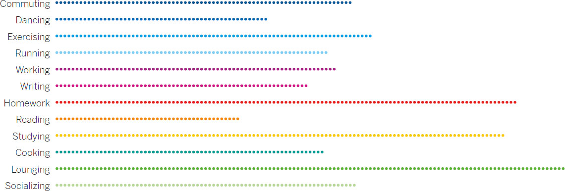
Lisbeth likes the first of these because the differences feel meaningful and the form feels familiar, like a proportional bar chart, but also because each group of dots evokes a group of people. In just 20 more minutes—less than two hours after she started—Lisbeth has a presentation version of her chart, the pair below, which organizes activities both by cateogry in one chart and by most-to-least-common in the other. She thinks, These are visualizations we can have a conversation about.

I’ve outlined a process that goes from one step to the next with fixed time intervals, largely because that’s the easiest, most accessible way to describe the progression of activities.
In practice, the process won’t be so linear. The steps will bleed into one another.

You may find yourself sketching as you talk, for example. You should: it’s hard not to start drawing as you capture keywords and talk through your challenge. Sometimes a prototype will expose a weakness in your visualization (or an opportunity you hadn’t seen) that will literally send you back to the drawing board to sketch alternatives.
In short, the process may proceed something more like this, which shows how, in that typical hour, the steps might overlap:

Not every project is typical, though. When the best visual approach isn’t clear, talking and sketching may dominate your efforts. Or, if you have a good idea of what you’re trying to show, or if prototypes lead you to further manipulate the data to refine the idea, you may quickly settle on the visual approach and spend much more time refining prototypes. You can imagine the length of these bars stretching and shrinking, and the arrows between them shifting.
________________
We’ve spent time trying and choosing forms, but this process isn’t really about finding the right type of chart. It’s about refining your ideas and your message, creating the best context possible. It’s about pushing yourself as far to the right as possible on the Good Charts Matrix.
Designing charts so that they’re beautiful is not the most difficult part of creating good charts. It’s this effort to make ideas visual that constitutes the greatest challenge. And now you have a method for accomplishing that. In fact, if you’re working in the exploratory space, or in an informal setting, this may be as far as you need to go with a particular visualization. The one-on-one with your boss may not demand a refined and finished product.
More often than not, though, even exploratory projects lead to declarative visuals—some kind of finished product for a presentation or for publication. That’s where we’ll go next. You can make your well-conceived sketches and prototypes even more effective by making them visually captivating.
BETTER CHARTS IN A COUPLE OF HOURS
To improve visual communication, fight the impulse to go right from getting data to choosing a chart type from the preset options in a software program. First spend time creating context and thinking through the idea you want to convey. Usually, an hour or so of prepping, talking and listening, sketching, and prototyping will help produce a superior visualization.
Follow these steps to make it happen:
1. Prep: 5 minutes
• Create a workspace with plenty of paper or whiteboards.
• Put aside your data so that you can think more broadly about ideas.
• Write down the basics as constant reminders, including who the visualization is for and what setting it will be used in.
2. Talk and listen: 15 minutes
• Enlist a colleague or a friend to talk about what you’re trying to say or show, or prove or learn.
• Capture words, phrases, and statements that possibly sum up the idea you want to convey.
3. Sketch: 20 minutes
• Match keywords you’ve captured to chart types that you may try out, using the Matching Key Words chart in this chapter.
• Start sketching, work quickly, and try out multiple visual approaches.
4. Prototype: 20 minutes
• Once you have an approach you think will work, prototype it by making a more accurate and detailed sketch.
• Use digital prototyping tools or paired prototyping techniques if you want to iterate further.
JOSHUA BLACKBURN
SAVING LIVES WITH REAL-TIME EXPLORATORY VISUALIZATION
“I’m a programmer, so I work with code all day, but it’s just easier for me to actually see things.”
Joshua Blackburn is a software engineer at IEX Group in New York, the protagonist firm in Flash Boys, Michael Lewis’s best seller about high-frequency stock trading. Blackburn plays a small but crucial part in the book. Because it’s easier for him to see things, he took the massive and complex data set that was IEX’s trading activity and visualized it. In a dramatic moment in the book, Blackburn tells IEX CEO Brad Katsuyama to refresh his browser to see the trading activity.7 “The screen was now organized in different shapes and colors,” Lewis writes, with anomalous trades “bunched together and highlighted in useful ways.” For the first time, the CEO “could see patterns. And in the patterns he could see predatory activity neither he nor the investors had yet imagined.”
Blackburn, a mostly self-taught programmer, excels in what he calls “operational environments”—a term he no doubt picked up from his years in the Air Force. What he means is that he builds exploratory visualizations on the fly to solve an immediate problem with a large data set. Then he adapts that visualization as the situation demands. “The way I build stuff is flexibly,” he says. “It’s high feedback. I do it. They use it. They give me feedback and I update it. I’m trying to help people answer questions in real time. Definitely here I’m the go-to visual guy.”
From a dataviz perspective, that means Blackburn’s visuals are utilitarian rather than polished. In many ways, prototypes are his final product, because operational environments change quickly and constantly. “The visual aspect is important,” he says, “but it’s always a question of not taking too much time with it, because you won’t get the answers you need when you need them.”
Whatever points he may lose on presentation, though, he gains back many times over with the types of fast insight he generates. The predatory activity his IEX dataviz confirmed is a good example. The word Blackburn uses most often to describe his visualizations is patterns. When mining big data sets, the goal is to find any pattern at all, and then try to make sense of it. That is true visual exploration.
Blackburn starts the visualization process by observing his users and listening to them. He says in Flash Boys that he zeroes in on people’s complaints, such as “I wish I could see” this or “I wish I knew” that.
What he’s doing reflects the talk and listen phase of visual thinking described in this chapter—only Blackburn does a lot less talking and a lot more listening. “I have no background in finance, so I might ask them, ‘How do you do this?’ or ‘What are you looking for?’ ” he says. “But mostly I want to hear them describe things. Then they’ll tell me about some stream of information and the tables that contain all that information. That’s how they’re used to seeing the data.”
Blackburn then becomes the user and asks himself how he’d want to see the information. “It’s always easier for me to develop something I can see. It’s natural for me to look at data and immediately think about how to make it visual.”
The deeply exploratory nature of the work Blackburn does, coupled with the fact that he iterates so rapidly, has led him to be much more experimental with forms. “I feel like I break with tradition a little,” he says. “You see a lot about how everything has to fit into these certain forms. Most of the time we don’t know what we’re looking for. If I’m confined to bar charts and line charts and scatter plots, I might not see the patterns I need to.” Those forms, he notes, wouldn’t have exposed the predatory trading patterns very well. “Allowing someone to look at data in different, unique ways can be beneficial. I made one visualization that’s really just things flying around the screen, exploding. At first it seems like eye candy, but pretty quickly you realize it’s not. The movement of things tells a story. The patterns and the motion aren’t just to look cool. They are the story.”
Being a key player for the good guys in Lewis’s book may be a point of pride, but it’s not what Blackburn thinks of when asked to remember a time he realized that his visualization was making a difference: “The highest point for me I can’t talk about much, but it was working with the military. It was at the height of the surge.”
The military, like a lot of companies, had gotten very good at collecting data but less adept at using it effectively. Blackburn realized he could build a map that aggregated battlefield information. He could use heat maps to show trends over time—for example, when and where IEDs were discovered and detonated. “I was looking for patterns. Could we take all this data and actually see how IED activity moved over the course of the war? Could we predict where they’d be and avoid them?”
He recalls how generals reacted watching his maps on massive screens—how they immediately began to pick out patterns and adjust strategy.
“The chief of operations is using the map. Patrols on routes are using the maps to see IED trends, to see the movements, the patterns of the enemy. And I just remember being there, thinking, I’m helping answer these big questions. I’m supporting decision makers. Giving them answers they didn’t have before.”