Although this book is not about designing a typeface, it is useful to have an understanding of the historical and technological context in which type has evolved.
Letterforms developed as an alternative means of communication to the spoken word. Initially this visual communication took place through pictograms, which use an image to represent an object, and ideograms, which convey more complex meanings such as actions.
These symbols gradually evolved, in different ways within different cultures and societies, into the letterforms we are familiar with today. The letterforms would originally have been hand-produced by scribes, but, with the increase in populations and need for more complex communication, mechanical means of producing the written word were developed. Woodcuts and woodblocks were used extensively to communicate one message to many people, for example, religious block books used by preachers.
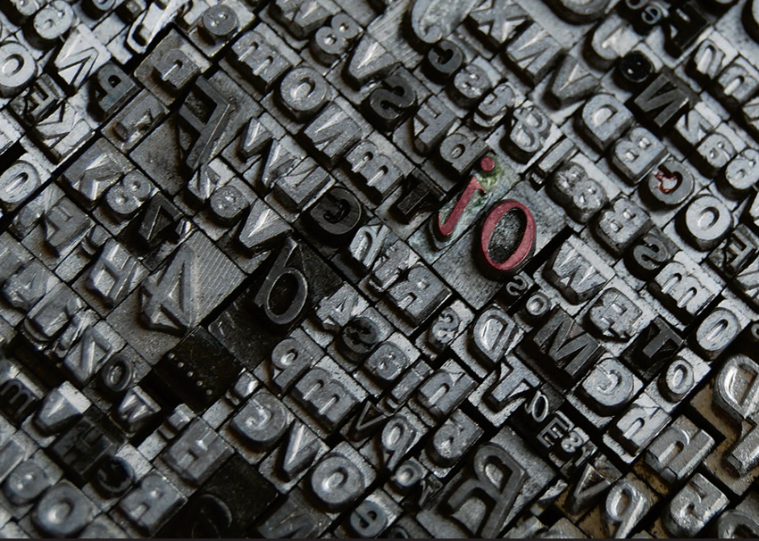
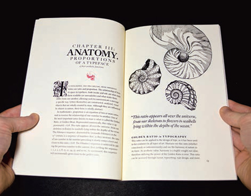
In 15th-century Germany, Johannes Gutenberg revolutionized the way we communicate by developing movable type—type where letterforms were cast in multiples of individual characters so that a printer could put together letters into a series of words for printing and then reuse the type blocks for another text. This is the origin of what we know as type. Prior to this the written word was produced either calligraphically or by woodblock prints (opposite, above left and right). Gutenberg’s system allowed for printing of letterforms quickly and economically, which meant that many more people were given access to the written word, leading to an increase in literacy. This method of printing type (generally known as letterpress) persisted, with modifications, well into the 1970s, when digital technologies began to transform type production. One of the characteristics of metal type is the debossing or indentations caused by the pressure of the type on the paper. This does not normally feature in digitally produced type unless a separate process is applied to simulate the effect. Designers often replicate letterpress or, where they can get access to appropriate equipment, will use letterpress to create specific effects, as in the examples shown on page 10.
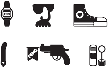
This series of dingbats by HVD Fonts includes pictograms, some of which may also be used as ideograms. For example, the pictogram of a watch may also be interpreted as an ideogram for time.

This store frontage has survived in its original format with 1950s-style design and contrasting use of typography.
As technological developments have improved methods of communication, the way we produce type has changed, so that today we can reproduce most letterforms for mass consumption, including simulated letterpress type. Therefore, throughout this book, when we refer to type we are using the term to describe any letterform, be it printed, inscribed, drawn, digitally produced, or modeled. Communication is normally the purpose of using type, whichever method of production is used.
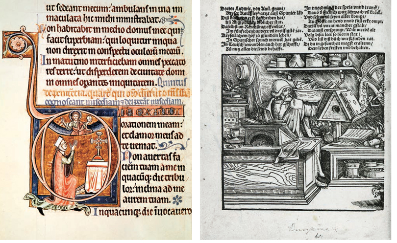
This example of an early hand-produced, one-offmanuscript shows the way hand lettering was combined with images to communicate the message. Occasionally, and particularly with religious subjects, such manuscripts were laboriously copied for dissemination to the population.

A woodblock print could be used to produce multiples, but was limited in that, once created, it could not be changed.
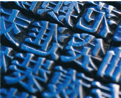
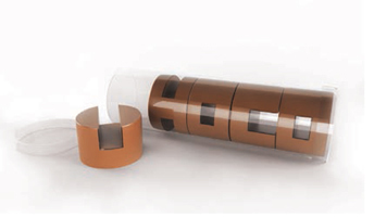
These pieces of metal type would enable a printer to assemble a series of words, such as a religious text, for printing, and could then be reassembled for another purpose.
Barbara Brownie has used a variety of traditional metal type for her design.
This poster has been created in letterpress by Hand & Eye Letterpress.
Sort, a letterpress printing company, have used an image created in letterpress for the opening page of their website.

Here you can see how the metal type has made an indentation in the paper through the pressure applied during the printing process.
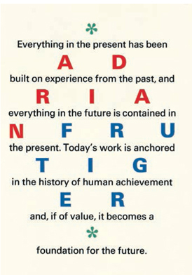
This symmetrical letterpress broadside by Christopher Wakeling has a combination of all caps with upper- and lowercase lettering to demonstrate Adrian Frutiger’s typeface. The lowercase type is legible as it is intended to be read whereas the uppercase words, in color, are meant to draw attention and cause the viewer to work out the name.
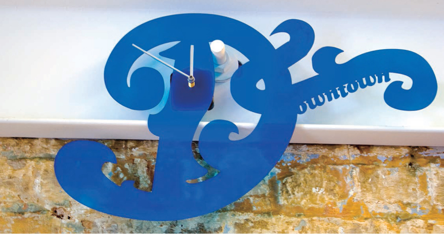
Dan Marino has used an initial letter design in this innovative clock for Downtown Studio.

Initial capital letters were often used in medieval manuscripts for decorative purposes and also as markers for the beginning of a section or chapter. This example shows an illustrated capital initial letter used in a music manuscript. Modern-day drop, hanging, or initial caps fulfill similar roles.
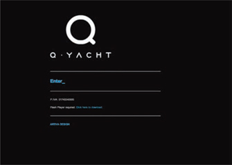
The design for the Q Yacht website, by Artiva, uses a capital “Q” that resembles a magnifying glass to encourage the reader to focus on the text.
Why is the way we use type important?
When we think of type it is usually in the context of communicating the written word and often, in that process, we don’t notice the type itself. We tend to ignore the type or letterforms themselves, as they are usually only a vehicle for the message. This is one of the lessons given to budding typographers: a good or successful typeface is often invisible except to the designer. When you read a newspaper or magazine, unless you are interested in typography, you probably won’t notice the typeface that has been used. In fact, if the reader does notice the typeface, or the way it is used, it may be for a negative reason—for example, because it impairs the legibility of the text. This is an issue that we will discuss in chapter 2.
On other occasions type is highly visible, such as when type is used as image, decorative lettering, or calligraphy to enhance the visual appearance of a page and, in this instance, is not the actual message but helps communicate the message. (There are examples, of course, where, either by design or mistake, such type does not help with communication.) An example of a decorative element that enhances communication is the initial or drop capital (cap), which may be highly decorative but also signals a starting point and helps draw the reader’s eye to it. This device is commonly used in editorial matter such as novels and magazines.
It is often the person who is using the type, either the designer or the author of the text, who will determine whether the type is to be purely functional or whether it needs enhancement of some sort. When deciding on a typeface or its use, your experience and “eye” in typography will be important. There are many rules and lots of advice available, but you will develop confidence in your own judgment and develop your own style and approach to using type.
Take an article from a magazine, newspaper, or website and decide where an initial cap would be appropriate. Design an eye-catching initial cap that fits with the theme of the article, the likely readership, and the typeface used.
In this editorial design, Steven Acres of studioimbrue has used a decorative initial cap to draw the reader to the beginning of the text.
There are probably very few people who don’t use type so it would be almost impossible to list everyone who does but, as a starter, they can be roughly categorized as: visual communicators, such as designers, illustrators, and Web developers; writers and educators, such as journalists, authors, and teachers; and information providers, such as scientists, nutritionists, and health professionals. Within each grouping there is a range of business activities that involve the use of type. For example, within the fields of design, illustration, and Web development we will find games designers, packaging designers, video and film makers, textile designers, product designers, signwriters, and calligraphers.
Such people may use type for a variety of purposes, including persuasion, information, illustration, propaganda, instruction, and even decoration. Often these purposes will overlap: for example, a website that provides information may also use decoration and/or illustration to attract the audience.
Choice of typeface and the way it is produced need to be considered in relation to the purpose of the communication. For example, if you were designing a brochure for a legal or accountancy firm, you would normally choose a typeface that conveyed a feeling of reliability and promoted confidence and that did not give the appearance of trying too hard to sell the organization. On the other hand, an advertisement for a festival would be expected to contain more overtly persuasive elements, and the typeface used would reflect this.
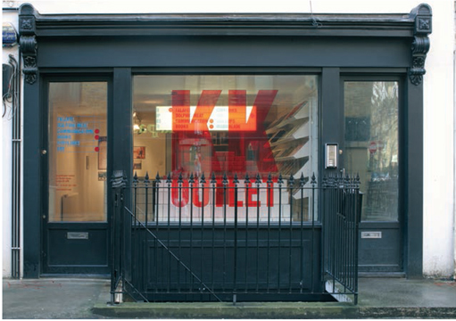
Damien Poulain draws attention to this storefront with his use of simple but dramatic red type.

This wine label for the Reggina Estate has been created with calligraphy by Jordan Jelev.

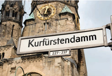
The restaurant sign uses type for information and promotion whereas the street sign is for information only.

Palette Industries use type in an innovative way on this lampshade. The appearance of the letterforms will change when the lamp is lit, and it will project shadow letterforms onto surrounding surfaces.
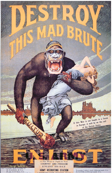
This First World War poster could be interpreted both as propaganda (portraying the enemy as a mad brute), and as persuasion (asking people to enlist). The typeface, and the way it surrounds the image, is typical of billboards and publications of the period.

This artwork by Jamie Portch shows the use of type for decorative effect. It accompanies a New Scientist article about a new form of terrorist attack using electromagnetic pulses to disable an airplane’s electronics systems. The letter “U” has been used in an image that references dropping bombs and magnets.
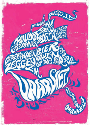
Attak’s distinctive use of hand-rendered type gives a lively and energetic look to this poster.
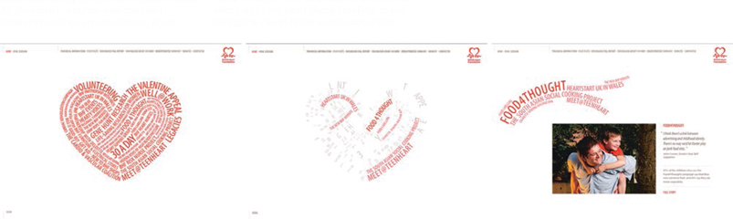
In this website for the British Heart Foundation, letterforms and words have been used decoratively to make up the heart shape. As you move the cursor over the heart, different headings are highlighted, which, when clicked, take you to the corresponding areas of the website. In this example, “food4thought” was scrolled over and clicked, which led to the heart shape breaking up and taking the viewer to the section about diet.
Petar Pavlov constructs 3-dimensional letterforms to look like a tube of chocolates, using color and form to reinforce the word.

Frost Design use the transparent quality of glass to good effect in this signage.
Choose any word you like (longer words will give you more letterforms to work with). Produce the word in two different ways, choosing typefaces or letterforms that are suitable for two different contexts: for example, a poster advertising a classical concert and another one advertising a circus.
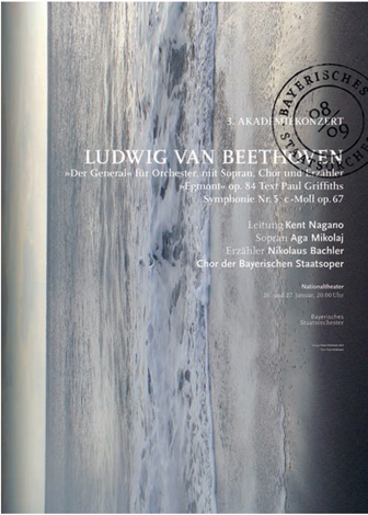
Fons Hickmann m23 use a serif typeface for the main heading in this poster—an appropriately restrained choice for a classicalmusic concert advertisement.
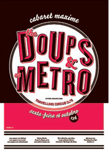
Eurico Sá Fernandes has chosen a display typeface to reflect the lively nature of a circus performance at a Lisbon night spot.
Type is used in almost all aspects of our daily lives. The list is constantly expanding as new uses, such as texting and smartphone apps, are developing at a rapid pace. These uses may be print-based (posters, leaflets, tickets, signage, board games, books, packaging, maps, instruction manuals, etc.) or screen-based (movie titles, websites, TV ads, computer games, cell phones, tablet computers, digital books, magazines and newspapers, etc.).
Context will influence the way that type is used. In the printed poster on the left, the way type has been applied would not transfer well into a website design, partly because of the portrait format of the poster but also because the capital letters would be more difficult to read on screen than on a billboard. However, it could work as an incrementally developing screen where the words fade in, giving the reader time to absorb them gradually. On the other hand, the series of website screenshots opposite exploit the possibilities inherent in this medium.
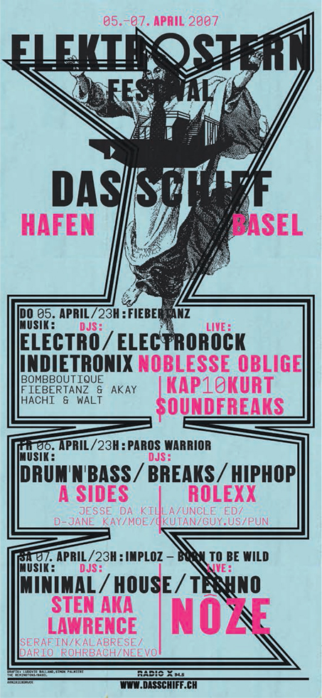
In this poster for a music festival, Ludovic Balland mainly uses type to communicate the message, but he also includes a strong frame to delineate the three days of the festival.
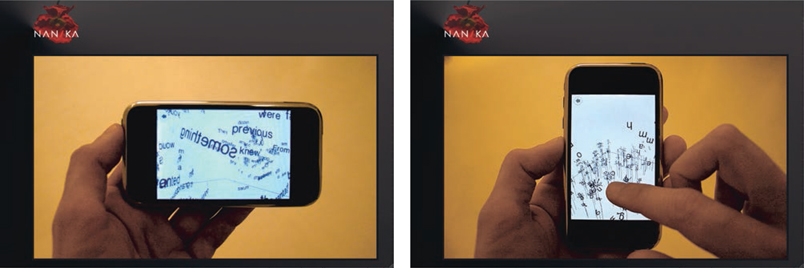
Nanika have used animated type on the iPhone platform.
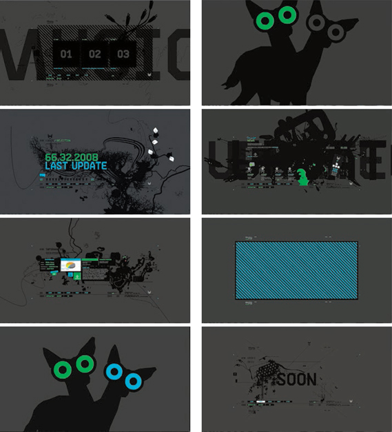
In this series of screenshots from Comandeer’s entertaining website, type and image have been used to provide a dynamic, nonlinear entry to the site.

This strong design has been produced in letterpress by Sebastien Carter of the Rampant Lions Press.