A2, A4, A5, etc.
ISO system of standardizing paper sizes, used in most countries except Canada and the United States. It begins with A0 (841 x 1189 mm). For each subsequent size the longer measurement is halved so A1 measures 594 x 841 mm. This continues to A10 (26 x 37 mm). The US system measures paper in inches; the standard letter size, equivalent to A4, is 8½ x 11 inches (216 x 279 mm). Other sizes in common use include legal (216 x 356 mm), executive (190 x 254 mm), and ledger/tabloid (279 x 432 mm).
Alignment
Whether text is vertically aligned left or right, justified, or centered (see also ranged left/right).
Appearing size
A term referring to the visual size of a typeface in relation to its x-height.
Ascender
The part of a letterform that projects above the x-height (see also descender).
Bar
The horizontal part of a letterform such as in the letter “e” or “A.”
Bas-relief
Elements carved, sculpted in low relief, or in some way raised from a flat background.
Baseline
The invisible line at the base of a line of text on which the letters sit.
Bleed (in layout)
The term used when a layout element runs offthe edge of a page or screen.
Body text or body type
Sections of text that are meant to be read, such as magazine articles or books (see also copy).
Bold
A letterform that is heavier/thicker in appearance than the ordinary/Roman form of the typeface.
Calligram
A section of text that is visually arranged to represent an idea or concept.
Calligraphy
Derived from the Greek for “beautiful writing,” calligraphy is a traditional method of producing letterforms by hand.
Capitals/caps
Letterforms that are of equal height, such as ABC (see also upper case).
Centered
When text is aligned in a symmetrical format based on the center of the column.
CMYK
Acronym for the colors Cyan (C), Magenta (M), Yellow (Y), and Black (K) that make up the four-color printing process.
Color
The density, lightness, or darkness of a block of text.
Column
A block of text that is organized in a vertical structure on the page.
Column measure
The width of a column of text.
Condensed
A letterform that is narrower than the ordinary/Roman version of the typeface.
Copy
Sections of text that are meant to be read, such as magazine articles or books (see also body text).
Counters/counterforms
The spaces left between or within shapes and forms, as in “O,” or partly enclosed, as in “E” (see also negative space).
Crosshead
See subheading.
Deboss
Where a design is stamped into the substrate, giving an indented effect.
Descender
The tail of a letterform that hangs below the baseline (see also ascender).
Die-cutting
Where a section of a design is cut out, often to reveal the material underneath, using a special metal form called a die.
Display typeface
A typeface that is designed to attract attention, usually used in larger sizes for small amounts of text such as titles and headlines rather than body text.
Double-page spread/dps
Two pages of a publication viewed adjacent to each other and in which the content is usually continuous.
dpi
Dots per inch—the closer together the dots, the more dots there are per inch, which results in higher quality.
Drop cap
When the first letter of a paragraph or section is larger than the body text and drops below the baseline.
Editorial
Refers to design that contains text for reading, such as newspapers, magazines, etc.
Em dash
A dash that is based on the width of the capital “M” in any size of type.
Emboss
Where a design is stamped into the reverse of the substrate, giving a raised or low-relief effect.
Emoticon
A symbol representing an emotion, such as :-) meaning a happy face.
En dash
A dash that is based on the width of the lowercase “n” or half an em dash in any size of type.
Expert set
A typeface that includes a set of letterforms/characters such as ligatures and fractions.
Family
A group of typefaces that are based on the same design, such as an italic and bold version of a Roman typeface.
Flatplan
A diagram of the pages of a publication laid flat, which is used by designers to help them work out how to arrange the various elements of the publication and provide an overview of the entire work.
Flowchart
A diagram showing the structure of a website or multimedia artifact.
Font
Originally the term (in Britain, fount) for a complete set, in one weight, style, and size, of characters such as letters, numbers, and punctuation marks for a particular typeface. It is now commonly used to refer to a typeface in one style or weight at any size.
Graphic elements/devices
Typographic items used in layout, such as arrows, exclamation marks, etc.
Grid
The underpinning structure for the page layout of most text-based design, usually made up of columns of text.
gsm
The weight of paper as represented in grams per square meter (gsm).
Hanging cap
When the first letter of a paragraph or section is larger than the body text, and sits outside the left-hand side of the column.
Headline
A typeface that is designed to attract attention, usually used in larger sizes for small amounts of text such as titles and headlines rather than body text (see also body text, display typeface).
Hierarchy
A system of prioritizing information to guide the reader or viewer.
Ideogram
Image or symbol used to represent a concept or action, conveying an abstract notion rather than a depiction of an object or person.
Imprint page
The page of a book that carries information about the author, publisher, publication date, copyright holders, etc.
Indent
To begin a line of text with a space, setting the line back slightly from the margin, such as at a new paragraph.
Initial cap
Signals a starting point to a section of text and helps draw the reader’s eye as it stands out from the body text (variations include drop caps and hanging caps).
Italic
A letterform that is more sloped in appearance than the Roman form of the typeface. It derives from cursive writing and in some countries is called Kursiv or Cursive (see also oblique, Roman, slant).
Justified
When text is aligned vertically to both left and right sides of a column.
Kerning
Adjusting the space between a pair of letterforms (see also letterspacing). Referred to as kerned pairs.
Format where the longest dimension is horizontal (see also portrait format).
Leading or linespacing
The space between lines of type from one baseline to the next.
Legibility
Defines whether characters or groups of characters are understandable and may be easily distinguished.
Letterpress/movable type/metal type
A method of relief printing where the letterforms are raised in metal or wood type to form an area for the ink to be applied before printing.
Letterspacing
The space between letterforms (see also kerning, tracking).
Ligature
Where two letterforms are conjoined to form a distinctive shape.
Line length
The width of a line of text.
Lino print
A method of printmaking where the areas not to be printed are cut out from the surface of the lino.
Logo
Shortened from logotype, a design developed from a company’s or institution’s name or emblem that forms its visual and/or corporate identity.
Lower case
Letterforms that are not capitals, such as abc. Called this because when type was set by hand, two cases were used, the one holding capitals arranged higher (upper) than the other, which held the small letters (lower).
Measure
The length of a line of text. In grids, the width of a column is referred to as column measure.
Negative space
The spaces left between or within shapes and forms (see also counters).
Oblique
A letterform that is more slanted in appearance than the Roman form of the typeface (see also italic, slant).
Ornaments
A typeface or section of a typeface that comprises decorative items and symbols—also called dingbats, printer’s flowers, or fleurons.
Outline
Where the contour of the letterform is outlined.
Pastiche
Reinterpreting historical styles and genres to support an idea.
Portable document format.
Pictogram
An image that represents an object or a person.
Points
A system for measuring a letterform.
Portrait format
Format where the longest dimension is vertical (see also landscape format).
ppi
Pixels per inch (ppi) is the measurement used for digital image resolution. Similar to dpi, the higher the ppi, the higher the resolution and quality.
Preflight
Checks and preparation before printing.
Pull quotes
A short section of text, a phrase, or quote, drawn out of an article in order to draw attention to the content.
Ranged left/right or ragged left/right
When a column of text is aligned vertically to the left- or right-hand side of the column.
Readability
How easy it is to read or understand a section of text.
Resolution: high, medium, low
The quality of the reproduction of an image, either for screen or print. High resolution means the image has higher definition and clarity for good-quality print-based work. Low resolution means an image will be less defined and therefore only suitable for use in screen-based work. In between is a range of resolutions suitable for different print processes. See also dpi, ppi.
Reversed out
Where text is lighter than the background.
RGB
Red Green Blue, the three colors that make up the digital color range.
Rivers
Formed when a series of large gaps between words appear above and below each other, linking together into a trickle-like pattern down the page.
Roman
The basic Latin letterform, ordinary, upright, and normal weight (for example not bold or italic).
Rules
Lines of various width, weight, and pattern.
Runaround
Where body text is wrapped around an item, also called text wrap.
Sans serif
Sans serif letterforms do not have small strokes at the ends of letterforms—hence “sans,” which means “without” (see also serif).
Screen print/silk-screen print
A method of printing where ink is pushed through a fine mesh (screen), to which a stencil has been attached, onto the surface to form the image.
Screen resolution
The quality of an image, its resolution, in terms of the number of visible dots or pixels per inch.
Script
A typeface that mimics calligraphic or handwritten shapes. The letters usually have a connecting stroke.
Serif
Serif typefaces are based on Roman incised lettering, which features small strokes at the ends of letterforms (see also sans serif).
Show-through
In print design, where the image and/ or text from the previous page is visible on the page being viewed.
Slab (block) serif
A serif that is pronounced and heavy in appearance.
Slant
A letterform that is more slanted in appearance than the Roman form of the typeface (see also italic, oblique).
Small caps
Smaller capital letterforms that are the size of the lowercase letters.
Spot color
Where a single (non-CMYK) color is used to highlight parts of a design.
Stem
The vertical strokes of a letterform.
Stock
Paper or other substrate.
Style sheet
Enables the designer to apply specific attributes, such as typeface or leading, to different sections of a document.
Subheading
A word or group of words that introduces a section of less importance than the title (see also crosshead, hierarchy).
Text linking/flowing/threading
The linkages between sections of text in a publication.
Thumbnails
Small sketches of design ideas.
Tracking
Adjusting the space between letterforms in a body of text (see also letterspacing).
Trapping
A method of compensating for the problem arising, in print, when a gap appears where two colors meet.
Typeface
A set of characters in a particular design.
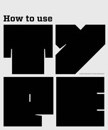
Typogram
Type used as a visual way of encapsulating an idea.
Upper case
Term for capital letters such as ABC.
White space
The area of a design that does not contain any elements (the space may not necessarily be white).
Wireframe
A diagram showing positioning of pages, information, and links, usually used in website design.
Woodcuts/woodblocks
A method of printing where the image is produced by carving into the surface of a woodblock, leaving a raised area that is inked.
Word spacing
The gap between words in a block of text.
x-height
The distance from the top of a lowercase “x” to its base.