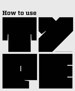
Unless you are providing a pdf (portable document format) where the typeface is embedded, you will need to make sure that the printer has access to the same typefaces as the ones used for your design.
When providing type as an object or image, such as a logotype, make sure that the resolution is appropriate to the print process. Software can be used to adjust resolution; the normal setting for high-quality publications is 300dpi.
Production for screen
There are certain key areas you will need to consider both when designing and handing over a Web or e-book project. For example, do you want your pages to resize automatically when users adjust the size of their browser window, or will page size be fixed? If you opt for a fluid layout, do you want all elements to be resizable? How will images and other graphics be affected? You also need to consider how your type design will react to users resizing text. Have you allowed enough vertical space for a larger type setting? How will text wrap at different size settings? Bear in mind that your choice of typeface for alterable text will generally be restricted to the standard typefaces supplied with users’ operating systems.
When handing your design over to a developer, make sure that your files are well organized, as the developer may be less familiar with the software than you are. For example, if you have been working in Adobe Photoshop, clearly group and label the layers for each page. To ensure colors reproduce as you intend them to, provide a reference that gives the RGB values of key colors. As with print production, it is better to specify too much than too little.
 | The resolution for images used on screen is usually 72dpi; larger files may cause problems as they will take longer to load and will also take up more memory than they need to. |
Legal issues and accessibility
It is important to be aware of copyright laws pertinent to the country or countries in which your work is to be published. This applies to content as well as typefaces and any images used.
It is also good practice to consider accessibility in your design. You will have seen statements on printed and screen-based design stating that there is a large-format version available for those with sight difficulties. Other accessibility issues include dyslexia and color blindness. Bear in mind that some countries have laws governing these issues.
Promotional brochure
by Mission Design, Norway
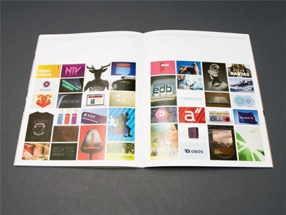
Mission Design’s philosophy is based on simplicity. In this brochure they explain their philosophy and the story behind the company. The brochure includes seven case studies illustrating some of the different challenges that clients have brought to the company.
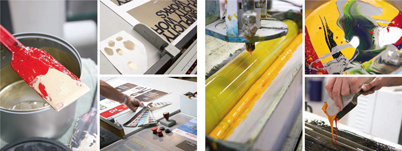
Color matching and mixing for the cover and interior, including the use of the PANTONE® matching system and testing the custom metallic ink.
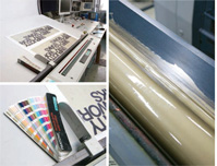
The proofing stage, where small adjustments are made to hue and contrast.
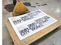
The outside cover printed and ready for trimming and finishing. Notice the crop marks to indicate folds and cuts. There are two covers on a sheet to maximize the standard printer’s paper size.
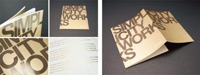
The finished brochure, which is 48 pages, perfect bound with custom metallic ink and spot UV varnish.