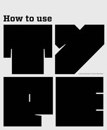
Chapter 5 : Color and movement
In this chapter we explore two key areas of type design: color and movement. Used imaginatively, color—of the type itself and its background—can add impact and meaning to your designs. We will discuss how to make the most of color—for example, to define hierarchy, to create balance or contrast, or to refer to the symbolic properties of certain shades. We will also look at some of the pitfalls to be avoided, such as incorporating illegible or unreadable color combinations.
Used in relation to type, the term movement can mean actual moving type, either through animation in screen-based work or by means of a mechanism to make physical, printed type alter in some way. We will consider both these aspects, as well as how to create the illusion of movement in a static piece of printed work.
There are many ways that you can use color to create impact with type and layout. Whichever you choose, remember that colors interact and react with each other: some work together, some fight each other and cancel each other out. Also, the background and any images have to be considered as they can affect the color/s used for the type.
The way that colors work together may also have an effect on legibility. This is not always a problem: sometimes designers choose to make legibility difficult in order to attract attention to the content or when using type as a graphic element in a design.
You do not need to use bright colors to catch the eye; a subtle but strong effect may be created using monochrome, particularly if there is contrast between sections and the range of tones is explored. This is apparent in the Reuben Rosh design (opposite left), in which he has used different tints of black to emphasize the interesting shapes that the letterforms make. He has used white, dark gray, and mid-gray on a pale gray background to good effect, leaving plenty of white (or, in this case, gray) space around the type, which allows the individual items to stand out.
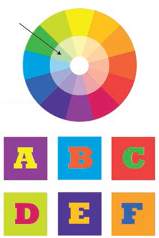
This color wheel is intended as a reference for the various topics covered in this chapter, such as tints and complementary opposites (colors located opposite each other on the wheel). The letter tiles underneath the wheel demonstrate combinations of complementary opposites.
Stefan Lucut and Ravi Vasavan have combined strong, bright colors, which results in a striking design. The type is quite difficult to make out, but this challenge to the viewer creates visual impact.
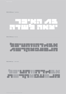
This design by Reuben Rosh demonstrates a stylish approach to the use of grayscale or monochrome.
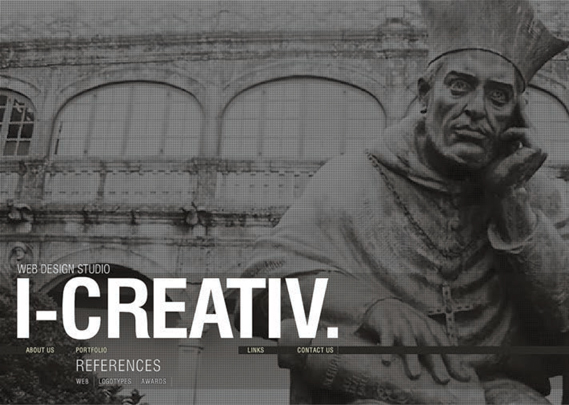
This website, designed by Yohannes Artinyan of i-creativ, uses a monochrome background image overlaid with simple white and gray type to create a sophisticated, understated look.
With the affordability and availability of full-color printing, it is tempting to make use of the full color palette on offer but, as shown in these examples, a more limited palette can make designs stand out from the crowd.
The addition of a single color to an otherwise grayscale layout can produce a dramatic effect. In the past, many designers used single color because full-color printing was expensive but, as previously discussed, this is no longer the case. Therefore, with full-color printing on display everywhere, grayscale plus a color can make a design more noticeable. Single color may take the form of a spot color, which is used to highlight or emphasize items or areas of a design, or to provide a link between elements of the design. This is often seen in magazine design where a color is selected from an image and used for the title or other text on the page, providing cohesion and helping the reader navigate the information.
Full color may be ubiquitous but it can still create impact if used well. The combination of colors and the relationship between type, image, and background color can make all the difference. Strong color combinations such as complementary opposites or discordant pairs can create visual disturbance that brings the content out of the page or site. This is also discussed in the section on color in relation to hierarchy later in this chapter (see page 128).
 | If color theory is not your strong point, there are tools in some software packages, such as Adobe Illustrator, that give you menus to help you select color combinations. There are also many books and websites that provide useful information on color. |
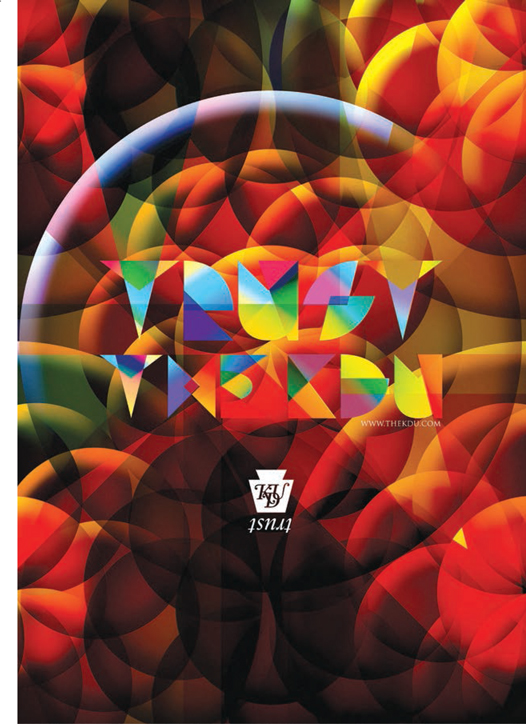
In this powerful poster and editorial design by Trapped in Suburbia, the strong pink would not stand out quite as much if it were not juxtaposed with the turquoise and bright green, because this combination is discordant.
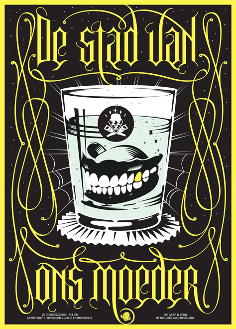
This typically quirky design from Attak uses the same color for the type and swashes as for the gold tooth in the dentures.
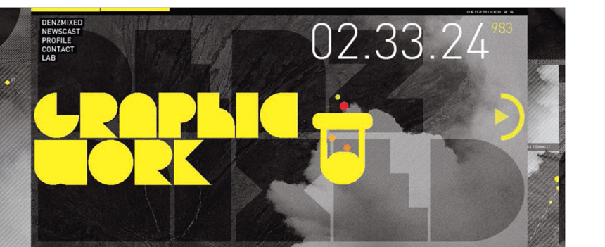
Denzmixed have used yellow to highlight type on a complex monochrome background in this website design.
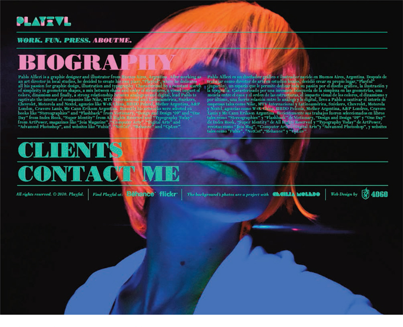
Pablo Alfieri of Playful has used powerful color combinations in the design of his website. The background image itself is made up of strong colors that he has overlaid with bright pink and green text to produce a lively, inviting design.
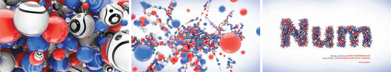
This animated sequence by Andrey Nepomnyaschev uses two primary colors with monochrome black and white, which gives the design a clean, consistent appearance.
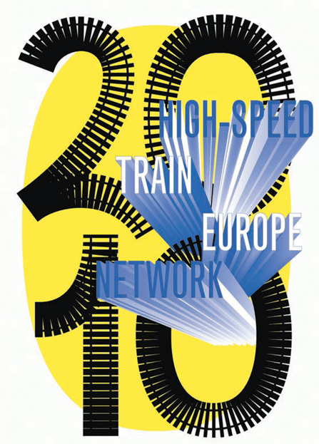
Côme de Bouchony used tints to indicate distance and speed on this poster.

YuHan Keng used tints as a decorative element in this design for online publication -11magazine.
Ambush have used a semitransparent box over a strong background image to make the block of type legible.
Oguzhan Ocalan has experimented with overlaying tints on a bright yellow background to create this powerful poster.
A tint is a color with white added to make it lighter. Although the term derives from printing, the principle is the same in screen-based work, except that the lightening in tone is created by increasing the proportion of white light rather than white ink.
As we have mentioned before, tints are useful for differentiating areas of a design. For example, a tint may provide the background or the border for a box containing an extra or distinct piece of information.
Tints may be used for the type itself or as a background to the type, as in tables. Tints are usually represented as a percentage of the original color (where 100% is the full value of the original color and 0% is white) and most software programs will allow you to adjust these values easily.
Tints may be used to produce gradual changes from one color to another or from a color to white or black, either for the type itself or for the background. They are also used to separate a section of type from a background image—this is seen both in print and on screen where a color is made semitransparent in order to make the type legible over a strong or complicated image.
 | Pitfall: Be careful that your tints don’t merge with the full color used; for example, yellow type on a medium tint of yellow would be difficult to identify and read. |
| When designing for print, take into account the color, absorbency, and texture of the paper stock, as this can change the appearance of a tint. This is an area, however, in which it is interesting to experiment. |
As well as aiding navigation and legibility, tints can be used creatively as decorative elements. A word could be produced in different tints to create a pattern, or the counters of letterforms could be filled with a tint of the color used for the letters themselves.

Dimitris Kanellopoulos has used a gradient from black to bright pink, which reinforces the image of the lightbulb and creates a dark background for the reversed-out text.
Erretres chose a strong-colored background stock here, which changes the appearance of the black text and images.
Using color to create hierarchy
Layering of information is usually referred to as hierarchy (see page 84). Color is a useful tool for creating hierarchy both in print and on screen. One simple method, using tints, is to set the least important information in a light tint, working up in tone to the most important information in a dark tint. You could also use a strong, bright color, such as shocking pink, to attract attention to a title or a key word or phrase within the body text. The reverse may also work, where a muted color stands out from a strong, boldly colored section of text or design. Contrasting colors can be effective. They can make something stand out or, if they are complementary opposites, they may react with each other, causing the interface between the two colors to seem to vibrate. This can be effective in creating hierarchy by drawing the eye to a specific area of the design. This technique is often used in packaging—of cleaning products, for example. The same jarring effect can be achieved using discordant colors.
| Pitfall: Take care when using complementary opposites, such as red and green, as they can cause problems for some types of color blindness and vision problems. |
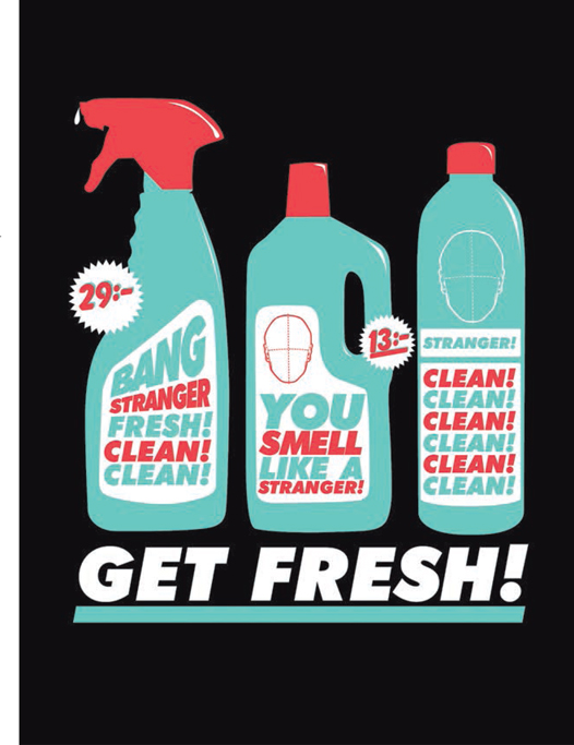
Nils Carlson has used the metaphor of cleaning products for this design; the link is made immediately clear to the viewer through the recreation of the bright contrasting colors associated with the packaging for this category of product.

The use of a strong shade of pink for the type on a light pink background makes for a striking brochure design by Karol Gadzala.
This detail of a poster by Letman demonstrates effective use of two
In color, as in other aspects of type design, the opposite of contrast and discord is harmony. Harmonious colors can also help create emphasis or priority of information but in a more subtle, restrained manner appropriate to subject matter, such as medical packaging or information. However, going against the grain and using harmonious colors for a product that is usually associated with contrasting, bold color combinations can make your design stand out from its rivals.
Select a pair of antonyms, such as “war” and “peace” or “quick” and “slow.” Render these as a tabloid-size poster, employing color to indicate the difference between the words. For example, “war” might be red and “peace” might be pale gray on a black background.

In this poster Jean-Benoît Lévy uses red type to help distinguish the word “war” from the other text, to provide a contrast and emphasize meaning.
It is almost impossible to avoid associating colors with meanings, and it is important to consider these connotations in relation to the context or subject matter of the design. One obvious link is between color and temperature: as shown on the color wheel on page 122, we think of reds and oranges as “warm” colors and blues and purples as “cold” colors. Of course, there are many other links—red as a symbol of danger or warning, black as the color of mourning. However, if you are designing for an international audience, bear in mind that color symbolism may differ between cultures. For example, in China red is associated with good fortune not danger, and the color of mourning is white not black. Regional differences aside, these allusions can help direct the reader/viewer and also convey the context or feel for the design. If your design relates to a hot climate, the obvious color choice would be within the warm range, but if you wanted to create contrast or impact, you might choose colors from the cooler range. Interestingly, placing warm colors near cool colors can make the warm color appear warmer and vice versa.
Certain colors have specific associations, which you may choose to draw on to convey your message. In designing promotional material for an ecologically concerned organization, the use of colors associated with nature or the earth, such as greens and browns, may help to support the communication. However, as mentioned before, sometimes the unexpected will help to reinforce the message, so you should experiment with the full range of colors before settling on an obvious choice.

Martin Woodtli has used warm and cool colors and a painterly style to create contrast for this poster design.
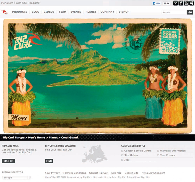
Philippe Sain uses an “ecological” color palette for this website for a coral-reef conservation project sponsored by Rip Curl Europe’s Planet department.
Technical issues relating to color
Production issues will be covered in depth in chapter 7, but it is worth mentioning here some of the considerations that relate specifically to color. Color in print, for example, is reproduced differently from that on screen. In print it is usually produced using the four process color inks, cyan, magenta, yellow, and black (CMYK), whereas color for screen is produced from red, green, and blue (RGB) light. When designing on screen for print, be aware that certain colors visible on screen may not be replicable in CMYK. This is why checking color reproduction on a printed proof and making any necessary adjustments before signing offfor printing is so important. Also remember that different screens display color differently—an important consideration whether you are designing for print or for screen.
| Pitfall: Bear in mind the possible cumulative effect of certain combinations. For example, printing a fine serif typeface in a pale color on an absorbent stock could result in loss of detail and the type becoming unreadable. |
You can select specific colors to be printed either as spot colors or as an extra color in addition to those reproduced as part of the CMYK printing process. Spot colors are specified by color reference systems, such as PANTONE®. Find the exact color you want in a swatch book, then quote its reference code to the printer or reproduction house. Spot colors are often used for company logos and identity systems. There are also various special finishes and inks, such as varnishes and metallics, which can affect the way a color appears but which also may be treated as a color. An example of this is the metallic gold lettering often used for paperback book titles.
When considering how color will print on your finished design, bear in mind that the stock can affect the depth of color. If the stock is very absorbent, for example, the color may appear less bright. The PANTONE® system shows how colors appear on different stocks, and so will help you avoid disappointing results.
A metallic finish gives impact to this design by Zion Graphics.
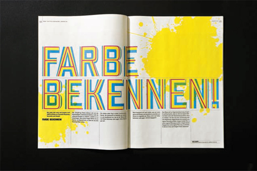
Andreas Hidber has used the four process colors in their pure form to illustrate the title “Farbe Bekennen!”, meaning “Show your colors!” or figuratively “Come clean!”.
Although the term “movement” used in relation to type suggests actual moving type of the kind often found in multimedia, Web-, or screen-based design, the illusion of movement is often created in print typography using all manner of techniques, including basic flip books, blurring effects, and by the typeface design itself.
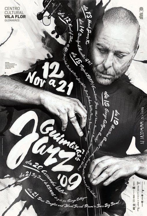
In Atelier Martino&Jaña’s expressive poster the type suggests the movement and rhythm to be experienced at a jazz festival.
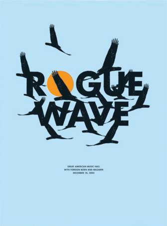
This poster by Small Stakes suggests movement by integrating the silhouettes of the birds with the black type.
Although most animations are now produced digitally, this used to be a largely paper-based technology, involving the painstaking sequencing of hundreds or thousands of minutely different drawings. Flip books are a relatively simple way of producing a paper animation by placing a series of pictures on each page of a book that change gradually from the first to last page. As the pages are flicked through, the images appear to move.
Animated type on screen
Flip books are one of the simplest methods of simulating movement; more complex methods are used in traditional cell animation and movie titles. More recently, sophisticated software has enabled designers to experiment with moving type for a range of screen-based contexts, from smartphone apps to TV ads. Although the production of moving type often entails the acquisition of specialist technical or software skills, the type designer’s basic principles of legibility and readability should not be forgotten.
The most straightforward approach to moving type is scrolling, which involves type gradually moving up, down, or across the screen, as commonly seen in movie and TV titles and website banners. This method is still used extensively in movie credits, but many people don’t tend to see these as they either turn offthe TV or leave the theater as soon as the action has finished. Perhaps to maintain audience interest, more complex animations have now been developed where the letterforms are manipulated— to appear from the background, for example, or to fade in and out, or move around the screen. Such animations often incorporate images or may even form part of an animated image. Early examples were hand produced, whereas nowadays they tend to be created digitally. In character animation, such as Nick Park’s Creature Comforts which are hand modeled and use stop-frame animation rather than computer-generated imagery (CGI), traditional techniques give a different feel to the animation. Compare Saul Bass’s animated title sequence for The Man with the Golden Arm with the CGI titles for, say, Fantastic Four: the former has a more tactile, immediate quality, whereas the latter has a slicker, more artificial feel.
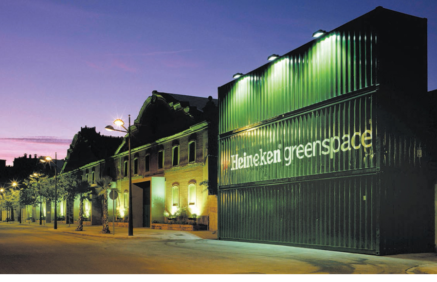
In some cases the type is stationary but the camera moves to give the effect of the type being part of a landscape or a structure. In other cases animated type is projected onto static objects or surfaces, such as buildings, to change appearance or attract attention. This technique is often seen in art and design installations.
Activity
Choose a word (a relatively long one works best). Put one letter of the word on a sheet of paper, then design a series of pages that reveal the word by one letter per page, ending up with the full word on the last page. Make sure that the letters are in the same position on each page. Fasten the pages together along the spine and then flick through them to see the word gradually materialize. It is best to use a semitransparent paper such as layout paper or photocopying paper, so that you can trace the letters onto each page.

A simple flip book in action.
Melvin Galapon has used a digitized version of the flip-book technique for this series of animated postcards.
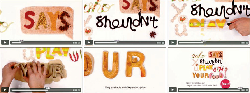
Blac Ionica have used stop-frame animation to produce this short film advertising a television food channel.
Moving type is often included in website design, either as part of the main screen or as a separate “pop-up,” to enable more information to be delivered in a small space. Apps are another vehicle for this sort of animation, to be found, for example, in the pop-up advertisements that often accompany free downloads. This is similar to the small ads that scroll across the edge of the pages in some online newspapers and magazines.
Animated versions of logos are generated for multimedia applications and TV ads to create impact. An example is the animated cartoon letterforms used for products aimed at children.
Sophisticated software, and powerful delivery platforms such as smartphones, have enabled designers and artists to realize their most experimental and creative ideas. Type can become part of a virtual reality, letterforms can seamlessly morph into the most unlikely objects— imagination is the only limitation.
Although this poster by Jonathan Arundel is not animated, its high-gloss finish means that reflections of people moving past it will cause the surface to be constantly changing.
Ellen Zhao has introduced an animated element to this printed booklet to give it an interactive, lively feel.
In this use of type in the environment, Small have optimized the corrugated surface to give an impression of movement as the viewer passes by.
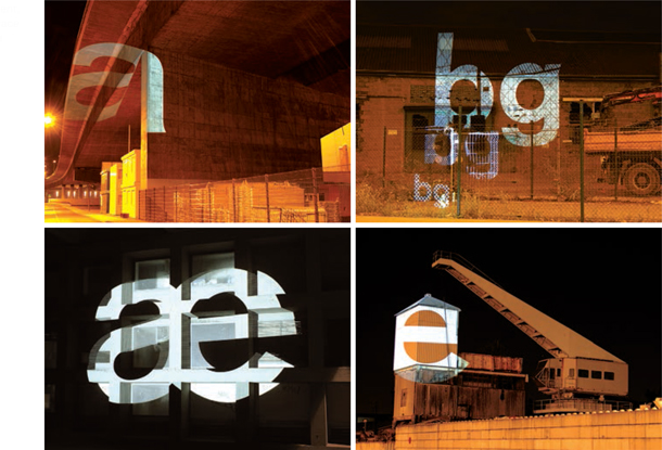
These images show examples from Tobias Battenberg’s project projecting letterforms in Akzidenz Grotesk typeface onto structures in the urban landscape.
Todd Smith animated the MTV logo using a plastic craft system that would be familiar to many children.
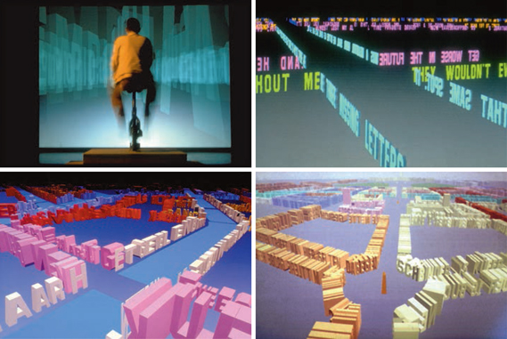
This early example of virtual animation from the late 1980s–early 1990s, Legible Cities by Jeffrey Shaw, uses type as virtual three-dimensional architecture, which the viewer explores by pedaling on a static bicycle in the real world.
d.kele has produced this innovative design in which freeborders hold up various shapes, including letterforms, made out of illuminated tubes.

Brent Barson’s multimedia project “F is for Fail” uses the alphabet to produce a typographic representation of a person’s creative process.
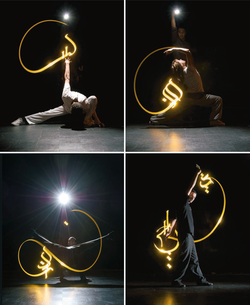
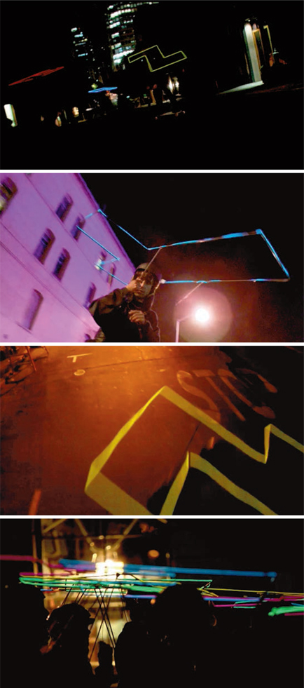
Julien Breton uses moving light to produce these Arabic letterforms.
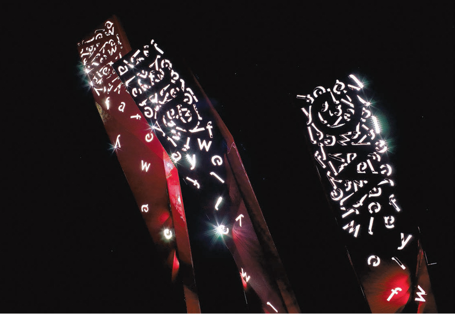

The letterforms covering this sculpture by Sanjeev Shankar come to life when illuminated at night.
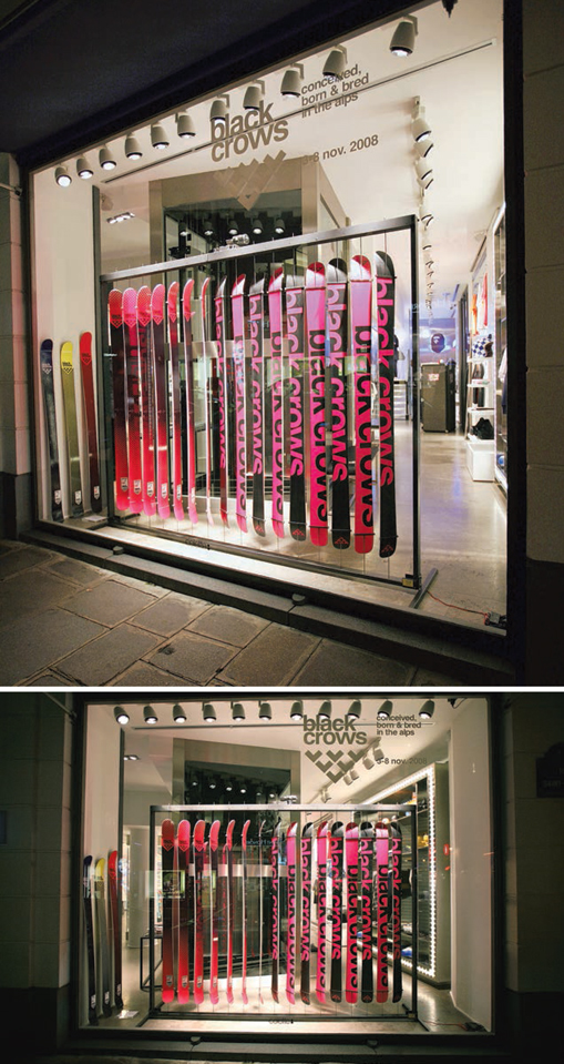
Yorgo Tloupas has adapted the rotating mechanism of airport departure boards for use with skis to attract attention to this window display.
Issues associated with moving type
There are particular considerations in relation to legibility and readability associated with moving type. Flickering screens or lights may be particularly challenging for people with vision problems. Color blindness affects many people and may be relevant to your design, especially if it is conveying important information such as a warning. As with any design, it is important to understand the needs of your audience, and appreciate social and ethical issues, at the same time as developing a creative and/or experimental design. It is up to you to decide which techniques are appropriate to the content and avoid using something just because you can. If moving type is overused it can be distracting and, in the case of website design, can cause delay in pages opening, leading to frustration and the risk of the audience moving elsewhere. Having said this, moving type has exciting potential for attracting an audience and conveying information quickly and effectively.
Transitions
Building a transition—from one piece of text to another, or from an image to a piece of text or vice versa—is a useful way to draw attention to a design. The technique can add humor, impart a meaning, establish emphasis or hierarchy, rhythm or repetition. It can also work with a narrative, such as in cartoons, or act as a counterpoint to a narrative. Low-tech contexts for transitional type include flick billboards and airport information signage. More advanced examples include LED grids that light up according to the information required—often used for announcements in railroad stations.
There are many examples of built-in facilities and tools for making transitions, such as those available in Microsoft’s Powerpoint presentation package.
| Pitfall: When using effects and styles built into software, stand back and consider your motives. Does the effect contribute to your message, or does it just show that you know how to do it? Does it add to or detract from the overall impact of your design? |
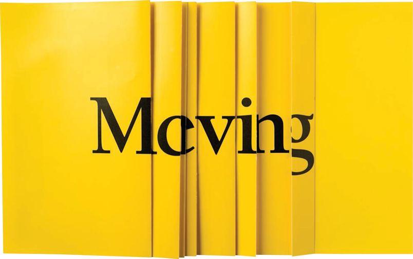
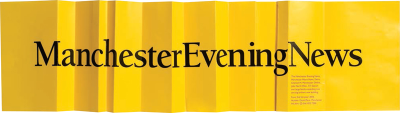
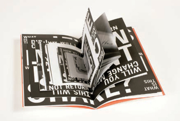
This change-of-address mailout card by The Chase uses an ingenious transition and folding arrangement to communicate the message that the Manchester Evening News headquarters is moving and expanding.

In this experimental piece, Andrew van der Merwe allows time and the elements to change his original type design.

Livius Dietzel applies type to fruit and records the effects as the fruit decays in this time-lapse-inspired project.
Static but changing
You can achieve innovative, meaningful effects by placing static type in a setting where it will be affected by physical processes such as erosion, precipitation, or decay. By filming or photographing the type over time, you can record the changes that it undergoes for use in print or multimedia applications. This technique is particularly useful for conveying abstract themes such as space, time, or impermanence.
At the beginning of this chapter there is a good example by Áron Jancscó of type being used to imply movement (see page 120). The type is used to represent a moving object as well as the effect of movement. This can be a way of conveying meaning, giving life to a design, directing the viewer, or even making a transition. Creating an illusion like this provides an ideal opportunity for experimentation —for example, with combinations of typefaces, point sizes, and type families.
Viewpoint
Movement can be created or implied in static type by the way the type is positioned in relation to the audience’s viewpoint. This technique may be used in signage and billboards where the spectator is transient or the signage is in an unusual position in relation to the spectator. The type may be on a moving object such as the side of a truck. Sometimes a series of posters or similar are designed to be viewed sequentially by a moving audience, almost like a simple animation. An example of this would be a series of posters running along an escalator shaft, where the message is conveyed through viewing the entire sequence. Another way of implying movement is by altering a poster over a series of weeks or an ad in a magazine over successive pages or issues. There are many opportunities for using viewpoint creatively; experiment with as many possibilities as you can think of. These techniques may be used to create different effects such as surprise, shock, or a sense of complicity—the audience may feel privileged to be in on the game and enjoy monitoring the gradual revelation of meaning.
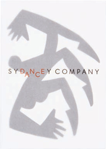
Frost Design have used a light typeface and arranged the letterforms to reinforce the movement associated with dance.
Activity
Choose three words associated with movement in some way (we’ve used “elastic,” “zip,” and “wriggle”) and experiment with producing them in a range of typefaces, families, and sizes to help reinforce the movement implied by the word.
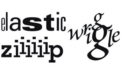
These experiments show the use of different typefaces, family members, and sizes to help reinforce the words’ meanings. Memphis has been used for “zip” because its slab serifs suggest the interlocking parts of a zipper; Univers has been chosen for “elastic” because its extensive family allows experimentation with width to indicate stretch; Brioso has been selected for “wriggle” because of the fluidity of its italic form, which is evocative of wriggling.
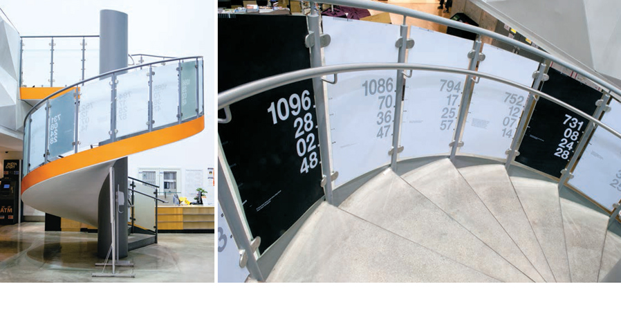
In this installation Moshik Nadav has devised a spiral timeline associated with the kidnapping of Israeli soldier Gilad Shalit in 2006. Each poster records a separate event in terms of the number of days, hours, minutes, and seconds into Shalit’s captivity that the event took place. The posters are arranged in chronological order as the viewer ascends the staircase.
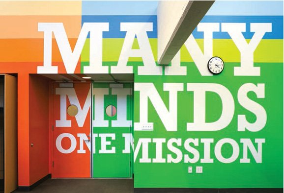
The words in this design by Pentagram seem to surge out from the doorway as viewers approach. This sense of thrust and energy works well for an inspirational motto in a New York school.
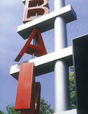
This rotating sign by Pentagram is viewed differently depending on whether it is seen from immediately below or from a distance.
Jesus Iso
by Thomas Pavitte, Melbourne
This typography project by Thomas Pavitte involved experimenting with 3-D using Google Sketchup. In the first stage Thomas created vector shapes in Adobe Illustrator using the letters of his name. He exported them into Sketchup and extruded the shapes.
After these initial experiments Thomas began work on a bigger project, Jesus Iso, which was based on the lyrics of the song “Jesus Etc.” by Wilco. The lyrics refer to tall buildings, and Thomas responded by developing his letterforms to resemble buildings in a futuristic cityscape.
Thomas took an organic approach to the design, allowing the typeface to evolve in response to the shapes and images conjured up by the lyrics. He didn’t want any spaces between letters or words, so individual letterforms needed several alternative shapes to allow them to fit together.
Each letterform was extruded individually in Google Sketchup, which enabled Thomas to vary the height of each shape. To maximize the contrast between the letterforms, he tried to place taller shapes next to smaller ones.
This design was exported back to Illustrator and converted to vector format for completion. Thomas created several layers so that he could change sections of the same color easily.
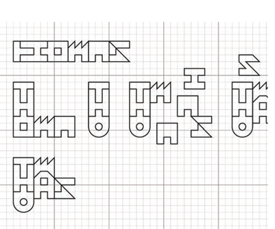
Preliminary sketches and experiments with letterforms.

Initial extruded shapes in Google Sketchup.
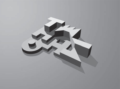
The extrusions were exported back into Illustrator and refined.
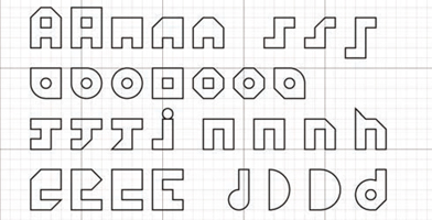
Variations on individual letterforms.

Thomas used a grid to help draw the letterforms for the phrase “Jesus don’t cry.”
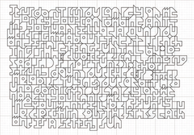
Completed text in 2-D, which was intended to give the impression of organized chaos.
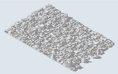
An isometric view of the words in Google Sketchup before adding color.

The finished piece creates an abstract pattern based on 3-D letterforms.
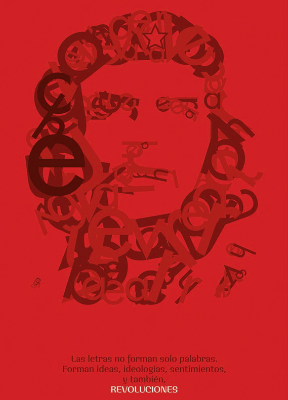
Colorless created this portrait of Che Guevara using nothing but type.