
Chapter 3: Data Analysis on Streaming Data
Now that you have seen an introduction to streaming data and streaming use cases, as well as an introduction to streaming architecture, it is time to enter into the core of this book: analytics and machine learning.
As you probably know, descriptive statistics and data analysis are the entry points into machine learning, but they are also often used as a standalone use case. In this chapter, you will first discover descriptive statistics from a traditional statistics viewpoint. Some parts of traditional statistics focus on making correct estimations of descriptive statistics when only part of the data is available.
In streaming, you will encounter such problems in an even more impacting manner than in batch data. Through a continuous data collection process, your descriptive statistics will continue changing on every new data point. This chapter will propose some solutions for dealing with this.
You will also build a data visualization based on those descriptive statistics. After all, the human brain is wired in such a way that visual presentations are much easier to read than data matrices. Data visualization is an important tool to master and comes with some additional reflections to take into account when working on streaming data.
The chapter will conclude with a short introduction to statistical process control. This subdomain of statistics focuses on analyzing a continuous stream of measurements. Although streaming analytics was not yet a thing when process control was invented, it became a new, important use case for those analytical methods.
This chapter covers the following topics:
- Descriptive statistics on streaming data
- Introduction to sampling theory
- Overview of the main descriptive statistics
- Real-time visualizations
- Basic alerting systems
Technical requirements
You can find all the code for this book on GitHub at the following link: https://github.com/PacktPublishing/Machine-Learning-for-Streaming-Data-with-Python. If you are not yet familiar with Git and GitHub, the easiest way to download the notebooks and code samples is the following:
- Go to the link of the repository.
- Click the green Code button.
- Select Download ZIP.
When you download the ZIP file, unzip it in your local environment and you will be able to access the code through your preferred Python editor.
Python environment
To follow along with this book, you can download the code in the repository and execute it using your preferred Python editor.
If you are not yet familiar with Python environments, I would advise you to check out Anaconda (https://www.anaconda.com/products/individual), which comes with Jupyter Notebook and JupyterLab, which are both great for executing notebooks. It also comes with Spyder and VSCode for editing scripts and programs.
If you have difficulty installing Python or the associated programs on your machine, you can check out Google Colab (https://colab.research.google.com/) or Kaggle Notebooks (https://www.kaggle.com/code), which both allow you to run Python code in online notebooks for free, without any setup to do.
Note
The code in the book will generally use Colab and Kaggle Notebooks with Python version 3.7.13 and you can set up your own environment to mimic this.
Descriptive statistics on streaming data
Computing descriptive statistics is generally one of the first things covered in statistics and data analytics courses. Descriptive statistics are measurements that data practitioners are very familiar with, as they allow you to summarize a dataset in a small set of indicators.
Why are descriptive statistics different on streaming data?
On regular datasets, you can use almost any statistical software to easily obtain descriptive statistics using well-known formulas. On streaming datasets, unfortunately, this is much less obvious.
The problem with applying descriptive statistics on streaming data is that the formulas are made for finding fixed measurements. In streaming data, you continue to receive new data, which unfortunately may alter your values. When you do not have all the data of a variable, you cannot be certain about its value. In the following section, you will get an introduction to sampling theory, the domain that deals with estimating parameters from data samples.
Introduction to sampling theory
Before diving into descriptive statistics in streaming data, it is important to understand the basics of descriptive statistics in regular data. The domain that deals with the estimation of descriptive statistics using samples of the data is called sampling theory.
Comparing population and sample
In regular statistics, the concept of population and sample is very important. Let's have a look at the definitions before diving into it further:
- Individual: Individuals are the individual objects or people that are included in a study. If your study looks at products on a production line and you measure the characteristics of a product, then the individual is the product. If you are doing a study on website sales and you track data on each website visitor, then your individual is the website visitor.
- Population: A statistical population is generally defined as the pool of individuals from which a sample is drawn. The population contains any individual that would theoretically qualify to participate in a study. In the production line example, the population would be all the products. In the website example, the population would be all the website visitors.
- Sample: A sample is defined as a subset of the population on which you are going to execute your study. In most statistical studies, you work with a sample; you do not have data on all possible individuals in the world, but rather, you have a subset, which you hope is large enough. There are numerous statistical tools that help you to decide whether this is the case.
Population parameters and sample statistics
When computing descriptive statistics on a sample, they are called sample statistics. Sample statistics are based on a sample, and although they are generally reliable estimates of the population, they are not perfect about the population.
For the population, the term used is population parameters. They are accurate, and there is no measurement error here. However, they are, in most cases, impossible to measure, as you'll never have enough time and money to measure every individual in the population.
Sample statistics allow you to estimate population parameters.
Sampling distribution
The sampling distribution is the distribution of the statistics. Imagine that a population of website customers spends, on average, 300 seconds (5 minutes) on your website. If you were drawing 100 random samples of your website visitors, and you computed the mean of each of those samples, you'd probably end up with 100 different estimates.
The distribution of those estimates is called the sampling distribution. It will follow a normal distribution in which the mean should be relatively close to the population mean. The standard deviation of the sampling distribution is called the standard error. The standard error is used to estimate the stability or representativeness of your samples.
Sample size calculations and confidence level
In traditional statistics, sample size calculations can be used to define the number of elements that you need to have in a sample for the sample to be reliable. You need to define a confidence level and a sample size calculation formula for your specific statistic. Together, they will allow you to identify the sample size needed for reliably estimating your population parameters using sample statistics.
Rolling descriptive statistics from streaming
In streaming analytics, you will have more and more data as time goes on. It would be possible to recompute the overall statistics at the reception of a new data point. At some point, new data points will have very little impact compared to a large number of data points in the past. If a change occurs in the stream, it will take time for this change to be reflected in the descriptive statistic, and this is, therefore, not generally the best approach.
The general approach for descriptive statistics on streaming data is to use a rolling window for computing and recomputing the descriptive statistics. Once you have decided on a definition of your window, you compute the statistics for all observations that are in your window.
An example can be to choose a window of the last 25 products. This way, every time a new product measurement comes into your analytical application, you compute the average of this product together with the 24 preceding products.
The more observations you have in your window, the less impact your last observation has. This can be great if you want to avoid false alarms, but it can be dangerous if you need every single product to be perfect. Choosing small numbers of individuals in your window will make your descriptive statistics vary heavily if a variation is present in your descriptive statistics.
Tuning the window period is a good exercise to do when trying to fine-tune your descriptive statistics. By trying out different approaches, you can find the method that works best for your use case.
Exponential weight
Another tool that you can use for fine-tuning your descriptive statistics on streaming data is exponential weighting. Exponential weighting puts exponentially more weight on recent observations and less on past observations. This allows you to take in more historical observations without affecting the importance of recent observations.
Tracking convergence as an additional KPI
When tracking descriptive statistics on a stream of data, it is a possibility to report multiple time windows of your measurements. For example, you could build a dashboard that informs your clients of the averages of the day, but at the same time, you can report the averages of the last hour and the averages of the last 15 minutes.
By doing this, you may, for example, give your client the information that the day and hour went well in general (day and hour averages are according to specification), but in the last 15 minutes, your product starts to present problems, and the last 15 minutes' average is not according to specification. With this information, the operators can intervene quickly and stop or change the process according to their needs, without having to worry about the production earlier on in the day.
Overview of the main descriptive statistics
Let's now have a look at the most used descriptive statistics and see how you can adapt them to use a rolling window on any data stream. Of course, as you have seen in the previous chapter, streaming analytics can be executed on a multitude of tools. The important takeaway is to understand which descriptive analytics to use and to have a basis that can be adapted to different streaming input tools.
The mean
The first descriptive statistic that will be covered is the mean. The mean is the most commonly used measure of centrality.
Interpretation and use
Together with other measures of centrality, such as the median and the mode, its goal is to describe the center of the distribution of a variable. If the distribution is perfectly symmetrical, the mean, median, and mode will be equal. If there is a skewed distribution, the mean will be affected by the outliers and move in the direction of the skew or the outliers.
Formula
The formula for the sample mean is the following:

In this formula, n is the sample size and x is the value of the variable in the sample.
Code
There are many Python functions that you can use for the mean. One of those is the numpy function called mean. You can see an example of it used here:
Code block 3-1
values = [10,8,12,11,7,10,8,9,12,11,10]
import numpy as np
np.mean(values)
You should obtain a result of 9.8181.
The median
The median is the second measure of the centrality of a variable or a distribution.
Interpretation and use
Like the mean, the median is used to indicate the center. However, a difference from the mean is that the median is not sensitive to outliers and is much less sensitive to skewed distributions.
An example where this is important is when studying the salaries of a country's population. Salaries are known to follow a strongly skewed distribution. Most people make between a minimum wage and an average wage. Few people make very high amounts of money. When computing the mean, it will be too high to represent the overall population, as it gets boosted upward by the high earners. Using the median is more sensible as it will more closely represent a lot of people.
The median represents the point where 50% of the people will earn less than this amount and 50% will earn more than this amount.
Formula
The formula for the median is relatively complex to read, as it does not work with the actual values, but rather, it takes the middle value after ordering all the values from low to high. If there is an even number of values, there is no middle, so it will take the average of the two middle values:

Here, x is an ordered list and the brackets indicate indexing on this list.
Code
You can compute the median as follows:
Code block 3-2
values = [10,8,12,11,7,10,8,9,12,11,10]
import numpy as np
np.median(values)
The result of this computation should be 10.
The mode
The mode is the third commonly used measure of centrality in descriptive statistics. This section will explain its use and implementation in Python.
Interpretation and use
The mode represents the value that was present the most often in the data. If you have a continuous (numeric) variable, then you generally create bins to regroup your data before computing the mode. This way, you can make sure that it is representative.
Formula
The easiest way to find the mode is to count the number of occurrences per group or per value and take the value with the highest occurrences as the mode. This will work for categorical as well as numerical variables.
Code
You can use the following code to find the mode in Python:
Code block 3-3
values = [10,8,12,11,7,10,8,9,12,11,10]
import statistics
statistics.mode(values)
The obtained result should be 10.
Standard deviation
You will now see a number of descriptive statistics for variability, starting with the standard deviation.
Interpretation and use
The standard deviation is a commonly used measure for variability. Measures for variability show the spread around the center that is present in your data. For example, where the mean can indicate the average salary of your population, it does not tell you whether everyone is close to this value or whether everyone is very far away. Measures of variability allow you to obtain this information.
Formula
The sample standard deviation can be computed as follows:

Code
You can compute the sample standard deviation as follows:
Code block 3-4
values = [10,8,12,11,7,10,8,9,12,11,10]
import numpy as np
np.std(values, ddof=1)
You should obtain a result of 1.66.
Variance
The variance is another measure of variability, and it is closely related to the standard deviation. Let's see how it works.
Interpretation and use
The variance is simply the square of the standard deviation. It is sometimes easier to work with the formula of variance, as it does not involve taking the square root. It is, therefore, easier to handle in some mathematical operations. The standard deviation is generally easier to use for interpretation.
Formula
The formula for variance is the following:

Code
You can use the following code for computing the sample variance:
Code block 3-5
values = [10,8,12,11,7,10,8,9,12,11,10]
import numpy as np
np.var(values, ddof=1)
The obtained result should be 2.76.
Quartiles and interquartile range
The third measure of variability that will be covered is the interquartile range (IQR). This will conclude the statistics for describing variability.
Interpretation and use
The IQR is a measure that is related to the median in some way. If you remember, the median is the point where 50% of the values are lower than it and 50% of the values are higher; it is really a middle point.
The same can be done with a 25/75% split instead of a 50/50% split. In that case, they are called quartiles. By computing the first quartile (25% is lower and 75% is higher) and the third quartile (75% is lower and 25% is higher), you can get an idea of the variability of your data as well. The difference between the third quartile and the first quartile is called the IQR.
Formula
The formula for the IQR is simply the difference between the third and first quartiles, as follows:

Code
You can use the following Python code to compute the IQR:
Code block 3-6
values = [10,8,12,11,7,10,8,9,12,11,10]
import scipy.stats
scipy.stats.iqr(values)
You should find an IQR of 2.5.
Correlations
Correlation is a descriptive statistic for describing relations hips between multiple variables. Let's see how it works.
Interpretation and use
Now that you have seen multiple measures of centrality and variability, you will now discover a descriptive statistic that allows you to study relations hips between two variables. The main descriptive statistic for this is correlation. There are multiple formulas and definitions of correlation, but here, you will see the most common one: Pearson correlation.
The correlation coefficient will be -1 for strong negative correlation, 1 for strong positive correlation, 0 for no correlation, or somewhere in between.
Formula
The formula for Pearson's correlation coefficient is shown here:

Code
You can compute it easily in Python using the following code:
Code block 3-7
values_x = [10,8,12,11,7,10,8,9,12,11,10]
values_y = [12,9,11,11,8,11,9,10,14,10,9]
import numpy as np
np.corrcoef(values_x,values_y)
You should obtain a correlation matrix in which you can read that the correlation coefficient is 0.77. This indicates a positive correlation between the two variables.
Now that you have seen some numerical ways to describe data, it will be useful to discover some methods for visualizing this data in a more user-friendly way. The following section goes deeper into this.
Real-time visualizations
In this part, you will see how to set up a simple real-time visualization using Plotly's Dash. This tool is a great dashboarding tool for data scientists, as it is easy to learn and does not require much except for a Python environment.
The code is a little bit too long to show in the book, but you can find the Python file (called ch3-realtimeviz.py) in the GitHub repository.
In the code, you can see how a simple real-time graph is built. The general setup of the code is to have an app. You define the layout in the app using HTML-like building blocks. In this case, the layout contains one div (one block of content) in which there is a graph.
The main component is the use of the Interval function in this layout. Using this will make the dashboard update automatically at a given frequency. It is fast enough to consider these as real-time updates.
The callback decorates the function that is written just below it (update_graph). By decorating it this way, the app knows that it has to call this function every time an update is done (triggered by Interval in the layout). The update_graph function returns an updated graph.
Opening the dashboard
Once you run the code on your local machine, you will see the following information:
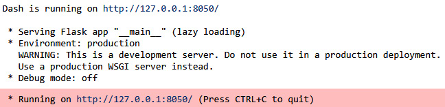
Figure 3.1 – Output of Dash
This link will give you access to the dashboard that is being updated in real time. It looks something like this:
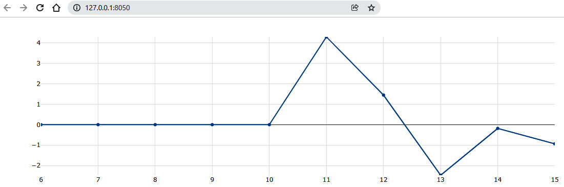
Figure 3.2 – The Plotly dashboard
Comparing Plotly's Dash and other real-time visualization tools
There are many other data visualization tools out there. Popular examples are Power BI, QlikView, and Tableau. The great thing about Plotly's Dash is that it is super easy to get started with if you are already in a Python environment. It is free and does not require installation.
If you want to be a pro in business intelligence (BI), it is worth checking out other tools. Many of them have capacities for real-time updates, and the specific documentation of each tool will guide you to it.
When building dashboarding or data visualization systems, it is also important to consider your overall architecture. As discussed in the previous chapter, in many cases, you will have a data-generating system and an architecture that is able to manage this in real time. Just like any other analytics building block, you will need to make sure that your dashboard can be plugged into your data generating process, or you may need to build an in-between data store or data communication layer.
We will now move on to the next use case of descriptive statistics: building basic alerting systems.
Building basic alerting systems
In the previous parts of this chapter, you have seen an introduction to descriptive statistics and visualization.
Basic alerting systems will be covered as the last data analysis use case. In this part, you will see how you can use basic alerting systems on streaming data. For this, you will see how you can leverage descriptive statistics together with business rules to automatically generate alerts in real time. Example methods for alerting systems are as follows:
- Alerting systems on extreme values
- Alerting systems on process stability
- Alerting systems on constant variability
- Statistical process control and Lean Six Sigma control charts
Alerting systems on extreme values
The first example for alerting and monitoring systems on streaming data is the use case that you have seen in earlier chapters: coding a business rule that sends an alert once observed values are outside of hardcoded boundaries.
This example was coded in previous chapters as follows:
Code block 3-9
import pandas as pd
data_batch = pd.DataFrame({'temperature': [10, 11, 10, 11, 12, 11, 10, 9, 10, 11, 12, 11, 9, 12, 11],
'pH': [5, 5.5, 6, 5, 4.5, 5, 4.5, 5, 4.5, 5, 4, 4.5, 5, 4.5, 6]
})
data_batch
You will see the following data being printed:

Figure 3.3 – The data batch
Let's now write the function and loop through the data to execute the function on each data point:
Code block 3-10
def super_simple_alert(datapoint):
if datapoint['temperature'] < 10:
print('this is a real time alert. Temp too low')if datapoint['pH'] > 5.5:
print('this is a real time alert. pH too high')data_iterable = data_batch.iterrows()
for i,new_datapoint in data_iterable:
print(new_datapoint.to_json())
super_simple_alert(new_datapoint)
The resulting print output shows that a number of alerts have been launched:
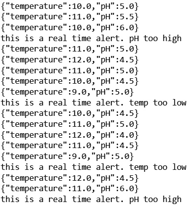
Figure 3.4 – The printed results of your alerting system
This example is a great first step into alerting and monitoring systems: a common use case for streaming data. Let's see how you can build on this example to add more and more complex static logic to this.
Alerting systems on process stability (mean and median)
Rather than applying business logic to individual values, it may be better in some cases to add logic for averages. In many cases, it will not be necessary to send alerts if just one observation is out of specification. However, when the average of several products gets out of specification, you are likely to have a structural problem that needs to be solved.
You could think of coding such an example as follows:
Code block 3-11
import numpy as np
def super_simple_alert(hist_datapoints):
print(hist_datapoints)
if np.mean(hist_datapoints['temperature']) < 10:
print('this is a real time alert. temp too low')if np.mean(hist_datapoints['pH']) > 5.5:
print('this is a real time alert. pH too high')data_iterable = data_batch.iterrows()
# create historization for window
hist_temp = []
hist_ph = []
for i,new_datapoint in data_iterable:
hist_temp.append([new_datapoint['temperature']])
hist_ph.append([new_datapoint['pH']])
hist_datapoint = {'temperature': hist_temp[-3:],
'pH': hist_ph[-3:]
}
super_simple_alert(hist_datapoint)
In this example, you see that there is a windowed average computed on the last 10 observations. This allows you to alert as soon as the average of the last three observations reaches a hardcoded alerting threshold. You should observe the following output:

Figure 3.5 – Improved print output
You can observe that the fact of using the average of three observations makes it much less likely to receive an alert. If you were to use even more observations in your window, this would be reduced even more. Fine-tuning should depend on the business case.
Alerting systems on constant variability (std and variance)
You can do the same with variability. As discussed in the section on descriptive statistics, a process is often described by centrality and variability. Even if your average is within specifications, there may be a large variability; if variability is large, this may be a problem for you as well.
You can do alerting systems on variability using windowed computations of the mean. This can be used for a dashboard, but also for alerting systems and more.
You can code this as follows:
Code block 3-12
import numpy as np
def super_simple_alert(hist_datapoints):
print(hist_datapoints)
if np.std(hist_datapoints['temperature']) > 1:
print('this is a real time alert. temp variations too high')if np.std(hist_datapoints['pH']) > 1:
print('this is a real time alert. pH variations too high')data_iterable = data_batch.iterrows()
# create historization for window
hist_temp = []
hist_ph = []
for i,new_datapoint in data_iterable:
hist_temp.append([new_datapoint['temperature']])
hist_ph.append([new_datapoint['pH']])
hist_datapoint = {'temperature': hist_temp[-3:],
'pH': hist_ph[-3:]
}
super_simple_alert(hist_datapoint)
Note that the alerts are now not based on the average value, but on variability. You will receive the following output for this example:

Figure 3.6 – Even further improved print output
Basic alerting systems using statistical process control
If you want to go a step further with this type of alert system, you can use methods from statistical process control. This domain of statistics focuses on controlling a process or a production method. The main tool that stems from this domain is called control charts.
In control charts, you plot a statistic over time, but you add control limits. A standard control chart is the one in which you plot the sample average over time, and you add control limits based on standard deviation. You then count and observe a number of extreme values and when a certain number of repetitive events occur, you launch an alert.
You will find a link in the Further reading section for more details on control charts and statistical process control.
Summary
In this chapter, you have learned the basics of doing data analysis on streaming data. You have seen that doing descriptive statistics on data streams does not work the same as when doing descriptive statistics on batch data. Estimation theory from batch data can be used, but you have to window over data to get a larger or smaller window of historical data.
Windowing settings can have a strong impact on your results. Larger windows will take into account more data and will be taking into account data further back in time. They will, however, be much less sensitive to the new data point. After all, the larger the window, the lesser impact one new data point has.
You have also learned how to build data visualizations using Plotly's Dash. This tool is great, as it is quite powerful and can still be used from a Python environment. Many other visualization tools exist, but the most important thing is to master at least one of them. This chapter has shown you the functional requirements for visualizing streaming data, and you'll be able to reproduce this on other data visualization tools if needed.
The last part of the chapter introduced statistical process control. Until now, you have been working with static rules or descriptive statistics for building simple alerting systems. Statistical process control is an interesting domain for building more advanced alerting systems that are still relatively easy to comprehend and implement.
In the next chapter, you will start discovering online machine learning. Once you get familiarized with online machine learning in general, you'll see, in later chapters, how you can replace static decision rules for alerting systems with machine learning-based anomaly detection models. The data analysis methods that you have seen in this chapter are an important first step in that direction.
Further reading
- Estimation theory: https://en.wikipedia.org/wiki/Estimation_theory
- Sampling: https://en.wikipedia.org/wiki/Sampling_(statistics)
- Windowing: https://softwaremill.com/windowing-in-big-data-streams-spark-flink-kafka-akka/
- Plot live graphs using Python Dash and Plotly: https://www.geeksforgeeks.org/plot-live-graphs-using-python-dash-and-plotly/
- Plotly Dash documentation: https://plotly.com/
- Control charts: https://en.wikipedia.org/wiki/Control_chart
- Engineering Statistics Handbook, Chapter 6.3 Univariate and Multivariate Control Charts: https://www.itl.nist.gov/div898/handbook/pmc/section3/pmc3.htm