
16
Creating a UI with the UI Toolkit
In the previous chapter, we discussed how to create user interfaces using uGUI (also known as Canvas), one of the most common Unity UI systems, but as we already mentioned, this is not the only one. While so far, uGUI is the most preferred option, Unity is working on a replacement called UI Toolkit, and even if it doesn’t have feature parity with uGUI yet, we thought it is worth covering it in this book.
The idea of this chapter is to create the same UI we created previously but with UI Toolkit, so you can get an idea of how creating a UI in Unity will look soon.
In this chapter, we will examine the following UI concepts:
- Why learn UI Toolkit?
- Creating a UI with UI Toolkit
- Making a responsive UI with UI Toolkit
By the end of the chapter, you will know how to use UI Toolkit to create basic UIs for our game, redoing the UI we did in the last chapter as a point of reference. So, let’s start by discussing the following question first: why are we using UI Toolkit?
Why learn UI Toolkit?
I know the topic of this chapter might sound a little bit confusing; we just learned how to use a whole Unity system to create our UI, and now we are learning another one! Why didn’t we just learn this new one?
Well, the first part of the answer is that UI Toolkit doesn’t have feature parity with uGUI yet, meaning that it doesn’t have all the features necessary to use it in real production environments. Another thing to take into account is that even if UI Toolkit is stable enough, it’s still a relatively new system, and there are still lots of games in development that were created on older Unity versions that don’t support it. This means that in order to land a job in this industry, we need to get a decent amount of exposure to uGUI due to most games being created with this technology. This happens because it’s not safe or practical to update an already-tested and working game with new technologies; such changes could lead to a major rework of the game to make it compatible with the new versions. Also, this could potentially introduce tons of bugs that could delay the release of new versions—not to mention the time it will take to remake a full app with a new system.
That being said, we believe it’s still worth learning the basic concepts of UI Toolkit to be prepared to use it in newer Unity versions, so let’s dive into it now.
Creating a UI with UI Toolkit
In this section, we are going to learn how to create UI Documents, an asset that will define the elements our UI has. To do this, we are going to discuss the following concepts:
- Creating UI Documents
- Editing UI Documents
- Creating UI Stylesheets
Let’s start by seeing how we can create our first UI Document.
Creating UI Documents
When creating a UI with uGUI, we need to create GameObjects and attach components like Button, Image, or Text, but with UI Toolkit, we need to create a UI Document instead. UI Document is a special kind of asset that will contain the definition of the elements our UI will have and its hierarchy. We will have a GameObject with a UI Document component (yes, it’s called the same, so pay attention here) that will reference this UI document asset and render its contents. It’s like a mesh asset that contains information about the Mesh, and the MeshRenderer component that will render it. In this case, the elements to render are contained in an asset and we have a component that reads the asset and renders its content (UI in this case).
UI Documents are actually plain text files. You can open one with a text editor and easily see its contents. If you do that and you are familiar with HTML, you will recognize the XML-like format used to define the elements our UI will be composed of; Unity calls this format UXML. With UI Toolkit, Unity is attempting to make it easy for web developers to jump into Unity and create UIs. In the following code, you can see the typical look of an UXML document’s file contents:
<ui:UXML
   xmlns:ui="UnityEngine.UIElements"
   xsi="http://www.w3.org/2001/XMLSchema-instance"
   engine="UnityEngine.UIElements"
   editor="UnityEditor.UIElements"
   noNamespaceSchemaLocation="../../UIElementsSchema/UIElements.xsd"
   editor-extension-mode="False">
    <ui:Button tabindex="-1" text="Button"
              display-tooltip-when-elided="true" />
    <ui:Scroller high-value="100"
                direction="Horizontal"
                 value="42" />
    <ui:VisualElement>
        <ui:Label tabindex="-1"
                 text="Label"
                 display-tooltip-when-elided="true" />
        <ui:Label tabindex="-1"
                 text="Label"
                 display-tooltip-when-elided="true" />
    </ui:VisualElement>
</ui:UXML>
Don’t worry if you don’t know XML; we will explain the core concepts in this chapter. Also, don’t worry about the UXML format; later in this chapter, we will be using a visual editor called UI Builder to edit our UI without writing UXML at all, but it is worth knowing how it actually works.
In order to create a UI Document and add it to the scene, we need to do the following:
- Click the + | UI Toolkit | UI Document option in the Project view to create a UI Document asset and name it
GameHUD:
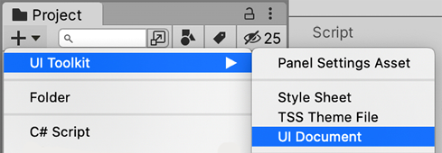
Figure 16.1: Creating the UI Document asset
- Click the Game Object | UI Tookit | UI Document option to create a GameObject in your scene with the UI Document component, which is capable of rendering the UI Document.
- Select it and drag the GameHUD UI Document asset (the one created in step 1) to the Source Asset property of the UI Document GameObject (the one created in step 2):

Figure 16.2: Making the UI Document component to render our UI Document asset
And that’s it! Of course, we won’t see anything yet on our screen as the UI Document is blank, so let’s start adding elements to it.
Editing UI Documents
As our goal is to recreate the same UI we created in the last chapter, let’s start with the simplest part: adding the player avatar to the top-left corner. One option would be to open the UI Document asset with any text editor and start writing the UXML code, but luckily, we have an easier way, which is using the UI Builder editor. This editor allows us to generate the UXML code visually, by dragging and dropping elements.
In order to do that, let’s first see how the UI Builder window works:
- Double-click the GameHUD asset in the Project view to make UI Builder open it:

Figure 16.3: The UI Builder editor
- In the Hierarchy panel inside the UI Builder (not the Hierarchy panel we’ve used so far in previous chapters), select
GameHUD.uxml, which is the container element of the UI.

Figure 16.4: Selecting the asset name in Hierarchy to edit the general UI settings
- Look at the Inspector panel at the right of the UI Builder window (not the Inspector we’ve used so far to modify GameObjects). Set the Size property to a Width of
1920and a Height of1080. This will allow us to view how our UI will look in this resolution. You can later change this value to see how it adapts to different sizes, but more on that later:

Figure 16.5: Setting the preview UI resolution
- You can pan the viewport to navigate the UI by pressing the Mouse Wheel Button (also known as Middle Button) and moving the mouse. On Mac, you can also press Option + Command and click and drag any free area of the viewport (places without our UI) to do the same.
- You can also use the Mouse Scroll Wheel to zoom in and out. Finally, you can use the zoom percentage selection at the top-left part of the viewport and the Fit Canvas button to automatically fit the entire UI in your viewport:

Figure 16.6: Setting the preview zoom
Now that we know the basics of UI Builder, let’s add our image to the UI:
- Drag the VisualElement icon from the Library at the bottom left to the Hierarchy section on the left. This will create a basic UI element capable of rendering an image and much more:

Figure 16.7: Creating a Visual Element
- Select the VisualElement in the Hierarchy (under
GameHUD.uxml) and look at the Inspector at the right part of the UI Builder window (again, not the regular Unity Inspector panel) for the Position section. Expand it if not already expanded (using the arrow on the left). - Set Position to Absolute in order to allow us to move our element freely around the UI. Later in this chapter, in the Using relative positions section, we will explain how Relative mode works:
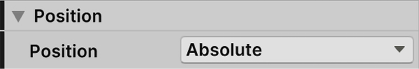
Figure 16.8: Setting our UI Element to be freely moved around
- Open the Size section and set Width and Height to
100to make our UI element have a non-zero size. This way, we can see its area in the Viewport:
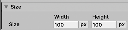
Figure 16.9: Setting our UI Element size
- In the Viewport pane, you can drag your element around and use the blue rectangles in the corners to change its size. Position your element at the top-left corner of the UI. If you don’t see your element in the Viewport, select it in the Hierarchy (the one of UI Builder):
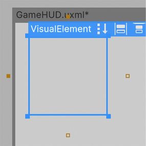
Figure 16.10: Moving VisualElements
- In order to set an exact position, you can set the Left and Top values of the Position section in the Inspector to specify the exact x and y coordinates respectively, expressed in pixels:
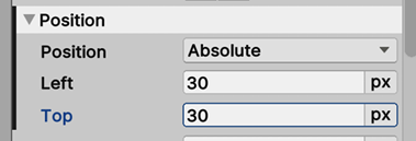
Figure 16.11: Setting the Position
- In the Background section of the Inspector, set the Image mode to Sprite using the combo box at the right of the Image property. This allows us to apply a sprite as the background of our element.
- Drag the sprite asset (the image) of our player avatar we imported in Chapter 15, User Interface Design, from the Project panel to the Image property in order to set it. Also, you can use the target button (circle button with the dot in the middle) to select the sprite asset from the picker window:

Figure 16.12: Setting the Background image of the element
- Return to the regular Game panel to see the results. If you don’t see a change, you can turn off and on the GameObject that renders our UI (the one we created with the UI Document).
Now that we have created the player avatar, we can create the player health bar by doing the following:
- Repeat the previous steps 1 to 6 to create a new element that will serve as the player health bar container. It won’t have any image as it will just be the container of the rest of the elements that will compose the health bar.
- Position it right next to the player avatar and set a width and height to resemble a classic health bar. Remember you can do this by dragging the image and the squares at the corners, or through the Size and Position properties as we did before.
- Drag a new VisualElement to the Hierarchy, as we did in step 1, but this time drop it over the element created in step 1. This will make this new element a child of it, which will make that element’s position and size depend on its parent, the same as what happened when we parented Canvas objects in Chapter 15, User Interface Design.
- Select the parent Visual Element and in the Inspector, set the Name property to
PlayerHealthto easily identify it. Do the same with the child element, calling itFilling:
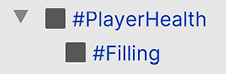
Figure 16.13: Parenting and naming Visual Elements
- Select the Filling element in the Hierarchy and look at the Inspector.
- In the Background section, set the Color property to red, clicking on the color box and using the Color Picker. This will fill our UI Element background with plain red instead of using an image:

Figure 16.14: Setting a pure red background for our element
- As usual, set the Position to Absolute, and also the Left and Top properties to
0. As this is a child of another element, the position will be relative to its parent position, so by specifying a Left and Top value of0, we are saying that we will be at 0 pixels from the left and top sides of our parent. This means that if our parent moves, this child element will move along with it. - Set Size’s Width and Height to
100and change the unit of measurement frompx(pixels) to%(percentage) by clicking on the px button and selecting %. This will make the Filling element size the same as its parent (100 percent the parent size):

Figure 16.15: Setting our size as the same size as our parent element
- Add a new VisualElement as a child of PlayerHealth (a sibling of Filling) and call it
Border. - Set the Position and Size as we did in steps 7 and 8 for the Filling element, but don’t set the background color.
- Set the Background section’s Image property to be the same border image we used in the previous chapter. Remember to set the Image mode to Sprite instead of Texture.
- Set the Slice property in the Background section to
15. This applies the nine-slices technique we used in Chapter 15, User Interface Design, to expand an object without stretching it:

Figure 16.16: Setting the nine-slices sizes in the element directly
- Select the Filling visual element in the Hierarchy and set its Size section’s Width property to simulate the Fill Amount property of the images we used in Chapter 11, User Interface Design. Later, we will change this Size to be directly proportional to the player’s health number via code:

Figure 16.17: Health bar result
- Repeat steps 1 to 12 to create the bottom of the Base Health bar. Remember the filling must be green this time. Alternatively, you can just copy and paste the PlayerHealth container, but I recommend you repeat the steps for learning purposes.
In previous steps, we basically saw how to compose several UI Elements to create a complex object. We needed a parent container element to drive the size of our child’s so that the inner elements adapt to it, especially the filling, which requires a percentage value to represent the current player health.
Now we have our Life Bar! Well, not quite yet; those red corners from the filling that our border doesn’t cover are pretty rough! We will improve that later in this chapter when discussing how to make our UI responsive, so for now, let’s keep it as is.
Finally, let’s add text elements to the UI by doing the following, but first, we will need to think about fonts. If you download a TTF font, you will need to create a Font Asset as we did in Chapter 15, User Interface Design, for it to be used in UI Toolkit. But with the current release of UI Toolkit, the Font Asset we created in the last chapter is not compatible. We will need to create a Font Asset using the UI Toolkit Font Asset Creator, instead of the Text Mesh Pro one. The reason behind the existence of duplicated tools is that Unity is integrating the Text Mesh Pro package into a new, improved one called Text Core, one of those improvements being compatibility with UI Toolkit and other Unity systems.
Considering this, in order to convert the TTF to a Font Asset compatible with UI Toolkit, you can just right-click the TTF asset in the Project panel and select Create | Text | Font Asset. This will create a new asset that will be the one we will be using to define the font of our UI Toolkit text.
Having solved this, let’s create the UI Element for text, that is, Label:
- Drag the Label icon from the Library pane of the UI Builder window to its Hierarchy panel. This will add a UI element capable of rendering not only an image in its background but also text (yes, you can add a background to the text if you want to).
- As usual, set its Position and Size, this time putting it in the top-right corner of the screen. Remember you can simply drag the element; you don’t need to set the specific coordinates by hand (although you can if you want to).
- Change the Text property in the Label section of the Inspector to the needed text; in our case, this will be
Score: 0:
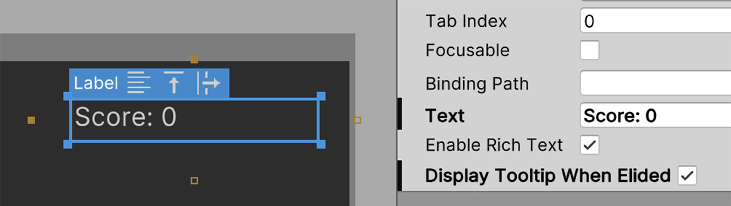
Figure 16.18: Setting the text to display
- Drag the Font asset created just before these steps to the Font Asset property in the Text section of the Inspector. Don’t confuse it with the Font property (the one above Font Asset). That one allows you to drag TTF assets directly, but that will be deprecated soon, so let’s stick with the Unity-recommended approach.
- If you notice your Font asset doesn’t work, try putting it in the UI Toolkit | Resources | Fonts & Materials folder in the Project panel. While this shouldn’t be necessary in the latest Unity versions, I’ve noticed that this solves these sorts of issues in the past. Also, there’s a bug that makes the font not recognized sometimes, which can be fixed by deleting and recreating the Label.
- Set the Size property of the Text section to any size that seems fit:

Figure 16.19: Setting the Text Font and Size of a Label
- Repeat steps 1 to 6 to add all the remaining labels to the UI.
- One last thing we need to do is save, which can be simply done by pressing Ctrl + S (Command + S on Mac) or using the File | Save menu in the top-left part of the Viewport section in the UI Builder window. Note that previous versions of UI Toolkit had a bug where this could make the Viewport become corrupt. Please close it and reopen UI Builder again if this happens.
Now that we have created our UI, you probably noticed the need to repeat several settings to make several objects look the same, like our health bars and labels. While this is perfectly viable, we could improve our workflow greatly by reusing styles, and Stylesheets are the exact feature we need to accomplish that, so let’s see them.
Creating UI Stylesheets
When creating UIs, you will find scenarios where several elements throughout the whole game will share the same style, for example, buttons with the same background, font, size, borders, etc. When creating the UI with uGUI, one way to not repeat configurations for each element would be to create a Prefab for the button and create instances (and Prefab variants where necessary). The problem is that here, we don’t have GameObjects, hence there are no Prefabs, but luckily, we have Stylesheets.
Stylesheets are separated assets that contain a series of styling presets for our UI elements. We can define a set of styles (for example, background, borders, font, size, etc.) and apply those to several elements across different UI Elements. This way, if we change a style in a Stylesheet asset, all UI Elements using that style will change, in a similar way to how materials work.
There are several ways to create styles in a Stylesheet. One example is the selector system. This system allows you to apply a series of rules to pick which elements should have a style applied (if you are thinking this is like CSS, then you are right), but for now, let’s stick with the basics, creating Stylesheet Classes. A Class is basically a style we can apply to any element via its name. For example, we can create a Class called Button and add that class to every button in the UI that we want to have that style. Please consider that the concept of Class here is something completely different from what a Class means in coding.
So, in this case, let’s create a Class for all the labels in our UI so that the appearance of all of them can be modified by simply changing the style:
- In the StyleSheets panel of the UI Builder, click the Add (+) button and click Create New USS (Unity StyleSheet). If that doesn’t work, try restarting Unity; there’s a bug in the current version of UI Toolkit that could cause this:

Figure 16.20: Creating a Unity StyleSheet
- Name the USS as you like (
GameUSSin my case) and save the file. - Select one of the label elements we have in our UI Document and look at the Inspector.
- In the StyleSheet pane of the Inspector, type
HUDTextin the Style Class List input field, but don’t press Enter yet. - Click the Extract Inlined Styles to New Class button. This will take all style modifications we did to our Label (position, size, font, etc.) and save them into a new style class called
HUDText. You can observe that it was added to the list of classes applied to the element (those labels at the bottom of the StyleSheet section in the Inspector):

Figure 16.21: Extracting settings into a Style Class
With these steps, we have taken a Label with the style we need to apply to others and extract it into a class named HUDText. This way, we can simply add the class HUDText to other elements in our UI, and we can even add the same USS asset to other UI Documents (click the + button on the StyleSheets pane | Add Existing USS) to add this class to the elements in it.
Also, if you select the label again, you can notice how properties that previously were in bold now became normal again; that’s because properties in bold represent changed properties, and we have extracted them, so the default values became whatever the style classes define. Luckily, not everything is extracted to the new USS Class; for example, the Text field still has our specific desired text, as it is highly unlikely you would want to put the same text in other objects.
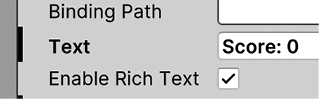
Figure 16.22: The Text property is bold, indicating it is different from the default values. On the other end, Enable Rich Text is not bold, meaning it follows the default values and the Classes ones
If you forgot some change in the style when extracting the class, you can easily modify it by selecting it in the StyleSheets section at the top-left part of the UI Builder. Then, select the class HUDText in the list. If you don’t see it, try expanding the GameUSS.uss section.
Once selected, you can change it in the Inspector panel, similarly to when we change the properties of a UI Element:

Figure 16.23: Selecting a Style Class for modification
This way, we have edited our HUDText class. If other elements had this class applied, they would have these changes applied also. Consider that another option would be to create the Class first, typing the name in the StyleSheets input field and pressing Enter, and then applying it to UI elements. This way, you will avoid needing to revert unwanted changes, but if you created the element first, it’s convenient to have the option to revert:
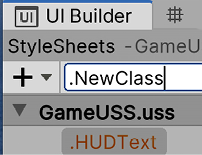
Figure 16.24: Creating a Style Class from scratch
Now that we have our Style Class, let’s apply it to other elements by doing the following:
- Select another label of our UI.
- Drag the HUDText style from the Stylesheet pane at the top-left part of the UI Builder window all the way to our element on the Viewport. You can also drag it to the Hierarchy element if you prefer:

Figure 16.25: Applying a Class to an element
- Select the Label and check how the HUDText class has been added to the StyleSheet section on the Inspector.
Now, consider that even if the element now has the class applied, the element itself has changes to the text we did in previous steps, overriding the style in our class. You can easily check this by selecting the class again (in the StyleSheets section at the top-left part of the UI Builder window) and changing any setting, like the size, and seeing how not all elements have changed. This shows how the override system works; the changes on the element take precedence over the ones in the classes it has applied.
If you want to remove these overrides, you can simply select the element (not the class), right-click on the overridden properties, and unset the changes by right-clicking and then selecting Unset. In the case of our Label, we can unset the entire Text section and probably the Absolute position (as the desired values are already contained in the class).
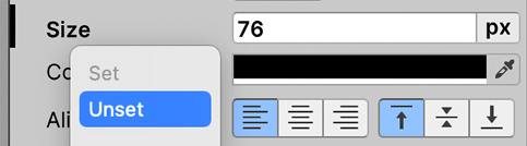
Figure 16.26: Reverting an override to use the default values of the Classes applied to the element
So, with these steps, we created a new StyleSheet asset and added it to the UI Document for it to use it. We have created a new Style Class in it, extracting the changes of an existing UI Element into it, and then adjusted which changes we wanted to keep. Finally, we applied that style to another element. With this, we just scratched the surface of the real power of StyleSheets. We can start doing things like combining different classes from different StyleSheets or using selectors to dynamically set styles, but that’s outside the scope of this chapter.
Something interesting is that even if the documentation of UI Toolkit is pretty basic at the moment, all these advanced concepts can be learned by reading about CSS, the web technology that Unity based the stylesheet system on. It won’t be exactly the same, but the basic idea and best practices still apply.
Now, the UI looks almost exactly the same as it does in Chapter 15, User Interface Design, but it won’t behave in the same way. If you try changing the size of the viewport (selecting GameHUD.uxml in the Hierarchy and changing Width and Height as we did at the beginning of the chapter), you will see the UI won’t adapt properly, so let’s fix this.
Making a responsive UI
In this section, we are going to learn how to make the UI we created previously adapt to different screen sizes. We are going to discuss the following concepts:
- Dynamic positioning and sizing
- Dynamic scaling
- Using relative positions
Let’s start by discussing how we can make the Position and Size of our objects adapt to the screen size.
Dynamic positioning and sizing
So far, we have used the Left and Top position attributes in order to specify the x and y positions of our elements with respect to the top-left corner of the screen, and then Width and Height to define the Size. While essentially that’s all that’s needed to define an object’s position and size, it is not very useful in all cases, especially when we need to adapt to different screen sizes.
For example, if you need to place an object in the top-right corner of the screen, knowing its size is 100x100 pixels and the screen size is 1920x1080 pixels, we can put the Left and Right position attributes as 1820x980 pixels, and this will work, but only for that specific resolution.
So, what happens if the user runs the game at 1280x720 pixels? The object will be outside the screen! In uGUI, we used Anchors to solve this issue, but we don’t have them here. Luckily, we have Right and Bottom to help.
As Left and Top attributes, Right and Bottom define distances from the parent element’s sides (if there is no parent, then just from the entire screen). Right now, we have both set to auto, meaning that the position will be driven by Left and Right exclusively, but interesting things can happen by changing those values, so let’s use them to make our Score and Bullet labels stick to the top-right corner of the screen instead, by doing the following:
- Put the cursor in the bottom part of the UI in the Viewport until a white bar appears.
- Drag that bar to resize the screen and see how our adapts (or not) to the different size.
- Do the same on the laterals to also see how it adapts to different screen widths:

Figure 16.27: UI not adapting to different screen sizes
- Select the score label on the Viewport and look at the Inspector.
- Set the Top and Right values in the Position section to
30. - Set the Left and Bottom values to
autoby clicking the px button at the right of each attribute and selectingauto:

Figure 16.28: Changing the unit type of the Position attributes to auto mode
- Notice the right and top golden-colored squares at the sides of the label became filled, while the left and bottom are hollow. This means that the left and bottom are in auto mode. You can also toggle auto mode by clicking those boxes if needed:

Figure 16.29: Toggling auto mode of our element position attributes
- Try changing the size of the UI container again as we did in steps 1 and 2 to see how our Score label is always aligned to the top-right corner.
- Repeat steps 4 to 6 for the Bullets label, this time setting the Top property to
140.
What we did with these steps was essentially make the position of the object expressed as a distance in pixels against the Top and Right sides of the UI, or the top-right corner of the screen. We needed to set the other sides to auto mode, so they won’t participate in the position calculations.
Now, we can use the Position attribute in other ways as well. As you might imagine by now, we can start combining Left and Right and Top and Bottom if we wish. In such cases, Left and Top will take precedence in defining the position, but then, what do Right and Bottom do? They define the size of the element.
For example, if we have an element with Left and Right attributes set to 100px each and we are seeing our UI on a screen with a width of 1920 pixels, the final width of our element will be 1720 (1920 minus 100 from Left minus 100 from Right). This way, the Position attributes represent the distances of the sides of our element from the sides of the screen (or the parent element).
Let’s see this in action by making the bottom health bar adapt to the screen width while preserving its position relative to the bottom of the screen by doing the following:
- Select the bottom health bar parent in the Hierarchy. Don’t select it in the Viewport as you will only be selecting its filling or border.
- Set Left, Right, and Bottom to
50px. - Set Top to auto (click on the px button at the right and select auto).
- In the Size section, set Width to auto also.
- Set Height to
35px:

Figure 16.30: Making the player’s base health bar adapt to the screen width
- Change the size of the UI to see how it adapts.
With these steps, we defined the bar distance from the sides of the screen as 50 pixels for it to adapt to any screen width, while keeping the distance from the border and height fixed. We basically achieved the same behavior as split anchors in uGUI! Consider that we needed to set Size’s Width attributes to auto to let the Left and Right attributes drive the position; if you don’t do that, the Width attributes take precedence and Right won’t have any effect. I invite you to experiment with other combinations of px/auto.
One last trick we can do here is to use negative values in the Left, Top, Right, and Bottom Position attributes of the health bar borders to make the borders slightly bigger than the container and cover the filling borders. Just set Left, Top, Right, and Bottom to -15px in this case and remember to set both the Size Width and Height attributes to auto. You might want to reduce the Height of the bar container (not the border) a little bit, as now it will look thicker due to this change:

Figure 16.31: Using negative Position attributes to cover the filling
Another mode aside from px (pixels) or auto mode is the percentual (%) mode, which allows us to represent values as percentages relative to the screen (or parent element if present) size. For example, if we set Top and Bottom to 25%, this means that our element will be vertically centered with a size of 50% of the Screen height (remember to set Height mode to auto here). We could achieve the same result if we set Top to 25%, Bottom to Auto, and Height to 50%; as you can see, we can achieve a clever combination of those values.
In our case, we will use percentual values in our Life Bar fillings so that we can express its size in percentages. We need this as later in the code, we can specify the width of the bar as a percentage of the player’s life (for example, a player with 25 life points and a max of 100 points has 25% life).
Now, while we solved the positioning adaption to the screen size with the usage of the Left, Top, Right, and Bottom properties, we still didn’t solve the dynamic sizing of the elements. With sizing this time, we are referring to screens with a different number of DPI (dots per inch), so let’s discuss how we can achieve that with the Panel Settings asset.
Dynamic scaling
We used 1920x1080 as the UI base resolution to position and size our elements so that they look nice in that resolution. We also changed the UI size to see how the elements adapt their position with different screen sizes, and while that worked nicely, you can notice how the elements looked bigger or smaller while doing that.
While having a base reference resolution is good to design our UI, we should consider the sizing of elements on different resolutions, especially on screens with high DPI. Sometimes, you can have screens with higher resolution but the same physical size in centimeters. This means pixels are smaller in the ones with higher resolution, hence they have a larger DPI, so elements can seem smaller if not scaled properly.
In the past, we used the Canvas Scaler component of the Canvas to make the UI scale the size of its elements according to the screen resolution. We have the exact same settings here as in the Panel Settings asset referenced in our UI Document component, so let’s configure it by doing the following:
- Look for the Panel Settings asset in the Project panel and select it. Another option would be to select the
UI DocumentGameObject in the Main Editor Hierarchy and click the asset referenced in the Panel Settings property:

Figure 16.32: Panel Settings being referenced in the UI Document component
- Set Scale Mode to Scale With Screen Size.
- Set Screen Match Mode to Match Width Or Height.
- Set the Reference Resolution X value to
1920and Y to1080. - Move the Match slider all the way to the right, toward the end labeled Height:
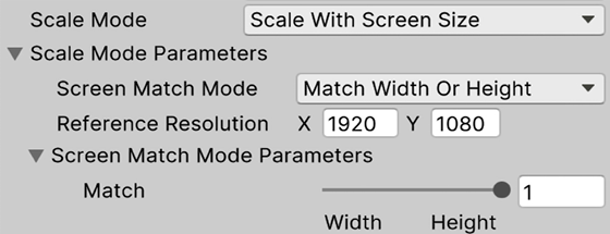
Figure 16.33: Setting the scaling of our UI
- Observe how changing the height of the Game panel of the Unity editor will make the UI adapt its element sizes accordingly (change the whole Unity editor window height).
What we did with those changes was first set Reference Resolution to whatever resolution we designed our UI, in our case, 1920x1080. Then, we set Screen Match Mode to allow us to scale our elements according to one of the sides, Width, Height, or a combination of the two if we prefer. In our case, we chose Height, mainly because our game is targeted at PC, where the screens are wide rather than tall. This means that on different screen widths, the elements will look the same size, but on different heights, the elements will be bigger or smaller.
With these settings, we can do some math to understand the values. If our screen is the same as the reference resolution (1920x1080), the element sizes will be the same as we specified in the size of our elements in pixels, so for the case of our player avatar, it will be 150x150 pixels. Remember that the physical size in centimeters depends on the DPI of the screen.
Now, imagine that we have a 4k screen, meaning a resolution of 3840x2160. As we specified that our UI matches via Height, we can determine that our elements will double in size because our screen has a height that is double the reference resolution (2160 divided 1080). Our player avatar will be 300x300, making the element have the same physical size in a 4k screen, double size but double pixel density achieves that. Finally, consider an ultra-wide standard resolution of 2560×1080 (yes, very wide screens), in which case the elements will be the same size as the only change is the width; the only difference is that the elements will have more horizontal separation due to the screen size. I know these calculations can be confusing but keep experimenting with the values of the Panel Settings and Game View sizes to understand them better.
Great, now we really have the same HUD. We could start applying the concepts seen so far to the Options menu, but let’s take the opportunity to do it in a different way, using relative positions, a way to create a flow of elements where the elements’ positions depend on each other.
Using relative positions
In the HUD of our game, each element requires its own Position and Size, and the different elements’ positions can be resized and repositioned without affecting others. We might observe the case of the player health bar and the avatar, but the changes would be trivial in this case. There are other cases where this is not that trivial, as in the case of a List of elements (for example, a list of matches to join in a multiplayer game) that needs to adapt vertically or horizontally, and here is where relative positions help us.
Relative positions allow us to make the positions of the elements relative to each other; in a way, the position of one element will depend on the position of the previous one, and that one to its previous, and so on, forming a chain or flow. This works like Vertical and Horizontal Layouts on uGUI. In our case, we will make the Pause label and the Options and Exit buttons of our options menu be vertically aligned and centered along its parent using those.
Let’s start creating the menu by doing the following:
- Create a new UI Document (click the + button after going to Project View | UI Tookit | UI Document) and call it
OptionsMenu. We can work on the previous UI Document but let’s keep those pieces of UI separated for easy activation and deactivation, and general assets organization. - Double-click the asset to set it as the current UI being edited by the UI Builder.
- Select the root object (OptionsMenu.uxml in the Hierarchy) and set the Width and Height Inspector properties to
1920x1080pixels. - Create a new GameObject with the UI Document component (GameObject | UI Toolkit | UI Document) and drag the asset for this object to render it (as we did with the HUD created earlier in the chapter).
- Double-click the UI Document asset to open the UI Builder window to edit it, and in that window, drag a new Visual Element to the Hierarchy or Viewport and call it
Container(the Name property in the Inspector in UI Builder). - Set the Left, Right, Top, and Right Position attributes to
0px. - Set Position to Absolute.
- Set Width and Height in the Size section to auto. This will make the container fit the entire screen.
- Drag a new Visual Element to be a child of the Container and call it
Background. - Leave Position as Relative this time.
- Set Size’s Width and Height to
500px. - Set the Background Image of the Background object to use the same background sprite used in the previous chapter.
- Select the Container parent object (not the Background).
- In the Inspector, set the Align Items property of the Align section to
center, which is the third button. If you hover the mouse over the icons, they will show their names in a tooltip. - Set Justify Content to Center (second button):

Figure 16.34: Preparing the UI background to host elements inside
- Change the size of the UI using the white bars at the sides to see how the background is always centered.
Even if we have only one element, we can start seeing how the relative positions work. First, we created an empty object that will always adapt to the screen size, allowing us to make the children’s elements depend on the full screen size. Then, we created an image element with a fixed size, but with relative position, meaning its position will be calculated by the parent container. Finally, we told the Container to make its child objects aligned to its horizontal and vertical center, so the background immediately became centered whatever the screen size is. When working with absolute positions, the Align properties didn’t work, so this is one of the first benefits of relative positioning.
But relative positioning becomes more powerful with multiple elements, so let’s add the Label and Buttons to our Background element to explore this concept further by doing the following:
- From the Library pane at the bottom left of UI Builder, drag a Label and two Button elements inside the Background in the Hierarchy. Note that there’s a bug where sometimes, even if you drag and drop a new element inside the desired object, it won’t be its child. Just drag the one created in the Hierarchy this time:

Figure 16.35: Adding elements inside the menu background
- Observe how by default, the elements became vertically aligned one on top of the other due to the relative position’s default settings:

Figure 16.36: Automatic relative vertical positioning
- Select the Background element and set Justify Content to
space-around(fifth button). This will spread the elements along the background. - Set Align Items to center (third option) to center elements horizontally:
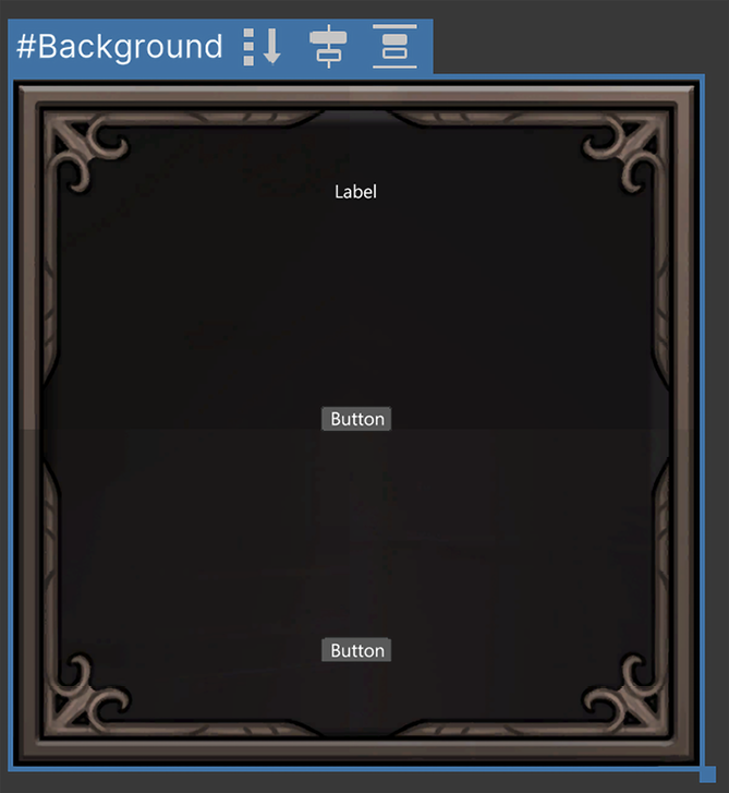
Figure 16.37: Automatic relative vertical positioning
There is a similar mode for Justify Content called “space-between” (the fourth button in Justify Content) that will also spread the elements along the vertical axis but won’t leave space on top of the first element or the bottom of the last one. Also, Align Items has an option called stretch (the fifth option) that, like center, will center elements horizontally, but also stretch them instead of respecting each element’s width. I recommend experimenting with the different aligning modes to discover all opportunities.
- Set the Label Text’s Font and Size attributes to whatever seems fit. In my case, I used the imported font and a size of
60px. Remember to also set the Text toPause. - Set the Buttons Background Image to use the same used for the button in the last chapter.
- Set the Color property of the Background section to a color with no alpha. You can achieve this by clicking the color rectangle and reducing the A channel in the color picker to
0. The idea of this color is to act as a background for our image, but we don’t need it, so we made it completely transparent. - Set the Buttons Text’s Font, Size, and Color to whatever seems fit to you. In my case, I’m using
50and gray color. - In the Margin and Padding section, set Padding to have some spacing between the text and the borders of the button. In my case,
30pxdid the trick:
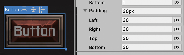
Figure 16.38: Adding inner padding to the button contents (the text in this case)
- Also, set the Top and Bottom Padding of the Background to allow some space between the borders of the window and its elements. In my case, it is
40pxeach.
As you can see, we changed different settings to set the size of the elements dynamically, like font sizes and paddings, and the relative system along with the align settings took the role of determining the position of the elements automatically. We can rearrange the order of the elements by dragging them in the Hierarchy and they will be accommodated automatically. We could have also set the size of the elements with the Size property, and we can also apply some offsets if desired using the Position properties, but I encourage you to see how these properties behave in Relative mode on your own.
One last setting I want you to explore is the Direction attribute of the Flex section, which, as you can imagine, will determine the orientation the elements will follow, vertically from top to bottom or bottom to top, and horizontally from left to right or right to left. For example, you could set Direction to distribute the elements from left to right using the row mode (third button) and make the background wider to have a horizontal options menu if you wish.
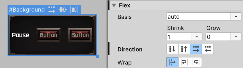
Figure 16.39: Changing to a vertical orientation of elements
As a side note, you might notice that the images for the background and buttons will look bigger than the options menu done in the last chapter. That’s because the Pixels per Unit setting that we changed on the Texture assets to control the scaling of the textures won’t take effect in UI Toolkit; you will need to manually change the texture file size in any image editor to give it its proper size. The best practice here would be to always create the images with a size that will look fine in our maximum supported resolution. Usually, this is 1920x1080 on PC but note that 4k resolutions are becoming more popular every day.
Summary
In this chapter, we had an introduction to the key concepts of UI Toolkit and how to create UI Documents and Stylesheets. Regarding UI Documents, we learned how to create different elements like images, text, and buttons and how to position and size them using different methods, like absolute and relative positioning, and pixel or percentual units. Also, we saw how to make the UI adapt to different sizes using different combinations of Position attributes. Finally, we learned how to use USS Stylesheets to share styles between different elements to easily manage our whole UI skinning.
Essentially, we learned again how to make UIs with a different system. Again, please note that this system is still in the experimental phase and is not recommended for real production projects. We used all these concepts to recreate the same UI created in Chapter 15, User Interface Design.
In the next chapter, we are going to see how to add animations to our game to make our character move. We will also see how to create cut-scenes and dynamic cameras.