
Chapter 3: Model Evaluation in Comet
Before accepting a data science model, we need to evaluate it, to establish whether it is ready for production or not. Model evaluation is the process of assessing whether a trained model performs as expected. Usually, we perform model evaluation on a different dataset from the one on which the model was trained.
In this chapter, you will review the basic concepts behind model evaluation, such as data splitting, how to choose metrics for evaluation, and basic concepts behind error analysis. In addition, you will see the main model evaluation techniques for the different data science tasks (classification, regression, and clustering).
Finally, you will learn how to perform model evaluation in Comet by deepening some concepts that you already know, such as experiments, panels, and reports, as well as introducing new concepts, including hyperparameter tuning, model registry, and queries.
Throughout the chapter, you will also implement a practical example.
The chapter is organized as follows:
- Introducing model evaluation
- Exploring model evaluation techniques
- Using Comet for model evaluation
Before reviewing the concepts behind model evaluation, let’s install all the Python packages needed to run the code and the experiments contained in this chapter.
Technical requirements
We will run all the experiments and code in this chapter using Python 3.8. You can download it from the official website (https://www.python.org/downloads/) and choose the 3.8 version.
The examples described in this chapter use the following Python packages:
- comet-ml 3.23.0
- matplotlib 3.4.3
- numpy 1.19.5
- pandas 1.3.4
- scikit-learn 1.0
We have already described the first five packages and how to install them in Chapter 1, An Overview of Comet. So, please refer back to that for further details on installation.
Now that you have installed all the software needed in this chapter, let’s move toward how to use Comet for model evaluation, starting from reviewing some basic concepts on model evaluation.
Introducing model evaluation
Model evaluation is the process of assessing the performance of one or more data science models to decide which is the best one to solve a given task. Model evaluation is an iterative task because we run it over and over again, until we reach a satisfactory model.
Model evaluation depends on the task we want to solve. In general, there are two types of tasks:
- Supervised learning – You train a model with some labeled data, you test the model on other labeled data, and then you try to predict the target value for unseen and unlabelled data. In this case, model evaluation is simple because, during the testing phase, you can compare the output produced by the model with the labeled testing data.
- Unsupervised learning – You do not have any labeled data, but you try to predict the output on the basis of some criteria, such as data similarity. In this case, model evaluation is quite complicated because you do not have any testing data to make comparisons.
In the case of supervised learning, model evaluation involves comparison in terms of committed errors between testing data and values predicted by the model. We can calculate different metrics that depend on a specific task, as we will see in the next sections. In the case of unsupervised learning, model evaluation is not a trivial task because we do not have a reference dataset for comparison. However, we can still also calculate some metrics in this case, as we will see in the following sections.
If we suppose that we already have a set of models to test, model evaluation is composed of the following two steps:
- Data splitting
- Choosing metrics
Let’s investigate each step separately, by starting from the first step – data splitting.
Data splitting
Let’s suppose that we want to build an application where users upload pictures and the system recognizes cars in them. To train a classification model, we need a dataset of pictures. We can collect them from the web, split them into training and test sets (for example, 70% of images for the training set and the remaining 30% for the test set), and train a neural network with the training set. Then, we perform model evaluation on the test set, so we calculate the accuracy. Let’s suppose that we obtain a good accuracy of 90%. But when we run our system in a real-case scenario, we obtain a bad performance, such as an accuracy of only 50%. What went wrong with our model?
In the previous example, we have split our original dataset into two parts, a training set and a test set, and we have used the training set to train the model and the test set to evaluate the model performance. However, in the era of big data, this practice of dividing data into training and test sets with a ratio of 70–30 is now obsolete because it is sufficient to have enough samples for the test set to evaluate small improvements in performance. Also, the best practice is to use three datasets:
- Training set – The dataset used to train the model.
- Dev (development) set – The dataset used to tune hyperparameters, select features, and perform other decision tasks on our model.
- Test set – The dataset used to perform the model evaluation. The results of the evaluation on the test set do not affect the choice of model.
In practice, we use both the dev and test sets to perform model evaluation, but while we exploit the performance calculated on the dev set to improve the model, we use the test set only to assess the final result of the model. In practice, the test set represents the real-case scenario; thus we should not extract it from the original dataset but from the real world, where we will use our system. In the previous example of car recognition, we should extract the test set directly from the application. In the beginning, we will have a few pictures, so our test set will be very small. Then, as users upload pictures, our test set will increase, so we can make more accurate assessments.
All three datasets should have the same distribution. Data distribution shows all possible values the data can assume. Although we know many types of data distribution, such as normal, beta, and gamma, in the real world, data does not assume any of them. For example, referring to the previous example of car recognition, if the dev set contains pictures with racing cars and the test set contains pictures with vintage cars, the two datasets follow different distributions.
Many techniques exist to test whether two variables follow the same distribution. However, they need to test each column of the two datasets independently. In this section, we propose a strategy to check whether the entire datasets follow the same distribution, not just the single columns.
We can use the strategy shown in the following figure.

Figure 3.1 – A possible strategy to check whether two datasets have the same distribution
Let’s suppose that we have two datasets, namely Dataset A and Dataset B (for example, the dev and test sets):
- Firstly, we add a new column to both the datasets, and we name it target. For Dataset A, we set the target to 1 for all the records; for Dataset B, we set the target value to 0, for all the records.
- We combine the two enriched datasets in order to obtain a single dataset. We also shuffle records.
- We split the obtained dataset into two parts – a training set and a test set.
- We train a classification model with the training set, and we evaluate it with the test set.
- We calculate the accuracy of the model. If we obtain a low value for the accuracy, it means that the two original datasets are very similar; thus the model cannot recognize correctly whether a record belongs to the first or the second dataset. If the accuracy is high, it means that the two datasets are quite different.
Note that in the previous strategy, we have transformed the problem of calculating whether two datasets follow the same distribution into a classification problem.
If the dev and test datasets do not follow the same distribution, we have a situation called covariate shift. In this case, we can encounter the following problems:
- Overfitting – The model performs well on the dev set, but it has poor performance on the test set.
- Complexity – The test set could be more complex than the dev set; thus the model is not suitable for managing the complexity of the problem.
- Diversity – Simply put, the test set is different from the dev set, so the model solves a different problem from the one we encounter in reality.
Now that you have learned how to split the data into training, dev, and test sets, as well as the general problems of covariate shift, we can move to the next step, choosing metrics.
Choosing metrics
Let’s suppose that you have implemented four models that solve the same problem of car recognition in pictures. Now, you want to choose the best model and move it into production. You may decide to calculate different metrics for all the models (for instance, precision and recall) and then choose the model that has the best metrics. However, it may happen that a model performs better than the others for one metric, while another model outperforms the others for another metric, as shown in the following table:

Figure 3.2 – Precision and recall for the four models of the car recognition example
We note that Model 1 has the best precision value, and Model 4 has the best recall value. Which one is the best model? According to the calculated metrics, the previous example suggests that there is no absolute best model.
To solve the previous problem, you should combine all the metrics you calculate to define a single metric. Your best model will be that with the best value for your defined metric. You can define your own metric, which depends on your specific task. For example, you can write the following metric:

In the previous formula, ![]() is the combined metric,
is the combined metric, ![]() and
and ![]() are precision and recall respectively, and
are precision and recall respectively, and ![]() and
and ![]() are the weights assigned to
are the weights assigned to ![]() and
and ![]() respectively. If, for example, precision is more important than recall for your task, you can set
respectively. If, for example, precision is more important than recall for your task, you can set ![]() and
and ![]() .
.
In the previous example, choosing the best model is simple, as shown in the following table:

Figure 3.3 – Precision, Recall, and Combined Metric for the car recognition example
The previous table shows that Model 2 is the best model.
Once you have defined your combined metric, you should optimize it on the dev set. It may happen that your combined metric is not the best metric to measure the performance of your model. Usually, this occurs when at least one of the following situations occurs:
- Overfitting – The performance between the dev set and the test set is totally different.
- Changing – The test set has changed.
- Targeting – The combined metric measures something other than what the project needs to optimize.
If at least one of the previous cases occurs, it is advisable to change your combined metric.
Now that you have learned how to choose the best metric to evaluate your model, we can move toward the next section, exploring model evaluation techniques.
Exploring model evaluation techniques
Depending on the problem we want to solve, there are different model evaluation techniques. In this section, we will consider three types of problems: regression, classification, and clustering.
The first two problems fall within the scope of supervised learning, while the third method falls within the scope of unsupervised learning.
In this section, you will review the main metrics used for model evaluation in the previously cited problems. We will implement a practical example in Python to illustrate how to calculate each metric. To review the main evaluation metrics, we will use only two datasets: the training and test sets.
Regarding supervised learning, there is also an additional technique to perform model evaluation. This technique is called cross validation. The basic idea behind cross validation is to split an original dataset into several subsets. The model trains all the subsets, except one. When the training phase is completed, the model is tested on the remaining subset. This is an iterative procedure, for all the possible subsets of the dataset. We will discuss cross validation and how Comet supports it in detail in Chapter 8, Comet for Machine Learning.
This section is organized as follows:
- Loading and preparing the dataset
- Regression
- Classification
- Clustering
Let’s start from the first step, loading and preparing the dataset.
Loading and preparing the dataset
We will use the Diamonds dataset, provided by ggplot2 under the MIT licenses (https://ggplot2.tidyverse.org/reference/diamonds.html) and available on Kaggle as a CSV file (https://www.kaggle.com/shivam2503/diamonds):
- Firstly, we load the dataset as a pandas DataFrame:
import pandas as pd
df = pd.read_csv('source/diamonds.csv')
The dataset contains 53,940 rows and 11 columns. The following figure shows the first 10 rows of the dataset:
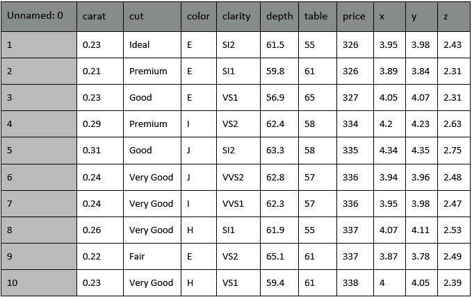
Figure 3.4 – The first 10 rows of the diamonds dataset
Note that the diamonds dataset contains some categorical columns, including cut, color, and clarity, and some numerical columns (the others).
- We drop the first column, Unnamed: 0, as follows:
df = df.drop(["Unnamed: 0"], axis=1)
We use the drop() method provided by pandas with axis=1 to indicate that we want to drop columns.
- We define two practical functions to transform our data; we will use the first one to convert categorical columns to numerical and the second to scale numerical columns. We define the first function as follows:
from sklearn.preprocessing import LabelEncoder
def encode_labels(data):
categories = (data.dtypes =="object")
cat_cols = list(categories[categories].index)
categories = (X.dtypes =="object")
feature_label_encoder_dict = {}
for col in cat_cols:
feature_label_encoder_dict[col] = LabelEncoder()
X[col] = feature_label_encoder_dict[col].fit_transform(X[col])
The function receives the DataFrame as input. Firstly, we import the LabelEncoder class, which will permit us to convert categorical values into numerical ones. Then, we select all the categorical columns, and we store them in the categories variable. Next, we build a LabelEncoder() object for each category column and store it in a dictionary named feature_label_encoder_dict. Finally, for each categorical column, we fit and transform the built feature_label_encoder_dict object.
- Now, we define the scale_numerical() function, as follows:
from sklearn.preprocessing import StandardScaler
def scale_numerical(data):
scaler = StandardScaler()
data[data.columns] = scaler.fit_transform(data[data.columns])
The function receives the DataFrame as input and scales all the numerical columns through a StandardScaler() object.
Now that we have prepared the data, we can move to the next step, evaluation metrics for regression.
Regression
Regression analysis is a type of supervised machine learning that tries to predict a continuous target variable, named Y, on the basis of one or more input variables, named X. To evaluate a regression task, we can calculate many metrics.
As a regression task example, we want to build a model that predicts a diamond’s price on the basis of other features. Before calculating these metrics, we build the training and test sets as follows:
- We split the dataset into input features (X) and a target variable (Y):
X = df.drop("price", axis = 1)
y = df["price"]
- We encode labels and scale numerical columns:
encode_labels(X)
scale_numerical(X)
Note that we have used the previously defined functions.
- We split the datasets into training and test sets, through the train_test_split() function, provided by scikit-learn:
from sklearn.model_selection import train_test_split
X_train, X_test, y_train, y_test = train_test_split(X, y, test_size=0.20, random_state=42)
We have reserved 20% of samples for the test set and the remaining 80% of samples for the training set. Also, we have set random_state to 42 to make the experiment reproducible.
- We create a new linear regression model, fit it with the training set, and calculate the predicted values on the test set:
model = LinearRegression()
model.fit(X_train, y_train)
y_pred = model.predict(X_test)
In this example, we do not care about model optimization; thus we use the default model.
Now that we have extracted the predicted values, we can calculate the main metrics used to evaluate a regression model. In this section, we calculate three of the most popular metrics: Mean Absolute Error, Root Mean Squared Error, and R Squared:
- Mean Absolute Error (MAE) – The average of the difference between the real value and the predicted one. This measures how far the predictions are from the actual output. The lower the MAE, the better the model. In the previous example, we can calculate MAE as follows:
from sklearn.metrics import mean_absolute_error
MAE = mean_absolute_error(y_test,y_pred)
- Root Mean Squared Error (RMSE) – The square root of Mean Squared Error (MSE). MSE is similar to MAE. The only difference is that MSE calculates the average of the square of the difference between the real values and the predicted ones. RMSE is the most used metric to evaluate regression models because it gives you an idea of how concentrated the data is around the line predicted by the model.
In the previous example, we can calculate RMSE as follows:
from sklearn.metrics import mean_squared_error
import numpy as np
RMSE = np.sqrt(mean_squared_error(y_test, y_pred))
- R Squared or the coefficient of determination – The proportion of variance in Y that can be explained by X. In other words, R Squared describes how well the data fits the regression model. R Squared is a number between 0 and 1. For example, R Squared = 0.80 means that 80% of the data fits the model. In general, the higher the R Squared value, the better the model. However, this is not always true; thus, you should always combine R Squared with other metrics. In the previous example, we can calculate R Squared as follows:
from sklearn.metrics import r2_score
R2 = r2_score(y_test, y_pred)
Now that you have seen the most popular metrics used to evaluate regression models, we can analyze the most common metrics for classification.
Classification
Classification is a type of supervised learning that tries to predict the target class label, named Y, on the basis of one or more input variables, named X. If the number of class labels is two, we have binary classification; otherwise, if the number of labels is greater than two, we have multiclass classification. In this chapter, we consider only binary classification, but the general concepts described can also be extended to multiclass classification.
As a classification task example, we want to build a model that predicts a diamond’s cut on the basis of other features. The diamonds dataset contains five types of diamond cuts (Ideal, Premium, Very Good, Good, and Fair); thus the problem is multiclass classification. For simplicity, we transform the multiclass classification problem into a binary classification problem.
Before calculating the metrics for binary classification, we prepare the dataset, as follows:
- We group the cuts into two classes, Gold and Silver, as shown in the following code:
def set_target(x):
golden_set = ['Ideal', 'Premium', 'Very Good']
if x in golden_set:
return 'Gold'
return 'Silver'
df['target'] = df['cut'].apply(lambda x: set_target(x))
df.drop("cut", axis = 1,inplace=True)
We define a function, named set_target(), which receives as input a variable, named x, checks whether it belongs to golder_set or not, and returns 'Gold' if true or 'Silver' otherwise. Then, we create a new column in the original DataFrame, called target, which contains the output of the set_target() function. We also drop the original cut column, which is not needed anymore.
- Now, we build the training and tests sets, as follows:
X = df.drop("target", axis = 1)
y = df["target"]
As the input features X, we consider all the columns except the target one, which instead is associated with the y output feature.
- We encode and scale input features:
encode_labels(X)
scale_numerical(X)
Since we have previously defined the encode_labels() and scale_numerical() functions, this operation is quite simple.
- We also encode the target labels:
label_encoder = LabelEncoder()
y = label_encoder.fit_transform(y)
- We split the dataset into training and test sets, as shown in the following code:
X_train, X_test, y_train, y_test = train_test_split(X, y, test_size=0.20, random_state=42)
We use the train_test_split() function provided by scikit-learn.
- We build the classification model and train it. In this example, we consider a RandomForestClassifier:
model = RandomForestClassifier()
model.fit(X_train, y_train)
y_pred = model.predict(X_test)
We fit the model with the training set and predict the values of the test set. Similar to the case of regression, we do not care about model optimization, since in this section, our objective is to show the evaluation metrics.
Now that we have built the model, we can calculate the most popular metrics for classification – confusion matrix, precision, recall, accuracy, the F1-score, and ROC curve:

Figure 3.5 – The confusion matrix
The table shows the predicted values (rows) versus the actual values (columns). Each cell of the table corresponds to the number of correct or wrong classifications:
- True Positive (TP) – The actual value is positive, and the predicted value is positive. In this case, the model performed well.
- True Negative (TN) – The actual value is negative, and the predicted value is negative. In this case, the model performed well.
- False Positive (FP) – The actual value is negative, but the predicted value is positive. In this case, the model committed an error.
- False Negative (FN) – The actual value is positive, but the predicted value is negative. In this case, the model committed an error.
- In scikit-learn, we can calculate the confusion matrix as follows:
from sklearn.metrics import confusion_matrix
[tp,fp], [fn,tn] = confusion_matrix(y_test, y_pred)
- We use the confusion_matrix() function, which receives the test set and the predicted values as input, and returns the TP, FP, FN, and TN. scikit-learn also provides a function to directly plot the confusion matrix, as shown in the following piece of code:
from sklearn.metrics import plot_confusion_matrix
import matplotlib.pyplot as plt
plot_confusion_matrix(model, X_test, y_test, cmap='GnBu')
plt.show()
The function receives the model and the test set as input. As an additional parameter, we can pass the color map ('GnBu', in our case). The following figure shows the output of the plot_confusion_matrix() function for our example:
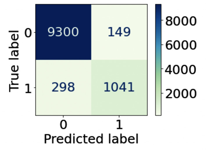
Figure 3.6 – The output of the plot_confusion_matrix() function
The matrix shows the number of records for each cell of the table. For example, the first cell indicates that there are 9,300 true positives. The table also colors the cells according to a gradient of colors.
- On the basis of the previous measurements, we can define the other metrics:
- Precision – Among all the positive predictions (TP and FP), count how many of them are really positive (TP). In scikit-learn, we can calculate this as follows:
from sklearn.metrics import precision_score
precision = precision_score(y_test, y_pred)
- Precision – Among all the positive predictions (TP and FP), count how many of them are really positive (TP). In scikit-learn, we can calculate this as follows:
We use the precision_score() function, which receives the test set and the predicted values as input, and returns a number corresponding to the precision.
- Recall – Among all the real positive cases (TP and FN), count how many of them are predicted positive (TP). In scikit-learn, we can calculate this as follows:
from sklearn.metrics import recall_score
recall = recall_score(y_test, y_pred)
We use the recall_score() function, which receives the test set and the predicted values as input, and returns a number corresponding to the recall.
- Accuracy – Among all the cases (TP + TN + FP + FN), count how many of them have been predicted correctly. In scikit-learn, we can calculate this as follows:
from sklearn.metrics import accuracy_score
accuracy = accuracy_score(y_test, y_pred)
We use the accuracy_score() function, which receives the test set and the predicted values as an input, and returns a number corresponding to the accuracy. Many data scientists use accuracy as a single metric to test the validity of their model.
- F1-score – The harmonic means of precision and recall. In scikit-learn, we can calculate this as follows:
from sklearn.metrics import f1_score
f1 = f1_score(y_test, y_pred)
We use the f1_score() function, which receives the test set and the predicted values as input, and returns a number corresponding to the F1-score.
- Receiver Operating Characteristics curve (ROC curve) – A curve showing the true positive rate (the recall or TPR) against the false positive rate (FRP). We can think about the FPR as the number of predictions incorrectly classified as positive (FP) among all the negative values (FP and TN). We plot the ROC curve at different threshold values – the threshold = 1, TPR = 1, and FPR = 1. In scikit-learn, we can plot the ROC curve as follows:
from sklearn.metrics import roc_curve,roc_auc_score
y_pred_proba = model.predict_proba(X_test)[::,1]
fpr, tpr, _ = roc_curve(y_test, y_pred_proba)
auc = roc_auc_score(y_test, y_pred_proba)
plt.plot(fpr,tpr,label='auc=%.3f' % auc, color='#084081')
axis_ranges = [0,1]
plt.plot(axis_ranges, axis_ranges, linestyle='--', color='k', scalex=False, scaley=False)
plt.xlabel('False Positive Rate')
plt.ylabel('True Positive Rate')
plt.legend()
plt.grid()
plt.show()
Firstly, we calculate the predicted probabilities for each class through the predict_proba() method. Then, we calculate the ROC curve through the roc_curve() function, which receives as input the output of the predict_proba() method. We also calculate the AUC score, through the roc_auc_score() function. The Area Under the Curve (AUC) score measures the ability of a classifier to distinguish between the target classes. The higher the AUC, the better the performance of a model in distinguishing between positive and negative targets. The following figure shows the output of the previous code:
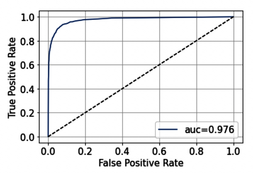
Figure 3.7 – The ROC curve
Note that in our example the model performs quite well because the ROC curve tends to be flattened to the left. The dotted line represents a 0.5 AUC score, which is inherent to the random guessing model.
Now that we have reviewed the most popular metrics used to evaluate classification models, we can analyze the most common metrics for clustering.
Clustering
Clustering analysis is a type of unsupervised machine learning, where there is no training set. Clustering is used to group records according to similarity criteria, such as distance. A clustering model takes a dataset as input and returns a list of labels as output, corresponding to the associated clusters.
Evaluating the performance of a clustering model is not easy because you should verify that each record has been assigned the right cluster. In other words, you should verify that each record is much more similar to the records belonging to its cluster than to the records belonging to the other clusters.
Before calculating the metrics, we will prepare the diamonds dataset, as follows:
- For simplicity, we will consider only two columns of the dataset, price and carat, as shown in the following code:
X = df[['price', 'carat']]
- Then, we plot the dataset, as follows:
plt.scatter(X['price'],X['carat'])
plt.xlabel('Price')
plt.ylabel('Carat')
plt.grid()
plt.show()
The following figure shows the resulting plot:

Figure 3.8 – A scatter plot showing Carat against Price
- We use a K-means model to cluster our data into two clusters, as follows:
from sklearn.cluster import KMeans
model = KMeans(n_clusters=2)
labels = model.fit_predict(X)
We use the KMeans() class provided by scikit-learn, and then we call the fit_predict() method to calculate the clusters.
- We plot the results of clustering, as follows:
from matplotlib.colors import ListedColormap
cmap = ListedColormap(['#40B7AD', '#084081'])
plt.scatter(X['price'],X['carat'], c=labels, cmap=cmap)
plt.xlabel('Price')
plt.ylabel('Carat')
plt.grid()
plt.show()
We assign to each point of the scatter plot a color, corresponding to the associated label. The following figure shows the resulting plot:

Figure 3.9 – The dataset after clustering
Now that we have clustered our dataset, we can evaluate the model. There are two types of evaluation:
- Supervised-based evaluation (or extrinsic methods) assumes that there is a ground truth to perform the evaluation. The idea is to compare the ground truth with the result of a clustering algorithm in order to calculate a score. Many metrics fall in to this category, such as the homogeneity score and the Mallows score. Since calculating a ground truth is very difficult, in this chapter, we will not focus on this type of evaluation.
- Unsupervised-based evaluation (or intrinsic methods) calculates how well the clusters are separated and how compact the clusters are.
Regarding the intrinsic methods, we can calculate many metrics, including the following ones:
- The silhouette coefficient or silhouette score measures how similar an object is to its cluster compared to the others. This coefficient can range from –1 to 1. A value equal to 1 means that the object has been correctly classified, while a value of –1 means that the model has inserted the object in the wrong cluster. In scikit-learn, we can calculate it as follows:
from sklearn.metrics import silhouette_score
score = silhouette_score(X, labels)
The function receives the X dataset and the labels as input and returns a number representing the silhouette score. In the previous example, the score is 0.708.
- The Elbow method – a visual method to estimate the optimal number of k clusters. We run the algorithm multiple times with an increasing number of clusters, and then we plot the sum of squared distances of samples to their closest cluster center (SSE) as a function of the number of clusters. In Python, we can apply the elbow method as follows:
sse = {}
for i in range(2,10):
model = KMeans(n_clusters=i)
sse[i] = model.inertia_
We define a loop with different values of the number of clusters. After fitting the model, we calculate SSE (model.inertia_) for each iteration. We plot the results as follows:
plt.plot(sse.keys(), sse.values())
plt.grid()
plt.xlabel('Number of Clusters')
plt.ylabel('SSE')
plt.show()
The previous code produces the following figure:
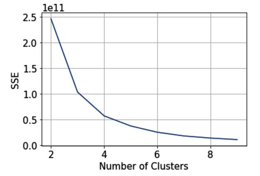
Figure 3.10 – The elbow method
We can identify the correct number of clusters as the point after which the curve begins to decrease rapidly. In our case, the best number of clusters could be two.
Now that we have reviewed all the main techniques for model evaluation, we are ready to move to the next section, using Comet for model evaluation.
Using Comet for model evaluation
Comet provides the following features to deal with model evaluation:
- Log – used to store metrics, assets, and objects in Comet
- Dashboard – used to compare the results of the experiments
- Registry – used to track and store your models
- Report – used to show the results
The following figure shows how to combine the features provided by Comet to compare different models and then choose the best one for production:
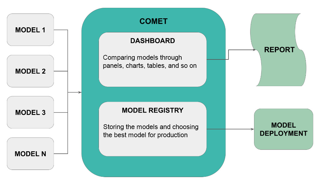
Figure 3.11 – How to use Comet for model evaluation
Let’s suppose that you want to compare N models and then choose the best model for deployment. You build your experiments and then you track them in Comet. Through Comet Dashboard, you can compare models by building panels, charts, tables, and other similar objects. You can also store your models in the Comet registry. You can even export a report showing the results of comparison from the Comet platform. Once you have selected the best model, you can export it from the registry and make it available for production.
To show how we can use Comet for model evaluation, you will use the previously defined diamonds dataset, and you will implement four classification models – Random Forest, Decision Tree, Gaussian Naive Bayes, and K-Nearest Neighbors. We will use the basic version of these models, without optimizing them, because the objective of this chapter is to show how to perform model evaluation. For more details on how to optimize classification models, you can refer to Chapter 8, Comet for Machine Learning. You will use the cleaned version of the dataset, described in the previous section, Classification, that we built as follows:
options = ['Ideal', 'Premium']
df2 = df[df['cut'].isin(options)]
X = df2.drop("cut", axis = 1)y = df2["cut"]
We have supposed that df contains the diamonds dataset. We have selected only two possible values for cut, to deal with binary classification. Then, we have built the input (X) and target (y) variables. We also suppose that we have encoded labels and scaled numerical values, as described in the previous section.
We can now move on to analyze each feature provided by Comet separately, by starting from the first, Log.
Comet Log
A Comet Log is an object that stores a metric, a parameter, or an object in general in Comet. We have already described the basic concepts behind a Comet Log in Chapter 1, An Overview of Comet, and Chapter 2, Exploratory Data Analysis in Comet. Thus, you can refer to those chapters for basic concepts. In this section, we will review the most useful Comet logs for model evaluation.
We will use the following methods provided by the experiment class:
- log_metrics()
- log_curve()
- log_confusion_matrix()
Let’s suppose that we have already split our dataset into training and test sets, as described in the previous section:
- Firstly, we define an auxiliary function, named compute_metrics(), which calculates all the evaluation metrics for our experiment:
from sklearn.metrics import precision_score, recall_score, f1_score, accuracy_score
def compute_metrics(y_pred, y_true):
metrics = {}
metrics['precision'] = precision_score(y_true, y_pred)
metrics['recall'] = recall_score(y_true, y_pred)
metrics['f1-score'] = f1_score(y_true, y_pred)
metrics['accuracy'] = accuracy_score(y_true, y_pred)
return metrics
The function returns a dictionary, named metrics, which stores all the calculated metrics. We calculate precision, recall, the F1-score, and accuracy. Following the discussion in the Choosing metrics section, we will use just one metric to perform the comparison among the different models: accuracy. However, for completeness, we also calculate the other metrics.
- Now, we define another auxiliary function, which runs a single experiment. The function receives the model class and the model’s name as input, then it trains the model with the training set, and finally, it calculates the metrics, as well as the confusion matrix and the ROC curve. The following code implements the described function:
from sklearn.metrics import roc_curve
def run_experiment(ModelClass, name):
experiment = Experiment()
experiment.set_name(name)
experiment.add_tag(name)
model = ModelClass()
with experiment.train():
model.fit(X_train, y_train)
y_pred = model.predict(X_train)
metrics = compute_metrics(y_pred, y_train)
experiment.log_metrics(metrics)
experiment.log_confusion_matrix(y_train, y_pred)
with experiment.validate():
y_pred = model.predict(X_test)
metrics = compute_metrics(y_pred, y_test)
experiment.log_metrics(metrics)
experiment.log_confusion_matrix(y_test, y_pred)
fpr, tpr, _ = roc_curve(y_test, y_pred)
experiment.log_curve(name, fpr, tpr)
Firstly, we create a new experiment object to permit communication with Comet. To configure the experiment parameters, including the workspace and the API key, you can refer to Chapter 1, An Overview of Comet. We also set the experiment name to a name passed as input, to make the experiment recognizable from the Comet Dashboard. We use the set_name() method of the Experiment class to perform this operation. In addition, we add a new tag to the experiment through the add_tag() method. Then, we create our model through the model = ModelClass() statement. Note that ModelClass() is a variable, which you will set when calling the function.
Once we have created the model, we can train it. We use the with experiment.train() statement to let Comet know that all the logged objects belong to the training phase. We calculate metrics through the compute_metrics() function, and then we log them in Comet through the log_metrics() method provided by the Experiment class. In addition, we log the confusion matrix through the log_confusion_matrix() method. Once training is complete, we can test the model. Similar to the training phase, we use the with experiment.validate() statement to let Comet know that all the logged objects belong to the training phase. We call the predict() method provided by the model on the test set, and we calculate all the metrics, as already done during the training phase. In addition, in this phase, we calculate the ROC curve through the roc_curve() function, and we log it in Comet through the log_curve() method, provided by the Experiment class.
- Finally, we can run the experiments. We test four classifiers, as follows:
from sklearn.ensemble import RandomForestClassifier
from sklearn.tree import DecisionTreeClassifier
from sklearn.naive_bayes import GaussianNB
from sklearn.neighbors import KNeighborsClassifier
run_experiment(RandomForestClassifier, 'RandomForest')
run_experiment(DecisionTreeClassifier, 'DecisionTreeClassifier')
run_experiment(GaussianNB, 'GaussianNB')
run_experiment(KNeighborsClassifier, 'KNeighborsClassifier')
Simply, we call the run_experiment() function for each of the classifiers we want to test. In the example, we test Random Forest, Decision Tree, Gaussian Naive Bayes, and K-Nearest Neighbors.
The log_metrics() method permits us to also log epochs and steps. An epoch is a hyperparameter available only for certain types of algorithms, such as those based on gradient descent. An epoch corresponds to the number of times the algorithm will work with the training dataset.
Setting the epoch to 1 means that each sample of the training set has just one opportunity to update the algorithm during the training phase. A step (or batch) defines the number of samples to use before updating the model parameters. We can set the step equal to the training set size or a smaller number.
- To deal with epochs, we can modify the run_experiment() function, as follows:
def run_experiment(ModelClass, name, n_epochs):
...
with experiment.train():
for i in range(n_epochs):
model = ModelClass(max_iter=n_epochs)
model.fit(X_train, y_train)
y_pred = model.predict(X_train)
metrics = compute_metrics(y_pred, y_train)
experiment.log_metrics(metrics, epoch = i)
experiment.log_confusion_matrix(y_train, y_pred, epoch=i)
...
We add another argument to the function, which is the number of epochs (n_epochs). Then, during the training phase, we build a loop over the number of epochs, and we build a model for each epoch. The previous function works only with models supporting the number of epochs, such as the SGD classifier:
from sklearn.linear_model import SGDClassifier
run_experiment_with_epoch(SGDClassifier, 'SGD',1000)
We build a classifier and set the number of epochs up to 1,000.
Similar to the number of epochs, we can set the number of steps. For example, we can decide to train our model with different sizes of the dataset. Thus, we can modify the run_experiment() function, as follows:
import numpy as np
def run_experiment(ModelClass, name):
step_size = len(X_train)
min_steps = 20
...
with experiment.train():
for i in np.arange(min_steps, step_size+1, step = 5000):
model = ModelClass()
X_t = X_train[0:i]
y_t = y_train[0:i]
model.fit(X_t, y_t)
y_pred = model.predict(X_t)
metrics = compute_metrics(y_pred, y_t)
experiment.log_metrics(metrics, step = i)
experiment.log_confusion_matrix(y_t, y_pred, step=i)
...
We set the step size to the length of the training set and the minimum number of samples in a step equal to 20. Then, we loop over the different steps and train different models, each with an increasing number of samples.
Now that you have logged all the needed metrics, we can analyze them in the Comet Dashboard.
Comet Dashboard
Comet Dashboard is the Comet online website, which stores all your experiments. Let’s suppose that you have run all four experiments, described before. Under the Panels or Experiments tab, you will see them, as shown in the following figure:

Figure 3.12 – The four experiments shown in Comet
We can easily identify each experiment because we have set the experiment name for each model.
We can perform the following types of comparison among the experiments:
- Ordering
- Raw comparison through a table
- Filtering
- Grouping
Let’s look at each type of comparison separately, starting with the first one, ordering.
We can order experiments by a specific parameter or metric:
- We select the ordering button, as shown in the following figure:

Figure 3.13 – The ordering button in Comet Dashboard
- A new pop-up window opens, showing the default criteria for ordering the experiments. There are two criteria as default. We can add as many criteria as we want. In this example, we set just one criterion. We can remove one of the default criteria by clicking the X button.
- Then, we can change the remaining criterion by opening the drop-down menu and selecting validate_accuracy, as shown in the following figure:
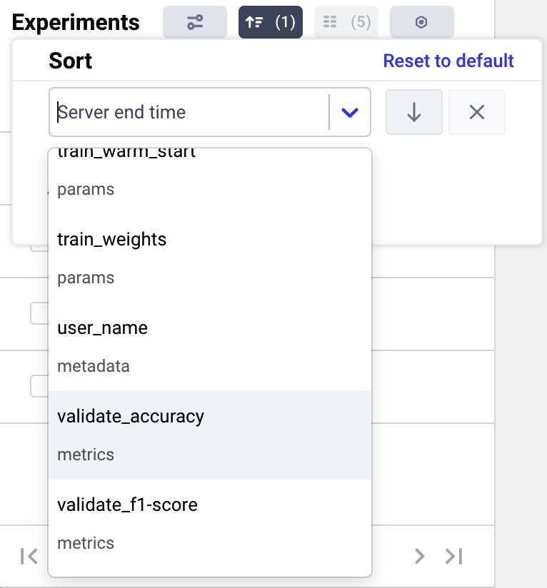
Figure 3.14 – How to select the ordering criterion in the drop-down menu
We can also choose whether to order the experiment by ascending (the top arrow) or descending (the down arrow). In our case, we select the descending order. Now, the four models are ordered, as shown in the following figure:

Figure 3.15 – The four experiments after sorting by validate_accuracy
Thanks to this simple operation, we know which is the best model, according to our evaluation metric.
Now, we can perform a raw comparison among the experiments through a table. We can see detailed information about each evaluation metric.
- We click the Experiments tab and see all the information about all the experiments, as shown in the following figure:

Figure 3.16 – A portion of the Experiments tab
The figure shows only some details about each experiment, such as TAGS, SERVER END TIME, FILE NAME, and DURATION. However, Comet provides the user with all the logged parameters and metrics, 15 columns in our case, as shown in the columns button at the top part of the previous figure.
- If we click the columns button, we can choose which columns we want to view, as shown in the following figure:

Figure 3.17 – The pop-up window to customize columns
- We choose the following columns – validate_accuracy, validate_precision, validate_recall, and validate_f1-score. As a result, the Experiments tab shows a table, as shown in the following figure:

Figure 3.18 – The Experiments tab after selecting some columns
We note that the Random Forest model reaches an accuracy of 0.957, followed by the Decision Tree model with an accuracy of 0.942, and then the other two models. Through the Comet Dashboard, it is very simple to compare experiments.
Now, we can group experiments by some criteria:
- We can click the Group by button, as shown in the following figure:

Figure 3.19 – The Group by button in the Experiments tab
- A drop-down menu opens. In the drop-down menu, we can choose the grouping criteria – for example, we can choose Duration. As a result, Comet groups all the experiments by duration, as shown in the following figure:
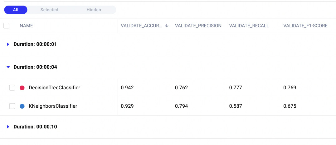
Figure 3.20 – The result of grouping by duration
There are three groups – 1, 4, and 10 seconds. In the 4-seconds group, there are two models, while in the other groups, there is just one model.
Finally, we can filter experiments by some criteria:
- We can click the Filters button, as shown in the following figure:

Figure 3.21 – The Filters button in the Experiments tab
- A pop-up window opens. We can click on the Add Filter button | validate_accuracy | greater than | 0.92 | Done | Close. As a result, Comet Dashboard shows only the experiments satisfying the filter, as shown in the following figure:
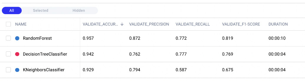
Figure 3.22 – The Experiments tab after applying the validate_accuracy greater than 0.92 filter
Note that Random Forest, Decision Tree, and K-Nearest Neighbors satisfy the applied filter.
For all the described operations, you can apply as many criteria as you want from the pop-up window.
Now that you have learned how to compare experiments in Comet, we can move onto the next step, model registry.
Registry
A Comet Registry or Model Registry is a place available in the Comet platform that stores all the registered models. There are at least two advantages of registering models in Comet. Firstly, you can keep track of all the stages of your project, and secondly, you can use the registry as secure storage.
To make a model available in the Model Registry, firstly, you need to register it during an experiment by using one of the following methods provided by the Experiment class:
- log_model(name, file_name)– logging the model as an artifact and then, manually, adding it to the registry.
- register_model(MODEL_NAME)– registering the full experiment and adding it to the registry
To log the model, we can modify the previously defined run_experiment() function, as follows:
- First, we define an auxiliary function that saves a model both in the local file system and in Comet:
import pickle
def save_file_to_comet(obj, obj_name, file_name, experiment):
with open(file_name, 'wb') as file:
pickle.dump(obj, file)
file.close()
experiment.log_model(obj_name, file_name)
The function receives the object (obj) as input to save its name, the output filename, and the Comet experiment object. We can save the model as a pickle file, through the dump() function provided by the pickle library. Then, we log the saved model through the log_model() method of the Experiment class.
- Then, we can use this function in the run_experiment() function, as follows:
def run_experiment(ModelClass, name):
...
with experiment.train():
...
file_name = 'model.pkl'
save_file_to_comet(model, name, file_name, experiment)
...
- You also should keep in mind to save the scalers and the encoders used to build the training and test set. You can do it simply by using the save_file_to_comet() function previously defined. For example, you can pass the scaler and encoder objects as additional parameters to the run_experiment() function, and then call the save_file_to_comet() function to save them in Comet, as shown in the following piece of code:
def run_experiment(ModelClass, name, feature_label_encoder_dict, scaler,label_encoder):
...
if feature_label_encoder_dict:
for k,v in feature_label_encoder_dict.items():
obj_name = f"{k}FeatureLabelEncoder"
file_name = f"{obj_name}.pkl"
save_file_to_comet(feature_label_encoder_dict[k], obj_name, file_name, experiment)
if label_encoder:
obj_name = "labelEncoder"
file_name = f"{obj_name}.pkl"
save_file_to_comet(label_encoder, obj_name, file_name, experiment)
if scaler:
obj_name = "scaler"
file_name = f"{obj_name}.pkl"
save_file_to_comet(scaler, obj_name, file_name, experiment)
We save each object separately. For each object, we define its name (obj_name) and the output filename (file_name) in the local filesystem.
Once we have run all the experiments, we can access the saved models, as follows:
- Under the Experiments tab of each experiment (for example, Random Forest), we select the Assets and Artifacts menu items, as shown in the following figure:

Figure 3.23 – The models directory under the Assets and Artifacts menu items
The figure shows all the logged objects, with a focus on the models directory. We can download the model if we want.
- On the right part of the screen, there is a button called Register. We click on it to add the model to the Registry. The following window opens:
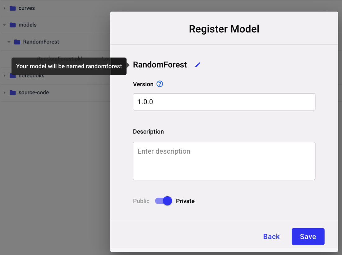
Figure 3.24 – The popup to register a new model
Since it is the first model of our project, we need to register it as a new model – for example, we can call it Diamonds classification. If we have already registered a previous model, we can add the new model to an existing Registry.
- We can repeat the same procedure for the other experiments, but when we need to add the experiment model to the Registry, we save it to the existing model. To add it, we need to increase the model version – for example, 1.0.1. In this example, we save only experiments with an accuracy greater than 0.92.
- We can now access the Registry from the main Comet Dashboard. We need to exit the current project, as shown in the following figure:

Figure 3.25 – A view of the Model Registry
- Click the View model button. We have three models, corresponding to the registered models. We can choose the best model for production (1.0.0 in our case, which corresponds to Random Forest), as shown in the following figure:
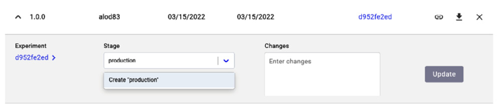
Figure 3.26 – How to set the stage as an experiment
- We click the arrow on the left, near the version, and then we set the stage as production. Finally, we click the Update button. If you do not remember which is the best experiment, you can click on the experiment key and retrieve the original experiment.
Now that you have learned how to save your models in Comet, we can move towards the next step, a report.
Reports
A Comet Report is an interactive document that contains experiments, panels, and text. You already learned the basic concepts behind the Comet Report in Chapter 2, Exploratory Data Analysis in Comet. In this section, you will learn how to build a report for model evaluation. The report will contain the following panels:
- Precision, recall, the F1-score, and accuracy graphs
- The ROC curve
Let’s start from the first panel, precision, recall, the F1-score, and accuracy graphs. Let’s suppose that we have logged the involved metrics using the step parameter, as described in the previous sections:
- Firstly, we create a new report, as described in Chapter 2, Exploratory Data Analysis in Comet. We set its name as Diamonds Report. The reporting dashboard appears with empty content.
- Then, we return to the main dashboard by clicking the project name at the top left of the screen.
- We access the Panels section, where we can see some of the logged metrics, as shown in the following figure:
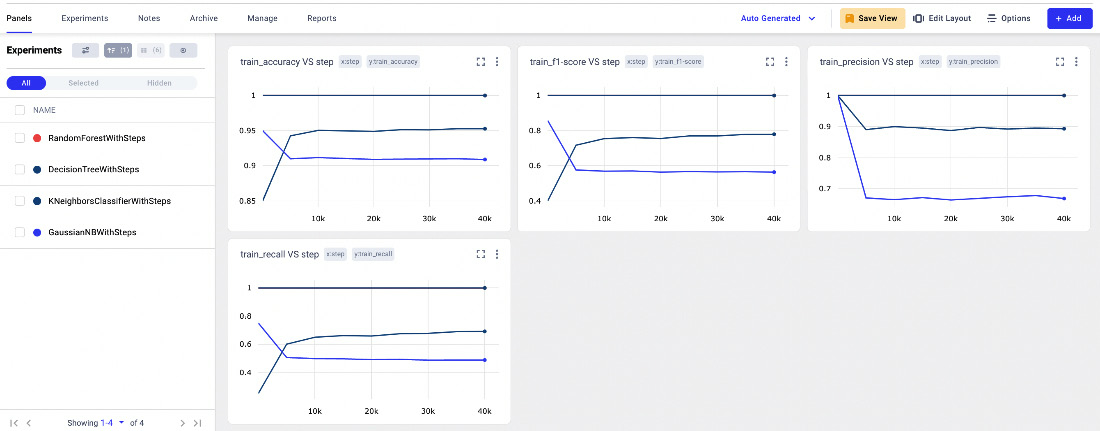
Figure 3.27 – The Panels menu item in the Comet Dashboard
The window contains four line charts, respectively of training accuracy, a training F1-score, training precision, and training recall, all against the step.
- We can add as many panels as we want simply by clicking Add | New Panel. In our case, we add a new bar chart, with validation accuracy. Once New Panel is selected, we choose Bar Chart | Add | Y Axis | validate_accuracy | Done.
- Now, we save the current view by clicking the Save View button | Create new view. We set the view name as metrics.
- Finally, we can add the panels to the report by clicking Add | Add to Report | diamonds-report. The Comet Dashboard now shows the report. We can click on the Save button to save it.
Now that we have added the basic panels to your report, we can move onto the next step, the ROC curve. Since Comet does not provide a default panel for the ROC curve, the idea is to build a custom panel that shows it:
- Firstly, we open the Comet online SDK, and we select the Python language. You have already learned how to build a custom panel in Chapter 2, Exploratory Data Analysis in Comet; thus you can refer to it for further details on how to access the Comet online SDK.
- We import all the needed libraries, including matplotlib, which we will use to plot a graph:
from comet_ml import API, ui
import matplotlib.pyplot as plt
- We retrieve all the experiment keys, as follows:
api = API()
experiment_keys = api.get_panel_experiment_keys()
We build an API() object, and we get all the experiment keys through the get_panel_experiment_keys() method.
- For each experiment, we extract the logged curves, and we plot them:
colors = iter(['#40B7AD', '#A1CDB3','#508DED','#454372'])
for experiment_key in experiment_keys:
for curve in api.get_experiment_curves(experiment_key):
curve_json = api.get_experiment_asset(experiment_key,curve['assetId'], return_type='json')
plt.plot(curve_json['x'],curve_json['y'],color=next(colors), label=curve_json['name'])
We use the get_experiment_curve() method to access all the logged curves, and the get_experiment_asset() method to retrieve each curve as JSON, which contains the TPR (x) and FPR (y). We plot the curve through the plot() function provided by matplotlib.
- We set the plot layout, as follows:
plt.plot([0, 1], [0, 1], color="navy", linestyle="--")
plt.xlim([0.0, 1.0])
plt.ylim([0.0, 1.05])
plt.xlabel("False Positive Rate")
plt.ylabel("True Positive Rate")
plt.legend()
Firstly, we plot the line y = x, and then we set the axis ranges through the xlim() and ylim() functions. Finally, we define the axis titles through xlabel() and ylabel(), as well as the legend.
- We use the display() function to show the graph in the panel:
ui.display(plt)
- Now, we save the panel as ROC curve. The following figure shows the produced graph:
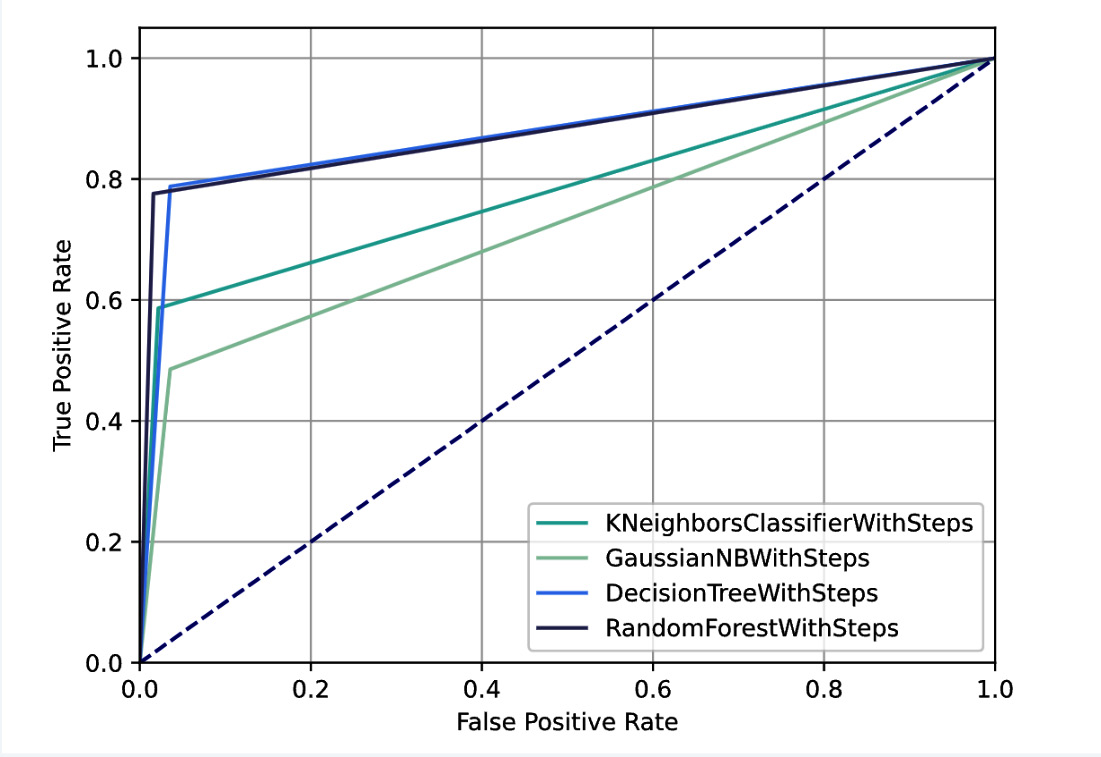
Figure 3.28 – The custom panel showing the ROC curve for all the experiments
- Finally, we are ready to add the custom panel to our report. We open the report, and then we click on Add Panel | Workspace | ROC curve | Add | Done.
The following figure shows the final report:
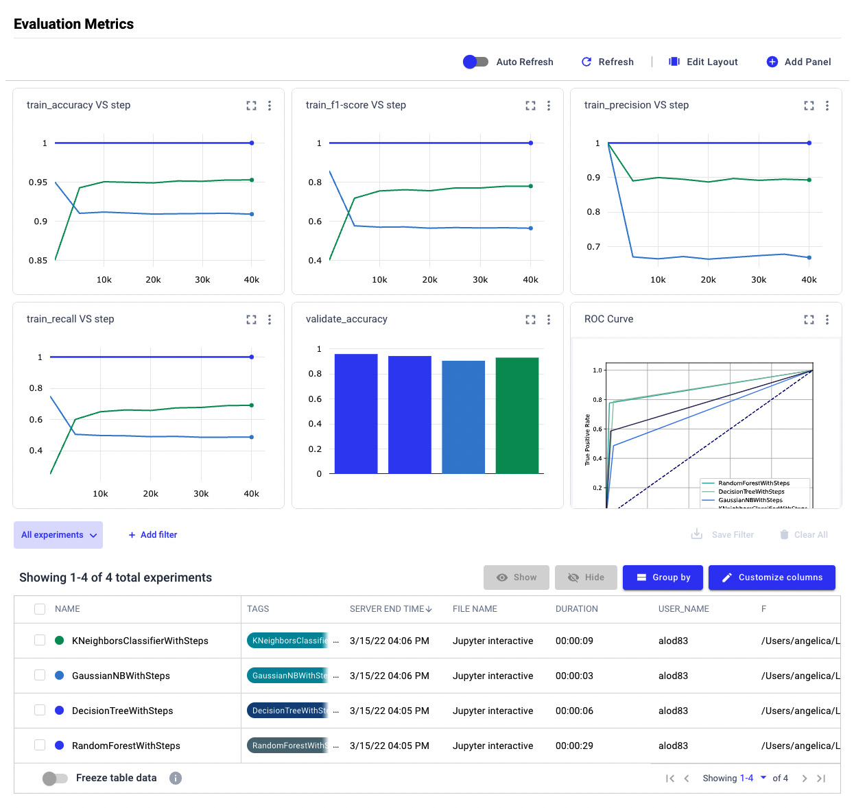
Figure 3.29 – The final report
The report is interactive; thus, we can modify it dynamically by selecting the involved experiments in the Experiment tab.
Summary
We have just completed the journey to perform model evaluation in Comet!
Throughout this chapter, we described some general concepts regarding model evaluation, as well as the main techniques to evaluate regression, classification, and clustering. We also illustrated the importance of model evaluation in a data science project; model evaluation permits us to define some metrics to choose the best model for production.
In the third part of the chapter, you learned which features Comet provides to perform model evaluation and how you can use them through a practical example. We deepened the concepts of logs and reports, which you already knew about, and illustrated two new concepts, the Comet Dashboard and the Model Registry.
Throughout this chapter, you learned how easy it is to use Comet to run model evaluation, as Comet provides very intuitive features that can be combined to build fantastic reports, as well as how to keep track of the best model for production.
Now that you have learned how to perform model evaluation in Comet, we can continue our journey toward the discovery of Comet for data science. In the next chapter, we will learn about some advanced concepts regarding workspaces, projects, experiments, and models in Comet.
Further reading
- Bonaccorso, G. (2018). Mastering Machine Learning Algorithms: Expert techniques to implement popular machine learning algorithms and fine-tune your models. Packt Publishing Ltd.
- Ng, A. (2017). Machine Learning Yearning: https://www.deeplearning.ai/machine-learning-yearning/. To download this book, you need to go to the bottom of the page and insert your email.