
Chapter 11: Comet for Time Series Analysis
Time series analysis is the study of the evolution of phenomena over time, in order to predict their future trends. It finds its application in various sectors, such as the price trend of a given product, tourist flows to a given location, and the performance of a product on the stock exchange.
Generally speaking, a time series can be represented by different components, such as the trend, which can be increasing, stable or decreasing; the seasonality – that is, the repetition over time; and the presence of breaking points, due to external events, which interrupt its normal trend.
In this chapter, you will review some basic concepts behind time series analysis, including the concept of stationarity, time series components, and how to check for the presence of breakpoints in a time series.
Over the last few years, different open source tools and libraries have been implemented to perform time series, including Prophet, statsmodels, and Kats. In this chapter, we will review the Prophet library and how to integrate it with Comet.
In the last part of this chapter, you will implement a practical use case, which uses the Prophet library, and tracks the result in Comet.
The chapter is organized as follows:
- Introducing basic concepts related to time series analysis
- Exploring the Prophet package
- Using time series analysis from project setup to report building
Before starting to review the basic concepts related to time series analysis, let’s install the required software needed to run the examples described in this chapter.
Technical requirements
We will run all the experiments and codes in this chapter using Python 3.8. You can download it from the official website, https://www.python.org/downloads/, choosing the 3.8 version.
The examples described in this chapter use the following Python packages:
- comet-ml 3.23.0
- matplotlib 3.2.2
- numpy 1.21.6
- pandas 1.3.4
- prophet 1.1
- scikit-learn 1.0
- statsmodels 0.13.2
We have already described the comet-ml, matplotlib, NumPy, pandas, and scikit-learn packages and how to install them in Chapter 1, An Overview of Comet, so please refer to that for further details on installation.
In this section, you will see how to install the other required packages.
Prophet
Prophet is an open source Python package for time series analysis. You can install it as follows:
pip install prophet
For more details about Prophet installation, you can read its official documentation, available at the following link: https://facebook.github.io/prophet/docs/installation.html.
statsmodels
statsmodels is a Python library for statistical analysis. You can install it as follows:
pip install statsmodels
For more details about statsmodels installation, you can read its official documentation, available at the following link: https://www.statsmodels.org/stable/install.html.
Now that you have installed all the software needed in this chapter, let’s move on to how to use Comet for time series analysis, starting with reviewing some basic concepts.
Introducing basic concepts related to time series analysis
A time series is an ordered sequence of values over time, representing the variation of a certain phenomenon. Examples of time series include the trend of the prices of a certain product, and the trend of rainfall in a given region over time. The following figure shows an example of time series representing the natural gas price from 2000 to 2020:
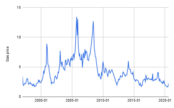
Figure 11.1 – The natural gas price time series
Data was extracted from the DataHub website and is available at https://datahub.io/core/natural-gas under the public domain and the use of Energy Information Administration (EIA) content license.
Time series analysis, also known as time series forecasting, is the study of the past values of a time series, with the purpose of building a model that predicts its future values.
In this section, you will learn the following basic concepts and aspects related to time series:
- Loading a time series in Python
- Checking whether a time series is stationary
- Exploring time series components
- Identifying breakpoints in a time series
Let’s start with the first aspect, loading a time series in Python.
Loading a time series in Python
To load a dataset as a time series in Python, you can proceed as follows:
- Firstly, you load the dataset as a pandas DataFrame:
import pandas as pd
df = pd.read_csv('https://datahub.io/core/natural-gas/r/monthly.csv', parse_dates=['Month'])
You should make sure that the column related to dates is parsed as a datetime (parse_dates=['Month']). As an example, we have used the natural gas prices dataset, as described previously.
- Then, we set the index of the DataFrame to the column containing dates:
df = df.set_index('Month')
- Finally, we assign to the time series the column containing values:
ts = df['Price']
Now that you have learned how to load a time series in Python, you are ready to check whether a time series is stationary.
Checking whether a time series is stationary
Stationarity is a time series property, meaning that the statistical properties of the process that generates the time series do not change over time. This property does not mean that the time series is constant over time, just that the way it changes does not change over time. For example, the time series of Figure 11.1 is not stationary because you cannot recognize a constant generating process for that time series.
The section is organized as follows:
- The stationarity test
- Dealing with non-stationary time series
Let’s start from the first point, the stationarity test.
The stationarity test
To check whether a time series is stationary, you can use different methods, including the Augmented Dickey-Fuller (ADF) test and the Kwiatkowski-Phillips-Schmidt-Shin (KPSS) test. In this chapter, we will focus on the ADF test. For more details, you can refer to the books contained in the Further reading section.
The ADF test is a statistical test, which is conducted with the following assumptions:
- Null Hypothesis (H0): The time series is non-stationary.
- Alternate Hypothesis (HA): The time series is stationary.
If the test fails to reject the null hypothesis, the series is non-stationary. In the ADF test, there are two conditions to reject the null hypothesis:
- If test statistic < critical value
- If p-value < alpha
The test statistic, the p-value, and the critical value are variables returned by the test. Conversely, the alpha variable is usually set to 0.05. If both the conditions are satisfied, you can conclude that the time series is stationary. The statsmodels Python package provides a function to perform the ADF test. You will explore it through a practical example in the Using time series analysis from project setup to report building section.
If a time series is stationary, you can build a prediction model, which, in theory, could be very accurate. Instead, if the time series is not stationary, you can even build a prediction model, but the results of the prediction could be unreliable. Thus, it would be better if your time series were stationary.
What should you do with a non-stationary time series? Let’s investigate it in the next section.
Dealing with non-stationary time series
If a time series is not stationary, you can perform a transformation to make the time series stationary. Examples of transformations include differentiating the current value from the previous one, and a logarithmic transformation.
To apply a differencing transformation to the time series, you can proceed as follows:
- Firstly, you calculate the difference between the values in the time series:
ts2 = ts.diff()
This diff() method calculates the difference between the current value and the previous one of the time series. Obviously, this operation cannot be done for the first value of the time series, which is set to NaN by the diff() method.
- Then, we drop all the NaN values in the new time series, as follows:
ts2.dropna(inplace=True)
The following figure shows the effects of the differencing transformation on the time series of Figure 11.1:
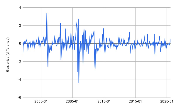
Figure 11.2 – The effects of the differencing transformation
In the example, the differencing transformation makes the time series stationary. Thus, you can use the differentiated time series to build the model. However, if you want to reconstruct the original time series, you need to perform the inverse operation. In the case of differencing, you should calculate the cumulative function:
ts3 = ts2.cumsum()
The new time series, ts3, is equal to the original time series. However, in ts3, the first value is missing, since it is also missing in ts2. Now that we have learned some basic concepts regarding stationarity, we can move on to the next aspect, exploring the time series components.
Exploring the time series components
You can think of a time series as being composed of the following three components:
- Trend, which represents the long-term direction. It can be either increasing or decreasing.
- Seasonality, which is a cycle that repeats regularly over time (for example, every day, month, or year). You can identify seasonality by finding regularly spaced peaks with approximately the same magnitude for every period of time.
- Residuals, which are short-term fluctuations.
You can use different techniques to decompose a time series in the previous three components and how to deal with seasonality. In this section, you will see the following:
- Decomposing a time series in Python
- Dealing with seasonal time series
Let’s start from the first point, decomposing a time series in Python.
Decomposing a time series in Python
In Python, you can decompose a time series into its three components through the seasonal_decompose() function, provided by the statsmodels package. Let’s suppose that you want to decompose the time series shown in the following figure:
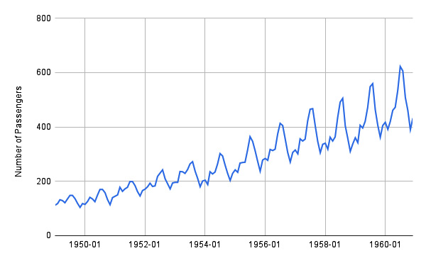
Figure 11.3 – The air passengers time series
The time series represents the number of air passengers per month. The dataset is available on Kaggle at https://www.kaggle.com/datasets/rakannimer/air-passengers under the Open Data Commons license.
The following piece of code shows how to decompose the time series through the seasonal_decompose() function:
from statsmodels.tsa.seasonal import seasonal_decompose
result = seasonal_decompose(ts, model='additive', period=12)
The function receives the time series as input, the model used to decompose (either multiplicative or additive), and the period, in months.
You can also plot the results of decomposition through the result.plot() method:
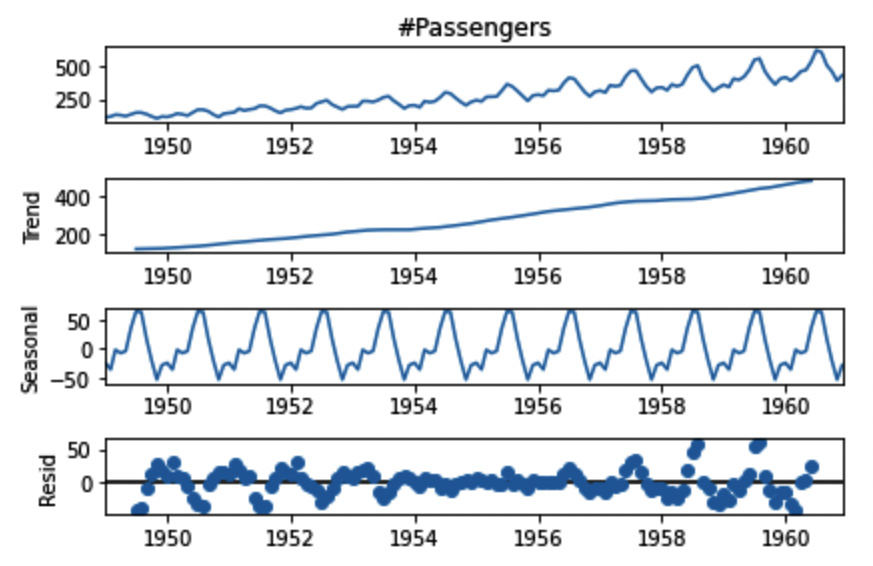
Figure 11.4 – The decomposed time series
You can easily identify the trend (Trend), the seasonality (Seasonal), and the residuals (Resid).
Now that you have learned how to decompose a time series in Python, we can move on to the next step, dealing with seasonal time series.
Dealing with seasonal time series
When you build a model for time series forecasting, you should take into account whether your time series has a seasonal component or not. In fact, some models perform better if the time series does not present seasonality, and others if they do.
One strategy to use any model regardless of the presence of seasonality is to remove seasonality from the time series and predict future values for the seasonally adjusted time series. Then, you can add the seasonality to the predicted values, to obtain the correct predictions.
Follow these detailed steps:
- First, you can decompose the time series through the seasonal_decompose() function, as described in the previous section.
- Then, you can compute the seasonally adjusted time series, as follows:
seasonality = result.seasonal
adjusted_ts = ts – seasonality
Since we have used an additive model, we can remove seasonality simply by calculating the difference between the original time series and the seasonality. The following figure shows the original time series and the seasonally adjusted time series:
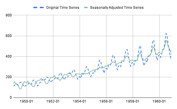
Figure 11.5 – The original time series and the seasonally adjusted time series
- Now, you can use any model you prefer to predict the future values of the seasonally adjusted time series.
- Finally, you add the seasonality of the last time period to the predicted values, to obtain the predictions for the original time series.
Now that we have learned about time series components, we can discuss how to identify breakpoints in a time series.
Identifying breakpoints in a time series
A breakpoint is a structural change in a time series, such as an anomaly or an expected event. The following figure shows an example of time series with two breakpoints:
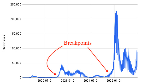
Figure 11.6 – A time series with at least two breakpoints
The figure shows the time series related to the number of new daily cases of infection of COVID-19 in Italy, extracted from the Humanitarian Data Exchange, available at the https://data.humdata.org/dataset/coronavirus-covid-19-cases-and-deaths under the Creative Commons attribution for the Intergovernmental Organizations license.
You can use the following two main techniques to identify breakpoints:
- Detection, which aims to identify breakpoints automatically. In Python, many libraries exist to detect breakpoints, such as ruptures (https://pypi.org/project/ruptures/) and jenkspy (https://pypi.org/project/jenkspy/).
- Test, which tests whether a point is a breakpoint or not. An example of this category of techniques is the Chow test (https://pypi.org/project/chowtest/).
Now that we have learned the basic concepts of breakpoints in a time series, we can move on to the next step, exploring the Prophet package.
Exploring the Prophet package
Prophet is an algorithm for time series analysis, released by Facebook’s Core Data Science team. Other algorithms exist for time series analysis, including Autoregressive Integrated Moving Average (ARIMA) and Seasonal Autoregressive Integrated Moving Average (SARIMA). You can refer to the books in the Further reading section if you are interested in them.
In this section, you will investigate Prophet, with a focus on the following aspects:
- Introducing the Prophet package
- Integrating Prophet with Comet
Let’s start with the first point, introducing the Prophet package.
Introducing the Prophet package
To build a model using Prophet, you can proceed as follows:
- Firstly, you import the Prophet library:
from prophet import Prophet
- Then, you build a Prophet() object:
model = Prophet()
- You train the model:
model.fit(df)
- You build a dataset with future dates:
future = model.make_future_dataframe(periods=N)
The N variable indicates the number of months.
- Finally, you use the model to predict future values:
forecast = model.predict(future)
You can customize the Prophet model with different parameters, which permit you to deal with the following main aspects:
- Breakpoints: Prophet automatically detects breakpoints. However, you can set them manually for more precise control, as follows:
model = Prophet(changepoints=['2020-05-06', '2022-07-06'])
We use the changepoints parameter to set the list of changepoints.
- Seasonality: Prophet automatically searches for weekly and yearly seasonality, and for time series with more than two cycles in length. However, you can set a custom seasonality as follows:
model = Prophet(weekly_seasonality=False, yearly_seasonality=False)
model.add_seasonality(name='monthly', period=30.5, fourier_order=3)
We disable the weekly and yearly seasonality (if not needed), and we use the add_seasonality() method to add a custom seasonality. This method receives as input the associated name, the period of seasonality, and the Fourier order. For more details on the Fourier order, you can read the official Prophet documentation, available at the following link: https://facebook.github.io/prophet/docs/seasonality,_holiday_effects,_and_regressors.html.
- Cross-validation: You can use this diagnostic feature to calculate the performance error of your model. This is achieved by means of cross-validation, where you need to specify the period and the length of prediction, as shown in the following piece of code:
from prophet.diagnostics import cross_validation
df_cv = cross_validation(model, initial='365 days', period='30 days', horizon = '100 days')
fig3 = plot_cross_validation_metric(df_cv, "mse")
You should pass to the cross_validation() function the following additional three parameters:
- Initial: the size of the training set used to fit the model. The training set is extracted from the first values of the dataset.
- Period: how much data the algorithm must add to the training set in every iteration of cross-validation.
- Horizon: the length of prediction.
The cross_validation() function returns a DataFrame that contains the predicted values and the actual values, which you can use to calculate the classical performance metrics, such as MSE, RMSE, and the Mean Absolute Percentage Error (MAPE).
For more details on the Prophet package, you can refer to its official documentation, available at the following link: https://facebook.github.io/prophet/.
Now that you have learned some basic concepts of the Prophet package, we can move on to the next step, integrating Prophet with Comet.
Integrating Prophet with Comet
Comet is fully integrated with Prophet, so whenever you build a Prophet model, Comet will log the following elements automatically:
- Hyperparameters
- The model
- All the matplotlib figures
You can control which elements you want to log by setting the corresponding parameter, as described in the Comet official documentation, available at the following link: https://www.comet.com/docs/python-sdk/prophet/.
To make automatic logging work, you should make sure that the comet_ml library is imported before the prophet one:
from comet_ml import Experiment
from prophet import Prophet
It may happen that you have a version of Prophet that is not supported by Comet. In this case, we can use the configuration parameters to make Comet log elements. For example, we can set the COMET_AUTO_LOG_FIGURES environment variable to 1 to make Comet log figures. We can set this variable in many ways. For example, we can use the os library, as follows:
import os
os.environ['COMET_AUTO_LOG_FIGURES'] = '1'
Alternatively, you should log the elements manually, as shown in the following piece of code:
experiment.log_figure(figure_name='forecast', figure=fig1)
The code shows how to plot a matplotlib figure named fig1.
Now that we have learned how to integrate Comet with Prophet, we can implement a practical example, which starts from project setup to report building.
Using time series analysis from project setup to report building
In this section, you will implement a practical example that builds two models to predict the future trend of a time series describing arrivals at tourist accommodation establishments. The dataset shows the trend from 1990 to 2022; thus, it contains a breakpoint in correspondence in April 2020, when the COVID-19 pandemic began.
In the example, you will build two models, one which considers the breakpoint at the beginning of the COVID-19 pandemic and another which does not. You will compare the two models in Comet to establish which one performs better.
The full code of the example described in this section is available at the following link: https://github.com/PacktPublishing/Comet-for-Data-Science/tree/main/11.
You can write the code using the editor or the notebook you prefer. In this example, you will use Deepnote, a popular online notebook, which is fully integrated with Comet.
You will focus on the following aspects:
- Configuring the Deepnote environment
- Loading and preparing the dataset
- Checking stationarity in data
- Building the models
- Exploring results in Comet
- Building the final report
Let’s start from the first point, configuring the Deepnote environment. If you do not want to use Deepnote for your project, you can skip the next section and jump directly to the Loading and preparing the dataset section.
Configuring the Deepnote environment
Deepnote is a platform that permits you to create notebooks over the web. The entry point to the Deepnote website is available at the following link: https://deepnote.com/.
With respect to the classical Jupyter notebooks, you can share notebooks created in Deepnote with your colleagues in real time. In addition, Deepnote is compatible with Jupyter notebook, so you can easily import notebooks implemented in Jupyter directly into Deepnote, and vice versa. Deepnote also provides you with a virtual machine that you can configure according to your needs. For example, you can configure the Python version, as well as the Python libraries used by a specific project.
Comet is fully integrated with Deepnote, so you can run your Comet experiments directly in Deepnote, and then you can display the Comet dashboard directly in Deepnote.
Let’s investigate how to configure Deepnote to work with Comet:
- To use Deepnote, firstly you should create an account at the following link: https://deepnote.com/sign-up. The automatic procedure will ask you to write the name of your workspace, as well as how you are using Deepnote (for example, as a student or a teacher).
- Once you have created your account, you can log in to the Deepnote platform. You will see a dashboard similar to the one shown in the following figure:
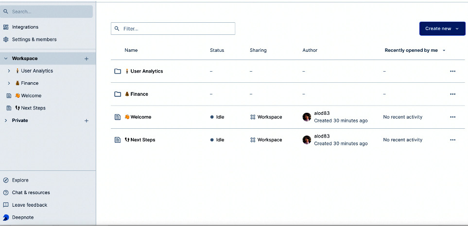
Figure 11.7 – The Deepnote dashboard
- Now you can create a new project by clicking on Create new | New Project. A new notebook opens, where you can start writing your code. You can also import an existing project from a Jupyter notebook, GitHub, or Google Drive. In the right part of the notebook, you can see a section that allows you to configure the environment, including the required hardware and the Python package, add new files, and so on.
- To install the required libraries for the project, you should create a new file, called requirements.txt, containing the list of libraries to install. You can create a new file by clicking on the + symbol, located in the Project tab of the section on the right, as shown in the following figure:
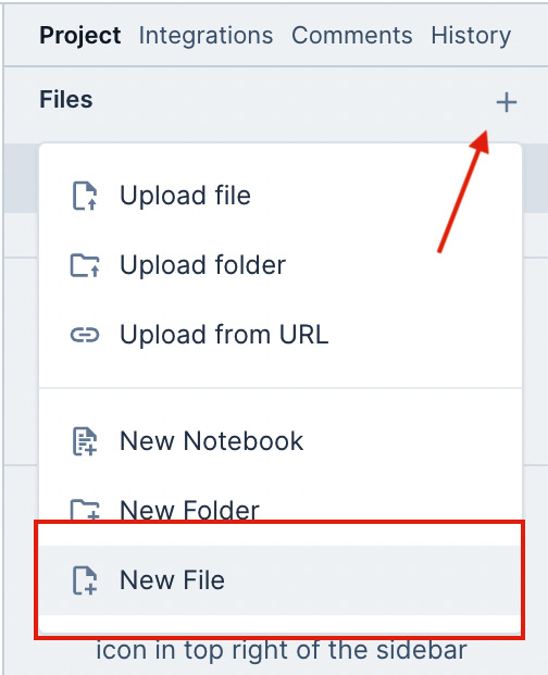
Figure 11.8 – The menu to create a new object in a Deepnote project
- After clicking on the + symbol, you can select New File from the popup menu. After entering the filename (requirements.txt in this example), a text editor opens, where you can write the list of required libraries, as shown here:
pandas
comet_ml
statsmodels
prophet
You do not need to save the file because Deepnote will do it for you. Whenever you run your project, Deepnote will install all the software contained in the requirements.txt file automatically.
- Now, you can come back to the previous notebook and rename it, by clicking on the three dots near the file, located in the Project tab of the section on the right, and then select Rename.
We have just configured Deepnote to host our code, so we can move on to the next step, loading and preparing the dataset.
Loading and preparing the dataset
As a use case, you will use the arrivals at tourist accommodation establishments, released by Eurostat and available at https://ec.europa.eu/eurostat/web/tourism/data/database and released under the Creative Commons CC BY 4.0 License. The dataset contains the tourist arrivals related to 42 European countries from January 1990 to April 2022. For each country, the dataset provides details related to the type of tourism (foreign, domestic, or both), the type of accommodation, and the unit used to measure the tourist arrivals. In this example, we will select Italian tourism, with a focus on hotels and similar accommodation (code I551). In addition, we will select absolute numbers as the unit to measure the tourist arrivals.
The following figure shows an extract of the dataset:
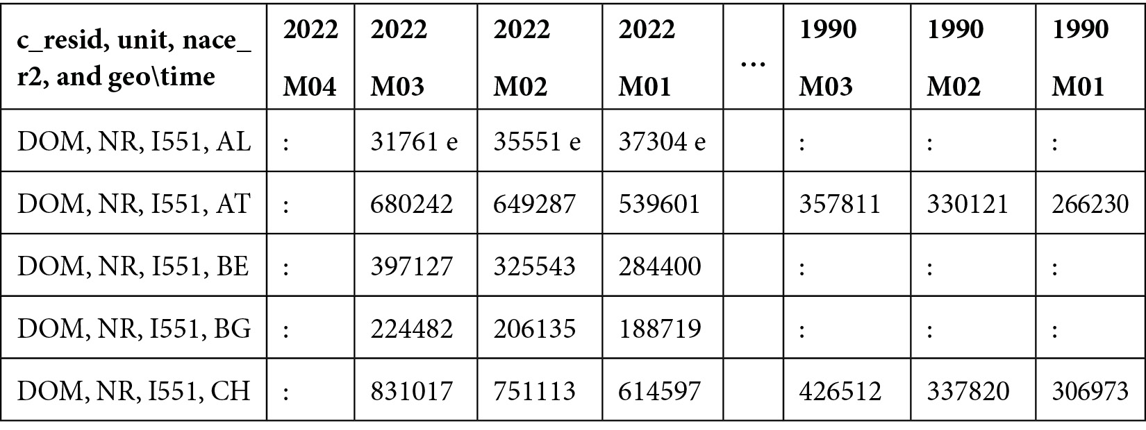
Figure 11.9 – An extract of the dataset used in the example
The dataset contains 2,358 rows and 389 columns. Each row contains data related to a country, while columns contain values related to different years. Before you can use the dataset, we should prepare it by extracting a subset containing only the Italian time series.
Let’s proceed to extraction:
- Firstly, we load the dataset as a pandas DataFrame:
import pandas as pd
df = pd.read_csv('source/tour_occ_arm.tsv', sep=' ', na_values=': ')
As additional parameters for the read_csv() function, we pass the sep argument to specify the separator character, as well as the na_values parameter to make read_csv() recognize the ':' character as an additional NaN value. The following figure shows an extract of the loaded dataset:
Figure 11.10 – The tourist arrivals dataset loaded as a pandas DataFrame
The first column of the dataset is not loaded properly, since columns are not separated by the tab character ( ) but by the comma character (',').
- To split the first column into four columns, we write the following code:
df[["c_resid", "unit", "nace_r2", "geo_time"]] = df["c_resid,unit,nace_r2,geo\time"].str.split(",",expand=True)
We access the single cell of the selected column through the str accessor. Then, we use the split() function to extract the tokens in the string and assign each of them to a new column.
The country code is contained in the geo_time column.
- For unit, we select numbers:
df = df[df['unit'] == 'NR']
The unit is contained in the unit column.
- We also select the total number of tourist arrivals:
df = df[df['c_resid'] == 'TOTAL']
The type of tourists is contained in the c_resid column.
- Finally, we select the type of accommodation associated with code I551:
df = df[df['nace_r2'] == 'I551']
The type of accommodation is contained in the nace_r2 column.
The following figure shows the dataset produced by applying the previous operations:

Figure 11.11 – The filtered dataset
Now, we should convert the previous dataset into a time series, where each row represents a different date. You can do it by transposing the DataFrame. However, before doing it, we should remove all the columns that do not refer to dates, as well as columns containing NaN values.
- We drop all the columns that are not dates:
df = df.drop(['c_resid,unit,nace_r2,geo\time', 'c_resid', 'unit', 'nace_r2', 'geo_time'], axis=1)
- We drop all the NaN values:
df = df.dropna(axis=1)
- We transpose the dataset:
df = df.T
- We reset the index of the resulting dataset:
df = df.reset_index()
- We format the dates according to a common format:
df['index'] = df['index'].str.replace('M', '-').str.strip() + '-01'
- We rename the columns:
df = df.rename(columns={'index' : 'ds', 1669 : 'y'})
- We convert columns to the correct type:
df['ds'] = pd.to_datetime(df['ds'])
df['y'] = pd.to_numeric(df['y'])
- The dataset contains the last date as the first row, so we need to reverse it:
df = df.iloc[::-1]
df.reset_index(inplace=True)
df.drop(['index'], axis=1,inplace=True)
The following figure shows the first five rows of the resulting dataset:
Figure 11.12 – The extracted time series
- You can quickly plot the extracted time series, as follows:
import matplotlib.pyplot as plt
plt.plot(df['ds'], df['y'])
plt.show()
The following figure shows the produced plot:
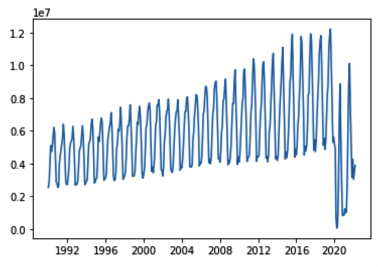
Figure 11.13 – The time series representing the total number of arrivals at Italian accommodation establishments
The figure clearly shows the breakpoint in correspondence during April 2020, when the lockdown produced by the COVID-19 pandemic began.
Now that we have loaded and prepared the dataset, we can move on to the next step, checking stationarity in data.
Checking stationarity in data
To check stationarity in data, we use the adfuller() function, provided by the statsmodels library. This function performs the ADF test. We proceed as follows:
- Firstly, we define a function, which returns True if the time series passed as an argument is stationary and False otherwise:
from statsmodels.tsa.stattools import adfuller
def is_stationary(df):
df2 = df.set_index('ds')
ts = df['y']
dftest = adfuller(ts)
adf = dftest[0]
pvalue = dftest[1]
critical_value = dftest[4]['5%']
if (pvalue < 0.05) and (adf < critical_value):
return True
else:
return False
The adfuller() function returns a tuple containing the test statistic (dftest[0]), the p-value (dftest[1]), and other values, including the critical ones.
- We call the defined function as follows:
test_result = is_stationary(df)
if test_result == True:
print('The series is stationary')
else:
print('The series is NOT stationary')
In our case, the series is stationary, so do not need to transform it to make it stationary.
We are ready to build the two prediction models, so let’s proceed to the next step, building the models.
Building the models
We build two different models; the first one does not consider the COVID-19 breakpoint, and the second one does. In both cases, we perform the following operations:
- Building the Comet experiment
- Building the Prophet model
- Logging model results in Comet
- Logging performance metrics in Comet
In the description that follows, we will analyze the model without breakpoints. The procedure adopted for the model with breakpoints is very similar, with only one difference when creating the model.
Let’s start from the first step, building the Comet experiment.
Building the Comet experiment
To build the Comet experiment, you can proceed as follows:
- Firstly, we import the libraries:
from comet_ml import Experiment
from prophet import Prophet
You should make sure that you import the comet_ml library before the Prophet one.
- Finally, we create the experiment and set its name:
experiment = Experiment()
experiment.set_name('WithoutChangePoints')
To make the preceding code work, you should configure the .comet.config file, as described in Chapter 1, An Overview of Comet.
We are ready to build the model, so let’s proceed.
Building the Prophet model
We split the dataset into training and test sets. The training set contains the first rows, up to the date of 2020-12-01, and the test set contains the remaining rows. We have chosen to keep in the training set some rows related to the effects of the COVID-19 pandemic (from April 2020 to December 2020), to give the model the possibility to learn the presence of the breakpoint:
- To split the dataset into training and test sets, we write the following code:
index = df.index[df['ds'] == '2021-01-01'].tolist()[0]
n = df.shape[0] - index
df_train = df.head(index)
df_test = df.tail(n)
We extract the index used to separate the training and test sets, and then we assign the first index rows to the training set and the remaining row to the test set.
- We create the model and train it with the training set, as follows:
m = Prophet()
m.fit(df_train)
In the case of the model that also considers the breakpoint, we create a different model, as shown here:
m = Prophet(changepoints=['2020-03-01'])
- We are ready to use the model to make predictions:
future = m.make_future_dataframe(periods=n,freq='MS')
forecast = m.predict(future)
We predict n values, with a monthly frequency (freq='MS'). The forecast variable is a DataFrame, which contains all the information related to the predicted values. The following figure shows the columns of the forecast DataFrame:
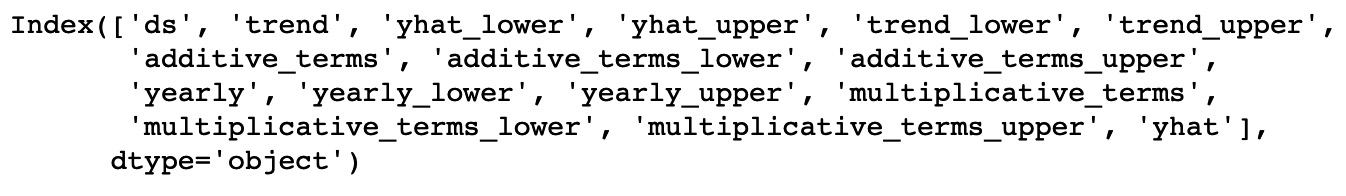
Figure 11.14 – The list of columns of the forecast DataFrame
After building the model, we are ready to log model results in Comet, so let’s proceed.
Logging model results in Comet
- Firstly, we log the forecast graph, as follows:
fig1 = m.plot(forecast)
The following figure shows the produced plot:
Figure 11.15 – The graph produced by the plot() method
The points in the figure indicate the data points used to train the model, the bold line indicates the prediction, and the light area indicates the uncertainty intervals. Note that the model is not able to recognize the breakpoint in correspondence at the beginning of the lockdown caused by the COVID-19 pandemic.
- Then, we log the forecast components, as follows:
fig2 = m.plot_components(forecast)
Similar to the plot() method, plot_components() should log the figure in Comet automatically. The following figure shows the produced graphs:

Figure 11.16 – The graphs produced by the plot_components() method
The graph shows the trend line and the yearly seasonality. From the first graph, you can clearly see a change in trend between 2013 and 2017. From the second graph, you see a peak in tourist arrivals in August, which is the hottest month in Italy.
- Finally, we log the results of the cross_evaluation() diagnostic function:
df_cv = cross_validation(m, initial="7300 days", period="365 days", horizon="730 days")
fig3 = plot_cross_validation_metric(df_cv, "rmse")
We use the first 20 years (7,300 days) as historical data for the training set, then we use a cutoff window of 365 days, and we predict the next 2 years (730 days). We also calculate RMSE. The following figure shows the plotted figure:
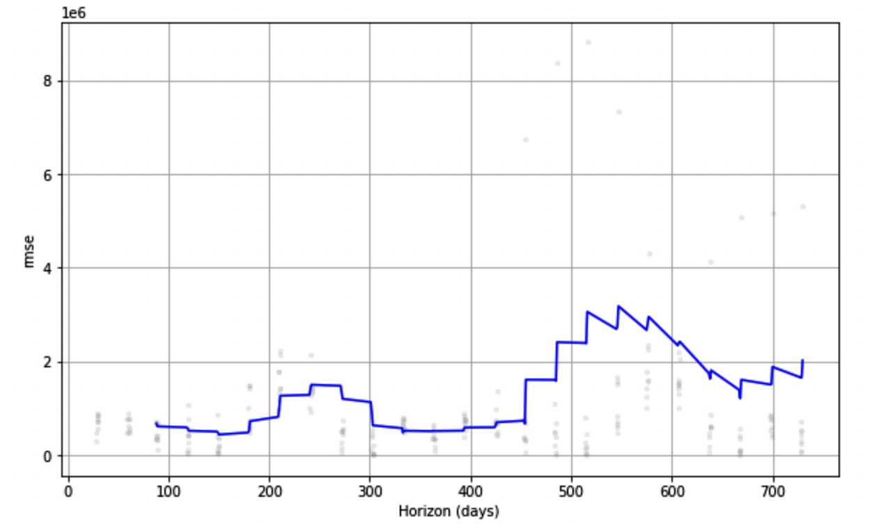
Figure 11.17 – RMSE over Horizon, as produced by the plot_cross_validation_metric() function
Now that we have logged the model results in Comet, we can move on to the next step, logging performance metrics in Comet.
Logging performance metrics in Comet
We log three performance metrics, MAE, MAPE, and RMSE, as follows:
- We use the functions provided by the scikit-learn package to calculate the metrics, so we first import them:
from sklearn.metrics import mean_absolute_error
from sklearn.metrics import mean_absolute_percentage_error
from sklearn.metrics import mean_squared_error
- Then, we define a function, which receives the original DataFrame and the forecast as input; then, it calculates the metrics and, finally, logs the results in Comet:
def log_metrics(ds, forecast, experiment):
df_merge = pd.merge(df[['ds', 'y']], forecast[['ds','yhat']],on='ds')
y_true = df_merge['y'].values
y_pred = df_merge['yhat'].values
metrics = {}
metrics['mae'] = mean_absolute_error(y_true, y_pred)
metrics['mape'] = mean_absolute_percentage_error(y_true, y_pred)
metrics['rmse'] = mean_squared_error(y_true, y_pred, squared=False)
experiment.log_metrics(metrics)
- Finally, we call the function with the actual parameters, as follows:
log_metrics(df,forecast, experiment)
You should remember that, at the end of your code, you should call the experiment.end() method, since you are using Deepnote.
You can repeat the previous steps for the second Prophet model, which also considers the COVID-19 breakpoint.
Now that we have learned how to log performance metrics in Comet, we can move on to the next step, exploring results in Comet.
Exploring results in Comet
After running the experiments, you should see the results in Comet:
- For each experiment, in the Chart menu, you can see the charts shown in the following figure:
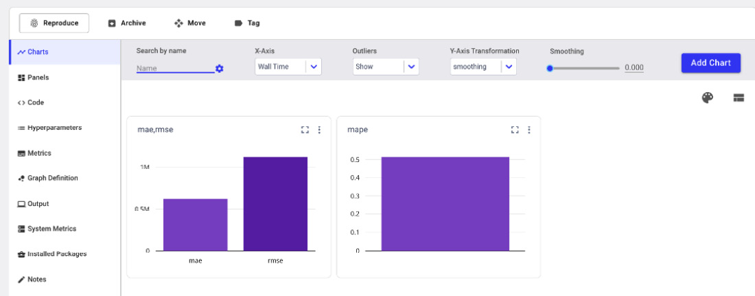
Figure 11.18 – The charts produced automatically by Comet
- In the Hyperparameters menu, you can see the hyperparameters logged by the model, as shown in the following figure:
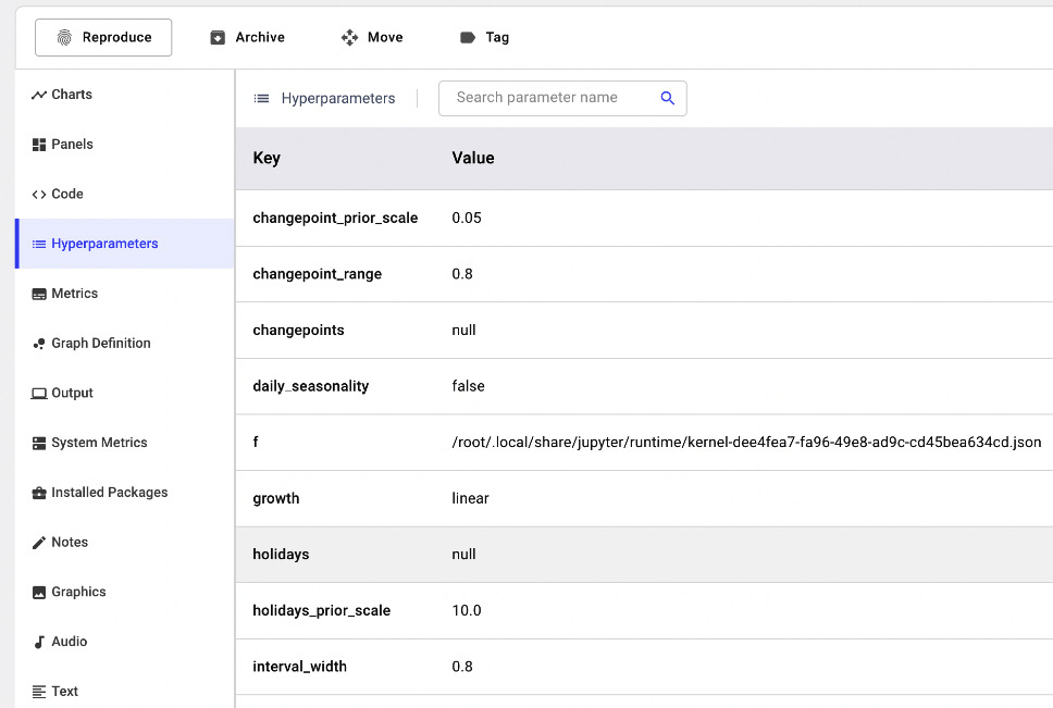
Figure 11.19 – The hyperparameters logged automatically by Comet
- In the Metrics menu, you can see all the logged metrics, as shown in the following figure:
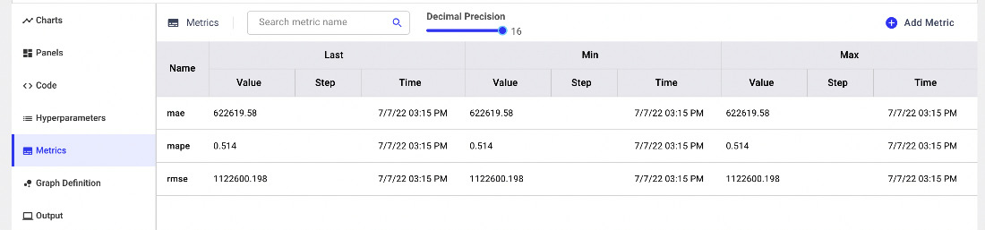
Figure 11.20 – The logged metrics in Comet
The table in the preceding screenshot shows the last (Last), minimum (Min), and maximum (Max) values for each metric.
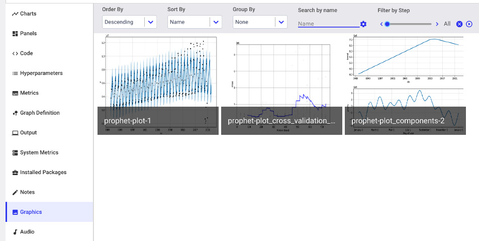
Figure 11.21 – The figures logged in Comet by the Prophet plots
Now that we have explored the results in Comet, we can move on to the final step, building the final report.
Building the final report
Now you are ready to build the final report. In this example, we will build a simple report with the results of both models. As a further exercise, you could improve them by applying the concepts learned in Chapter 5, Building a Narrative in Comet. To create the report, in the Comet dashboard, click on the Panels tab and then select Add | Add to Report | New Report.
You will create a report with the following two sections:
- Comparing forecasts visually
- Comparing performance metrics
Let’s start with the first section, comparing forecasts visually.
Comparing forecasts visually
In this section, we add all the graphics available under the Graphics menu:
- Firstly, we click on the Add your fist panel area, within your section in the report.
- A popup window opens. Select FEATURED | Show Images | Add | Done.
- A new panel is added to your section, but the graphs are small. You can adjust the panel size by clicking on the Edit Layout button, located at the top-right part of the section, and drag and drop the panel to adjust its size.
- Within the panel, you can select one of the two experiments and show the related graphs.
Comparing performance metrics
In this section, we add two panels related to performance metrics:
- The first panel contains a bar chart showing MAE and RMSE for the two experiments.
- The second panel contains a bar chart showing MAPE for the two experiments. We use a different panel for MAPE because it has a different order of magnitude with respect to MAE and RMSE.
To add the two panels, you can proceed as follows:
- Firstly, we click on the Add your fist panel area, within our section in the report.
- A popup window opens. Select the BUILT-IN tab | Bar Chart | Add. Select MAE in the Y-Axis textbox.
- You can click on the Add field button under the Y-Axis textbox and then select RMSE.
- Then, click Done. A new panel is added to your section.
You can repeat steps 1, 2, and 3 to add the MAPE panel.
Your report is ready! You can view the final result directly in Comet at the following link: https://www.comet.com/packt/time-series-analysis-deepnote/reports/time-series-forecasting.
Summary
We have just built a time series analysis model in Prophet and tracked it in Comet!
Throughout this chapter, we described some general concepts regarding time series analysis, including stationarity, seasonality, and breakpoints. In addition, you have learned the main concepts behind the Prophet package and how to combine it with Comet.
In the last part of the chapter, you implemented a practical use case that showed you how to track and compare two time series analysis experiments in Comet, as well as how to build a report with the results of the experiments.
The world of data science is very promising and challenging. Both research and industry sectors are constantly trying to improve current knowledge with new algorithms, frameworks, and tools. Throughout this book, you have investigated Comet, one of the promising platforms for experiment tracking and monitoring.
I hope that all the concepts you learned in this book will help you to increase your knowledge to build better models, track them with a valid tool, and eventually, become a better data scientist and be able to increase your overall knowledge for the future.
Further reading
- Atwan, T.A. (2022). Time Series Analysis with Python Cookbook. Packt Publishing Ltd.
- Nielsen, A. (2019). Practical Time Series Analysis: Prediction with Statistics and Machine Learning. O’Reilly Media.
- Pinheiro, C.A.R. and Patetta, M. (2021). Introduction to Statistical and Machine Learning Methods for Data Science. Cary, NC: SAS Institute Inc.