
6
Building a Simple Contact Application with Forms and Gesturess
So far, we have explored how to allow our users to interact with a Flutter application by navigating from page to page, and by tapping on fields to change values or trigger dynamic changes. However, we have not explored how to handle one of the most common use cases of all applications: data entry.
You have undoubtedly used an application today that at least required you to input your username and password on a login screen before you could use any of the application’s core features. In this chapter, we will learn how to build forms by building a simple Contacts application that allows users to keep track of their network of friends and family members.
In this chapter, we will cover the following topics:
- Setting up the project
- Building forms the manual way
- Building complex forms using Form/FormField widgets
- Custom form validation
First, we will learn how to build forms manually using setState and callback functions. Then, we will explore building our Contacts application using Flutter’s Form and FormField widgets. Finally, we will learn how to validate our form using custom validation.
Technical requirements
Make sure to have your Flutter environment updated to the latest version in the stable channel. Clone our repository and use your favorite IDE to open the Flutter project we’ve built in chapter_6/start_0.
The project that we’ll build upon in this chapter can be found on GitHub at https://github.com/PacktPublishing/Cross-Platform-UIs-with-Flutter/tree/main/chapter_6/start_0.
The complete source code can be found on GitHub as well: https://github.com/PacktPublishing/Cross-Platform-UIs-with-Flutter/tree/main/chapter_6/step_3_form_validation.
Let’s set up the project so that we can start to explore how forms work in Flutter applications.
Setting up the project
In this chapter, we will learn how to use Flutter’s form APIs to build an interactive Contacts application that allows us to create a list of contacts that includes their First name, Last name, Phone, and Email.
When we have finished, the resulting application should look as follows:
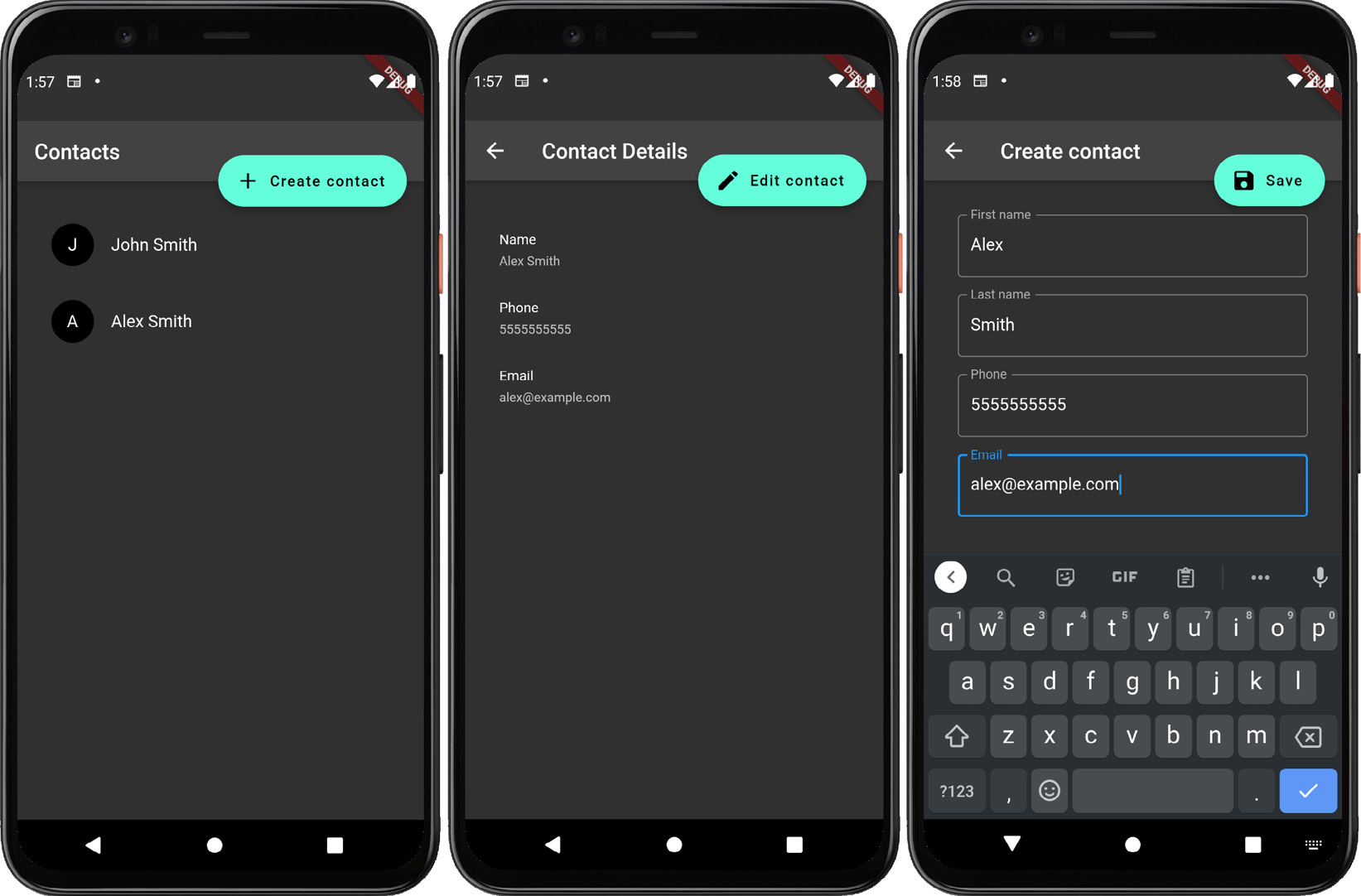
Figure 6.1 – Completed Contacts application
In the preceding figure, we see three different screens:
- A home screen that displays a list of contacts using an avatar of their first initial and their full name
- A details screen that allows us to view each contact’s information
- A create/edit screen that allows us to edit existing contacts or create a new one
We will start with an example that already includes the List and Details views in the contact_list_view.dart and contact_details_view.dart files, respectively. The application uses GoRouter and Provider as dependencies for routing, state management, and dependency injection. It also includes the controllers and APIs to retrieve a list of contacts, add a new contact to the list, or edit a pre-existing contact. After providing an overview of how input fields work in Flutter, we will use Flutter’s input widgets to write our Contacts application. Then, we will conclude this chapter by validating the user’s input and creating or editing contacts.
After downloading the initial application from GitHub, we can start by moving into its root directory and running the flutter pub get command from the Terminal. This will install any package dependencies that the application needs. Additionally, opening the project in an IDE will also trigger an installation of the project on initial load and when the pubspec.yaml file is updated.
Install the project’s dependencies by using the flutter pub get command from the project’s root. After installing the application’s dependencies, execute the flutter run command from the same Terminal window and view the project either in your browser or on your currently running emulator:
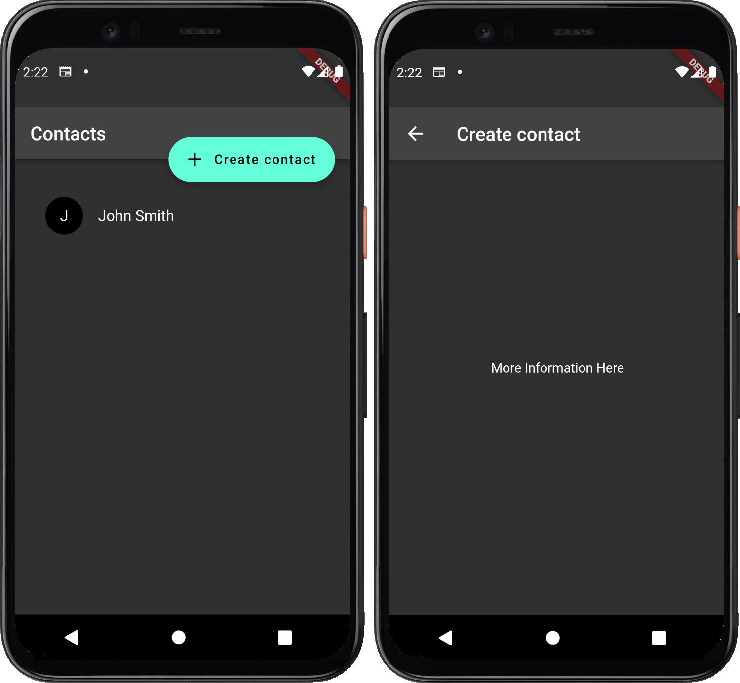
Figure 6.2 – The Contacts List view and Empty Create contact view
On the left-hand side of the preceding figure, observe that we have a pre-populated user, John Smith. Upon pressing the Create contact button, the application navigates to an empty view, as displayed on the right of the preceding figure. This view, located in contact_edit_view.dart, is where we will be working in this chapter.
When viewing the application in your IDE, you should observe the following file structure:
lib
|-- src
   |-- data
   |-- localization
   |-- ui
      |-- contact
   |-- app.dart
|-- main.dart
Let’s briefly explore the purpose of each top-level folder/class:
- src: The source folder contains implementation details of our application that, unless exposed, will be hidden from consumers.
- data: This folder includes any reusable business logic for our application. In this case, it includes the Contact model that we will use in our views and our controllers.
- ui: This folder includes all the presentational components of our application. This can include controllers and widgets.
- contact: This folder includes all of the presentational components associated with contacts.
- app.dart: This widget will control whether to display a Material-themed application or a Cupertino-themed application.
- app_router.dart: This module includes all of the routing information for our application.
- main.dart: This is the entry point of the application.
Now, let’s explore the features of the Flutter framework that enable us to build interactive forms.
Building forms the manual way
Flutter has two primary ways of building forms. The first uses TextField and similar input field widgets and updates the field values and validation manually. To understand how TextField works, let’s start by building our contacts form with it.
Open contact_edit_view.dart and replace the Scaffold.body property with the following code:
      body: ListView(
        padding: const EdgeInsets.symmetric(
          horizontal: 16,
          vertical: 32,
        ),
        children: const [
          Padding(
            padding: EdgeInsets.symmetric(horizontal:
                                          16.0),
            child: TextField(),
          ),
        ],
      ),
Let’s examine what this code does:
- It creates a ListView that is horizontally padded by 16 pixels and vertically padded by 32 pixels.
- It adds a TextField to the ListView’s children.
Now, if we reload the application, we should be met with our new field in the Scaffold body:
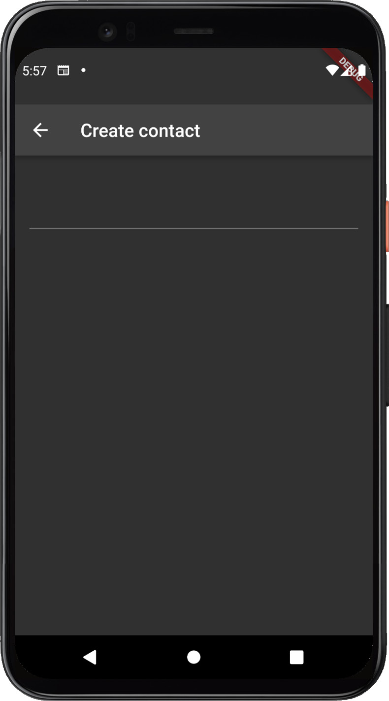
Figure 6.3 – Contact form with an input field
Here, we can see our defined TextField. Select the input field and notice that on a mobile device or emulator, the device’s soft keyboard displays and hides, depending on whether or not the field is in focus, as shown in Figure 6.4:
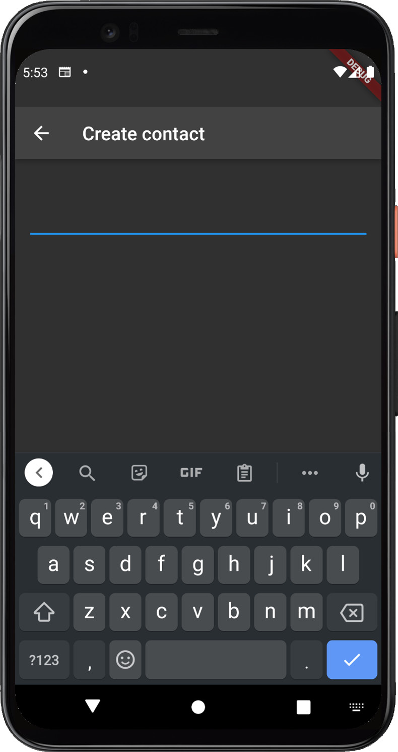
Figure 6.4 – Contact form with default styling
You may also notice that the default input field is styled with a bottom border that changes colors when the field is in focus and does not provide a label for the field. We can restyle the input field by using InputDecoration.
Let’s give the field a full border and a label by replacing TextField with the following code:
          TextField(
            decoration: InputDecoration(
              label: Text('First name'),
              border: OutlineInputBorder(),
            ),
          ),
The preceding code adds a label called First name to the input field and sets the border to OutlineInputBorder, which provides the border based on the theme defined in our MaterialApp. Now, rerun the application; you should see the following changes:
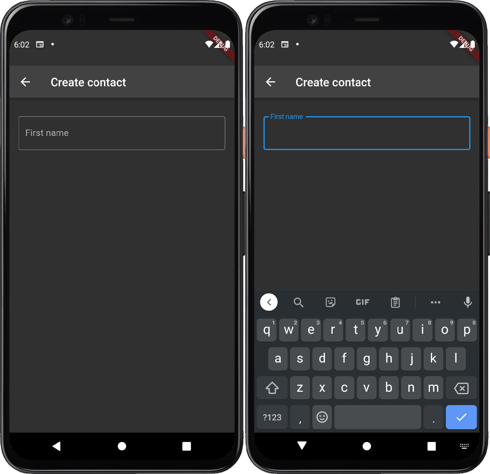
Figure 6.5 – Contact form with outline styling
Notice that in Figure 6.5, the unfocused input field renders the label centered inside of the border and that the label transitions to the border when the field is focused. This behavior, again, is the default behavior of TextField in the Material design.
Now, let’s learn how to keep track of how the value of TextInput that we have defined changes. The TextField widget accepts an onChanged callback function that is triggered each time the user inputs text. This method could be used in several ways, for example:
- For updating the value of StatefulWidget or Notifier
- For performing validation when the input has changed
Let’s use this callback function to validate our newly created field. Update TextField with the following code:
TextField(
    decoration: InputDecoration(
        label: const Text('First name'),
        border: const OutlineInputBorder(),
        errorText: _firstNameErrorMessage,
    ),
    onChanged: (value) {
        setState(() {
            _firstNameErrorMessage =
                value.isEmpty ? 'First name is required' :
                   null;
        });
    },
),
Additionally, add the _firstNameErrorMessage nullable string variable just before the build method. Now, when you rerun the application, you should be able to add and delete text to/from the input field and observe a transition between unfocused, focused, and error states, as shown in Figure 6.6:
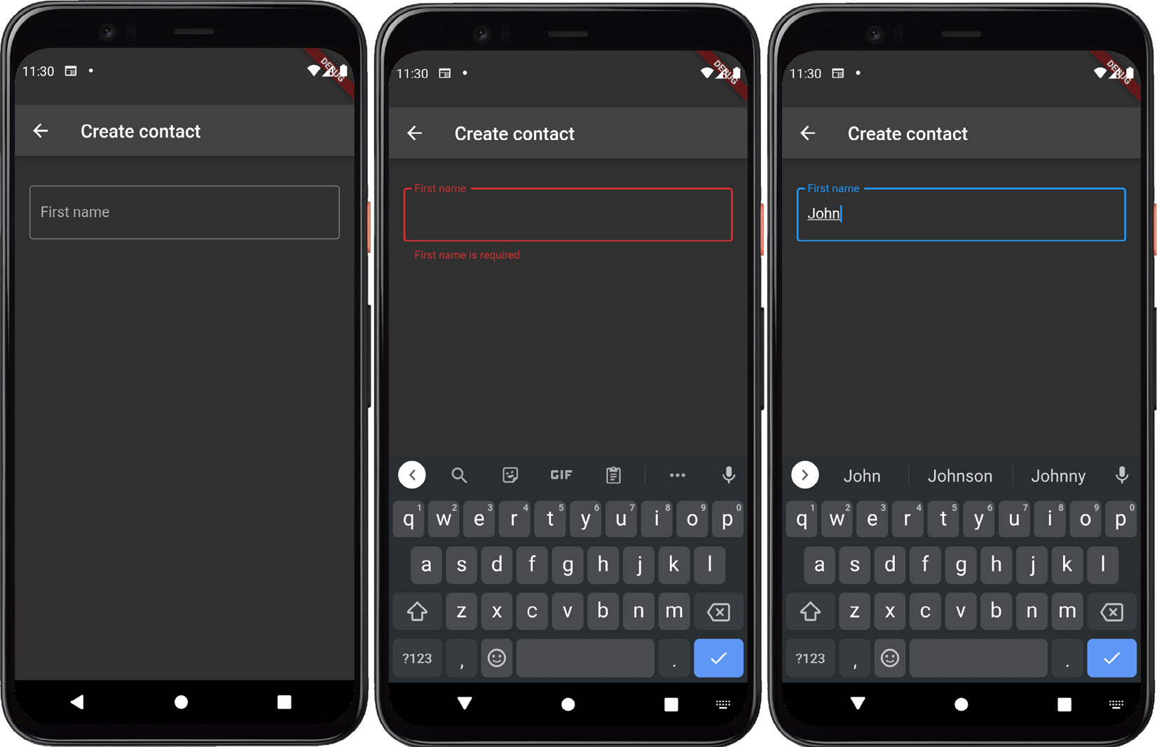
Figure 6.6 – Contact form with error/default styling
We could also defer validation until the field has been submitted by using the TextField.onSubmitted callback function property, which has the same signature as the TextField.onChanged callback function. To demonstrate, rename onChanged to onSubmitted and refresh the application.
Upon interacting with TextField, you should notice that the states from Figure 6.6 remain the same, but they are now triggered when the field loses focus via clicking the checkmark on the soft keyboard rather than when the input changes.
TextField uses TextInputAction to determine whether the field should be placed in a submitted state and uses the default value of TextInputAction.done when the input field is not multiline.
Let’s see this behavior in action when we have two input fields rather than one. Add the following code after the first TextField:
const SizedBox(height: 16),
TextField(
    decoration: InputDecoration(
        label: const Text('Last name'),
        border: const OutlineInputBorder(),
        errorText: _lastNameErrorMessage,
    ),
    onSubmitted: (value) {
        setState(() {
            _lastNameErrorMessage =
                value.isEmpty ? 'Last name is required' :
                  null;
        });
    },
),
Here, we have added some space between the two fields for aesthetic purposes and then created an input field for Last name. Like _firstNameErrorMessage, add a variable following it called _lastNameErrorMessage. Now, rerun the application; you may notice some odd behavior when using the checkmark key that matches what’s shown in Figure 6.7:
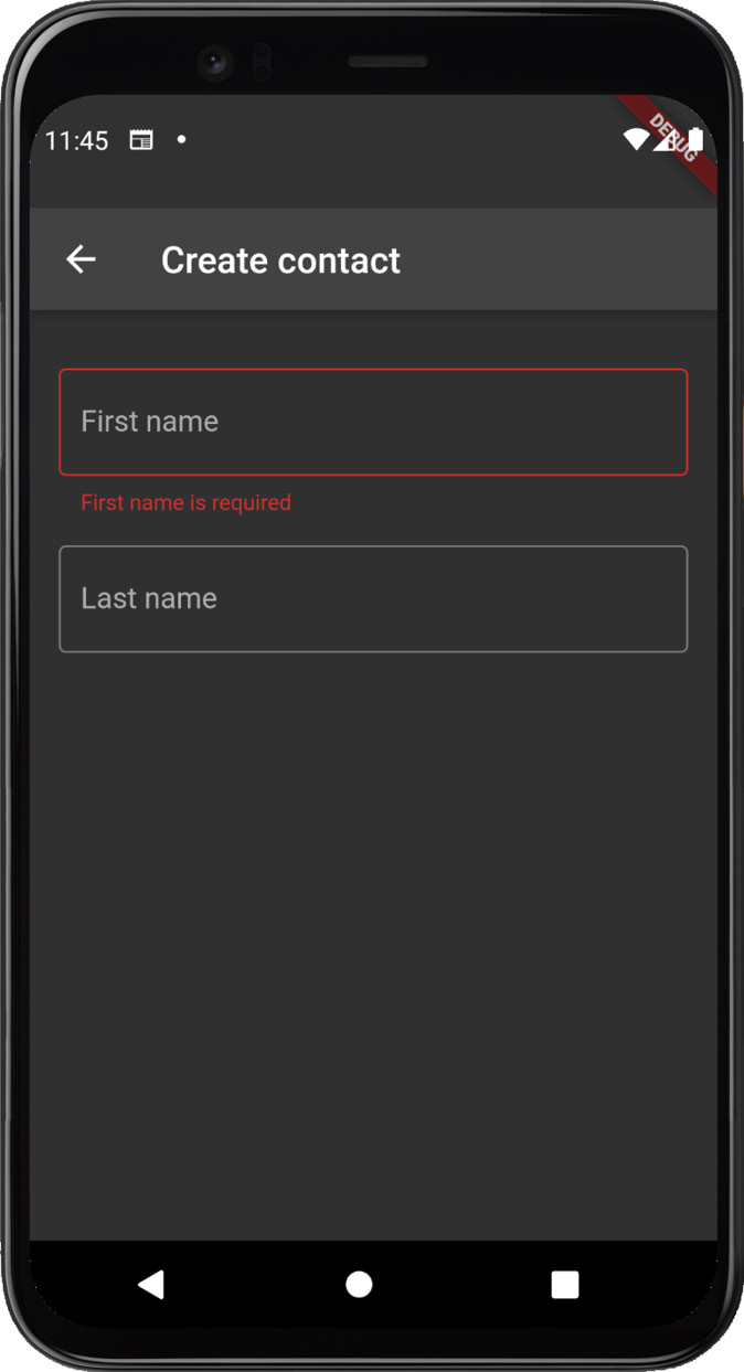
Figure 6.7 – Contact form with the first and last name input fields
Notice that the first input validates. Upon losing focus, the second input field is not focused correctly and the soft keyboard is dismissed. While TextField is smart enough for TextInputAction.done, it does not know the surrounding input fields, so it does not know to give focus to the next field in the view.
Therefore, we must do this manually by using another TextInputAction – specifically, TextInputAction.next. Add textInputAction: TextInputAction.next to the first input field’s definition and rerun the application. Now, upon interacting with the fields, we should see that validation for each field is triggered when the fields lose focus and a Next icon instead of the previous Done icon when the first field is in focus. The result should mirror what’s shown in Figure 6.8:
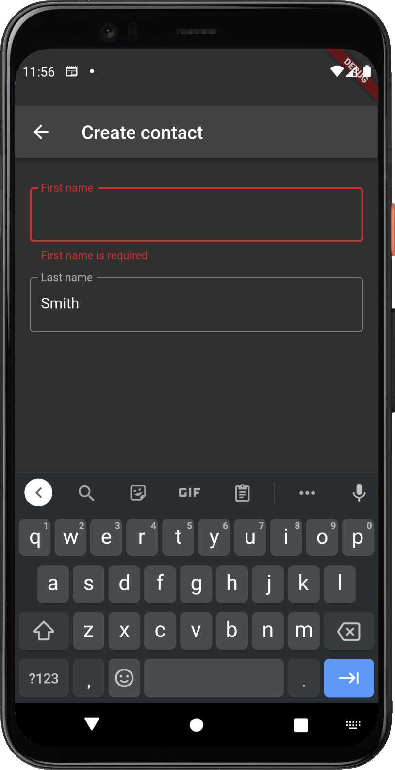
Figure 6.8 – Contact form with keyboard navigation
Here, we can observe the slightly changed UI of the keyboard and the behavior that we would normally expect.
As a final experiment, let’s see how we would perform validation when the user attempts to use another form of interaction, such as clicking a button. To do so, we will use TextEditingController, which allows more granular control over the text of TextField than a simple callback function. Add the following code at the top of _ContactEditViewState:
  final _firstNameController = TextEditingController();
  final _lastNameController = TextEditingController();

  @override
  void dispose() {
    _firstNameController.dispose();
    _lastNameController.dispose();
    super.dispose();
  }
Here, we have created an instance of TextEditingController for each input field and overridden the class’s dispose function to ensure that both variables are disposed of correctly. Next, we will remove all instances of onSubmitted and change both input fields so that they use their respective controllers. The result of ListView.children should resemble the following code:
TextField(
    controller: _firstNameController,
    decoration: InputDecoration(
        label: const Text('First name'),
        border: const OutlineInputBorder(),
        errorText: _firstNameErrorMessage,
    ),
    textInputAction: TextInputAction.next,
),
const SizedBox(height: 16),
TextField(
    controller: _lastNameController,
    decoration: InputDecoration(
        label: const Text('Last name'),
        border: const OutlineInputBorder(),
        errorText: _lastNameErrorMessage,
    ),
),
Finally, we will need a button to trigger validation. So, let’s add FloatingActionButton to the scaffold by adding the following code:
floatingActionButton: FloatingActionButton.extended(
    onPressed: () {
        setState(() {
            _firstNameErrorMessage =
              _firstNameController.text.isEmpty
                ? 'First name is required'
                : null;
            _lastNameErrorMessage =
              _lastNameController.text.isEmpty
                ? 'Last name is required'
                : null;
        });
    },
    icon: const Icon(Icons.add),
    label: const Text('Create contact'),
),
floatingActionButtonLocation: FloatingActionButtonLocation.endTop,- Creates an extended FloatingActionButton that allows us to define text and an icon for the button
- Validates both input fields when the button is pressed, using the TextEditingController.text property to determine whether the text has been added to the field
Rerun the application and interact with the fields. If you leave a field empty and click on the previously created floating action button, you should be met with correctly validated input fields mirroring the following output:

Figure 6.9 – A Form widget in the “error” state
Figure 6.9 shows the results of inputting a value in the first field, leaving the second field blank, and pressing the submission button: an error is displayed on the second field.
Before we move on to the next section, we should cover one last topic: how to set values using TextEditingController. The default constructor for TextEditingController accepts an optional named parameter.
Let’s use it to set our input fields with default values. Update the code that creates the two controllers so that it resembles the following code:
  final _firstNameController =
    TextEditingController(text: 'John');
  final _lastNameController =
    TextEditingController(text: 'Smith');
The preceding code defaults the first input field to the value John and the second input field to the value Smith. Rerun the application; you should see that the input fields have been populated correctly:
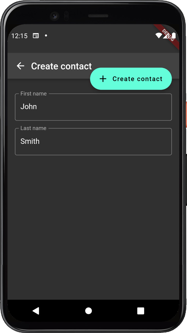
Figure 6.10 – A Form widget not in “error” state
Figure 6.10 displays the correctly populated first and last names spread across the two input fields.
Now, we should have a clearer understanding of how to build forms manually. Next, let’s learn how to build a form using Flutter’s Form and FormField widgets.
Building complex forms with the Form/FormField widgets
Hopefully, the previous section demonstrated that using the vanilla TextField widgets inherently comes with quite a bit of boilerplate since much of the state of each input field must be maintained in the parent widget.
Fortunately, there is a more declarative API that encapsulates most of that boilerplate and allows us to group input fields. Let’s explore how to build forms using the Form and FormField widgets.
The Form widget allows you to group multiple input fields to perform operations such as saving, resetting, or validating each input field in unison. The container leverages FormField widgets rather than regular Field widgets, which are its descendants. It allows these operations to be performed by using Form.of with a context whose ancestor is the form, or by using a GlobalKey passed to the form’s constructor.
To start, wrap the scaffold in contact_edit_view.dart with a Form widget and a Builder widget:
return Form(
    child: Builder(builder: (context) {
        return Scaffold(
            ...
        );
    }),
);
We will use the Builder widget to inject a context that can be used to retrieve an instance of its Form ancestor. Next, update the FloatingActionButton.onPressed code so that it resembles the following:
if (Form.of(context)!.validate()) {
}
Here, we remove the complicated logic from the Building forms the manual way section in favor of retrieving the Form ancestor widget and executing its validate function. Upon rerunning the code and interacting with the input fields, you will notice that the validation no longer appears when pressing the Save button. This is because we have removed the validation logic.
Fortunately, FormField widgets provide a much simpler and more declarative mechanism to trigger validation: by using the FormField.validator callback function. Let’s refactor our ListView.children so that it uses TextFormField widgets instead of TextField widgets:
TextFormField(
    controller: _firstNameController,
    textInputAction: TextInputAction.next,
    decoration: const InputDecoration(
        label: Text('First name'),
        border: OutlineInputBorder(),
    ),
    validator: (value) =>
    (value?.isEmpty ?? true) ? 'First name is required' :
      null,
),
const SizedBox(height: 16),
TextFormField(
    controller: _lastNameController,
    textInputAction: TextInputAction.next,
    decoration: const InputDecoration(
        label: Text('Last name'),
        border: OutlineInputBorder(),
    ),
    validator: (value) =>
    (value?.isEmpty ?? true) ? 'Last name is required' : null,
),
The only major change to point out is that we now use a validator callback function to return an error message if either input field is empty or null otherwise. Upon calling Form.validate, the form will traverse its FormField ancestors and execute each validator callback function to transition the input field to a valid or invalid state.
Now, if you rerun the application and press the Save button without adding any text to the input fields, you should see the following output:
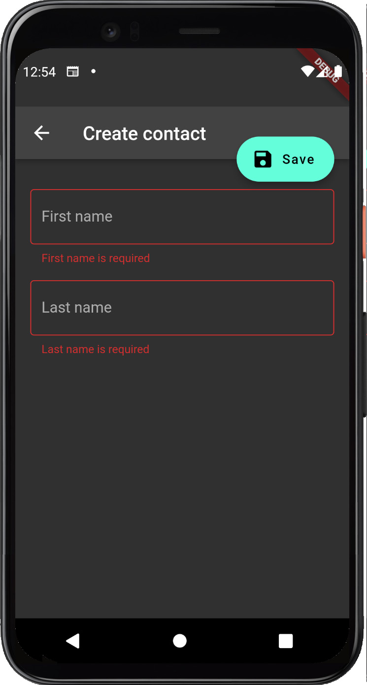
Figure 6.11 – The Form's error state as both inputs have bad values
Figure 6.11 shows that the Contacts application correctly sets the invalid state on both input fields. We can also demonstrate how to reset the form by adding the following code to the end of the ListView.children array:
ElevatedButton(
    onPressed: () {
        Form.of(context)!.reset();
    },
    child: const Text('Reset'),
)
Now, if we rerun the application and click on the Reset button, we should see our form returned to its pristine state:
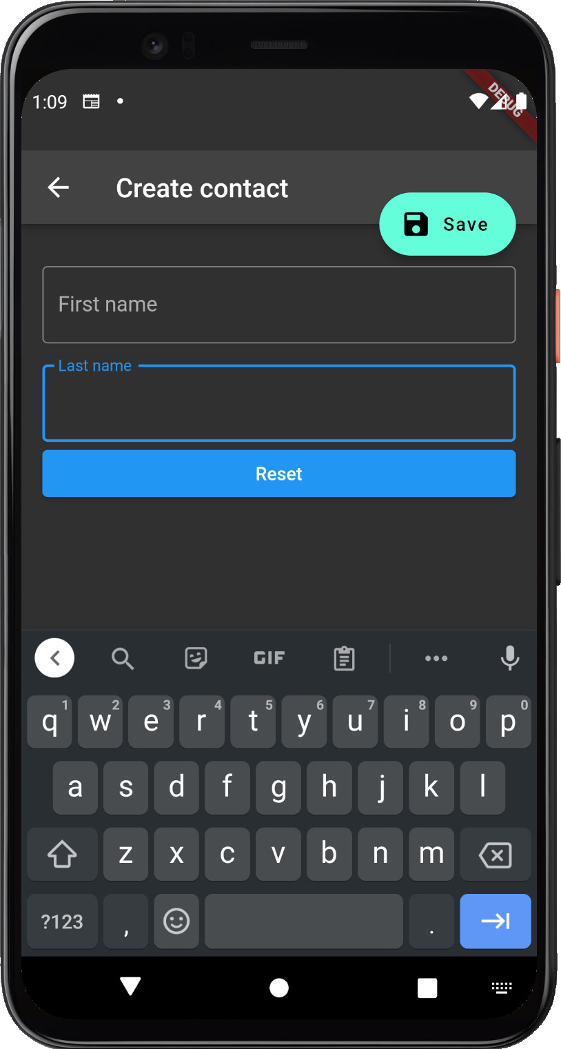
Figure 6.12 – The Form back to its valid state with no more errors
In this section, we learned how to do the following:
- Define a group of input fields using Form and FormField.
- Define a FormField.validator function to validate each input field on submission.
- Use Form.of(context).validate() to validate the form’s input fields.
- Use Form.of(context).reset() to reset the form to a pristine state.
In the next section, we will round out our Contacts application by using custom validation.
Custom form validation
Now that we have covered how to use the Form and FormField widgets to reduce some of the boilerplate of handling user input, let’s round out our form with new input fields to capture the contact’s phone number and email address.
In the contact_edit_view.dart module, add a TextEditingController for the email address and phone number, and then instantiate them in the initState method. The result should resemble the following code:
late final TextEditingController _firstNameController;
late final TextEditingController _lastNameController;
late final TextEditingController _emailController;
late final TextEditingController _phoneController;

@override
void initState() {
    super.initState();
    _firstNameController =
       TextEditingController(text: _contact?.firstName);
    _lastNameController =
       TextEditingController(text: _contact?.lastName);
    _emailController =
       TextEditingController(text: _contact?.emailAddress);
    _phoneController =
       TextEditingController(text: _contact?.phoneNumber);
}

@override
void dispose() {
    _firstNameController.dispose();
    _lastNameController.dispose();
    _emailController.dispose();
    _phoneController.dispose();
    super.dispose();
}
Next, replace the Reset button with FormField widgets for each input field using the following code:
const SizedBox(height: 16),
Padding(
    padding: const EdgeInsets.symmetric(horizontal: 16.0),
    child: TextFormField(
        controller: _phoneController,
        textInputAction: TextInputAction.next,
        decoration: const InputDecoration(
            label: Text('Phone'),
            border: OutlineInputBorder(),
        ),
        validator: _handlePhoneValidation,
    ),
),
const SizedBox(height: 16),
Padding(
    padding: const EdgeInsets.symmetric(horizontal: 16.0),
    child: TextFormField(
        controller: _emailController,
        textInputAction: TextInputAction.done,
        decoration: const InputDecoration(
            label: Text('Email'),
            border: OutlineInputBorder(),
        ),
        validator: _handleEmailValidation,
    ),
),
The preceding code creates a form field for the contact’s email address and password using the previously created controllers. It also references two validator callback functions that we will now define below the build function:
String? _handlePhoneValidation(String? value) {
    final isMissing = value?.isEmpty ?? true;

    if (isMissing || !isPhoneNumber(value)) {
        return 'Please provide a valid phone number';
    }

    return null;
}

String? _handleEmailValidation(String? value) {
    final isMissing = value?.isEmpty ?? true;

    if (isMissing || !isEmail(value)) {
        return 'Please provide a valid email address';
    }

    return null;
}
The methods in the code sample do the following:
- Return an error if the phone number field is empty or invalid using the isPhoneNumber function in validators.dart.
- Return an error if the phone number field is empty or invalid using the isEmail function in validators.dart.
Because the validator function returns a nullable string, we can perform as many custom validations as we would like. The only requirement for validation to display correctly is that an error message is returned. Now, run the application and observe the newly added input fields:
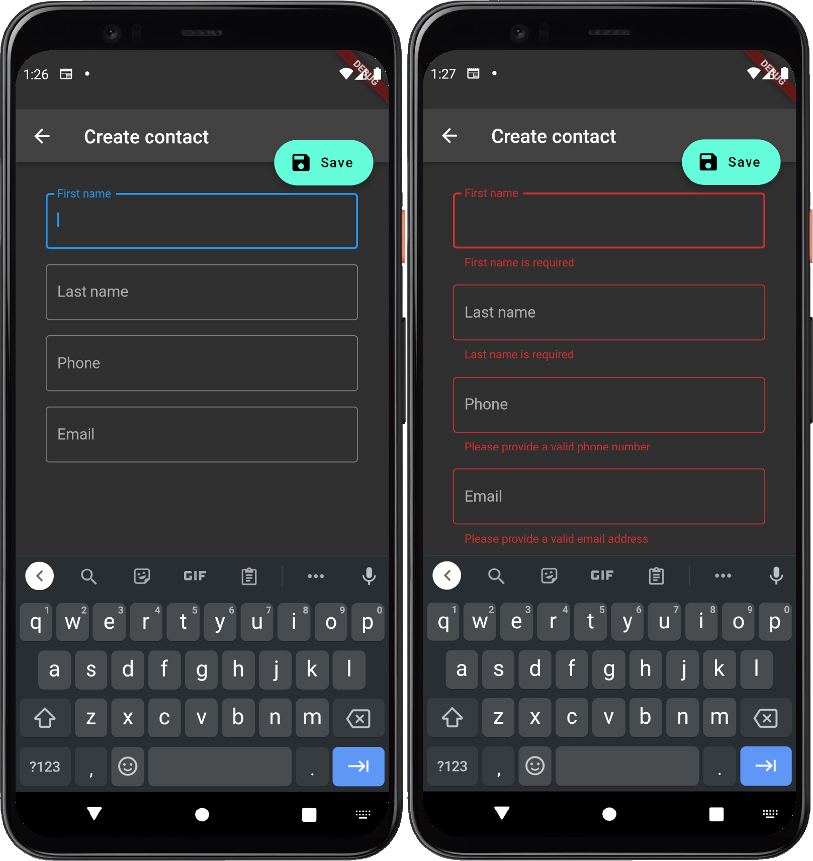
Figure 6.13 – Valid form state on the left, the erroneous one on the right
Figure 6.13 demonstrates the form in a pristine, unsubmitted state and then in an invalid, submitted state after the Save button has been clicked. To round out the Contacts application, let’s add some code to allow the form to be populated by a previously created contact and create or update the contact when the form is validated. First, add the following code to the beginning of _ContactEditViewState:
  late final _contact = context
      .read<ContactController?>()
      ?.contacts
      .firstWhereOrNull((contact) => contact.id ==
        widget.id);
The preceding code merely retrieves the selected contact from ContactController using the id parameter that was passed into the widget by the router. Next, update the initState method so that it resembles the following code:
  @override
  void initState() {
    super.initState();
    _firstNameController =
       TextEditingController(text: _contact?.firstName);
    _lastNameController =
       TextEditingController(text: _contact?.lastName);
    _emailController =
       TextEditingController(text: _contact?.emailAddress);
    _phoneController =
       TextEditingController(text: _contact?.phoneNumber);
  }
The preceding code sample sets each controller with the initial value from the previously retrieved contact if it exists. We should be able to refresh the application, navigate to John Smith’s contact details view, and then his edit view. The result should resemble the following output:
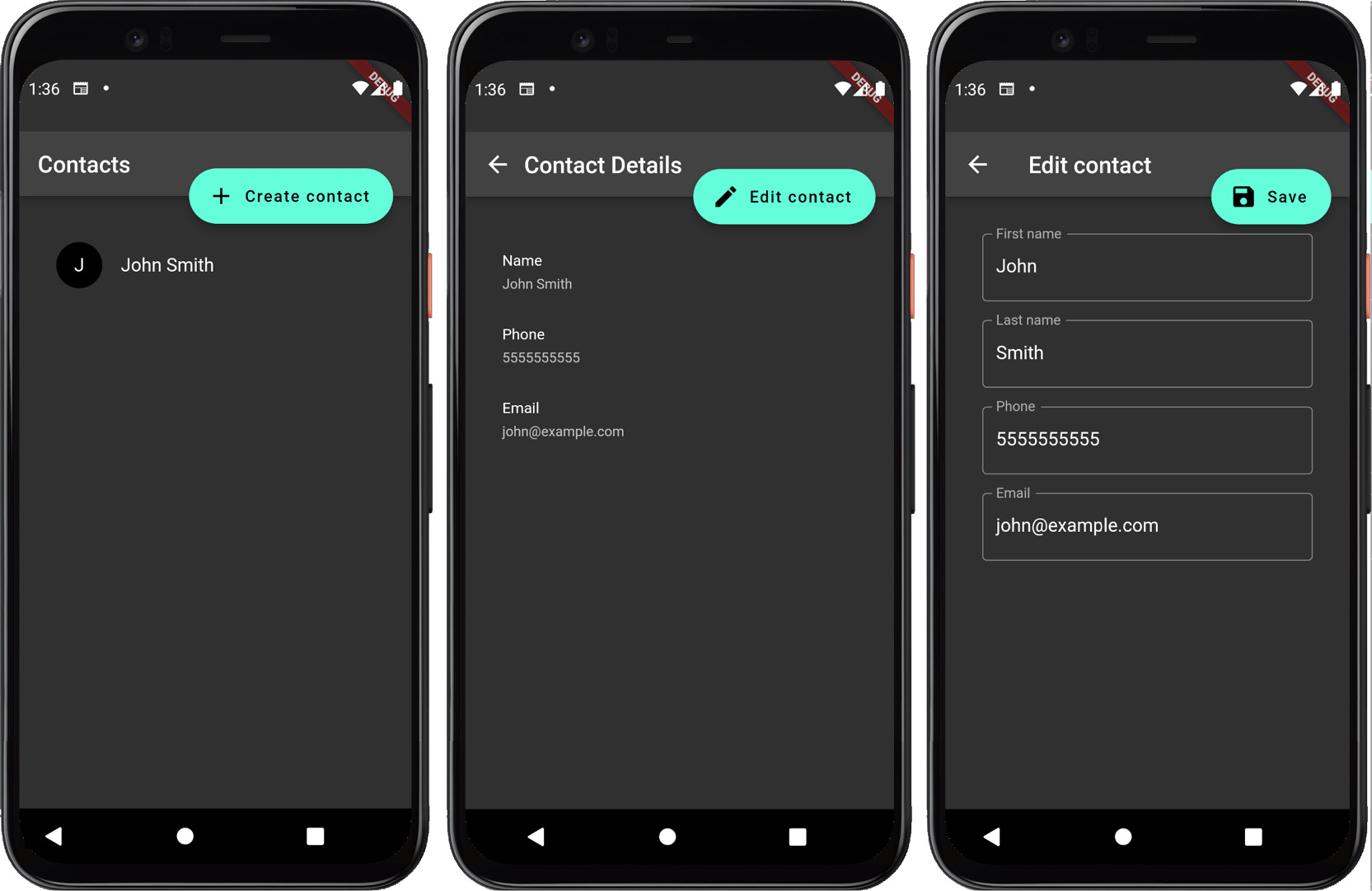
Figure 6.14 – App's navigation flow to edit user data
Figure 6.14 shows the transition that culminates in a pre-populated contact editing form. Finally, let’s round out our Contacts application with the logic to create or update a new contact. Replace the FloatingActionButton.onPressed function with the following code:
onPressed: () {
      ScaffoldFeatureController? scaffoldController;

    if (Form.of(context)!.validate()) {
        final contactController =
          context.read<ContactController>();
        if (_contact == null) {
        } else {
        }
    }
}
Then add the following code to the if block:
            final newContact = Contact(
                id: contactController.contacts.length + 1,
                firstName: _firstNameController.text,
                lastName: _lastNameController.text,
                emailAddress: _emailController.text,
                phoneNumber: _phoneController.text,
            );
            contactController.addContact(newContact);
            scaffoldController =
                ScaffoldMessenger.of(context).showSnackBar(
                SnackBar(
                    content:
                    Text('Successfully created
                          ${newContact.firstName}'),
                ),
            );
            await scaffoldController.closed;
            appRouter.goNamed(ContactDetailsView.routeName,
              params: {
                'id': newContact.id.toString(),
            });
And finally add the following code to the else block:
            final updatedContact = _contact!.copyWith(
                firstName: _firstNameController.text,
                lastName: _lastNameController.text,
                emailAddress: _emailController.text,
                phoneNumber: _phoneController.text,
            );
            contactController.updateContact(updatedContact);
            scaffoldController =
                ScaffoldMessenger.of(context).showSnackBar(
                SnackBar(
                    content:
                    Text('Successfully updated
                          ${_contact!.firstName}'),
                ),
            );
            await scaffoldController.closed;
            appRouter.pop();
The final code sample performs the following logic:
- Initializes a ScaffoldFeatureController variable for assignment.
- Retrieves the instance of ContactController from the context.
- If the retrieved contact does not exist, creates a new one using the ContactController.addContact function and with an id incremented from ContactController.contacts.length.
- If the retrieved contact exists, updates the contact’s values from each input field and updates the contact using the ContactController.updateContact function.
- Displays a SnackBar message after either operation assigns its controller to the previously initialized scaffoldController variable.
- Navigates to the details screen after SnackBar has finished displaying.
After rerunning the application, we should be able to create and update contacts using the Save button, and be met with a fully functioning Contacts application mirroring what’s shown in Figure 6.15:
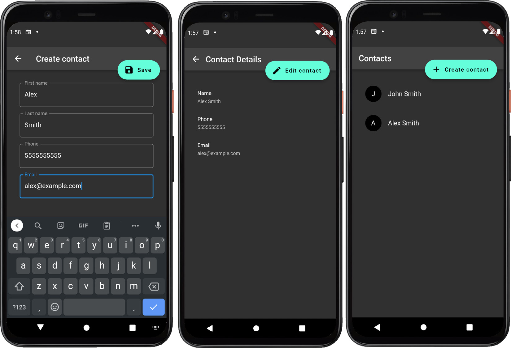
Figure 6.15 – The flow for creating a new contact
Now that we understand how to validate our Contacts form using custom validation and update and create contacts, let’s summarize this chapter.
Summary
In this chapter, we learned how to build a form manually using TextField widgets. Then, we learned how to reduce some of the boilerplate that we introduced by using the Form and FormField widgets. Finally, we rounded out our Contacts application by learning how to validate the Contact form using custom validation and updating our contacts when the form has been successfully validated.
You should now have a clear understanding of how to build an application that collects information by using input fields and forms.
In the next chapter, you will learn how to build declarative animations that give your application a unique feel.