
14
Understanding the Tableau Data Model, Joins, and Blends
In this chapter, we’ll gain a deeper understanding of how to model and structure data with Tableau. We’ve seen the Data Source screen in previous chapters and briefly explored how to drag and drop tables to form relationships. Now, we’ll explore some of Tableau’s more complex features to gain a good understanding of how Tableau allows you to relate multiple tables together, either logically or physically.
We’ll start with a broad overview of Tableau’s new data model and then examine some details of different types of joins and blends. The data model and blending apply primarily to Tableau Desktop (and Server), but pay special attention to the discussion of joins, as a good understanding of join types will aid you greatly when we discuss Tableau preparation in Chapter 16, Taming Data with Tableau Prep.
The data model was introduced in Tableau 2020.2. If you are using an older version, the explanation of joins and blends will be directly applicable, while the explanation of the data model will serve as inspiration for you to upgrade!
In this chapter, we’ll cover the following topics:
- Explanation of the sample data used in this chapter
- Exploring the Tableau data model
- Using joins
- Using blends
- When to use a data model, joins, or blends
We’ll start by understanding the sample dataset included in the workbook for this chapter. This is so that you have a good foundation of knowledge before working through the examples.
Explanation of the sample data used in this chapter
For this chapter, we’ll use a sample dataset of patient visits to the hospital. The data itself is contained in the Excel file Hospital Visits.xlsx in the Learning TableauChapter 14 directory. In this example, each tab of the Excel file represent tables of data. The principles described here are directly applicable to relational database tables, multiple files, or tables in any data source. The relationship between those tables is illustrated here:

Figure 14.1: The four tabs of the Excel file illustrated as four tables with relationships
Excel does not explicitly define the relationships, but they are shown here as they might exist in a relational database using foreign key lookups. Here is a brief explanation of the tables and their relationships:
- Hospital Visit: This is the primary table that records the admission and diagnosis of a single patient on a single visit to the hospital. It contains attributes, such as Admit Type and Location, and a measure of Minutes to Service.
- Patient: This table contains additional information for a single patient, such as their Name and Birthdate, and a measure of their Age at Most Recent Admit.
- Discharge Details: This table gives additional information for the discharge of a patient, such as the Discharge Date and the Disposition (the condition under which they were discharged and where they went after being discharged). It also contains a measure How did patient feel about care? (1-10) that ranks the patient’s feelings about the level of care, with 1 being the lowest and 10 being the highest.
- Patient & Doctor Interaction: This table defines the interaction between a patient and a doctor during the visit. It includes the Doctor Name, Notes, and measures how long the doctor spent with the patient (Minutes spent with Patient).
The tables relate to each other in different ways. Here are some details:
- Hospital Visit to Patient: Each visit has a single patient, so Hospital Visit will always have a Patient ID field that points to a single record in the Patient table. We will also find additional patients in the Patient table who do not have recorded visits. Perhaps they are historical records from a legacy system or the patient’s interaction with the hospital occurred in a manner other than a visit.
- Hospital Visit to Discharge Details: Each visit may have a single discharge, but some patients may still be in the hospital. In a well-designed data structure, we should be able to count on a record in the Discharge Details table that indicates “still in the hospital.” In our Excel data, however, there may or may not be a Discharge Details ID, meaning there won’t always be a matching Discharge Details record for every Hospital Visit.
- Patient & Doctor Interaction to Hospital Visit: Throughout the patient’s visit, there may be one or more doctors who interact with a patient. It’s also possible that no doctor records any interaction. So, we’ll sometimes find multiple records in the Patient & Doctor Interaction that reference a single Visit ID, sometimes only a single record, and sometimes no records at all for a visit that exists in the Hospital Visit table.
With a solid grasp of the sample data source, let’s turn our attention to how we might build a data model in Tableau.
Exploring the Tableau data model
Every data source you create in Tableau will use the data model. Any time you relate two or more sets of data, you’ll need to give some thought as to the various ways you might relate them in the data model. We’ll cover some of the basics of what a data model is and how to create it first.
Creating a data model
We’ve briefly looked at the Data Source screen in Chapter 2, Connecting to Data in Tableau. Now, we’ll take a deeper look at the concepts behind the interface. Feel free to follow along with the following example in the Chapter 14 Starter.twb workbook, or examine the end results in Chapter 14 Complete.twbx.
We’ll start by creating a connection to the Hospital Visits.xlsx file in the Chapter 14 directory. The Data Source screen will look like this upon first connecting to the file:

Figure 14.2: The Data Source screen lists the tabs in the Excel workbook and invites you to start a data model
We’ll build the data model by dragging and dropping tables onto the canvas. We’ll add all four tables. Tableau will suggest relationships for each new table added based on any matching field names and types. For our tables, we’ll accept the default settings because the ID fields that indicate the correct relationship are identically named and typed.
The first table added is the root and forms the start of the data model.
You may change the root table by right-clicking a table that is not currently the root table and selecting the Swap with root option.
In this example, the order in which you add the tables won’t matter, though you may notice a slightly different display depending on which table you start with. In the following screenshot, we’ve started with Hospital Visit (which is the primary table and, therefore, makes sense to be the root table) and then added all of the other tables:

Figure 14.3: All tables have been added to the data model
Selecting a connector between tables (sometimes called a “noodle” in the data model) will allow you to edit the relationship in the bottom pane. In Figure 14.3, you’ll notice the relationship options for the connector between Hospital Visit and Patient. Tableau automatically created our relationships because the ID fields had the same name and type between both tables. If necessary, you could manually edit the relationships to change which fields define the relationship.
A relationship simply defines which fields connect the tables together. It does not define exactly how the tables relate to each other. We’ll discuss the concepts of join types (for example, left join or inner join) later in this chapter, but relationships are not restricted to a certain join type. Instead, Tableau will use the appropriate kind of join as well as the correct aggregations depending on which fields you use in your view. For the most part, you won’t have to think about what Tableau is doing behind the scenes, but we’ll examine some unique behaviors in the next section.
Also, notice the Performance Options drop-down menu in the relationship editor, as shown here:

Figure 14.4: The Edit Relationship dialog box includes options to improve performance
These performance options allow Tableau to generate more efficient queries if the nature of the relationship is known. If you do not know the exact nature of the relationship, it is best to leave the options in their default settings as an incorrect setting can lead to incorrect results.
There are two basic concepts covered by the performance options:
- Cardinality: This term indicates how many records in one table could potentially relate to the records of another table. For example, we know that one visit matches to only one patient. However, we also know that many doctors could potentially interact with a patient during one visit.
- Referential Integrity: This term indicates whether we expect all records to find a match or whether some records could potentially be unmatched. For example, we know (from the preceding description) that there are patients in the Patient table that will not have a match in the Hospital Visit table. We also know that some patients will not have discharge records as they are still in the hospital.
If Tableau is able to determine constraints from a relational database, those constraints will be used. Otherwise, Tableau will set the defaults to Many and Some records match. For the examples in this chapter, we do know the precise nature of the relationships (they are described in the previous section), but we’ll accept the performance defaults as the dataset is small enough that there won’t be any perceptible performance gain in modifying them.
With our initial data model created, let’s take a moment to explore the two layers of the data model paradigm.
Layers of the data model
A data model consists of two layers:
- The logical layer: A semantic layer made up of logical tables or objects that are related. Each logical table might be made up of one or more physical tables.
- The physical layer: A layer made up of the physical tables that come from the underlying data source. These tables may be joined or unioned together with conventional joins or unions or created from custom SQL statements.
Consider the following screenshot of a canvas containing our four tables:

Figure 14.5: The logical layer of the data model
This initial canvas defines the logical tables of the data model. A logical table is a collection of data that defines a single structure or object that relates to other logical structures of data. Double-click on the Hospital Visit table on the canvas, and you’ll see another layer beneath the logical layer:

Figure 14.6: The physical layer of the physical tables that make up Hospital Visit
This is the physical layer for the logical Hospital Visit table. This physical layer is made up of physical tables of data—potentially unioned or joined together. In this case, we are informed that Hospital Visit is made of 1 table. So, in this case, the logical layer of Hospital Visit is identical to the physical layer underneath. In the Using joins section of this chapter, we’ll explore examples of how we might extend the complexity of the physical layer with multiple tables while still treating the collection of tables as a single object.
Go ahead and close the physical layer of Hospital Visit with the X icon in the upper-right corner. Then navigate to the Analysis tab of the workbook for this chapter, and we’ll explore how the data model works in practice.
Using the data model
For the most part, working with the data model will be relatively intuitive. There are a few data pane interface features that will help you work with the data model. There are also a few data model behaviors you should learn to expect. Once you are comfortable with them, your analysis will exceed expectations!
The data pane interface
With multiple tables related in a data model, you’ll find the Data pane looks something like this:

Figure 14.7: The Data pane is organized by logical tables and shows a separation of dimensions and measures per table
You’ll notice that the Data pane is organized by logical tables, with fields belonging to each table. Measures and dimensions are separated by a thin line rather than appearing in different sections as they did previously.
This makes it easier to find the fields relevant to your analysis and also helps you to understand the expected behavior of the data model. Each logical table also has its own number of records field that is named using the convention Table Name (Count), which will appear at the end of the list of measures for that table.
With an overview of how the data pane helps you work with the data model, let’s look at some behaviors you can expect from the data model.
Data model behaviors
In the Analysis tab of the Starter workbook, experiment with creating different visualizations. Especially note dimensions, what values are shown, and how measures are aggregated. We’ll walk through a few examples to illustrate (which you can replicate in the Starter workbook or examine in the Complete workbook).
First, notice that dragging Name from the Patient table to Rows reveals 10 patients. It turns out that not all of these patients have hospital visits, but when we use one or more dimensions from the same logical table, we see the full domain of values in Tableau. That is, we see all the patients, whether or not they had visited the hospital. We can verify how many visits each patient had by adding the Hospital Visit (Count) field, resulting in the following view:
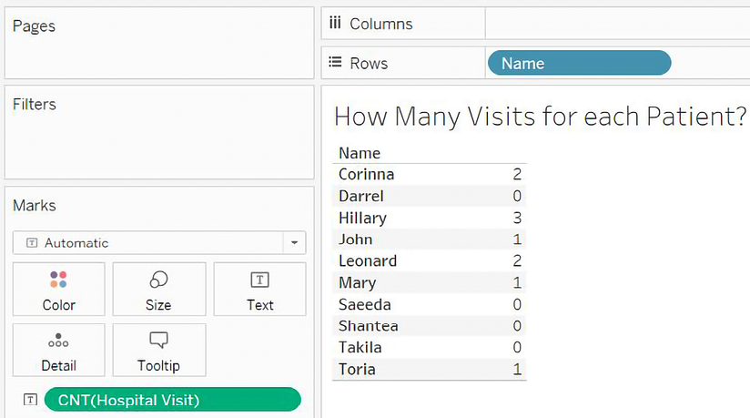
Figure 14.8: All patients are shown, even those with 0 visits
But if we add Primary Diagnosis to the table, notice that only 6 out of the 10 patients are shown:

Figure 14.9: Only patients with visits are shown; most patients had a single visit with a given diagnosis, but one came in twice with the same diagnosis
This highlights another behavior: when you include dimensions from two or more tables, only matching values are shown. In essence, when you add Name and Primary Diagnosis, Tableau is showing you patients who exist in both the Patient and Hospital Visit tables. This is great if you want to focus on only patients who had visited the hospital.
But what if you truly want to see all patients and a diagnosis where applicable? To accomplish that, simply add a measure from the table of the field where you want to see the full domain. In this case, we could add either the Age at Most Recent Admit or Patient (Count) measures, as both come from the Patient table. Doing so results in the following view:

Figure 14.10: All patients are once again shown
Even though the Age at Most Recent Admit value is NULL for patients who have never been admitted, simply adding the measure to the view instructs Tableau to show all patients. This demonstrates a third behavior: including a measure from the same table as a dimension will force Tableau to show the full domain of values for that dimension.
Another basic principle of data model behavior is also displayed here. Notice that Age at Most Recent Admit is shown for each patient and each diagnosis. However, Tableau does not incorrectly duplicate the value in totals or subtotals.
If you were to add subtotals for each patient in the Age at Most Recent Admit and Count of Hospital Visit columns, as has been done in the following view, you’ll see that Tableau has the correct values:

Figure 14.11: Tableau calculates the subtotals correctly, even though traditional join behavior would have duplicated the values
This final behavior of the data model can be stated as: aggregates are calculated at the level of detail defined by the logical table of the measure. This is similar to how you might use a Level of Detail (LOD) expression to avoid a LOD duplication, but you didn’t have to write the expression or break your flow of thought to solve the problem. The Tableau data model did the hard work for you!
Take some additional time to build out views and visualizations with the data model you’ve created, and review the following behaviors so you know what to expect and how to control the analysis you want to perform:
- When you use one or more dimensions from the same logical table, you’ll see the full domain of values in Tableau
- When you include dimensions from two or more logical tables, only matching values are shown
- Including a measure from the same logical table as a dimension will force Tableau to show the full domain of values for that dimension (even when the previous behavior was in effect)
- Aggregates are calculated at the level of detail defined by the logical table of the measure
With just a bit of practice, you’ll find that the behaviors feel natural, and you’ll especially appreciate Tableau performing aggregations at the correct level of detail.
When you first create a new data model, it is helpful to run through a couple of quick checks similar to the examples in this section. That will help you gain familiarity with the data model, as well as helping you validate that the relationships are working as you expect.
We’ll now turn our focus to learn how to relate data in the physical layer using joins.
Using joins
A join at the physical level is a row-by-row matching of the data between tables. We’ll look at some different types of joins and then consider how to leverage them in the physical layer of a data model.
Types of joins
In the physical layer, you may specify the following types of joins:
- Inner: Only records that match the join condition from both the table on the left and the table on the right will be kept. In the following example, only three matching rows are kept in the results:
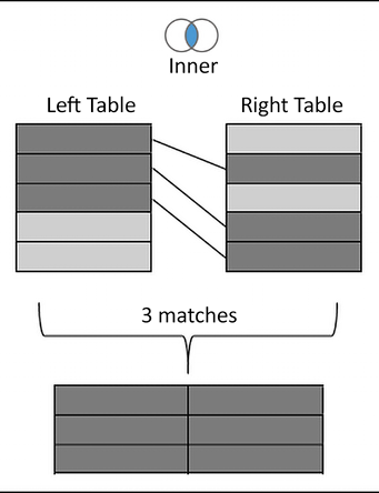
Figure 14.12: Inner join
- Left: All records from the table on the left will be kept. Matching records from the table on the right will have values in the resulting table, while unmatched records will contain
NULLvalues for all fields from the table on the right.In the following example, the five rows from the left table are kept, with
NULLresults for any values in the right table that were not matched:
Figure 14.13: Left join
- Right: All records from the table on the right will be kept. Matching records from the table on the left will result in values, while unmatched records will contain
NULLvalues for all fields from the table on the left. Not every data source supports a right join. If it is not supported, the option will be disabled. In the following example, the five rows from the right table are kept, withNULLresults for any values from the left table that were not matched:

Figure 14.14: Right join
- Full Outer: All records from tables on both sides will be kept. Matching records will have values from the left and the right. Unmatched records will have
NULLvalues where either the left or the right matching record was not found. Not every data source supports a full outer join.If it is not supported, the option will be disabled. In the following example, all rows are kept from both sides with
NULLvalues where matches were not found:
Figure 14.15: Full Outer join
- Spatial: This joins together records that match based on the intersection (overlap) of spatial objects (we discussed Tableau’s spatial features in Chapter 12, Exploring Mapping and Advanced Geospatial Features). For example, a point based on the latitude and longitude might fall inside the complex shape defined by a shapefile. Records will be kept for any records where the spatial object in one table overlaps with the spatial object specified for the other:

Figure 14.16: Spatial join
When you select spatial objects from the left and right tables, you’ll need to specify Intersects as the operator between the fields to accomplish a spatial join, as shown in Figure 14.17:

Figure 14.17: Assuming the two fields selected represent spatial objects, the Intersects option will be available
With a solid understanding of join types, let’s consider how to use them in the physical layer of Tableau’s data model.
Joining tables
Most databases have multiple tables of data that are related in some way. Additionally, you are able to join together tables of data across various data connections for many different data sources.
For our examples here, let’s once again consider the tables in the hospital database, with a bit of simplification:

Figure 14.18: The primary Hospital Visit table with Patient and Discharge Details as they might exist in a relational database
Let’s consider how we might build a data source using some joins in the physical layer. To follow along, create a new Excel data source in the Chapter 14 Starter.twbx workbook that references the Hospital Visits (Joins).xlsx file in the Chapter 14 directory. You may also examine the connection in the Chapter 14 Complete.twbx workbook.
Just as we did before, we’ll start by dragging the Hospital Visit table onto the data source canvas such that we have a Hospital Visit object in the logical layer, like this:
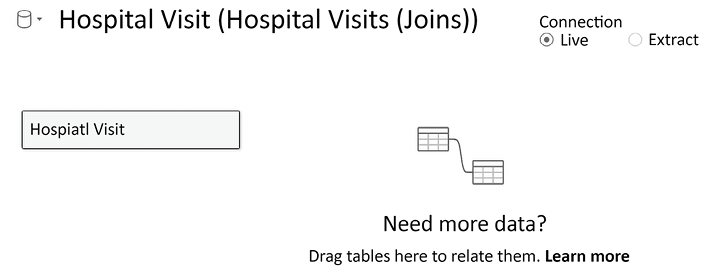
Figure 14.19: After dragging the table onto the canvas, the Hospital Visit object is created in the logical layer
At this point, the logical layer object simply contains a single physical table. But we’ll extend that next. Double-click on the Hospital Visit object to expand the physical layer. It will look like this:

Figure 14.20: The physical layer, which currently consists of a single physical table
You can extend the physical model by adding additional tables. We’ll do that here, by adding Discharge Detail and Patient. As we add them, Tableau will prompt you with a dialog box to adjust the details of the join.
It will look like this:

Figure 14.21: Joining Discharge Detail to Hospital Visit in the physical layer
The Join dialog allows you to specify the join type (Inner, Left, Right, or Full Outer) and to specify one or more fields on which to join. Between the fields, you may select which kind of operator joins the fields. The default is equality (=; the fields must be equal), but you may also select inequality (<>; the fields must not be equal), less than (<), less than or equal to (<=), greater than (>), or greater than or equal to (>=). The type of join and the field relationships that define the join will determine how many records are returned from the join. We’ll take a look at the details in the next section.
Typically, you’ll want to start by dragging the primary table onto the physical layer canvas. In this case, Hospital Visit contains keys to join additional tables. Additional tables should be dragged and dropped after the primary table.
For now, accept the fields that Tableau automatically detects as shared between the tables (Discharge Details ID for Discharge Details and Patient ID for Patient). Change the join to Discharge Details to a left join. This means that all hospital visits will be included, even if there has not yet been a discharge. Leave Patient as an inner join. This will return only records that are shared between the tables so that only patients with visits will be retained.
Ultimately, the physical layer for Hospital Visit will look like this:

Figure 14.22: The physical layer is made up of three tables joined together
When you close the physical layer, you’ll once again see the logical layer, which contains a single object: Hospital Visit. That object now contains a join icon, indicating that it is made up of joined physical tables. But it remains a single object in the logical layer of the data model and looks like this:

Figure 14.23: The logical layer contains a single object that is made up of three physical tables
All the joins create what you might think of as one flat table, which can be related together with other objects in the data model. Those objects, in turn, might each be made up of a single physical table or multiple physical tables joined together.
If you are following along with the example, rename this data source Hospital Visits (Joins). We’ll leverage this data source for one more example at the end of this chapter. In the meantime, let’s consider a few additional details related to joins.
Other join considerations
We conclude this section with some further possibilities to leverage joins, as well as a caution regarding a potential problem that can arise from their use.
Join calculations
In the previous example, we noted that Tableau joins rows in one table to rows in another based on fields in the data. You may come across cases where you need to join based on values that are not present in the data but can be derived from the existing data. For example, imagine that there is a Patient Profile table that would add significant value to your dataset. However, it lacks a Patient ID and only has First Name and Last Name fields.
To join this to our Patient table, we can use a join calculation. This is a calculation that exists only for the purpose of joining tables together. To create a join calculation, use the drop-down list of fields in the Join dialog box and select the final option, Create Join Calculation...:

Figure 14.24: You can create a join calculation to aid in forming the correct joins
Selecting this option allows you to write row-level calculations that can be used in the join. For example, our join calculation might have code like [First Name] + " " + [Last Name] to return values that match with the Name field.
Try to avoid joining on text fields, especially in larger datasets, for performance reasons. Joining on integers is far more efficient. Also, it is entirely possible for two separate people to share first and last names, so a real-world dataset that followed the structure in this example would be subject to false matches and errors.
You may also leverage the geospatial functions mentioned in Chapter 12, Exploring Mapping and Advanced Geospatial Features, to create a spatial join between two sources, even when one or both lack specific spatial objects on which to join. For example, if you have Latitude and Longitude, you might create a join calculation with the code MAKEPOINT([Latitude], [Longitude]) to find the intersection with another spatial object in another table.
Join calculations can also help when you are missing a field for a join. What if the data you want to join is in another database or file completely? In this scenario, we would consider cross-database joins.
Cross-database joins
With Tableau, you have the ability to join (at the row level) across multiple different data connections. Joining across different data connections is referred to as a cross-database join. For example, you can join SQL Server tables with text files or Excel files, or join tables in one database with tables in another, even if they are on a different server. This opens up all kinds of possibilities for supplementing your data or analyzing data from disparate sources.
Consider the hospital data. Though not part of the data included in the Chapter 14 sample data, it would not be uncommon for billing data to be in a separate system from patient care data. Let’s say you had a file for patient billing that contained data you wanted to include in your analysis of hospital visits. You would be able to accomplish this by adding the text file as a data connection and then joining it to the existing tables, as follows:

Figure 14.25: Joining tables or files based on separate data connections
You’ll notice that the interface on the Data Source screen includes an Add link that allows you to add data connections to a data source. Clicking on each connection will allow you to drag and drop tables from that connection into the Data Source designer and specify the joins as you desire. Each data connection will be color-coded so that you can immediately identify the source of various tables in the designer.
You may also use multiple data sources in the logical layer.
Another consideration with joins is unintentional errors, which we’ll consider next.
The unintentional duplication of data
Finally, we conclude with a warning about joins—if you are not careful, you could potentially end up with a few extra rows or many times the number of records than you were expecting. Let’s consider a theoretical example.
Let’s say you have a Visit table like this:
|
Visit ID |
Patient Name |
Doctor ID |
|
1 |
Kirk |
1 |
|
2 |
Picard |
2 |
|
3 |
Sisko |
3 |
And a Doctor table like this:
|
Doctor ID |
Doctor Name |
|
1 |
McCoy |
|
2 |
Crusher |
|
3 |
Bashir |
|
2 |
Pulaski |
Notice that the value 2 for Doctor ID occurs twice in the Doctor table. Joining the table on equality between the Doctor ID value will result in duplicate records, regardless of which join type is used. Such a join would result in the following dataset:
|
Visit ID |
Patient Name |
Doctor ID |
Doctor Name |
|
1 |
Kirk |
1 |
McCoy |
|
2 |
Picard |
2 |
Crusher |
|
3 |
Sisko |
3 |
Bashir |
|
2 |
Picard |
2 |
Pulaski |
This will greatly impact your analysis. For example, if you were counting the number of rows to determine how many patient visits had occurred, you’d overcount. There are times when you may want to intentionally create duplicate records to aid in analysis; however, often, this will appear as an unintentional error.
In addition to the danger of unintentionally duplicating data and ending up with extra rows, there’s also the possibility of losing rows where values you expected to match didn’t match exactly. Get into the habit of verifying the row count of any data sources where you use joins.
A solid understanding of joins will not only help you as you leverage Tableau Desktop and Tableau Server, but it will also give you a solid foundation when we look at Tableau Prep in Chapter 16, Taming Data with Tableau Prep. For now, let’s wrap up this chapter with a brief look at blends.
Using blends
Data blending allows you to use data from multiple data sources in the same view. Often, these sources may be of different types. For example, you can blend data from Oracle with data from Excel. You can blend Google Analytics data with a spatial file. Data blending also allows you to compare data at different levels of detail. Let’s consider the basics and a simple example.
Data blending is done at an aggregate level and involves different queries sent to each data source, unlike joining, which is done at the row level and (conceptually) involves a single query to a single data source. A simple data blending process involves several steps, as shown in the following diagram:

Figure 14.26: How Tableau accomplishes blending
We can see the following from the preceding diagram:
- Tableau issues a query to the primary data source.
- The underlying data engine returns aggregate results.
- Tableau issues another query to the secondary data source. This query is filtered based on the set of values returned from the primary data source for dimensions that link the two data sources.
- The underlying data engine returns aggregate results from the secondary data source.
- The aggregated results from the primary data source and the aggregated results from the secondary data source are blended together in the cache.
It is important to note that data blending is different from joining. Joins are accomplished in a single query and results are matched row by row. Data blending occurs by issuing two separate queries and then blending together the aggregate results.
There can only be one primary source, but there can be as many secondary sources as you desire. Steps 3 and 4 are repeated for each secondary source. When all aggregated results have been returned, Tableau matches the aggregated rows based on linking fields.
When you have more than one data source in a Tableau workbook, whichever source you use first in a view becomes the primary source for that view.
Blending is view-specific. You can have one data source as the primary in one view and the same data source as the secondary in another. Any data source can be used in a blend, but OLAP cubes, such as in SQL Server Analysis Services, must be used as the primary source.
In many ways, blending is similar to creating a data model with two or more objects. In many cases, the data model will give you exactly what you need without using blending. However, you have a lot more flexibility with blending because you can change which fields are related at a view level rather than at an object level.
Linking fields are dimensions that are used to match data blended between primary and secondary data sources. Linking fields define the level of detail for the secondary source. Linking fields are automatically assigned if fields match by name and type between data sources.
Otherwise, you can manually assign relationships between fields by selecting, from the menu, Data | Edit Blend Relationships, as shown in Figure 14.27:

Figure 14.27: Defining blending relationships between data sources
The Relationships window will display the relationships recognized between different data sources. You can switch from Automatic to Custom to define your own linking fields.
Linking fields can be activated or deactivated to blend in a view. Linking fields used in the view will usually be active by default, while other fields will not. You can, however, change whether a linking field is active or not by clicking on the link icon next to a linking field in the data pane.
Additionally, use the Edit Data Relationships screen to define the fields that will be used for cross-data source filters. When you use the drop-down menu of a field on Filters in a view, and select Apply to Worksheets | All Using Related Data Sources, the filter works across data sources.
Let’s take this from the conceptual to the practical with an example.
Using blending to show progress toward a goal
Let’s look at a quick example of blending in action. Let’s say you have the following table representing the service goals of various locations throughout the hospital when it comes to serving patients:
|
Location |
Avg. Minutes to Service Goal |
|
Inpatient Surgery |
30 |
|
Outpatient Surgery |
40 |
|
ICU |
30 |
|
OBGYN |
25 |
|
Lab |
120 |
This data is contained in a simple text file, named Location Goals.txt, in the Chapter 14 directory. Both the starter and complete workbooks already contain a data source defined for the file.
We’ll start by creating a simple bar chart from the Hospital Visit (Joins) data source you created previously, showing the Average Minutes to Service by Location like so:
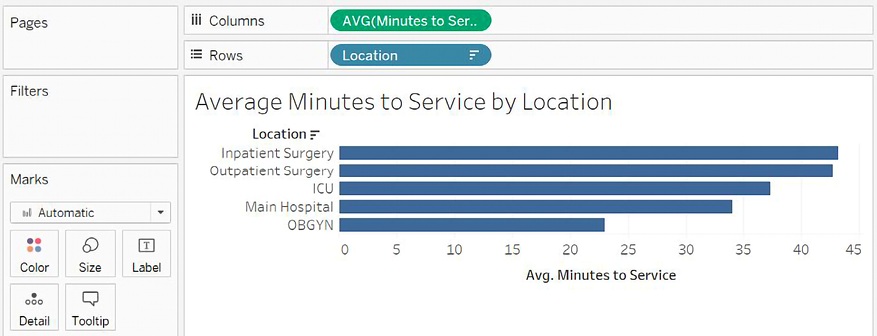
Figure 14.28: Average Minutes to Service by Location
Then, in the Data pane, we’ll select the Location Goals data source. Observe the Data pane shown here:

Figure 14.29: Hospital Visit (Joins) is shown as the Primary data source and Location in the Location Goals data source is indicated as a linking field
The blue checkmark on the Hospital Visit (Joins) data source (numbered 1 in Figure 14.29) indicates that the data source is primary. Tableau recognizes Location as a linking field and indicates that it is active with a connected link icon (numbered 2 in Figure 14.29). It is active because you have used Location from the primary data source in the current view. If you had not, Tableau would still show the link, but it would not be active by default. You may click on the link icon to switch from active to inactive or vice versa to control the level of detail at which aggregations are done in the secondary source.
For now, click on Avg. Minutes to Service Goal in the data pane and select Bullet Graph from Show Me, as indicated here:

Figure 14.30: You may drag and drop fields from secondary sources into the view or use Show Me
You may have to right-click on the Avg. Minutes to Service axis in the view and select the Swap Reference Line fields to ensure the goal is the reference line and the bar is the actual metric. Your view should now look like this:

Figure 14.31: A view created from a primary source and a secondary source
Notice that both the Hospital Visits (Joins) data source and the Location Goals data source are used in this view. Hospital Visit (Joins) is the primary data source (indicated by a blue checkmark), while Location Goals is the secondary source (indicated by the orange checkmark). The Avg. Minutes to Service Goal field on Detail in the Marks card is secondary and also indicated by an icon with an orange checkmark.
You may also notice that Main Hospital and Intensive Care do not have goals indicated in the view. Recall that the primary data source is used to determine the full list of values shown in the view. Main Hospital is in the primary source but does not have a match in the secondary source. It is shown in the view, but it does not have a secondary source value.
Intensive Care also does not have a secondary value. This is because the corresponding value in the secondary source is ICU. Values must match exactly between the primary and secondary sources for a blend to find matches. However, blends do also take into account aliases.
An alias is an alternate value for a dimension value that will be used for display and data blending. Aliases for dimensions can be changed by right-clicking on row headers or using the menu on the field in the view or the data pane and selecting the Aliases option.
We can change the alias of a field by right-clicking on the row header in the view and using the Edit Alias… option, as shown here:

Figure 14.32: Using the Edit Alias... option
If we change the alias to ICU, a match is found in the secondary source and our view reflects the secondary value:

Figure 14.33: ICU now finds a match in the secondary source
A final value for Location, Lab, only occurs in the Location Goals.txt source and is, therefore, not shown in this view. If we were to create a new view and use Location Goals as the primary source, it would show.
We’ve covered quite a few options regarding how to relate data in this chapter. Let’s just take a moment to consider when to use these different techniques.
When to use a data model, joins, or blends
In one sense, every data source you create using the latest versions of Tableau will use a data model. Even data sources using one physical table will have a corresponding object in the logical layer of a data model. But when should you relate tables using the data model, when should you join them together in the physical layer, and when should you employ blending?
Most of the time, there’s no single right or wrong answer. However, here are some general guidelines to help you think through when it’s appropriate to use a given approach.
In general, use a data model to relate tables:
- When joins would make correct aggregations impossible or require complex LOD expressions to get accurate results
- When joins would result in unwanted duplication of data
- When you need flexibility in showing full domains of dimensions versus only values that match across relationships
- When you are uncertain of a data source and wouldn’t know what type of join to use
In general, use joins at the physical level:
- When the results of joining two or more tables in a specific way clearly defines a logical object that you want to use in the logical layer
- When you want to do a spatial join
- When you want to specifically control the type of join used in your analysis
- When the performance of the data model is less efficient than it would be with the use of joins
In general, use blending when:
- You need to relate data sources that cannot be joined or related using a data model (such as OLAP cubes)
- You need flexibility to “fix” matching using aliases
- You need flexibility to adjust which fields define the relationship differently in different views
As you grow in confidence while using each of these approaches, you’ll be able to better determine which makes sense in a given circumstance.
Summary
You now have several techniques to turn to when you need to relate tables of data together. The data model gives a paradigm for relating logical tables of data together. It introduces a few behaviors when it comes to showing the full and partial domains of dimensional values, but it also greatly simplifies aggregations by taking into account the natural level of detail for the aggregation. In the physical layer, you have the option of joining together physical tables.
We covered the various types of joins and discussed possibilities for using join calculations and cross-database joins for ultimate flexibility. We briefly discussed how data blending works and saw a practical example. Finally, you examined a broad outline of when to turn to each approach. You now have a broad toolset to tackle data in different tables or even in different databases or files.
We’ll expand that toolset quite a bit more in the next chapter as we look at Tableau Prep Builder. Tableau Prep gives you incredible power and sophistication, allowing you to bring together data from various sources, clean it, and structure it in any way you like!
Join our community on Discord
Join our community’s Discord space for discussions with the author and other readers: https://packt.link/ips2H
