
11
Dynamic Dashboards
We’ve looked at dashboards previously, in Chapter 8, Telling a Data Story with Dashboards, and considered how to make them interactive using a variety of actions. Now we’ll expand on that concept to consider how to create truly dynamic dashboards—dashboards where objects can be shown and hidden. This enables you to do all kinds of amazing things, such as allow the user to select which type of visualization to see or to dynamically hide or show controls that are relevant or desired.
We’ll consider the following types of dynamic interactivity:
- Show/Hide buttons
- Sheet swapping
- Automatically showing and hiding controls
Let’s start by considering how to show and hide content on dashboards using Show/Hide buttons.
Show/Hide buttons
Show/Hide buttons allow you to show and hide layout containers (and everything in them!). You’ll find a couple of examples in the Chapter 11 Complete workbook. The Chapter 11 Starter workbook has the dashboards, but not the Show/Hide buttons or containers. The images used in the second example are also in the Chapter 11 directory.
To use the Show/Hide buttons, add a layout container to a dashboard as a floating object and then use the dropdown to select Add Show/Hide Button, as shown here in Figure 11.1:
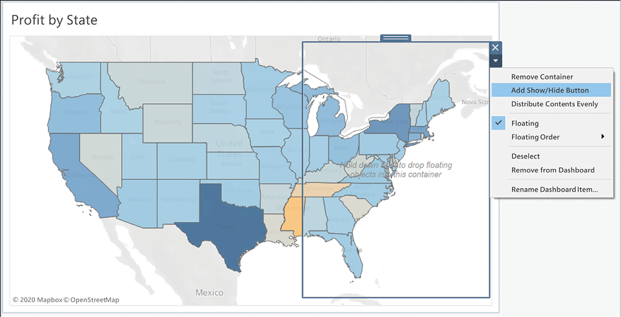
Figure 11.1: A dashboard with a single map view and a floating layout container
On this dashboard, we’ve added a vertical layout container floating over the map. When we select Add Show/Hide Button, Tableau adds a small button to the dashboard:
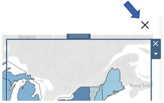
Figure 11.2: The Show/Hide button for the layout container
A Show/Hide button can be applied to any single floating layout container on the dashboard.
Use the Rename Dashboard Item… option on the layout container dropdown to make it easy to identify which layout container is the target of a Show/Hide button.
You may edit the button’s appearance and actions using the button’s dropdown to select Edit Button...:

Figure 11.3: Selecting Edit Button… reveals many options for altering the button’s behavior and appearance
In the resulting dialog box, you’ll have options for selecting which layout container to show or hide, the style of the button (image or text), and which images or text to show when the container is shown or hidden.
In this example, the Show/Hide button uses the default Image Button style (as seen in Figure 11.3) and the layout container has been filled with a couple of filters and the map’s legend.
You may include any dashboard objects in a container, including filters, legends, parameter and set controls, and even other views!
Additionally, the container has been given a border and a semi-transparent background so that the map is slightly visible beneath the container. This was accomplished by selecting the container and then using the Layout tab of the Dashboard pane, as shown here:

Figure 11.4: Use the Layout pane to adjust options for any selected dashboard object
The end result, demonstrated in the Chapter 11 workbook, is a dashboard with a Show/Hide button that makes it clear to the user that additional options can be shown or hidden:

Figure 11.5: Here you can see the layout container’s hidden and shown states along with the changing image of the button
When working in Tableau Desktop, you can switch between Design Mode and Presentation Mode by pressing F11 or using the presentation mode button on the toolbar.

Figure 11.6: Click the Presentation Mode button on the toolbar to enter presentation mode
Presentation Mode hides all design tools and menus and allows you to show the dashboard or test it as it would function when published. Buttons will function a bit differently depending on the mode. In Design Mode, clicking the button allows you to access various menus and controls associated with designing the button. If you want to actually trigger the button’s action, use Alt + Click while in Design Mode or switch to Presentation Mode where a single click will trigger the button.
Show/Hide buttons give you a lot of flexibility in your dashboard design, from optimizing space and simplifying the display, to removing filters and other clutter from printed output.
Consider another example in the Chapter 11 Complete workbook that illustrates the possibility of showing and hiding instructions:

Figure 11.7: Clicking the question mark button reveals instructions for how to use the dashboard
In this case, the default button image has been replaced with a question mark icon. This is accomplished by editing the image as illustrated in Figure 11.3 and changing the image (questionmark.png is included in the Chapter 11 directory.)
When the user clicks the button, a floating container appears over the top of the entire dashboard. It includes text as well as an annotated image to instruct the user on how to use the dashboard. In this simple example, it might be overkill to supply instructions in this way, when a simple text label would suffice.
However, as you build more complex dashboards or have detailed analyses that require explanation, this is a great way to give users additional instructions and detail that would otherwise clutter a dashboard.
Consider also using Show/Hide buttons to allow user interactivity that you do not want to include in PDFs or printed pages of the dashboards. Filters and parameters are incredibly useful, but you don’t always want them to show up in a polished output.
Let’s move on to consider another method of dynamically showing, hiding, and even swapping out content on a dashboard.
Sheet swapping
Sheet swapping, sometimes also called sheet selection, is a technique in which views are dynamically shown and hidden on a dashboard, often with the appearance of swapping one view for another. The dynamic hiding and showing of views on a dashboard has an even broader application. When combined with floating objects and layout containers, this technique allows you to create rich and dynamic dashboards.
Let’s start with some fundamental principles of sheet swapping.
Basic principles of sheet swapping
The basic principles are relatively simple. A view on a dashboard collapses when the following occur:
- At least one field is on rows or columns
- It is in a horizontal or vertical layout container
- It does not have a fixed height or width and the layout container is not set to distribute items equally
- A combination of filters or hiding prevents any marks from being rendered
Additionally, titles and captions do not collapse with the view. However, they can be hidden so that the view collapses entirely.
Next, we’ll explore an example of how sheet swapping can be used in practice.
Using sheet swapping to change views on a dashboard
Let’s consider a simple example with a view showing Profit by Department and Category with a Department quick filter.
The dashboard has been formatted (from the menu, select Format | Dashboard) with gray shading to help us see the effect:
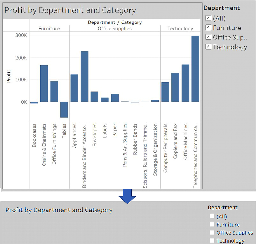
Figure 11.8: A demonstration of hiding a sheet in a dashboard
Observe how filtering out all departments results in a blank view. The title remains which prevents the view from collapsing. We’ll remove titles in the next example to complete the sheet swapping.
In order to swap two different sheets, we simply take advantage of the collapsing behavior along with the properties of layout containers. We’ll start by creating two different views filtered through a parameter and a calculated field. The parameter will allow us to determine which sheet is shown. Perform the following steps:
- Create an integer parameter named
Show Sheetwith a list of String values set to Bar Chart and Map:

Figure 11.9: Creating a parameter to control which sheet is shown
- Since we want to filter based on the parameter selection and the parameters cannot be directly added to the Filters shelf, instead we’ll create a calculated field named
Show Sheet Filterto return the selected value of the parameter. The code is simply[Show Sheet], which is the parameter name, which returns the current value of the parameter. - Create a new sheet named
Bar Chart, similar to the Profit by Department and Category view shown in Figure 11.7. - Show the parameter control (right-click the parameter in the data window and select Show Parameter Control). Make sure the Bar Chart option is selected.
- Add the
Show Sheet Filterfield to the Filters shelf and check Bar Chart to keep that value. - Create another sheet named
Mapthat shows a filled map of states by profit:
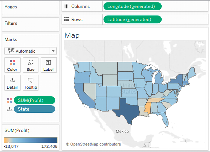
Figure 11.10: The Map view
- Show the parameter on this view and change the selection to Map. Remember that parameter selections are universal to the worksheet. If you were to switch back to the Bar Chart view, it should no longer be showing any data because of the filter.
- Add the
Show Sheet Filterfield to the Filters shelf and check Map as the value to keep. - Create a new dashboard named
Sheet Swap. - Add a Horizontal layout container to the dashboard from the objects in the left window:

Figure 11.11: Insert a Horizontal layout container
- A Vertical layout container would work just as well in this case. The key is that a layout container will allow each view inside to expand to fill the container when the view is set to fit the entire view, or fit the width (for horizontal containers), or fit the height (for vertical containers). When one view collapses, the visible view will expand to fill the rest of the container.
- Add each sheet to the layout container in the dashboard. The parameter control should be added automatically since it was visible in each view.
- Using the drop-down menu on the Bar Chart view, ensure the view is set to fill the container (Fit | Entire View). You won’t have to set the fill for the map because map visualizations automatically fill the container.
- Hide the title for each view (right-click the title and select Hide Title).
You now have a dashboard where changing the parameter results in one view or the other being shown. When Map is selected, the filter results in no data for the bar chart, so it collapses and the map fills the container:

Figure 11.12: Map is visible while Bar Chart is collapsed
Alternately, when Bar Chart is selected, the map collapses due to the filter and the bar chart fills the container:
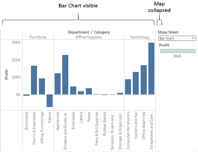
Figure 11.13: Bar Chart is visible while Map is collapsed
The key to collapsing a view is to have a filter or set of filters that ensures no rows of data are shown. You do not have to use a parameter to control the filtering. You could use a regular filter or action filter to accomplish the same effect. This opens up all kinds of possibilities for dynamic behavior in dashboards.
Sheet swapping can lead to amazing effects on your dashboard. From allowing the user to select a type of visualization, to swapping out a view that works well for a small set of data, to a view that summarizes at a higher level for a larger set, consider using sheet swapping for a dynamic experience.
Sheet swapping allows you to swap views in a dashboard. What if the change in views makes certain legends, filters, or parameters no longer applicable and you wish to hide them? Let’s consider some possibilities.
Automatically showing and hiding other controls
Views will collapse when all data is filtered out. However, other controls, such as quick filters, parameters, images, legends, and textboxes, will not collapse. You could use a Show/Hide button as we previously discussed, but often you’ll want to show or hide these controls automatically as filters change, without forcing the user to take additional action.
Consider the simple example in the previous section. The color legend, which was automatically added to the dashboard by Tableau, applies to the map. But when the bar chart is shown, the legend is no longer applicable.
Fortunately, we can extend the technique we used in the previous section to expand a view to push items we want to show out from under a floating object and then collapse the view to allow the items we want to hide to return to a position under the floating object.
Let’s extend the earlier sheet swapping example to see how to show and hide the color legend:
- Create a new sheet named
Show/Hide Legend. This view is only used to show and hide the color legend. - Create an ad hoc calculation by double-clicking on Rows and type
MIN(1). We must have a field on rows or columns for the view to collapse, so we’ll use this field to give us a single axis for Rows and a single axis for Columns without any other headers. - Duplicate the ad hoc calculation on Columns. You should now have a simple scatterplot with one mark.
- As this is a helper sheet and not anything we want the user to see, we don’t want it to show any marks or lines. Format the view using Format | Lines to remove Grid Lines from Rows and Columns, along with Axis Rulers. Additionally, hide the axes (right-click each axis or field and uncheck Show Headers). Also, set the color to full transparency to hide the mark.
- We will want this view to show when the map option is selected, so show the parameter control and ensure it is set to Map, and then add the Show Sheet Filter to filters and check Map:

Figure 11.14: The Show/Hide Legend sheet with the Show Sheet Filter applied
- On the Sheet Swap dashboard, add the Show/Hide Legend sheet to the layout container between the Show Sheet parameter dropdown and the color legend. Hide the title for the Show/Hide Legend sheet.
- Ensure that Map is selected. The color legend should be pushed all the way to the bottom.
- Add a layout container as a floating object. In terms of size and position, it should completely cover the area where the color legend used to be. It should cover the title of the Show/Hide Legend sheet but not the parameter dropdown.
Objects and sheets can be added as floating objects by holding Shift while dragging, setting the New Objects option to Floating, or by using the drop-down menu on the object. You may also change the default behavior for new objects from tiled to floating in the Dashboard pane.
- The layout container is transparent by default, but we want it to hide what is underneath. Format it using the drop-down menu and add white shading so it is indistinguishable from the background.
At this point, you have a dynamic dashboard in which the legend is shown when the map is shown and it is applicable, and hidden when the bar chart is visible. When Map is selected, the Show/Hide Legend sheet is shown and pushes the legend to the bottom of the Layout Container:
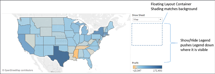
Figure 11.15: The Show/Hide Legend pushes the legend down past the floating object
When Bar Chart is selected, the Show/Hide Legend sheet collapses and the legend, which is no longer applicable to the view, is hidden behind the Floating Layout Container:
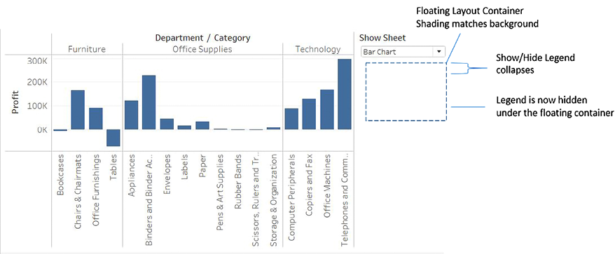
Figure 11.16: The Show/Hide Legend collapses, causing the legend to move under the floating object
There is no limit to how many variations of this technique you can use on a dashboard. You can have as many layers as you’d like. You can even use combinations of these techniques to push views and objects on and off the dashboard. The possibilities for creating a richly interactive user experience are incredible.
Summary
Creating truly dynamic dashboards gives you incredible flexibility in your dashboard design. Show/Hide buttons give the end user the option to show or hide content on the dashboard. Sheet-swapping techniques allow you to swap out which views are shown and also automatically show or hide controls or other content.
The techniques covered in this chapter will enable you to accomplish all sorts of amazing interactivity, from hiding and showing controls, instructions, and explanations of business rules and analysis to allowing users to determine visualization types and swap views in and out.
Next, we’ll turn our attention to exploring a certain kind of data using some advanced techniques: geospatial data!
Join our community on Discord
Join our community’s Discord space for discussions with the author and other readers: https://packt.link/ips2H
