10
Advanced Visualizations
We’ve explored many different types of visualizations and considered which types of questions they best answer. For example, bar charts aid in comparing values; line charts can show changes and trends over time; stacked bars and treemaps help us see part-to-whole relationships; box plots help us understand distributions and outliers. We’ve also seen how to enhance our understanding and data storytelling with calculations, annotations, formatting, and reference lines. With this knowledge as a foundation, we’ll expand the possibilities of data analysis with some advanced visualizations.
These are only examples of Tableau’s amazing flexibility and are meant to inspire you to think through new ways of seeing, understanding, and communicating your data. These are not designed as complex charts for the sake of complexity, but rather to spark creativity and interest to effectively communicate data.
We’ll consider the following topics:
- Advanced visualizations – when and why to use them
- Slope charts and bump charts
- Waterfall charts
- Step lines and jump lines
- Spark lines
- Dumbbell charts
- Unit/symbol charts
- Marimekko charts
- Animated visualizations
Advanced visualizations – when and why to use them
The visualization types we’ve seen up to this point will answer many, if not most, of the questions you have about your data. If you are asking questions of when?, then a time series is the most likely solution. If you are asking how much?, a bar chart gives a good, quick result. But there are times when you’ll ask questions that are better answered with a different type of visualization. For example, movement or flow might be best represented with a Sankey diagram. How many? might be best answered with a unit or symbol chart.
Comparing changes in ranks or absolute values might be best accomplished with a slope or bump chart. The visualizations that follow are not what you will use as you first explore the data. But as you dive deeper into your analysis and want to know or communicate more, you might consider some of the options in this chapter.
Each of the visualizations in this chapter is created using the supplied Superstore data. Instead of providing step-by-step instructions, we’ll point out specific advanced techniques used to create each chart type. The goal is not to memorize steps but to understand how to creatively leverage Tableau’s features.
You can find completed examples in the Chapter 10 Complete workbook, or test your growing Tableau skills by building everything from scratch using the Chapter 10 Starter workbook.
Let’s start our journey into advanced visualizations with slope and bump charts.
Slope charts and bump charts
A slope chart shows a change of values from one period or status to another. For example, here is a slope chart demonstrating the change in sales rank for each state in the South region from 2016 to 2017:

Figure 10.1: A slope chart is useful to compare the change of rank or absolute values from one period or status to another
Here are some features and techniques used to create the preceding slope chart:
- The table calculation Rank(SUM(Sales)) is computed by (addressed by) State, meaning that each state is ranked within the partition of a single year.
- Grid Lines and Zero Lines for Rows have been set to None.
- The axis has been reversed (right-click the axis and select Edit, then check the option to reverse). This allows rank #1 to appear at the top and lower ranks to appear in descending order.
- The axis has been hidden (right-click the axis and uncheck Show Header).
- Labels have been edited (by clicking on Label) to show on both ends of the line, to center vertically, and to position the rank number next to the state name.
- The year column headers have been moved from the bottom of the view to the top (from the top menu, select Analysis | Table Layout | Advanced and uncheck the option to show the innermost level at the bottom).
- A Highlighter has been added (using the dropdown on the
Statefield in the view, select Show Highlighter) to give the end user the ability to highlight one or more states.
Highlighters give the user the ability to highlight marks in a view by selecting values from the drop-down list or by typing (any match on any part of a value will highlight the mark; so, for example, typing Carolina would highlight North Carolina and South Carolina in the preceding view). Data highlighters can be shown for any field you use as discrete (blue) in the view and will function across multiple views in a dashboard as long as that same field is used in those views.
Slope charts can use absolute values (for example, the actual values of Sales) or relative values (for example, the rank of Sales, as shown in this example).
If you were to show more than two years of data to observe the change in rankings over multiple periods of time, the resulting visualization might be called a Bump Chart and look like this:

Figure 10.2: This bump chart shows the change in rank for each state over time and makes use of a highlighter
Slope charts are very useful when comparing ranks before and after or from one state to another. Bump charts extend this concept across more than two periods. Consider using either of these two charts when you want to understand the relative change in rank and make comparisons against that change.
Next, we’ll consider a chart that helps us understand the build-up of parts to the whole.
Waterfall charts
A waterfall chart is useful when you want to show how parts successively build up to a whole. In the following screenshot, for example, a waterfall chart shows how profit builds up to a grand total across Department and Category of products. Sometimes profit is negative, so at that point, the waterfall chart takes a dip, while positive values build up toward the total:

Figure 10.3: This waterfall chart shows how each Category adds (or subtracts) profit to build toward the total
Here are the features and techniques used to build the chart:
- The SUM(Profit) field on Rows is a Running Total table calculation (created using a Quick Table Calculation from the drop-down menu) and is computed across the table.
- Row Grand Totals have been added to the view (dragged and dropped from the Analytics pane).
- The mark type is set to Gantt Bar and an ad hoc calculation is used with code: SUM(Profit) for the size. This may seem a bit odd at first, but it causes the Gantt Bars to be drawn from the actual value and filled down when profit is positive or filled up when profit is negative.
- Category has been sorted by the sum of the profit in ascending order so that the waterfall chart builds slowly (or negatively) from left to right within each Department. You might want to experiment with the sort options to discover the impact on the presentation.
Waterfall charts will help you demonstrate a build-up or progression toward a total or whole value. Let’s next consider step lines and jump lines to show discrete changes over time.
Step lines and jump lines
With a mark type of Line, click the Path shelf and you’ll see three options for Line Type:

Figure 10.4: Change the type of Line by clicking Path on the Marks card
The three options are:
- Linear: Use angled lines to emphasize movement or transition between values. This is the default and every example of a line chart in this book so far has made use of this line type.
- Step lines: Remain connected but emphasize discrete steps of change. This is useful when you want to communicate that there is no transition between values or that the transition is a discrete step in value. For example, you might want to show the number of generators running over time. The change from 7 to 8 is a discrete change that might be best represented by a step line.
- Jump lines: Are not connected, and when a value changes, a new line starts. Jump lines are useful when you want to show values that indicate a certain state that may exist for a given period of time before jumping to another state. For example, you might wish to show the daily occupancy rate of a hotel over time. A jump line might help emphasize that each day is a new value.
In the following example, we’ve taken the build-up of profit that was previously demonstrated with a waterfall chart and used step lines to show each successive step of profit:

Figure 10.5: A step line chart emphasizes an abrupt change or discrete difference
Experiment with switching line types to see the visual impact and what each communicates about the data.
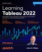
Sparklines
Sparklines are visualizations that use multiple small line graphs that are designed to be read and compared quickly. The goal of sparklines is to give a visualization that can be understood at a glance. You aren’t trying to communicate exact values, but rather give the audience the ability to quickly understand trends, movements, and patterns.
Among various uses of this type of visualization, you may have seen sparklines used in financial publications to compare the movement of stock prices. Recall, that in Chapter 1, Taking Off with Tableau, we considered the initial start of a sparklines visualization as we looked at iterations of line charts. Here is a far more developed example:
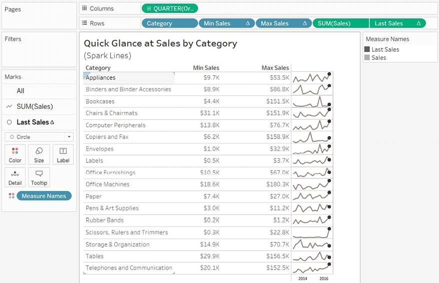
Figure 10.6: Spark Lines give you a quick glance at the “shape” of change over time across multiple categories
You can build a chart like this by following these steps:
- Start with a simple view of SUM(Sales) by Quarter of Order Date (as a date value) with Category on Rows.
- Create two calculated fields to show the minimum and maximum quarterly sales values for each category. Min Sales has the code
WINDOW_MIN(SUM(Sales))and Max Sales has the codeWINDOW_MAX(SUM(Sales)). Add both to Rows as discrete (blue) fields. - Place the Last Sales calculation with the code
IF LAST() == 0 THEN SUM([Sales]) ENDon Rows and use a synchronized dual axis with a circle mark type to emphasize the final value of sales for each timeline. - Edit the axis for SUM(Sales) to have independent axis ranges for each row or column and hide the axes. This allows the line movement to be emphasized. Remember: the goal is not to show the exact values, but to allow your audience to see the patterns and movement.
- Hide grid lines for Rows.
- Resize the view (compress the view horizontally and set to Fit Height). This allows the sparklines to fit into a small space, facilitating a quick understanding of patterns and movement.
Sparklines can be used with all kinds of time series to reveal overall big-picture trends and behaviors at a glance.
Dumbbell charts
A dumbbell chart is a variation of the circle plot that compares two values for each slice of data, emphasizing the distance between the two values.
Here, for example, is a chart showing the Difference in Profit between East and West regions for each Category of products:
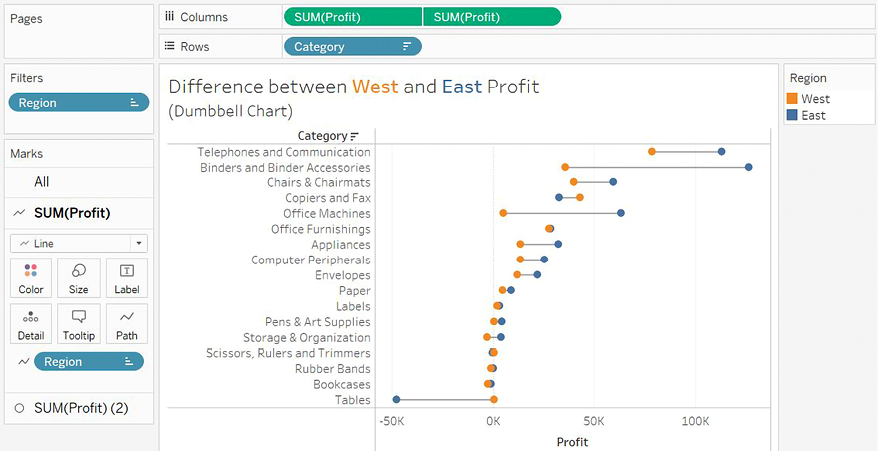
Figure 10.7: A dumbbell chart emphasizes the distance/difference between two values
This chart was built using the following features and techniques:
- A synchronized dual axis of SUM(Profit) has been used with one set to mark the type of Circle and the other set to Line
- Category has been sorted by Profit descending (the sort sums the profit for both the East and West regions)
- Region has been placed on the Path shelf for the line to tell Tableau to draw a line between the two Regions
The Path shelf is available for Line and Polygon mark types. When you place a field on the Path shelf, it tells Tableau the order to connect the points (following the sort order of the field placed on Path). Paths are often used with geographic visualizations to connect origins and destinations on routes but can be used with other visualization types. Tableau draws a single line between two values (in this case East and West).
- Region is placed on Color for the circle mark type
Dumbbell charts are great at highlighting the disparity between values. Let’s next consider how we can use unit/symbol charts to drive responses.
Unit/symbol charts
A unit chart can be used to show individual items, often using shapes or symbols to represent each individual. These charts can elicit a powerful emotional response because the representations of the data are less abstract and more easily identified as something real. For example, here is a chart showing how many customers had late shipments for each Region:

Figure 10.8: Each image represents a real person and is less abstract than circles or squares
The view was created with the following techniques:
- The view is filtered where Late Shipping is True. Late Shipping is a calculated field that determines if it took more than
14days to ship an order. The code is as follows:DATEDIFF('day', [Order Date], [Ship Date]) > 14 - Region has been sorted by the distinct count of Customer ID in descending order.
- Customer ID has been placed on Detail so that there is a mark for each distinct customer.
- The mark type has been changed to Shape and the shape has been changed to the included person shape in the Gender shape palette. To change shapes, click the Shape shelf and select the desired shape(s), as shown in the following screenshot:
Figure 10.9: You can assign shapes to dimensional values using the Shape shelf
The preceding unit chart might elicit more of a response from regional managers than a standard bar chart when they are gently reminded that poor customer service impacts real people. Granted, the shapes are still abstract, but more closely represent an actual person. You could also consider labeling the mark with the customer name or using other techniques to further engage your audience.
Remember that normally in Tableau, a mark is drawn for each distinct intersection of dimensional values. So, it is rather difficult to draw, for example, 10 individual shapes for a single row of data that simply contains the value 10 for a field. This means that you will need to consider the shape of your data and include enough rows to draw the units you wish to represent.
Concrete shapes, in any type of visualization, can also dramatically reduce the amount of time it takes to comprehend the data. Contrast the amount of effort required to identify the departments in these two scatterplots:

Figure 10.10: Notice the difference in “cognitive load” between the left chart and the right
Once you know the meaning of a shape, you no longer have to reference a legend. Placing a discrete field on the Shape shelf allows you to assign shapes to individual values of the field.
Shapes are images located in the My Tableau RepositoryShapes directory. You can include your own custom shapes in subfolders of that directory by adding folders and image files.
Marimekko charts
A Marimekko chart (sometimes alternately called a Mekko chart) is similar to a vertically stacked bar chart, but additionally uses varying widths of bars to communicate additional information about the data. Here, for example, is a Marimekko chart showing the breakdown of sales by region and department.
The width of the bars communicates the total Sales for Region, while the height of each segment gives you the percentage of sales for the Department within the Region:
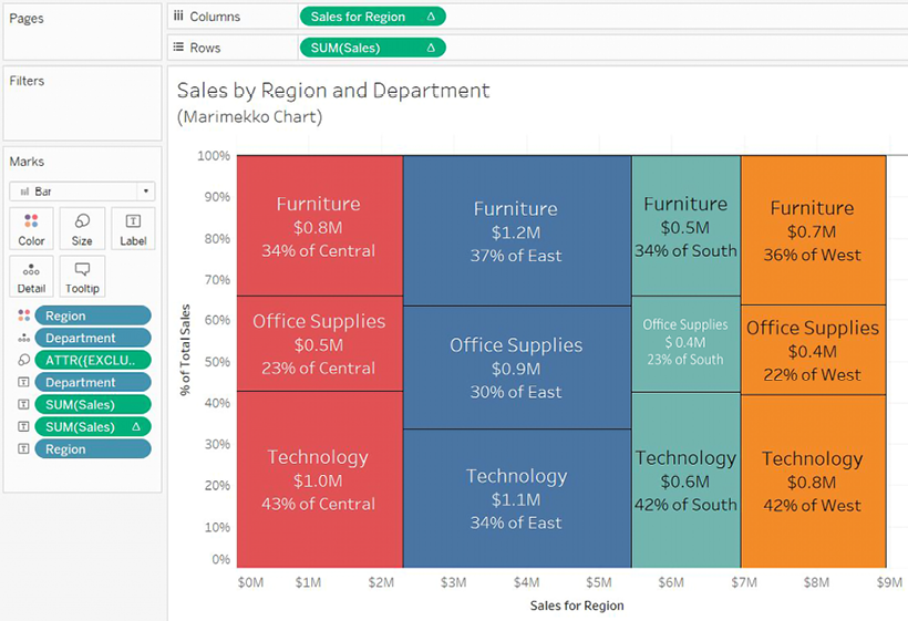
Figure 10.11: The amount of sales per Department is indicated by the height of each segment, while the width of each bar indicates the overall sales per Region
Creating a Marimekko chart in Tableau leverages the ability to fix the width of bars according to the axis’ units.
Clicking the Size shelf when a continuous (green) field is on Columns (thus defining a horizontal axis) and the mark type is set to Bar reveals options for a fixed size. You can manually enter a Size and Alignment or drop a field on the Size shelf to vary the width of the bars.
Here are the steps required to create this kind of visualization:
- The mark type has been specifically set to Bar.
- Region and Department have been placed on Color and Detail, respectively. They are the only dimensions in the view, so they define the view’s level of detail.
- Sales has been placed on Rows and a Percent of Total quick table calculation applied. The Compute Using (addressing) has been set to Department so that we get the percentage of sales for each department within the partition of the Region.
- The calculated field Sales for Region calculates the x axis location for the right-side position of each bar. The code is as follows:
IF FIRST() = 0
    THEN MIN({EXCLUDE [Department] : SUM(Sales)})
ELSEIF LOOKUP(MIN([Region]), -1) <> MIN([Region])
    THEN PREVIOUS_VALUE(0) + MIN({EXCLUDE [Department] : SUM(Sales)})
ELSE
    PREVIOUS_VALUE(0)
END
While this code may seem daunting at first, it follows a logical progression. Specifically, if this is the first bar segment, we’ll want to know the sum of Sales for the entire region (which is why we exclude Department with an inline level of detail calculation). When the calculation moves to a new Region, we’ll need to add the previous Region total to the new Region total. Otherwise, the calculation is for another segment in the same Region, so the regional total is the same as the previous segment. Notice again, the Compute Using option has been set to Department to enable the logical progression to work as expected.
Finally, a few additional adjustments were made to the view:
- The field on Size is an ad hoc level of detail calculation with the code
{EXCLUDE [Department] : SUM(Sales)}. As we mentioned earlier, this excludes Department and allows us to get the sum of sales at the Region level. This means that each bar is sized according to the total sales for the given Region. - Clicking on the Size shelf gives the option to set the alignment of the bars to the right. Since the preceding calculation gave the right position of the bar, we need to make certain the bars are drawn from that starting point.
- Various fields, such as SUM(Sales) as an absolute value and percentage, have been copied to the Label shelf so that each bar segment more clearly communicates meaning to the viewer.
To add labels to each Region column, you might consider creating a second view and placing both on a dashboard. Alternately, you might use annotations.
In addition to allowing you to create Marimekko charts, the ability to control the size of bars in axis units opens all kinds of possibilities for creating additional visualizations, such as complex cascade charts or stepped area charts. The techniques are like those used here. You may also leverage the sizing feature with continuous bins (use the drop-down menu to change a bin field in the view to continuous from discrete).
For a more comprehensive discussion of Marimekko charts, along with approaches that work with sparse data, see Jonathan Drummey’s blog post at https://www.tableau.com/about/blog/2016/8/how-build-marimekko-chart-tableau-58153.
Animated visualizations
Previous versions of Tableau allowed rudimentary animation using the Pages shelf with playback controls. Newer versions of Tableau include Mark Animation, which means marks smoothly transition when you apply filters, sorting, or page changes. Consider leveraging animation to extend your analytical potential in a couple of ways:
- Turn it on while exploring and analyzing your data. This allows you to gain analytical insights you might otherwise miss, such as seeing how far and in which direction marks in a scatterplot move as a filter changes.
- Use it strategically to enhance the data story. Animation can be used to capture interest, draw attention to important elements, or build suspense toward a conclusion.
We’ll consider both approaches to animation in the following examples.
Enhancing analysis with animation
Consider the following bar chart, which shows the correlation of Sales and Profit for each Department:

Figure 10.12: Sales and profit per Department
Notice the Region filter. Change the filter selection a few times in the Chapter 10 workbook. You’ll observe the standard behavior that occurs without animations: the circle marks are immediately redrawn at the new location determined by the filter. This works well, but there is a bit of a disconnect between filter settings. As you switch between regions, notice the mental difficulty in keeping track of where a mark was versus where it is with the new selection. Did one region’s mark increase in profit? Did it decrease in sales?
Now, turn on animations for the view. To do this, use the menu to select Format | Animations…. The Animations format pane will show on the left. Use it to turn On for the Selected Sheet:

Figure 10.13: The Animations format pane gives various options for workbook and individual sheet animation settings
Experiment with various duration settings and change the filter value. Notice how much easier it is to see the change in sales and profit from region to region. This gives you the ability to notice changes more easily. You’ll start to gain insight, even without spending a lot of cognitive effort, into the magnitude and direction of change. Animations provide a path to this analytical insight.
Enhancing data storytelling with animation
Beyond providing analytical insight as you perform your data discovery and analysis, you can also leverage animation to more effectively drive interest and highlight decision points, opportunities, or risks in your data stories.
As an example, consider this view in the Chapter 10 workbook:
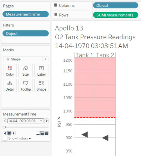
Figure 10.14: O2 Tank 1 and 2 pressure readings over time during the Apollo 13 mission
The view tells a part of the story of Apollo 13 and the disaster that crippled the spacecraft. It does this by making use of both the Pages shelf and smooth animation. Experiment with the animation speed and playback controls in the Chapter 10 workbook. Consider how animation can be used to heighten awareness, drive interest, or even create suspense.
When you use multiple views on a dashboard, each having the same combination of fields on the Pages shelf, you can synchronize the playback controls (using the caret drop-down menu on the playback controls) to create a fully animated dashboard.
Animations can be shared with other users of Tableau Desktop and are displayed on Tableau Server, Tableau Online, and Tableau Public.
Summary
We’ve covered a wide variety of advanced visualization types in this chapter! We’ve considered slope and bump charts that show changes in rank or value, step and jump lines that show discretely changing values, and unit charts that help materialize abstract concepts.
There is no way to cover every possible visualization type. Instead, the aim was to demonstrate some of what can be accomplished and spark new ideas and creativity. As you experiment and iterate through new ways of looking at data, you’ll become more confident in how to best communicate the stories contained in the data. Next, we’ll return briefly to the topic of dashboards to see how some advanced techniques can make them truly dynamic.
Join our community on Discord
Join our community’s Discord space for discussions with the author and other readers: https://packt.link/ips2H
