
Chapter 8: Adding Measures and Calculations with DAX
Now that you have created your tabular models, we will look at expanding the models further using Data Analytic Expressions, or DAX. Like MDX for multidimensional models, DAX is designed for use with Microsoft's VertiPaq engine. While MDX is modeled after SQL (SELECT…FROM…WHERE), DAX was designed for use by business and data analysts already familiar with Excel functions. In some ways, it is a happy medium between Multidimensional Expressions (MDX) and Excel functions. We can use DAX to create columns, measures, and query the database.
In this chapter, you will learn all there is to know about DAX, which will help you to enhance your existing models to meet the business requirements. Without the calculations you create with DAX, the user experience with the models will not be as good as it could be. DAX calculations allow your users to have business-ready calculations at their fingertips. Without these calculations in the models, users would need to add them in their tools. Not only is this not user friendly, but it often leads to calculation variances between the reports different users create.
In this chapter, we're going to cover the following main topics:
- Understanding the basics of DAX
- Adding columns and measures to the tabular model
- Creating measures with the CALCULATE function
- Working with time intelligence and DAX
- Creating calculated tables
- Creating calculation groups (new in SQL Server 2019)
- Creating KPIs
- Querying your model with SQL Server Management Studio and DAX
Technical requirements
In this chapter, we will be using the first tabular model we created in Chapter 6, Preparing Your Data for Tabular Models, WideWorldImportersTAB, to exercise DAX. We will be working with our Visual Studio project as well. Lastly, you will need to have Excel ready for testing and SSMS for querying.
Understanding the basics of DAX
One of the key differences in DAX is that it is used to build expressions and formulas, not traditional style queries. SQL works with tabular sets of data and MDX works with multidimensional sets. DAX was designed more like Excel functions. This works well when creating calculated measures and calculated columns. So, unlike MDX and SQL, there is no SELECT … FROM … WHERE structure. There are a few other concepts we need to review before we start creating calculations.
When working with DAX, you need to consider the context the function applies to. When creating calculated columns, the context is the row. You can use anything in the row to help build the column with DAX. Other functions apply to the table or just the column. When creating DAX calculations, you need to check the context to make sure you are using the function correctly.
Table names and field names use special syntax. Table names are typically enclosed in single quotes, 'Table Name', and columns are enclosed in brackets, [Column Name]. When working with tables, you may see some calculations that do not use single quotes. They are not required when there are no spaces or special characters in the name of the table. For example, Item and 'Item' are both valid table names in our model. IntelliSense demonstrates the standard practices when used.
Finally, whenever working with DAX, you always start with an equals sign. This is true in both measures and calculated columns. You can add the name of the measure before the equals sign. The base syntax for measures is [Measure Name]:=<Measure Calculation>. When creating a calculated column, the formula bar does not contain the name; it is simply =<Column Calculation>.
Adding columns and measures to the tabular model
We can add value and usability to our model by adding measures and columns. In the previous chapter, we created Invoices, Invoice Line Count, and Total Sales Amount on the Sales table. We created these using the Autosum button on the toolbar. This is the simplest way to add basic measures to your tables. Sum, Average, Count, DistinctCount, Min, and Max are available using this button. As we did previously, simply select the column you want to create the measure for and use the Autosum menu to create the measure. Rename the measure as desired, add some formatting, and you are good to go.
We will look at other options in this chapter to manually create measures and calculated columns. Like Excel, we can use the formula bar to create and manage our measures. The following screenshot shows the formula bar and the formula buttons (highlighted):

Figure 8.1 – DAX Formula Bar and Formula Buttons in Visual Studio
Both calculated columns and measures use the formula bar to display the calculation and the name of the calculation.
Note
Visual Studio has issues with some high-resolution monitors that cause some of the buttons to be very small as it does not scale. This is particularly an issue with data tools and, depending on your monitor resolutions, some buttons and text will appear as they do in the preceding screenshot. We will show the details where we can, so that you can identify the buttons and text used throughout the book.
As you can see in the preceding screenshot, there are three buttons on the formula bar to help you create calculations. The red X is used to cancel the changes you made. The green check mark will check and apply the changes. Keep in mind that you are actively adding these to a tabular model in your workspace. When applied, it will create and deploy the calculation to the workspace. Canceling changes becomes necessary when troubleshooting issues with your calculation that cause it to not deploy correctly.
The third button on the formula bar is fx, which is a function list. This allows you to add a function to your formula. It also shows you the syntax and basic description of the function. In the following screenshot, we opened the Insert Function dialog and have highlighted AVERAGEA. This function creates an average of the numeric values in the column while ignoring the non-numeric values:
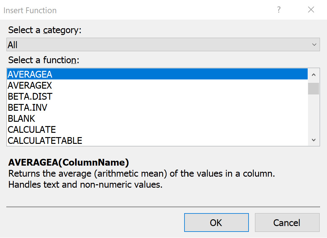
Figure 8.2 – The Insert Function dialog
As you can see in the screenshot, there are many functions available to you. This is a good way to explore them. The dialog also has a Select a category dropdown. This will filter the functions to one of the following areas:
- Date & Time: These functions are typically referred to as time intelligence functions. Some are basic, which capture the date part, but others require the Date table to support functions such as NEXTYEAR.
- Math & Trig: Just like the category implies, these are math functions such as SQRT (returns the square root of a number) and MOD (returns the remainder in a division calculation).
- Statistical: This is one of the most frequently used categories as it supports counts, averages, and standard deviation.
- Text: You can use the functions here to concatenate, trim, and search string values.
- Logical: Logical functions include IF, AND, and NOT, which allow you to add decision logic to your calculations.
- Filter: This list includes various types of functions that limit the set of values included in calculations. Some of these filters have explicit functionality to work with selected values or to even remove other filters from the calculation.
- Information: Most of the functions you will use in this category are IS functions; for example, checking to see whether a value is a number (ISNUMBER) or whether the field is empty (ISEMPTY). They are often used with the Filter functions to properly apply calculations.
- Parent/Child: These are PATH functions that work with a list of IDs. The functions here are used to traverse hierarchies.
Implicit calculations
Like Excel, tabular models have the concept of implicit calculations. If you have a value in a column that is numeric, by default, a sum calculation for that column is created. You do not need to add the calculation. However, to make sure you get your expected result, we recommend that you build calculations that meet those needs. This will allow you to apply any business corrections or any other adjustments needed at a later time. Also, some tools will treat value columns as attribute columns. Calculated measures clearly define the value role.
Before we create our calculations, there are two other buttons to call out on the formula bar. The formula buttons we have been looking at are on the left side of the formula bar. On the right side of the formula bar are two buttons. The first button looks like a down arrow. You can use this button to expand the formula section so you can see longer DAX expressions. The button furthest to the right will open a basic DAX Editor. This allows for more screen space when creating complicated or long DAX expressions, as shown here:
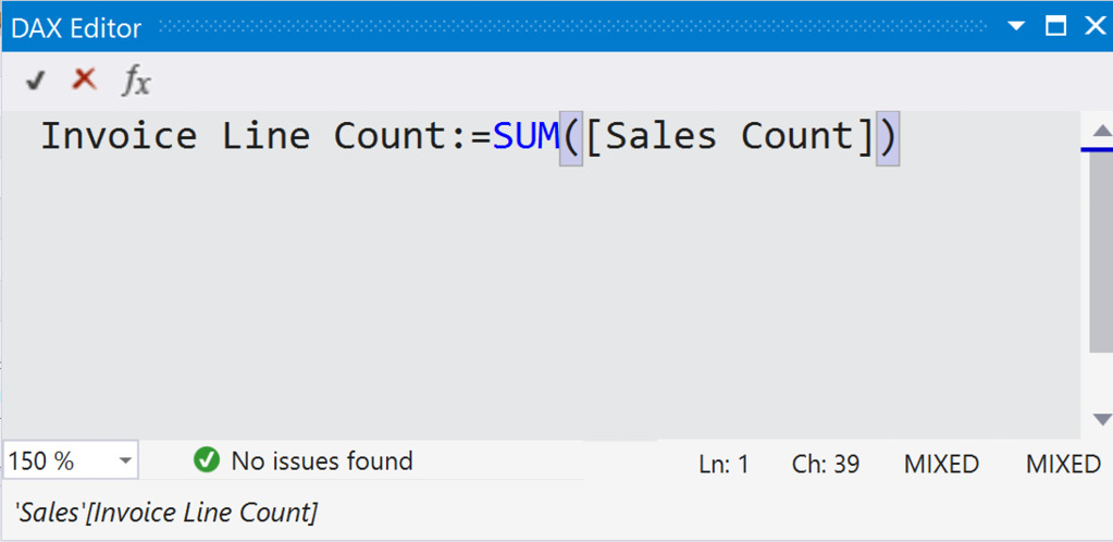
Figure 8.3 – DAX Editor
Now that we are familiar with adding columns and measures to the table, let's learn how to create item calculations.
Creating item calculations
In Chapter 5, Adding Measures and Calculations with MDX, we created calculations based on item colors. In this section, we will go through a similar process, creating calculated columns and measures to support item counts by color. Through the next steps, we will create a column to determine how many red items are on each line and then create some calculations based on that information. In the next section, we will do a similar process, but use the CALCULATE function to create the values:
- In your Visual Studio project, go to the Sales table in the model.
- Scroll over to the right and you will see a blank column at the end with the words Add Column. Click the column header.
- In the function bar, start by giving the column a name. We will call this column Red Items. Let's start the function with the following code: Red Items:=.
- In order to identify which items are red, we need to refer to the Item table. DAX has a function to look up values in related tables called RELATED. This will return the related value from the table, which, in our case, is items whose color is red. We will use the RELATED('Item'[Color]) code to find the related item color. This function works well when creating calculated columns that refer to columns from other tables. However, if the relationship does not exist, this will return an error.
- In the end, we want to populate our column with Quantity from the line we are on whenever the item's color is red. Here is the full formula to return the desired result:
Red Items:=IF(RELATED('Item'[Color])="Red", Sales[Quantity], 0)
We now have a column that contains the quantity of red items for each row. The value 0 is used when the row does not have red items. Keep in mind that this formula uses the row as its context to determine the relationship and return the quantity.
- Now that we have the Red Items column, we can create a measure that returns the sum. Click in the measures area below the column. Go to the formula bar and use the following code to create the Total Red Items measure:
Total Red Items:= SUM(Sales[Red Items)
- While you have the measure highlighted, let's fix the format. In the measure properties, set the format to Custom and use the following code for the format string: 0,0. Now we are done with the basics of adding red items.
In DAX, you will notice that many functions, such as SUM and AVERAGE, have suffixes such as A and X or a combination thereof. The base functions work as expected; the calculation is based on the column or field specified. Let's start with SUMX to see the difference. SUMX evaluates the table and returns the sum of the values based on the expression you create for the table. When we created the sum for red items, we created a column and then summed those values. In this case, we will use a single function for the measure; no column is required:
- Select a field in the measure grid on the Sales table.
- In the formula bar, enter the following calculation: Total Blue Items:=SUMX('Sales',IF(RELATED('Item'[Color])="Blue", Sales[Quantity],0)). You can see in the formula that we moved the same calculation we used for the Red Items column into the measure itself. This eliminates the need for the additional column.
- Finally, set the format for this measure to 0,0 using the Custom format option in the measure properties.
Note
You may decide that you need the column as well as the calculation. Keep in mind that columns are calculated and stored in memory to improve performance. Measures are calculated on the fly when requested. You may find that your performance varies depending on how you create the calculation. Furthermore, you may want those values in columns if you have other calculations you would like to use them with.
Let's wrap up this section by creating the rest of the color measures for the remaining item colors (black, gray, light brown, steel gray, white, and yellow) using the SUMX function format. Remember to set the formatting to keep the measures consistent when you add those measures now.
In the next section, we will look at the variations of the COUNT and AVERAGE measures.
The COUNT and AVERAGE measures
The COUNT and AVERAGE measures have variations that can be used to understand the various ways in which DAX does calculations. We have already looked at the SUMX function and how it uses the table as the base for the calculation. The syntax and functionality are the same for COUNTX and AVERAGEX. They both will perform the calculation over the table based on the expression you provide.
In the next steps, we are going to create additional metrics based on Invoice Profit in the Invoice Sales table:
- First, we need to switch to the Invoice Sales table. Find the Invoice Profit column and select a field in the measure grid.
- The first measure we will create is Average Invoice Profit. For this measure, we will use the AVERAGE function. This will give us the average or mathematic mean for all the invoices. Here is the formula for this measure:
Average Invoice Profit:=AVERAGE('Invoice Sales'[Invoice Profit])
- The next measure will be to demonstrate AVERAGEX. We will look for the average profit for sales made in Indiana. Once again, we will use the RELATED function to find the matching State Province instance from the City table. This will filter the invoices and give us an average profit for Indiana sales.
Here is the formula for the Indiana profits:
Average Indiana Profit:=AVERAGEX('Invoice Sales',IF(RELATED(City[State Province])="Indiana",'Invoice Sales'[Invoice Profit],""))
- Now, to demonstrate the COUNTA measure, we are going to copy the Invoice Profit column and set some of the values to NULL. COUNTA counts non-empty cells, whereas COUNT will count only those cells containing values.
- In Tabular Model Explorer, right-click the Invoice Sales table and select Table Properties.
- In the Edit Table Properties dialog, click the Design button. This will open the Power Query Editor for the table.
- Find the Invoice Profit column. Right-click the column header and select Duplicate Column. This will create a copy of the column in the table called Invoice Profit – Copy.
- Right-click the header again and choose Replace Values. In this dialog, use 40.00 for Value To Find. Use null as the Replace With value (null is case-sensitive. You may get an error if you use any capital letters. The error you will see is that text is not permitted). Your dialog should look like the one in the following screenshot:
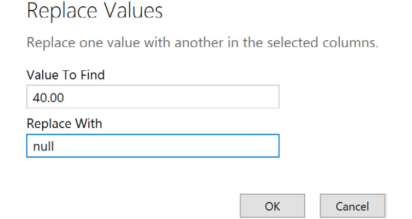
Figure 8.4 – The Replace Values dialog in Power Query
- Click OK to complete the process.
- To verify that the change has been applied properly, you can click the down arrow on the column header and filter for (null), as shown in the following screenshot. This will show the values you changed:
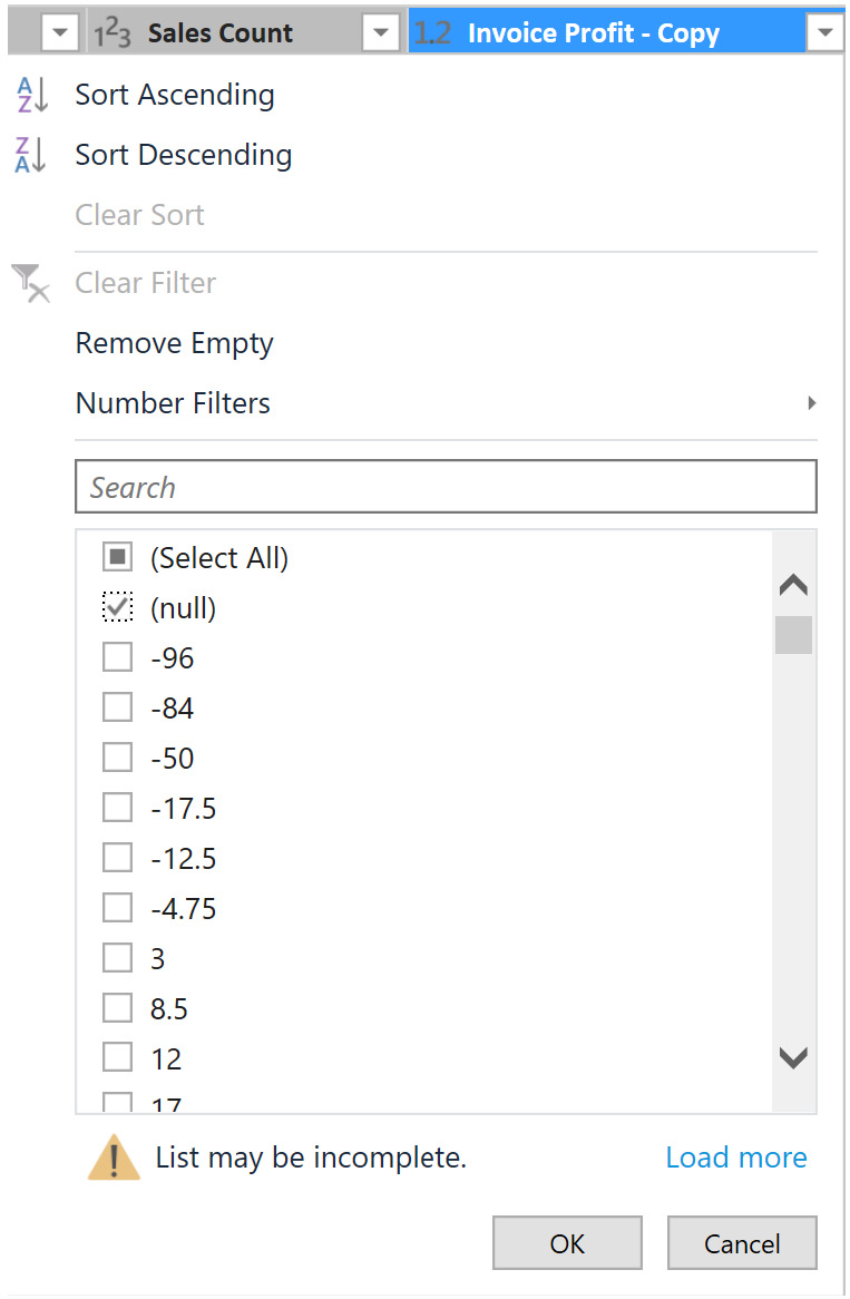
Figure 8.5 – Filtering the column for null values
- Once you have finished reviewing the change, be sure to remove the filter step from the Applied Steps section by clicking the delete button, as shown in the following screenshot. Then you are ready to move to the next step:
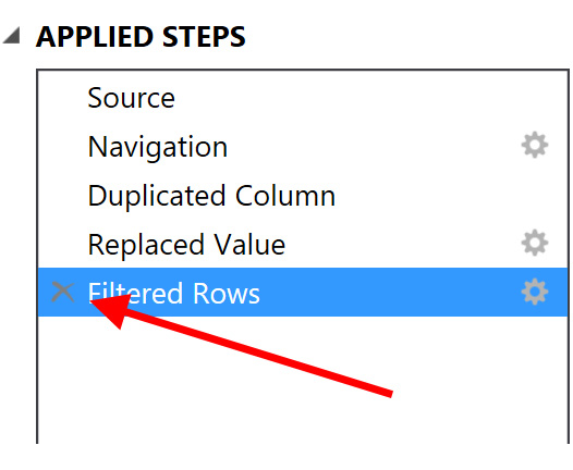
Figure 8.6 – Removing the filter
- Go to Home and choose Close & Update. Then, click OK to close the Table Properties window.
- Back on the Invoice Sales table, you will see the Invoice Profit – Copy field you added at the end of the table. If there are no values in the column, process the table using the Process Table button on the toolbar shown here:
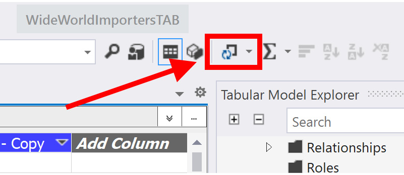
Figure 8.7 – The Process Table button
- Now that we have the Invoice Profit – Copy field, create a COUNT calculation – Count Inv Profits:=COUNT('Invoice Sales'[Invoice Profit - Copy]). This returns the count of non-empty values in the column.
- Create the COUNTA measure: CountA Inv Profits:=COUNTA('Invoice Sales'[Invoice Profit - Copy]). This also returns the count of non-empty values in the column. Effectively they have the same value, but we are not discovering how many invoices do not have a profit or loss recorded.
These measures have helped us see profits. The next measures will help us identify missing profits using DAX.
Identifying missing profits
We will now add another column that will help us identify invoices missing profits:
- Click on Add Column in your Invoice Sales table.
- In the formula bar, we are going to use the ISBLANK function to identify those columns' missing values. Use this formula to create the column: =ISBLANK('Invoice Sales'[Invoice Profit - Copy]).
- Name the column Missing Profit. The Missing Profit column contains TRUE and FALSE as values.
- First, let's add the standard COUNT function to this column. Use the following calculation: Total Profit Count:=COUNT('Invoice Sales'[Missing Profit]). When you apply the change, your cell will report an error. If you read the tooltip for the error, you will see that COUNT does not work with BOOLEAN data type columns.
- Update the formula by using the COUNTA function as follows: Total Profit Count:=COUNTA('Invoice Sales'[Missing Profit]). This will now return the full number of rows with a value in it. The COUNTA function can be used effectively for various column types.
- The final step is to answer the question, "How many invoices are missing profit calculations?". We can use two measures to answer this question. Click an empty space in Measures Grid to create your new measure. This answer can now be done with simple math: Total Profit Count – Count Inv Profits. Here is the complete formula: Invoices Missing Profits:=[Total Profit Count]-[Count Inv Profits].
The steps so far in this section have been used to exercise various aspects of using DAX with tabular models. As you were working through this section, you likely realized that the editor for building measures and columns with the tabular model is not very elegant. While working with the editor, IntelliSense can even get in the way. The more you work with the tool, the easier it will be.
Before we move to the next section, all the measures we have created respond to filters, slicers, and cross-filtering in visualization tools. For example, if your visualization tool has a date slicer, we can find the number of red items sold during that range just by using our measure. It will filter the measure by the date selected. We will explore some ways to ignore filters and build more complex calculations using the CALCUATE function in the next section.
Creating measures with the CALCULATE function
In the previous section, we created measures that gave us counts for each of the colors for our items. We will be using the CALCUATE function to create formulas that return the percentage of a color versus the total of colored items in the model. To do this, we will need to eliminate those items whose color is N/A. We will use the CALCULATE function to do this.
The CALCULATE function allows us to add filters to the calculation we are trying to work with. CALCULATE does not allow the use of a measure in its expression. It also returns a single value. The filters for this function need to return a table, so the work we did with our item filter in the count calculations will need to be handled as a table filter. The other important note here is that the CALCULATE function's filters override other filters that may be applied by external operations in visualization tools. The calculation will be performed over the tables as specified in the filter.
Let's get started with creating our percentage calculations:
- Open the Sales table in your model in Visual Studio.
- Select a cell in the measure grid. We will be creating similar measures for each of the colors. Here is the measure we will be adding for red items:
% of Red Items:=[Total Red Items] / CALCULATE(SUM(Sales[Quantity]),FILTER('Sales',RELATED('Item'[Color])<>"N/A"))
Let's break this down so you can understand the parts better. The numerator is the measure we created previously – Total Red Items. While a column is required for this calculation, the rest of the measures require the use of the following syntax as we see with blue items (this is the preferred approach):
Total Blue Items:=SUMX('Sales',IF(RELATED('Item'[Color])="Blue", Sales[Quantity],0))
- Next, let's look at the FILTER function we used. This is similar to the IF functionality in our color count measures. The FILTER function creates a table based on the criteria specified. We are eliminating any Sales line where Item has a color of N/A. This means that our measures will be calculating the percentage of red items for all items that have color.
In the CALCULATE function, we are calculating the sum of Quantity over the table returned by the filter. This gives the sum of all the colored items sold in the Sales table. This completes the denominator.
We use a standard division operation to create the percentage.
- Finally, change the formatting to Percentage in Measure Properties. It will automatically use two decimal places.
- Wrap this up by creating the percentages for the remaining colors: blue, black, gray, steel gray, light brown, yellow, and white.
Now, we mentioned before that designing measures is difficult, including the fact that IntelliSense will get in the way. Let's now review some helpful tips to save you from frustration here:
- First, copy the original % of Red Items calculation from the formula bar.
- Next, click into the next cell in the measure grid and paste the formula into the bar.
- Normally, I would try to double-click Red and replace it with Blue to finish this off. However, this does not work as expected all the time, or even most of the time. Instead, for the name of the measure, place your cursor at the beginning or end of the word. Then, delete the word using backspace or delete and type in the new value.
- For the calculation itself, we need to change the value from [Total Red Items] to [Total Blue Items].
IntelliSense can complicate editing
At times, it is difficult in Visual Studio to highlight the words in the formula bar. You can delete the expression and start typing. IntelliSense will want to help, so, you let it. However, you may get partial results in Visual Studio such as [Total Blue Items]Items], which is obviously incorrect. Now you need to eliminate the extra characters. The other option is to delete the entire formula and type it in. Then, click at the end of the formula (do not use Tab or Enter). Then, click Enter and it will work. Hopefully, this will help you use the formula bar more efficiently when creating measures.
Let's now look at how we can perform key calculations using the ALL function.
Using the ALL function with CALCULATE
Before we move on, there is another key calculation that can be performed using the CALCULATE function. We often need to create calculations that are in reference to the grand total and we don't want external filters to change how the denominator for those calculations is performed. In this case, we can use the CALCULATE function with the ALL function to guarantee the results.
Let's use this capability to calculate the percentage of total invoices. The purpose of the calculation is to have a flexible numerator that honors context filtering, whereas the denominator will be static and count all of the invoices and ignore the filters:
- Change to the Invoice Sales table in your model.
- Select a cell in the measure grid below the WWI Invoice ID column.
Where should you put measures in the measure grid?
Throughout the creation of measures in this chapter, we have been adding measures under columns that are used. However, this is not required. We are doing this to make finding the measures a bit easier. The reality is that it does not matter where you put the measure in the grid. By now, you must have noticed that all measures contain full references to tables. The grid is simply a way to see the results of a calculation quickly. All measures are considered to be part of the tabular model as a whole and not bound to a table or column. So, if you have a pattern that you would prefer to use, go for it. We will continue to keep calculations on tables that make sense and near primary columns being used.
- Let's now review the formula we will use to create the calculation:
% of All Invoices:=COUNT(Invoice[WWI Invoice ID]) / CALCULATE(COUNT(Invoice[WWI Invoice ID]),ALL('Invoice Sales'))
You can see that we use the standard COUNT function to count the invoices.
- Next, we use the CALCULATE and ALL functions to override other filters to create the denominator. When applied, this will be 100%.
- Change the format to Percentage. You should see the result as 100% in the measure grid.
- There is no way in Visual Studio to validate that the percentage worked as expected. Let's use the Analyze in Excel feature to test this measure. Click the Excel icon in the toolbar. This will open an Excel workbook with a PivotTable connected to your tabular model.
- Add % of All Invoices to the Values panel. This will add the value to the PivotTable with the value 100.00% in the only cell.
- Next, use the Search function in the PivotTables Fields panel and search for Buying Group. Select the Buying Group option in the More Fields section of the Customer table. This will add Buying Group to the rows. You can see that the % of All Invoices works as designed as shown in the following screenshot:
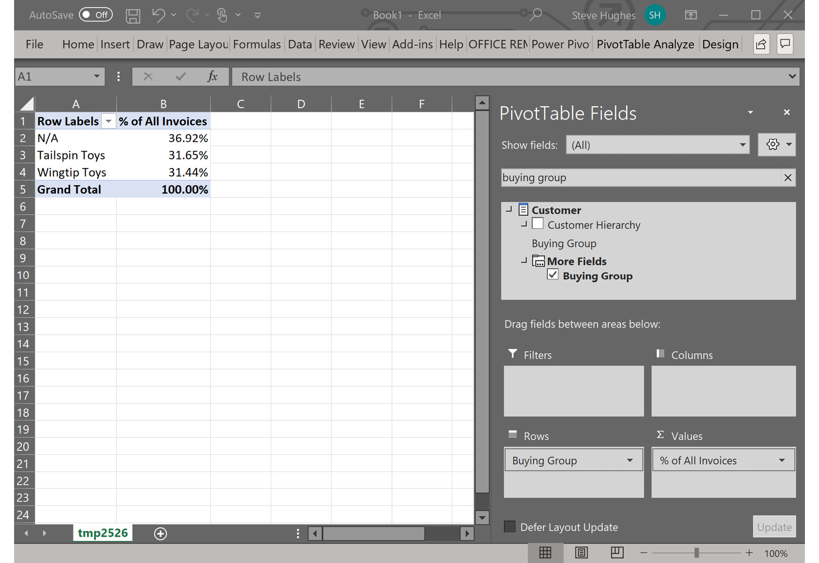
Figure 8.8 – Analyzing new calculations in Excel
- Close Excel when you are done exploring. You can use this feature to validate formulas as needed.
We are now ready to look at some time intelligence functions.
Checking your work with Excel
Use the Analyze in Excel feature available in Visual Studio to check your work often. This is a great way to make sure the calculation responds to filtering, slicing and dicing, and visualization as expected. This feature creates a connection to your workspace model and runs queries there. This is a quick way to work with the model you are currently designing.
Working with time intelligence and DAX
The time intelligence functionality is an important part of any analytics solution. Tabular models are no exception. DAX has several functions that support time intelligence. In order for these functions to work, a table in the model must be marked as Date Table. In Chapter 7, Building a Tabular Model in SSAS 2019, we marked our date table as the date table for this purpose. The requirements for the date table are called out in that chapter as well.
Time intelligence functions in DAX allow you to perform calculations with your data over supported time periods. This includes year, quarter, month, and day. Some of the functions are common, including the to date functions such as YTD, QTD, and MTD. Others have specific use cases, such as the BALANCE functions, which can be used to calculate a value at the end of a period such as a month, CLOSINGBALANCEMONTH.
We are going to create a few calculations using the Invoice Sales table. We will be checking our calculations using Analyze with Excel. The data we are working with is not in the current time period, so we will not be able to rely on the calculations in the measure grid. We are going to create a set of annual calculations. Here is what we will be creating in the next set of steps:
- Invoice sales YTD
- Invoice sales next year
- Invoice sales previous year
Creating the YTD measure
Let's get started by creating the YTD measure:
- Open your model in Visual Studio and navigate to the Invoice Sales table in the model.
- We will be using the Invoice Total Including Tax field for these calculations. You can select a cell in the measure grid to start creating these formulas. Let's keep these calculations in the same area for ease of use.
- The first calculation we are going to create is Invoice Sales YTD. We will be using the TOTALYTD function. This function takes the following four parameters:
a) expression: The expression is the calculation, which is SUM('Invoice Sales'[Invoice Total Including Tax]) in our case.
b) dates: Next is the dates parameter. We need to reference a date column or a date table that has a single date column. We will be using 'Date'[Date] from our model as the date column.
c) filter and year_end_date: These two parameters are optional. You can filter the data being evaluated and specify a specific year end date if needed. We will not be using either of these options.
The full formula we are using is as follows:
Invoice Sales YTD:=TOTALYTD(SUM('Invoice Sales'[Invoice Total Including Tax]),'Date'[Date]).
- Let's check our work in Excel. Click the Analyze in Excel button. In the PivotTable, add the Invoice Sales YTD measure to the Values area and then add Calendar Year from the Date table to the Rows area. You can see that each year shows the YTD value for that year. You should see results similar to the worksheet shown here:
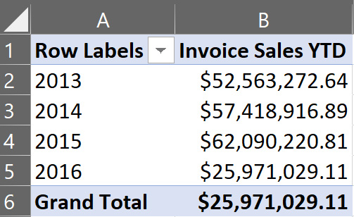
Figure 8.9 – YTD results in Excel
Close Excel and then move on to the next two calculations.
Creating a calculation for next year's sales
Now we are going to create the calculation for next year's sales. While this sounds predictive, it is useful when looking at changes for the following year when evaluating values:
- Click on a new cell in the measure grid. The NEXTYEAR function returns a table of dates that match the criteria. In order to use this function, we will use the CALCULATE function as well. Here is the code to create the next year's sales calculation:
Invoice Sales Next Year:=CALCULATE(SUM('Invoice Sales'[Invoice Total Including Tax]), NEXTYEAR('Date'[Date]))
You will see that the calculation in the measure grid returns (blank) as the result. This is because no values exist in the next year.
- Before we check next year's values, let's create the previous year's sales measure as well. The PREVIOUSYEAR function has the same syntax and returns a list of dates like the NEXTYEAR function:
Invoice Sales Previous Year:=CALCULATE(SUM('Invoice Sales'[Invoice Total Including Tax]), PREVIOUSYEAR('Date'[Date]))
This calculation also shows (blank) in the measure grid results. Let's get back into Excel.
- Click Analyze in Excel to open Excel again.
- Add both of our new measures to the Values area. They still show no results.
- Add Calendar Year to the Rows area. To make the comparison clearer, you can also add the Invoice Sales YTD measure to the Values area. Your results should look similar to the following screenshot. The results have been formatted as currency in Excel to make reading the results easier:
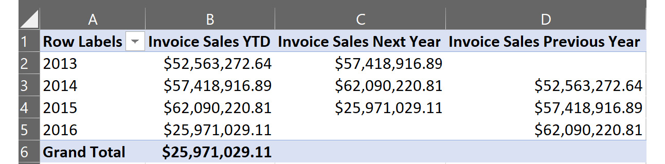
Figure 8.10 – Excel results for the next year and previous year functions
- Close Excel when you are done creating and checking the time intelligence functions.
Now that we have worked with time intelligence functions, let's move on to creating calculated tables.
Creating calculated tables
Calculated tables in tabular models are built using DAX and purely calculations. Calculated tables allow you to create role-playing dimensions, filtered row sets, summary tables, or even composite tables (made from columns of more than one table). We will demonstrate the use cases in this section.
Creating a delivery date table to support role playing
In our model, we have used two dates – Invoice Date and Delivery Date – in the Sales table. We have been using Invoice Date as our primary date in the model. This means that in order to refer to Delivery Date in calculations, you need to use the USERELATIONSHIP function. Both Invoice Date and Delivery Date are related to our Date table. However, only the relationship with Invoice Date is active.
You can visually identify inactive relationships in the Diagram view. In the following screenshot, you can see the two relationships. The inactive relationship is signified by the dotted line. Solid lines are active relationships:
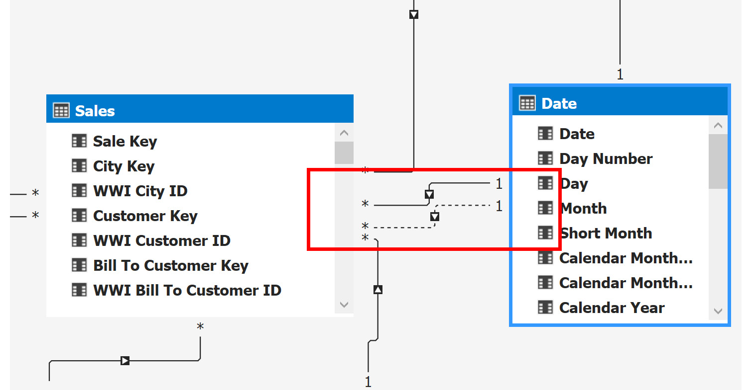
Figure 8.11 – Date relationships in the Diagram view
Using USERELATIONSHIP
If you have an inactive relationship that you want to use, the syntax is fairly straightforward. You should have an inactive relationship in place to use this function. (Do not use USERELATIONSHIP with active relationships.) In our model, you can create a calculation to show quantities by delivery date. You can use the following calculation to accomplish this: Total Items by Delivery Date:=CALCULATE(SUM(Sales[Quantity]),USERELATIONSHIP(Sales[Delivery Date Key],'Date'[Date])).
You will need to use Excel to see the results in action.
Let's get started with our Delivery Date table:
- In Tabular Model Explorer, right-click the Tables folder and select New Calculated Table. You need to be in the Grid view to do this.
- To create our calculated copy, simply add the following formula: ='Date'. This should result in the new table being loaded with the same data as the Date table.
- Rename the table Delivery Date in the Properties window and you are done. You have created your first calculated table.
- Let's wrap this up by adding the relationship. Go to the Diagram view and add the relationship between the Delivery Date table and the Sales table by using the Date field from the Delivery Date table and Delivery Date Key from the Sales table. Now you have an active relationship to use for more expanded analysis according to the date of delivery:
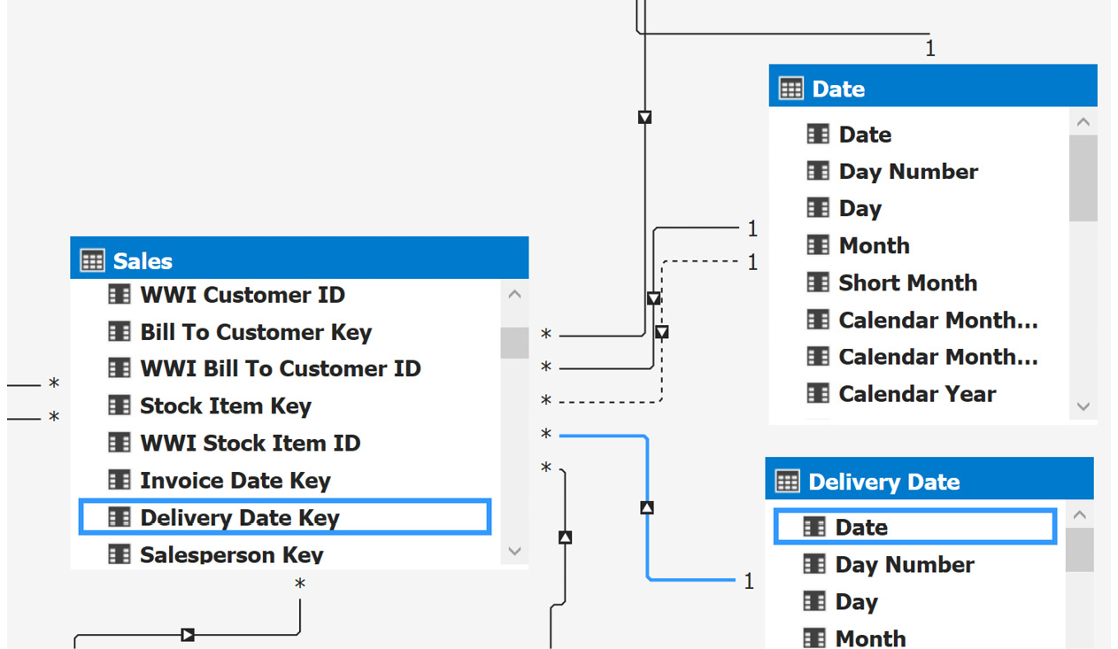
Figure 8.12 – New relationship with the calculated table delivery date
We have just created a calculated table that can be used to support a role-playing dimension. Now, we will use a filtered row set to create a calculated table.
Creating a filtered row set calculated table
In this example, we will create a calculated table that is filtered. We will use the Invoice Sales table as our base table. We will be filtering the Invoice Sales table for sales only made by the Tailspin Toys buying group:
- Right-click the Tables folder in Tabular Model Explorer and click New Calculated Table.
- In this case, we will use the FILTER function to reduce the rows to those from Tailspin Toys. Here is the formula we used:
=FILTER('Invoice Sales',RELATED(Customer[Buying Group])="Tailspin Toys")
- Rename the table Tailspin Toys Sales.
Delayed refresh in calculated data
In some cases, the newly created data will not show right away in the calculated tables. You know it is working if there are no errors and you get a record count in the lower-right corner while the table is selected. We can force the data to refresh in the designer by closing and reopening Visual Studio if you want to see the data to confirm the table is working as expected.
In our case, we have just created the table. To effectively use the table moving forward, you should add relationships to support the work you want to do. Calculated tables function the same as imported tables, but they do not retain relationships when created. You will need to add them.
Creating a summary calculated table
We will create a summary calculated table that will show all the numbers of items we have by color and brand:
- Right-click the Tables folder in Tabular Model Explorer and click Create Calculated Table.
- For this table, we will be using the SUMMARIZECOLUMNS function. This will allow us to reduce rows and create the summary we are looking for. Logically, this is like creating an aggregated SQL statement with GROUP BY clauses. We will be creating the table with three columns: Color, Brand, and the count of items in that selection. Here is the formula for this table:
=SUMMARIZECOLUMNS('Item'[Brand],'Item'[Color],"Item Brand Color Breakdown", COUNT('Item'[Stock Item Key]))
- Rename the table Item Brand Color. Your results should look like the following screenshot:

Figure 8.13 – Item Brand Color calculated table
As you can see, if you want to create some pre-aggregated or summarized tables to make the data easier to use for your end users, that capability is built into tabular models with DAX. Next, we will create a calculated table that brings more columns from other tables.
Creating a composite calculated table
We are going to use a new DAX function, GENERATE, to build out our composite table. The GENERATE function returns a Cartesian product from two tables that have matching rows between them. We are going to expand on our previous table and bring in the sales numbers from the Sales table with the help of another SUMMARIZE function:
- Right-click the Tables folder in Tabular Model Explorer and click New Calculated Table.
- Here is the code to build our table:
=GENERATE(SUMMARIZE('Customer',Customer[Buying Group]), SUMMARIZE('Item', 'Item'[Brand],'Item'[Color],"Item Brand Color Breakdown", SUMX(RELATEDTABLE(Sales), Sales[Quantity]))
)
We will break it down for ease of understanding:
a) The first summarized table returns the list of buying groups. SUMMARIZE generates a table based on groups by logic.
b) The next summarized table joins Item and Sales to create a summarized set of quantities sold by color and brand. GENERATE brings these together in a Cartesian product and you should get results similar to the following screenshot:
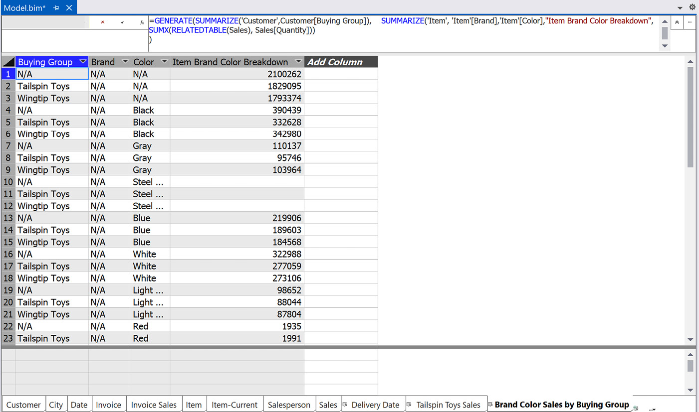
Figure 8.14 – Composite table results
- Now, rename the table to Brand Color Sales by Buying Group.
You have now walked through building multiple calculated tables to serve different purposes. We only added the relationship to the Delivery Date table. If you want to add relationships to other tables, make sure to include a column that can be used to build a relationship between the target tables.
Creating calculation groups
Calculation groups are new to tabular models. You can only use this functionality if your model is set to Compatibility Level = 1500. Now, why is this important? As tabular models become more prevalent, we see more and more calculations being added to models. Many times, users grab a common set of calculations in various settings. For example, we created YTD, next year, and previous year measures for Invoice Sales.
If you want to do the same calculations for Invoice Profit, you will need to create new measures to support this. With calculation groups, you can create a group of metrics that work with various measures. We could use a calculation group to create the time intelligence calculations that can be shared across measures.
Getting ready to create calculation groups
Before we create our calculation group, we need to make sure our measures and model are ready. First, this functionality only works with explicit measures. Explicit measures are measures that are created in the model and not built implicitly in the visualization tools. (For example, Power BI generates implicit measures for numeric columns, and this is not supported.) In order to make sure this is handled correctly, it is necessary to set discourageImplicitMeasures to TRUE for the model. Let's set that now.
First, you will not find discourageImplicitMeasures as a property of the model. As per Microsoft documentation, it is exposed in the Tabular Object Model (TOM). What the documentation does not tell you (at least easily) is how to check or modify this value. This property appears to be set to true by default if you are using a 1500 level model, which we are. However, if you upgraded or changed the level at some point, this value may not be set correctly. Let's look at the setting to confirm or change it in our model:
- In Solution Explorer, find the WideWorldImportersTAB project and its Model.bim file.
- Right-click the file and then choose View Code. If you have the file open in design view, you will be asked to close the file before opening it to view the code.
- You can now see the TOM that is built in JSON. I have copied the first few lines of the JSON to highlight the property. If your model's discourageImplicitMeasures property is set to false, change it to true now. (JSON is case-sensitive. Make sure you use lowercase for the property.) Remember, this property will not be in models whose compatibilityLevel value is less than 1500:
{
"name": "SemanticModel",
"compatibilityLevel": 1500,
"model": {
"culture": "en-US",
"discourageImplicitMeasures": true,
If you do not see this property, you can add the property to your file and save the changes.
- You can now change the view back to designer view from Solution Explorer. We are now ready to create a calculation group. If you have not already closed the code view of the file, you will be prompted to close it before continuing.
Now that we have the requirements out of the way, let's create a new calculation group.
Creating your calculation group
Keeping with our year theme from the previous section, we are going to create a calculation group with YTD, previous year, and next year as the calculations:
- Find the Calculation Groups folder in Tabular Model Explorer.
- Right-click the folder and choose New calculation group.
- Select the calculation group in Tabular Model Explorer. It will likely be named something like CalculationGroup 1.
- In the Properties window, change the name to Annual Calcs.
- Next, set Precedence to 25. Precedence determines that a processing order for more than one group is created. We don't want to leave it as 0 as other groups you create in the future may need to be calculated first.
- Next, expand the Columns folder under Annual Calcs. Let's rename the calculation column Annual Metric.
- We will now add the first metric, YTD. Expand the Calculation Items folder and select the default item in the folder.
- Rename the default item YTD.
- Next, click the ellipses button in the Expression property to open the DAX Editor.
Enter the following code into the editor:
CALCULATE(SELECTEDMEASURE(),DATESYTD('Date'[Date]))
This formula uses the SELECTEDMEASURE function. This function and others with SELECTEDMEASURE in the name were created specifically for calculation groups. These functions work with the measure that is selected to be used with the calculation group. We will demonstrate this functionality once we have our other metrics in the group. Be sure to apply your formula changes before moving to the next step.
Change to how DAX is formatted
This is the only instance where we use DAX without using an equals sign. Using an equals sign only raises an error, but the calculation group will not work correctly if you use an equals sign.
- Right-click on the Calculation Items folder to add a new calculation item. We are planning to create two new items, so repeat this process while you are here. This will give you two items with default names.
- Rename one of the items Previous Year and the other Next Year.
- The Previous Year expression is CALCULATE(SELECTEDMEASURE(),PREVIOUSYEAR('Date'[Date])).
- The Next Year expression is CALCULATE(SELECTEDMEASURE(),NEXTYEAR('Date'[Date])).
- Apply the DAX formulas to save your updates.
- We want to have the metrics in a specific order. You will be unable to change the Ordinal property without a field to support sorting. Right-click on the Columns folder and add a column.
- Change the column name to Sort Order. You can now set the Ordinal value for each of the items you created. I ordered them 1-3 in the following order: YTD, Next Year, Previous Year.
In the following section, we will look at the issues that may occur when setting the sort order and how to work around these issues.
Issues with setting the sort order
In some cases, developers have experienced issues setting the ordinal. When the column is changed, it tries to save the value, but fails with an error message that says the value in not valid. The workaround for this problem is to open Solution Explorer and choose to view the code on the model.bim file. Search for calculationGroup and add the following line after the expression statement: "ordinal" : 1. You can update all the calculation items in the code. Save your changes and open the designer.
You will see that the changes are applied to your calculation items. There appears to be some issue with the early implementation of this functionality. This workaround will allow you to use the latest functionality in spite of some issues with the designer.
For reference, here is an example of a complete calculationItems with the ordinal added:
"calculationItems": [
{
"name": "YTD",
"expression": "CALCULATE(SELECTEDMEASURE(),DATESYTD('Date'[Date]))",
"ordinal" : 1
},
Let's now test the calculation group in Excel.
Testing your calculation group in Excel
The Annual Calcs calculation group is now complete. You should be able to test this with the Analyze in Excel function. Add some measures to your Values areas (for example, Red Items, Blue Items). Add Annual Calcs to Rows and you will see the YTD item. Add Calendar Year from the Date table to the Columns area and you can see all the items. You should see something similar to the following screenshot:
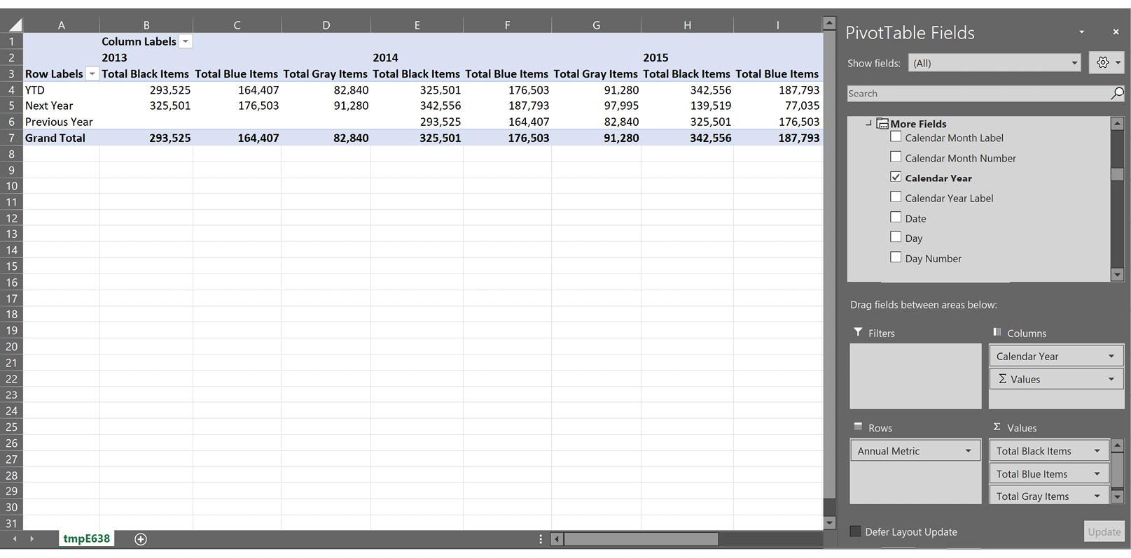
Figure 8.15 – Analyzing the calculation group in Excel
Now that we have seen how to create different calculated tables, let's create Key Performance Indicators (KPIs) that help in evaluating performance.
Creating KPIs
KPIs are used by businesses to evaluate performance over time. Businesses use KPIs in dashboards to show progress toward specific goals or targets. KPIs use a combination of symbols and numbers to represent current states and trends. KPIs in tabular models in SSAS are server-based and can be used by various end user tools such as Excel and Power BI. The advantage here is that a business KPI can be created and shared easily within an organization. This allows multiple users to include KPIs in their reporting with ease and consistency.
Understanding the components in a tabular model KPI
In tabular models, KPIs are more simplistic than the KPIs in multidimensional models. They are also much easier to create. KPIs are created directly from the measures. When creating a KPI, you need to understand the five components that make up the KPI:
- Base value: The base value is the measure you select when creating the KPI. It is what you are measuring against the target.
- Target value: The target value can be either an absolute value or a different measure. In either case, the value needs to be scalar to work with your KPI.
- Target pattern: There are four patterns available in the KPI designer. The colors red (bad), yellow (mid), and green (good) are used for the patterns. The first is the standard pattern where high is good and low is bad. The second pattern reverses the order. The other two patterns are based on whether closer to the target is better or worse. You can see the patterns in the following KPI dialog screenshot.
- Target threshold: The threshold uses percentages to illustrate proximity to the target. You can move the indicators to change how the target pattern returns good or bad indicators.
- Icon style: These are the icons you want to use to visualize the base value relationship to the target based on the threshold marks:
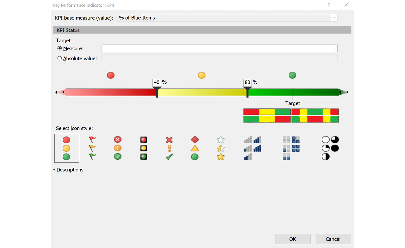
Figure 8.16 – Key Performance Indicator dialog
Now that we have a good understanding of the components that make up a KPI, let's build it.
Building your KPI
We will create a KPI to show whether we are meeting our goal of selling 30% blue items for all items we sell with a color. We will base this on our % of Blue Items measure in the Sales table:
- Locate the % of Blue Items measure in the Sales table.
- Right-click the measure and select Create KPI from the menu. This will open the KPI dialog.
- We are going to use 0.3 (30%) as our target. Switch the Target to Absolute Value and set the value to 0.3.
- The threshold value is updated to match our target of 0.3. Set the yellow mark to 0.15 and the green mark to 0.25.
- You can choose a different icon style, but we will use the default colored dots also known as the stoplight.
- Click OK. You can now see an icon with the measure, so you know a KPI has been created, as shown here. The following screenshot illustrates this:
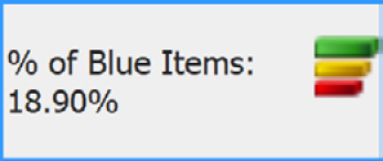
Figure 8.17 – Measuring with KPIs
You can now check this out using Excel once again. You can drag KPI Status to the Values section. Then, add the Sales Region hierarchy to rows. You can drill in and see how each region and levels below the region are performing. You should see something like our results shown here:
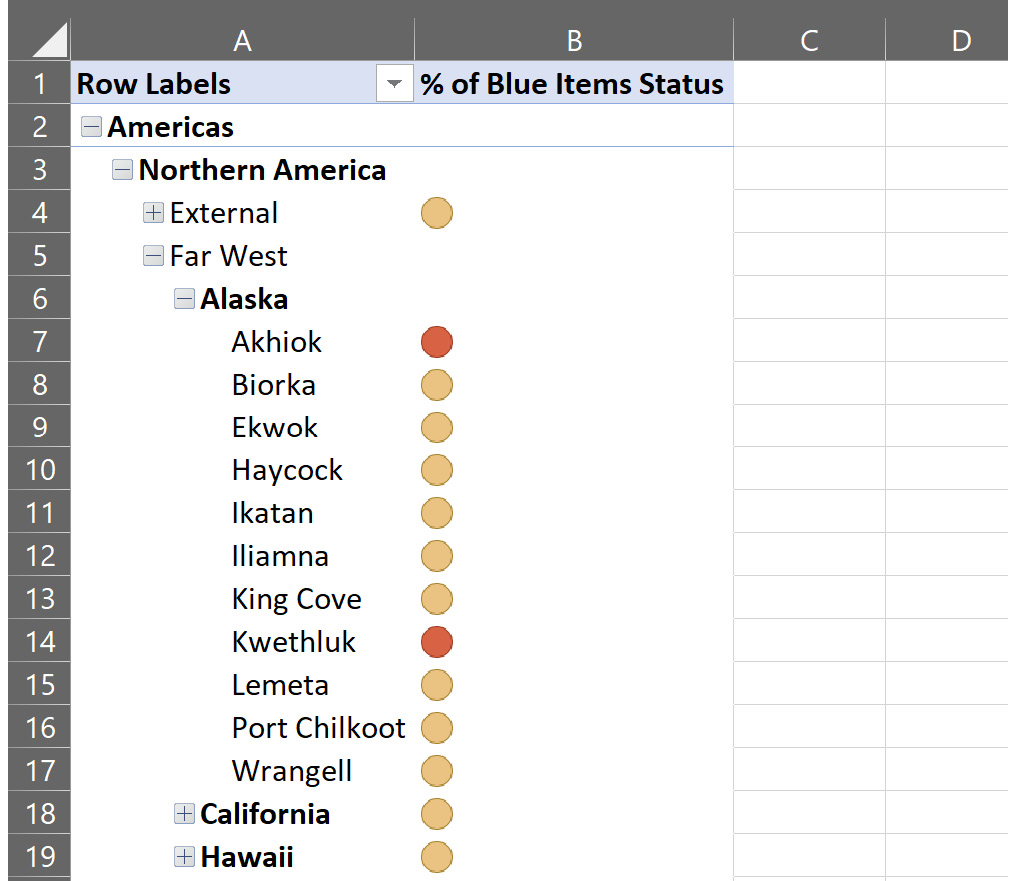
Figure 8.18 – KPIs in Excel
As you can see, adding simple KPIs to your model is easy. You can add targets with other measures you have created as well.
Querying your model with SQL Server Management Studio and DAX
To wrap up the chapter, we are going to create a query in SSMS using DAX. First, DAX is not a query language, so the syntax is not as easy to understand at first for SQL users. The first difference is that you must start every query with EVALUATE. The EVALUATE function is used to analyze a table and return the values in the same way as a SELECT statement does with relational databases. To use EVALUATE, your outermost function must resolve to a table. Let's work through an example of this process:
- Open SQL Server Management Studio and connect to your tabular model instance. You should see your workspace database there.
- Right-click your workspace database and select New Query followed by DAX.
- Add the EVAULATE statement.
- In the first query, let's get the Item table using EVALUATE('Item'). Execute the query to return the contents of the Item table. You will notice that no measures are included in the results. Calculated columns will be returned, but measures are not scoped to a table.
- For our next query, let's use the GENERATE function we used previously:
EVALUATE(
GENERATE(
SUMMARIZE('Customer',Customer[Buying Group]),
SUMMARIZE('Item',
'Item'[Brand],
'Item'[Color],
"Item Brand Color Breakdown",
SUMX(RELATEDTABLE(Sales), Sales[Quantity]))
))
We have used this same query before. Now you can see how you can test the results prior to adding it as a calculated table.
- We can also order the results in our DAX query by adding the ORDER BY clause after our table definition. Let's order the results according to the buying group. Here is the updated code with the results sorted by buying group:
EVALUATE(
GENERATE(
SUMMARIZE('Customer',Customer[Buying Group]),
SUMMARIZE('Item',
'Item'[Brand],
'Item'[Color],
"Item Brand Color Breakdown",
SUMX(RELATEDTABLE(Sales), Sales[Quantity]))
))
ORDER BY Customer[Buying Group]
- Let's eliminate the N/A group. We can add the START AT clause to let SSMS know where we want to start the results at. This only works with the ORDER BY clause:
EVALUATE(
GENERATE(
SUMMARIZE('Customer',Customer[Buying Group]),
SUMMARIZE('Item', 'Item'[Brand],'Item'[Color],
"Item Brand Color Breakdown",
SUMX(RELATEDTABLE(Sales), Sales[Quantity]))
))
ORDER BY Customer[Buying Group]
START AT "Tailspin Toys"
- The DEFINE keyword can be used to add measures or other values for use in your query. In this query, we shake it up a bit and create a query that uses dates and colors with a custom sales measure:
DEFINE MEASURE 'Sales'[Sales Total] = SUM('Sales'[Total Excluding Tax])EVALUATE( SUMMARIZECOLUMNS( 'Date'[Calendar Year] , 'Item'[Color] , "Total Sales" , CALCULATE([Sales Total]) ))
You can see that there are many creative ways to create queries in DAX. It does take some time to get used to, but you can work with DAX to test queries and check your tabular model with SSMS.
Summary
That wraps up our chapter on DAX. So much more can be done with DAX. We encourage you to explore the functions and try new things with your data. In this chapter, you added measures, calculated columns, calculated tables, calculation groups, and KPIs to your tabular model. We concluded the chapter by using SSMS to query the data.
You can use your DAX skills here to continue to expand and improve your tabular models. These improvements will help your users have a more complete experience with your models. You can also use DAX query techniques to review the data in your models and continue to improve data quality and validate results.
The next chapter is our first chapter focused on visualizations. We begin our visualization journey with Excel. We have been using Excel quite a bit in this chapter to check our work. In the next chapter, we dig deeper and create some dashboards and learn a number of Excel functions that help us make Excel look great while delivering the data.