
Although Sales Order Processing (SOP) is technically a distribution module, many non-distribution companies use it. Many professional services organizations bill through the SOP module as well. Distribution and non-distribution companies alike evaluate SOP reporting daily to view past performance for information on:
- Sales
- Cash flow forecasting
- Commissions
- Profitability
The SOP module interfaces with our customers and represents (usually) the source of our mainstream revenue, so it is critical to review it regularly.
This chapter focuses on the review of SOP data. The next chapter will focus on using BI as part of your workflow.
What we will build:
- Dashboard of sales by customer, state, item class, and salesperson
- Dashboard of open orders by customer, state, item class, and salesperson
- Items sold by manufacturer
Evaluating sales provides valuable information or intelligence. Knowing who is buying our products, who is selling our products, where our products are being sold, and specifically, what is being sold helps us identify trends. These trends can help us decide where to spend marketing dollars, when to invest in more inventory (and when not to), and so much more.
Consider a baseball pitcher on the mound. An opposing player walks up to the plate, and now it's time to decide what kind of pitch to throw. The catcher will call a pitch based on the batter's past performance and the pitcher's performance for this game. For example, if 70 percent of a batter's hits come on fastballs and less than 10 percent on curveballs, the pitcher will want to avoid fastballs, if at all possible. There's even a name for this condition; it's called "trouble with the curve."
Trends are evaluated to enhance intelligence and, in this case, attempt to strike out the batter and ultimately win the game.
This report is for a distribution company that sells all across the U.S., and sells products from a variety of manufacturers. This company has a direct sales force, physical showroom where customers can purchase in person, and web presence where customers can place orders directly via their website.
The owner needed a way to access sales information quickly, without rummaging through a variety of reports. She needed something that was easy and quick to access, so she no longer had to rely on what was being told to her. She also needed something that could quickly be altered to show her the same data in a variety of ways, in order to allow her to have a full understanding of what was happening with the entire "customer-facing" department.
Sales transaction data can become very large, very fast; particularly if you start with a quote or an order and involve backorders. With this data appearing in large quantities, many systems can get bogged down rather quickly. We are choosing to use Microsoft Excel PowerPivot to help with these large amounts of data.
There are two parts to these steps. The first part is technical, containing steps that involve work in SQL Server. The second part is the actual building of the report. You may choose to obtain assistance with the technical part, especially if you do not have access to SQL Server.
Create the following view in SQL Server:
Tip
This first part involves working in SQL Server. Refer back to our earlier warnings.
For directions to create a view, follow the technical matter step for the first report in Chapter 2, Business Intelligence for the General Ledger.
CREATE VIEW view_BI_SOP_HistDocs AS
SELECT CASE SH.soptype
 WHEN 3 THEN 'Invoice'
 WHEN 4 THEN 'Return'
 WHEN 1 THEN 'Quote'
 WHEN 2 THEN 'Order'
 WHEN 5 THEN 'Backorder'
 WHEN 6 THEN 'Fulfillment_Order'
 ELSE 'Other'
 END AS Doc_Type,
 SH.sopnumbe AS Doc_Number,
 SH.docdate AS Doc_Date,
 SH.glpostdt AS GL_Date,
 SH.bachnumb AS Batch,
 SH.custnmbr AS Customer_ID,
 SH.custname AS Customer,
 SH.cstponbr AS Customer_PO,
 SH.mstrnumb AS Master_Num,
 SL.locncode AS Inventory_Site,
 SL.itemnmbr AS Item_ID,
 SL.itemdesc AS Item_Desc,
 CASE sl.soptype
 WHEN 4 THEN -sl.quantity
 ELSE sl.quantity
 END AS Quantity,
 SL.uofm AS Unit,
 CASE SL.soptype
 WHEN 4 THEN -sl.unitcost
 ELSE sl.unitcost
 END AS Unit_Cost,
 SL.extdcost AS Extended_Cost,
 SL.unitprce AS Unit_Price,
 CASE sl.soptype
 WHEN 4 THEN -sl.xtndprce
 ELSE sl.xtndprce
 END AS Extended_Price,
 CASE sl.soptype
 WHEN 4 THEN -( SL.xtndprce - SL.extdcost )
 ELSE ( SL.xtndprce - SL.extdcost )
 END AS [Gross Margin],
 SL.reqshipdate AS Requested_Ship_Date,
 SL.actlship AS Actual_Ship_Date,
 SL.slprsnid AS Salesperson_ID,
 SL.shipmthd AS Shippping_Method,
 SL.prstadcd AS Ship_To_Address_ID,
 SL.shiptoname AS Ship_To_Name,
 SL.cntcprsn AS Contact_Person,
 SL.address1 AS Address1,
 SL.address2 AS Address2,
 SL.address3 AS Address3,
 SL.city AS City,
 SL.state AS State,
 SL.zipcode AS Zip,
 SL.country AS Country,
 IM.itmclscd AS Item_Class,
 IM.uscatvls_1 AS Manufacturer,
 IM.uscatvls_2 AS Category2,
 IM.uscatvls_3 AS Category3,
 IM.uscatvls_4 AS Category4,
 IM.uscatvls_5 AS Category5,
 IM.uscatvls_6 AS Category6
FROM dbo.sop30200 AS SH
 LEFT OUTER JOIN dbo.sop30300 AS SL
 ON SH.soptype = SL.soptype
 AND SH.sopnumbe = SL.sopnumbe
 LEFT OUTER JOIN dbo.iv00101 AS IM
 ON SL.itemnmbr = IM.itemnmbr
WHERE ( SH.voidstts = 0 )
GO
GRANT SELECT ON view_BI_SOP_HistDocs TO DYNGRP
Tip
The preceding view only shows history documents (quotes, orders, invoices, and so on), or documents that have been posted or fully transferred to another document. To obtain a view that includes both open and history, refer to the Preface for instructions on where you can download all the views in this book.
Now that the SQL Server part is done, let's build a report!
Know what you want. We've already completed this step and have included a screenshot here:
Tip
Yes, we have said this over and over. This is more than just a time saver because it helps you focus on requirements for this report. It is amazing how often BI fails because nobody has stated the requirements. Would you start baking a cake if you didn't check to see if you had all the ingredients?
Let's make a connection to the GP data:
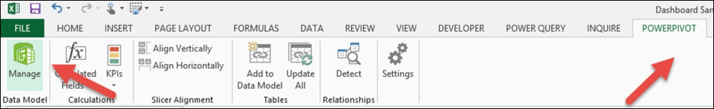
- Open a new workbook in Excel 2013. From the menu bar, choose POWERPIVOT; then, from the Data Model area on the ribbon, choose Manage:
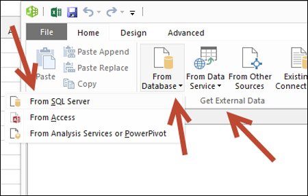
- The PowerPivot for Excel – Book1 window will open. On the PowerPivot menu bar, select From Database in the Get External Data area of the ribbon. From the From Database drop-down menu, select From SQL Server:
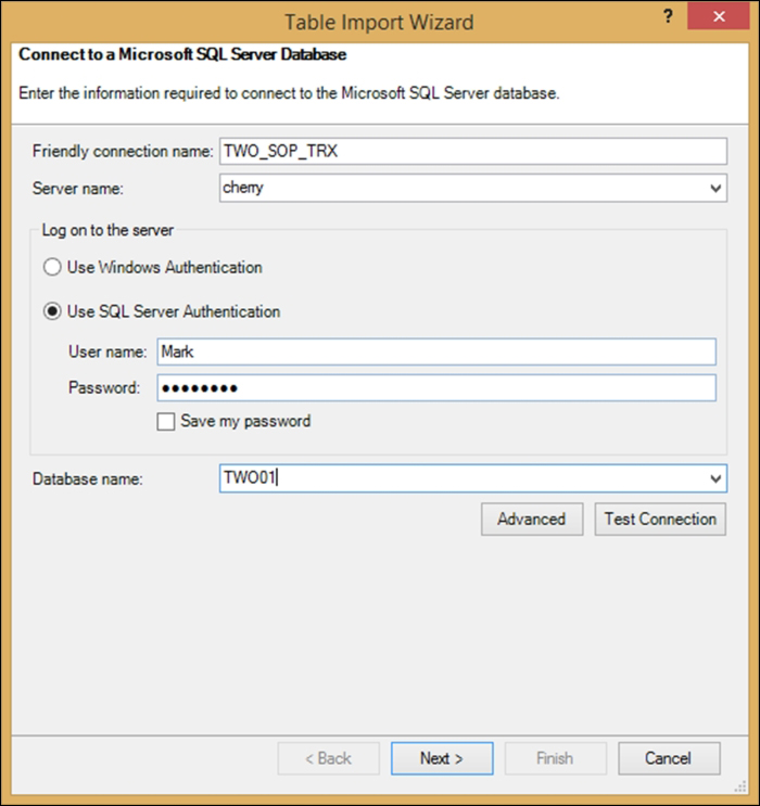
- The Table Import Wizard window will open. Perform the following steps:
- In the Friendly connection name field, enter TWO01_SOP_TRX (replace TWO01 with your company's database name). This was identified previously. You can also create an entirely new name. The goal here is to identify the database and view being used. Since we are using the view that has both Open and History, we are just using TWO01_SOP_TRX; if you are using the view for only the History transactions, you may want to use TWO01_SOP_HistTRX.
- In the Server name field, enter your server name, which is also identified previously.
- Select the Use SQL Server Authentication radio button and enter your SQL/Network or AD login ID and password.
- In the Database name field, enter your company's database name (the same that you used previously).
- Then, click on Next:
- In the Table Import Wizard | Choose How to Import the Data window, select the radio button for Select from a list of tables and views to choose the data to import. Then, click on Next:

- In the Table Import Wizard | Select Tables and Views window, select the view we just created, named view_BI_SOP_Docs:
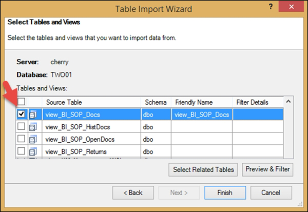
- Click on Finish. The data will then start to import from your SQL database in GP to Excel PowerPivot. After the data is completed, you will be notified. Once successfully imported, click on Close:

Let's add PivotTables:
- Your data is now populated in PowerPivot. On the ribbon, click on the drop-down arrow for PivotTable, and select the Four Charts option. You'll then be sent to Excel with the option to insert the pivots into a new worksheet or the existing one. Select the Existing Worksheet option and click on OK:

- Your Excel worksheet should have four blank Pivot Charts displayed, along with the PivotChart Fields list:

Let's create the first PivotChart:
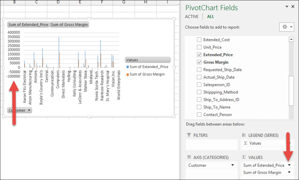
- Click on Chart 1; then, open the VIEW_BI_SOP_DOCS data (or VIEW_BI_HISTDOCS) in the PivotChart Fields list. Select Customer and drag it to the AXIS area:

Tip
Now that we have used PivotTables a lot, you might want to learn more about them. Visit the following Microsoft website for more information on PivotTables and PivotCharts: www.bit.ly/ExcelPT.
- Select Extended_Price and Gross_Margin, and drag these to the VALUES area:

- Now, we will format the numbers to reflect the fact that they represent currency. In the VALUES area of the PivotChart Fields list, click on the drop-down arrow for Sum of Extended_Price and select Value Field Settings:
- In the Value Field Settings window, click on the Number Format button:

- In the Format Cell window, select the Category for Currency. I like to select the option that shows negative numbers in red and in (). Click on OK to close this window, and click on OK to close the Value Field Settings window:
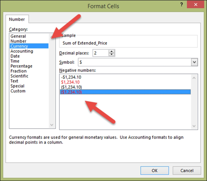
- Repeat the number formatting (last two steps) for Sum of Extended Price and Sum of Gross Margin.
- Save the file as a precaution; navigate to File | Save.
- Now, let's sort Chart 1 so that the sales display from highest to lowest. In Chart 1, click on the Customer Name drop-down list and select More Sort Options:
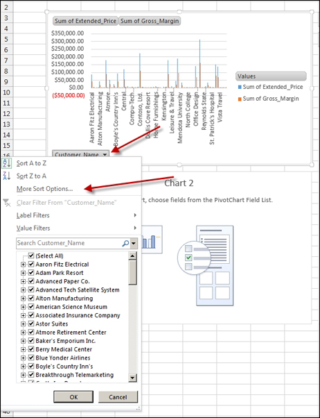
- Select the Descending (Z to A) by option, and choose Sum of Extended_Price from the drop-down list. Then, click on OK:

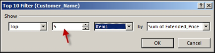
- Now, let's have the chart display only the five customers with the highest sales. In Chart 1, click on the Customer Name drop-down list and select Value Filters. Then, select Top 10:

- In the Top 10 Filter window, change the second box from 10 to 5. This will then show up the top five customers. Then, click on OK:
- If you have Chart Title at the top, skip this step. Otherwise, in Chart 1, click on the + sign to the right-hand side of the chart and select the Chart Title option. Then, click somewhere else and the pop-up window will disappear:

- Click on the text field that you just added and replace the Chart Title text with Customer Sales.
- Save the file as a precaution; navigate to File | Save.
Let's create the remaining PivotCharts:
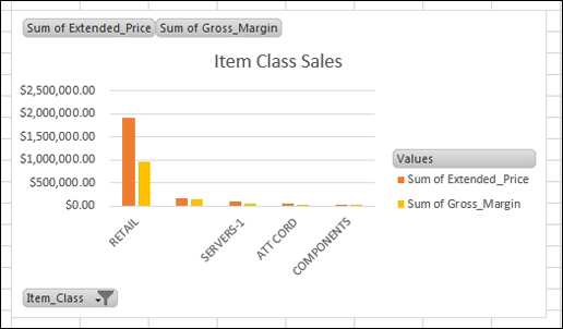
- Repeat the steps for Chart 3 that we did in Chart 1, except put Item_Class in the AXIS instead of Customer, and name the chart Item Class Sales. Note that Item_Class is almost at the bottom; these fields are not displayed in alphabetical order, but in the order in which they exist in the view.
Tip
Yes, we know the number 2 comes between 1 and 3. So, why did we skip Chart 2? Simple, we are going from left to right for each row of charts. Also, we wanted to see if you were awake. No, it doesn't matter if you populate the charts in the same order as we did. If you feel crazy, put Item Class Sales in Chart 2.
You should end up with a chart that looks similar to the following:
- Repeat the steps for Chart 2 that we did in Chart 1, except put State in the AXIS instead of Customer, and name the chart State Sales:
You should end up with a chart that looks similar to the following:

- Repeat the steps for Chart 4, except put Salesperson in the AXIS instead of Customer, and name the chart Salesperson Sales.
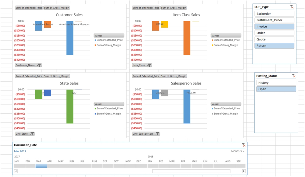
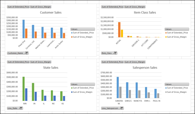
Your worksheet should now look similar to the following:
Let's look at Filters:
- This looks great, but what period(s) does this include? Is it posted or un-posted? What kinds of documents does this include? To get these answers and make them user-defined, we'll use Slicers and Timeline.
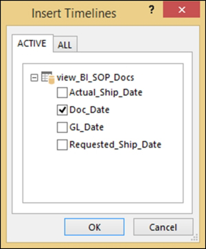
- Let's start with adding a way to enter a date range. Click on the Customer Sales chart, and from the Excel menu bar in the PIVOTCHART TOOLS area, select ANALYZE. Then, select Insert Timeline from the Filter area of the ribbon:

- Select Doc_Date in the Insert Timelines window, and click on OK:
- Drag the timeline below the charts and stretch it out to the same width as the charts. Click on the left arrow, and the timeline dates will stretch across:

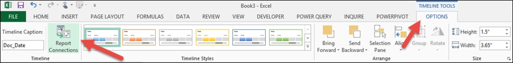
- Click on the Document_Date timeline, and from the Excel menu bar in the TIMELINE TOOLS area, select OPTIONS. Then, select Report Connections from the ribbon:
- In the Report Connections window, select all four charts and click on OK. Now the timeline works with all four charts:

- Save the file as a precaution; navigate to File | Save.
- Now, we need to add filters for the different sales order processing document types and the posting status of each document. We'll use slicers for both. Click on the Customer Sales chart, and from the Excel menu bar in the PIVOTCHART TOOLS area, select ANALYZE. Then, select Insert Slicer from the Filter area of the ribbon:

- In the Insert Slicers window, select both Status and Doc_Type. Then, click on OK:

- Drag the Slicers to the right-hand side of the charts, so they do not cover a chart, nor do they cover each other.
- Click on the Doc_Type slicer, and from the Excel menu bar in the Slicer Tools area, select Options. Then, select Report Connections from the ribbon.
In the Report Connections window, select all four charts and click on OK. Now the slicer works with all four charts:

- This step is only for those using the SQL view that shows both Open and History. Click on the Status slicer, and from the Excel menu bar in the Slicer Tools area, select Options. Then, select Report Connections from the ribbon.
In the Report Connections window, select all four charts and click on OK. Now the slicer works with all four charts.
- Save the file as a precaution; navigate to File | Save.
- OPTIONAL: Add your company name to the worksheet by using INSERT | WORDART.
- OPTIONAL: Add your logo to the worksheet by using INSERT | PICTURE.
- OPTIONAL: Add today's date to the worksheet by using FORMULA | DATE & TIME | TODAY, and then click on OK on the Functional Arguments window. This message is just warning us that the result will change. So every time your computer changes the date, this date will change (and it should!).
- OPTIONAL: There is more additional formatting that can be done, but this is outside the scope of this book.
- Save the file as a precaution; navigate to File | Save.
- Final results:

Tip
Understanding that this report is based on the data in PowerPivot is important! This means that to refresh this report, you must open this worksheet, open PowerPivot, refresh in PowerPivot, and then refresh in Excel. PowerPivot can be set to auto-refresh if you are using SharePoint. You can also use VBA to change Today's Date to be Last Refresh Date. When using this report for posted sales information, it is usually not necessary to refresh more than once a day, if that often.
From this report, the company can evaluate both sales and gross margin by customer, item sales class, delivery state, and salesperson. This report can also be edited to show more or less than the top ten.
From this report, the company can quickly see who's buying what, who's selling, and where it's going, for both completed (History) sales and in progress (Open) sales.