
The General Ledger is the bucket that collects and holds data from every module of Dynamics GP. It can be used for so much more than just balance sheets and profit and loss statements. We encourage all Microsoft Dynamics GP customers to post everything but payroll into the General Ledger in detail. We recommend this because extracting data from the General Ledger is easier than extracting data from any other module.
What makes General Ledger (GL) data easier to work with is that all GL data contains the same format for transactions. Each line has either a debit or credit amount. There are no entries that need to have their type reviewed (for example, invoice vs return) to determine whether the amount should be a positive or negative amount. There is no need to determine if the document is still unpaid or paid. If it’s in the GL, it’s reportable (with the one exception of voided entries).
With detail in the GL, each entry can be linked to its source. For example, an accounts payables invoice entered in the payables transaction entry can be linked to the vendor and invoice itself. For customer-centric organizations, it’s quite valuable to look at a detailed trial balance of all your accounts, but only for entries that were generated by a specific customer. It explains how did this customer affect your business? The same holds true for vendors.
The reports that we’ll build in this chapter are related to financial statements, but they’ll define how to get to the data, providing you with the knowledge to build a large variety of reports based on your specific needs.
What we will build:
- Balance sheet dashboard (changes in cash, AR, sales, AP, inventory and profit/loss)
- Ratio of AP to AR
The first report we will build is a dashboard or visualization of some balance sheet items. Balance sheets have a lot of valuable information, but it takes a bit of concentration to read them and provide a real value. Putting this information in a dashboard will make the balance sheet a management tool, not just a bank or tax tool.
That said, the first report we are going to build is a very big report with many steps. In fact, it is very likely to be the most step-intensive report in the book; however, it has huge payoffs. We realize that this is a challenge right off the block. We considered a smaller report to start with, but upon reviewing it, we saw even greater benefits than when we began writing this chapter, so please do not feel intimidated when building this report. When you are through, you will understand why we love this report and how much Business Intelligence can be mined from your balance sheet and General Ledger!
This report was built for a retail/distribution company that sells from their website, on www.amazon.com, using an outside sales team (for bulk sales) and a brick and mortar store. The items this company sells are very low margin, so to be profitable, this company must have high sales volumes while managing their cash.
This company spends a lot of time evaluating how to get their bills paid due to poor cash flow. Sales are seemingly good, although they fluctuate due to environmental and economic changes. This brings up a lot of questions for this company: How much cash is fluctuating in the bank? Are accounts receivable and accounts payable going up or down? Do we have too much inventory or not enough inventory? Are we selling enough product to make money? They wish to monitor this information on a rolling quarter (this period plus the last two periods) in an attempt to spot trends quickly.
For this solution, we are going to build a dashboard using multiple pivot charts using Microsoft Excel 2013.
There are two parts to these steps. The first part is technical, containing steps that involve work in SQL Server. The second part is the actual building of the report. You may choose to obtain assistance with the technical part, especially if you do not have access to SQL Server.
This first part involves working in SQL Server. If you are not experienced in working with Microsoft SQL Server, please request help from your IT department or ask your Microsoft GP partner to assist you. You may corrupt your data and completely break your system if you are not careful. You should also have an SQL Server password with appropriate access. For example, we use the SQL Server System Administrator (SA) password, but using ‘’sa’’ in production for this type of thing is definitely not a best practice. We’re going to be a bit more detailed in this chapter to make sure that you know how to make this work.
We’ll start by building a Microsoft SQL Server view in the company database. As a brief introduction, a view is a “virtual table” or you can think of it as a reusable, stored query. They’re helpful because they hide the complexity behind the scenes and present a more readable format. They also make managing security simpler. To get started:
- Launch Microsoft SQL Server Management Studio. Open the connection to your SQL Server (click on the + sign).
- Click on New Query on the ribbon:

- Select your company database in the drop-down list of Available Databases:

- Paste the following code into the SQL pane:
CREATE VIEW view_BI_GL_TRX AS
SELECT [journal entry],
  [credit amount],
  [debit amount],
  [debit amount] - [credit amount] AS DebitNet,
  [credit amount] - [debit amount] AS CreditNet,
  [account category number],
  [account description from account master]
  + ‘ - ‘ + [account number] AS Account,
  [posting type from account master],
  [trx date],
  CONVERT(VARCHAR(7), [trx date], 126) AS Period,
  [document status],
  [user who posted],
  [originating posted date],
  [originating master name],
  [originating document number],
  series,
  Isnull([history year], [open year]) AS FiscalYear,
  [period id] AS FiscalPeriod
FROM dbo.accounttransactions
WHERE ( [account type from account master] = ‘Posting Account’ )AND ( voided = ‘No’ )
GO
GRANT SELECT ON view_BI_GL_TRX TO DYNGRP
Tip
Downloading the example code
You can download the example code files for all Packt books you have purchased from your account at http://www.packtpub.com. If you purchased this book elsewhere, you can visit http://www.packtpub.com/support and register to have the files e-mailed directly to you.
- After you have pasted the code in to the SQL pane, click on the ! Execute button from the ribbon:

You should receive the Command(s) completed successfully message and at the bottom, the Query executed successfully notice:

- The following command creates the view for your company database and it grants security to the SQL group:
DYNGRPTip
You will need to run this for each company database for which you want to create this report. This can be done easily by changing the database name in the Available Database drop-down list on the ribbon.
It is a good practice to use the word View at the beginning of all the views you create. This helps in distinguishing which view is naturally part of GP from the views you create (for example, VIEW_BI_from_GP_1, VIEW_BI_from_GP_2, and so on.)
Now that the view is created, we must grant permissions for users to access this view. Following are the steps required to grant access permissions to the users:
- Launch Microsoft SQL Server Management Studio (if you closed it after the previous step).
- In the Object Explorer, click on the + sign in order to open the connection to your SQL Server. Similarly, expand Databases | your company database | Views.
- Right-click on the Views and choose Refresh (if you did not close SQL Studio after creating the view):
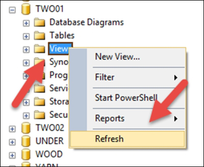
- Scroll down and right-click on the View_BI_GL_TRX view you just created and select Properties:

- In the View Properties window, select Permissions from the Select a page area, and then click on the Search button:

- In the Select Users or Roles window, click on the Browse button. For each user you want to have access to this report, click on the corresponding checkbox and then click OK (permissions can be edited later if necessary or desired):

Tip
The users displayed are only the users who have been granted access to this database (company) in GP Administration | System | Setup | User Access. You can add users who have entered directly through SQL or users through their active directory or Windows login as well. Adding an active directory group and putting users in that group can make this process simpler to go forward. Don’t use an SQL login for a GP user. Those are encrypted and won’t work. Use a network (active directory) login if possible for your users.
- Then, click on OK to close the Select Users or Roles window.
- When back in the View Properties window, select the users you’ve just added, one at a time, and click each Grant box for Alter, Control, Delete, Insert, References, Select and Take Ownership. Do NOT select the bottom three boxes (Update, View Change Tracking, and View Definition). See the following screenshot for reference:

- Click on OK to save permissions and close the window.
- Close Microsoft SQL Server Management Studio. When closing, you do not need to save the SQL Query we created, so when prompted to save, click No.
Now that the SQL Server part is done, let’s build a report!
Know what you want. I’ve already completed this step, as shown in the following screenshot:
Tip
As always, we must know what we want our end result to look like before we start. Draw it on a paper or perform a “mock-up” in Excel. Starting with the end result in mind will save you many, many hours of time. We’ll say this over and over again because it’s that important! The preceding screenshot shows, how we want our report to look like.
The consumer of this report uses multiple monitors on each workstation, so viewing a report this wide does not result in scrolling left to right or up and down.
Now that we know what we want, we’re ready to build it.
Tip
Keep in mind that this book is about Business Intelligence, not training on Microsoft SQL Server, Excel, or SQL Server Report Builder. With that in mind, these steps will help you obtain the reports we are building together. As a result, the steps may not always give you the explanation for the purpose of each step. For more resources around SQL Server, Excel, and SSRS, visit http://www.packtpub.com.
Let’s make a connection to the GP data:
- Open a blank workbook in Microsoft Excel 2013.
- Rename the worksheet from Sheet1 to Accounts by right-clicking on the worksheet name and selecting Rename.
- Click on the A1 cell to position the cursor in the top-left corner. Select DATA from the menu, and then From Other Sources from the ribbon. Then, select From Data Connection Wizard:

- When the Data Connection Wizard window opens, select Microsoft SQL Server and then click on the Next button:

- Enter your Server name and your Network or AD login credentials. Then, click on Next:

- Use the Select Database and Table window to choose your company database (note that it will probably NOT default to the correct database):

- Scroll down to find your new view. Highlight the view and click on Finish:
Tip
Although the views and tables are in alphabetical order, the views are separated from the tables. This means you see items A through Z, then it starts at A again. So, if you do not see your view, keep scrolling. From here, views are first, followed by tables (note that in other Excel data access points, tables are listed before views).

Add the first PivotChart to the report as follows:
- The next window to appear is the Import Data window. Click on the PivotChart option, verify that you will import to Existing worksheet (by clicking on the A1 cell earlier, the field we want will appear, which is =$A$1). Then, click on OK:

- We’ll start by creating the “Cash Change” PivotChart. Drag Account Category Number to the FILTERS area:

- Drag FiscalPeriod to the FILTERS area:

- In the PivotTable area, choose from the drop-down list for Account Category Number and select Cash, or the Category name(s) you have that represents your cash or bank accounts. Then, click on OK:

- In the PivotTable area, choose from the drop-down list for FiscalPeriod, mark the Select Multiple Items box at the bottom, and unmark period 0. Then, click on OK:

- Since the bank accounts are an asset, and assets typically have a debit balance, select DebitNet from the field list and drag it to the VALUES area:

- In the PivotChart fields list, drag Period to the LEGEND (SERIES) area:
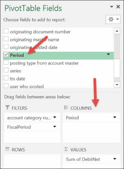
- In the PivotTable, choose Period from the drop-down list. Select the Sort A to Z sort option, so the periods will be displayed in order:

- Click on the plus sign to the right-hand side of the PivotChart and select Chart Title. On the chart itself, highlight the new title field and change the name to Cash Change:

- Save your Excel file, as you would with any other Excel file, to a secure area of the network.
- Add a new worksheet to this file and rename it to Dashboard. Switch to the Accounts worksheet.
- Click on the PivotChart and from the menu, select ANALYZE from the PIVOTCHART TOOLS tab. From the ribbon, select the Move Chart action:

- When the Move Chart window appears, click on the Object in option and select the Dashboard worksheet. Then, click on OK:

- Save the file as a precaution by navigating to File | Save.
Remember that the first one is always the hardest and the slowest to build.
Add the second PivotChart to the report as follows:
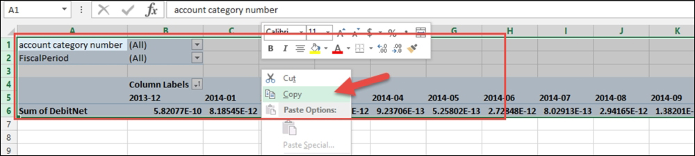
- Switch to the Accounts worksheet. Highlight rows 1 to 5 (all the rows the PivotTable uses), right-click, and choose Copy:
- Click on the A column that is a couple of rows down (for us it was row 9), and right-click and choose Insert Copied Cells:

- On the Accounts worksheet, you will now see two PivotTables that are identical:
- In the bottom PivotTable, click on the filter for Account Category Number drop-down list and select Accounts Receivable, or the Category name(s) you have that represents your AR. Then, click on OK:

- Click anywhere on the PivotTable at the bottom to bring up PIVOTTABLE TOOLS on the menu. Click on the ANALYZE tab and select PivotChart from the Tools area of the ribbon:

- The Insert Chart window will open. Select the default chart, which is Clustered Column:

- Click on the plus sign to the right-hand side of the PivotChart and select Chart Title. On the chart itself, highlight the new title field and change the name to Receivables Change.
- Click on the Receivables Change PivotChart and, from the menu, select ANALYZE from the PIVOTCHART TOOLS tab. From the ribbon, select the Move Chart action.
- When the Move Chart window appears, click on the Object in option and select the Dashboard worksheet. Then, click on OK.
- Save the file as a precaution by navigating to File | Save.
The third PivotChart will represent Inventory Change as follows:
- On the Accounts tab, highlight the last PivotTable added, and copy and paste a new PivotTable below the highlighted one. We’ll be working on the new (at the bottom) PivotTable for this step.
- In the PivotTable area, choose from the drop-down list, but this time select Inventory, or the Category name(s) you have that represents inventory. Then, click on OK.
- After adding the PivotChart, rename the Chart Title to Inventory Change.
- Move the new PivotChart to the Dashboard worksheet.
- Save the file as a precaution by navigating to File | Save.
The fourth PivotChart will represent Payables Change as follows:
- On the Accounts tab, highlight the last PivotTable added, and copy and paste a new PivotTable below the highlighted one. We’ll be working in the new (bottom) PivotTable for this step.
- In the PivotTable area, choose from the drop-down list, but this time select Accounts Payable, or the Category name(s) you have that represents Accounts Payable. Then, click on OK.
- Before adding the next PivotChart, click on PivotTable to pull up the PivotTable Fields list. Remove DebitNet from VALUES and add CreditNet to VALUES:

Tip
Since the Accounts Payable accounts are a liability, and liabilities typically have a credit balance, we will use CreditNet for our values. CreditNet is the credit amount minus the debit amount so if the balance is a credit, it shows up as a positive number. We would not want a credit balance in payables to show up as a negative number unless it is a debit balance, as it might confuse the report recipient(s).
- After adding the PivotChart, rename the Chart Title to Payables Change.
- Move the new PivotChart to the Dashboard worksheet.
- Save the file as a precaution by navigating to File | Save.
It’s the fifth one; you should be an expert by now!
The fifth PivotChart will represent sales, returns, and discount change as follows:
- On the Accounts tab, highlight the last PivotTable added, and copy and paste a new PivotTable below the highlighted one. We’ll be working in the new (bottom) PivotTable for this step.
- In the PivotTable area, choose from the drop-down list, but this time select Sales and Sales Discounts, or the Category name(s) you have that represents Sales and Sales Discounts. Then, click on OK. To mark two categories on the drop-down list, check the Select Multiple Items box:

- Before adding the PivotChart, click on the PivotTable to pull up the PivotTable Fields list. Make sure that CreditNet is in the VALUES area. If DebitNet appears, remove it and add CreditNet.
- After adding the PivotChart, rename the Chart Title to Sales Change.
- Move the new PivotChart to the Dashboard worksheet.
- Save the file as a precaution by navigating to File | Save.
The sixth PivotChart will represent YTD profit (loss) change as follows:.
- On the Accounts tab, highlight the last PivotTable added, and copy and paste a new PivotTable below the highlighted one. We’ll be working in the new (bottom) PivotTable for this step.
- Click on the PivotTable and the PivotTable Fields list will appear. Drag Posting Type for Account Master into FILTERS and remove Account Category Number from FILTERS:

- In the PivotTable area, choose from the drop-down list, but this time select Profit and Loss. Then, click on OK:

- Before adding the PivotChart, click on PivotTable to pull up the PivotTable Fields list. Make sure that CreditNet is in the VALUES area. If DebitNet appears, remove it and add CreditNet.
- After adding the PivotChart, rename the Chart Title to Profit (Loss).
- Move the new PivotChart to the Dashboard worksheet.
- Save the file as a precaution by navigating to File | Save.
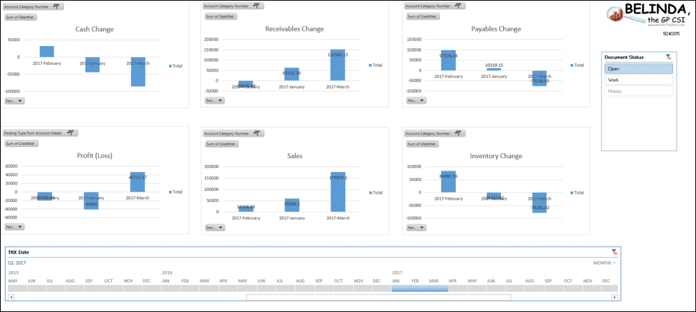
Let’s create the dashboard, as shown in the following screenshot:
- On the Dashboard worksheet, drag around the PivotCharts in whatever order makes sense to you. Close the PivotChart Fields window by clicking on X in the top-right corner to give yourself more viewing room.

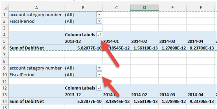
- We created our view based on the same view that SmartList uses; therefore, we have access to data in this report that is both the Open Year(s) and Historical Year(s) data. We also have access to General Ledger journal entries that have not yet been posted. As a result, we will want to see data with and/or without unposted transactions. To achieve this, we’ll use an Excel slicer.

Click on the first chart, in our case it is the Cash Change chart, to select it. On the Excel menu, select ANALYZE from PIVOTCHART TOOLS and then select the filter Insert Slicer.
- When the Insert Slicer window appears, select Document Status and click on OK:

- Drag the Document Status Slicer window to a position where it is not covering a chart. We put ours to the right-hand side of the rightmost chart. You may also choose to resize the Slicer, as this Slicer will always only contain three options: Open, Work, and History.
- At this point, the slicer is only connected with one of the charts. We now want to make this slicer work with all six charts. To do this, click on the slicer to select it (you’ll know when an object is selected because it will have handles or a box around it).
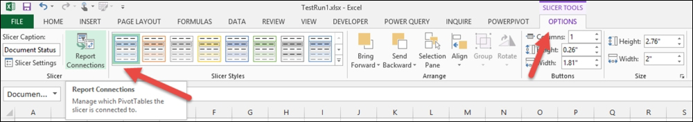
With the slicer selected from the Excel menu bar, choose Options from the Slicer Tools, and then select Report Connections from the ribbon.
- When the Report Connections window opens, select all PivotTables and click on OK. The slicer now activates all the charts. If you select the Work option on the Slicer, all of the charts will only show the data from unposted General Ledger transactions. The Slicer works using standard Windows commands. So to select multiple options, hold down the Ctrl key and select all the options you want. To select everything, click on the clear filter icon in the top-right:

- Now, let’s add the Timeline so that we can select the period(s) that the report should display. Click on the first chart (in our report, it is the Cash Change chart) to select it. On the Excel menu, select ANALYZE from PIVOTCHART TOOLS, and then select the Insert Timeline filter:

- When the Insert Timelines window opens, select TRX Date and click on OK:

Drag the TRX Date Timeline to a position where it is not overlapping a chart. We moved it to just below the bottom of our charts. We also stretched it out to match the length of our charts.
- At this point, the Timeline is connected with only one of the charts. We now want to make this Timeline work with all the six charts. To do this, click on the Timeline to select it.

With the Timeline selected from the Excel menu bar, choose Options from Timeline Tools, and then select Report Connections from the ribbon.
- When the Report Connections window opens, select all PivotTables and click on OK. The Timeline now activates all the charts. To select a single period, click on that period on the Timeline. To select a range of periods, click on the first period of the range and while holding your left mouse button down, drag across the entire range desired and let go.
- At this point, you may choose to add a logo by choosing Insert from the Excel menu. Then, from the illustrations area on the ribbon, choose Pictures.
- Finally, let’s make this report automatically refresh for us. From the Excel menu choose Data, and then from the connections area on the ribbon, choose Connections. Once the Workbook Connections window appears, highlight the view we’ve been using and click on the Properties button:

- From the Connection Properties window on the Usage tab, select both Refresh every X minutes and Refresh data when opening the file options. If you have a lot of data, you may opt to click only on the Refresh data when opening the file option. When prompted, enter your login and password for GP.

Tip
This is a “Big Picture” report; therefore, looking at it no more than once a day, at a maximum, is all that you would probably want.
Granting permissions to individual SQL users is covered at https://support.microsoft.com/en-us/kb/949524?wa=wsignin1.0.
The following is the final result:

This report gives the company the ability to spot trends in their cash compared to profit, receivables compared to sales, and payables compared to inventory.
When reading this report, if sales and receivables go up significantly, but cash and profits stay the same, it’s time to start asking a lot of questions. Are you selling items at cost? If so, did you intend to, or is a rouge salesperson increasing their commissions? Is it the sales from the new customers that are not being paid, resulting in higher receivables?
There are so many questions that you can and will likely have after reviewing this report. Remember where many GP users have problems in starting a BI strategy? I do not know what I want to see. This report might answer the question of what you need to see!