We begin preparing to learn about multiple regression by looking at correlation analysis. As you will see, the basic purpose of correlation analysis is to tell you if two variables have enough of a relationship between them to be included in a multiple regression model. Also, as we will see later, correlation analysis can be used to help diagnose problems with a multiple regression model.
Take a look at the chart in Figure 1.1. This scatterplot shows 26 observations on 2 variables. These are actual data. Notice how the points seem to almost form a line? These data have a strong correlation—that is, you can imagine a line through the data that would be a close fit to the data points. While we will see a more formal definition of correlation shortly, thinking about correlation as data forming a straight line provides a good mental image. As it turns out, many variables in business have this type of linear relationship, although perhaps not this strong.

Figure 1.1 A scatterplot of actual data
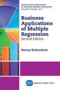
Now take a look at the chart in Figure 1.2. This scatterplot also shows actual data. This time, it is impossible to imagine a line that would fit the data. In this case, the data have a very weak correlation.
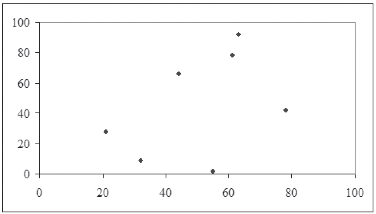
Figure 1.2 Another scatterplot of actual data
Terms
Correlation is only able to find, and simple regression and multiple regression are only able to describe, linear relationships. Figure 1.1 shows a linear relationship. Figure 1.3 shows a scatterplot in which there is a perfect relationship between the X and Y variables, only not a linear one (in this case, a sine wave.) While there is a perfect mathematical relationship between X and Y, it is not linear, and so there is no linear correlation between X and Y.
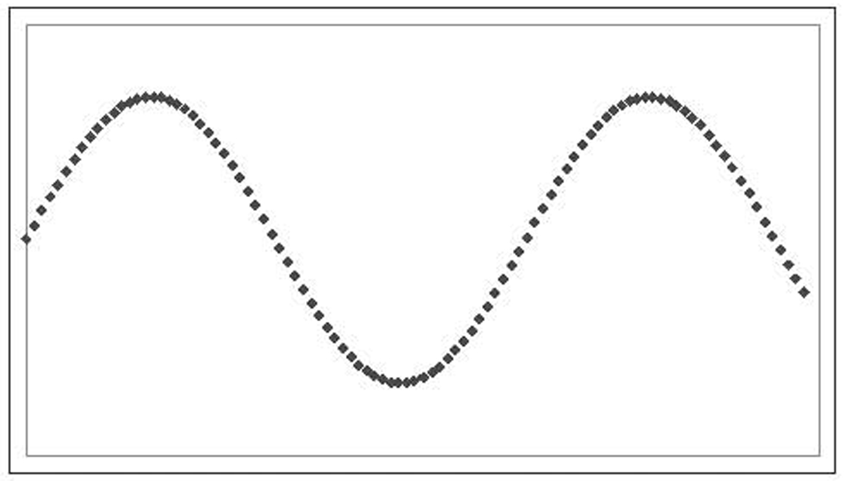
Figure 1.3 A scatterplot of nonlinear (fictitious) data
A positive linear relationship exists when a change in one variable causes a change in the same direction of another variable. For example, an increase in advertising will generally cause a corresponding increase in sales. When we describe this relationship with a line, that line will have a positive slope. The relationship shown in Figure 1.1 is positive.
A negative linear relationship exists when a change in one variable causes a change in the opposite direction of another variable. For example, an increase in competition will generally cause a corresponding decrease in sales. When we describe this relationship with a line, that line will have a negative slope.
Having a positive or negative relationship should not be seen as a value judgment. The terms “positive” and “negative” are not intended to be moral or ethical terms. Rather, they simply describe whether the slope coefficient is a positive or negative number—that is, whether the line slopes up or down as it moves from left to right.
While it does not matter for correlation, the variables we use with regression fall into one of two categories: dependent or independent variables. The dependent variable is a measurement whose value is controlled or influenced by another variable or variables. For example, someone’s weight likely is influenced by the person’s height and level of exercise, whereas company sales are likely greatly influenced by the company’s level of advertising. In scatterplots of data that will be used for regression later, the dependent variable is placed on the Y-axis.
An independent variable is just the opposite: a measurement whose value is not controlled or influenced by other variables in the study. Examples include a person’s height or a company’s advertising. That is not to say that nothing influences an independent variable. A person’s height is influenced by the person’s genetics and early nutrition, and a company’s advertising is influenced by its income and the cost of advertising. In the grand scheme of things, everything is controlled or influenced by something else. However, for our purposes, it is enough to say that none of the other variables in the study influences our independent variables.
While none of the other variables in the study should influence independent variables, it is not uncommon for the researcher to manipulate the independent variables. For example, a company trying to understand the impact of its advertising on its sales might try different levels of advertising in order to see what impact those varying values have on sales. Thus the “independent” variable of advertising is being controlled by the researcher. A medical researcher trying to understand the effect of a drug on a disease might vary the dosage and observe the progress of the disease. A market researcher interested in understanding how different colors and package designs influence brand recognition might perform research varying the packaging in different cities and seeing how brand recognition varies.
When a researcher is interested in finding out more about the relationship between an independent variable and a dependent variable, he must measure both in situations where the independent variable is at differing levels. This can be done either by finding naturally occurring variations in the independent variable or by artificially causing those variations to manifest.
When trying to understand the behavior of a dependent variable, a researcher needs to remember that it can have either a simple or multiple relationship with other variables. With a simple relationship, the value of the dependent variable is mostly determined by a single independent variable. For example, sales might be mostly determined by advertising. Simple relationships are the focus of chapter 2. With a multiple relationship, the value of the dependent variable is determined by two or more independent variables. For example, weight is determined by a host of variables, including height, age, gender, level of exercise, eating level, and so on, and income could be determined by several variables, including raw material and labor costs, pricing, advertising, and competition. Multiple relationships are the focus of chapters 3 and 4.
Scatterplots
Figures 1.1 through 1.3 are scatterplots. A scatterplot (which some versions of Microsoft Excel calls an XY chart) places one variable on the Y-axis and the other on the X-axis. It then plots pairs of values as dots, with the X variable determining the position of each dot on the X-axis and the Y variable likewise determining the position of each dot on the Y-axis. A scatterplot is an excellent way to begin your investigation. A quick glance will tell you whether the relationship is linear or not. In addition, it will tell you whether the relationship is strong or weak, as well as whether it is positive or negative.
Scatterplots are limited to exactly two variables: one to determine the position on the X-axis and another to determine the position on the Y-axis. As mentioned before, the dependent variable is placed on the Y-axis, and the independent variable is placed on the X-axis.
In chapter 3, we will look at multiple regression, where one dependent variable is influenced by two or more independent variables. All these variables cannot be shown on a single scatterplot. Rather, each independent variable is paired with the dependent variable for a scatterplot. Thus having three independent variables will require three scatterplots. We will explore working with multiple independent variables further in chapter 3.
Data Sets
We will use a couple of data sets to illustrate correlation. Some of these data sets will also be used to illustrate regression. Those data sets, along with their scatterplots, are presented in the following subsections.
All the data sets and all the worksheets and other files discussed in this book are available for download from the Business Expert Press website (http://www.businessexpertpress.com/books/business-applications-multiple-regression). All the Excel files are in Excel 2003 format and all the SPSS files are in SPSS 9.0 format. These formats are standard, and any later version of these programs should be able to load them with no difficulty.
Number of Broilers
Figure 1.1 showed the top 25 broiler-producing states for 2001 by both numbers and pounds, according to the National Chicken Council. The underlying data are shown in Table 1.1.
Table 1.1 Top 25 Broiler-Producing States in 2001
Age and Tag Numbers
Figure 1.2 was constructed by asking seven people their age and the last two digits of their car tag number. The resulting data are shown in Table 1.2. As you can imagine, there is no connection between someone’s age and that person’s tag number, so this data does not show any strong pattern. To the extent that any pattern at all is visible, it is the result of sampling error and having a small sample rather than any relationship between the two variables.
Table 1.2 Age and Tag Number

Return on Stocks and Government Bonds
The data in Table 1.3 show the actual returns on stocks, bonds, and bills for the United States from 1928 to 2009.1 Since there are three variables (four if you count the year), it is not possible to show all of them in one scatterplot. Figure 1.4 shows the scatterplot of stock returns and treasury bills. Notice that there is almost no correlation.

Figure 1.4 Stock returns and treasury bills, 1928 to 2009. X- and Y-axes have been removed for readability
Table 1.3 Return on Stocks and Government Bonds


Federal Civilian Workforce Statistics
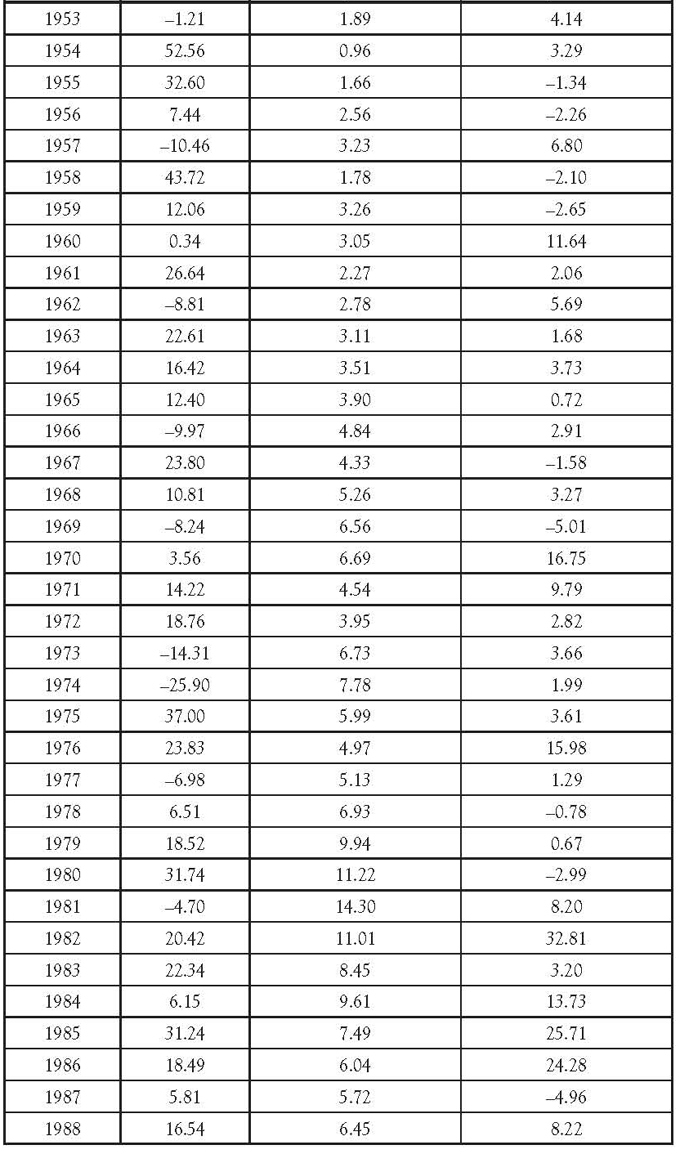
Table 1.42 shows a state-by- state breakdown of the number of federal employees and their average salaries for 2007. Figure 1.5 shows the resulting scatterplot. Notice that there appears to be a fairly weak linear relationship.
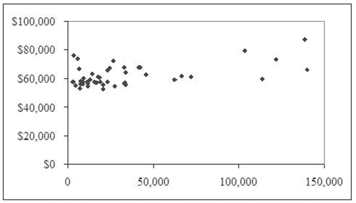
Figure 1.5 Number of federal employees by state and average salaries
Table 1.4 Average Federal Salaries and Number of Employees by State


Public Transportation Ridership
Table 1.53 shows the largest urbanized areas by population, unlinked passenger trips,4 and passenger miles for 2008. Figure 1.6 shows the relationship between unlinked passenger trips and population. Notice that almost all the data points are clustered in the bottom left corner of the chart. That is because the New York system has so many more trips (over 4 million versus the next highest of about 700,000) and such a higher population (almost 18 million versus the next highest of almost 12 million) that its observation overpowers the remaining observations. This type of observation outside the usual values is called an outlier.5 Figure 1.7 shows the same chart with the New York observation removed. Here you can begin to see how a line might be used to fit the data and how the relationship is positive.

Figure 1.6 Relationship between unlinked passenger trips and population
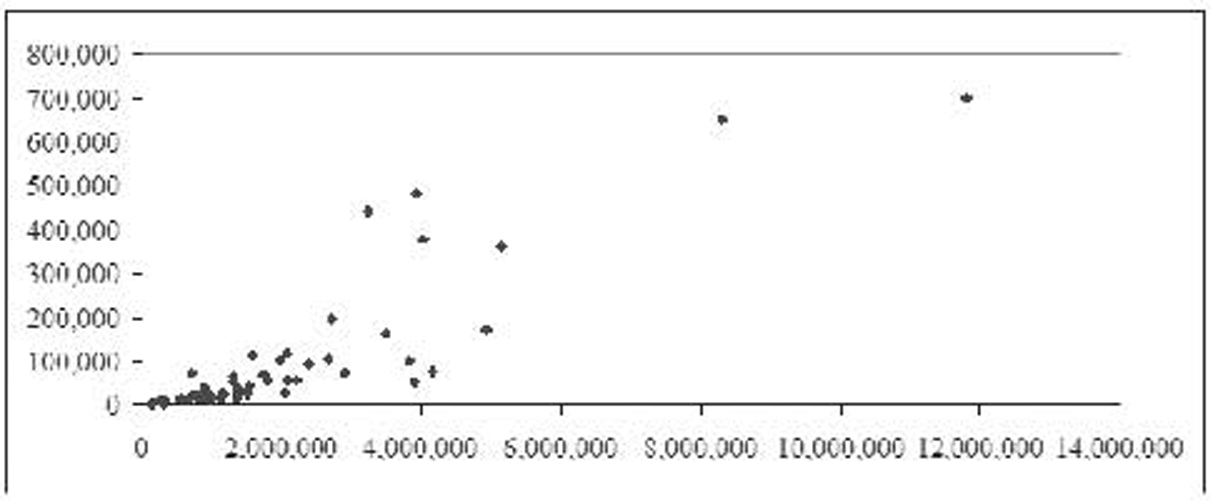
Figure 1.7 Figure 1.6 with the New York observation removed
Table 1.5 Largest Urbanized Areas by Population, Unlinked Passenger Trips, and Passenger Miles (2008)


Figure 1.8 shows the relationship between passenger miles and population, again with the New York observation removed. Once again, we see a positive relationship. Figure 1.9 shows the relationship between unlinked passenger trips and passenger miles, again with the New York observation removed. This time, the data form an almost perfectly straight, positive line.
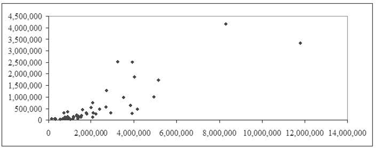
Figure 1.8 Relationship between passenger miles and population with New York observation removed
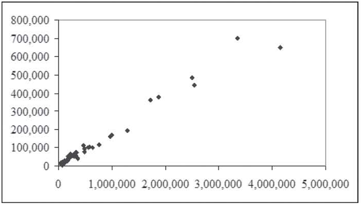
Figure 1.9 Relationship between unlinked passenger trips and passenger miles
Correlation
Correlation measures the degree of linear association between two variables. Correlation can only be measured between pairs of variables, and it makes no distinction between dependent and independent variables—that is, the correlation between height and weight is exactly the same as between weight and height. The term correlation analysis is often used interchangeably with correlation.
Correlation is measured using a statistic called the correlation coefficient. The population symbol is the Greek letter rho (ρ), whereas the sample symbol is the letter r. The correlation coefficient can take on any value between negative one and positive one. A negative sign indicates a negative relationship, whereas a positive sign indicates a positive relationship. Two variables with a negative relationship will have a line with a negative slope fitted to them, whereas two variables with a positive relationship will have a line with a positive slope fitted to them.
Ignoring the sign, the closer the value is to one (or negative one), the stronger the relationship. The closer the value is to zero, the weaker the relationship. A value of 1 indicates perfect positive linear correlation—that is, all the points form a perfect line with a positive slope. A value of –1 indicates perfect negative linear correlation where all the points form a perfect line with a negative slope. A value of zero indicates no correlation—that is, there is no relationship between the two variables. When this happens, the points will appear to be randomly dispersed on the scatterplot.
It is important to note that correlation only measures linear relationships. Even a very strong nonlinear relationship will not be spotted by correlation. So a correlation coefficient near zero only indicates that there is no linear relationship, not that there is no relationship. If you look back at Figure 1.3, for example, you can see a clear pattern to the data: a sine wave. The data were generated using a sine wave formula, so a sine wave fits it absolutely perfectly. However, the correlation coefficient for this data is, for all practical purposes, zero.6
Calculating the Correlation Coefficient by Hand
Most likely, you will never need to calculate a correlation coefficient by hand. Excel can easily calculate the value for you, as can any statistical software package. As such, feel free to skip this section if you like. However, seeing and working with the underlying formula can give you some insight into what it means for two variables to be correlated.
The formula to compute the correlation coefficient is as follows:
Correlation Coefficient

This is a long formula and it looks to be incredibly complex; however, as we will see, it is not all that difficult to compute manually. The first thing to note is that, except for n (the sample size), all the terms in this equation begin with a summation sign (∑). It is this characteristic that will allow us to greatly simplify this formula. This is best seen with an example.
Using the data on age and tag numbers from Table 1.2, Table 1.6 shows the interim calculations needed to determine the correlation coefficient. The sample size is seven, so n = 7. We will arbitrarily assign Age as X and Tag Number as Y, so, using Table 1.6, ∑X = 354, ∑Y = 317, ∑XY = 17,720, ∑X2 = 20,200, and ∑Y2 = 21,537.7 The resulting calculations are as follows:

Table 1.6 Correlation Coefficient Calculations

The resulting correlation coefficient of 0.4157 is weak but not zero as you might expect given the lack of a relationship between these two variables. That is a result of the small sampling size and sampling error. However, the real question is if this value is large enough to be statistically significant—that is, is this sample value large enough to convince us that the population value is not zero? We will explore this question in a later section.
Using Excel
Naturally, these calculations can be performed easily using Excel. Excel has two main approaches that can be used to calculate a correlation coefficient: dynamic and static. These two approaches can also be used to compute some of the regression coefficients discussed in later chapters.
The dynamic approach uses a standard Excel formula. Doing so has the advantage of automatically updating the value if you change one of the numbers in the data series. For the correlation coefficient, it uses the CORREL function. This function takes two inputs: the range containing the first data series and the range containing the second data series. Since correlation makes no distinction between the independent and dependent variables, they can be entered in either order.
The data in Figure 1.10 are entered in column format—that is, the age variable is entered in one column and the tag number variable is entered in a separate column but side by side. This is the standard format for statistical data: variables in columns and observations in rows. In this case, the data for age are in cells A2 to A8, and the data for tag number are in cells B2 to B8. Row two, for example, represents one observation—that is, someone 55 years old had a tag number that ended in a “02” value.

Figure 1.10 Calculating a correlation coefficient using the CORREL function in Excel
The following are a few other notes regarding this standard format for statistical data:
1. There should not be any blank columns inside the data set. In fact, having a blank column will cause some of the later procedures we will perform to fail; however, blank columns would not affect correlation analysis.
2. Having blank columns on either side of the data set is a good idea because it sets the data off from the rest of the worksheet and makes data analysis, like sorting, much easier.
3. Having column headings is good; however, they are not required. Some of the later procedures will use these column headings to label the results, which makes those results more readable. Column headings should be meaningful but not too long.
4. There should not be any blank rows inside the data set. While Excel will ignore blank rows in the statistical procedures themselves, blank rows make it more difficult to visualize the data as well as making data sorting difficult.
5. While it does not matter for correlation analysis, since it ignores the dependent/independent status of variables, it is required for multiple regression that all the independent variables be in contiguous columns so the dependent variable should be in either the left or right column of the data set. The generally accepted approach is to use the left column.
While some of these are just “good ideas” in Excel, most statistical software will strictly enforce many of these rules. Figure 1.11 shows the same car tag data inside a professional statistical software package called SPSS.8 Notice the column format that looks almost identical to Excel, only the variable names are not shown inside a cell the way they are in Excel. Speaking of variable names, notice that the tag number is labeled “Tag.Number” rather than “Tag no”. SPSS does not allow spaces in spaces in variable names so a period is used in its place. The data file you can download is in an older SPSU format that did not allow periods or uppercase letters so it has the variables labeled “age” and “tagno”.

Figure 1.11 The car tag data inside SPSS
SPSS is a very powerful and widely used statistical package. In later chapters, some of the techniques discussed will be too advanced to perform using Excel. These techniques will be illustrated using SPSS. However, any modern statistical package would be able to perform these techniques in a similar manner.
Referring to Figure 1.10, the correlation coefficient is shown in cell A10, and you can see the underlying formula in the formula bar. It is “=CORREL(A2:A8,B2:B8)”. The CORREL function is used, and it provides the range of the two variables without the column labels.9
The static approach uses an Excel menu option to perform the calculation of the correlation coefficient. Excel computes the value and then enters it into the worksheet as a hardwired number—that is, the actual number is entered into a cell rather than a formula that evaluates to a number. If you then change the data, the correlation coefficient does not change since it is just a number. To update its value, you must rerun the menu option.
Before we demonstrate the static approach, we must warn you that not all installations of Excel are ready to perform these calculations. Fortunately, the necessary files are usually installed on the hard drive, and the modification to make Excel ready is quick and only needs to be performed one time. We will see how to prepare Excel before continuing with the example.
Click the Office button, which brings up the dialog box shown in Figure 1.12. Click on the Excel Options button at the bottom, which brings up the Excel Options dialog box shown in Figure 1.13. Click on Add-Ins on the left and then hit the GO button next to Manage Excel Add-Ins at the bottom to bring up the Add-In Manager shown in Figure 1.14. Click on the Analysis ToolPak and Analysis ToolPak-VBA and hit OK to enable them.

Figure 1.12 The office button dialog box in Excel
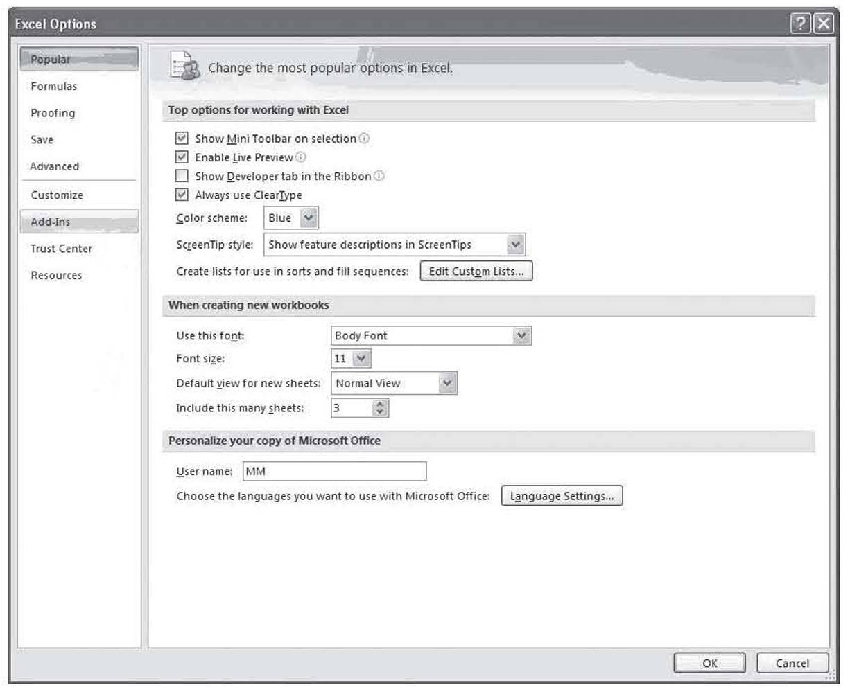
Figure 1.13 The Excel options dialog box
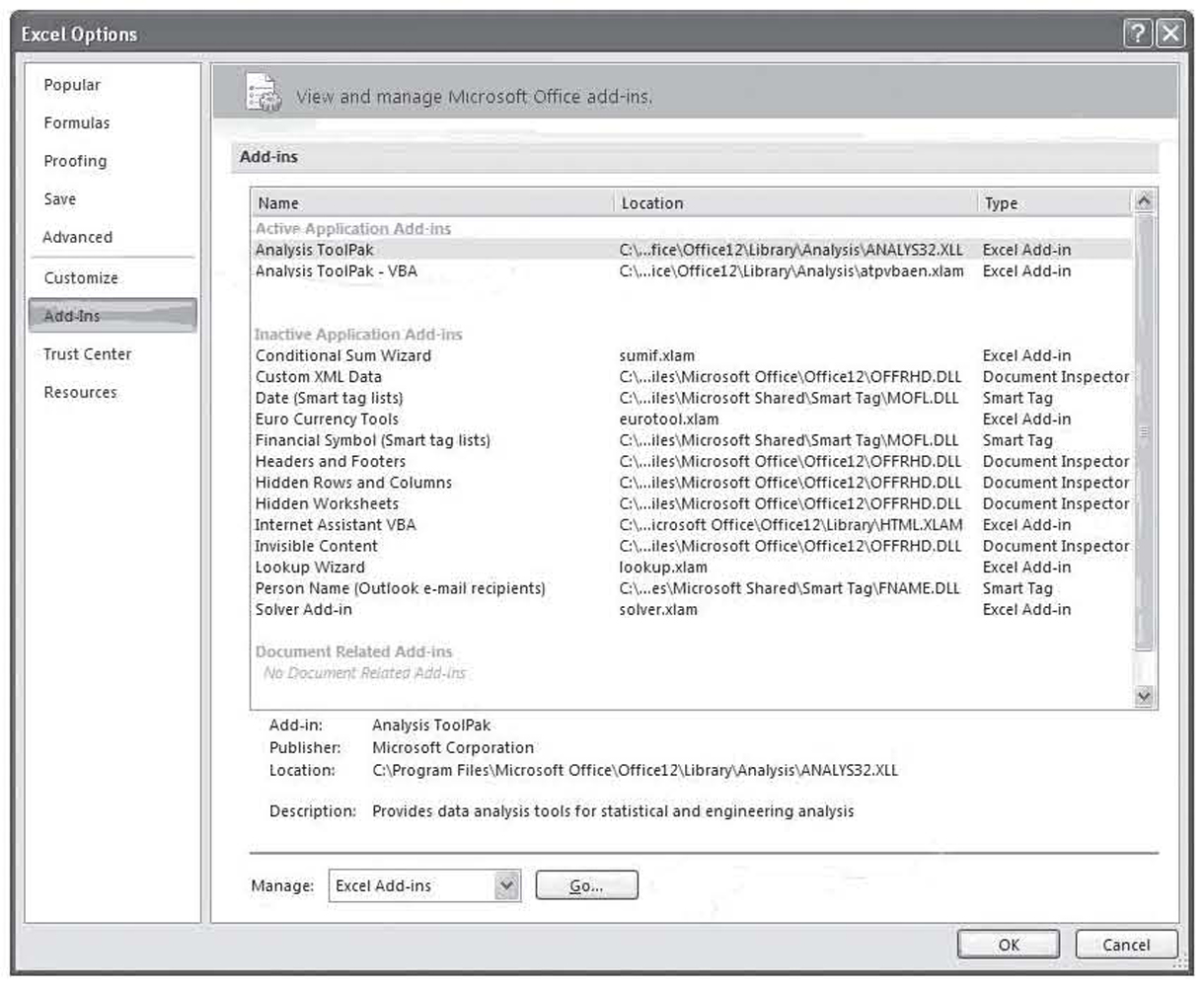
Figure 1.14 Excel add-in manager under Excel 2010
Now that you have the add-ins installed, to compute the correlation coefficient using the static approach, select Data Analysis under the Data tab from the Ribbon. This brings up the dialog box shown in Figure 1.15. By default, the procedure you last used during this session will be highlighted. You use this dialog box to select the statistical procedure to perform—Correlation, in this case. Selecting Correlation and clicking on OK brings up the dialog box shown in Figure 1.16.
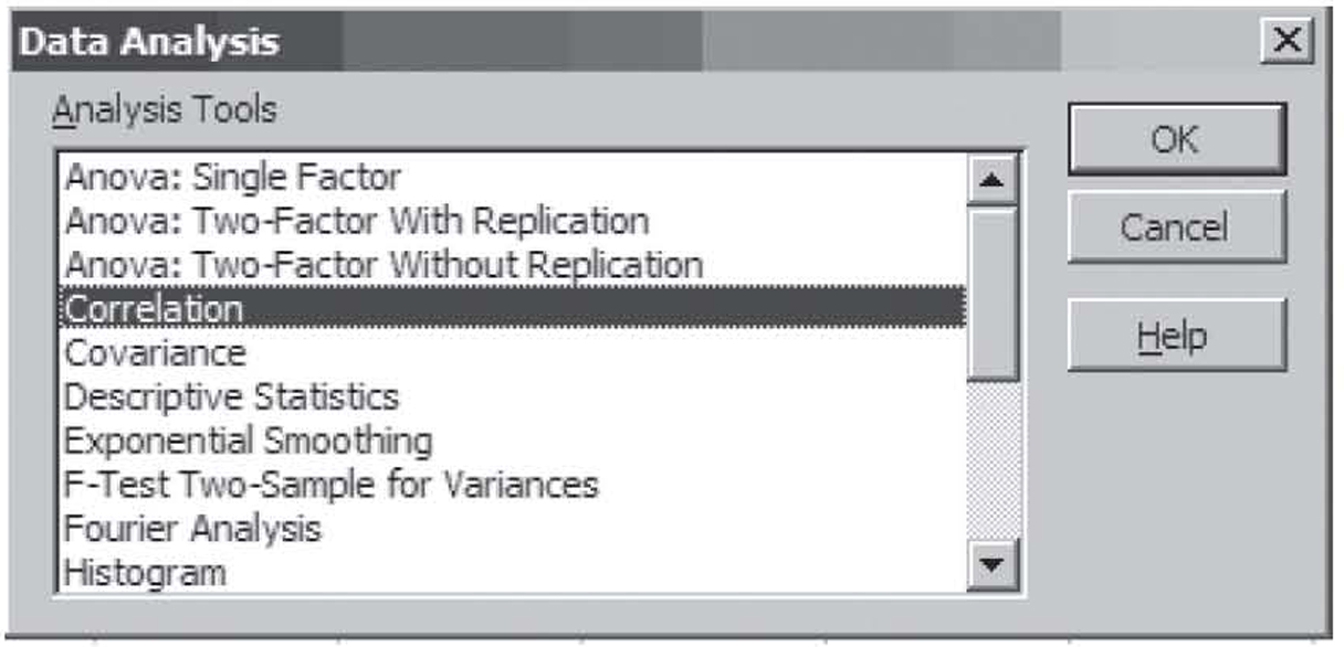
Figure 1.15 Excel data analysis dialog box

Figure 1.16 The Excel correlation dialog box
You use the dialog box in Figure 1.16 to give Excel the information it needs to perform the correlation analysis. At the top of the dialog box, you enter the cells containing the data. If you include the column heading in the range, which is a good idea, Excel will use those titles in the output. If you do, you will need to check the Labels in first row box. Excel can perform correlation analysis on data that is stored in either row or column format, so you must tell Excel which format is used. Excel can usually figure it out automatically when headings are included, but it sometimes guesses wrong when only numbers are included in the range.
Finally, you must tell Excel where to store the results. Some statistical procedures, especially regression analysis, take up a lot of space for their output, so it is usually best to store the results in either a large blank area or, even better, a blank worksheet tab, called a ply on this dialog box. Just to display the results of this single correlation analysis, for example, Excel required nine worksheet cells. This is shown in Figure 1.16 on the right side of the figure.
At first glance, the output in Figure 1.16 will seem more than a little strange. To understand why this format is used, you need to know that correlation analysis is often applied to many variables all at once. The correlation coefficient itself can only be calculated for pairs of variables, but when applied to many variables, a correlation coefficient is calculated for every possible pair of variables. When more than a couple of variables are used, the format in Figure 1.16 is the most efficient approach to reporting those results.
This format is called a correlation matrix. The top row and left column provide the names of the variables. Each variable has a row and column title. Inside this heading row and column are the correlation coefficients. The pair of variables associated with any particular correlation coefficients can be read off by observing the row and column heading for that cell.
Every correlation matrix will have a value of 1.000 in a diagonal line from the top left cell to the bottom right cell. This is called the main diagonal. The cells in the main diagonal have the same row and columns headings and each variable is 100 percent positively correlated with itself, so this diagonal always has a value of one. Notice too that Excel does not show the numbers above the main diagonal. These numbers are a mirror image of the numbers below the main diagonal. After all, the correlation coefficient between age and tag number would be the same as the correlation coefficient between tag number and age, so it would be redundant to give the same numbers twice.
The static approach avoids the problem of writing formulas and is especially efficient when the correlation coefficient must be computed for many variables, but it does have a significant drawback. Since the results are static, you must always remember to rerun Correlation if you must change any of the numbers.
Using SPSS
Earlier, we saw how SPSS stores data in column format similar to the way it is stored in Excel. To perform correlation analysis, you click on Analyze, Correlate, and Bivariate.10 This brings up the dialog box shown in Figure 1.17 where you select the variables to perform correlation analysis on. A minimum of two variables is required (currently only one is selected), but you can select as many as you like. With more than two variables, SPSS performs correlation on every possible pair of variables.

Figure 1.17 The SPSS variable selection dialog box
The result of the correlation analysis in SPSS is shown in Figure 1.18. As discussed, this format for displaying the data is known as a correlation matrix. Notice that the correlation matrix has two other numbers in each box besides the actual correlation. The first one is the significances using a two-tailed test. This is also referred to as the p-value, which will be discussed later. Notice, too, that the p-value is missing on the main diagonal. This will always be the case as these values are always significant. The last number is the sample size, or seven in this case.
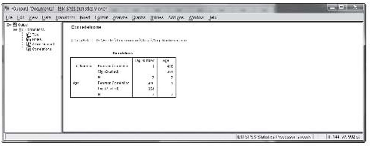
Figure 1.18 Correlation results in SPSS
Some Correlation Examples
We will now look at some more correlation examples using the data sets discussed earlier.
Figure 1.1 shows a set of data that was very strongly correlated. This chart shows the top 25 broiler-producing states for 2001 by both numbers and pounds. The data are shown in Table 1.1. The resulting correlation is 0.9970. As expected, this value is both strong and positive.
Tag Numbers and Sine Wave
Figure 1.2 shows the tag number example, which is discussed earlier. That correlation is 0.4158. Figure 1.3 shows the sine wave. As discussed, that correlation is –0.0424, or about zero.
Stock and Bond Returns
Table 1.3 shows the actual returns on stocks, bonds, and bills for the United States from 1928 to 2009. That dataset has four variables:
1. Year
2. Return on stocks
3. Return on treasury bonds
4. Return on treasury bills
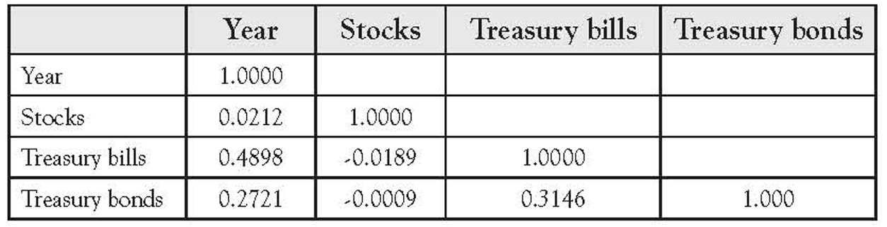
Table 1.7 shows the correlation matrix for this data. Notice that none of the correlations is very high. The value of 0.4898 between “Year” and “Treasury bills” is the highest, whereas the correlation between “Stocks” and “Treasury bonds” is virtually zero.
Table 1.7 Correlation Matrix for Stock and Bond Returns
Federal Employees and Salary
Table 1.4 shows a state-by-state breakdown of the number of federal employees and their average salary for 2007. Figure 1.5 shows this data to have a weak, positive correlation. This is supported by the resulting correlation value of 0.5350.
Transit Ridership
Table 1.5 shows the largest urbanized areas by population, unlinked passenger trips, and passenger miles for 2008. That dataset has three variables:
1. Unlinked passenger trips in thousands
2. Passenger miles in thousands
3. Population from the 2000 Census
Figure 1.6 shows that the data had an outlier in the values for New York. Its values in all three categories far exceed the values for any other transit system. The single outlier does not affect correlation analysis as much as it does the scatterplots. Table 1.8 shows the correlation matrix using all the data and Table 1.9 shows the correlation matrix while excluding New York. Notice that the correlations are all very strong, all very positive, and not very different with or without New York.
Table 1.8 Correlation Matrix for Transit Ridership Including New York
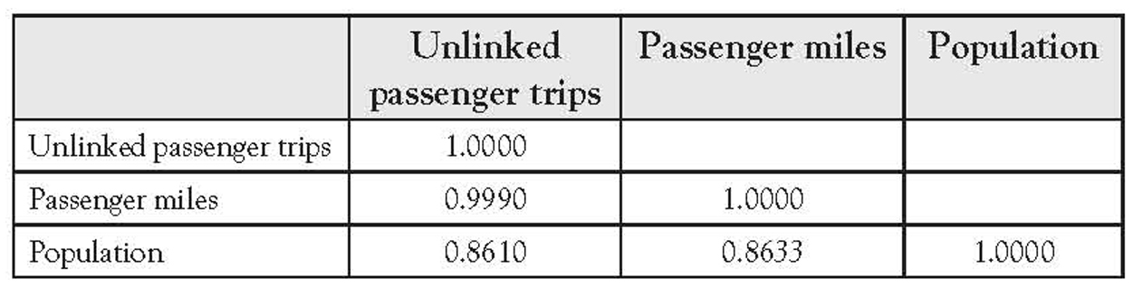
Table 1.9 Correlation Matrix for Transit Ridership Excluding New York

Correlation Coefficient Hypothesis Testing11
All the aforementioned data discussed are sample data. The sample correlation coefficients r computed on the aforementioned data are just an estimate of the population parameter ρ. As with any other statistic, it makes sense to perform hypothesis testing on the sample value. While the mechanics of the hypothesis for the correlation coefficient are almost identical to the single variable hypothesis tests of means and proportions that you are likely familiar with, the logic behind the test is slightly different.
With hypothesis testing on the sample mean or sample proportion, the test is to see if the sample statistic is statistically different from some hypothesized value. For example, you might test the average weight of cans of peas coming off a production line to see if it is 16 ounces or not. With the correlation coefficient, the hypothesis testing is to see if a significant population linear correlation exists or not. Therefore, our hypotheses become
H0 : The population correlation is not meaningful
H1 : The population correlation is meaningful
Since a nonzero value represents a meaningful correlation, we operationalize these hypotheses as follows:
H0 : ρ = 0
H1 : ρ ≠ 0
If we have reason to expect a positive or negative correlation, we can also perform a one-tailed version of this test.
In virtually all instances, we are testing a one-or two-tailed version of ρ = 0. The test we will use for this hypothesis is only good where the null hypothesis assumes a correlation of zero. In the rare case that you wish to test for a value other than zero, the Student t-distribution does not apply and the test discussed just after the next paragraph cannot be used. Readers needing to test values other than zero are urged to consult an advanced reference for the methodology.
Once the one-or two-tailed version of the hypotheses is selected, the critical value or values are found in the Student t-table or from an appropriate worksheet in the normal fashion. However, this test has n – 2 degrees of freedom rather than n – 1. The test statistic is as follows:
Correlation Coefficient Test Statistics
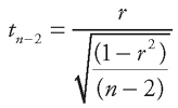
Notice that the hypothesized value is not used in this equation. That is because it is always zero, and subtracting it would have no impact. Also notice that none of the column totals is used in the calculations. All you need is the sample correlation coefficient r and the sample size n.
An Example Using Tag Numbers
In the tag number example, the sample size is seven and the sample correlation is 0.4158. Since we have no reason to believe that tag numbers should be positively or negatively correlated with age, we will perform a two-tailed test—that is,
H0 : ρ = 0
H1 : ρ ≠ 0
With n = 7, we have five degrees of freedom (n – 2), giving us a critical value of ±2.5706. The test statistic calculates as the following:
Hypothesis Test for Tag Numbers
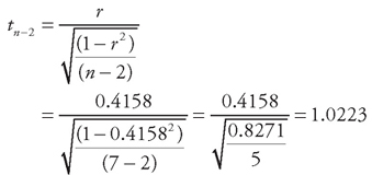
Since 1.0223 is less than the critical value of 2.5706, we accept that the null hypothesis is correct. Accepting the null hypothesis as correct means we conclude that the population correlation is not significantly different from zero. In other words, there is no evidence of a population correlation. Given the nature of the data, this is exactly what we would expect.
Steps to Hypothesis Testing
To summarize, the steps to hypothesis testing of the correlation coefficient are as follows:
1. Select the null and alternative hypothesis based on your belief that the correlation should or should not have a direction. You will always be selecting one of the three following sets of hypotheses:
a. When you have no reason to believe the correlation will have a positive or negative value
H0 : ρ = 0
H1 : ρ ≠ 0
b. When you believe the variables will have a positive correlation
H0 : ρ ≤ 0
H1 : ρ > 0
c. When you believe the variables will have a negative correlation
H0 : ρ ≥ 0
H1 : ρ < 0
2. Set the level of significance, also known as alpha. In business data analysis, this is almost always 0.05. For a more detailed discussion of alpha, consult any introductory statistics textbook.
3. Find the critical value based on the Student t-distribution and n – 2 degrees of freedom.
4. Compute the test statistic using the Correlation Coefficient Test Statistics formula.
5. Make a decision.
a. When you have no reason to believe the correlation will have a positive or negative value, you accept the null hypothesis (that there is no correlation) when the test statistic is between the two values. You reject the null hypothesis (and conclude the correlation is significant) when the test statistic is greater than the positive value or less than the negative value.
b. When you believe the variables will have a positive correlation, you accept the null hypothesis when the test statistic is less than the positive critical value and reject the null hypothesis when the test statistic is greater than the positive critical value.
c. When you believe the variables will have a negative correlation, you accept the null hypothesis when the test statistic is greater than the negative critical value and reject the null hypothesis when the test statistic is less than the negative critical value.
The Excel Template
All these calculations can be automated using the Correlate.XLS worksheet. We will demonstrate it using the example of the tag data. The Correlate tab allows you to enter up to 100 pairs of values in cells A2 to B101. It then shows the correlation coefficient to four decimal points in cell E3 and the sample size in cell E4. This is shown in Figure 1.19.

Figure 1.19 Using the Excel template to perform correlation analysis
The red square in the worksheet, shown in gray here, outlines the area where the data are to be entered. Only pairs of values are entered into the calculations and values outside of the red square (shown in gray) are not allowed. This is enforced by the worksheet. It is protected and no changes can be made outside the data entry area.
The Critical Values tab of the worksheet is shown in Figure 1.20. Since this hypothesis test is always performed using the Student t-distribution, those are the only values returned by this worksheet tab. Just as in the hypothesis testing template, these values are not really needed since the tab for hypothesis testing looks up the values automatically.
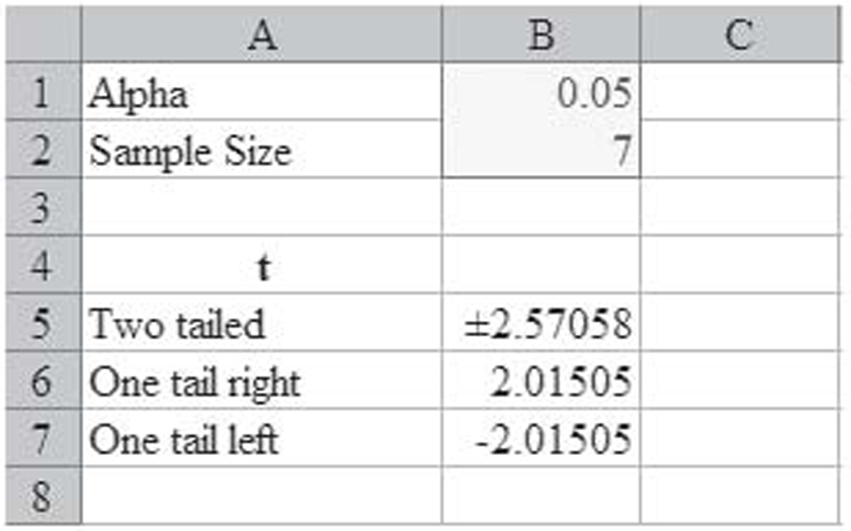
Figure 1.20 The critical values tab of the template
The Hypothesis Test tab of the worksheet is shown in Figure 1.21. This tab automates much of the hypothesis testing. You enter the alpha level in cell B2, the correlation coefficient in cell B5, and the sample size in cell B6. The tab then performs all the calculations. You then simply select the appropriate hypothesis. In this example, the two-tailed test returns the test statistic of 1.0223, as computed in the Hypothesis Test for Tag Numbers, and accepts the null hypothesis.
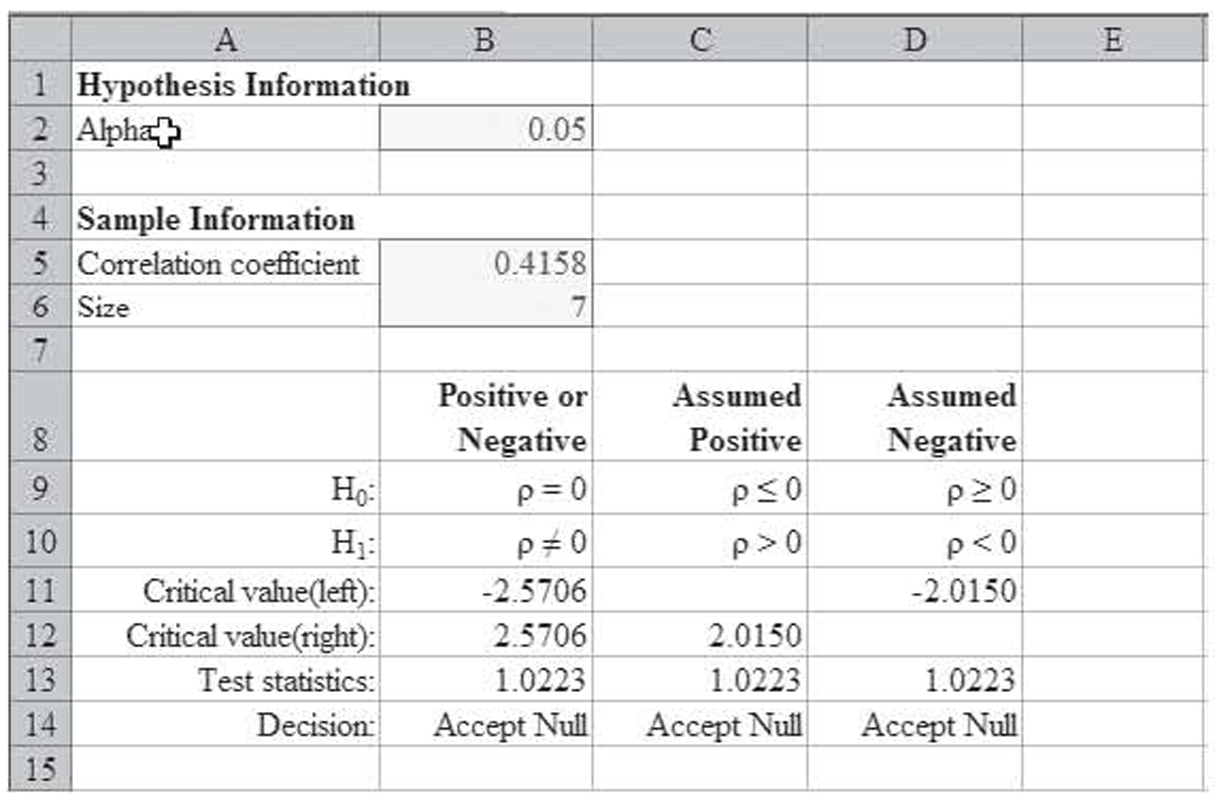
Figure 1.21 A template for automating hypothesis testing of correlation values
Using SPSS
Look back at Figure 1.18, which shows the correlation matrix for the tag data. This has everything you need to perform the hypothesis test. In Figure 1.18, the value below the correlation is the two-tailed significance level, or 0.354 in this case. This is also known as the p-value. For a two-tailed test, you accept the null hypothesis when the p-value is greater than alpha and reject the null hypothesis when the p-value is less than alpha. Since the p-value of 0.354 is greater than our alpha value of 0.05, we accept the null hypothesis and again conclude that the correlation is insignificant.
The process is almost as easy for a one-tailed hypothesis test—that is, when you believe the correlation should be either positive or negative. In this case, the hypothesis test is a two-step process. First, you compare the sign of the correlation coefficient. If it does not match your expectations—that is, if your alternative hypothesis is that it is positive but the calculated value is negative—then you always accept the null hypothesis. Second, if the signs match, then you compare alpha and the p-value as in the first paragraph of this section, only you divide the p-value in half.
So if we believed the tag correlation should have been positive, then we would have passed the first part since the calculated correlation was indeed positive. Now we would compare 0.354 / 2 = 0.177 against the alpha value of 0.05. Since the new p-value of 0.117 is still larger than alpha, we would again accept the null hypothesis and conclude the correlation is insignificant.
Broilers
Figure 1.1 shows a set of data that is very strongly correlated. This chart shows the top 25 broiler-producing states for 2001 by both numbers and pounds. The data are shown in Table 1.1. The resulting correlation is 0.9970. Since more broilers should weigh more, we would expect a positive correlation. Figure 1.22 shows use of the Excel template to test the correlation coefficient for significances, and it is significant.

Figure 1.22 Using the Excel template to test the broilers hypothesis
Stock and Bond Returns
Table 1.3 shows the actual returns on stocks, bonds, and bills for the United States from 1928 to 2009. Figure 1.23 shows the correlation matrix on these variables from SPSS. As you can see, it flags the combinations that are significant at the 0.05 level with one asterisk, as well as the higher 0.01 level with two asterisks. In this case, the following are significant:

Figure 1.23 SPSS correlation matrix for stock and bond data
1. “Treasury bills” with “Year”
2. “Treasury bonds” with “Year”
3. “Treasury bills” with “Treasury bonds”
Due to the large sample size, these are significant in spite of their relatively low correlation values. In general, the larger the sample size, the weaker the correlation can be and the correlation still be significant.
Causality
Finding that a correlation coefficient is significant only shows that the two variables have a linear relationship. It does not show that changes in one variable cause changes in another variable. This is called causality, and showing causality is much more complex than just showing correlation. Consider the example in Box 1.1.
Spelling and Shoe Size
If you walk into any elementary school in this nation and measure the students’ spelling ability and shoe size (yes, shoe size), you will find a strong positive correlation. In fact, the correlation coefficient will be very close to +1 if you compute it separately for boys and girls! Does this mean that big feet cause you to be able to spell better? Can we scrap all the standardized tests that elementary school students take and just measure their feet? Or does it mean that being a good speller causes you to have bigger feet?
To make the matter even more confusing, if you walk into any high school in this nation and make the same measurement, you will find that the correlation coefficient is close to zero and, in fact, is insignificant. Can it be the case that having big feet only helps you in elementary school? Or is correlation analysis telling us something other than big feet cause good spelling?
Have you figured it out? In first grade, most students are poor spellers and have small feet. As they get older and move into higher grades, they learn to spell better and their feet grow. Thus the correlation between foot size and spelling ability really tells us that older elementary school students spell better than younger ones. In addition, since boys and girls grow at different rates, the correlation improves when each gender is computed separately. By high school, much of this effect has finished. Students no longer study spelling and are mostly reasonably competent spellers. Thus any differences in spelling ability are due to factors other than their age. Since age is no longer an indicator of spelling ability, a surrogate measure like foot size is no longer correlated with spelling. In addition, many students have completed the bulk of their growth by high school, so differences in feet are more an indication of the natural variation of foot size in the population than they are of age.
Simply stated, if we wish to show that A causes B, simply showing that A and B are correlated is not enough. However, if A and B are not correlated, that does show that A does not cause B—that is, the lack of correlation between foot size and spelling ability in high school is, by itself, enough to conclusively demonstrate that having larger feet does not cause a student to spell better.
Three things are required in order to show that A causes B:
1. A and B are correlated.
2. If A causes B, then A must come before B. This is called a clear temporary sequence.
3. There must be no possible explanation for the existence of B other than A.
Of these three items, only the first item—that A and B are correlated—is demonstrated using statistics. Thus it is never possible to demonstrate causality by just using statistics. Demonstrating the second and third items requires knowledge of the field being investigated. For this reason, they are not discussed in any detail in this textbook.
Think this spelling example is too esoteric to be meaningful? Think again. At many businesses, we can show that as advertising rises, sales go up. Does that mean that increases in advertising cause increases in sales? It could be, but businesses have more income when sales increase, and so they might simply elect to spend more of that income on advertising. In other words, does advertising → sales or does sales → income → advertising? Another example might help.
Now suppose that we have a new marketing campaign that we are testing, and we wish to show that the campaign causes sales of our product to rise. How might this be accomplished?
Showing that the two are correlated would involve computing the correlation of the level of expenditure on the new marketing campaign and our market share in the various regions. Showing a clear temporary sequence would involve looking at historical sales records to verify that the sales in the areas receiving the marketing campaign did not go up until after the marketing campaign had been started. In all likelihood, accomplishing these first two steps would not be too difficult, especially if the marketing campaign truly did cause additional sales. However, the third step might be more difficult.
Box 1.2
Ice Cream Sales
When ice cream sales are high, the number of automobile wrecks is also high. When ice cream sales are low, the number of automobile wrecks is lower. Does this mean that sales of ice cream cause automobile wrecks or that automobile wrecks drive the sale of ice cream?
Actually, it means neither. Just as income might drive advertising, a third variable influences both ice cream sales and automobile wrecks. In the summer, people drive more and so have more wrecks; they also buy more ice cream. In the winter, people drive less and so have fewer wrecks; they also buy less ice cream. Thus it is the season that is influencing both ice cream sales and automobile wrecks. Since they are both influenced by the same variable, they are correlated.
In deciding if anything other than your new marketing campaign could explain the change in sales, you will need to look at the actions of your competitors, changes in demographics, changes in weather patterns, and much more. Of course, the specific items on this list would depend on the product being investigated. Now imagine how difficult it is to rule out all alternative explanations for more complex areas of study such as something causing cancer. Clearly, showing causality is not a simple undertaking. Fortunately, effective use of regression does not require showing causality. Likewise, using the results of regression either to understand relationships or to forecast future behavior of a variable does not require showing causality.
For another, more detailed discussion of the problems showing causality, see Box 1.3.
Working Mothers Have Smarter Kids
A few years ago, a rash of television and newspaper reports focused on a research finding that stated that the children of working mothers had
• higher IQ scores,
• lower school absenteeism,
• higher grades,
• more self-reliance.
Any stay-at-home mother who saw these reports might reasonably conclude that the best thing she could do for her children is to put the kids in daycare and get a job!
The problem is the research was seriously flawed! But first, we will review how the research was conducted. Only by knowing how the research was conducted can you begin to see the flaws in that research.
Researchers selected 573 students in 38 states. The students were in first, third, and fifth grades. They divided these students into two groups: those with working mothers and those with stay-at-home mothers. On the measures of success used by the researchers, the first group did better.
Do you see the problem? The researchers made no attempt to figure out why the mothers in the second group were at home. Naturally, some of them were in families who were making the sacrifices necessary so the mother could be home with the kids. If those were the only ones in the second group, then it might make sense to conclude that the mother’s staying at home did not improve the child’s performance. However, this group of stay-at-home mothers included mothers who were not working for the following reasons:
• They were on welfare.
• They were too sick to work.
• They could not find a job.
• They simply did not want to work.
• They did not speak English.
• They were alcoholics or drug users who were unemployable.
• They were unemployable for other reasons.
• They were under 18 and too young to work.
It is likely that the poor performance from children from these groups was bad enough that it drove down the likely higher performance by children who had loving, concerned mothers who stayed home for their children.
Even if none of these factors were present and the data were completely valid, there is another equally likely explanation for the data: Families are more likely to make the sacrifice for the mother to stay home when the child is having problems. Thus the lower score for the kids of stay-at-home mothers could be due to the mothers’ staying at home to help kids with problems rather than the facts that the moms are at home causing kids to have problems—that is, it could very well be that poor performance by the children caused their mother to stay at home rather than the mother staying at home causing the poor performance.
This study makes a point that every researcher and every consumer of research should always keep in mind: A statistical relationship—even a strong statistical relationship—does not imply that one thing caused another thing. It also makes another very important point if you wish to be an educated consumer of statistics: It is not enough to know the results of the statistical analysis; in order to truly understand the topic, you must know how the data were collected and what those data collection methods imply.
Summary
In this chapter the topic of correlation was introduced. Beginning with a scatterplot, we considered how two variables could be correlated. We also considered the relationship between causality and correlation.
We saw that correlation measured if there was a significant relationship between a pair of variables. In the next chapter, we will see how to use simple regression to mathematically describe that relationship.