CHAPTER 1
INTRODUCTION TO The Art of Pastel
Tools and Materials
You don’t need many supplies to begin painting in pastel; unlike oil or acrylic paints, pastels don’t require additives or brushes. All you really need to get started is a set of pastels and a variety of papers (or supports). Then just add a few additional tools and materials described on these pages, and you’ll be ready! (For oil pastel materials, see page 92.)
PURCHASING SOFT PASTELS
Pastels are available in several forms, including oil pastels; hard, clay-based pastel sticks; pastel pencils; and soft pastels, which are chalklike sticks. Soft pastels produce a beautiful, velvety texture and are easy to blend with your fingers or a cloth. When purchasing pastels, keep in mind that pastel colors are mixed on the paper as you paint, rather than premixed on a palette. (See page 9.) It is helpful to buy a wide range of colors in various values—lights, mediums, and darks—so you will always have the color you want readily at hand.
APPLYING FIXATIVE
Because soft pastels have less binder than hard pastels, they crumble easily, and your finished work can be smudged. Many artists use some type of spray-on sealer or fixative to set their work and prevent it from smearing. (See the demonstration at right.) Some artists don’t fix their paintings because they don’t like the way the varnish affects the quality of the pastel. Instead they preserve the artwork by keeping the layers of pastel very thin as they paint. Then they tap the support several times so that the excess pigment falls off. To preserve your painting, you may want to have it double-matted and framed under UV light-protected glass. A pastel painting that’s properly mounted on archival paper will last for centuries.
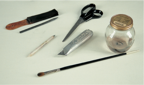
Gathering Extras There are other tools that will help you as you paint, such as scissors to trim supports; vine charcoal to layout designs (it’s easy to erase and can be painted over with pastel); a sand paper block as a sharpener; a paper stump for blending; and a razor blade to break the pastels cleanly. You can also paint over your work with denatured alcohol on a soft brush to wash the color thoroughly into the paper.
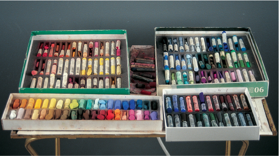
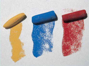
Picking Soft Pastels Here is a basic set (shown above) that consists of an assortment of 90 medium soft pastels, another assortment of 40 very soft half-sticks, and a set of 24 deep darks. If you’ve never worked in soft pastel, you might want to invest in a 45- or 60-stick set created specifically for beginners. Look for a set that has a wide range of reds, blues, and yellows. If you prefer to buy individual colors, start with black, white, and four values (3, 5, 7, and 9) of permanent red, ultramarine blue deep, and cadmium yellow light (See page 9 for a description of the numbering system.) You can create additional tones by layering and blending these basics, and you can always add more colors later as you develop your own style and preferred palette of colors.

Fixing, Stage One To determine whether the fixative you have will adversely affect the colors, test it first by laying down a thick layer of pigment on a piece of pastel paper.

Fixing, Stage Two Spray the piece with an even layer of fixative. If the color stays true, you can varnish your work as you go, painting over each fixed layer without the risk of smudging.

Sharpening Pastels A sandpaper block is a good sharpening tool for both charcoal and pastel. You can also hone pastels with a razor blade, but rubbing the stick gently across sandpaper or another rough-grained surface is a safer way to form a point or chiseled edge.
The texture and color of the support you choose will affect your pastel painting. Because of the delicate nature of soft pastels, you need a paper that has some tooth, or grain, for the pigment to stick to. A rough support, such as sanded paper (made especially for pastel application), will “break up” the applied strokes and create texture. A smooth surface, such as pastel or watercolor paper, will make the unbroken colors appear more intense. Pastel supports are also available in a variety of colors; you can choose a color that offers a contrasting background tone or one that is in the same color range as your subject. (For more on using colored supports, see the examples below right and on page 28.)

Keeping Pastels Clean The powdery texture of pastels can make them messy to handle and store, but you can avoid this problem by storing your soft pastels in raw rice.

Storing Your Work To protect your finished artwork from smudging or smearing, always store your pastel paintings between a board and a cover sheet. You can purchase artist’s tissue paper by the roll and cut it to fit your painting; then affix the paper to the back of the support with low-tack artist’s tape.

Using Textured Grounds Rough papers are perfect for creating textured effects—the rougher the paper, the more it will break up the color. Rough-grained supports can also help convey the look of foliage, stucco, or fur.

Painting on Smooth Paper Smoother papers are wonderful choices for rendering detailed work and soft blends. The smooth side of pastel paper actually holds more pigment than the rough side.
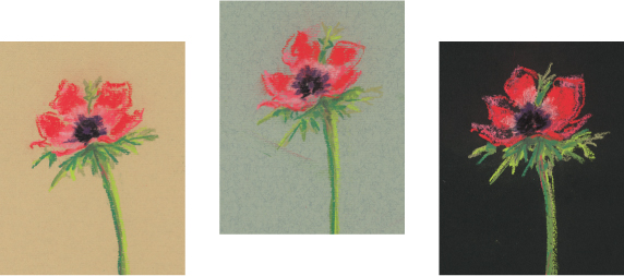
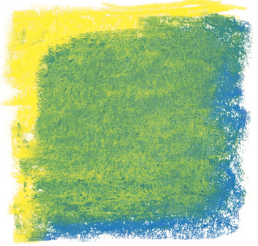
Working with Colored Supports Here you can see how the color of the paper affects the same flower image. On the beige paper, the dark center has the greatest visual impact; on the gray paper, the green stem has less strength; and on the black paper, the contrasts are very striking.
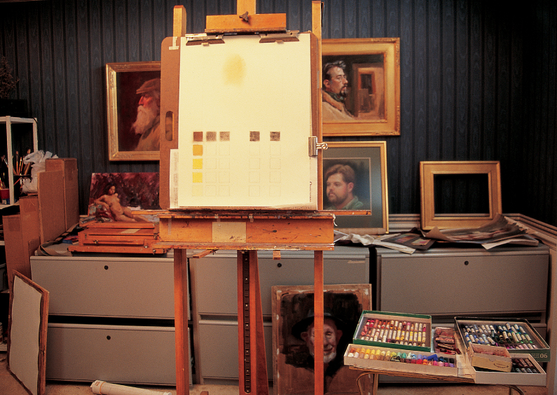
Setting Up a Workspace Good lighting is essential in any workspace. William Schneider’s studio has two north-facing windows that provide constant, cool light. Directly above each window is a large fluorescent floor-lamp with color-corrected bulbs. William works on a large, studio easel on rollers that can easily be moved. He also built an 18-inch high platform (on rollers) for models, so he can see them at eye level while he paints. He keeps the pastels in their original boxes, sorted by color and value, and he always returns each pastel to its original slot to prevent them from getting lost. Lastly, William keeps a large mirror mounted on another easel nearby. He frequently examines his work in the mirror while he paints; the reflection offers another viewpoint to check for inaccuracies.
Introducing Color Theory
There are a few basic terms and concepts to know about color theory. The primary colors (traditionally red, yellow, and blue) are the three basic colors that can’t be created by mixing other colors; all other colors are derived from these three. Secondary colors are each a combination of two primary colors, and tertiary colors are a combination of a primary color and a secondary color. Complementary colors are any two directly across from each other on the color wheel, as shown at right, and the term hue refers to the color itself.
USING THE MUNSELL COLOR SYSTEM
The Munsell Color System is a variation of the traditional color wheel. In the Munsell system, purple and green are also treated as primary colors, which shifts the placement of blue and yellow on the color wheel (below right). This in turn creates different complementary colors. For example, on the traditional wheel, the complement of red is green; in the Munsell system, the complement of red is blue-green. The difference between the two systems is subtle but important; when you mix complements in the traditional system, you don’t get true neutral grays—for example, red mixed with green produces a warm, brownish gray. But if you mix red and blue-green, you get a truer, more neutral gray.
UNDERSTANDING COLOR “TEMPERATURE”
We often refer to colors in terms of temperature, meaning they convey a sense of warmth or coolness. In general, reds, yellow, and oranges are considered warm; blues, greens, and purples are considered cool. But there are also cool and warm variations of every hue. For example, a red with more yellow in it would be a warm red, and a red with more blue in it would be a cool red. Consequently, your painting will impart an overall feeling of warmth or coolness depending on which colors dominate.
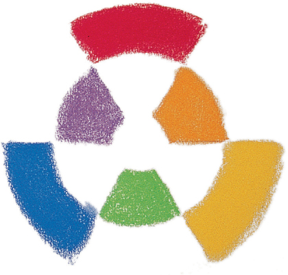
The Standard Color Wheel In this color wheel, the traditional primary colors of red, yellow, and blue are shown on the outer ring. The inner ring illustrates the traditional secondary colors: orange, green, and purple. In this system, you can see that the complementary colors are red and green, yellow and purple, and blue and orange.
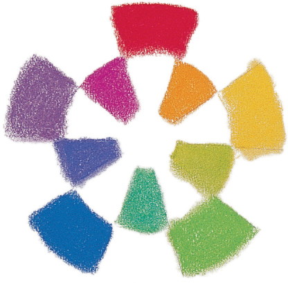
The Munsell Color Wheel On the Munsell color wheel, the primary colors are also on the outer ring and the secondaries are again in the inner ring. But with green and purple as additional primaries, the complementary pairs in this system are red and blue-green, yellow and blue-purple, green and red-purple, blue and orange, and purple and yellow-green.
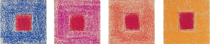
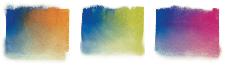
Applying the Concept of Color “Temperature” In practice, colors are perceived of as warm or cool only in relation to one another. Here, a square of the same red is painted on different backgrounds. Next to a cool blue, the red appears warm. Against red-violet, it also appears warm, but with much less temperature contrast. When placed on red-orange, the red seems cooler, and next to a warm orange background it appears quite cool. When painting, always view each area in terms of the temperature of the colors around it.
Working with Gray Many artists use grays as the base for their color harmonies. While you can buy gray sticks, a better approach is to blend and layer various hues to create your own grays. In the example at near right, cobalt blue is blended with its complement (orange) and some white. If you look closely, you’ll notice that this mixture produces a range of warm and cool grays as well as a true neutral gray. Next, cobalt blue is blended with yellow-green and white, followed by cobalt blue with red-purple and white. Although these other two mixtures don’t result in the creation of true grays, they do create a range of neutral gray tones.
Pastel manufacturers produce each hue in a variety of full-strength colors. They also make a wide range of dark and light values by adding black (creating a shade) or white (creating a tint) to the pure color. And most manufacturers label their pastels using a numbering system to identify the strength of each color. Unfortunately these numbering systems are not standardized among brands. With some pastels, a value of 5 indicates the pure color. A value of 3 or 1 indicates a darker value of the hue, and a value of 7 or 8 indicates that some white has been added to the pure pigment to create a lighter value. The higher the number above 5, the lighter the value. A value of 12 is almost completely white. When you purchase pastels, it’s a good idea to create a labeled chart like the one at right to help you identify the various pastels you have at your disposal.
MIXING COLORS
Although it is more convenient to have a wide range of colors and values in your pastel set, you can mix additional colors directly on your support by layering and blending your soft pastels. The chart at the bottom of the page demonstrates various ways you can mix colors on your paper. You can blend the strokes thoroughly to create a solid area of smooth color, or you can leave visible strokes of various hues if you want more texture.

Purchasing a Variety of Values You can buy just about any value you’d want, but it’s easy to get carried away. However, you can keep expenses to a minimum by starting out with just 4 basic values. This chart shows four different values of four different colors. To substitute for the values you don’t have, you can always blend in a little white to create a lighter value (creating a tint) or a touch of black (creating a shade) to give yourself more options.
Smooth Blend Here side strokes of yellow are layered smoothly over blue to create a bright green, which has more life and interest than a manufactured green.

Unblended Strokes Choppy, unblended strokes of yellow and blue create the impression of green. Instead of blending the colors on the paper, the eye visually mixes them.

Three Color Mixes Here strokes of lavender and turquoise are layered over blue. This creates a richer color than does a mix of just two colors.
Pastel Techniques
Unlike painting with a brush, working with pastel allows you to make direct contact with the support. Therefore you have much more control over the strokes you make, the way you blend the pigment, and the final effects. Once you learn and practice the techniques shown here, you’ll know which ones will give you the results you desire.

Firm Strokes Use the ends of the pastel sticks to create thick, bold strokes. The more pressure you apply, the thicker the stroke will be. These strokes are ideal for rendering large textured areas, such as fields of grass.
Side Strokes To quickly cover the support and fill in areas of broad color, drag the side of the stick across the support. This technique is effective for creating skies, water, and underpaintings.

Pencil Lines Pastel pencils offer the most line control, as they are less likely to crumble or break than other types of pastel. If sharp, they can produce a very fine line, which is ideal for creating details or textures, such as fur or hair.
EXPERIMENTING WITH STROKES
The way you hold and manipulate the pastel stick or pencil will directly affect the resulting stroke. Some grips will give you more control than others, making them better for detail work; some will allow you to apply more pigment to the support to create broad coverage. The pressure you exert will affect the intensity of the color and the weight of the line you create. Experiment with each of the grips described below to discover which are most comfortable and effective for you.
Broad Strokes Place the pastel flat on the paper and slide it back and forth to create broad linear strokes. This grip is also useful to create a “wash”; use the length of the pastel to cover large areas and create backgrounds quickly.
Linear Strokes To create linear strokes, grip the pastel stick toward the back end, and use your thumb and index finger to control the strokes. This grip is ideal for creating fine lines and details; however, it offers less control than the other grips.

Round Strokes Turn the pastel stick on its end and grip it toward the front to create short, rounded strokes. This grip is perfect for creating texture quickly in large areas. Try overlapping the rounded strokes to create a denser texture.
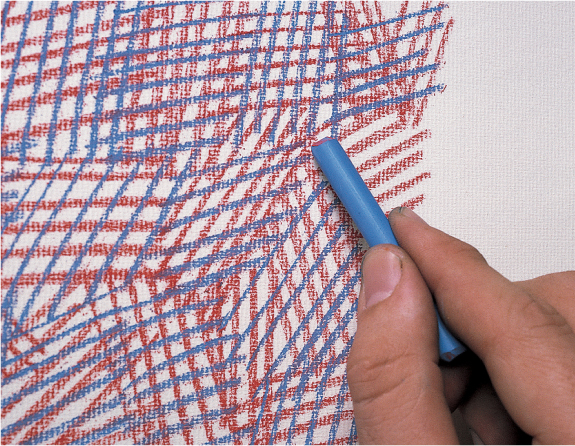
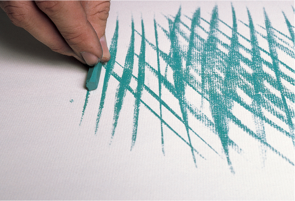
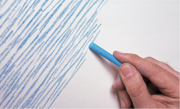
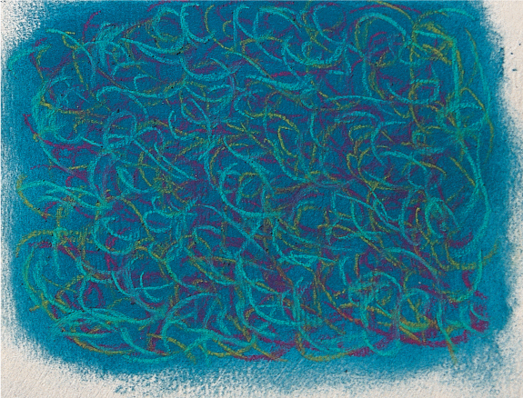
Crosshatching Hatched strokes are a series of parallel lines; crosshatched strokes are simply hatched lines layered over one another, but in opposite directions. You can cross-hatch strokes of the same color to create texture or use several different colors to create an interesting blend.
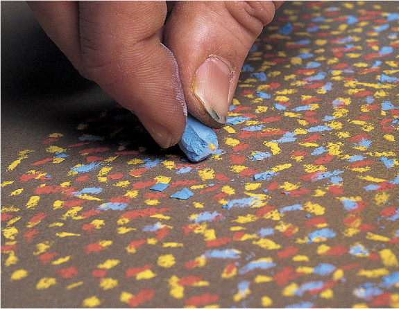
Pointillism Another way to build up color for backgrounds or other large areas of color is to use a series of dots, a technique called “pointillism.” This technique creates a rougher, more textured blend. When viewed from a distance, the dots appear to merge, creating one color.
Removing Pigment When you need to remove color from a given area, use a kneaded eraser to pick up the pigment. The more pressure you apply, the more pigment will be removed. Keep stretching and kneading the eraser to expose clean, new surfaces.
Creating Patterns To create textures or patterns when rendering fabric or clothing, first lay down a solid layer of color using the side of the pastel stick or pencil. Then use the point of a pastel pencil to draw a pattern, using several different colors if you wish.
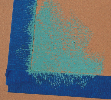
Using Tape You can create straight, even edges by using house painter’s tape. Just apply it to your support, and make sure the edges are pressed down securely. Apply the pastel as you desire, and then peel off the tape to reveal the straight edges.
Gradating on a Textured Support Creating a smooth, even gradation on a textured ground can be a little tricky. Add the colors one at a time, applying the length of the stick and letting it skip over the texture of the paper by using light pressure.

Glazing Create a “glaze” just as you might with water-color by layering one color over another. Use the length of the pastel stick with light pressure to skim over the paper lightly. The result is a new hue—a smooth blend of the two colors.
There are a number of ways to blend pastel, and the method you use depends on the effect you want to achieve and the size of the area you’re blending. Smooth, even blends are easy to achieve with a brush, a rag, or even your fingers. You can also use your finger or a paper blending stump to soften fine lines and details. Still another method is to place two or more colors next to each other on the support and allow the eye to visually blend them together.

Applying Unblended Strokes In this example, magenta is layered loosely over a yellow background. The strokes are not blended together, and yet from a distance the color appears orange—a mix of the two colors.

Blending with Fingers Using your fingers or the side of your hand to blend gives you the softest blend and the most control, but be sure to wipe your hands after each stroke so you don’t muddy your work. Or use rubber gloves to keep your hands clean.
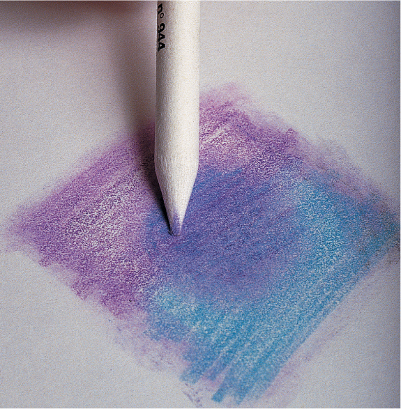
Blending with a Tortillon For blending small areas, some artists use a paper blending stump, or tortillon. Use the point to soften details and to reach areas that require precise attention.

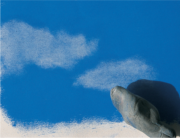
Using a Cloth For a large background, it is sometimes helpful to use a cloth or a paper towel to blend the colors. To lighten an area, remove the powdery excess pastel by wiping it off with a soft paper towel.
The dusty nature of pastel makes it difficult to create clean, hard edges; but employing a simple masking technique is a great way to produce sharp edges. To mask, use a piece of paper or tape to create a straight edge (see page 11), or create a clean-edged shape with a special mask you make yourself. Of course, you would use tape only to save the white of the paper; never apply it to a support that already has pigment on it.
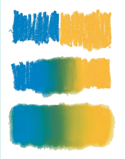
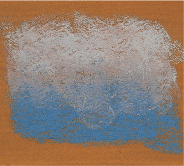
Creating a Gradation With soft pastel, you can create an even color gradation to depict sunset skies or smooth water. Just start with two spots of color, and then blend the area where they meet.
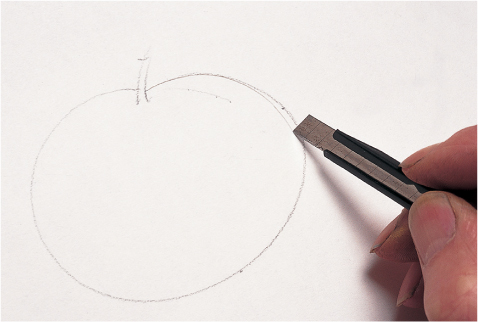
Cutting the Shape Begin by drawing the shape on a piece of tracing paper and cutting it out.
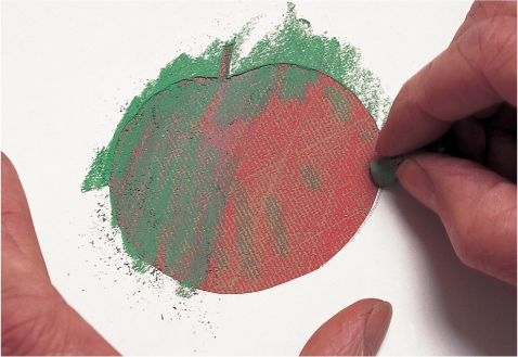
Applying the Color After painting the background, place the mask on top and then apply color.
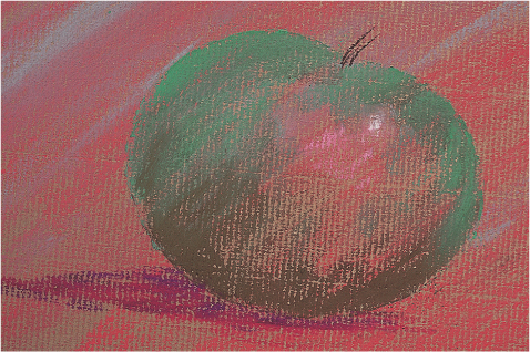
Removing the Mask Carefully peel away the mask to reveal the crisp shape underneath.
USING A COMBINATION OF TECHNIQUES
These techniques are useful in and of themselves, but you won’t truly understand the effects you can achieve until you apply them to an actual subject. Here you can see how the same subject is rendered using three different methods; notice the different look of each.
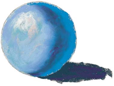
Blending Here the colors were applied thickly and smoothly. The even layers of color create the appearance of a slick, smooth object.
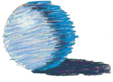
Linear Strokes Linear strokes are layered over one another to create a more textured appearance. From a distance, the colors still appear to blend together.
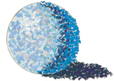
Pointillism Pointillism is used to create the form of the sphere. Although the same colors are used, the surface of the object appears much rougher.