CHAPTER 2
Pastel WITH WILLIAM SCHNEIDER

Planning a Composition
A successful painting has both an appealing subject and an appealing composition. Composition refers to the way objects are placed in a painting and how they relate to one another. The elements in a good composition are grouped into a balanced unit, and there is a distinct center of interest, or focal point. A strong composition comprises interesting colors, shapes, and lines, which lead the viewer’s eye through the painting and toward the focal point. Here I arranged the onions to create a visual path toward the white carafe, which is placed off-center. The onion peel on the far left counterbalances the forms on the right, whereas the peel on the far right acts as a “stopper,” preventing the eye from wandering off the paper and keeping the focus on the onions and carafe.
CONVEYING A CONCEPT
Although beginning artists often believe the intent of a painting is to depict objects as accurately as possible, more advanced artists use objects to convey an abstract idea or concept. The objects in this still life are not as important as what the composition itself communicates. What matters is creating the sense movement of light from left to right; therefore, I make the nonessential elements—the table and background—very dark. I also place the onions so they lead the eye to the center of interest. This way the onions are brighter the closer they are to the light, naturally drawing the eye in the same direction.

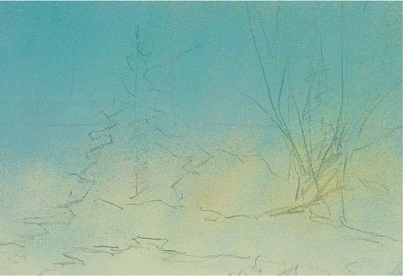
Starting with a Drawing I start by placing the center of interest about a third of the way from the right. Using a centerline to keep my drawing straight, I sketch the shape of the carafe with vine charcoal. Then I outline the onions and peels. At this stage, I draw the onions as a single mass—I’ll separate them later as I paint.

Step One The tone is dark, so I paint the background with layers of black, carmine brown 2, and purple 3, blending well with my hand. I paint the table with burnt sienna 3 and yellow ochre 3, working these colors into the tooth of the paper with the side of my hand. I apply a strip of black and carmine brown 2 to indicate the space beneath the tabletop.

Step Two Next I paint the highlight on the carafe with phthalocyanine (“phthalo”) blue 9. I block in the carafe with blue-gray 7 and chrome green 7 for the light side and mouse gray 5 for the shadow side. This establishes the destination for the movement of light. I block in the foremost onion with ultramarine blue 3, burnt sienna 5, and phthalo green 5.

Step Three Now I block in the rest of the onions. I use raw umber 3 and carmine 3 for the shadow sides and raw sienna 3 and 5 for the light sides. I anchor the onions to the tabletop with accents of carmine brown 2, and I use brown ochre 3 for the reflections. Then I draw in the shapes of the peels with raw sienna 3. Next I blend my strokes with the side of my finger to keep my rendering soft.
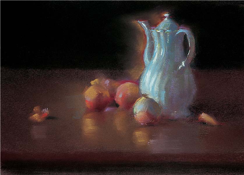
Step Four I blend vermilion 5, orange 3, and purple 5 into the area around the carafe and add some permanent red dark 5 above the onion closest to the carafe. I lighten the carafe with chrome green 9 and sharpen the highlights with white. I lighten the other three onions and their reflections with gold ochre 5 and phthalo green 5, and I stroke in some light behind the left onion with violet 5. Next I paint the stem on the foremost onion with madder brown 3 and add highlights on the other onions with red-violet 5 and phthalo green 9. I cool the “halo” around the carafe with blue-violet 5 and ultramarine blue 5, and I use black and carmine brown 2 to blend the background into the halo. I refine the ridges in the carafe with blue-gray 5 and 7. To sharpen the lower edge of the carafe, I apply some bistre 3. Then I warm the light behind the left onion with yellow ochre 5. Next I draw the peel and stem with yellow ochre 3 and indicate the skin with English red light 3 and 5.

Step Five I refine some of the edges on the carafe with madder brown 2 and brighten some highlights with cobalt blue 7. Then I sharpen some of the dark accents near the onions with burnt sienna 3. I add a final highlight of turquoise blue 9 on the edge of the table so it appears to come forward and establishes the foreground edge. The finished piece conveys the movement of light from right to left.
Creating Depth
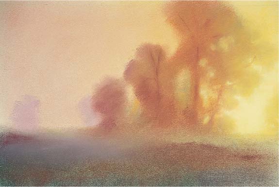
One rewarding aspect of painting a landscape is creating the illusion of depth and distance. I use a variety of visual cues to convey a sense of depth, including atmospheric perspective. Atmospheric perspective refers to particles in the air—such as moisture and dust—that block out some of the red wavelengths of light, making objects in the distance appear less distinct and cooler in value than those in the foreground. Therefore, I paint the objects closest to me with the most texture, detail, and intense colors, and I use increasingly less detail and more muted colors for the objects that are farther away. I also suggest depth by overlapping objects and painting nearer objects larger than those in the distance. In this rural landscape, I emphasized the texture and size of the warm and brightly colored hay bale and stubble in the foreground, overlapped the trees in the middle ground and background, and blurred the edges and smoothed the forms of the cool and distant fields, trees, and sky.

Step One I lay out my design with vine charcoal on an off-white sheet of sanded pastel paper. I establish the lightest light (the sunlight on top of the hay bale) with permanent red light 5, deep yellow 7, and orange 9. Next I lay in the darkest dark shadow underneath with Mars violet 5 and black. It’s important that the two value extremes are in the foreground to help create the sense that this area is closest to the viewer. Now I work from the back to the front, overlapping objects as I go. I lay in the sky with ultramarine blue 5, cobalt blue 7, and phthalo blue 9. Where the sky lightens near the horizon, I work in deep yellow 9, red-violet light 8, and permanent rose 10, blending these colors with the side of my hand. Then I use blue-gray 7, blue-violet 5, and olive green 8 for the distant row of trees, blending the strokes with my palm.

Step Two Working my way forward and blending virtually every stroke, I paint the distant grass with olive green 5, phthalo green 7, and red-violet deep 5. Remember that the atmosphere cools and grays things in the distance—the red-violet I use cools and neutralizes the greens. For the middle trees, I use red-violet deep 5, olive green 5, blue-green 5, and gray 5. The two trees closest to the viewer are blocked in with red-violet deep 3 and blue-green 3, while their dark shadows are bistre 3. For the red of the field, I use burnt sienna 5, red-violet 5, and gray 8.

Step Three Next I paint the middle-tree shadows with red-violet 5 and blue-violet 3. The shadows on the smaller hay bales are olive green 5 and burnt sienna 5. The shadowed side of the foreground bale is olive green 3, light oxide red 3, and orange 3. Then I render the end of the bale with caput mortuum red 7, permanent red light 5, and gold ochre 5, blending these strokes less so the details are sharper. I establish a base tone for the foreground with scarlet 5 and burnt sienna 5, and I use caput mortuum red 3 and red-violet 3 for the shadow on the near right. Then I paint the left tree with chrome green deep 3, olive green 5, and deep yellow 5.

Step Four I gray the field slightly with blue-gray 7 to contrast with the foreground hay bale and make it “pop” forward. Then I paint the foreground grass with chrome green 5 and phthalo green 5. I also use chrome green deep 5 to add some grass into the shadows. Next I work olive green 5 and 8 into the distant fields and overlay strokes of red-violet 7 to create a hazy atmosphere. Then I adjust the distant row of trees with blue-gray 5 and cobalt blue 5, using blue-purple 5 for the shadow areas.

Step Five I add the look of sunlight on the distant trees by applying olive green 8. Then I darken the middle ground trees with ultramarine blue 5 and blue-violet 5 and add the sunlit areas with olive green 8, orange 5, and mouse gray 5. I define the shape of the trunk using olive green 8 by painting the area around it rather than painting the trunk itself. (This is referred to as “painting the negative spaces”; the trunk and foliage are the positive shapes, and the spaces between and around them are the negative shapes.)

Step Six To finish, I add a number of unblended strokes to the foreground to give the area the most texture and detail. I place some gold ochre 9 highlights to indicate the pieces of mown hay on the ground. Then I work some burnt sienna 5 to suggest the ground in the spaces between the shadowed grass patches. For the hay bale and grass highlights, I use chrome green 10 and deep yellow 5 and 7. Finally I add a few more dark strokes in the hay bale with raw umber 3.
Expressing Mood
Color has a tremendous effect on people. Warm colors—such as reds, yellows, and oranges—convey energy and excitement. Cool colors—such as greens, blues, and purples—are more calming. Muted, grayed tones also have a soothing effect. Knowing how colors relate to and interact with one another will help you express emotion in your paintings. In this landscape, I want the viewer to experience the serenity of the fog-shrouded dawn, which I will convey through a toned-down palette. Before I begin painting, I determine what the dominant value and color will be. In this case, the values and colors are subdued by the mist, so the dominant value is a light middle tone, and the dominant color is a muted yellow-red with complementary touches of grayed purple and green.

Taking Photographs If you are unable to paint on site, taking good reference photos is the next best alternative. (For more on painting outdoors, see page 38.) Referring to my photo helped recapture the way I felt when I first saw this sunrise.

Step One For this painting, I chose a light, warm-colored paper to complement the dominant tone and value. (See page 28 for more on choosing colored papers.) I lay the base color of the sky, starting with warmer colors on the right. I use light yellow 5 and deep yellow 5 and 9, gradually transitioning to permanent red 5 and carmine 7. As I work toward the left side, I add in cooler colors red-violet 7 and blue-violet 8. Next I sketch in the general placement of the trees with vine charcoal.

Step Two I block in the general tones for the silhouetted trees, creating a warm-to-cool transition of color and blend virtually every stroke with the side of my hand. I start with orange 5 and chrome green 10 on the right and then move to red-violet 7 and olive green 5 and 8 in the middle. Then I use red-violet 7, blue-violet 5, and olive green 5 on the left side of the tree mass. I establish the cooler, darker mass in the foreground using olive green 3, blue-green 3, burnt sienna 3, and blue-violet 5. Pay attention to the color temperature relationship between light and shadow; in general, a warm light source will cast cool shadows.
Step Three I indicate the trunks of the trees with Indian red 3 and 5. I also paint in the negative spaces in the foliage where the sky is visible using deep yellow 7 and 9. With pastel, it is often easier to create a solid tone for the tree and then paint the negative spaces on top, rather than the other way around. But you need to be careful of the edges; if they’re too hard, the sky may seem to pop forward in front of the trees. Keep in mind that these negative spaces appear to be darker than the sky itself.

Step Four I lighten and gray the sky with blue-violet deep 9 and deep yellow 7. Then I drag some yellow deep 5 over the trees to indicate light streaming into the mist. The rich color not only helps create the effect of light, but the diagonal strokes also add little bit of action to the composition. Next I use some well-blended strokes of phthalo green 8 and blue-violet 8 to indicate the middle ground mist on the left side.
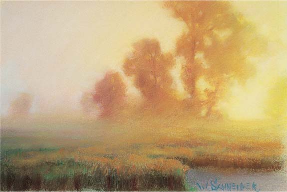
Step Five Next I complete the foreground. The darkest values are in the front: red-violet 3, burnt sienna 3, and black. I use a light touch of denatured alcohol and a brush to solidify those darks. Then I indicate some of the grasses with olive green 5 and chrome green 5. I use strokes of burnt sienna 5, caput mortuum red 5, and orange 5 to indicate the tops of the grasses that are bathed in the warm light of the rising sun. The trees have almost no detail; they exist primarily as silhouettes against the sky.

Step Six I sharpen the image a bit to create greater visual impact. To increase the contrast, I lighten the sky on the right with orange 9 and white. I lighten the sky on the left side with a well-blended layer of Mars violet 10. Then I paint in a few smaller sky holes into the trees using English red 7 and deep yellow 7. Next I darken the foreground with bistre 7, burnt sienna 3 and 5, and olive green 3. Finally I add a few sharp strokes of orange 5 and 3 to depict individual grass stalks that are illuminated by the sun.
Rendering Light with Value
Light is one of the most fascinating elements in a painting. You can capture the effect of light by using both value and color temperature contrasts, such as placing light and dark values next to each other and pairing warm colors with cool colors. The contrast doesn’t have to be dramatic; in fact, if the darkest and lightest colors are closer in value, the painting will seem more realistic. Contrasts in color temperature between the warm, light areas and the cool shadows have great impact. In this outdoor scene, I played up the contrast between the red and yellow light and the blue and green shadows. The warm-colored adobe dwelling appears to be intensely lit both because it is bathed in warm light and because it is placed against cool colors.

Step One I sketch the scene on off-white, sanded pastel board. (I chose off-white so my lightest values would appear rich and dark against the paper.) Next I paint the lightest value—the sunlit adobe walls—with a blend of permanent red 5, orange 5, and gold ochre 7. Then I paint the darkest value—the window—with a combination of bistre 3, carmine brown 2, and gray-green 3.

Step Two I want to establish some of the contrasting cool colors right away, so I paint the sky with a blend of turquoise blue 5, cobalt blue 5 and 7, and ultramarine blue 7, with phthalo blue 9 near the horizon. Note that the sky is not only cooler but also slightly darker than the house. I use olive green 5 and turquoise blue 5 for the hill shadows.

Step Three I use gray 5 and blue-gray 7 to block in the mountains, blue-violet 5 for the distant hill, and carmine brown 3 for the shadowed trees. For the light on the hills, I blend orange 3 and permanent red 5 into the cooler gray tones. Next I paint the foreground with orange 3 and blue-violet 5 near the horizon.

Step Four Next I paint the shadows on the house with olive green 3 and orange 3 and refine the shadows on the mountains with blue-gray 5 and turquoise blue 5. I paint the light areas of the trees with olive green 7, adding some of the same color to the ground. I apply carmine brown 3 and chrome green deep 5 to the trees by the house. Then I warm the shadows on the adobe with burnt sienna 5—particularly on the edge between light and shadow—and define the edges more clearly with gold ochre 5. I lighten the shadows on the hills with Prussian blue 7 and redraw their edges with turquoise blue 3. For the shadowy darks on either side of the house, I use Indian red 3.

Step Five Now I indicate some of the foreground texture with burnt sienna 3 and yellow ochre 3 and 5. To create the effect of sparse vegetation on the desert floor, I add different shapes of olive green 5, gold ochre 3, chrome green 7, lemon yellow 7, and light English red 7. Adding texture to the foreground makes that plane seem to come forward, and I also use these spots of vegetation to draw the viewer’s eye into the painting and direct it toward my center of interest: the adobe house.

Step Six Next I sharpen some of the edges in the shadowed windows with purple 3. I add a hint of autumn color in the trees with orange 3. I draw the fence posts with burgundy 3 and indicate the fence rails with mouse gray 5. The details I place in the foreground plants help the rest of the color shapes “read” as vegetation. I notice that I drew the windows and the chimney with a slight lean, so I correct those lines. I also straighten the alignment on the top of the house by painting in some of the hill color. Then I add a few dark accents to the house and the surrounding trees.
Portraying Animals
Animals offer a range of shapes, lines, and textures to intrigue an artist. Painting animals is like painting anything else—you simply need to see shapes of color and put them in the correct place on paper. But when painting animals, I also want to capture the unique qualities of my subject, such as the animal’s skin or hair texture and its features and body type. Consult books or magazines for appealing photographs, or take pictures of your pet. Look for subtle types of movement, like the twist of the body or the direction of a gaze. Don’t worry if your rendition doesn’t look exactly like your subject—an animal painting doesn’t have to be a perfect likeness to be appreciated.
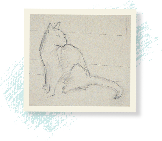
Sketching basic shapes The design of this painting is simple: The cat is silhouetted against the light of a patio door. I begin by drawing the main shapes, roughing in the outlines and sketching the lines of the glass and wood door. This pose shows movement even though the cat is sitting still. (See page 30 for more on movement and the line of action.)
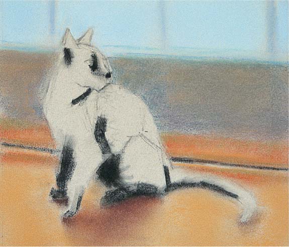
Step One First I establish the light area of the window with cobalt blue 9; then I mix black with denatured alcohol, and paint the darks in the fur with a brush. Because I want to blend the softness of the cat’s fur into the surroundings, I paint the background first. I render the wall with blue-gray 5 and gold ochre 5, blending them with my hand. Then I use burnt sienna 5 and chrome green 5 for the molding. The basic tone of the floor is gold ochre 5. Next I block in the shadow of the cat on the floor with light English red 3, carmine brown 5, and burnt sienna 5.

Step Two I lighten the floor with phthalo green 8, red-violet deep 9, and phthalo blue 9 to show the reflected light from the door. I lighten the value on the window with permanent rose 10 and use carmine 3 for the dark of the molding. Next I use a well-blended mix of carmine brown 3 and bistre 3 for the lighter colors in the fur and black for the deepest shadows in the fur.
Step Three Next I use raw sienna 5 to paint the shadows in the lighter areas of fur, making unblended strokes that follow the direction of the fur growth. For the eye, I paint the pupil black; then I draw around it with chrome green 5 grayed with scarlet 5 (its complement), touching lightly with my finger. Next I use caput mortuum red 7 for the warm color in the ear, and I use gold ochre 5, gold ochre 7, and yellow ochre 7 for the highlighted fur.

Step Four I lighten the window with viridian green 9 and darken the wall with purple 3 and blue-gray 7. Then I add vermilion 3 and olive green 3 to the molding. For the dark accents in the shadowed fur, I add unblended strokes of carmine brown 3 and bistre 3. Next I add more detail with English red 3. I indicate the reflected light on the muzzle with cobalt blue 5 and use scarlet for the light shining through the ear. Then I add a little crimson 5 to add depth to the corner of the eye.
Step Five Now I decide to shorten the muzzle, using Mars violet 5 to paint the background into the nose a bit to define its shape. Then I go over the dark patches of fur with black, particularly in the tail. I use light English red 9 and cobalt blue 9 for details in the light areas, and I add thin strokes of cobalt blue 9 that trail off into the background to create the illusion of backlit fur. Then I paint into the edge of the tail with the floor color (gold ochre 5 and phthalo green 8).
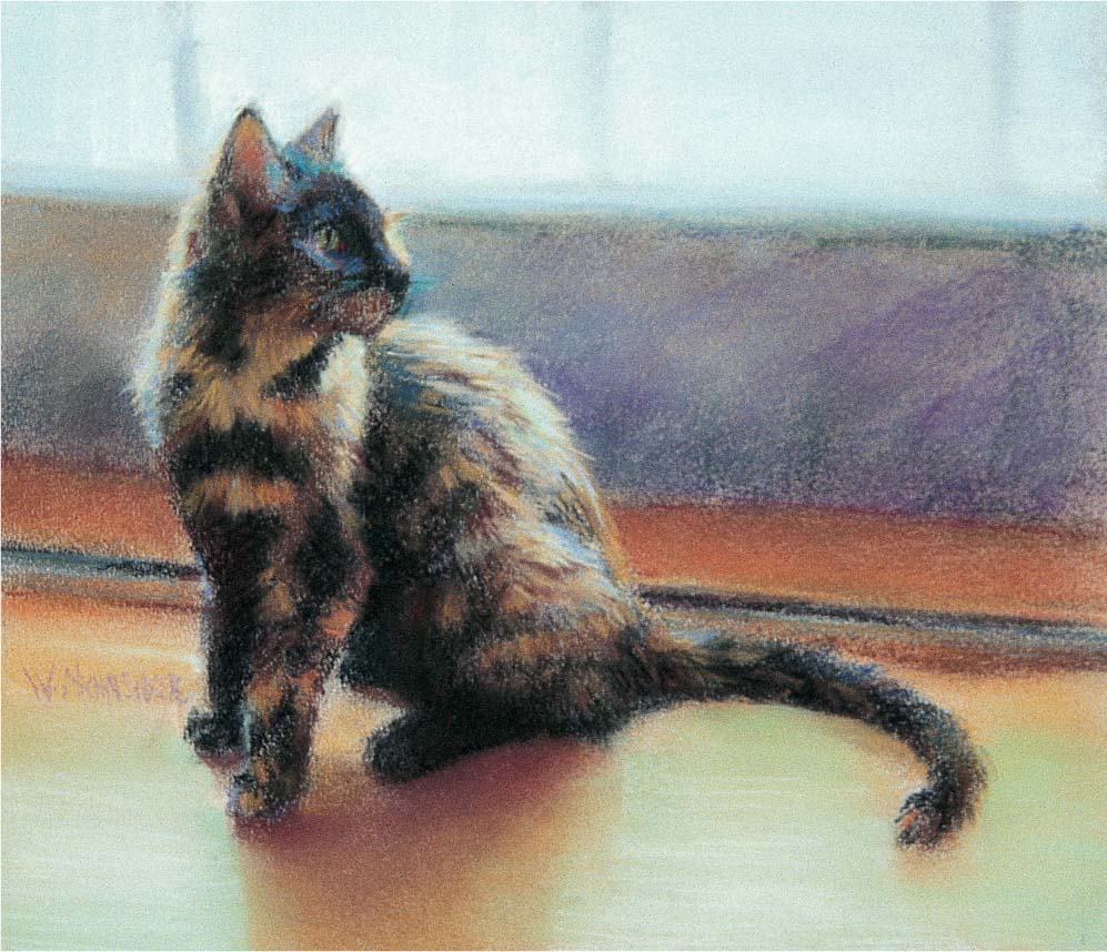
Step Six To complete the painting, I lighten the window with white to create more contrast and make it appear as if the light were shining through it. Then I add a little phthalo blue 10 to the sunlit areas of the floor, and I high light the fur with yellow ochre 10 and phthalo blue 10.
Capturing a Likeness
As an artist, creating a recognizable portrait is extremely satisfying. Although it may seem challenging at first, painting a portrait is similar to painting an animal, landscape, or any other subject; look for the basic shapes and contours, and paint what you see. The key is noticing the subtle differences in the features of each individual, such as a small nose, thin lips, or a high forehead, and then making sure they’re in the correct place and proportion. So when painting a portrait, I first define my subject’s main features, beginning with the general outline of the head. For this portrait of Bethany, I first sketched the loose contours of the face and hair; then I focused on the features and what makes each unique, carefully observing and copying the shapes and measuring the distances between them. (See “Measuring for Accuracy” on page 27.) As long as you draw what you really see (not what you expect to see), your portrait will look like your model.

Focusing on Features I want to capture Bethany’s calm gaze, so I focus on carefully defining the features of her face that contribute to that feeling. I pay close attention to rendering her wide eyes, set lips, and outstretched neck.

Step One I begin by working a light cool tone into the tooth of the paper with the side of my hand, painting around the area where her face and neck will be. I want to enhance her beautiful red hair and skin tones, so I use a thin blend of permanent red dark 8 and phthalo green 8. Then, with vine charcoal, I establish the general size of her head and the placement of her features. I also place a few strokes of ultramarine blue 3 in the background and lightly blend them with a paper towel.
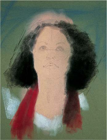
Step Two I establish the “extremes” of value, color, and definition (sharpness). I paint the darkest dark first—the shadows in her hair—after wiping off some of the green base tone with a paper towel. Then I paint over the black with a little denatured alcohol and a brush to saturate the paper so none of the white shows through. I establish the lightest light—the blouse—with blue-gray 9, followed by the most intense color for the scarf with scarlet 5. The sharpest edge is her right cheek; all other edges will be softer.

Step Three Next I paint in the warm shadow patterns. For the shadow on the side of her face and under her chin, I use primarily Indian red 3, with a little olive green 3 to cool it slightly. I paint the darks under her upper eyelids with Indian red 3 with a little black. I use vermilion 3 for her nostrils, madder lake deep 5 for her lips, and alizarin crimson 3 for the dark corner of her mouth. I establish the pupils of her eyes with black, and place some olive green 3 to indicate the irises. I’m not concerned with the large shapes and colors at this point.

Step Four Here I block in more of the background tones with a deep gray-green. Then I paint the cool color of the “white” in her left eye and the shadows on her blouse with blue-gray 3. Next I darken her upper eyelashes with black and add some strokes of burnt sienna 5 for the dark red of her hair. I place madder lake deep 3 in the corners of her mouth and in her nostrils to darken them. I blend every stroke with the side of my finger to keep the edges soft.

Step Five I use a few strokes of orange 3 to indicate the light areas of her hair and then move to the light side of her face. I apply layers of permanent red deep 8 and phthalo green 8, blending well in the light areas. For the highlight on the right side of her nose, I use cobalt blue 8 and permanent red deep 9. Then I add some burnt umber 3 and alizarin crimson 3 to her eyelashes. I use two different values for the “whites” of her right eye: On the light side of the eye, I use blue-gray 7; on the shadow side, I use blue-gray 5 and 3. Note that the edges in eyes are all very soft; the only sharp stroke in the eye is the highlight of cobalt blue 9. Opposite the highlight, I place some olive green 5 on the iris. I use carmine 7 for the midtone on the front plane of the nose and chrome green 8 for the highlight. I darken her upper lip with Indian red 3 and vermilion 3, and use carmine 7 for the highlight on her lower lip.

Step Six Now I paint the light masses of the hair with broad strokes of scarlet 5, permanent red deep 5, and madder lake deep 5. I add touches of cobalt blue 7 to the light areas of her skin and lighten the highlight on the side of her nose with phthalo blue 9. I add a highlight on her left eye with blue-gray 5. Then I paint the highlight on her lower lip with red-violet 5; for the highlight above her lip, I use phthalo green 8. I add more darks to the background with black-green 3. Then I draw in a few light strokes for the curls in her hair. I add the curl on her forehead with Indian red 3 and burnt sienna 5. I also add some olive green 5 to her hair to give it some variety and contrast. Finally, I place a few bold strokes of permanent red light 5 in her scarf and use Indian red 3 to indicate the cast shadows on the edges of her blouse and scarf.
MEASURING FOR ACCURACY
For portraiture, an accurate drawing will automatically produce a likeness. Accuracy is really nothing more than careful measurement. At the beginning stages, I’m not concerned with details—I just want the placement of the features to be correct. First I establish a basic unit of measurement (usually the width of one of the model’s eyes). Then I use this unit to measure and mark the distances between each facial landmark. (See photo and caption at right.) I also consider the angles between the features by comparing my model’s face to the face of a clock. I use a pencil to represent the hands of the clock, which helps me determine the angle at which to place the features. (For example, I might decide the eyes should be placed at 10:00 and 2:00.) Once I’m confident my measurements are correct, I look carefully to see what is unique about each feature and draw their basic shapes. I assess my work from a distance and make any necessary corrections.

Choosing a good unit of measurement In this example, I use the model’s right eye as a unit of measurement, and then I measure all the other facial proportions based on one “eye-width.” (See diagram at left.) For example, the highest part of her eyebrow is one eye-width above her lower eyelid. I also look at general proportions—the distance from the top of her eyebrows to her hairline is a bit less than the distance from the base of her nose to the top of her eyebrows. Angles are also important; the pupil of her right eye is at about 9:30 in relation to the inner corner of her eye.
Using Colored Paper
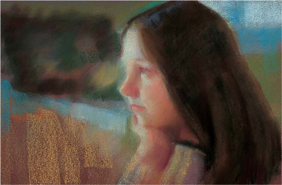
When you work on colored paper, the support becomes an integral part of the painting, instead of just a surface to be covered with pastel. Unless the color is applied very heavily, the pigment sits on top of the raised grain, allowing the paper to show through the strokes. There fore the paper you choose can either set the overall tone for the painting—light, medium, or dark—or provide a warm or cool color contrast. The paper color can also be used to either add weight and depth to your painting, stand in for a dominant color, harmonize with the palette, or provide a contrasting tone. You can also choose a colored ground that will serve as a middle value and remain uncovered, so that all you need to paint are the light and dark values. For this painting of Katherine, I chose a warm burgundy paper as the base color to complement and mingle with the warm reds and yellows in the shadows, beautifully offsetting the cool, reflected light on Katherine’s face. And by letting the paper stand in for some of the color, I was able to keep the background loosely painted, maintaining the focus on my subject.

Candid Photos Normally it’s best to paint from life; our eyes see colors, values, and edges much more accurately than a photo can reproduce them. But a camera can be useful for capturing fleeting expressions, such as this one of Katherine gazing wistfully out the window.

Step One I first apply a thin, light base tone of alizarin crimson 8 with a layer of phthalo green 8 around the area where I will place the face. I blend the color with circular movements and work it into the tooth of the paper with the side of my hand. Then, using soft vine charcoal, I draw in the main features. This is the most important step in capturing a likeness, but is also the most mechanical. I start by defining the top and bottom of the head and the general profile. I go from one facial landmark to the next, comparing each to the previous feature. (See pages 26 and 27.)

Step Two Next I establish the darkest dark (the shadow areas of her hair and sweater). I use a soft paper towel to wipe off the light pastel where her hair will be, and then I cover the area with black. I dip a soft brush in denatured alcohol and paint the dark pigment thoroughly into the tooth of the paper. Then I place a swatch of ultramarine blue where the highlight in her hair will be. I also establish some of the background colors with olive green 5 and blue- gray 5. I like to work on the background and foreground of a painting at the same time—this way the whole piece has a sense of color harmony.

Step Three Now I establish the shadow pattern on her face, keeping in mind that the cool light produces warm shadows. I use Indian red 3 for the deepest shadows under her chin and a 5 value for the lighter shadows on the side of her nose and around her eye. For the halftone (middle value) on the side of her cheek, I use carmine 8, blending the colors to produce a soft, even tone. I add a few strokes of dark vermilion to indicate some of the deeper shadow in her hair. I also block in the brown rectangular shape on the left side with burnt umber 3. Then I suggest the window with mouse gray 7 and cobalt blue 7, and I add warm orange strokes of burnt sienna 5 to the foreground.
Step Four I work the halftones by applying alternating layers of carmine red 7 and olive green 8. On the lower third of her face, I use the same colors in a 5 value with more emphasis on the green. I use the side of my finger to wipe and blend the strokes, so the skin to appears smooth. Next I cool the shadow under her chin with olive green 3 and use Indian red 5 for the shadows on her upper lip and in the corner of her eye. I paint the shadowed sleeve of her left arm with mouse gray 5 and blue-violet 5, adding gold ochre 7 and phthalo green 7 for the lighter areas. I work burnt umber 3 into her hair and lighten the highlight with cobalt blue 7.

Step Five I use thin layers of permanent red 9 and phthalo blue 9 for the lights in her forehead and permanent red 8 and cobalt blue 8 for the lights in the middle of her face. I add the lights in the lower third of her face with permanent red 8 and chrome green 8. Then I darken the shadow of the upper eyelid with a little black; I also touch black in the center of the eye to indicate the pupil. I work more colors into the background, with strokes of gold ochre 3, carmine 3, and olive green 5, blending them slightly.

Step Six To finish, I use burgundy 2 to indicate the deepest dark tones under her chin and in the corner of her mouth; then I place umber 2 in some of the recesses of her hair. I add the highlight in her eye with a single dash of turquoise blue 10. Opposite and below the highlight, I place a touch of chrome green 5. I blend in a stroke of chrome green 10 for the highlight on her nose. I sharpen the edge of the sweater on her left sleeve with blue-gray 5. Then I blend strokes of orange 8 and olive green 8 to show where the light catches a few strands of hair. Finally, I add a red-violet deep 7 highlight on her lower lip.
Developing the Human Form
Throughout the ages, artists have been captivated by the beauty of the human form. Learning to paint the human figure is just a matter of seeing how the basic shapes flow to gether into a form. Think of the body as composed of a series of cylinders—or rounded oblongs—and the head as a sphere. After drawing the basic shapes, simply develop them into solid forms with varying values, shadows, and highlights. Before you start sketching, examine your subject to determine the line of action—an imaginary line (or lines) that establishes the extent and direction of the pose. It can be a simple curve in the back, as in this seated figure, or the complex angled limbs of an athlete in motion. Just make sure that all the parts of the body conform to the line of action. In this woman’s graceful pose, the curve of her body extends from her head through her leg, which is then counterbalanced by her supporting right arm.

Establishing the Pose First I sketch the outline of the figure using vine charcoal. All I want is the overall gesture of the pose and the line of action. I also indicate where I will block in some background around the figure.

Step One I place my extremes first. Then I paint the lightest light—the hip and upper leg—with permanent red deep 8 and phthalo green 8 and rub them into the tooth of the paper with my hand. The darkest dark is the black of her hair and the shadow to the right. To ensure that none of the paper shows through, I blend the black into the paper with a light wash of denatured alcohol. Then I block in the most intense color: the vermilion red to the right of her shoulder.

Step Two Next I paint the shadows on the figure with olive green 3 and 5 and caput mortuum red 7. I use umber 3 for the darkest part of the shadow, which lies between the halftone and the reflected light. Then I add some background colors to set off the figure. I use burnt sienna 3 for the darkest areas in front of and to the right of the figure. I wipe it with a paper towel to blend the strokes and to remove all but a thin layer of pastel. I then use turquoise blue 5 and phthalo blue 3 for the area below and behind the figure.

Step Three I add a few bold, unblended strokes of permanent red 5 to the right of her head and above her left shoulder. I cool the edges of her leg with phthalo green 7. This helps create the illusion that the leg is turning away from the viewer. Next I lighten the highlight on the thigh with permanent red deep 9, cobalt blue 7, permanent rose 10, and gold ochre 9.

Step Four To soften the curve of her body, I paint some of the background red into the edge of her shoulder and add turquoise blue 5 to the space between her right arm and her back. I lighten her leg by adding pure white and blend each stroke of the skin tones with a swipe of my finger. Next I add ultramarine blue 5 to her hair for the highlights. For the reflected light on her buttocks, I use blue-green 5; for the reflected light on her arm, I use scarlet 5. I add a stroke of gold ochre 9 for the highlight on her left leg and burnt umber 3 to indicate the dark shadow above her calf.

Step Five I add a few more bold strokes of color to the background. Then I use bistre 3 to sharpen the upper edge of her thigh, the area around her knee, and the area around her chin. I also slightly sharpen the edges around her buttocks. Finally I add a few strokes of red-violet 7 to lighten the background on the far right. I step back again and assess the painting. I am satisfied that I have captured the pose accurately and have rendered the forms well without overworking the piece.
Depicting Flowers
Flowers are wonderful subjects for pastel. There are so many varieties of flower that you can produce dozens of paintings without ever portraying the same flower twice. A bouquet of several flowers offers the opportunity to use the brilliant pigments of pastel to their fullest. When arranging a group of flowers, strive for an asymmetrical setup to add a sense of movement. Your painting will be much more effective if the arrangement is dynamic and the blossoms aren’t carbon copies of one another.

Step One I draw the main shapes using vine charcoal on a dark-toned, sanded pastel board. I place the center of interest (second peony from the left) slightly off-center and position another blossom in front of the vase. I sketch in a vertical centerline for the vase and then measure how far the sides are away from that line. I establish the darkest values using ivory black and carmine brown 2. Because this is a sanded support, I won’t blend with my hands. I work the colors into the support with a brush dampened in denatured alcohol.

Step Two I use blue-gray 7 and lemon yellow 7 to establish the lightest light. Then I apply madder lake deep 5—the most intense color—for the center of interest. Next I paint in the background flowers with Indian red 5 and blue-gray 3, and I block in the tabletop with mouse gray 5. I use blue-violet 3 for the vase and blend the strokes with a paper stump and an occasional swipe of my fingers.

Step Three Next I fill in the background with gray-green 3 and indicate some of the leaves with olive green 3. I create the flowers on the table with madder lake deep 5, and I paint the bud on the right with Indian red 5. Then I add Indian red 3 to the vase and add blue-gray 5 to the middle white flower.
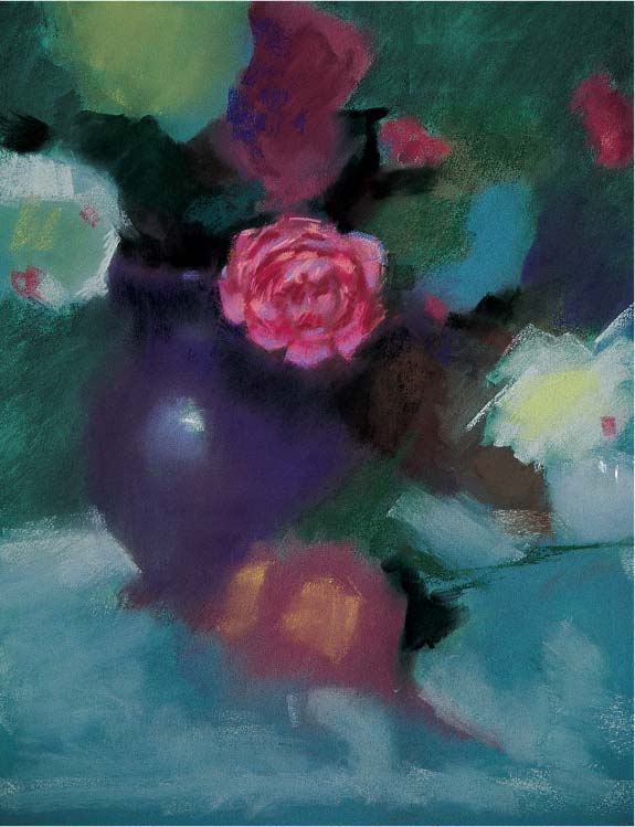
Step Four I paint around the center flower with cobalt violet 2. Then I use blue-violet 5, carmine 5 and 7, and permanent rose 7 for the lighter areas; for the deep recesses between petals, I use burgundy 3. I paint a few strokes of gray 7 to show where the light is hitting the two white flowers, and then I draw the stems of the peonies on the table with blue-green 3, adding yellow 5 for the lighter petals. I paint the darker parts of the vase with cobalt violet 2 and use a little black to help define the area below the top rim. I indicate the main highlight by first creating a lighter area with blue-violet 5 and then adding a sharp (unblended) stroke of phthalo green 8. I sharpen the edge of the vase on the lower-left side with gray 5 and blend the rest of the vase into the background.

Step Five I add blue-gray 5 and 7 to the white flower on the lower right. I paint the dark recesses between petals with blue-violet 3, olive green 5, and yellow ochre 3. Then I use Indian red 5, red-violet 7, and lemon yellow 5 for the pink flowers lying on the table and burgundy 3 for the dark shadows. I paint the leaves with olive green 5, and I highlight the lower peonies’ leaves with turquoise 7. I blend virtually every stroke to keep the edges soft.

Step Six For the lights on the distant pink flower and buds, I add blue-violet 5. Then I refine the light peony at the top left with simple strokes of blue-gray 5 and 7 and indicate the recesses with yellow ochre 3. As I move away from the center of interest, I add less detail, which reflects the way we see. When we look directly at an object, we see sharp edges and a wealth of de tail, whereas objects in our peripheral vision appear less sharply defined.

Step Seven I darken the center of interest with permanent rose 5 and blue-violet 5. I also refine the outline of the petals to make them less regular. Then I darken the vase with cobalt violet 2 and simplify the folds in the tablecloth with blue-gray 7 and 9. I use phthalo blue 10 to make the light at the edge of the table appear to come forward, and I define the outer petals of the three top white peonies with simple strokes of blue-gray 7. Finally I add a couple of small, sharp strokes of cobalt blue 9 to indicate the highlights at the neck of the vase.
Detecting Color in White
Like any white object, snow has a wonderfully reflective surface—therefore, it mirrors the colors of the sky and other elements around it. I love the way the interlocking light and dark shapes in a snowy winter landscape create visually interesting patterns, while the roughness of the terrain adds more variations in color temperature and value. In this scene, the only true white areas are the lightest highlights, where the sun hits the snow directly. Rather than making my shadow areas a flat gray, I fill them with touches of the cool blues and greens reflected from the sky and the surrounding trees and bushes. Reflected colors don’t have to be dramatic to make an impact; subtle variations can be just as effective.

Simplifying a Subject This photo shows the intricate details of these trees, but I simplified them greatly in my painting. You don’t have to render every branch and leaf to make a believable tree; just paint the shapes you see, and the viewer’s eye will fill in the details.
Step One I want the dominant color of this piece to be blue-green to help evoke the cold feeling of this day. I begin by toning the sky with blue-green 7, deep yellow 9, red-violet 9, and phthalo green 8, making the top part of the paper a little darker than the lower part. Then I draw in the main shapes with vine charcoal, indicating where I want the dark shapes to be sandwiched between lights. Now I’m ready to establish the darkest darks.

Step Two I paint the trees with a warm mixture of vermilion 3 and ivory black. Then I brush a denatured alcohol wash over the area to make sure none of the light paper shows through. Next I indicate the background with turquoise blue 5 and the wispy clouds with blue-gray 8. I then create the lightest light in the snow with deep yellow 9 and 12 and scarlet 10. These colors are almost white, but they maintain a bit of warmth that helps to portray the bright sunlit snow.

Step Three Because the snow reflects the blue sky, there is a cool tone to the shadows in this piece. Here I use blue-gray 5, mouse gray 7, and blue-violet 3 and 5 to indicate the shadows that mirror the trees and bushes. I make the more distant shadows a little lighter and more violet in tone, and then I blend all the shadows with the side of my hand.

Step Four Now I block in the pine trees. I add black and scarlet 3 for the shadowed branches and ultramarine blue 3 near the deepest darks. For the rest of the pine trees, I use a mix of blue-green 3 and olive green 3. Because the trees are backlit, there are very few variations in value; however, I paint some of the places where light shines through the branches with olive green 5.
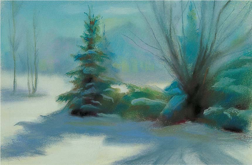
Step Five Next I render the branches of the pussy willow with mouse gray 3 and burnt sienna 3, keeping the edges soft by blending every stroke. I also add the trunks of the bare trees on the left with mouse gray 5 and raw sienna 5. I draw in the shadowed clumps of snow on the pines with gray 7 and ultramarine blue 7. Because I notice a warm tone in the shadow near the base of the trees, I paint it with olive green 5. Look for changes like this in temperature (not value); these details will strengthen the sense of realism in your paintings.
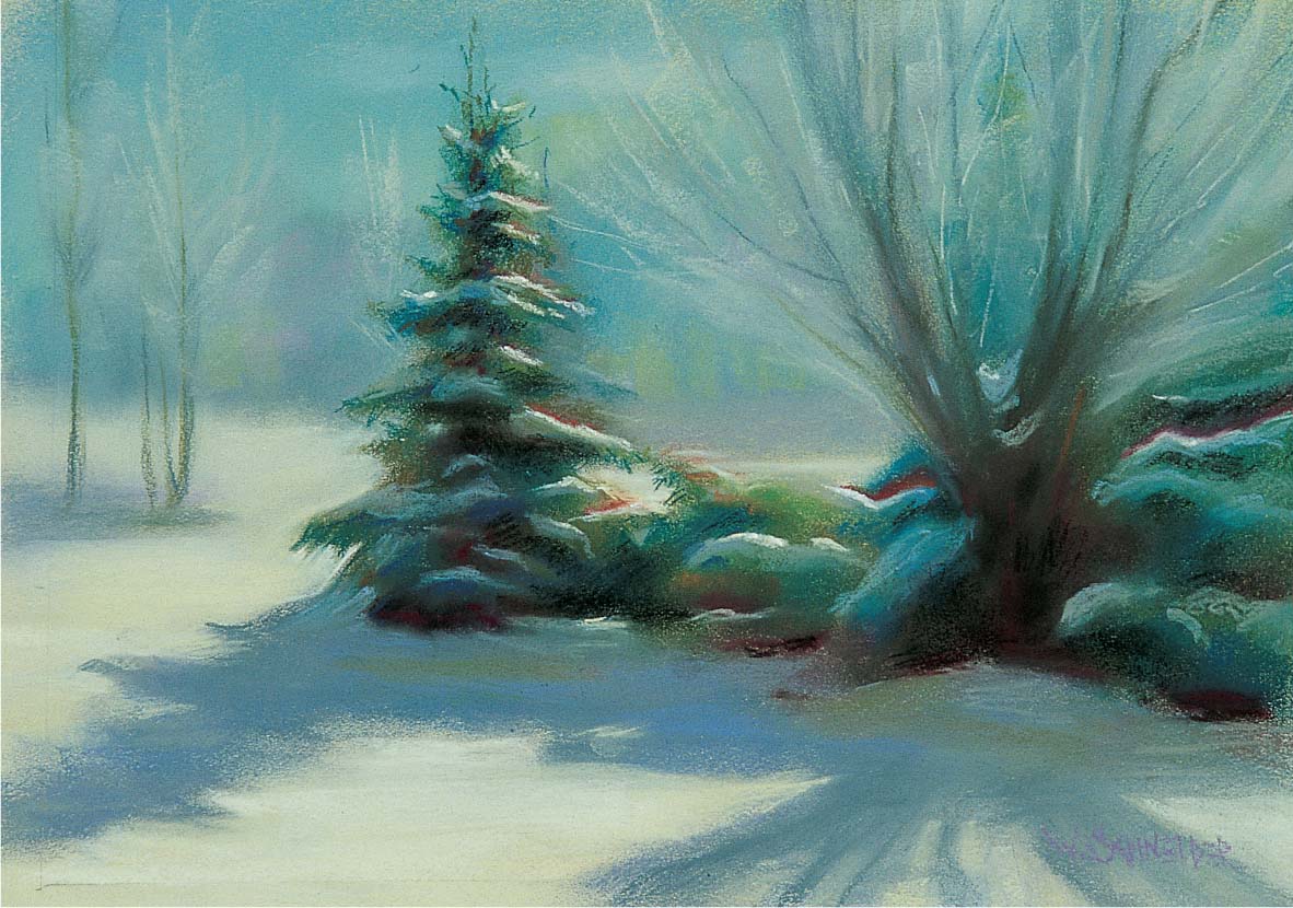
Step Six Here I add deep yellow 12 and white for the snow highlights on the edge of the boughs. I outline the white in some areas with permanent red light 5 and blend it away from the snow. This creates the effect of warmth in the air above the snow. I use green-gray 9 to indicate the frosty, backlit branches of the trees on the left and the pussy willow branches on the right. To sharpen the edge on the left side of the pine, I use deep yellow 12 and leave those strokes unblended. I make sure there is always at least one sharp edge in any subject. If all the edges are equally soft in a painting, the subject can look fuzzy. And if all the edges are hard (a common mistake), the painting will look as if the objects were flat cutouts pasted onto the background.
Deciding What to Paint
Selecting what to paint is a wonderful expression of your personal style, taste, and creativity. The more strongly you feel about your subject, the more your emotions will show through in your work, and the more successful your paintings will be. So try to pick something that you care about or that inspires you—your children, your garden, your pet, vacation photos, or natural wonders. For this painting, I was moved by the majesty of Mount Rushmore, and I like the composition and sharp perspective of this scene. Looking up from a worm’s eye view emphasizes the grandeur of the monument. And for me, the dramatic contrast between the solid, pristine blue sky and the numerous gray colors in the rocks makes this painting that much more inspiring and compelling.

Transferring a Drawing Because this drawing needs to be precise and the sanded board I’m using makes it difficult to erase any lines, I first work out the composition on a piece of translucent paper. Next I punch tiny holes in the paper along the lines of the design. Then I place the perforated drawing (called a “cartoon”) on top of the pastel board and apply charcoal dust to the outline with a soft brush. The charcoal dust goes through the holes, thus transferring the design to the pastel board. Then I connect the dots on the board with a piece of vine charcoal.

Step One I start by blocking in the blue of the sky. (I won’t be distributing the colors in an equal ratio; more than half of the picture area will be blue sky.) I apply a base of sapphire blue 5 and wash it into the tooth of the board with denatured alcohol and a brush. Although the sky seems very even, it is actually composed of a number of colors: I add ultramarine blue 5, cobalt blue 5, lemon yellow 7, and red-violet 7 and blend them with the side of my hand. Then I add a little more lemon yellow and red-violet at the bottom.
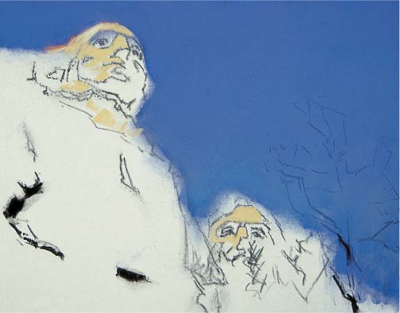
Step Two Next I paint my darkest dark, bistre 3, in the crevices of the rocks. I am careful to select those crevices that emphasize the perspective; notice that they point toward Washington’s head. Then I apply lightest light with yellow ochre 7 and 9, and I add a little permanent red light 5 for a “halo” effect at the top of Washington’s head. Next I redraw the tree on the right with charcoal; this tree is important to the design because it helps establish the scale of the massive stone sculpture.

Step Three I paint in the shadow pattern on the mountain with mouse gray 3. The sunlight is warm, so the shadows are cool (they’re picking up some of the blue of the sky). Since I’m rendering stone, I blend my strokes much less than I normally would. Harder edges “read” as more angled planes, which is perfect for painting rocks. Then I place the darks in the trees with Mars violet 3, carmine brown 3, and bistre 3. I block in the rest of the trees with blue-green 3, and I apply gray 8 to the roughly chiseled stone below Washington’s face.

Step Four Although the tone of the mountain is much less intense than the bright blue sky, it’s still very colorful and more than a compilation of various shades of gray. I begin by applying strokes of blue-violet 5 and turquoise blue 7 to block in the base colors of the mountain. Then I tone down these hues with green-gray 9 and gray 8. I want to keep harder edges here, so I do not blend these strokes to any great degree.
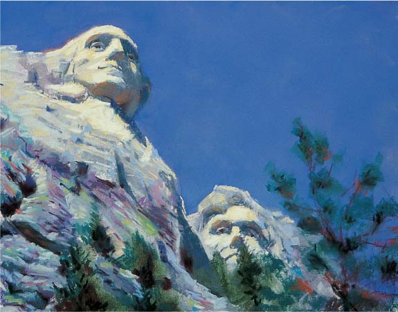
Step Five I deepen some of the key dark areas with carmine brown 3, bistre 3, and black-green 3. The reflected light under Washington’s chin and brow helps define the form, so I paint it with permanent red light 5, burnt sienna 5, and caput mortuum red 7. Then I modify the green in the rocks with olive green 8 and green-gray 9, and indicate some smaller cracks and recesses with carmine brown 3. Next I lighten the sunlit areas of the heads with yellow ochre 10 and orange 12.

Step Six Here I add the final details. I use black to deepen the crevice on the left side of the painting, and I indicate some of the lighter areas of the pine trees with chrome green 5 and blue-green 7. Then I sharpen some of the sunlit edges on Washington’s head with gold ochre 10 and orange 12. Finally I use burnt sienna 5 to render the dead pine needles on a few of the branches.
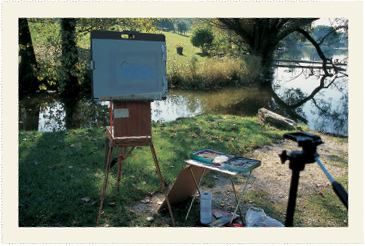
Painting Outdoors
The best thing you can do to hone your artistic skills is to go outdoors and paint directly from life. And because pastel is such a rapid and responsive medium, it is ideal for painting en plein air and recording the effects that often change so quickly in nature. Morning dew, shifting clouds, and crashing waves all can be captured with a few quick, decisive strokes. For this painting, I was able to re-create the cool morning light before the sun warmed and the colors shifted. Another advantage of pastel is that I don’t have to premix my pigments, wait for the colors to dry, or worry about keeping brushes clean—in short, there are no tiresome procedures. And because I don’t need the extra supplies, such as brushes, knives, or mixing mediums, my traveling art pack is light and portable.

Working from Life Photos are convenient, but they still only offer pale imitations of nature. This photo lacks many color nuances and values compared to my final painting. And squinting only allows you to simplify values or see hard edges when you are working outdoors.

Step One I begin by toning the light areas of my light blue paper with thin layers of light yellow 5, red-violet 7, and cobalt blue 5, using the side of my hand to rub the pastel into the tooth of the paper. I sketch in the main elements of the scene with vine charcoal and begin painting the black in the tree mass. Next I paint the sky with layers of cobalt blue 5 near the top, turquoise 7 and raw sienna 7 in the middle, and cobalt blue 7 near the bottom. I also add lemon yellow 5 near the horizon, since clear skies tend to be darker at the top and lighter near the horizon. I paint the trees on the far shore with mouse gray 5 for the trunks and the deepest shadows, and olive green 5 for the light areas. I gray the trees further with a layer of red-violet 5 to enhance the sense of depth. For variety I add blue-green 5 to a few trees and burnt sienna 5 to another, blending each stroke with my finger.

Step Two Water is like a mirror—it reflects the colors in the sky and nearby objects. Because the darker area of the water is closest and the lightest area is farthest away (reflecting the horizon), I add blue-violet 5 and cobalt blue 5 to the foreground water and red-violet 7 to the background. Then I blend the color transitions in the sky and water with the side of my hand, and add a few strokes of lemon yellow 7 for highlights on the water. For the light areas of the dock, I use gold ochre 7; for the darks, I use mouse gray 5 and red-violet deep 3. I block in the general mass of the closest tree using olive green 3. Then I add a warmer Indian red 3 to the trunk. I paint dark reflections on the water with olive green 3 and gray-green 3, and I work chrome green 8 grayed with red-violet 8 to the light areas on the far shore to indicate the sunlit grass.
SETUPS FOR PAINTING EN PLEIN AIR
When I paint outdoors, I use a French easel that is light and easy to transport. I place my support on a board with clips, and I use a TV tray to hold my pastels (although you can buy portable pastel boxes that attach easily to a portable easel). You may also want to bring a folding chair or collapsible stool if you prefer to sit while painting. I’ve found it’s best to work on smaller supports when plein air painting—they are easier to transport and there is less surface space you have to cover in a limited timeframe. Plastic bags are handy for disposing of any trash, and you might consider bringing along some clips or twine to secure your setup in case it gets windy. Sunscreen and/or a hat are essential (even on cloudy days), and you should never hike out too far without some food and water. The more flexible you can be when you’re painting outdoors, the more you will enjoy the experience. Nature provides an endless array of subject matter—so go outdoors and have fun painting in pastel!

Step Three Because water is an imperfect mirror, the reflections are darker than the objects reflected (but very dark objects appear slightly lighter in reflections). Here I darken the tree mass and the reflection with gray-green 3 and burnt sienna 3. Then I sharpen the edges of the broken branch by painting some of the sky color into its edges. Next I add leaves with olive green 3 and define the spaces between the branches with strokes of olive green 8 and orange 5. I use a few strokes of olive green 5 to indicate the grass near the tree trunk.

Step Four Next I add strokes of ultramarine blue 5 in the water to represent the sky holes in the reflection of the tree. Here I blend my strokes less so they appear bolder; then I apply cobalt blue 5 to indicate ripples cutting across the reflected branches. Next I add a few more warm darks to the trees with burnt sienna 3, and I add a hint of the sky color behind the tree with cobalt blue 5 and blend it into some of the spaces between branches (the negative spaces).
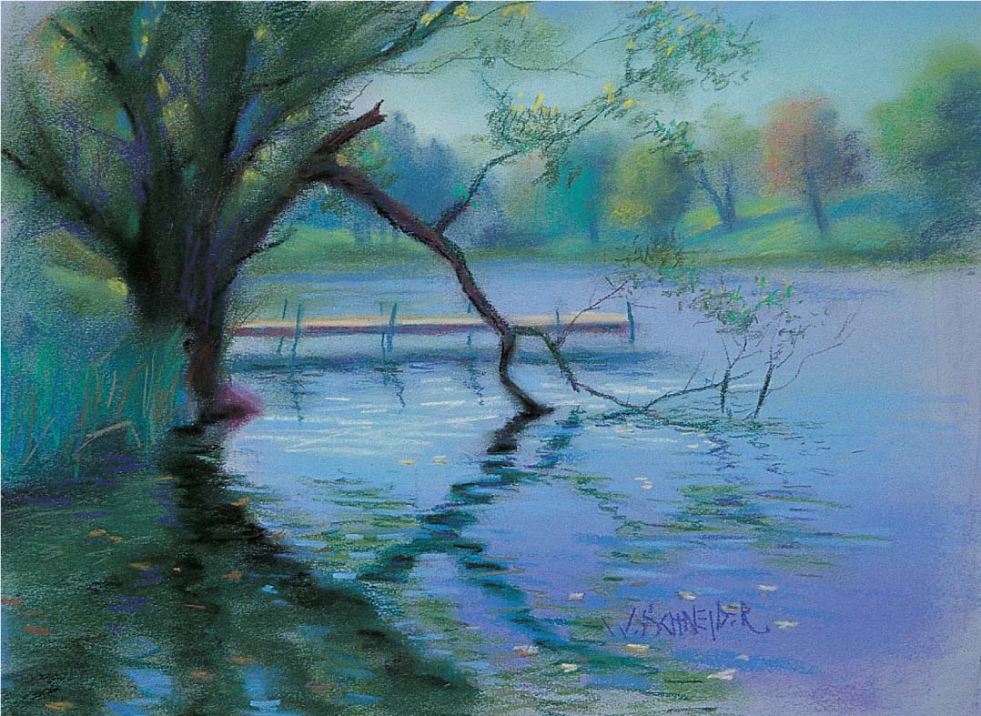
Step Five To make water appear flat, it helps to somehow indicate its surface plane—the definition of the edge of the shore, the highlights, the ripples, and any floating surface matter can all help to create that illusion. Here I add more highlights to the water with deep yellow 9 and place a few of the floating leaves on the surface of the water. I use yellow ochre 3 on the shadowed sides of the floating leaves and gold ochre 5 in the light areas. Then I draw a thin, dark shadow with Indian red 3 below some of the leaves to deepen the cast shadows. As a finishing touch, I add strokes of orange 5 in the foreground tree to indicate some backlit leaves. Finally I place a few strokes of gold ochre 3 to deepen the green grasses near the trunk.