Chapter 7
Aesthetic Considerations

Aesthetic Universals
The New Zealand–based philosopher Denis Dutton, author of the 2009 book, The Art Instinct: Beauty, Pleasure, and Human Evolution, has identified seven universal signatures in human aesthetics. These things are common, no matter what cultural difference may be. In summary, Dutton observes the following identifying characteristics:

Well-Designed Goes Beyond Pretty
Great design can be pretty. If pretty is the right way to deliver the right message to the right people, then by all means, a designer should make their work pretty. It’s all about connecting an audience to a client’s product or service. Design at its best uses all the artistic and aesthetic tools possible to do the job it was intended to do.
Aesthetic Truths
Aesthetics plays a significant role in cognitive processing—the way things look and feel affects the way people think or understand them. Consider the following truths when thinking about how a design can move an audience to a particular response:
• Aesthetics can communicate function and the idea of usability.
• People believe they like what they like instinctively—but, in fact, it is a learned preference.
• Color affects people on a visceral level.
• Emotions are strong differentiators because they trigger unconscious responses to the design for a product or service.
• People identify and trust certain personalities. Because personality can be conveyed through branding, people perceive a client’s personality through graphics.
In 2002, Donald A. Norman, professor of cognitive and computer science, author of the books The Design of Everyday Things (2002) and Emotional Design: Why We Love (Or Hate) Everyday Things (2005), wrote in an article for Interactions magazine, “Aesthetics matter: attractive things work better.” He goes on to essentially argue that beauty, as well as function and usability, are of equal and necessary importance in design. Norman’s work is valuable to designers because he breaks down the psychology behind what people think of as “good” and “bad” design—all helpful ammunition in conversations justifying a particular design solution to a client.
So, if we understand that emotion (feeling) and cognition (thinking) are both at work in design to create perception (intuitive knowing), then having all three things addressed by the designer, in the context of their target audience, is how to move design beyond the merely visual into a deeper meaning. When that happens, a design concept will strike a true and lasting chord with the audience.
Understanding Aesthetic Dynamics in Design
Psychologists, philosophers, and designers all study aesthetics. There are numerous theories and schools of thought on the specific details on how to use aesthetics and how it fits into the way people think and feel, or to use a fancy way of saying it, the cognitive-effective framework.
There is a duality in responding to the differences between thinking and feeling, yet both must be addressed by the designer. For example, how much order provides coherence before it becomes boring to a certain group of people? How much complexity provides an intriguing puzzle that requires audience involvement? How long before that involvement frustrates them and the audience moves on to an easier, more apparent format? The line between these polar opposites seems to be always in flux—ask a different group of people, and get a different answer. This is where a designer really earns their fees. First by understanding, then by graphically interpreting the aesthetic requirements of the audience they are designing for, is one of the key strengths a designer must have. This is what separates a technician from an artist or a good designer from a great one.

ABOVE
Great aesthetic design lives at the intersection of four main factors: style, function, story, and iconography. Balancing these within the specific context the design will be used in allows the target audience to make an intellectual and emotional connection with the client’s message.
Key Aesthetic Questions
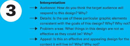
If a designer boils it all down to the essential, there are a few critical questions they need answered in terms of aesthetic considerations. These questions refer back to the primary questions asked during the designer’s creative briefing session. They include

Case Study in Aesthetic Considerations
Modern Dog Design Company / Seattle, Washington USA
Founded in Seattle Washington in 1987 by Robynne Raye and Michael Strassburger, Modern Dog Design Co. creates intriguing, thought provoking, and often quite cheeky design in interactive and print medias. “Right from the start, if a job came along that we didn’t think we would enjoy, we turned it down—even when we really needed money,” says Strassburger. “We always said to ourselves, ‘What if a really fun job comes in and we’re stuck doing this?’ That screening process was a key factor in our development as a company.” That philosophy has lead to a variety of projects, including branding, identity, product development, illustration, custom lettering, publication design, websites, character design, and naming in an array of stylistic approaches for a broad range of clients.
Fainting Goat Gelato
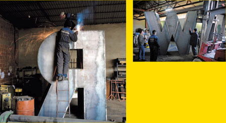
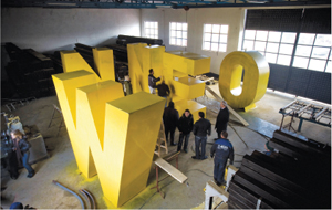
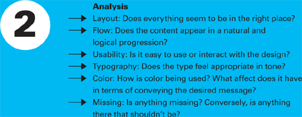
Fainting Goat is a family-owned and run organic gelato shop located in the Wallingford neighborhood of Seattle. Their gelato is made from locally grown, organic dairy and sugar, and is handcrafted on site. Lower in both fat and calories when compared to traditional ice cream, it’s a lighter and healthier sweet treat. Modern Dog designed their identity and store signage with aesthetics that reflect the handmade quality of the gelato itself.
At the heart of Modern Dog Design Company’s work is what Raye describes as “bold, imaginative, and playful design.” It is diverse, and nearly always exhibits a razor sharp sense of humor. Famed graphic designer Rick Valicenti wryly observed that their work “is the complete archaeological core sample of late twentieth century or maybe earlier American graphics.”

K2 Japan
“In the early ’90s we were introduced to K2 Japan through our affiliation with K2 Snowboards here in the US,” notes Strassburger. “The people at K2 Japan who hired us thought our work looked very West Coast American. For several years, we designed their skis and collateral materials—we even designed and wrote a comic book that was used as a giveaway.” The comic book proved to be so successful that the characters Modern Dog designed (left) were turned into life-size costumes and made live appearances at Japanese retailers and trade shows. Aesthetically, these designs proved so popular that they launched scores of imitators, making Modern Dog’s designs the dominant visual language for winter snow sport gear in Asia. This cross-cultural exchange was an interesting working experience. “When we initially traveled to Japan to work on a line of skis with them,’ says Raye, “we were not prepared for the culture shock. If you’ve ever seen the movie Lost in Translation, then you have a pretty good mental picture of what that was like. But we did have a lot of fun, and we are proud of all this work.”

Phinney Neighborhood Associates
This poster is for the Phinney Home Tour, an event produced by the Phinney Neighborhood Association (PNA) in the Seattle area.
Modern Dog has done many posters for the PNA over the years, including ones for their Artwalk and Garden Tours. “Our goal was to capture both themes in the poster,” explains Raye. “In the past, the home tour posters have usually featured a photograph of a house on the tour. The bird is looking at the little house and wondering if he can get a look inside it. In case you’re wondering, his friend Mr. Hummingbird lives there.”
Olive
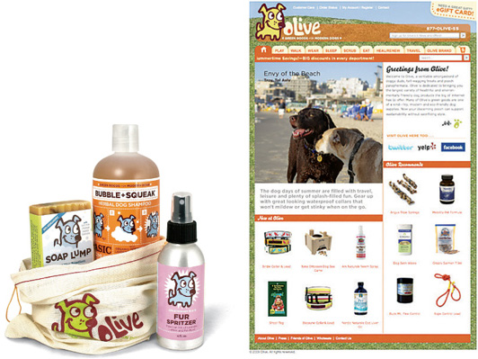
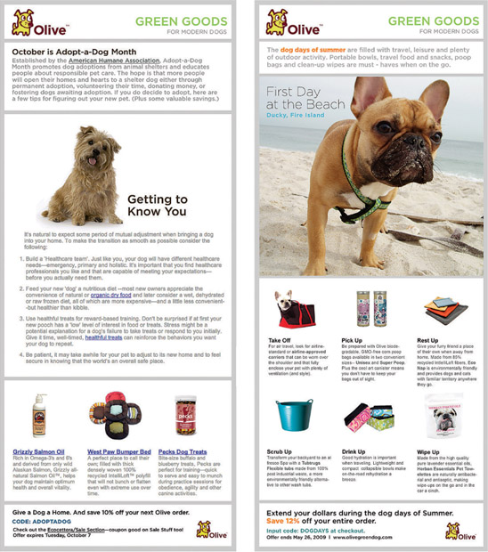
Olive is dedicated to featuring the largest variety of healthful and environmentally friendly dog products available online and beyond. Modern Dog has worked with Olive founders Gina Quiroga and Barb Savidge for several years launching the brand and creating everything from packaging to email marketing blasts. “I had no experience with graphic design,” says Quiroga. “But from the very beginning Modern Dog included us in the process. As we went along, the dialogue led to a broad range of Olive-branded goods. We agreed to a financial arrangement that allows them to participate in our success and allows us access to their exceptional skills. We couldn’t be happier.”

Modern Dog named, as well as designed, a variety of products for Austin, Texas–based Olive. “Some of our favorites include Soap Lump, Fur Spritzer, and Bubble + Squeak organic dog shampoo, “says Raye. “It’s great to work with a company that truly cares about our environment and not only talks the talk, but walks the walk. Olive spa products contain nothing yucky—no parabens, no sodium lauryl/laureth sulfates, no phthalates—and are completely biodegradable.” The muslin bag is imprinted with the lovable Olive logo. The products are guaranteed to be gentle on dogs and the Earth, something the design also conveys aesthetically.

Modern Dog helped create this company’s identity from the ground up. They developed a friendly dog character, which is central to the identity system. One of the central messages all of the designs for Olive must express is that they are makers of “Green Goods for Modern Dogs.”
Monthly e-blasts created by Modern Dog have proven to be an effective marketing technique for Olive. “To help save money and time, we designed three templates that can be used repeatedly,” explains Strassburger. “Since most of Olive’s sales are driven by their online store, the e-blasts are an important part of their business: sales always spike immediately following their release. We have the process streamlined and now most e-blasts only take a couple of hours to complete.” The designers even use their own dogs as models—that’s Raye’s Cairn Terrier, Conan, left.
Evaluating Aesthetic Choices
Presenting a design and explaining the aesthetic considerations and creative decisions in a business/audience context is a great way to increase a designer’s approval ratings. However, it is not a certainty that the design will be accepted. That still takes great presentation and persuasion skills. Selling a design and getting approvals every time is something a designer gets better and better at the more they do it.
Managing the Conversation
When presenting any design, make sure to discuss the following. These tips keep the conversation at a level that emphasizes the designer as a skilled professional consultant and not an exotic artist:
• How this design positions the client in their competitive landscape
• The client’s business goals and how this design helps meet them
• The audience’s needs, expectations, aspirations and how this design works to satisfy them
• The overall tone and content and how it supports the client’s message(s)
• Feasibility: how this design will be rolled out on time and on budget
• New opportunities that presented themselves in the course of developing this design
Avoid discussions that focus on the following:
• Minutia of graphic choices
• Personal preferences
• Reactions not based on the creative brief
Getting Clients to Participate
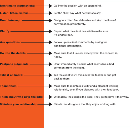
A designer should encourage both positive and negative feedback from the client. If the client expresses resistance to a particular design, make sure to explore their concerns with professionalism and an open mind. Remember that the client usually knows their business and their consumers better. Their gut instinct that a design misses the mark must be considered and weighed appropriately.
Sometimes, clients have difficulty speaking the language of design and aesthetics. It is not in the realm of their comfort zone. It can be kind of like speaking a foreign language. Therefore, clients are often unable, or unwilling, to provide clear feedback. It’s up to the designer or open them up and encourage them to try to articulate what the pluses and minuses of a particular design are for them.
Avoid the Negatives
One of the biggest mistakes a designer can make is arguing with the client. The designer has been paid to do a job, they do it to the best of their ability, and they present it to their client in the best way they can. If the client doesn’t believe it solves their problem or addresses their needs, it is up to the designer to convince them. Sometimes, however, it is simply impossible. No matter how eloquently the designer presents the work or how passionately they argue the design’s appropriateness, the client just doesn’t agree, or maybe, they simply don’t like it.
In order for the designer to not get caught in an endless loop of revisions and/or the creation of new concepts, it is critical to have clear feedback in order to know how to proceed. It is also critical to have indicated in the contract for the project, right up front, how many revisions are included in the designer’s fee. Sometimes, if a designer fails to argue their design solution effectively, they can fall back on contractual limitations to get their design approved. In that instance, the client is forced to accept a design, or increase the designer’s fee, in order to see additional solutions. That’s not a great situation to be in. It is far better to argue the design convincingly and get the client to agree wholeheartedly.
Case Study Aesthetic Considerations
Stanley Wong / Hong Kong, China
Stanley Wong Ping-pui, also known as “anothermountainman,” is an award-winning, Hong Kong–based advertising guru, graphic designer, photographer, filmmaker, and fine artist. He has held creative director positions at some of the world’s largest advertising agencies in Asia, including J. Walter Thompson; Bartle Bogle Hegarty; and TBWA Hong Kong. “I was never taught how to draw—I just did it,” says Wong. “In school, I was always assigned to do the school posters. I liked to enter logo design competitions, too. If I hadn’t joined the graphic design and advertising field, I might have become a teacher. I was trained to ‘teach’ design, not actually ‘do’ it.” Wong creates installations, both art projects and commercial environments, along with graphic design, branding, and television commercials. “I define myself as a social worker using visual communication as a tool to raise people’s awareness on various issues.”
Redwhiteandblue
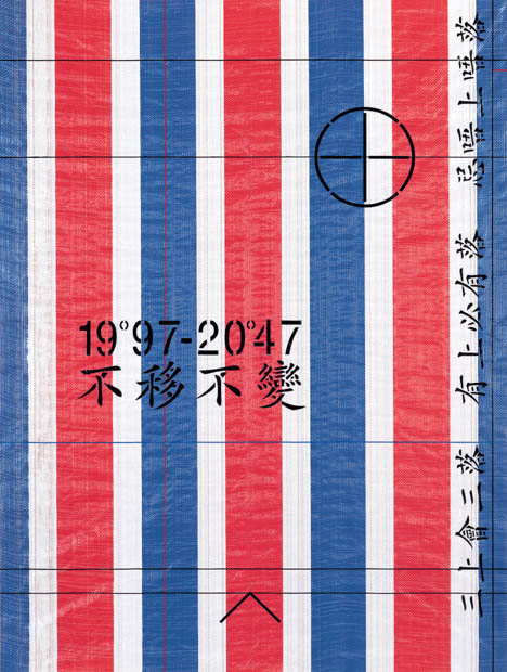
Redwhiteandblue is an ongoing art, design, and social commentary project by Wong. This series, which takes the form of posters, installations, objects, and books, plays off of the ubiquitous red, white, and blue tricolor woven bags found in Hong Kong—the city’s de facto flag. It conveys the positive spirit of Hong Kong using the colors as a jumping off point. The project won critical acclaim, and is part of the permanent collections at Hong Kong and Victoria & Albert museums.


The Redwhiteandblue posters, left, are silkscreened on colored fabric. Wong further explores the concept by creating fabric-wrapped three-dimensional objects, like the vases and jars, opposite. With this work, Wong uses a simple color scheme as a graphic unifier—both literal and symbolic. “Our Hong Kong, our home, since the ’97 handover [to China], has become shrouded in an atmosphere of mutual distrust, noncommunication, and non-consensus,” explains Wong. “I try to promote the positive spirit of Hong Kong in two and three dimensions.”
Case Study Aesthetic Considerations
Stanley Wong / Hong Kong, China
Redwhiteandblue
The synthetic tricolor fabric was Japanese in origin, and produced in Taiwan for use as shopping bags. It has been in use since Hong Kong’s British-ruled colonial days. Initially, this red, white, and blue cloth was used to make a popular bag for carrying foodstuffs and necessities from Hong Kong to mainland China through Shenzhen, the first city you reach after crossing the British/Chinese border. The fabric is still used as carrying bags, store canopies, coverings in construction sites, and other uses.
In high art and daily life, the fabric has become a kind of flag, symbolically acknowledging and reminding people of their Chinese heritage.
Wong transforms this ordinary stuff into something extraordinary to become an icon of Hong Kong and its people. He has created Redwhiteandblue for over a decade. Wong’s intention is to tap into aesthetic preferences of Hong Kong and design things that spark conversation and open a dialogue about the city and its culture.
The LEE Ka-sing Gallery in Toronto, Canada, wrote about the series: “Wong approaches this tangible material with great sensitivity, seeing beauty in it, finding meaning in the inexhaustible applications Redwhiteandblue offers in everyday life. The process of continual discovery of this ‘urban icon’ in different Asian cities makes him post the questions: When and where? An identity which becomes more and more difficult to define, and increasingly blurry in the shifting landscape of globalism.”


Case Study Aesthetic Considerations
Stanley Wong / Hong Kong, China
The Cave Living of Exception / Act-itude
With an aim toward promoting Asian culture and beauty, the Exception / Act-itude retail environment, designed by Wong, features recycled or found objects to create a profound sense of passing time and the enlightened reuse of beautiful objects. It is a truly unique shopping experience. Located in Beijing, China, the store for this upscale retailer of ecofriendly clothing and home accessories for a sustainable lifestyle is divided into a variety of spaces. The shop features an art gallery, coffee corner, book corner, main fashion area, and fitting rooms. Rows of spotlights on beams are spread over the canvas ceiling, with smaller ceiling lights used to line the hay cave and floor spotlights that illuminate clothing displays and design features.

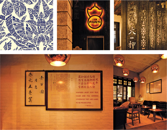
The Pawn
The Pawn restaurant and bar occupies one of the few old buildings left in the densely populated Wan Chai district of Hong Kong. Located on Johnston Road in a former site of the “Wedding Card Street,” which is a casualty of recent urban renewal in the area. Whole blocks of buildings in this area have been razed and replaced. However, both Wong, who branded the Pawn and designed the interiors, and his client have an avid interest in Hong Kong history and its preservation. The restaurant building once housed a pawn shop, and the design nods to this aesthetic while being a very modern eating and drinking establishment. The food and atmosphere is that of a uniquely Hong Kong gourmet pub.
Getting Aesthetic Ideas Approved
A critical responsibility of a designer is selling the client on a design as it was concepted. Accomplishing this is part informing and part charming, with a whole lot of salesmanship thrown into the mix. A designer who can’t, or won’t, effectively win clients over will soon find themselves unable to get their best ideas approved. Some tips on persuading:
Set the tone
Be on time, dress to impress, show the client respect. Set the stage for them to receive the presentation and listen to you in a positive frame of mind.
Summarize the background
A previous meeting should have gone over the research and strategy for the work. Sum it up again so that the client truly understands the context. Reinforce that this design is not an arbitrary decision.
Tell them a story
Explain briefly how this concept works. Do it in narrative form. How the idea evolved from their goals and is a logical conclusion embodied in the aesthetics of this design.
Employ relevant buzzwords
Refer back to the client’s own language from briefings. For example, if they wanted to “dominate” or “reignite,” tell them that this design does exactly that.
Give them an aesthetic solution hook
Provide something clearly definable that is also memorable. Explain the concept as a sound bite that obviously solves their problem. Let this be the takeaway they can explain to others.
Know when enough is enough
Make your case. Do it with confidence. Then stop talking and invite feedback. Think before you speak, especially avoid defense mechanisms.
Managing by Voice
Voice has some very specific and useful methods of managing client relationships. Here are three key points:
1. Communication must be clear, open, honest, and respectful
• It is vital that clients understand what you are proposing, discussing, and advising.
• Honesty is essential in our opinions and advice, as well as information about fees, fee variations, and contract agreements.
• We are respectful of our clients’ time, personality etc.
• It’s important to be pleasant and understanding.
2. Explain concepts effectively
• We always ask clients to remove themselves from the project and disconnect their emotions when we present concepts. This is extremely difficult for them, but we need them to put themselves in the position of their audience.
• Presentations are as close to the real thing as possible, so what clients see is almost exactly like what they will be getting. Our experience is that a high percentage of clients cannot accurately imagine an idea if they are not seeing the physical concept; this can introduce confusion and lack of confidence.
• Present ideas and concepts a client cannot refuse because the process and results are taking them to new exciting places—beyond their expectations.
3. Partnering with clients and forming enjoyable relationships
• We view our clients as design partners—we need them in order to get the right result.
• Clients enjoy being involved in the process because it creates a strong rapport.
• If they enjoy our personalities and we deliver tangible results, they will return in confidence and relationships grow and develop.


