
Chapter 5. Designing Successful Payment Interactions
Your user is standing at the register in a grocery store. The cashier rings up her purchases, and a total amount displays on a screen. Your user has pulled out her phone with the intent to pay using your app. What happens next? This is, of course, the crux of mobile payment design, and if the experience is unclear or broken, or simply takes too long, you can bet the user will not give your app a second chance.
Regardless of the method you utilize, the most important factors to keep in mind when plotting out your payment flow are time and effort. In the context of a shopping experience, the window during which a payment at the register happens is relatively tiny, compared with all the effort users expend in the process of purchasing something. A task analysis of a typical shopping trip reveals five phases: planning, travel, browsing, purchase, and completion (Figure 5-1). Each phase has its own set of tasks that users must complete to reach their end goal—buying groceries, for example.
When designing your checkout experience, consider the cost of user effort with the timing of these tasks, in context with all the other steps users have to take to get to this point, and think about how those previous tasks might influence their mindset. Are they annoyed because they waited in a long line? Did they find everything they wrote down on their shopping list? How many bus transfers did they make in order to get to the grocery store? In terms of mental and physical effort, the payment experience should rank near the lower end of the scale, with the least amount of friction possible.

Mobile payments are not meant to be complex, engrossing, and experiential—like games or social interactions. They should be lightning- quick and dead simple; otherwise, your app will just get in the way of your users enjoying or using whatever it is they set out to buy. It’s important to remember that interacting with your app is never the user’s end goal.
This chapter will focus on designing successful mobile interactions at the point of sale, using the three most popular payment methods: NFC, QR (quick response) codes and 2D barcodes, and geolocation. Table 5-1 shows the UX benefits and challenges of the three frameworks we will explore, and which live apps you can refer to as examples of the respective technologies in action (they are covered in depth in Chapter 3 and Chapter 4).
Framework | Benefits | Challenges | Examples |
NFC | Transaction speed, no need for data network, high security | Merchant adoption, user education | Isis, Google Wallet |
Barcodes and QR codes | Works on most devices and OSes | Dependence on data connectivity, lack of security standards, merchant acceptance | Starbucks, LevelUp |
Geolocation | Works on most devices and OSes, less effort for the user to pay | Dependence on data connectivity and GPS accuracy, user education | PayPal |
Near Field Communication (NFC)
NFC presents a whole new mode for consumers to use their mobile devices, in which they can interact with their physical environment (tags, other NFC-enabled devices) instead of being passive “receivers of information” via their phones. NFC lets mobile users tap to initiate a short-range data transfer. NFC technology can be used to open a door, pay a transit fare, or swap contact details and pictures.
Apart from the novelty of bumping phones together, NFC offers many other advantages, like being built on well-established global security standards and simplifying the redemption of loyalty cards and coupons. The latter feature appeals especially to retail marketers that wish to drive up redemption rates of their promotional programs, and explains the recent buzz around large mobile operators and device manufacturers partnering with financial institutions to put a stake in the ground of mobile wallets. This model will only become more prevalent given the growing numbers of new NFC-enabled Android, Windows, and BlackBerry phones shipping—nearly 235 million in 2013.[62] For a more in-depth look at how NFC works behind the scenes, refer back to the profile of the NFC ecosystem in Chapter 2.
Because NFC is largely dependent on hardware, and has a variety of usage patterns (authorize and tap, versus Tap & Go without opening the app), designers must create obvious feedback patterns for when the phone taps a reader, and the outcome of the payment. NFC payments also require more instructional cues than 2D barcode/QR code- or geolocation-based apps, as many users are not familiar with how NFC works. The last thing a user wants is to get to the register and fruitlessly bonk their phone on the point-of-sale with no apparent results, holding up the checkout line.
NFC Essentials
Because NFC is such an underutilized technology (especially to US users), a payment interaction with this method lives and dies by the visual and haptic cues given to the user throughout the experience: how to pay, when the phone is ready to pay, and when the payment is done. It’s key to give users clear directions and calls to action, and keep them informed of what is going on. With NFC, the actual data exchange (between the phone and the point of sale) is literally half a second, so there’s little room (or need) for lengthy transitions or complex animations at each interaction point. These three interactions are:
Initiating a payment
Tapping the phone on the reader
Receiving the payment result
Besides your app, the user will also encounter a variety of audible and visual stimuli that will be out of your purview, as there are several NFC reader manufacturers. No two NFC readers will look exactly the same, and the sounds or visual feedback they provide the user will vary (see Figure 5-2 for examples from some of the major providers in this space: VeriFone, First Data, and Vivotech). The screens you design for this experience will be the one constant as the user moves from store to store, tapping away, so it pays[63] to create a payment flow that is meaningful and reliable. So let’s explore the three interaction points in more depth.

Initiate a payment
The first step is providing a very prominent button (e.g., Pay) or status indicator (e.g., Ready to Pay) so the user doesn’t have to speculate about how to start the transaction. The nature of UI messaging here really depends on the particular implementation, and allows for the following distinct conditions:
- Tap & Go
Payments can be made whenever the device is on. The app doesn’t need to be open to pay.
- Open & Tap
Payments can be made as long as the app is open, and one of the mobile cards is turned on.
- Tap on Demand
Payments can be made only when the user opens the app and manually turns a mobile card on, and only for a brief window of time (e.g., less than 30 seconds).
An obvious, actionable path here will start the payment experience off on the right foot. For a good example of this first step, have a look at Google Wallet, which uses the Open & Tap method. It shows a large blue box that clearly reads “You’re ready to tap & pay” under the card the user has selected. For payment apps using a Tap & Go implementation, users don’t even need to open their app to pay—NFC payments are always on. In this case, you’ll want to show clear controls when the app is open that indicate when the user’s NFC app is on or off. For apps using Tap on Demand, all that’s really needed is a large button that reads Pay or Pay Now placed in the center of the lower half of the screen, which is the most comfortable ergonomic location for one-handed use. For Tap & Go and Open & Tap methods, it’s a good idea to include the contactless payment symbol (which resembles the Wi-Fi “waves” icon turned on its side) most likely to be found on the face of NFC readers, so that the user can associate your app with compatible point-of-sale registers. Refer to Table 5-2 for some examples of action buttons for these three payment modes.

Tap the phone on the reader
Use purposeful animations to alert users that a payment event is occurring, like a pulsating “halo” around the card they have selected, or animating the contactless “wave” symbol. This should be supplemented by haptic or audio cues to tell the user when a payment source has come in contact with a compatible reader. As many users are still unfamiliar with how NFC works, it may be necessary to specify that they tap the back of the phone on the reader. (In usability testing sessions I have observed, 30% of participants in the US had no idea where the NFC antenna in their phones was located.) You can do this by showing a diagram of how best to present the phone to the reader. If your app uses Tap on Demand, a large timer should be displayed to count down the seconds until the mobile NFC card will be turned off. When using the Open & Tap or Tap & Go method, you will want to notify the user that a tap has been detected, and that the results of that tap are coming soon. Figure 5-3 shows two examples of how these visual elements can work together to clearly communicate to a user that the payment is in progress.

Receive the payment result
Once the user’s phone has been read by the NFC reader, the next step is to clearly indicate to the user that the tap was successful, or that something has gone wrong, as the case may be. Account for this by using a screen that clearly shows the outcome of the payment, and reinforce that outcome with short vibration pulses or audio cues. If the NFC reader at the register doesn’t beep or light up, it’s possible the reader is off, broken, or not compatible (some shops may have old or faulty readers at their registers, oblivious to their working condition). Keep in mind that NFC readers vary in the strength of their NFC fields, so some readers may recognize a tap from inches away, while for others the phone must physically touch the reader pad (especially if the particular phone has a protective case). Lots can go wrong!
If the tap was successful, show the user the outcome relevant to the card he has selected. Some NFC readers used in South America, Europe, and Asia may be able to send back to the phone the metadata around a transaction (e.g., the amount and the name of the merchant), so include those details if possible to make the payment feedback as rich as possible. You will also need to inform the user if there are additional actions needed to finish the payment. For example, the user’s bank may have enforced a limit on the amount of purchases (e.g., any over $100) that he can make with his mobile card, so you may need to allow the user to authorize the payment with his m-PIN. This is meant to protect the user from theft or unauthorized use of his card. Table 5-3 shows some examples of possible NFC payment outcomes, and what stimuli should be offered back to the user.
Payment outcome | Feedback to the user |
Payment accepted | PAYMENT SUCCESSFUL $15.99 paid from: Visa Card ...5678 Home Depot [one short vibration pulse] |
Refund processed | REFUND $20.00 refunded to: Visa Card ...5678 [one short vibration pulse] |
Payment declined | PAYMENT DECLINED Please select another card and try again. [two short vibration pulses] |
Reader not working/not supported | PAYMENT INCOMPLETE This reader may not be working properly. Please check with the merchant and try again. [one long vibration pulse] |
User authentication required | m-PIN REQUIRED Amount: $100.00 Please enter your m-PIN to authorize this purchase. [three short vibration pulses] |
The best way to learn about this or any payment technology is to use it yourself. I would also encourage you to sign up for any NFC wallet service available to you, use it for a week or so at a variety of stores, and get a feel for how NFC phones and readers in general interact with one another. Think about how you might improve a particular mobile wallet’s experience. Table 5-4 gives a sampling of NFC payment initiatives, listed by country (as of this writing).
Putting It All Together
Now let’s take a look at some typical NFC payment scenarios, and see how the three steps (initiation, the tap, the result) work together. For this book, I’ve put together some flow diagrams and basic wireframe concepts to illustrate each step.
The first one, shown in Figure 5-4, is a user flow for a Tap on Demand payment. Here the user must first intentionally activate a payment by tapping a button (1), such as Pay or On, which will turn on the mobile card for a brief interval of time. A countdown timer displays, and the user is prompted to hold her phone over the NFC reader (2). Once the payment is complete (3), the app lets the user know with vibration pulses or audio cues, accompanied by the amount of the purchase, the name of the merchant (when possible), and the card that was used.

In the case of Open & Tap (Figure 5-5), the app is ready to pay as long as the phone is powered on and the app is open. The user doesn’t need to do all that much—she can pay simply by holding the phone over the NFC reader. When the reader is detected by the phone (1), an animation shows that a payment is in progress, followed shortly by the payment confirmation (2) and haptic and audio cues.
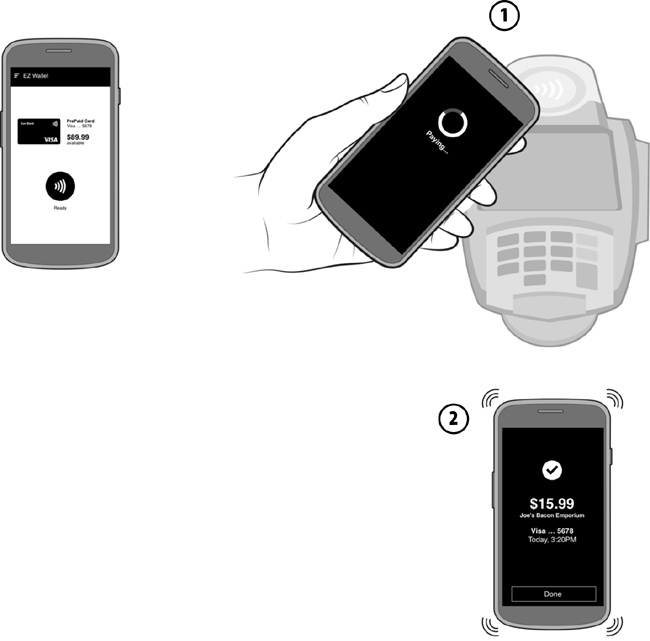
Tap & Go payments, as shown in Figure 5-6, offer a payment mode ideally suited for transit use cases, because it requires the least amount of effort from the user; she may not even have to unlock her phone’s screen. When she approaches the turnstile, the user simply taps her phone on the gate’s NFC reader pad as she passes through (1). The phone vibrates or dings, letting her know her phone has been read (2). You should make use of the OS notification drawer and any lock-screen messaging capabilities to notify the user of any taps that have happened since she last looked at her phone. When the user eventually unlocks her screen, show her a payment confirmation screen (3).

There may be times when the user will be required to authorize a payment by entering her m-PIN. This multistep process applies when the user attempts a payment that is over a threshold set by her issuing bank (such as a high dollar amount), to protect against unauthorized payments. First, the user taps her phone on the reader (1). The app shows the total amount of the purchase, and asks for the user’s m-PIN (2). The user enters her m-PIN (3) and taps the phone on the reader again (4), and now the payment is processed (5). This scenario is a little less convenient than a normal NFC tap, but goes a long way toward reassuring the user that her mobile cards are always protected from theft. This scenario is shown in Figure 5-7.
There may be times when the reader is not working or configured properly, or does not accept the tap for some reason. In this case (Figure 5-8), when the user taps her phone (1), the payment result (2) should include obvious alert iconography, messaging written in plain language should describe the error, and the user should be given options to retry or cancel the payment.


Barcodes and QR Codes
Apps like Starbucks, which use barcodes and QR codes, are fast becoming what I like to call the “gateway drug” of mobile payments. That is, consumers who have become comfortable with using 2D barcodes often find it easier to move on to NFC, geolocation, remote ordering, or other payment models. In the US, at least, Starbucks is the first real exposure that most consumers get to mobile payments, with over 10 million customers providing about 11% of the company’s revenue. Resembling a digital Rorschach image, QR codes can be encoded with data that will direct POS scanners to charge a registered account or a prepaid card. This method is generally faster to implement than NFC wallets, though it is less secure due to the exposure of the user’s payment source on screen in the form of a visual proxy. There are no encryption standards for barcode- or QR code–based wallets, so codes can be vulnerable to theft or interception. Still, with emerging concepts like tokenization, barcodes and QR codes may have a shot at supplanting NFC as the most secure method of mobile payments. The major card companies like Visa and MasterCard have yet to issue specifications that endorse these methods per se, but it’s conceivable that they will, should tokenized 2D codes emerge as the frontrunner for the consumer market.
Point-of-sale experiences with this method typically require the user to either align his phone’s screen with a POS scanner (held by the merchant or fixed to the register), or alternately use his phone’s camera to scan a code generated and presented by the merchant. Accounting for these two distinct interactions, successful designs should facilitate fast scanning while addressing user’s security concerns and need for feedback from the payment experience.
Barcode and QR Code Essentials
Regardless of whether your app is designed for consumer- or merchant- presented codes, you should adhere closely to the following best practices, which call for optimized scanning of the code images and efficient user feedback.
Show me the code
Display the barcode or QR code as soon as the app is launched. Don’t bury it under a subscreen or behind a Pay button. If the user is opening his app in a store with the intent to pay, the last thing he wants is to have to hunt for where his code is so he can show it to the merchant. LevelUp is a great example of this. However, if your app’s architecture or business rules can’t allow for this (payments are a smaller aspect of a larger wallet-like experience), try to make navigating to the code as efficient as possible. You might consider looking at using geolocation services like GPS or Bluetooth Low Energy beacons to determine whether a consumer happens to be at or near a participating merchant, so you can bring up his code when the context of use is most appropriate.
Secure the code
QR codes and barcodes are generally not secure, so dynamically generating codes using a tokenization method can help reduce the risk of exposing account details. For example, the data attached to the code could be refreshed after five transactions, making the old code obsolete and reducing the risk of a thief duplicating or redirecting the QR code somewhere else. You may also provide a security option, such as an m-PIN or password lock, to further prevent unauthorized use.
Create big codes
Make the QR code or barcode on screen as large as possible to make for a better scanning target. For example, the Gyft app for mobile gift cards forces the screen into landscape mode, to provide lots of screen real estate for displaying a linear barcode. The Starbucks app for Android uses this method as well. However, for consumer-presented codes, don’t scale the image so wide that the merchant has trouble scanning it, as most retail POS registers are equipped only with short-range readers. A needlessly wide barcode may force an awkward dance where the checkout cashier has to increase her distance from your user’s screen in order to fit the code to her scanner’s laser field.
Use the best light and high contrast
If possible, override the consumer device’s current screen brightness setting temporarily to display at the brightest level. This is a device attribute that is exposed to developers by various OS platforms, so check with your target platforms’ developer guides for the best method to accomplish this. You should refer to the Starbucks app for an example of this in practice. To mitigate any screen glare from sunlight or environmental light, stick to high-contrast, black-and-white code images. Try to resist the temptation to incorporate custom colors or images within the code pattern. Participating merchants may not be using newer multiangle optical scanners (Figure 5-9), and anything but a conventional barcode or QR code might stump them. As an illustration of this, think back to when you have seen a checkout cashier struggle to scan a barcode label on an item that was round and packed in rumpled plastic.

Use camera guides
Depending on whether your app supports scanning merchant barcodes or QR codes, you will want to help your user align the code image correctly for scanning, using a viewfinder-style box or guidelines on the scanning screen. This will help the user quickly orient the camera to the right position to get an accurate read, and eliminate guesswork.
Provide rapid payment feedback
Once the user has presented his code to the merchant (or read the merchant’s code) with his app, the next aspect is payment feedback. The user will expect to be informed whether the payment was successful, and to see some form of digital receipt that captures the amount, the name of the merchant, and perhaps an itemized receipt. To facilitate this feedback, communications between the merchant’s POS system, the web service your app uses to settle the transaction, and the user’s phone need to be as efficient as possible. Otherwise, the user will have to rely on the merchant telling him whether the payment was accepted, which is sufficient, but not a new experience. This is especially true for closed loop wallets that rely on a stored-value card (like a gift card) to fund the transaction; the user will need a way to keep track of the current balance.
Putting It All Together
Now let’s take a look at some typical payment scenarios that use image codes, and see how the user experience elements I’ve outlined come together. Here are two user flows, one for a consumer-presented QR code, and one for a merchant-presented barcode.
In Figure 5-10, the user’s app is displaying a QR code that links to her funding source. This could be a stored-value card (e.g., gift card, prepaid card) or a debit or credit card. The scanner at the point of sale picks up the QR code pattern and processes the payment (1). Shortly afterward, the app should display a notification that the payment has completed successfully (2).

In Figure 5-11, the consumer must scan the code displayed at the point of sale by the merchant. To do this, the consumer must find the QR code with her phone’s camera and align it inside a set of guidelines (1). Once the code is read and the payment has been received by the merchant, a notification displays the outcome (2).

Geolocation
Think of payments using geolocation technology like having an invisible fence around the perimeter of a store. Once the consumer crosses into this perimeter, the merchant is made aware of his presence, facilitating the opportunity for a financial exchange. This could be negotiated through the use of GPS or BLE (Bluetooth Low Energy) beacons, depending on the target devices you’d like to support. Mobile payment apps that use geolocation are significant in their lack of interactions, because there is less emphasis on the communication between hardware components as the conduit for a purchase (as seen in the NFC model). Payments in this mode don’t even require the user to pull out his phone if the merchant has been indicated by the user as a “favorite.” Apps like now-defunct Square Wallet and PayPal are designed to work “in the background,” so that a user needs only to open the door of his favorite café to open a tab. The user has a payment source stored in a secure cloud service, which can be charged only if he crosses the merchant’s geofence, or manually makes himself known to the merchant by checking in. With Square in particular, these types of transactions resemble the days when you could walk into your local corner store, and the store owner would know you by name. If you didn’t have any cash on you, you could simply put your bill on a running tab to be settled later.
Geolocation Payment Essentials
Designing for this experience is primarily driven by efficiently allowing the user to find nearby participating merchants, making transaction preference settings easy to understand, and offering the user clear feedback once his payment has been processed.
Find a store
First, ensure that searching for shops is as fluid as possible, as this payment experience relies on the user finding participating merchants before he enters the store. This means using mobile location search patterns (including map view, list view, and distance and directions to the nearest merchant) to direct the user to a participating merchant. After all, the user can’t pay if he can’t find the store in the first place. Make the store search feature a prominent option of your app’s menu, so that the user can pull it up whenever he intends to use the app.
Authorize payment easily
Consider how the user will want to initiate and authorize a purchase when he doesn’t have to hand over a traditional form of payment (like cash or a card). There are typically two patterns for initiating a payment in this type of experience:
- Automatic authorization
If the user is within range of the store, he can “check in” (intentionally or by remembering a favorite merchant) in order to make himself known to the merchant POS system. When the merchant “sees” the user in its system, it can then charge a bill to that user, and a digital receipt should be sent a few seconds later. The user’s mere presence in the store is enough to establish that he will accept any charges the merchant bills to him. This method is great for speeding up checkout lines, and can be seen in PayPal, when a PayPal register merchant “sees” a user pop up on its screen and charges the bill to the user. In this case, time is of the essence, so system speed should support expedient communication by the geolocation service that notifies the merchant that the user is checked in, the billing service that charges the transaction to the user, and the notification method to confirm to the user that the payment was received. Lag in any of these communications will give the impression that “something” is not working, causing unwanted confusion at the register.
- Manual authorization
If the user has checked in to a store, and the merchant charges a bill to that user, there could be an extra step that gives the user the opportunity to review an itemized bill before accepting the charges. After confirming that he is happy with the bill, the user can authorize the payment by pressing a Confirm or Check Out button. He may also want to add a tip to the bill. This method is great for those users for whom security is of the utmost concern, and previewing any charges made to their account gives them more control of the experience. Manual authorization may call for more system communication steps than the automatic method, meaning the speed of the overall interaction may be slightly longer, so this option may not be best for stores with high volumes of customer traffic.
Provide rapid payment feedback
As with the other payment experiences, prompt feedback is critical in making the user comfortable in the stability of this new way of paying. As any visual feedback or payment confirmation in the form of a digital receipt or a bill must be delivered via data networks or Wi-Fi, it’s key to make the web services necessary to deliver transaction confirmations as agile as possible, whether by text, push notifications, or in-app messaging. Users won’t want to wait more than 5 or 10 seconds for some kind of payment confirmation; any longer than that, and they’ll start to wonder where their money is going. This applies regardless of whether the feedback is generic (e.g., “Payment received!”) or an itemized digital bill for which the user must approve the total amount. Users will also expect to see the name and location of the merchant who charged them, to alleviate any concerns of theft or misuse.
Putting It All Together
Now let’s take a look at three interactions with geolocation for payments, and see how the three user touchpoints (locating a store, authorizing a payment, providing feedback) work together for a seamless payment experience.
Figure 5-12 shows an automatic authorization geolocation scenario. First, the user searches for the nearby merchant where she wishes to pay with the app. Once the user enters a merchant’s location, she can check in (1, 2) to make herself known to the merchant’s POS system. The merchant will see the user pop up on its list of current customers, and can then charge a bill to the user’s account (3). The user receives a notification on her phone when the purchase is done (4).

For stores that the user visits often, she may elect to set a particular store as a favorite so that the app will automatically check her in whenever she’s within range. This preference is reflected in Figure 5-13. This option (1) saves the step of the user having to open her app and manually check in every time. Otherwise, the process is the same: the user arrives at the store (2), the merchant sees the user pop up on the POS system, and the merchant charges a bill to the user (3).

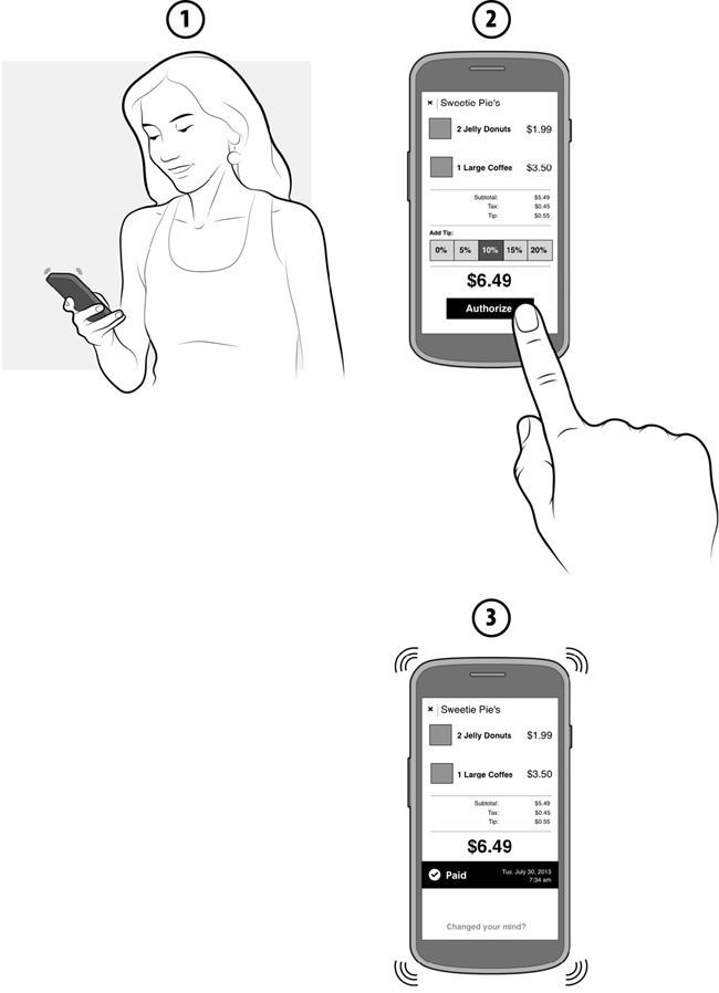
In manual authorization cases (see Figure 5-14), users will want to review the bill the merchant has charged them before authorizing the sale. For this interaction, when bill is sent to the user’s app (1), she will expect to press a button labeled Authorize or Pay (2), then receive a confirmation message (3). Tips can be added as well; ideally, the app would give the user preset tip amounts or percentages to eliminate the guesswork of figuring out appropriate tip amounts.
Summary
It’s hard at the outset to judge whether nascent payment technologies, like the ones described in this chapter, will have any significant impact on social and commercial interactions. It may seem especially hazy now, with so many ecosystem players and newfangled gadgets coming out every week that claim to disrupt the world of payments as we know it. What is clear to me is that the way we earn, save, and use our money is most certainly being revolutionized by the sum of all these different initiatives. I can’t say which will be the undisputed winner (NFC, QR codes, or whatever else comes next), and there may never be a clear winner, as users will be drawn to whichever payment method works best for them. That might still be cash. That might be the app you build.
As the world of mobile payments continues to broil, and we as designers begin to shape how these experiences will play out in the stores, it’s important to remember that the goal of a user in the midst of a grocery run is not to play around with your app. He just wants to pick up some ribeyes, get home, and grill them for his family. Still, your work in this space adds value to the user’s life by making that shopping trip slightly faster, and his payment methods safer from fraud.
This kind of service design revolution is unprecedented, and the technology enabling this change is truly groundbreaking (if not a little frustrating at times) and continues to mature every day. Still, the fundamental UX principles (like efficiency, feedback, and context) included in this chapter will remain relevant.
[62] “NFC Devices, Strategies, and Form Factors: Update and Roadmap,” ABI Research, 2013 (http://bit.ly/VVWKbB).
[63] Apologies for this pun, dear reader, but you must give me credit for waiting until you were halfway through the book to use it.