
Controls provide the fundamental UI building blocks of Cascades applications. By learning how to use them effectively, you will be able to design shiny applications where information is presented to the user in a polished and clear manner. This chapter will review the most essential Cascades controls and show you how to use them in your own applications. Considering that you will build your UI in QML most of the time, I will use QML exclusively in this chapter (you can also build your UI using C++, but that should rarely be the case in practice). UI best practices are another important topic that I will cover throughout the topics presented here. After having read this chapter, you will
- Understand how to use layouts in order to effectively arrange your application’s controls on the screen.
- Have a broad perspective of the Cascades core set of controls that you can use in your own applications.
- Apply best practices when selecting controls and creating your UIs.
Control
Control is the base class for all UI controls and contains common properties that you can set in order to specify the control’s visual appearance on the screen:
- Preferred dimensions: A control’s preferred dimensions is specified by the preferredWidth and preferredHeight properties. Some controls, such as TextField or Button, have a fixed height. Therefore, setting the preferredHeight will have no effect. The preferredWidth and preferredHeight properties are used by the parent container’s layout to position the control (I will explain containers and layouts shortly). Note that the values are indications to the layout object and could be ignored altogether.
- Maximum and minimum dimensions: Just like preferred dimensions, you can also set maximum and minimum dimensions using the maxWidth, maxHeight, minWidth, and minHeight properties.
- Layout properties: You can further refine how a control is laid out by its parent container using the control’s layoutProperties property. The value must match the parent container’s layout object. For example, if the parent container’s layout is a StackLayout, the corresponding settable layout property for a control is StackLayoutProperties (which defines the control’s relative size to other controls using space quotas).
- Alignment: You can set a control’s vertical and horizontal alignment within a container by setting its verticalAlignment and horizontalAlignment properties (the properties are taken into account only if the parent container uses a StackLayout or DockLayout). For example, using a stack layout, you can specify that the control will be vertically centered in the parent container by setting the control’s verticalAlignment property to VerticalAlignment.Center. Note that the alignment property is taken into account only if its direction is perpendicular to the current layout direction (in other words, the control’s vertical alignment in the previous example will be respected only if the parent container’s stack layout orientation is left to right or right to left).
- Margins: Margins specify some extra space around the control. The corresponding properties are leftMargin, rightMargin, topMargin, and bottomMargin. The parent container’s layout manager uses these values during layout.
- Padding: For controls such as Container, ListView, TextArea, and TextField, you can set a padding value, which specifies space between the control’s edge and its children. (Note that this is different from margins, which specify space between adjacent controls in a container.) If you don’t specify paddings for a container, the child controls will be positioned at the container’s edges.
The best way to understand the effects of these properties on the UI’s layout is to use the QML properties view under Momentics and play with the various parameters (see Figure 4-1, where a Container control has been selected).

Figure 4-1. QML properties view with a Container selected
A Container is a control for grouping other controls. A Container’s layout property governs how its child controls are displayed (note that a Cascades layout is equivalent to a layout manager in Java). Because containers can be nested, you can logically regroup a subset of your UI’s controls by adding them to a nested Container (there are actually no limits in the nesting depth, but for code readability reasons, it is a good idea to keep the nesting level to three at most). In practice, you can create extremely complex UIs by judiciously using the possibility to nest Containers with different layout properties.
You have three layouts to work with in Cascades: StackLayout, DockLayout, and AbsoluteLayout. The next section will review all three of them, with a particular emphasis on StackLayout, which should be preferred in most situations (a StackLayout is also used by default when no layout is specified for a Container).
StackLayout
StackLayout is by far the most common layout in Cascades. You should therefore invest some time in mastering it. You can use a StackLayout in order to stack controls horizontally or vertically in a Container. You specify the layout direction by setting the orientation property of a StackLayout, which can take one of the following values:
- LayoutOrientation.TopToBottom: Stacks child controls vertically from top to bottom. This is the default orientation.
- LayoutOrientation.BottomToTop: Stacks child controls vertically from bottom to top.
- LayoutOrientation.LeftToRight: Stacks child controls horizontally from left to right.
- LayoutOrientation.RightToLeft: Stacks child controls horizontally from right to left.
You can further customize a child control’s layout by optionally setting its layoutProperties, horizontalAlignment, and verticalAlignment properties. The layoutProperties property accepts an object, which matches the layout of the parent Container (for example, if the parent Container’s layout is an instance of AbsoluteLayout, a child control’s layoutProperties can only accept an instance of AbsolutLayoutProperties, and if the Container’s layout is an instance of StackLayout, the child control’s layoutProperties will take an instance of StackLayoutProperties).
Listing 4-1 and Listing 4-2 illustrate the correspondence between layout and layoutProperties.
Listing 4-1. AbsoluteLayout and Corresponding layoutProperties
import bb.cascades 1.2
Page {
    Container {
        layout: AbsoluteLayout {
        }
        Button {
            layoutProperties: AbsoluteLayoutProperties {
                positionX: 200
                positionY: 500
            }
        }
    }
}
Listing 4-2. StackLayout and Corresponding layoutProperties
import bb.cascades 1.2
Page {
    Container {
        layout: StackLayout {
            orientation: LayoutOrientation.LeftToRight
        }
        Button {
            layoutProperties: StackLayoutProperties {
                spaceQuota: 1
            }
            text: "Button 1"
        }
    }
}
In the specific case of StackLayout, the StackLayoutProperties object defines a spaceQuota property, which specifies how space is divided amongst controls. For controls with a negative space quota, the preferredSize property is used to display the control (these “static” controls are given priority over dynamic controls with a space quota larger than 0). Controls with a space quota larger than 0 are dynamically displayed once the static controls have been positioned.
For example, Figure 4-2 illustrates a UI entirely designed using a StackLayout and space quotas.

Figure 4-2. UI created with StackLayout and space quotas (portrait)
If you change the device’s orientation, you will obtain the layout shown in Figure 4-3.

Figure 4-3. Same UI in landscape orientation
The UI controls are organized as follows (see also Figure 4-2 and Listing 4-1):
- Controls are added to a root Container. Because no layout property is specified for the container, a StackLayout will be assigned to the Container with a default layout orientation value of LayoutOrientation.TopToBottom.
- The first row represents another Container (child1), which in turn holds two Button controls (button1 and button2). The Container’s layout orientation is defined as LayoutOrientation.LeftToRight. Space quotas are also used to define the Buttons’ relative sizes. In other words, a space quota defines a ratio: button2, which has space quota of 2, will occupy two-thirds of the space; and button1, which has a space quota of 1, will occupy one-third of the available space (the sum of the controls’ space quota being 3).
- button3 is an immediate child of the root control and completely fills the second row (this is because its horizontalAlignment property is set to HorizontalAlignment.Fill).
- The third row again represents a Container (child2). The Container’s layout orientation has been defined as LayoutOrientation.RightToLeft (the child controls will therefore be laid out starting from the Container’s rightmost corner). The buttons’ relative sizes have been once again set using space quotas. button4’s space quota is 4, b5’s is 1, and finally, button6’s space quota is 3. The sum of the controls’ space quotas being 8, button4 occupies half of the space (4/8=1/2), b5 occupies one-eighth, and button6 occupies three-eighths.
- The last row is a TextArea. By specifying a space quota, the TextArea fills the remaining vertical space in the UI.
- Finally, note that when the UI orientation changes, the relative control sizes specified by space quotas are preserved (see Figure 4-3).
Listing 4-3 shows you the corresponding QML.
Listing 4-3. main.qml
Page {
    Container {
        id: root
        topPadding: 20
        bottomPadding: 20
        leftPadding: 20
        rightPadding: 20
        Container {
            id: child1
            layout: StackLayout {
                orientation: LayoutOrientation.LeftToRight
            }
            Button {
                text: "button1"
                layoutProperties: StackLayoutProperties {
                    spaceQuota: 1
                }
            }
            Button {
                text: "button2"
                layoutProperties: StackLayoutProperties {
                    spaceQuota: 2
                }
            }
        }
        Button {
            horizontalAlignment: HorizontalAlignment.Fill
            text: "button3"
        }
        Container {
            id: child2
            layout: StackLayout {
                orientation: LayoutOrientation.RightToLeft
            }
            Button {
                text: "button4"
                layoutProperties: StackLayoutProperties {
                    spaceQuota: 4
                }
            }
            Button {
                text: "b5"
                layoutProperties: StackLayoutProperties {
                    spaceQuota: 1
                }
            }
            Button {
                text: "button6"
                layoutProperties: StackLayoutProperties {
                    spaceQuota: 3
                }

            }
        }
        TextArea {
            layoutProperties: StackLayoutProperties {
                spaceQuota: 1
            }
        }
    }
}
AbsoluteLayout
AbsoluteLayoutallows you to precisely set the X and Y coordinates of controls within a container. In practice, unless you are designing your UI for a very specific screen resolution and orientation, you should not use an absolute layout. As mentioned, the main advantage of the absolute layout is that you have complete control on positioning the UI elements. However, the major downside is that your UI will not gracefully handle different screen resolutions and orientations (there are cases, however, where using an absolute layout makes sense; for example, when you are designing a custom control and need to position the UI elements precisely). Listing 4-4 shows you how to use an absolute layout for positioning a button on the screen.
Listing 4-4. Absolute Layout
Container {
    layout: AbsoluteLayout {}

    Button {
        text: "Button"
        layoutProperties: AbsoluteLayoutProperties {
            positionX: 100
            positionY: 100
        }
    }
}
DockLayout
You can use a DockLayout in order to dock child controls to a specific area of the parent container. The child control’s docking area is specified by its horizontalAlignment and verticalAlignment properties, as illustrated in Listing 4-5 and Figure 4-4.
Listing 4-5. Dock layout
Page {
    Container {
        layout: DockLayout {}
        Button {
            text: "b1"
        }
       Button {
            text: "b2"
            verticalAlignment: VerticalAlignment.Center
        }
        Button {
            text: "b3"
            horizontalAlignment: HorizontalAlignment.Center
            verticalAlignment: VerticalAlignment.Bottom
        }
    }
}
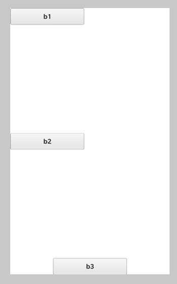
Figure 4-4. Dock layout
A DockLayout also has the following interesting characteristics:
- Controls can overlap (see Figure 4-5 and Figure 4-6). (The “z-order” determines which control is on top. Note that we used the overlapping property in the HelloCascades app from Chapter 1 in order to “hide” one image behind another.)

Figure 4-5. Dock layout with overlapping controls
- A DockLayout preserves the relative control positions if the screen orientation changes (see Figure 4-6).

Figure 4-6. Dock layout with overlapping controls
Finally, Listing 4-6 shows the QML document corresponding to Figure 4-5 and Figure 4-6.
Listing 4-6. Dock layout with overlapping controls
import bb.cascades 1.2

Page{
    Container {
        leftPadding: 20
        rightPadding:20
        topPadding: 20
        bottomPadding: 20
        layout: DockLayout {}
        ImageView {
            horizontalAlignment: HorizontalAlignment.Right;
            imageSource:"asset:///swissalpsnight.png"
            preferredWidth: 600
        }
        ImageView {
            horizontalAlignment: HorizontalAlignment.Center;
            verticalAlignment: VerticalAlignment.Center;
            imageSource:"asset:///swissalpsday.png"
            preferredWidth: 600
            rotationZ: 10
        }
        TextField {
            verticalAlignment: VerticalAlignment.Bottom;
        }
    }
}
Text is probably the most ubiquitous control in any UI. Cascades therefore gives you lots of flexibility in handling text, as well as its appearance. You can customize the text styles by creating your own text style definitions. This section will review the three main text controls, which are Label, TextField, and TextArea, and show you how to customize their corresponding text style.
Text Styles
You can customize a text control’s appearance by setting its textStyle.base property, which is an instance of the TextStyle object. In practice, you will use a TextStyleDefinition attached object to create a new TextStyle instance (in other words, the TextStyleDefinition object is a factory for TextStyle objects).Using a TextStyleDefinition, you can customize visual attributes such as font weight (light, normal, and bold), color, size, and alignment. When specifying a TextStyleDefinition, you will always start with a system default base, TextStyle, which gives you an initial set of attributes to work from. The SystemDefaults.TextStyles class gives you the following default text styles:
- SystemDefaults.TextStyles.BigText: The default text style for large text.
- SystemDefaults.TextStyles.BodyText: The default text style for body text.
- SystemDefaults.TextStyles.PrimaryText: The default text style for primary text.
- SystemDefaults.TextStyles.SmallText: The default text style for small text.
- SystemDefaults.TextStyles.SubtitleText: The default text style for subtitle text.
- SystemDefaults.TextStyles.TitleText: The default text style for title text.
Listing 4-7 shows you how you can use the default system text styles with a Label.
Listing 4-7. System Text Styles
import bb.cascades 1.2
Page {
    Container {
        Label {
            text: "This is big text"
            textStyle.base: SystemDefaults.TextStyles.BigText
        }
        Label {
            text: "This is title text"
            textStyle.base: SystemDefaults.TextStyles.TitleText
        }
        Label {
            text: "This is subtitle text"
            textStyle.base: SystemDefaults.TextStyles.SubtitleText
        }
        Label {
            text: "This is body text"
            textStyle.base: SystemDefaults.TextStyles.BodyText
        }
        Label{
            text: "This is primary text"
            textStyle.base: SystemDefaults.TextStyles.PrimaryText
        }
        Label{
            text: "This is small text"
            textStyle.base: SystemDefaults.TextStyles.SmallText
        }
    }
}
Listing 4-8 shows you how to customize a text style using a TextStyleDefintion.
Listing 4-8. Custom Text Style
import bb.cascades 1.2
Page {
    Container {
        attachedObjects: [
            TextStyleDefinition {
                id: myStyle
                base: SystemDefaults.TextStyles.BigText
                color: Color.DarkBlue
                fontWeight: FontWeight.Bold
            }
        ]
        Label {
            text: "Some bold text"
            textStyle.base: myStyle.style
        }
    }
}
The advantage of specifying a TextStyleDefinition object is that you will be able to reuse it throughout your UI without redefining text styles for each control.
Inline HTML and CSS
Besides using TextStyleDefinition objects for customizing text appearance, you can also resort to inline HTML and CSS. The supported HTML tags are: <a>, <b>, <br/>, <i>, <span>, <p>, <div>, <em>, and <strong>. Listing 4-9 shows you how to apply inline HTML text styling to a label.
Listing 4-9. Custom Text Style
import bb.cascades 1.2

Page {
    Label {
        text: "<html><b>Cascades</b> is <i>awesome!</i></html>"
    }
}
You can also embed a <style> tag inside <span> or <div> tags in order to apply CSS styling to your text, as shown in Listing 4-10.
Listing 4-10. CSS Styling
import bb.cascades 1.2

Page {
    Label {
        text: "<html><span style='text-decoration:underline'>Cascades</span> is"+
              "<span style='font-size:xx-large;font-style:italic;color:green'>awesome!</span></html>"
    }
}
Note that not all CSS attributes are supported in style definitions, but you can rely on the following ones (for additional details on how to use the attributes, refer to one of the numerous online CSS tutorials; a good starting point is www.w3schools.com/css/):
- background-color: Sets the text background color.
- color: Sets the text color (for example: red, green, gray, etc…).
- direction: Sets the text direction (for example: ltr which is left to right or rtl which is right to left)
- font-family: Specifies the text font family (for example: font-family:"Courier New", Courier, monospace;). The font-family property should hold several font names as a fallback system. You should always start with the font you want and end with a generic family.
- font-size: Specifies the font size (for example: medium, large, x-large, xx-large).
- font-style: Specifies the font style (normal, italic, oblique).
- font-weight: Specifies the font weight (normal, bold, lighter, bolder, 100, 200, 300, 400, 500, 600, 700, 800, 900). A normal font weight is 400 and bold is 700.
- line-height: Specifies the height of a line of text.
- text-align: Specifies the text’s horizontal alignment (left, right, center, justify).
- text-decoration: Specifies whether the text should be underlined or strike-through (none, underline, line-through).
- letter-spacing: Adjusts the space between letters in the text (see www.w3schools.com/cssref/pr_text_letter-spacing.asp).
Label
You can use a label control to display a single or multiple lines of read-only text by setting its text property. You have already seen labels in action in the previous examples (see Listing 4-7 to Listing 4-9).
TextField
A TextField is a single-line control that accepts text input. A TextField has fixed height and variable width. Just like a label, you can control the text styling using a TextStyleDefinition object (in other words, all the techniques described in the previous sections apply to text fields). You can specify how the text field behaves in relation to its text input by specifying its inputMode property. The following are some common values:
- TextFieldInputMode.Default: This is the default input mode.
- TextFieldInputMode.Text: An input mode for a wide variety of text.
- TextFieldInputMode.EmailAddress: An input mode for e-mail addresses.
- TextFieldInputMode.Password: An input mode for passwords.
- TextFieldInputMode.NumericPassword: An input mode for numeric passwords.
- TextFieldInputMode.Url: An input mode for URLs.
- TextFieldInputMode.PhoneNumber: An input mode for phone numbers.
In fact, a TextFieldInputMode corresponds to default values for input and content flags. Input flags determine how the text that users type is parsed and interpreted by the text field. Content flags determine how the text that users type is displayed. In practice, using one of the default TextFieldInputMode types to preset the flags is more than adequate, and you should rarely need to set the input and content flags directly. The inputMode property value also determines the kind of virtual keyboard displayed to the user when entering text. For example, TextFieldInputMode.Text is the most flexible and suitable for a wide variety of text. This mode also includes word suggestions to help users type faster. The other input modes are optimized for specific tasks such as writing e-mails or entering numeric values. For example, Figures 4-7 and 4-8 illustrate the TextFieldInputMode.EmailAddress and TextFieldInputMode.NumericPassword respectively.

Figure 4-7. A virtual keyboard corresponding to an e-mail address input (image source: BlackBerry)
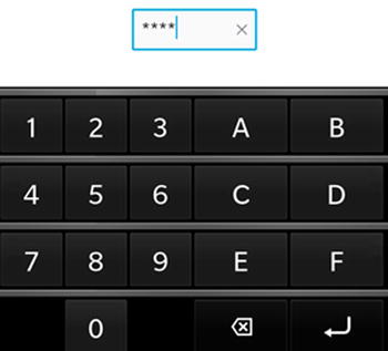
Figure 4-8. A virtual keyboard corresponding to numeric password input (image source: BlackBerry)
You can capture a TextField’s input using its input grouped property, as illustrated in Listing 4-11.
Listing 4-11. Text Capture
import bb.cascades 1.2

Page {
    Container {
        TextField {
            id: myField
            inputMode: TextFieldInputMode.EmailAddress
            hintText: "Enter email address"
            input{
                submitKey: SubmitKey.Go
                onSubmitted: {
                    // handle input when submit key is pressed
                    // by extracting text from myField.text
                }
            }
        }
    }
}
The submitKey property controls the text that will appear on the virtual keyboard’s Submit key (the Submit key is always located on the lower-right side of the virtual keyboard). The property can take one of the following values: SubmitKey.Go, SubmitKey.Join, SubmitKey.Next, SubmitKey.Search, SubmitKey.Send, SubmitKey.Submit, SubmitKey.Done, SubmitKey.Connect, SubmitKey.EnterKey, and SubmitKey.Replace.
You can also use a TextField’s hintText property to suggest the purpose of the field to the user when there is no input (see Listing 4-11).
Validator
You can make sure that the user’s input conforms to a certain set of rules by specifying a Validator class for the TextField using its validator property. For example, for a password field you could ensure that it is of a certain length and that it contains at least a digit. You can use the validator’s mode property to specify when text validation should occur. For example, by setting the mode property to ValidationMode.Immediate, the user’s input will be validated as the user types along, and by setting the property to ValidationMode.FocusLost, the user’s input will be validated once the TextField has lost focus. During validation, you can update the validator’s state by setting its state property, which can take one of the following values:
- ValidatationState.Unknown: Validation state is unknown. This state is used for cases where the validation process has not been initiated.
- ValidationState.InProgress: Validation is currently in progress.
- ValidationState.Valid: Validation has succeeded.
- ValidationState.Invalid: Validation has failed.
You should implement the actual validation in JavaScript by handling the validator’s validate signal, as illustrated in Listing 4-12.
Listing 4-12. JavaScript Validation Using a Regular Expression
import bb.cascades 1.2

Page {
    Container {
        TextField {
            id: myField
            inputMode: TextFieldInputMode.NumbersAndPunctuation
            input {
                submitKey: SubmitKey.Go
                onSubmitted: {
                    // handle input when submit key is pressed
                    // by extracting value text from myField.text
                }
            }
            validator: Validator {
                mode: ValidationMode.Immediate
                errorMessage: "Invalid integer!"
                onValidate: {
                   // regexp for valid integer including optional sign
                    var regexp = /^s*(+|-)?d+s*$/;
                    var isValidInteger = regexp.test(myField.text);
                    if (regexp.test(myField.text))
                        state = ValidationState.Valid;
                    else
                        state = ValidationState.Invalid;
                }
            }
        }
    }
}
The regexp variable defines a valid integer (for example, 10, -99, and 0 are valid expressions, but 10.0 would be considered as invalid). The important point is that I am using the regexp variable to toggle the validator’s validation state.
Finally, here a few best practices to consider:
- Use a text field to let users input a single line of text, such as an e-mail address, a password, or a contact name.
- Include hint texts in text fields (by doing so, you won’t need to add a label describing the text field’s purpose).
- Don’t use word prediction in e-mail, password, and contact name fields. Using word prediction in these cases will simply get in the user’s way.
- Provide clear error messages when using validators.
TextArea
A TextArea is very similar to a TextField and shares many of its properties (which they both inherit from AbstractTextControl). The main difference comes from the fact that a TextArea can handle multiple lines of text, whereas a TextField provides a single line. You can set the TextArea’s inputMode using a TextAreaInputMode object (the possible values are TextAreaInputMode.Default, TextAreaInputMode.Text, TextAreaInputMode.Chat, TextAreaInputMode.Email, and TextAreaInputMode.Custom). Finally, you can also use the TextArea’s editor object to track the current cursor position or the current selected text (see Listing 4-13).
Listing 4-13. TextArea Signal Handling
import bb.cascades 1.2
Page {
    Container {
        layout: DockLayout {

        }
        leftPadding: 20
        rightPadding: 20

        TextArea {
            id: myField
            inputMode: TextAreaInputMode.Chat
            hintText: "Enter some text"
            verticalAlignment: VerticalAlignment.Center
            preferredHeight: 500

            scrollMode: TextAreaScrollMode.Elastic
            onTextChanging: {
                console.log("text changing: "+text)
            }

            editor.onSelectionStartChanged: {
                console.log("selection start: "+selectionStart);
            }
            editor.onSelectionEndChanged: {
                console.log("selection end: "+selectionEnd);
            }
            editor.onSelectedTextChanged: {
                console.log("selectedTextChanged: " + selectedText)
            }
            editor.onCursorPositionChanged: {
                console.log("cursorPositionChanged: " + cursorPosition)
            }
        }
    }
}
Button
You can use buttons in order to capture touch events in your application. A Button can display some text, an image, or both. You can set the following properties on a Button:
- For sizing, you can set the preferredWidth, minWidth, and maxWidth properties. A button’s height is fixed and you cannot change it. The button’s width is increased automatically in order to fit text and images. A button will truncate its text if the text content is wider than the maxWidth property.
- The button’s text property specifies the text that will be displayed on the Button.
- You can use the image or imageSource properties for specifying an image to be displayed on the Button. In most cases, you will use the imageSource property, which will usually correspond to the URL of an image located in a subfolder of your application’s assets folder (you can also use the image property to specify a Image wrapped as a QVariant).
As explained in the previous chapters, the button will emit the clicked signal that you can handle in QML using the onClicked signal handler (see Listing 4-14).
Listing 4-14. Button Clicked Signal
Button{
   id: button
   text: "mybutton"
   onClicked: {
      console.log("I was clicked!")
   }
}
The following best practices apply to buttons:
- Set the button that users are most likely to tap as the default button. Also, don’t make a button associated with a destructive action as the default button.
- Use single-word labels when possible.
- Use verbs that describe the associated action (for example: Login, Cancel, Delete, or Save).
Slider
A Slider is a control that allows the selection of a value from a range of values (see Figure 4-9). You can set the range using the fromValue and toValue properties. You can handle the value using the onImmediateValueChanged signal handler. In practice, you will have to round to the closest integer the immediateValue passed to the handler (see Listing 4-15).
Figure 4-9. Slider
Listing 4-15. Slider
import bb.cascades 1.0
Page {
    Container {
        TextField {
           id: texfield
        }
        Slider{
            id: slider
            fromValue: 0
            toValue: 100
            onImmediateValueChanged: {
                texfield.text = Math.round(immediateValue)
            }
        }
    }
}
Use a slider when a user needs to quickly set a value from a predetermined range of values.
ImageView
An ImageView is a visual control for displaying images (you used ImageView controls in Listing 4-3 and in the HelloCascades app from Chapter 1). You can either set the imageSource property, which is a URL specifying the location of the image, or set the image property, which is a Image wrapped as a QVariant (note that when you specify the imageSource property as an absolute path on the filesystem, you must prepend the path with “file://”). You can also set the ImageView’s scalingMethod property, which specifies how the source image will be scaled within the control.
- ScalingMethod.AspectFit: Fit the image inside the area while preserving the correct aspect ratio.
- ScalingMethod.AspectFill: Stretch and crop the image to fill the entire assigned area while keeping the aspect ratio.
- ScalingMethod.Fill: Stretch the image to fill the assigned area.
- ScalingMethod.None: Content is either cropped or centered with no scaling.
Selection Controls
You can use a selection control to specify a criteria for refining the information displayed to the user. In practice, selection controls will display a list of options to the user so that he can perform a selection from the list. It is therefore not surprising that Cascades provides a wealth of controls organized around option selection. The purpose of this section is to pass the controls in review and illustrate their usage by starting with the essential building block, which is the Option control.
Option
The Option control represents the basic building block of a list of selectable items. You will therefore use an Option control combined with controls such as DropDown, RadioGroup, and SegmentedControl to display a selectable item in a list of items. You can set the Option’s text, description, and imageSource properties to display the option on the screen and provide visual feedback. The Option’s selected property indicates its state.
DropDown
A DropDown is a control that allows users to select an option from a list of options. As illustrated in Figure 4-11, a DropDown consists of a title bar and an expandable list of options. The list expands and collapses when you tap on the title bar. When the DropDown is expanded, each option displays a title with an optional description and/or image. When the user selects an option, the drop-down is collapsed and the selected option’s title is displayed to the right on the title bar.
As illustrated in Listing 4-16, you can determine the user’s selection by handling the drop-down’s selectedIndexChanged signal and/or the option’s selectedChanged signal (if an option is selected, selected=true will be passed to the signal).
Listing 4-16. DropDown
Page {
    DropDown {
        title: "Actors"
        enabled: true

        onSelectedIndexChanged: {
            console.log("SelectedIndex was changed to " + selectedIndex);
        }

        Option {
            id: clint
            text: "Clint Eastwood"
            description: "The Good, The Bad, The Ugly"
            value: "Blondie"

            onSelectedChanged: {
                if (selected == true) {
                    console.log(clint.value);
                }
            }
        }
        Option {
            id: robert
            text: "Robert De Niro"
            description: "Taxi Driver"
            value: "Travis Bickle"
            selected: true
            onSelectedChanged: {
                if (selected == true) {
                    console.log(robert.value);
                }
            }
        }
        Option {
            id: jack
            text: "Jack Nicholson"
            // description omitted
            value: "J.J. Jake Gittes"
            onSelectedChanged: {
                if (selected == true) {
                    console.log(jack.value);
                }
            }
        }

    }
}
Figure 4-10 illustrates the corresponding UI.

Figure 4-10. DropDown
In practice, you should use a drop-down when you want your users to select a single option from a list of options. A drop-down also makes your UI more compact, thus saving you some screen real estate. You should not use drop-downs when you need to select multiple interconnected values (in this case, use a picker).
RadioGroup
A RadioGroup can be used to group a set of options together. However, only one option can be selected at a time. Options are displayed as radio buttons, with an optional text describing their purpose (see Figure 4-11).
Figure 4-11. RadioGroup
You can handle option selection by responding to the RadioGroup’s selectedOptionChanged signal (or alternatively, you could also directly handle the Option’s selectedChanged signal; see Listing 4-17).
Listing 4-17. RadioGroup
// Create a RadioGroup with three options
Page {
    RadioGroup {
        Option {
            id: option1
            text: "Easy"
            onSelectedChanged: {
                if (selected) {
                    console.log("Easy selected");
                }
            }
        }
        Option {
            id: option2
            text: "Hard"
            selected: true
            onSelectedChanged: {
                if (selected) {
                    console.log("Hard selected");
                }
            }
        }
        Option {
            id: option3
            text: "Very Hard"
            onSelectedChanged: {
                if (selected) {
                    console.log("Very hard selected");
                }
            }
        }
    }
}
Use a RadioButton when users can choose between more than two mutually exclusive options.
SegmentedControl
A SegmentedControl displays a horizontal row of selectable options (in practice, you can display up to four visible options). A SegmentedControl is a great way of filtering content inside a view (for example, you will see in Chapter 5 how to use a SegmentedControl to dynamically switch QML components depending on the selected option). Listing 4-18 shows you how to create a SegmentedControl in QML.
Listing 4-18. SegmentedControl
Page {
    Container {
        SegmentedControl {
            id: segmented1
            Option {
                id: option1
                text: "Option 1"
                value: "option1"
                selected: true
            }
            Option {
                id: option2
                text: "Option 2"
                value: "option2"
            }
            Option {
                id: option3
                text: "Option 3"
                value: "option3"
            }
            onSelectedIndexChanged: {
                var value = segmented1.selectedValue
                console.debug("Selected value: " + value);
            }
        }
    }
}
And Figure 4-12 shows the corresponding UI.
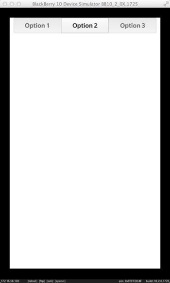
Figure 4-12. SegmentedControl
Pickers
A picker is a control for selecting items such as a picture, a file, or a date. I will describe in this section the FilePicker and the DataAndTimePicker, which come as standard controls with Cascades. (You can also create your own custom picker, but I won’t cover this here. Custom pickers are nevertheless explained in the online BlackBerry 10 developer documentation.)
FilePicker
A FilePicker allows the user to either select a file from the file system (in picker mode) or specify a name and location for saving a file (in saver mode). For example, you can use a FilePicker to load an image from the device’s photo folder in an ImageView (see Listing 4-19). (Note that in QML you must prefix the path returned by a FilePicker with “file://” before passing it to an ImageView.) You can also filter the file types by setting the FilePicker’s type property. Finally, you can use the fileSelected signal to handle selection (the signal is emitted both in picker and saver modes).
Listing 4-19. FilePicker
import bb.cascades 1.0
import bb.cascades.pickers 1.0

Page {
   Container {
      ImageView{
          id: myImageView
      }
      Button {
          text: "FilePicker from QML"
          onClicked: {
              filePicker.open()
          }
      }
      attachedObjects: [
          FilePicker {
              id:filePicker
              type : FileType.Picture
              title : "Select Picture"
              directories : ["/accounts/1000/shared/misc"]
              onFileSelected : {
                  console.log("FileSelected signal received : " + selectedFiles);
                  myImageView.imageSource = "file://" + selectedFiles[0];
              }
          }
      ]
   }
}
Also note that in the example provided in Listing 4-14, the FilePicker is an attached object property of the Container (this enables you to selectively display the FilePicker when the button is pressed).
DateTimePicker
A DateTimePicker is a control for selecting a date and/or time. You can set the DateTimePicker’s mode, which specifies how date and time are shown to the user (see Figure 4-13).
- DateTimePickerMode.Time: In this mode, the time is shown in two columns (hours and minutes).
- DateTimePickerMode.Date: This is the default mode. The date is shown in three columns (day, month, and year).
- DateTimePickerMode.DateTime: Shows the day and time in three columns (day, hours, and minutes).
- DateTimePickerMode.Timer: Shows the time in three columns, like a stopwatch (hours, minutes, and seconds).
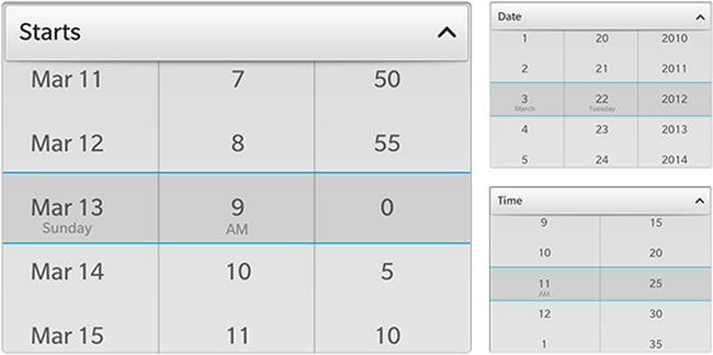
Figure 4-13. DateTimePiker (image source: BlackBerry web site)
Note that the internal representation of a date by the QDateTimePicker is a Qt QDateTime object, which is accessible with the QDateTimePicker.value property. In QML, there are several ways of setting this property: you can set the value property either by using a correctly formatted string or by using a JavaScript Date object. Finally, you can respond to the valueChanged signal to handle date changes.
CheckBox and ToggleButton
Check boxes and toggle buttons enable users to select options. Both controls inherit from AbstractToggleButton and share the following attributes:
- You can use the checked property to determine the state of the toggle control.
- You can handle the checkedChanged signal to capture state changes.
CheckBox
A CheckBox control has two states: checked or unchecked. You can also optionally display some text beside the check box explaining its purpose. If you include some text, it will always be left-aligned, and the check box will be right-aligned (see Figure 4-14).

Figure 4-14. CheckBox
Listing 4-20 shows you how to handle check box states in QML.
Listing 4-20. CheckBox
CheckBox {
    id: checkbox
    checked: true
    text: "Checkbox"
    onCheckedChanged: {
        console.log("checkbox state: " + checkbox.checked)
    }
}
In practice, use check boxes when users can select multiple items or options, which are not mutually exclusive.
ToggleButton
A toggle button is a kind of switch control, which can, for example, represent On/Off states (see Figure 4-15). Signal handling is identical to a check box.
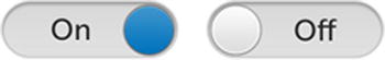
Figure 4-15. CheckBox
You should use a toggle button when users can switch between two mutually exclusive options, such as On and Off.
ScrollView
A ScrollView is a container allowing the scrolling and zooming of its content. A ScrollView provides a viewport, which displays an area of the entire content. You can use a ScrollView when the content will not fit the UI entirely (for example, that would be the case if a container included many controls). Note that a ScrollView’s content can also be an ImageView or a WebView (for example, you can use a ScrollView to zoom in or out of a picture). You can control the scrolling behavior by setting the ScrollView’s scrollViewProperties property. Listing 4-21 shows you how to include a WebView in a ScrollView.
Listing 4-21. ScrollView
Page {
    ScrollView {
        WebView {
            url: "http://www.apress.com"
        }
        scrollViewProperties {
            scrollMode: ScrollMode.Vertical
            pinchToZoomEnabled: true
        }
    }
}
Use a ScrollView when
- A control’s content does not fit the screen and you need to provide a viewport that you can navigate (by scrolling horizontally and/or vertically).
- You need to zoom in or out of content using a pinch gesture.
System Dialogs, Prompts, and Toasts
You can use the system dialog controls to pause your application flow and communicate important information to the user. System dialogs can be used to ask the user to confirm an action, notify the user of an event, or prompt the user for additional information.
SystemDialog
You can use a SystemDialog control to ask the user to confirm an action (see Listing 4-22). (Note that you need to import the bb.system 1.2 library.)
Listing 4-22. SystemDialog with User Confirmation
import bb.cascades 1.2
import bb.system 1.2

Page {
    Container {
        layout: DockLayout {
        }
        Button {
            text: "Show Dialog!"
            verticalAlignment: VerticalAlignment.Center
            horizontalAlignment: HorizontalAlignment.Center
            onClicked: {
                myDialog.show();
            }
        }
        attachedObjects: [
            SystemDialog {
                title: "Save Changes"
                id: myDialog
                onFinished: {
                    switch (value) {
                        case (SystemUiResult.ConfirmButtonSelection):
                            console.log("save confirmed");
                            break;
                        case (SystemUiResult.CancelButtonSelection):
                            console.log("save canceled");
                            break;
                        default:
                            break;
                    }
                }
            }
        ]

    }
}
To display the dialog, you need to call SystemDialog.show(). To determine the user’s selection, you need to handle the SystemDialog.finished() signal. The SystemDialog’s text property will be displayed on the dialog’s title bar (see Figure 4-16).

Figure 4-16. SystemDialog
SystemPrompt
You can use a SystemPromptto ask for some input from the user before continuing with your application flow. The SystemPrompt will display two default buttons for accepting or rejecting the dialog box and an input field for user input. You can retrieve the user’s input by calling SystemPrompt.inputFieldTextEntry() (see Listing 4-23).
Listing 4-23. SystemPrompt
import bb.cascades 1.2
import bb.system 1.2

Page {
    Container {
        layout: DockLayout {

        }
        Button {
            text: "Show Dialog!"
            verticalAlignment: VerticalAlignment.Center
            horizontalAlignment: HorizontalAlignment.Center
            onClicked: {
                myPrompt.show();
            }
        }
        attachedObjects: [
            SystemPrompt {
                title: "Enter a new file name"
                id: myPrompt
                onFinished: {
                    switch (value) {
                        case (SystemUiResult.ConfirmButtonSelection):
                            console.log("new file name is: "+myPrompt.inputFieldTextEntry())
                            break;
                        case (SystemUiResult.CancelButtonSelection):
                            console.log("new file canceled");
                            break;
                        default:
                            break;
                    }
                }
            }
        ]

    }
}
Figure 4-17 shows the SystemPrompt when displayed.

Figure 4-17. SystemPrompt
SystemToast
A toast is a simple pop-up message that is displayed for a predefined amount of time. The toast is for information purposes only and the user does not need to interact with it. Listing 4-24 shows you how to use a SystemToast to display a toast to the user.
Listing 4-24. SystemToast
import bb.cascades 1.2
import bb.system 1.2

Page {
    Container {
        layout: DockLayout {
        }
        Button {
            text: "Show Dialog!"
            verticalAlignment: VerticalAlignment.Center
            horizontalAlignment: HorizontalAlignment.Center
            onClicked: {
                myToast.show();
            }
        }
        attachedObjects: [
            SystemToast {
                id: myToast
                body: "Happy New Year!"
            }
        ]

    }
}
Summary
This chapter gave you a broad perspective of essential Cascades controls. You should now have a good understanding of the core controls and be able to use them in your own applications when designing single page UIs (the goal of the next chapter will be to show you how to add application navigation and structure using multiple pages).
Layout management is also an important topic covered in this chapter. The StackLayout was given a particular emphasis because it is the building block for creating device-independent and resizable UIs using space quotas. You also saw that in practice it is a good idea to use space quotas to define relative controls sizes instead of statically specifying a control’s preferred size. Finally, you discovered how Cascades gives lots of flexibility in styling UI text by either using text style definition objects or by using inline HTML and CSS.