5
Understanding the Widget Tree
WHAT YOU WILL LEARN IN THIS CHAPTER
- The fundamentals of widgets
- How to use a full widget tree
- How to use a shallow widget tree
The widgettree is how you create your UI; you position widgets within each other to build simple and complex layouts. Since just about everything in the Flutter framework is a widget, and as you start nesting them, the code can become harder to follow. A good practice is to try to keep the widget tree as shallow as possible. To understand the full effects of a deep tree, you'll look at a fullwidgettree and then refactor it into a shallowwidgettree, making the code more manageable. You'll learn three ways to create a shallow widget tree by refactoring: with a constant, with a method, and with a widget class.
INTRODUCTION TO WIDGETS
Before analyzing the widget tree, let's look at the short list of widgets that you will use for this chapter's example apps. At this point, do not worry about understanding the functionality for each widget; just focus on what happens when you nest widgets and how you can separate them into smaller sections. In Chapter 6, “Using Common Widgets,” you'll take a deeper look at using the most common widgets by functionality.
As I mentioned in Chapter 4, “Creating a Starter Project Template,” this book uses Material Design for all the examples. The following are the widgets (usable only with Material Design) that you'll use to create the full and shallow widget tree projects for this chapter:
Scaffold—Implements the Material Design visual layout, allowing the use of Flutter's Material Components widgetsAppBar—Implements the toolbar at the top of the screenCircleAvatar—Usually used to show a rounded user profile photo, but you can use it for any imageDivider—Draws a horizontal line with padding above and below
If the app you are creating is using Cupertino, you can use the following widgets instead. Note that with Cupertino you can use two different scaffolds, a page scaffold or a tab scaffold.
CupertinoPageScaffold—Implements the iOS visual layout for a page. It works withCupertinoNavigationBarto provide the use of Flutter's Cupertino iOS‐style widgets.CupertinoTabScaffold—Implements the iOS visual layout. This is used to navigate multiple pages, with the tabs at the bottom of the screen allowing you to use Flutter's Cupertino iOS‐style widgets.CupertinoNavigationBar—Implements the iOS visual layout toolbar at the top of the screen.
Table 5.1 summarizes a short list of the different widgets to use based on platform.
TABLE 5.1: Material Design vs. Cupertino Widgets
| MATERIAL DESIGN | CUPERTINO |
Scaffold |
CupertinoPageScaffoldCupertinoTabScaffold |
AppBar |
CupertinoNavigationBar |
CircleAvatar |
n/a |
Divider |
n/a |
The following widgets can be used with both Material Design and Cupertino:
SingleChildScrollview—This adds vertical or horizontal scrolling ability to a single child widget.Padding—This adds left, top, right, and bottom padding.Column—This displays a vertical list of child widgets.Row—This displays a horizontal list of child widgets.Container—This widget can be used as an empty placeholder (invisible) or can specify height, width, color, transform (rotate, move, skew), and many more properties.Expanded—This expands and fills the available space for the child widget that belongs to aColumnorRowwidget.Text—TheTextwidget is a great way to display labels on the screen. It can be configured to be a single line or multiple lines. An optionalstyleargument can be applied to change the color, font, size, and many other properties.Stack—What a powerful widget!Stacklets you stack widgets on top of each other and use aPositioned(optional)widget to align each child of theStackfor the layout needed. A great example is a shopping cart icon with a small red circle on the upper right to show the number of items to purchase.Positioned—ThePositionedwidget works with the Stack widget to control child positioning and size. APositionedwidget allows you to set the height and width. You can also specify the position location distance from the top, bottom, left, and right sides of theStackwidget.
You've learned about each widget that you will implement for the rest of this chapter. You'll now create a full widget tree, and then you'll learn how to refactor it to a shallow widget tree.
BUILDING THE FULL WIDGET TREE
To show how a widget tree can start to expand quickly, you'll use a combination of Column, Row, Container, CircleAvatar, Divider, Padding, and Text widgets. You'll take a closer look at these widgets in Chapter 6. The code that you'll write is a simple example, and you can immediately see how the widget tree can grow quickly (Figure 5.1).
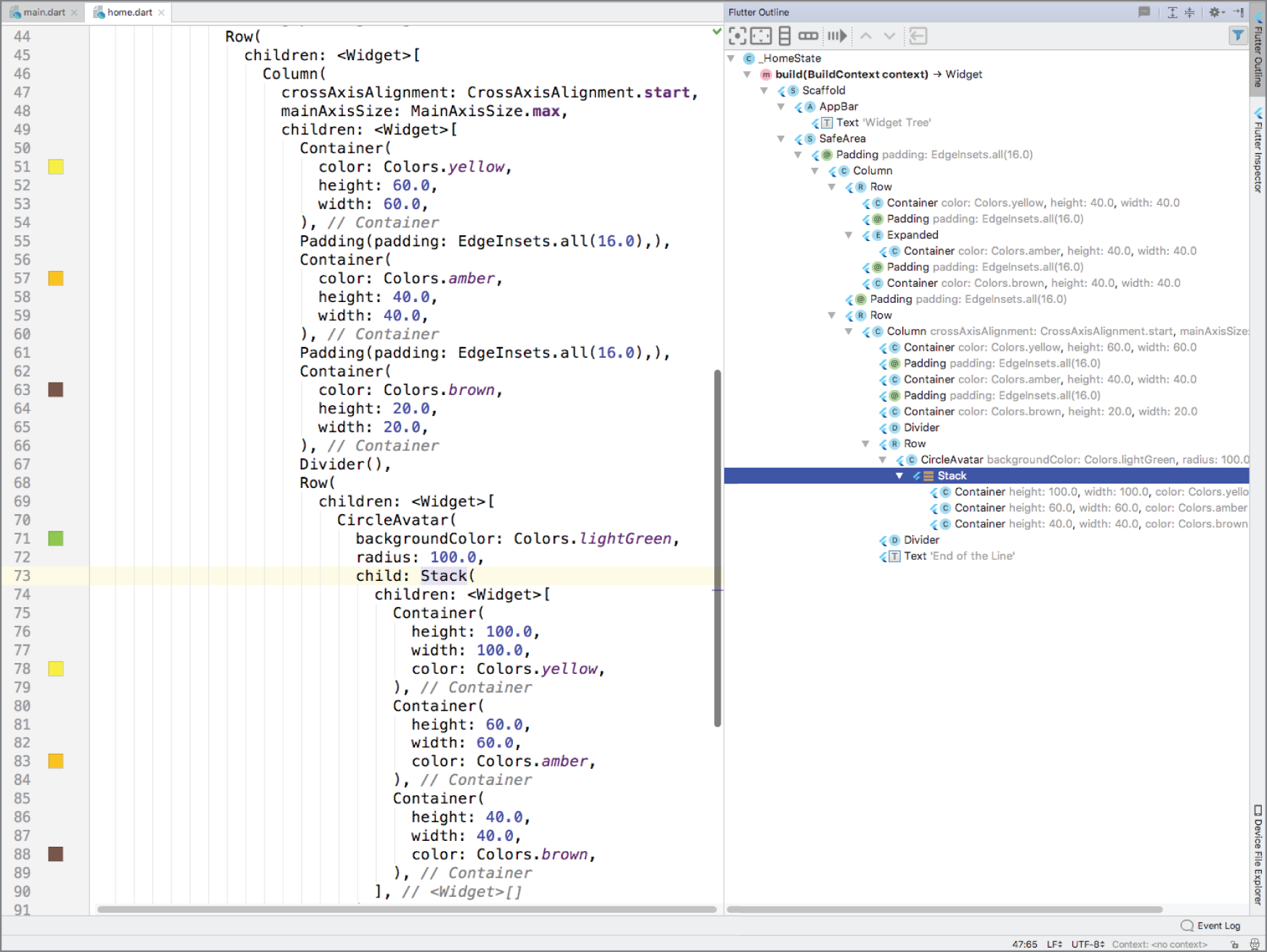
FIGURE 5.1: Full widget tree view
BUILDING A SHALLOW WIDGET TREE
To make the example code more readable and maintainable, you'll refactor major sections of the code into separate entities. You have multiple refactor options, and the most common techniques are constants, methods, and widget classes.
Refactoring with a Constant
Refactoring with a constant initializes the widget to a final variable. This approach allows you to separate widgets into sections, making for better code readability. When widgets are initialized with a constant, they rely on the BuildContext object of the parent widget.
What does this mean? Every time the parent widget is redrawn, all the constants will also redraw their widgets, so you can't do any performance optimization. In the next section, you'll take a detailed look at refactoring with a method instead of a constant. The benefits of making the widget tree shallower are similar with both techniques.
The following sample code shows how to use a constant to initialize the container variable as final with the Container widget. You insert the container variable in the widget tree where needed.
final container = Container(color: Colors.yellow,height: 40.0,width: 40.0,);
Refactoring with a Method
Refactoring with a method returns the widget by calling the method name. The method can return a value by a general widget (Widget) or a specific widget (Container, Row, and others).
The widgets initialized by a method rely on the BuildContext object of the parent widget. There could be unwanted side effects if these kinds of methods are nested and call other nested methods/functions. Since each situation is different, do not assume that using methods is not a good choice. This approach allows you to separate widgets into sections, making for better code readability. However, like when refactoring with a constant, every time the parent widget is redrawn, all the methods will also redraw their widgets. That means the widget tree is not optimizable for performance.
The following sample code shows how to use a method to return a Container widget. This first method returns the Container widget as a general Widget, and the second method returns the Container widget as a Container widget. Both approaches are acceptable. You insert the _buildContainer() method name in the widget tree where needed.
// Return by general Widget NameWidget _buildContainer() {return Container(color: Colors.yellow,height: 40.0,width: 40.0,);}// Or Return by specific Widget like Container in this caseContainer _buildContainer() {return Container(color: Colors.yellow,height: 40.0,width: 40.0,);}
Let's look at an example that refactors by using methods. This approach improves code readability by separating the main parts of the widget tree into separate methods. The same approach could be taken by refactoring with a constant.
What is the benefit of using the method approach? The benefit is pure and simple code readability, but you lose the benefits of Flutter's subtree rebuilding: performance.
Refactoring with a Widget Class
Refactoring with a widget class allows you to create the widget by subclassing the StatelessWidget class. You can create reusable widgets within the current or separate Dart file and initiate them anywhere in the application. Notice that the constructor starts with a const keyword, which allows you to cache and reuse the widget. When calling the constructor to initiate the widget, use the constkeyword. By calling with the const keyword, the widget does not rebuild when other widgets change their state in the tree. If you omit the const keyword, the widget will be called every time the parent widget redraws.
The widget class relies on its own BuildContext, not the parent like the constant and method approaches. BuildContext is responsible for handling the location of a widget in the widget tree. In Chapter 7, “Adding Animation to an App,” you'll build an example that refactors and separates widgets with multiple StatefulWidgets instead of the StatelessWidget class.
What does this mean? Every time the parent widget is redrawn, all the widget classes will not redraw. They are built only once, which is great for performance optimization.
The following sample code shows how to use a widget class to return a Container widget. You insert the constContainerLeft() widget in the widget tree where needed. Note the use of the const keyword to take advantage of caching.
class ContainerLeft extends StatelessWidget {const ContainerLeft({Key key,}) : super(key: key);@overrideWidget build(BuildContext context) {return Container(color: Colors.yellow,height: 40.0,width: 40.0,);}}// Call to initialize the widget and note the const keywordconst ContainerLeft(),
Let's look at an example that refactors by using widget classes (a Flutter widget). This approach improves code readability and performance by separating the main parts of the widget tree into separate widget classes.
What is the benefit of using the widget classes? It's pure and simple performance during screen updates. When calling a widget class, you need to use the const declaration; otherwise, it will be rebuilt every time, without caching. An example of refactoring with a widget class is when you have a UI layout where only specific widgets change state and others stay the same.
SUMMARY
In this chapter, you learned that the widget tree is the result of nested widgets. As the number of widgets increases, the widget tree expands quickly and lessens code readability and manageability. I call this the full widget tree. To improve code readability and manageability, you can separate widgets into their own widget class, creating a shallower widget tree. In each app, you should strive to keep the widget tree shallow.
By refactoring with a widget class, you can take advantage of Flutter's subtree rebuilding, which improves performance.
In the next chapter, you'll look at using basic widgets. You'll learn how to implement different types of buttons, images, icons, decorators, forms with text field validation and orientation.
 WHAT YOU LEARNED IN THIS CHAPTER
| TOPIC | KEY CONCEPTS |
| Nesting widgets | You learned about the available widgets for Material Design and Cupertino and how to nest widgets to compose the UI layout. The basic widgets we covered for Material Design were Scaffold, AppBar, CircleAvatar, Divider, SingleChildScrollView, Padding, Column, Row, Container, Expanded, Text, Stack, and Positioned.The basic widgets we covered for Cupertino were CupertinoPageScaffold, CupertinoTabScaffold, and CupertinoNavigationBar. |
| Creating a full widget tree | A full widget tree is the result of nesting widgets to create the page UI. The more widgets added, the harder the code is to read and manage. |
| Creating a shallow widget tree | A shallow widget tree is the result of separating widgets into manageable sections to accomplish each task. The widgets can be separated by a constant variable, method, or widget class. The goal is to keep the widget tree shallow to improve code readability and manageability. To improve performance, you can refactor by using the widget class that takes advantage of Flutter's subtree rebuilding. |