
Chapter 5
THE YIELD CURVE
Understanding and appreciating the yield curve is, or should be, important to all finance market participants. It is especially important to debt capital market participants, and even more especially important to bank practitioners. So, for anyone reading this book, it is safe to assume that the yield curve is a very important subject! This is a long chapter but well worth getting to grips with. In it, we discuss the basic concepts of the yield curve, as well as its uses and interpretation. We show how to calculate the zero‐coupon (or spot) and forward yield curve, and present the main theories that seek to explain its shape and behaviour. We will see that the spread of one different curve to another, such as the swap curve compared with the government curve, is itself important. We begin with an introduction to the curve and interest rates.
IMPORTANCE OF THE YIELD CURVE
Banks deal in interest rates and credit risk. These are two fundamental tenets of banking – just as fundamental today as they were when banking first began. The first of these – interest rates – is an explicit measure of the cost of borrowing money and is encapsulated in the yield curve. For bankers, understanding the behaviour and properties of the yield curve is an essential part of the loan pricing and asset‐liability management (ALM) process. The following are some, but not all, of the reasons that this is so:
- Changes in interest rates have a direct impact on bank revenue, measured by net interest income (NII); the yield curve captures the current state of term interest rates and also presents the current market expectation of future interest rates;
- The interest‐rate gap reflects the state of bank borrowing and lending; gaps along the term structure are sensitive to changes in the shape and slope of the yield curve;
- Current and future business strategy, including the asset allocation and credit policy decision, will impact interest‐rate risk exposure and therefore will take into account the shape and behaviour of the yield curve.
We can see then that understanding and appreciating the yield curve is a vital part of banking and ALM operations. This chapter is a detailed look at the curve from the banker's viewpoint.
The yield curve is an important indicator and knowledge source of the state of a financial market. It is sometimes referred to as the term structure of interest rates, although strictly speaking this is not correct, as this expression should be reserved for the zero‐coupon yield curve only. In other words, the two expressions are not synonymous. But we don't need to worry about this here.
The analysis and pricing activity that takes place in financial markets revolves around the yield curve. The yield curve describes the relationship between a particular yield and its term to maturity. So, plotting yields of a set of interest rates along the maturity structure will give us our yield curve. These interest rates can come from a variety of sources, including market instruments such as bonds or deposits. The primary curve in any domestic capital market is the government bond yield curve – for example, in the US market it is the US Treasury yield curve. Outside government bond markets, yield curves are plotted for Eurobonds, money market instruments, off‐balance‐sheet instruments – in fact, virtually all debt market products. So, it is always important to remember to compare like for like when analysing yield curves across markets.
USING THE YIELD CURVE
The yield curve tells us where the bond market is trading now. It also implies the level of trading for the future, or at least what the market thinks will be happening in the future. In other words, it is a good indicator of the future level of the market. It is also a much more reliable indicator than any other indicator used by private investors, and we can prove this empirically. But for the moment take my word for it!
As an introduction to yield curve analysis, let us first consider its main uses. All participants in debt capital markets will be interested in the current shape and level of the yield curve, as well as what this information implies for the future. The main uses are summarised below.
Setting the yield for all debt market instruments. The yield curve essentially fixes the price of money over the maturity structure. The yields of government bonds from the shortest maturity instrument to the longest set the benchmark for yields for all other debt instruments in the market, around which all debt instruments are priced. What does this mean? Essentially, it means that if a government 5‐year bond is trading at a yield of 5.00%, all other 5‐year bonds, whoever they are issued by, will be issued at a yield over 5.00%. The amount over 5.00% that the other bond trades is known as the spread. Therefore, issuers of debt use the yield curve to price bonds and all other debt instruments. Generally, the zero‐coupon yield curve is used to price new issue securities, rather than the redemption yield curve.
The spread over the risk‐free yield is composed of credit risk spread and term liquidity risk spread (see Figure 5.1). It is this risky curve that drives customer loan pricing.

Figure 5.1 Risk‐free and risky curves
Acting as an indicator of future yield levels. As we discuss later in this chapter, the yield curve assumes certain shapes in response to market expectations of future interest rates. Bond market participants analyse the present shape of the yield curve in an effort to determine implications regarding the direction of market interest rates. This is perhaps one of the most important functions of the yield curve. Interpreting it is a mixture of art and science. The yield curve is scrutinised for its information content not just by bond traders and fund managers but also by corporate financiers as part of their project appraisals. Central banks and government Treasury departments also analyse the yield curve for its information content, not just regarding forward interest rates but also inflation levels. They then use this information when setting interest rates.
Measuring and comparing returns across the maturity spectrum. Portfolio managers use the yield curve to assess the relative value of investments across the maturity spectrum. The yield curve indicates returns that are available at different maturity points and is therefore very important to fixed interest fund managers, who can use it to assist them to assess which point of the curve offers the best return relative to other points.
Indicating the relative value between different bonds of similar maturity. The yield curve can be analysed to indicate which bonds are “cheap” or “dear” (expensive) to the curve. Placing bonds relative to the zero‐coupon yield curve helps to highlight which bonds should be bought or sold, either outright or as part of a bond spread trade.
Pricing interest‐rate derivative instruments. The price of derivatives such as futures and swaps revolves around the yield curve. At the shorter end, products such as forward rate agreements are priced off the futures curve, but futures rates reflect the market's view on forward 3‐month cash deposit rates. At the longer end, interest‐rate swaps are priced off the yield curve, while hybrid instruments that incorporate an option feature such as convertibles and callable bonds also reflect current yield curve levels. The “risk‐free” interest rate – one of the parameters used in option pricing – is the T‐bill rate or short‐term government repo rate, both constituents of the money market yield curve.
YIELD‐TO‐MATURITY YIELD CURVE
Yield curve shapes
The most commonly occurring yield curve is the yield‐to‐maturity (YTM) yield curve. The process of calculating a debt instrument's yield to maturity is described in countless finance textbooks. The curve itself is constructed by plotting yield to maturity against term to maturity for a group of bonds of the same class.
Curves assume many different shapes; Figure 5.2 shows three common types. Bonds used in constructing the curve will only rarely have an exact number of whole years to redemption; however, it is often common to see yields plotted against whole years on the X‐axis. This is because once a bond is designated the benchmark for that term, its yield is taken to be the representative yield. A bond loses benchmark status once a new benchmark for that maturity is issued.

Figure 5.2 Yield‐to‐maturity yield curves
The yield‐to‐maturity yield curve is the most commonly observed curve simply because yield to maturity is the most frequent measure of return used. The business sections of daily newspapers – if they quote bond yield at all – usually quote bond yields to maturity.
The yield‐to‐maturity yield curve contains some inaccuracies. This is because the yield‐to‐maturity measure has one large weakness: the assumption of a constant discount rate for coupons during the bond's life at the redemption yield level. In other words, we discount all the cash flows of the bond at one discount rate. This is not a realistic assumption to make because we know, just as night follows day, that interest rates in 6 months' time (used to discount the coupon due in 6 months) will not be the same as the interest rate prevailing in 2 years' time (used to discount the 2‐year coupon). To actually earn the YTM stated on a bond, one would have to purchase the bond at par and then be able to reinvest all of the bond's coupons at the same stated YTM. This is clearly never going to happen. But we make this assumption nevertheless – for the sake of convenience. However, the upshot of all this is that redemption yield is not the true interest rate for its particular maturity.
By the way, this gives rise to a feature known as reinvestment risk: the risk that – when we reinvest each bond coupon as it is paid – the interest rate at which we invest it will not be the same as the redemption yield prevailing on the day we bought the bond. We must accept this risk, unless we buy a strip or zero‐coupon bond. Only zero‐coupon bondholders avoid reinvestment risk as no coupon is paid during the life of their bond.
For the reasons we have discussed, the professional wholesale market often uses other types of yield curve for analysis when the yield‐to‐maturity yield curve is deemed unsuitable – usually, the zero‐coupon yield curve. This is the yield curve constructed from zero‐coupon yields; it is also known as the term structure of interest rates. We construct a zero‐coupon curve from bond prices and redemption yields.
ANALYSING AND INTERPRETING THE YIELD CURVE
From observing yield curves in different markets at any time, we notice that a yield curve can adopt one of four basic shapes:
- Normal or conventional: in which yields are at “average” levels and the curve slopes gently upwards as maturity increases;
- Upward sloping or positive or rising: in which yields are at historically low levels, with long rates substantially greater than short rates;
- Downward sloping or inverted or negative: in which yield levels are very high by historical standards, but long‐term yields are significantly lower than short rates;
- Humped: where yields are high with the curve rising to a peak in the medium‐term maturity area, and then sloping downwards at longer maturities.
Sometimes yield curves incorporate a mixture of the above features. A great deal of effort is spent by bond analysts and economists analysing and interpreting yield curves. There is considerable information content associated with any curve at any time.
The very existence of a yield curve indicates that there is a cost associated with funds of different maturities, otherwise we would observe a flat yield curve. The fact that we very rarely observe anything approaching a flat yield curve suggests that investors require different rates of return depending on the maturity of the instrument they are holding. In the next section, we will consider the various explanations that have been put forward to explain the shape of the yield curve at any one time. Why do we need to do this? Because an understanding of why the yield curve assumes certain shapes will help us understand the information that a certain shape implies.
None of the theories can adequately explain everything about yield curves and the shapes they assume at any time, so generally observers seek to explain specific curves using a combination of accepted theories.
THEORIES OF THE YIELD CURVE
No one mathematical explanation of the yield curve explains its shape at all times. At the same time, some explanations are mutually exclusive. That said, practitioners often seek to explain the shape of a curve by recourse to a mixture of theories.
The expectations hypothesis
The expectations hypothesis suggests that bondholder expectations determine the course of future interest rates. There are two main competing versions of this hypothesis: the local expectations hypothesis and the unbiased expectations hypothesis. The return‐to‐maturity expectations hypothesis and yield‐to‐maturity expectations hypothesis are also quoted (see Ingersoll, 1987). The local expectations hypothesis states that all bonds of the same class – but differing in term to maturity – will have the same expected holding period rate of return. This suggests that a 6‐month bond and a 20‐year bond will produce the same rate of return, on average, over the stated holding period. So, if we intend to hold a bond for 6 months, we will get the same return no matter what specific bond we buy. The author feels that this theory is not always the case, despite being mathematically neat; however, it is worth spending a few moments discussing it and related points. Generally, holding period returns from longer dated bonds are on average higher than those from short‐dated bonds. Intuitively, we would expect this, with longer dated bonds offering higher returns to compensate for their higher price volatility (risk). The local expectations hypothesis would not agree with the conventional belief that investors, being risk averse, require higher returns as a reward for taking on higher risk; in addition, it does not provide any insight into the shape of the yield curve. Essentially though, in theory, one should expect that the return from holding any bond for a 6‐month period will be the same irrespective of the term to maturity and yield that the bond has at time of purchase.
In his excellent book Modelling Fixed Income Securities, Professor Robert Jarrow (1996, p. 50) states:
“…in an economic equilibrium, the returns on similar maturity zero‐coupon bonds cannot be too different. If they were too different, no investor would hold the bond with the smaller return. This difference could not persist in an economic equilibrium.”
This is true, but in practice other factors can impact holding period returns between bonds that do not have similar maturities. For instance, investors have restrictions as to which bonds they can hold – for example, banks and building societies are required to hold short‐dated bonds for liquidity purposes. In an environment of economic disequilibrium, these investors would still have to hold shorter dated bonds, even if the holding period return was lower.
This is noted by Mark Rubinstein (1999, pp. 84–85) who states in his book Rubinstein on Derivatives:
“In the real world…it is usually the case that annualised shorter‐term riskless returns are lower than longer‐term riskless returns…Real assets with shorter‐term payouts will tend to have a “liquidity” advantage. In aggregate this advantage will be passed on to shorter‐term financial claims on real assets [which results in them having a lower return].”
A related theory is the pure or unbiased expectations hypothesis, which states that current implied forward rates are unbiased estimators of future spot interest rates.1 It assumes that investors act in a way that eliminates any advantage of holding instruments of a particular maturity. Therefore, if we have a positive‐sloping yield curve, the unbiased expectations hypothesis states that the market expects spot interest rates to rise. Equally, an inverted yield curve is an indication that spot rates are expected to fall. If short‐term interest rates are expected to rise, then longer yields should be higher than shorter ones to reflect this. If this were not the case, investors would only buy the shorter dated bonds and roll over the investment when they matured. Likewise, if rates are expected to fall, then longer yields should be lower than short yields. The unbiased expectations hypothesis states that the long‐term interest rate is a geometric average of expected future short‐term rates.
Using elementary mathematics we can prove this theory. Indeed, its premise must be so, to ensure no arbitrage opportunities exist in the market. The hypothesis can be used to explain any shape in the yield curve.
Therefore, a rising yield curve is explained by investors expecting short‐term interest rates to rise. A falling yield curve is explained by investors expecting short‐term rates to be lower in the future. A humped yield curve is explained by investors expecting short‐term interest rates to rise and long‐term rates to fall. Expectations, or views on the future direction of the market, are a function mainly of the expected rate of inflation. If the market expects inflationary pressures in the future, the yield curve will be positively shaped, while if inflation expectations are inclined towards disinflation, then the yield curve will be negative. Several empirical studies including one by Fama (1976) have shown that forward rates are essentially biased predictors of future spot interest rates, and often overestimate future levels of spot rates. The unbiased hypothesis has also been criticised for suggesting that investors can forecast (or have a view on) very long‐dated spot interest rates, which might be considered slightly unrealistic. As yield curves in most developed country markets exist to a maturity of up to 30 years or longer, such criticisms may have some substance. Are investors able to forecast interest rates 10, 20, or 30 years into the future? Perhaps not, nevertheless this is indeed the information content of, say, a 30‐year bond. Since the yield on the bond is set by the market, it is valid to suggest that the market has a view on inflation and future interest rates for up to 30 years forward.
The expectations hypothesis is stated in more than one way; we have already encountered the local expectations hypothesis. Other versions include the return‐to‐maturity expectations hypothesis, which states that total return from holding a zero‐coupon bond to maturity will be equal to total return that is generated by holding a short‐term instrument and continuously rolling it over the same maturity period. A related version – the yield‐to‐maturity hypothesis – states that the periodic return from holding a zero‐coupon bond will be equal to the return from rolling over a series of coupon bonds, but refers to annualised return earned each year rather than total return earned over the life of the bond. This assumption enables a zero‐coupon yield curve to be derived from the redemption yields of coupon bonds. The unbiased expectations hypothesis of course states that forward rates are equal to the spot rates expected by the market in the future. Cox, Ingersoll and Ross (1981) suggest that only the local expectations hypothesis describes a model that is purely arbitrage free, as under the other scenarios it would be possible to employ certain investment strategies that would produce returns in excess of what was implied by today's yields. Although it has been suggested2 that differences between the local and unbiased hypotheses are not material, a model that describes such a scenario would not reflect investors' beliefs, which is why further research is required in this area.
The unbiased expectations hypothesis does not in itself explain all the shapes of the yield curve or the information content contained within it, which is why it is often combined with other explanations when seeking to explain the shape of the yield curve, including the liquidity preference theory.
Liquidity preference theory
Intuitively, we might feel that longer maturity investments are more risky than shorter ones. An investor lending money for a 5‐year term will usually demand a higher rate of interest than if she were to lend the same customer money for a 5‐week term. This is because the borrower may not be able to repay the loan over the longer time period as he may, for instance, have gone bankrupt in that period. For this reason, longer dated yields should be higher than short‐dated yields, to recompense the lender for higher risk exposure during the term of the loan.3
We can consider this theory in terms of inflation expectations as well. Where inflation is expected to remain roughly stable over time, the market would anticipate a positive yield curve. However, the expectations hypothesis cannot in itself explain this phenomenon, as under stable inflationary conditions one would expect a flat yield curve. The risk inherent in longer dated investments, or the liquidity preference theory, seeks to explain a positive‐shaped curve. Generally, borrowers prefer to borrow over as long a term as possible, while lenders will wish to lend over as short a term as possible. Therefore, as we first stated, lenders have to be compensated for lending over the longer term; this compensation is considered a premium for a loss in liquidity for the lender. The premium is increased the further the investor lends across the term structure, so that longest dated investments will, all else being equal, have the highest yield. So, the liquidity preference theory states that the yield curve should almost always be upward sloping, reflecting bondholders' preference for the liquidity and lower risk of shorter dated bonds. An inverted yield curve could still be explained by the liquidity preference theory when it is combined with the unbiased expectations hypothesis. A humped yield curve might be viewed as a combination of an inverted yield curve together with a positive‐sloping liquidity preference curve.
The difference between a yield curve explained by unbiased expectations and an actual observed yield curve is sometimes referred to as the liquidity premium. This refers to the fact that in some cases short‐dated bonds are easier to transact in the market than long‐term bonds. It is difficult to quantify the effect of the liquidity premium, because it is not static and fluctuates over time. The liquidity premium is so called because, in order to induce investors to hold longer dated securities, the yields on such securities must be higher than those available on short‐dated securities, which are more liquid and may be converted into cash more easily. The liquidity premium is the compensation required for holding less liquid instruments. If longer dated securities then provide higher yields, as is suggested by the existence of the liquidity premium, they should generate on average higher total returns over an investment period. This is not consistent with the local expectations hypothesis.
Segmentation hypothesis
Capital markets are made up of a wide variety of users, each with different requirements. Certain classes of investors will prefer dealing at the shorter end of the yield curve, while others will concentrate on the longer end of the market. The segmented markets theory suggests that activity is concentrated in certain specific areas of the market and that there are no interrelationships between these parts of the market; the relative amounts of funds invested in each of the maturity spectra cause differentials in supply and demand, which results in humps in the yield curve. That is, the shape of the yield curve is determined by supply and demand for certain specific maturity investments, each of which has no reference to any other part of the curve.
For example, banks and building societies concentrate a large part of their activity at the short end of the curve, as part of daily cash management (known as asset and liability management) and for regulatory purposes (known as liquidity requirements). However, fund managers such as pension funds and insurance companies are active at the long end of the market. But, few institutional investors have any preference for medium‐dated bonds. This behaviour on the part of investors will lead to high prices (low yields) at both the short and long ends of the yield curve and lower prices (higher yields) in the middle of the term structure.
According to the segmented markets hypothesis, a separate market exists for specific maturities along the term structure, hence interest rates for these maturities are set by supply and demand.4 Where there is no demand for a particular maturity, the yield will lie above other segments. Market participants do not hold bonds in any other area of the curve outside their area of interest5 so that short‐dated and long‐dated bond yields exist independently of each other. The segmented markets theory is usually illustrated by reference to banks and life assurance companies. Banks and building societies usually hold their funds in short‐dated instruments for no longer than 5 years in maturity. This is because of the nature of retail banking operations, with a large volume of instant access funds being deposited at banks, and also for regulatory purposes. Holding short‐term, liquid bonds enables banks to meet any sudden or unexpected demand for funds from customers. The classic theory suggests that – as banks invest their funds in short‐dated bonds – the yields on these bonds are driven down. When they then liquidate part of their holding, perhaps to meet higher demand for loans, the yields are driven up and the prices of the bonds fall. This affects the short end of the yield curve but not the long end.
The segmented markets theory can be used to explain any particular shape of the yield curve, although it perhaps fits best with positive‐sloping curves. However, it cannot be used to interpret the yield curve whatever shape it may be, and therefore offers no information content during analysis. By definition, the theory suggests that – for investors – bonds with different maturities are not perfect substitutes for each other. This is because different bonds would have different holding period returns, making them imperfect substitutes for one another.6 As a result of bonds being imperfect substitutes, markets are segmented according to maturity.
The segmentations hypothesis is a reasonable explanation of certain features of a conventional positive‐sloping yield curve, but by itself is not sufficient. There is no doubt that banks and building societies have a requirement to hold securities at the short end of the yield curve, as much for regulatory purposes as for yield considerations; however, other investors are probably more flexible and will place funds where value is deemed to exist. Nevertheless, the higher demand for benchmark securities does drive down yields along certain segments of the curve.
A slightly modified version of the market segmentation hypothesis is known as the preferred habitat theory. This suggests that different market participants have an interest in specified areas of the yield curve, but can be induced to hold bonds from other parts of the maturity spectrum if there is sufficient incentive. Hence, banks may at certain times hold longer dated bonds once the price of these bonds falls to a certain level, making the return on the bonds worth the risk involved in holding. Similar considerations may persuade long‐term investors to hold short‐dated debt. So, higher yields will be required to make bondholders shift out of their usual area of interest. This theory essentially recognises the flexibility that investors have – outside regulatory or legal constraints (such as the terms of an institutional fund's objectives) – to invest in whatever area of the yield curve they identify value.
The flat yield curve
Conventional theories do not seek to explain a flat yield curve. Although it is rare – certainly for any length of time – to observe flat curves in a market, at times they do emerge in response to peculiar economic circumstances. In conventional thinking, a flat curve is not tenable because investors should in theory have no incentive to hold long‐dated bonds over shorter dated bonds when there is no yield premium, so that the yield at the long end should rise as they sell off long‐dated paper, producing an upward‐sloping curve. In previous occurrences of a flat curve, analysts have produced different explanations for their existence. In November 1988 the US Treasury yield curve was flat relative to the recent past; researchers contended that this was the result of the market's view that long‐dated yields would fall as bond prices rallied upwards.7 One recommendation is to buy longer maturities when the yield curve is flat, in anticipation of lower long‐term interest rates, which is diametrically opposite to the view that a flat curve is a signal to sell long bonds. In the case of the US market in 1988, long bond yields did in fact fall by approximately 2% in the following 12 months. This would seem to indicate that one's view of future long‐term rates should be behind the decision to buy or sell long bonds, rather than the shape of the yield curve itself. A flat curve may well be more heavily influenced by supply and demand factors than anything else, with the majority opinion eventually winning out and forcing the curve to change into a more conventional shape.
Further views on the yield curve
At any one time a range of factors contribute to the yield curve being a particular level and shape. For instance, short‐term interest rates are greatly influenced by the availability of funds in the money market. The slope of the yield curve (usually defined as 10‐year yield minus 3‐month interest rate) is also a measure of the degree of tightness of government monetary policy, as well as supply and demand for bonds at particular points along the curve. A low, upward‐sloping curve is often thought to be a sign that an environment of cheap money, due to looser monetary policy, is to be followed by a period of higher inflation and higher bond yields. Equally, a high downward‐sloping curve is taken to mean that a situation of tight credit, due to stricter monetary policy, will result in falling inflation and lower bond yields. Inverted yield curves have often preceded recessions; for instance, an article in The Economist in April 1998 remarked that in the US every recession since 1955 bar one has been preceded by a negative yield curve. The analysis is the same: if investors expect a recession they also expect inflation to fall, so the yields on long‐term bonds will fall relative to short‐term bonds. So, the conventional explanation of an inverted yield curve is that the markets and the investment community expect either a slowdown of the economy – if not an outright recession.8 In this case, one would expect monetary policy to ease the money supply by reducing the base interest rate in the near future: hence, an inverted curve. At the same time, a reduction in short‐term interest rates will affect short‐dated bonds, which are then sold off by investors, further raising their yield.
There is therefore significant information content in the yield curve, and economists and bond analysts will consider the shape of the curve as part of their policy‐making and investment advice. The shape of parts of the curve, whether the short end or long end, as well as that of the entire curve, can serve as useful predictors of future market conditions. As part of an analysis it is also worthwhile considering yield curves across several different markets and currencies. For instance, the interest‐rate swap curve, and its position relative to that of the government bond yield curve, is also regularly analysed for its information content. In developed country economies, the interest‐rate swap market is invariably as liquid as the government bond market – if not more so – hence, it is common to see the swap curve analysed when making predictions about, say, the future level of short‐term interest rates.9
Government policy will influence the shape and level of the yield curve, including its policy on public sector borrowing, debt management, and open‐market operations. The market's perception of the size of public sector debt will influence bond yields – for instance, an increase in the level of debt can lead to an increase in bond yields across the maturity range. Open‐market operations – that is, a central bank's daily operations to control the money supply (to which end the central bank may purchase short‐term bills and also engage in repo dealing) – can have a number of effects. In the short term, they can tilt the yield curve both upwards and downwards; in the longer term, changes in the level of the base rate will affect yield levels. An anticipated rise in base rates can lead to a drop in prices for short‐term bonds, whose yields will be expected to rise; this can lead to a temporary inverted curve. Finally, debt management policy will influence the yield curve. Much government debt is rolled over as it matures, but the maturity of the replacement debt can have a significant influence on the yield curve in the form of humps in the market segment in which the debt is placed, as long as the debt is priced by the market at a relatively low price and hence high yield.
THE ZERO‐COUPON YIELD CURVE
The zero‐coupon (or spot) yield curve plots zero‐coupon yields (or spot yields) against the term to maturity. A zero‐coupon yield is the yield prevailing on a bond that has no coupons. In the first instance – as long as there is a liquid zero‐coupon bond market – we can plot the yields from these bonds if we wish to construct this curve. However, it is not necessary to have a set of zero‐coupon bonds in order to construct this curve, as we can derive it from a coupon or par yield curve; in fact, in many markets where zero‐coupon bonds are not traded, a spot yield curve is derived from the conventional‐yield‐to‐maturity‐yield curve. This is of course a theoretical zero‐coupon (spot) yield curve, as opposed to a market or observed spot curve that can be constructed using the yields of actual zero‐coupon bonds trading in the market.
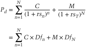
Spot yields must comply with equation (5.1). This equation assumes annual coupon payments and that the calculation is carried out on a coupon date such that accrued interest is zero:
where
- rsn = Spot or zero‐coupon yield on a bond with t years to maturity;
 .
.
In equation (5.1), rs1 is the current 1‐year spot yield, rs2 is the current 2‐year spot yield, and so on. Theoretically, the spot yield for a particular term to maturity is the same as the yield on a zero‐coupon bond of the same maturity, which is why spot yields are also known as zero‐coupon yields.
This last result is important. It means spot yields can be derived from redemption yields that have been observed in the market.
As with the yield‐to‐redemption yield curve, the spot yield curve is commonly used in the market. It is viewed as the true term structure of interest rates because there is no reinvestment risk involved; the stated yield is equal to actual annual return. That is, the yield on a zero‐coupon bond of n years maturity is regarded as the true n‐year interest rate. Because the observed government bond redemption yield curve is not considered to be the true interest rate, analysts often construct a theoretical spot yield curve. Essentially, this is done by breaking down each coupon bond being observed into its constituent cash flows, which become a series of individual zero‐coupon bonds. For example, £100 nominal of a 5% 2‐year bond (paying annual coupons) is considered equivalent to £5 nominal of a 1‐year zero‐coupon bond and £105 nominal of a 2‐year zero‐coupon bond.
Let us assume that there are 30 bonds in the market all paying annual coupons. The first bond has a maturity of 1 year, the second bond of 2 years, and so on out to 30 years. We know the price of each of these bonds, but we wish to determine what the prices imply about the market's estimate of future interest rates. We naturally expect interest rates to vary over time and that all payments being made on the same date are valued using the same rate. For the 1‐year bond we know its current price and the amount of the payment (comprising one coupon payment and the redemption proceeds) we will receive at the end of the year; therefore, we can calculate the interest rate for the first year. Assume the 1‐year bond has a coupon of 5%. If the bond is priced at par and we invest £100 today we will receive £105 in 1 year's time, hence the rate of interest is apparent and is 5%. For the 2‐year bond we use this interest rate to calculate the future value of its current price in 1 year's time: this is how much we would receive if we had invested the same amount in the 1‐year bond. However, the 2‐year bond pays a coupon at the end of the first year; if we subtract this amount from the future value of the current price, the net amount is what we should be giving up in 1 year in return for the one remaining payment. From these numbers we can calculate the interest rate in Year 2.
Assume that the 2‐year bond pays a coupon of 6% and is priced at 99.00. If 99.00 was invested at the rate we calculated for the 1‐year bond (5%), it would accumulate £103.95 in 1 year, made up of the £99 investment and interest of £4.95. On the payment date in 1 year's time, the 1‐year bond matures and the 2‐year bond pays a coupon of 6%. If everyone expected the 2‐year bond at this time to be priced at more than 97.95 (which is 103.95 minus 6.00), then no investor would buy the 1‐year bond, since it would be more advantageous to buy the 2‐year bond and sell it after 1 year for a greater return. Similarly, if the price was less than 97.95 no investor would buy the 2‐year bond, as it would be cheaper to buy the shorter bond and then buy the longer dated bond with the proceeds received when the 1‐year bond matures. Therefore, the 2‐year bond must be priced at exactly 97.95 in 12 months' time. For this £97.95 to grow to £106.00 (the maturity proceeds from the 2‐year bond, comprising the redemption payment and coupon interest), the interest rate in Year 2 must be 8.20%. We can check this using the present value formula covered earlier. At these two interest rates, the two bonds are said to be in equilibrium.
This is an important result and shows that there can be no arbitrage opportunity along the yield curve; using interest rates available today the return from buying the 2‐year bond must equal the return from buying the 1‐year bond and rolling over the proceeds (or reinvesting) for another year. This is known as the breakeven principle.
Using the price and coupon of the 3‐year bond we can calculate the interest rate in Year 3 in precisely the same way. Using each of the bonds in turn we can link together the implied 1‐year rates for each year up to the maturity of the longest dated bond. The process is known as bootstrapping. The “average” rate over a given period is the spot yield for that term: in the example given above, the rate in Year 1 is 5%, and in Year 2 is 8.20%. An investment of £100 at these rates would grow to £113.61. This gives a total percentage increase of 13.61% over 2 years, or 6.588% per annum. The average rate is not obtained by simply dividing 13.61 by 2, but – using our present value relationship again – by calculating the square root of “1 plus the interest rate” and then subtracting 1 from this number. Thus, the 1‐year yield is 5% and the 2‐year yield is 8.20%.
In real‐world markets it is not necessarily as straightforward as this; for instance, on some dates there may be several bonds maturing, with different coupons, and on some dates there may be no bonds maturing. It is most unlikely that there will be a regular spacing of bond redemptions exactly 1 year apart. For this reason, it is common for analysts to use a software model to calculate the set of implied spot rates that best fits the market prices of the bonds that do exist in the market. For instance, if there are several 1‐year bonds, each of their prices may imply a slightly different rate of interest. We choose the rate that gives the smallest average price error. In practice, all bonds are used to find the rate in Year 1, all bonds with a term longer than 1 year are used to calculate the rate in Year 2, and so on. The zero‐coupon curve can also be calculated directly from the coupon yield curve using a method similar to that described above; in this case, the bonds would be priced at par and their coupons set to par yield values.
The zero‐coupon yield curve is ideal to use when deriving implied forward rates, which we consider next, and when defining the term structure of interest rates. It is also the best curve to use when determining the relative value, whether cheap or dear, of bonds trading in the market, and when pricing new issues, irrespective of their coupons.
Arithmetic
Having introduced the concept of the zero‐coupon curve in the previous section, we can illustrate the mathematics involved more formally. When deriving spot yields from redemption yields, we view conventional bonds as being made up of an annuity (the stream of fixed coupon payments) and a zero‐coupon bond (the redemption payment on maturity). To derive the rates we can use equation (5.1), setting Pd = M = 100 and C = rmN, as shown in equation (5.2). This has coupon bonds trading at par, so that the coupon is equal to the yield:

where rmN is par yield for a term to maturity of N years, the discount factor DfN is the fair price of a zero‐coupon bond with a par value of £1 and a term to maturity of N years, and

is the fair price of an annuity of £1 per year for N years (with A0 = 0 by convention). Substituting equation (5.3) into equation (5.2) and rearranging will give us the expression for the N‐year discount factor shown in equation (5.4):

If we assume 1‐year, 2‐year, and 3‐year redemption yields for bonds priced at par to be 5%, 5.25%, and 5.75%, respectively, we will obtain the following solutions for the discount factors:

We can confirm that these are the correct discount factors by substituting them back into equation (5.2). This gives us the following results for the 1‐year, 2‐year, and 3‐year par value bonds (with coupons of 5%, 5.25%, and 5.75%, respectively):

Now that we have found the correct discount factors it is relatively straightforward to calculate the spot yields using equation (5.1):

Equation (5.1) discounts the n‐year cash flow (comprising the coupon payment and/or principal repayment) by the corresponding n‐year spot yield. In other words, rsn is the time‐weighted rate of return on an n‐year bond. Thus, as we said in the previous section, the spot yield curve is the correct method for pricing or valuing any cash flow, including an irregular cash flow, because it uses the appropriate discount factors. That is, it matches each cash flow to the discount rate that applies to the time period in which the cash flow is paid. Compare this with the approach for calculating the yield‐to‐maturity, which discounts all cash flows by the same yield to maturity. This neatly illustrates why the n‐period zero‐coupon interest rate is the true interest rate for an N‐year bond.
The expressions above are solved algebraically in the conventional manner, although those wishing to use a spreadsheet application such as Microsoft Excel® can input the constituents of each equation into individual cells and solve using the “Tools” and “Goal Seek” functions.
There is a very large literature on the zero‐coupon yield curve. A small fraction of it – as referred to in this chapter – is given in the Bibliography at the end of the chapter.
CONSTRUCTING THE BANK'S INTERNAL YIELD CURVE10
The construction of an internal yield curve is one of the major steps in product pricing as well as in the implementation of the bank's internal funds pricing or “funds transfer pricing” (FTP – see Chapter 11) system in a bank. It should be done after the trading book and the banking book are split, but before internal funding methodologies for all balance sheet items and the internal bank result calculation methodology are approved and implemented in the balance sheet reporting metrics (“MIS”).
As is pointed out in regulatory recommendations, “the transfer prices should reflect current market conditions as well as the actual institution‐specific circumstances”.11 Put simply, that means the curve should contain a market component responsible for interest‐rate risk and a bank‐specific spread over the market that will reflect the term liquidity cost for the bank.
There are several approaches for construction of an FTP curve. The choice of the approach depends on the scale of your bank, as well as on the market where the bank operates. These main approaches are:
- Market approach (based on market interest rates): FTP rates reflect the rate of alternative placement of funds or borrowing in the market and change according to the market's dynamics;
- Cost approach (based on the borrowing rates): FTP rates motivate placement of funds at a higher rate than the rate at which the funds were raised;
- Mixed approach (based on the sum of the interest‐rate curves): FTP rates take into consideration diversified contents of liabilities at different tenors;
- Marginal approach (based on the price of the following additional asset or liability): FTP rates represent the most relevant pricing levels. This approach can be based on:
- Marginal rates of lending; or
- Marginal rates of borrowing.
We consider each of these approaches in turn. We also show in the Appendix the ALCO submission prepared by one of the authors on implementing an internal curve methodology, when he was working in the investment banking division of a global multinational bank.
Market approach for FTP curve construction
As it comes from the name and definition of the approach, both components of an FTP curve should be derived from the market quotes and indicators. There's a list of requirements towards characteristics of these market indicators:
- They should properly and in time reflect the market situation;
- The quotes should be published in well‐known sources and should be available for all market participants (or calculated according to widely accepted formula);
- Instruments should allow one to define the spread to the market indicator to get the level of the funding cost for the bank.
Usually, as market indicators for FTP curve construction, we understand Libor (Euribor, etc.), interest‐rate swap (IRS), cross‐currency swap (CCS), and credit default swap (CDS). Although CDS is not available for each bank and sometimes is not representative when it is available, bond yields as market quotes can be used. An FTP curve based on bond yields can be constructed using several methods, which are deeply analysed in a special section (see Application of Ordinary Least Squares method and Nelson‐Siegel family approaches).
The market approach can be applied by large banks that have a lot of operations in financial markets. The deep and developed market of financial instruments (including derivatives) is required.
The advantages of this approach are:
- Objectivity and transparency (as a consequence, high level of trust);
- Instant reflection of the level of the market rates;
- Possibility to define FTP rates even for those tenors at which no balance sheet items exist;
- Construction of a smoothed curve without distortions.
Although this method also has limitations:
- Too high volatility of the money market indicators;
- Sometimes lack of market indicators for the middle and long term;
- Sometimes low volume of deals with government bonds and as a result loss of marketability of quotes;
- Insufficient volume of deals and instruments for representativeness of the results for mathematical modelling.
Application of Ordinary Least Squares method and Nelson‐Siegel family approaches
The topic of constructing a yield curve has been widely investigated in scientific literature and by practitioners of central banks. The reason for such a deep investigation for these researches was that each country that has government bonds needs to construct a realistic, trustworthy, and flexible zero‐coupon yield curve to reflect the level of the country's debt cost. Such reasons and the grade of responsibility for fair curve construction do not stop debates around the best methods and approaches to use for curve building, although not all of them are of use for ALM purposes.
What are the main criteria for choosing the optimal approach? This approach should be simple enough to be executed without complicated technical packages, but at the same time reflect the market of a particular country, even when bond quotes are available not for all tenors.
According to the Bank for International Settlements survey about zero‐coupon yield curve estimation procedures at central banks (2005), the most used approaches are spline‐based (for example, McCulloch, 1971, 1975) and parametric (Nelson, Siegel, 1987 and Svensson, 1994) methods. Although the spline methods gain more positive assessments due to their provision of smoothness and accuracy, they are more complex. At the same time, Nelson and Siegel state in their work that their objective is simplicity rather than accuracy. The following part of this section is devoted to comparison and contrasting of parametric approaches and their practical implementation.
All the parametric methods are based on minimisation of the price/yield errors. Among parametric methods the most basic approach is the Ordinary Least Squares (OLS) method. This is the simplest parametric method, which applies calculation of squares of deviations of actual quotes from the calculated approximated values and minimisation of their sum. The formula used to construct the curve is:
where
- x – duration;
- f(x) – yield.
Parameters a, b, and c should satisfy the following: sum of the squares of deviations from the mean should be minimal.
The implementation in practice consists of three steps:
- Collecting data from the information sources and placing in an Excel spreadsheet (on the graph the bond quotes with different durations would represent a so‐called “starry sky”);
- Calculation of approximations according to the formula with some initial values of parameters a, b, and c, deviations from the actual values, squares of deviations, and sum of squares; next through the “Goal Seek” in Excel determination of the most appropriate parameters a, b, and c;
- Solving the equation for some tenor in order to get the yield for this tenor.
The advantages of applying this method for ALM purposes are its simplicity and transparency.
There are, however, disadvantages that can significantly impact the result. The first and the main one is that the function that is used for approximation is parabolic – and, thus, is increasing in its first half, but after the extremum it starts to decline (see the graph). It's evident that this is not the best function to describe the market structure of interest rates – at least due to the reason that according to time value of money theory, in the long run the rates tend to increase.
This method can, however, be used by an ALM unit of a bank in the following cases:
- The market does not have long tenors (so the declining part of the curve won't be used);
- The market yield curve is increasing (which means that it is not inverted and does not have troughs);
- The ALM unit doesn't have resources to try to implement any more complicated method (usually in small banks).
Figure 5.3 shows an example of the difference in output of the Nelson‐Siegel and OLS methodologies when using the same inputs.

Figure 5.3 Curve results when employing Nelson‐Siegel and OLS methods
Source: www.micex.ru, author's calculations.
In order to make the curve more flexible, Nelson‐Siegel family curves are used.
For the first time the approach was suggested by Nelson and Siegel (basic N‐S). They use four parameters in the equation to describe the yield curve:

where
| β0 | – | is a long‐term interest rate; |
| β1 | – | represents the spread between short‐term and long‐term rates (this parameter defines the slope of the curve: if the parameter is positive, then the slope is negative). |
| β2 | – | is the difference between the middle‐term and the long‐term rates, defining the hump of the curve (if |
| τ | – | a constant parameter, representing the tenor at which the maximum of the hump is achieved. |
The main difference between the basic N‐S approach and the OLS method is the addition of dependence between short‐term and long‐term rates, which tend to make the curve more flexible. This model assumes that long‐term rates directly impact the short‐term rates and, thus, some segments of the curve can't change while other segments are stable. Moreover, this basic approach provides a curve with only one hump or trough. And that is not always true in practice.
Svensson suggested an extension to the basic N‐S approach: he implemented an additional component for better description of the first part of the curve:

Thus, the curve can have two extremums: β3 determines the size and the form of the second hump, and τ2 specifies the tenor for the second hump.
The advantages of the Svensson method in comparison to OLS and basic N‐S approaches are even better flexibility and better accuracy. However, even two humps do not perfectly reflect the market curve. That is why in practice further adjustments were made.
One of them is the adjusted Nelson‐Siegel (adjusted N‐S) approach with a set of seven parameters. The vector of the curve's parameters is recalculated after each new bond/new quote is added. The first four parameters (βS) are responsible for the level of yields on short‐term, middle‐term, and long‐term segments of the yield curve (the shifts up and down). The remaining three parameters (τS) are responsible for convexity/concavity of the appropriate segments.
Such adjustment provides even more advantages: such flexibility that the yield curve by the adjusted N‐S approach can have all types of forms: monotonous increasing or decreasing, convex, U‐form, or S‐form; memory, because the calculation is based on the previous parameters, so additional data doesn't change the form abruptly. This may be especially useful for markets with low liquidity of some bond issues – when on one day bonds are traded, there's a quote and the bond is included in the calculation, but on another day they are not traded, there's no quote and, thus, there's no input for calculation.
The disadvantage of all types of Nelson‐Siegel approaches is their complexity in comparison with the OLS method. As far as one needs to assign initial values to parameters and then apply the “Goal Seek” function – there's the risk that at this moment a mistake is made and further calculations are incorrect.
Nevertheless, one of the Nelson‐Siegel family approaches would be recommended to be used for ALM purposes in the following cases:
- For larger banks with bigger ALM units, equipped with automatic systems;
- On the markets where the curve is supposed to demonstrate several humps on different tenors;
- On bond markets with low liquidity.
To summarise, not all of the existing methods to construct a yield curve can be successfully applied by ALM units. Parametric approaches are most simple in their implementation. The choice between the most “plain vanilla” OLS method and the more complicated Nelson‐Siegel family approaches should be done according to the size of the bank and market conditions and peculiarities.
Cost approach for FTP curve construction
In this method, an FTP rate is an average borrowing rate defined according to the current (or historic) contents of liabilities. It can be the only rate or several rates, calculated for different time periods. Just current interest rates (rates of deposits raised in the current accounting period) can be used. Or a moving average of historic interest rates on deposits can be applied in order to describe slow change of rates for the particular type of liabilities. When needed, the weights are used for construction of the moving average. (The older observation will have a smaller weight, while most recent ones will have higher weights.)
This method is applied on a calm non‐European market with low volatility of rates and when widely accepted market indicators (for some currencies) do not exist. The better effect is achieved when the bank has a diversified liability structure and liabilities are of different tenors. This approach is recommended for use at a bank that has raised long‐term funds at high rates in the past. An FTP curve constructed according to the cost approach will give the needed incentive to the lending units – to place money not at market rates (so the bank will face losses), but to place above the funding cost (and try to earn more for the bank).
This is probably the only case when the cost approach should be applied, as notwithstanding the advantages of the method (absolute objectivity and simplicity of calculation), its drawbacks are significant:
- Dependence on the rates in the past results in reaction to the market changes with a time lag;
- The yield curve can be distorted because liabilities on different tenors could be raised at different times in the past;
- When there are too many liabilities not placed into loans (on some tenors), this method doesn't provide an instrument for deposit volumes regulation;
- It doesn't allow for steering of risk.
Mixed approach for FTP curve construction
As it follows from the name of the method, it is a mixture of the market curve and the curve based on actual costs of liabilities.
The construction itself consists of the following steps:
- Step 1 – Construction of the FTP curve based on market approach.
- Step 2 – Analysis of stable funding sources for each tenor. Calculation of the weights of each type of liability in total liabilities of this time bucket.
- Step 3 – Obtaining the weighted FTP curve as a result of summing up of yield curves of different liabilities.
The advantages of the method are:
- The current structure of liabilities and the costs of funding are taken into account;
- The market component helps to reflect the fluctuations of market conjuncture;
- The cost component helps to take the actual cost of funds into account.
The disadvantages include time‐consuming calculation. Moreover, in case of a lack of long‐term liabilities it is necessary to make assumptions about the cost of funding – thus, it brings some subjectivity and opacity into calculations.
Marginal approach for FTP curve construction
The marginal approach is the only approach recommended by a regulator (Commission for European Banking Supervision) to European banks. The attractiveness of this method is due to these perceived advantages:
- The curve overall reflects the market level of rates;
- Exhibits comparably fast reaction to market changes;
- Allows the bank to set an FTP rate for those tenors for which no balance sheet liabilities exist.
The fact that this method is considered the best one by the regulators doesn't mean that it lacks disadvantages. They are:
- Subjectivity of assessment;
- Severe dependence of this method adequacy on the depth of market of lending/borrowing instruments and the chosen instruments as benchmarks;
- Possibility of distortions of the yield curve;
- Limited opportunities to hedge interest‐rate risk.
The marginal lending approach is less popular among bankers than the marginal borrowing approach. It is applied by small banks operating in rather developed local financial markets that don't use any other approach. For application of this method, a deep and diversified market of lending instruments should exist.
The marginal borrowing approach is much more often applied by banks, usually in developing countries with an insufficient level of development of the local financial market (and limited choice of money market indicators). Banks should have a diversified balance sheet structure. This requirement is due to the need to outline the core liabilities.
Core liabilities are such liabilities on the bank's balance sheet that satisfy the following:
- Deposited by customers of long standing;
- The funding volume is sufficiently high for the bank's financing needs;
- The overall structure of each funding source is stable.
The steps to construct a curve using this approach are as follows:
- Selection of the relevant funding sources (core liabilities) for the bank:
- Analysis of all the sources of funding in place at the bank;
- Assessment of the additional amount needed to be borrowed at the current moment;
- If there's no need to raise funds at the moment – the rates are decreased to the level when no additional funds are raised.
- Gathering of information to obtain the rates:
- That could be actual quotes at what level the bank can raise funds (for example, the rates for retail products published at the bank's website);
- In some cases, it can be an assumption of the business at what rate it is possible to borrow the required amount of funds;
- Determining weights, which reflect the marginal funding mix. The weights can be derived either from the actual balance sheet structure or from the budgeted balance sheet structure for the future period and should reflect the possibilities of a bank to raise these kinds of funds.
No matter which approach for yield curve construction is chosen, it should serve the principles of FTP and customer loan pricing in the bank.
CALCULATION ILLUSTRATIONS
In this section we illustrate some elementary uses of the yield curve by providing some example calculations.
Forward rates: breakeven principle
Consider the following spot yields:
| 1‐year | 10% |
| 2‐year | 12% |
Assume that a bank's client wishes to lock in today the cost of borrowing 1‐year funds in 1 year's time. The solution for the bank (and the mechanism to enable the bank to quote a price to the client) involves raising 1‐year funds at 10% and investing the proceeds for 2 years at 12%. The no‐arbitrage principle means that the same return must be generated from both fixed rate and reinvestment strategies.
In effect, we can look at the issue in terms of two alternative investment strategies, both of which must provide the same return:
| Strategy 1 | Invest funds for 2 years at 12%. |
| Strategy 2 | Invest funds for 1 year at 10%, and reinvest the proceeds for a further year at the forward rate calculated today. |
The forward rate for Strategy 2 is the rate that will be quoted to the client. Using the present value relationship, we know that the proceeds from Strategy 1 are:
while the proceeds from Strategy 2 would be:
We know from the no‐arbitrage principle that the proceeds from both strategies will be the same, therefore this enables us to set:

This enables us to calculate the forward rate that can be quoted to the client (together with any spread that the bank might add) as follows:

This rate is the 1‐year forward‐forward rate, or the implied forward rate.
Forward rates: calculating forward start yield
A highly rated customer asks you to fix a yield at which he could issue a 2‐year zero‐coupon USD Eurobond in 3 years' time. At this time the US Treasury zero‐coupon rates were:
| 1 year | 6.25% |
| 2 year | 6.75% |
| 3 year | 7.00% |
| 4 year | 7.125% |
| 5 year | 7.25% |
- Ignoring borrowing spreads over these benchmark yields, as a market‐maker you could cover the exposure created by borrowing funds for 5 years on a zero‐coupon basis and placing these funds in the market for 3 years before lending them on to your client. Assume annual interest compounding (even if none is actually paid out during the life of the loans):

- The key arbitrage relationship is:
Therefore, breakeven forward yield is:


UNDERSTANDING FORWARD RATES
Spot and forward rates calculated from current market rates follow mathematical principles to establish what the arbitrage‐free rates for dealing today will be at some point in the future. In other words, forward rates and spot rates are actually saying the same thing. They are two sides of the same coin.
However, as we have already noted, forward rates are not a prediction of future rates. It is important to be aware of this distinction. If we were to plot the forward rate curve for the term structure in 3 months' time, and then compare it in 3 months with the actual term structure prevailing at the time, the curves would certainly not match. However, this has no bearing on our earlier statement: that forward rates are the mathematical expectation of future rates as of today. The main point to bear in mind is that we are not comparing like for like when plotting forward rates against actual current rates at a future date. When we calculate forward rates we use the current term structure. The current term structure incorporates all known information, both economic and political, and reflects the market's views. This is exactly the same as when we say that a company's share price reflects all that is known about the company and all that is expected to happen with regard to the company in the near future, including expected future earnings. The term structure of interest rates reflects everything the market knows about relevant domestic and international factors. It is this information, then, that goes into forward rate calculation. An instant later, though, there will be new developments that will alter the market's view and therefore alter the current term structure. These developments and events were (by definition, as we cannot know what lies in the future!) not known at the time we calculated and used 3‐month forward rates. This is why rates actually turn out to be different from what the term structure mathematically constructed at an earlier date. However, for dealing today we use today's forward rates, which reflect everything we know about the market today.
SONIA YIELD CURVE12
An important reference yield curve today is the overnight index swap (OIS) curve. This is similar to the conventional swap curve except it refers to the overnight rate on the floating leg of the swap, compared to the 3‐month or 6‐month rate on the floating leg of a conventional swap.
Prior to the 2008 crash, derivative pricing and valuations were based on the simple principle of the time value of money. A breakeven price was calculated such that when all the future implied cash flows were discounted back to today, the net present value (NPV) of all the cash flows was zero. The breakeven price was used for valuations or spread by a bid–offer price to create a trading price. Bid–offers would generally incorporate a counterparty‐dependent mark‐up to cover various costs and a return on capital in a fairly ill‐defined way.
A breakeven price required the construction of a projection curve for the index being referenced, which could be a tenor of Libor, such as 3‐month, for 3‐month Libor swaps, or an overnight rate in the case of Overnight Index Swaps. The projection curve would use market observable inputs and various interpolation methodologies to derive market implied future rates used to project the future floating rate fixings. In other words:
- A conventional swap curve is a projection curve based on the 3‐month (or 6‐month) Libor fix; whereas
- An OIS curve is a projection curve based on the overnight rate.
Once the market implied future fixings are known, a discount curve will then be used to discount cash flow mismatches in such a way that the breakeven fixed rate gives a result where all the cash flow mismatches have a present value of zero. Historically, market practice was to discount cash flows using a Libor discount curve, the assumption being that all cash flow mismatches could be borrowed or reinvested at Libor. It was implicitly assumed that Libor was the risk‐free rate at which these cash flow mismatches could be funded.
Figure 5.4 shows the GBP OIS (known as SONIA) and GBP swap curves as at 13 October 2016. The OIS curve lies below the conventional swap curve because of the term liquidity premium (TLP) difference between the two tenors (the TLP is higher the longer the tenor).

Figure 5.4 GBP SONIA and GBP swap curves, 13 October 2016
© Bloomberg LP. Reproduced with permission.
In the case of a collateralised trade transacted under the terms of a CSA, the posting of collateral ensures that the NPV of a trade is always zero net of collateral held or posted. All future funding mismatches are therefore explicitly funded directly by the exchange of collateral and as a result do not require any external funding. The collateral remuneration rate is defined by the CSA and is normally the relevant OIS rate. As it is the relevant OIS rate that becomes the applicable rate for funding cash flow mismatches, market practice has evolved to discount future cash flows using OIS rates when pricing or valuing a collateralised trade, so‐called OIS discounting. It is impossible to determine when market practice changed but it is generally accepted that when the London Clearing House (LCH) (which clears derivative transactions) changed to OIS discounting in 2010, it was doing so to reflect best market practice.
Where multiple forms of collateral were permissible under a CSA, market practice evolved to take into account the embedded option for the collateral poster. Pricing assumed that a counterparty would always act rationally and post the cheapest to deliver collateral with the discount curve reflecting the relevant collateral OIS rate, so‐called CTD or CSA discounting. A further enhancement is often used where the collateral is non‐cash such as a government bond. In these instances the discount curve reflects the price at which the bonds can be traded in the repo market. For complex CSAs where collateral was multicurrency, the discount curve is often a multicurrency hybrid curve that reflects that the CTD may change at a future date.
For uncollateralised trades, not only was the use of a Libor rate to discount cash flow mismatches clearly inappropriate given the increase in funding spreads during the 2008 crisis but also, in the absence of collateral, the NPV of an uncollateralised trade represented a potential funding requirement. Pricing for uncollateralised trades now generally contains an upfront adjustment to the price to take into account the expected funding costs of non‐collateralisation referred to as the Funding Valuation Adjustment or FVA. FVA along with a Credit Valuation Adjustment CVA now represent a more rigorously defined part of the bid–offer adjustment.
Collateral posted at the LCH has no optionality allowed – it must be in cash and in the currency of the transaction. Hence, the swap screen price now reflects the price for a cleared swap at the LCH. Because the collateral is unambiguous (cash in the currency of the trade) remunerated at the relevant OIS, so the discount/funding rate is always known and is not counterparty dependent. Anything other than an LCH cleared trade means the price is different to take into account the impact of the type of collateral. This is an important point: observable swap rates are for LCH cleared trades only.
CONCLUSIONS
The yield curve is the best snapshot of the state of the financial markets. It is not the sole driver of customer prices in banking, but it is the most influential. Hence, it is important that all practitioners understand the behaviour of the curve and how to analyse and interpret it. Being aware of the relationship between spot rates, forward rates, and yield to maturity is also important. Ultimately, there should be no shortcuts when it comes to understanding the yield curve.
APPENDIX

ALCO submission paper
| Author: |
Moorad Choudhry GBM Treasury |
Global Banking & Markets 135 Bishopsgate London EC2M 3UR |
| Date: | 29 March 2011 | |
| Subject: | Formalising the procedure for constructing the GBM internal yield curve | |
A significant risk management decision at every bank is selecting the internal yield curve construction methodology. The internal curve is an important tool in the pricing and risk management process, driving resource allocation, business line transaction pricing, hedge construction and RAROC analysis. It is given therefore that curve construction methodology should follow business best‐practice. In this paper we describe a recommended procedure on curve formulation to adopt at GBM, as well as a secondary procedure to liaise with Group Treasury (GT) aimed at maintaining a realistic and market‐accurate public issuance curve.
Background
Orthodox valuation methodology in financial markets follows the logic of risk‐neutral no‐arbitrage pricing [1]. The same logic should apply when setting a bank's internal pricing term structure. The risk‐free curve is given by sovereign bond prices, while the banking sector risky curve was traditionally the Libor or swap curve. Banks now fund at “cost of funds” as opposed to Libor‐flat; therefore, the logic of the no‐arbitrage approach dictates that a bank's risky pricing yield curve should be extracted from market prices, because the latter dictate the rate at which the bank can raise liabilities. Such an approach preserves consistency because the same no‐arbitrage principles drive market prices in the first place. In other words, the logic behind setting a bank's yield curve would be identical to the logic used when pricing derivatives.
The practice at peer‐group banks is to adopt an interpolation method that uses prices (yields) of the issuer's existing debt as model inputs, and extracts a discount function from these prices. The output is then used to derive a term structure that represents the issuer's current risky yield curve. To adopt such an approach requires a liquid secondary market in the issuer's bonds. This is a not unreasonable assumption in the case of RBS.
The two most common interpolation methods in use are the cubic spline approach and the parametric approach. The former produces markedly oscillating forward rates and is also less accurate at the short‐end [2], [3]. Therefore we propose adopting the parametric method. The original parametric model is Nelson‐Siegel [4], which is a forward rate model; however we recommend an extension of Nelson‐Siegel for use at GBM, the Svensson (94) model, which produces a smoother forward curve, partly as a result of incorporating one extra parameter [5].
Recommended procedure
In line with business best‐practice we recommend immediate adoption of the following procedure:
- Fit Svensson 94 to market data
- Extract the RBS risky yield curve. This is the baseline EUR yield curve that determines the fixed coupon for a vanilla coupon fixed‐maturity bond issued at par
- Use the continuous discount function obtained from (2) above to create a par‐par asset swap curve
- This is the market‐implied EUR Term Liquidity Premium (TLP) curve, which sets the spread for a vanilla FRN issued at par.
The curve at (4) is therefore the GBM TLP as dictated by market rates. By definition, under the no‐arbitrage principles we refer to above, this curve is the baseline GBM pricing curve, and therefore will be used as such in GBM going forward.
The curve construction procedure logic is shown in the Appendix. It has been reviewed by the GBM Head of Front Office Risk Management and Quantitative Analytics.
Following approval at ALCO, we will implement the procedure via the Quantitative Analytics function, to create an application that can produce the RBS risky curve at the touch of a button.
The baseline EUR curve will be the source for creating all cross‐currency funding curves. This procedure will be articulated formally in a later submission to GBM ALCO.
Maintenance in line with market: liaison with Group Treasury
One of the issues raised by the FSA during the recent ILAA review, and also as part of the KPMG s166 review, referred to the risks created by a bank's public funding curve falling out of line with market prices.
To manage this risk, we recommend that GBM liaise with Group Treasury on a regular basis to ensure that the public issuance curve set by GT remains within a 10‐15 basis point range of the 2‐week moving average of the GBM market‐implied TLP curve.
The tolerance level will be reviewed on a quarterly basis (or as required by market events) by GBM ALCO and in liaison with GT.
REFERENCES
- [1] The most appropriate references in this field are Feynman‐Kac (1949), Ito (1951), Markowitz (1959), Fama (1970), Black‐Scholes (1973) and Merton (1973).
- [2] James, J., and N. Webber (2000), Interest Rate Modelling, Chichester: John Wiley & Co Ltd
- [3] Choudhry, M. (2003), Analysing and Interpreting the Yield Curve, Singapore: John Wiley & Sons Pte Ltd
- [4] Nelson, C., and A.F. Siegel, (1987), “Parsimonious Modeling of Yield Curves”, Journal of Business, 60, pp. 473–489
- [5] Svensson, Lars E. O. (1994), “Estimating and Interpreting Forward Rates: Sweden 1992‐4,” National Bureau of Economic Research Working Paper #4871
APPENDIX
We desire to extract the RBS credit‐risky curve from market prices. To do this we require a liquid secondary market of RBS‐issued bonds, and an interpolation model. Practitioners generally use either the cubic spline approach or a parametric model approach.
For the reasons cited above, we recommend using the parametric methodology. The original parametric model is Nelson‐Siegel (1987), which suffers to an extent from oscillating forward curves, so we recommend Svensson (1994) which has one extra parameter, and reduced oscillation, and also produces smoother short‐date forwards.
A working Svensson model with Excel front‐end is available on request.
The procedure we implement involves the following:
1 – Extract the RBS risky yield curve using RBS money‐market funding rates and prices of secondary market bonds. We set the model's Beta and Tau parameters ourselves, or otherwise allow for the model to extract the ordinary least‐squares best fit. The parameters include the long‐run expected interest rate, which in general would be user‐specified. This will be set as part of regular discussion within GBM, co‐ordinated by GBM Treasury, and in liaison with GT.
2 – Running the model produces a discount function in near‐continuous time. (See Exhibit 1, which shows the function in annual time steps. This can be adjusted for monthly or daily time steps if desired). This is the Svensson discount function (DF). We convert this DF to match to EUR swap dates, and to spot settlement (this is because the EUR curve in the bank's common analytics function (CAF) is defined with spot settlement).
| Maturity (year) | discount factor | forward rates | spot rates |
| 0 | 1 | 0.48% | 0.48% |
| 1 | 0.981433988 | 3.10% | 1.87% |
| 2 | 0.942635953 | 4.85% | 2.95% |
| 3 | 0.892551064 | 5.98% | 3.79% |
| 4 | 0.837510049 | 6.68% | 4.43% |
| 5 | 0.781645775 | 7.08% | 4.93% |
| 6 | 0.727458537 | 7.26% | 5.30% |
| 7 | 0.676326573 | 7.30% | 5.59% |
| 8 | 0.628899097 | 7.23% | 5.80% |
| 9 | 0.585375249 | 7.10% | 5.95% |
| 10 | 0.545690715 | 6.93% | 6.06% |
Exhibit 1 Svensson discount function, annual time steps
3 – We extract the par yield curve. We now have a set of discrete rates corresponding to the RBS fair value yield curve, which tells us the coupon to set on a vanilla fixed coupon bond we issue at par for the relevant tenor.
4 – We use these rates to construct a full yield curve in CAF. Note that until the CAF methodology is set up to incorporate the Svensson model, this part of the process will use cubic spline methodology. However the procedure will ensure that the CAF output matches the input precisely (that is, a 0.000% error) so we have preserved our market‐determined Svensson curve.
From the curve at (4) we extract the implied TLP. (Exhibit 2) This shows the fair‐value spread we should pay on an FRN we issue of relevant tenor with a floating re‐set of 3 months Euribor. It is also the GBM internal private placement curve.
| Point | Basis Swap | implied 3m spreads |
| 3m | ##66.Unity.Swap | −17 |
| 6m | ##67.Unity.Swap | −1 |
| 1y | ##35.Unity.Swap | 33 |
| 18m | ##41.Unity.Swap | 66 |
| 2y | ##40.Unity.Swap | 95 |
| 3y | ##39.Unity.Swap | 147 |
| 4y | ##38.Unity.Swap | 184 |
| 5y | ##37.Unity.Swap | 210 |
| 6y | ##36.Unity.Swap | 228 |
| 7y | ##42.Unity.Swap | 240 |
| 8y | ##43.Unity.Swap | 248 |
| 9y | ##44.Unity.Swap | 253 |
| 10y | ##45.Unity.Swap | 255 |
Exhibit 2 Extracted implied TLP
(Note: this also sets the rate we would pay on a fixed coupon bond issue that was asset‐swapped, but for an unsecured swap [as this is the unsecured pricing curve]. Hence it would not be the correct fair‐value spread to pay on an asset swap, because that would involve a secured derivative. If we assume an unsecured derivative, we now have the par‐par asset swap curve.).
We should note that the above is the market‐implied curve process. The model output extrapolates beyond the latest tenor of our issued bonds to as long a maturity as the user wishes, and as a function of the long‐run expected forward rate. Exhibit 2 shows yields up to 10‐year because that is within the life of existing RBS debt issuance. The user can set the model to extrapolate fair‐value output to a tenor of its choice. Note that extrapolated rates represent the current secondary market‐implied value, and hence the fair‐value rate to pay for that tenor.
The implied TLP is the same curve that GBM would be feeding back to GT on a regular basis. The suggested procedure to GT is that they will set the RBS public curve to within a specified tolerance (such as plus/minus 15 bps) of the 2‐week moving average of the GBM curve.
BIBLIOGRAPHY
- Campbell, J. (1986). “A defence of traditional hypotheses about the term structure of interest rates”, Journal of Finance, March, pp. 183–193.
- Choudhry, M. (1998). “The information content of the United Kingdom gilt yield curve”, unpublished MBA assignment, Henley Management College.
- Choudhry, M. (2001). The Bond and Money Markets, Butterworth Heinemann, Chapters 51–53.
- Choudhry, M. (2009). “The value of introducing structural reform to improve bond market liquidity: Experience from the U.K. gilt market”, European Journal of Finance and Banking Research, 2(2).
- Cox, J., Ingersoll, J.E., and Ross, S.A. (1981). “A re‐examination of traditional hypotheses about the term structure of interest rates”, Journal of Finance, 36, September, pp. 769–799.
- Culbertson, J.M. (1957). “The term structure of interest rates”, Quarterly Journal of Economics, 71, November, 485–517.
- The Economist (1998). “Admiring those shapely curves”, 4 April, p. 117.
- Fama, E.F. (1976). “Forward rates as predictors of future spot interest rates”, Journal of Financial Economics, 3(4), October, pp. 361–377.
- Fama, E.F. (1984). “The information in the term structure”, Journal of Financial Economics, 13, December, 509–528.
- Fisher, I. (1986). “Appreciation of interest”, Publications of the American Economic Association, August, pp. 23–39.
- Hicks, J. (1946). Value and Capital, Oxford University Press, 1946.
- Ingersoll, J. (1987). Theory of Financial Decision Making, Rowman & Littlefield, Chapter 18.
- Jarrow, R. (1996). Modelling Fixed Income Securities and Interest Rate Options, McGraw‐Hill.
- Levy, H. (1999). Introduction to Investments, Second Edition, South‐Western.
- Livingstone, M. (1990). Money and Capital Markets, Prentice Hall.
- Lutz, F. (1940). “The structure of interest rates”, Quarterly Journal of Economics, November, pp. 36–63.
- McCulloch, J.H. (1975). “An estimate of the liquidity premium”, Journal of Political Economy, 83, January/February, pp. 95–119.
- Meiselman, D. (1962). The Term Structure of Interest Rates, Prentice Hall.
- Rubinstein, M. (1999). Rubinstein on Derivatives, RISK Publishing.