
Chapter 20
Presenting Data with Access Reports
IN THIS CHAPTER
- Looking at the different types of Access reports
- Creating reports with the Report Wizard
- Creating a report from scratch
- Improving a report's appearance
It's hard to underestimate the importance of reports in database applications. Many people who never work with an Access application in person use reports created by Access. A lot of maintenance work on database projects involves creating new and enhancing existing reports. Access is well known and respected for its powerful reporting features.
Reports provide the most flexible way of viewing and printing summarized information. They display information with the desired level of detail, while enabling you to view or print your information in many different formats. You can add multilevel totals, statistical comparisons, and pictures and graphics to a report.
In this chapter, you learn to use the Report Wizard as a starting point. You also learn how to create reports and what types of reports you can create with Access.
Introducing Reports
Reports present a customized view of your data. Report output is viewed onscreen or printed to provide a hard copy of the data. Very often, reports provide summaries of the information contained in the database. Data can be grouped and sorted in any order and can be used to create totals that perform statistical operations on data. Reports can include pictures and other graphics as well as memo fields in a report. If you can think of a report you want, Access probably supports it.
Identifying the different types of reports
Three basic types of reports are used by most businesses:
- Tabular reports: Print data in rows and columns with groupings and totals. Variations include summary and group/total reports.
- Columnar reports: Print data and can include totals and graphs.
- Mailing label reports: Create multicolumn labels or snaked-column reports.
Tabular reports
Tabular reports are similar to a table displaying data in rows and columns. Figure 20.1 is a typical tabular report (rptProductsSummary) displayed in Print Preview.

Figure 20.1 A tabular report (rptProductsSummary) displayed in Print Preview.
Unlike forms or datasheets, tabular reports often group data by one or more fields. Often, tabular reports calculate and display subtotals or statistical information for numeric fields in each group. Some reports include page totals and grand totals. You can even have multiple snaked columns so that you can create directories (such as telephone books). These types of reports often use page numbers, report dates, or lines and boxes to separate information. Reports may have color and shading and display pictures, business graphs, and memo fields. A special type of summary tabular report can have all the features of a detail tabular report but omit record details.
Columnar reports
Columnar reports generally display one or more records per page, but they do so vertically. Columnar reports display data very much as a data entry form does, but they're used strictly for viewing data and not for entering it. Figure 20.2 shows part of a columnar report (rptProducts) in Print Preview.

Figure 20.2 A columnar report showing report controls distributed throughout the entire page.
Another type of columnar report displays one main record per page (like a business form) but can show many records within embedded subreports. An invoice is a typical example. This type of report can have sections that display only one record and at the same time have sections that display multiple records from the “many” side of a one-to-many relationship—and even include totals.
Figure 20.3 shows an invoice report (rptInvoice) from the Collectible Mini Cars database system in Report view.

Figure 20.3 An invoice report (rptInvoice).
In Figure 20.3, the information in the top portion of the report is on the “main” part of the report, whereas the product details near the bottom of the figure are contained in a subreport embedded within the main report.
Mailing label reports
Mailing labels (shown in Figure 20.4) are also a type of report. Access includes a Label Wizard to help you create this type of report. The Label Wizard enables you to select from a long list of label styles. Access accurately creates a report design based on the label style you select. You can then open the report in Design mode and customize it as needed.

Figure 20.4 rptCustomerMailingLabels, a typical mailing label report.
Distinguishing between reports and forms
The main difference between reports and forms is the intended output. Whereas forms are primarily for data entry and interaction with the users, reports are for viewing data (either onscreen or in hard-copy form). Calculated fields can be used with forms to display an amount based on other fields in the record. With reports, you typically perform calculations on groups of records, a page of records, or all the records included in the report. Anything you can do with a form—except input data—can be duplicated by a report. In fact, you can save a form as a report and then refine it in the Report Design window.
Creating a Report, from Beginning to End
The report process begins with your desire to view data, but in a way that differs from a form or datasheet display. The purpose of the report is to transform raw data into a meaningful set of information. The process of creating a report involves several steps:
- Define the report layout.
- Assemble the data.
- Create the report with the Access Report Wizard.
- Print or view the report.
- Save the report.
Defining the report layout
You should begin by having a general idea of the layout of your report. You can define the layout in your mind, on paper, or interactively using the Report Designer. When laying out a report, consider how the data should be sorted (for example, chronologically or by name), how the data should be grouped (for example, by invoice number or by week), and how the size of the paper used to print the report will constrain the data.
Assembling the data
After you have a general idea of the report layout, assemble the data needed for the report. Access reports use data from two primary sources:
- A single database table
- A recordset produced by a query
You can join many tables in a query and use the query's recordset as the record source for your report. A query's recordset appears to an Access report as if it were a single table.
As you learned in Chapter 8, you use queries to specify the fields, records, and sort order of the records stored in tables. Access treats a recordset's data as if it were a single table (for processing purposes) in datasheets, forms, and reports. When the report is run, Access matches data from the recordset or table against the bound controls specified in the report and uses the data available at that moment to produce the report.
In the following example, you use data from tblProducts to create a relatively simple tabular report.
Creating a report with the Report Wizard
Access enables you to create virtually any type of report. Some reports, however, are easier to create than others, especially when the Report Wizard is used as a starting point. Like form wizards, the Report Wizard gives you a basic layout for your report, which you can then customize.
The Report Wizard simplifies laying out controls by stepping you through a series of questions about the report that you want to create. In this chapter, you use the Report Wizard to create tabular and columnar reports.
Creating a new report
The Ribbon contains several commands for creating new reports for your applications. The Create tab of the Ribbon includes the Reports group, which contains several options such as Report, Labels, and Report Wizard. For this exercise, click the Report Wizard button. The first screen of the Report Wizard (shown in Figure 20.5) appears.

Figure 20.5 The first screen of the Report Wizard after selecting a data source and fields.
In Figure 20.5, tblProducts has been selected as the data source for the new report. You can do this by selecting table tblProducts in the Navigation tab before clicking on the Report Wizard button, or by selecting tblProducts from the Tables/Queries drop-down list. Under the Tables/Queries drop-down list is a list of available fields. When you click a field in this list and click the right-pointing arrow, the field moves from the Available Fields list to the report's Selected Fields list. For this exercise, select Product ID, Category, Description, QtyInStock, and RetailPrice.
You're limited to selecting fields from the original record source you started with. You can select fields from other tables or queries by using the Tables/Queries drop-down list in the Report Wizard. As long as you've specified valid relationships so that Access properly links the data, these fields are added to your original selection and you use them on the report. If you choose fields from unrelated tables, a dialog box asks you to edit the relationship and join the tables. Or you can return to the Report Wizard and remove the fields.
After you've selected your data, click Next to go to the next wizard dialog box.
Selecting the grouping levels
The next dialog box enables you to choose which field(s) to use for grouping data. Figure 20.6 shows the Category field selected as the data grouping field for the report. The field selected for grouping determines how data appears on the report, and the grouping fields appear as group headers and footers in the report.

Figure 20.6 Specifying the report's grouping.
Groups are most often used to combine data that is logically related. One example is grouping all products by product category. Another example is choosing to group on CustomerID so that each customer's sales history appears as a group on the report. You use the report's group headers and footers to display the customer name and any other information specific to each customer.
The Report Wizard lets you specify as many as four group fields for your report. You use the Priority buttons to change the grouping order on the report. The order you select for the group fields is the order of the grouping hierarchy.
Select the Category field as the grouping field and click the > button to specify a grouping based on category values. Notice that the picture changes to show Category as a grouping field, as shown in Figure 20.6. Each of the other fields (ProductID, Description, QtyInStock, RetailPrice, and SalesPrice) selected for the report will appear in the Category group's details section.
Defining the group data
After you select the group field(s), click the Grouping Options button at the bottom of the dialog box to display the Grouping Options dialog box, which enables you to further define how you want groups displayed on the report.
For example, you can choose to group by only the first character of the grouping field. This means that all records with the same first character in the grouping field are grouped. If you group a customers table on CustomerName, and then specify grouping by the first character of the CustomerName field, a group header and footer appears for all customers whose name begins with the same character. This specification groups all customer names beginning with the letter A, another group for all records with customer names beginning with B, and so on.
The Grouping Options dialog box enables you to further define the grouping. This selection can vary in importance, depending on the data type.
The Grouping Intervals list box displays different values for various data types:
- Text: Normal, 1st Letter, 2 Initial Letters, 3 Initial Letters, 4 Initial Letters, 5 Initial Letters
- Numeric: Normal, 10s, 50s, 100s, 500s, 1000s, 5000s, 10000s, 50000s, 100000s
- Date: Normal, Year, Quarter, Month, Week, Day, Hour, Minute
Normal means that the grouping is on the entire field. In this example, use the entire Category field.
Notice that the grouping options simplify creating reports grouped by calendar months, quarters, years, and so on. This means that you can easily produce reports showing sales, payroll, or other financial information needed for business reporting.
If you displayed the Grouping Options dialog box, click the OK button to return to the Grouping Levels dialog box, and then click the Next button to move to the Sort Order dialog box.
Selecting the sort order
By default, Access automatically sorts grouped records in an order meaningful to the grouping field(s). For example, after you've chosen to group by Category, Access arranges the groups in alphabetical order by Category. However, you can't be sure of the order of the records within the group, so it's a good idea to specify a sort within each group. For example, your users might want to see the product records sorted by Retail Price in descending order so that the most expensive products appear near the top for each category group.
In this example, Access sorts data by the Category field. As Figure 20.7 shows, the data is also sorted by Description within each group.

Figure 20.7 Selecting the field sorting order.
Sort fields are selected by the same method you use for selecting grouping fields. You can select sorting fields that haven't been chosen for grouping. The fields chosen in this dialog box affect only the sorting order in the data displayed in the report's Detail section. Select ascending or descending sort by clicking the button to the right of each sort field.
Selecting summary options
Near the bottom of the sorting screen of the Report Wizard is a Summary Options button. Clicking this button displays the Summary Options dialog box (shown in Figure 20.8), which provides additional display options for numeric fields. All the numeric and currency fields selected for the report are displayed and may be summed. Additionally, you can display averages, minimums, and maximums.

Figure 20.8 Selecting the summary options.
You can also decide whether to show or hide the data in the report's Detail section. If you select Detail and Summary, the report shows the detail data, whereas selecting Summary Only hides the Detail section and shows only totals in the report.
Finally, checking the Calculate Percent of Total for Sums box adds the percentage of the entire report that the total represents below the total in the group footer. For example, if you have three products and their totals are 15, 25, and 10, respectively, 30%, 50%, and 20% shows below their total (that is, 50)—indicating the percentage of the total sum (100%) represented by their sum.
Clicking the OK button in this dialog box returns you to the sorting screen of the Report Wizard. There you can click the Next button to move to the next wizard screen.
Selecting the layout
The next step in the Report Wizard affects the look of your report. The Layout area enables you to determine the basic layout of the data. The Layout area provides three layout choices that tell Access whether to repeat the column headers, indent each grouping, and add lines or boxes between the detail lines. As you select each option, the picture on the left changes to show how the choice affects the report's appearance.
You choose between Portrait (up-and-down) and Landscape (across-the-page) layout for the report in the Orientation area. Finally, the Adjust the Field Width So All Fields Fit on a Page check box enables you to cram a lot of data into a little area. (A magnifying glass may be necessary!)
For this example, choose Stepped and Portrait, as shown in Figure 20.9. Then click the Next button to move to the next dialog box.

Figure 20.9 Selecting the page layout.
Opening the report design
The final Report Wizard screen contains an area for you to enter a title for the report. This title appears only once, at the very beginning of the report, not at the top of each page. The report title also serves as the new report's name. The default title is the name of the table or query you initially specified as the report's data source. The report just created in the Chapter20.accdb example is named rptProducts_Wizard.
Next, choose one of the option buttons at the bottom of the dialog box:
- Preview the report
- Modify the report's design
For this example, leave the default selection intact to preview the report. Click Finish and the report displays in Print Preview (see Figure 20.10).

Figure 20.10 rptProducts_Wizard displayed in Print Preview.
Adjusting the report's layout
There are a few small issues with the report shown in Figure 20.10. The Access Report Wizard has chosen the fonts and overall color scheme, which may not be what you had in mind. Also, the Retail Price column isn't quite wide enough to show the column heading.
The Report Wizard displays the new report in Print Preview. Right-click the report's title bar and select Layout View from the shortcut menu. The new report in Layout view is shown in Figure 20.11.

Figure 20.11 Layout view is useful for resizing controls in a columnar report.
In Figure 20.11, the Category column has been shrunk to eliminate some wasted space, the Description column has been widened to the left to fill that space, and the remaining columns have been separated so that the column headings show and aren't all pushed together. Working with controls in Layout view for a report is identical to working with them in Layout view for a form. To shrink a column, for example, drag the right edge of the control to the left.
Choosing a theme
After you adjust the layout, you can use controls in the Themes group on the Design tab of the Ribbon to change the report's colors, fonts, and overall appearance. The Themes button opens a gallery containing several dozen themes (see Figure 20.12).

Figure 20.12 Choosing a theme for the report.
Themes are an important concept in Access 2016. A theme sets the color scheme, selected font face, font colors, and font sizes for Access 2016 forms and reports. As you hover the mouse over the theme icons in the gallery, the report open in Layout view behind the gallery instantly changes to show you how the report would look with the selected theme.
Each theme has a name, like Office, Facet, Organic, and Slice. Theme names are useful when you want to refer to a particular theme in the application's documentation or in an e-mail or other correspondence. Themes are stored in a file with a THMX extension, in the Program FilesMicrosoft Office
ootDocument Themes 16 folder. Themes apply to all the Office 2016 documents (Word, Excel, and Access), making it easy to determine a style to apply to all of a company's Office output.
As the right-click menu in Figure 20.12 indicates, you can apply the selected theme just to the current report (Apply Theme to this Object Only), all reports (Apply Theme to All Matching Objects), or all forms and reports in the application (Make This Theme the Database Default). There's even an option to add the theme as a button to the Quick Access toolbar, an extremely useful option for selectively applying the theme to other objects in the database.
For the purposes of this exercise, the Wisp theme was selected for the new products report.
Creating new theme color schemes
Access 2016 provides several default themes, with each theme consisting of a set of complementary colors, fonts, and font characteristics. In addition, you can set up entirely new color and font themes and apply them to your forms and reports. Creating a custom color theme is a great way to apply a company's corporate color scheme to the forms and reports in an application.
With a form or report open in Design view, follow these steps:
- Click the Colors button in the Themes group on the Design tab of the Ribbon. The color theme list opens.
- Select the Customize Colors command at the bottom of the list of color themes. The Create New Theme Colors dialog box (shown in Figure 20.13) appears, showing the currently selected color theme.
Modifying a color theme requires a considerable amount of work. As you can see from Figure 20.13, each color theme includes 12 different colors. Each of the 12 buttons on the Create New Theme Colors dialog box opens a color palette (shown in Figure 20.14) where you select a theme element's color, such as the color for the Text/Background – Light 2 element.
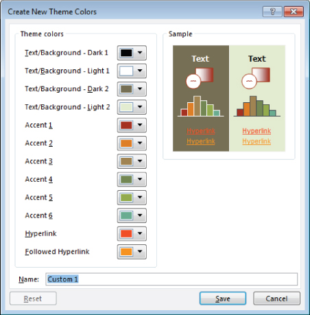
Figure 20.13 Setting up a custom color theme.

Figure 20.14 Selecting a theme element's color.
- When the color customization is complete, assign a name for the custom color theme and click Save. When you close the Create New Theme Colors dialog box, you'll see that the custom color theme has been applied to the form or report currently open in Design view. If you want to apply the new color theme to all the forms or reports in the application, open the color theme list, right-click the name of a custom color theme at the top of the list (see Figure 20.15), and select Apply Color Scheme to All Matching Objects. If you have a report open in Design view, the theme will be applied to all reports in the application. If, on the other hand, you have a form open in Design view, all the forms in the application receive the new color theme.
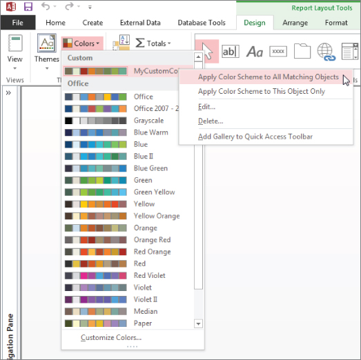
Figure 20.15 Applying a color theme to all matching objects in an application.
Even after applying a color theme, you can adjust the colors of individual items on a report (or form, for that matter). Open the report in Design view, select the item to change, and choose its new color(s) in the Property Sheet.
Although not described or shown here, a similar dialog box is available (Create New Theme Fonts) in the Fonts drop-down list in the Themes group on the Design tab. The Create New Theme Fonts dialog box enables you to set up a custom font theme (heading and body fonts, and so on) to apply to forms and reports. Creating custom fonts themes works just like adding your own color themes to an application. Save the theme with a name you'll recognize, and apply the font theme to forms and reports as needed.
Using the Print Preview window
Figure 20.16 shows the Print Preview window in a zoomed view of rptProducts_Wizard. To open a report in Print Preview, right-click on the report in the Navigation pane and choose Print Preview. This view displays your report with the actual fonts, shading, lines, boxes, and data that will be used on the report when printed to the default Windows printer. Clicking the left mouse button on the report's surface toggles the view between a zoomed view and an entire page view.

Figure 20.16 Displaying rptProducts_Wizard in the zoomed preview mode.
The Ribbon transforms to display controls relevant to viewing and printing the report. The Print Preview tab of the Ribbon includes controls for adjusting the size, margins, page orientation (Portrait or Landscape), and other printing options. The print options are stored with the report when you save the report's design. The Print Preview tab also includes a Print button for printing the report, and another button for closing Print Preview and returning to the report's previous view (Design, Layout, or Report view).
You can move around the page by using the horizontal and vertical scroll bars, or use the Page controls (at the bottom-left corner of the window) to move from page to page. The Page controls include navigation buttons to move from page to page or to the first or last page of the report. You can also go to a specific page of the report by entering a value in the text box between the Previous Page and Next Page controls.
Right-clicking the report and selecting the Multiple Pages option, or using the controls in the Zoom group on the Print Preview tab of the Ribbon, lets you view more than one page of the report in a single view. Figure 20.17 shows a view of the report in the Print Preview's two-page mode. Use the navigation buttons (in the lower-left section of the Print Preview window) to move between pages, just as you would to move between records in a datasheet. The Print Preview window has a toolbar with commonly used printing commands.

Figure 20.17 Displaying multiple pages of a report in Print Preview's page preview mode.
If, after examining the preview, you're satisfied with the report, click the Print button on the toolbar to print the report. If you're dissatisfied with the design, select the Close Print Preview button to switch to the Report Design window and make further changes.
Publishing in alternate formats
An important feature of the Print Preview tab is the ability to output the Access report in a number of common business formats, including PDF, XPS (XML Paper Specification), HTML, and other formats.
Clicking the PDF or XPS button in the Data group on the Print Preview tab of the Ribbon opens the Publish as PDF or XPS dialog box (shown in Figure 20.18). This dialog box provides options for outputting in standard PDF format or in a condensed version (for use in a web context). You also specify the destination folder for the exported file.

Figure 20.18 Access 2016 provides powerful options for publishing reports.
The PDF or XPS view of an Access report is indistinguishable from the report when viewed in Access. Either format is common in many business environments these days.
Viewing the report in Design view
Right-clicking the report's title bar and selecting Design View opens the report in Design view. As shown in Figure 20.19, the report design reflects the choices you made using the Report Wizard.

Figure 20.19 The report in Design view.
Return to the Print Preview mode by clicking Print Preview on the right-click menu or by choosing Print Preview in the Views group.
Printing or viewing the report
The final step in the process of creating a report is printing or viewing it.
Printing the report
There are several ways to print your report:
- Choose File
 Print in the main Access window (with a report highlighted in the Navigation pane). The standard Print dialog box appears. You use this dialog box to select the print range, number of copies, and print properties.
 - Click the Print button on the Print Preview tab of the Ribbon. The report is immediately sent to the default printer without displaying a Print dialog box.
Viewing the report
You can view a report in four different views: Design, Report, Layout, and Print Preview. The Design and Layout views are used to build a report and are similar to Design and Layout views for forms. Most of the work in this chapter is done in Design view.
You begin working with a new report by selecting a table or query to serve as the new report's data source. Click the Report button on the Create tab of the Ribbon. By default, the new report appears in Layout view, as shown in Figure 20.20.

Figure 20.20 Layout view of a new report based on tblProducts.
Layout view enables you to see the relative positions of the controls on the report's surface, as well as the margins, page headers and footers, and other report details.
The main constraint of Layout view is that you can't make fine adjustments to a report's design unless you put the report in Design view. Layout view is primarily intended to allow you to adjust the relative positions of controls on the report and is not meant for moving individual controls around on the report.
While in Layout view, you can also right-click any control and select Properties from the shortcut menu. The Property Sheet allows you to modify the settings for the selected control.
Figure 20.21 shows the Ribbon while a report is open in Layout view. Not surprisingly, the options on the Ribbon are mostly involved with adjusting the appearance of the controls on the report.

Figure 20.21 The Ribbon while a report is open in Layout view.
Saving the report
Save the report design at any time by choosing File Save, File Save As, or File Export from the Report Design window, or by clicking the Save button on the Quick Access toolbar. The first time you save a report (or any time you select Save As or Export), a dialog box enables you to select or type a name.
Banded Report Design Concepts
Access reports support a banded approach to design. The banded report design is an important concept and must be mastered by Access developers. In an Access report, data is processed one record at a time. Individual fields may be placed in different places on a report and can even appear more than once in a report, if needed.
Many first-time Access developers are confused by a report's appearance in Design view. Some people expect to see a “page” that is decorated by adding fields in a large design surface, much like how forms are built. However, because Access processes report data one record at a time, Design view is meant to help you specify how each row is laid out on the printed page. In addition, Design view shows you elements such as a page's header and footer, as well as areas occupied by group headers and footers. Each area occupied by controls plays a vital role in the report's appearance when printed.
Reports are divided into sections, known as bands in most report-writing software packages. (In Access, these are simply called sections.) Access processes each record in the underlying dataset, processing each section in order and deciding (for each record) whether to process fields or text in that section. For example, the report footer section is processed only after the last record is processed in the recordset.
Figure 20.22 shows rptProductsSummary in Print Preview. Notice that the data on the report is grouped by Category (Cars, Trucks, and so on). Each group has a group header containing the category name. Each group also has a footer displaying summary information for the category. The page header contains column descriptions (Product ID, Description, and so on). The group footer that ends each group contains summary data for several columns in each group.

Figure 20.22 A portion of rptProductsSummary, a grouped report containing summary data.
The following Access sections are available:
- Report header: Prints only at the beginning of the report; used for the title page
- Page header: Prints at the top of each page
- Group header: Prints before the first record of a group is processed
- Detail: Prints each record in the table or recordset
- Group footer: Prints after the last record of a group is processed
- Page footer: Prints at the bottom of each page
- Report footer: Prints only at the end of a report after all records are processed
Figure 20.23 shows rptProductSummary open in Design view. As you can see, the report is divided into as many as seven sections. The group section displays data grouped by categories, so you see the sections Category Header and Category Footer. Each of the other sections is also named based on where it displays on the report.

Figure 20.23 rptProductSummary in Design view.
You can place any type of text or Text Box controls in any section, but Access processes the data one record at a time. It also takes certain actions (based on the values of the group fields or current section of the page being processed) to make the bands or sections active. The example in Figure 20.23 is typical of a report with multiple sections. As you learned, each section in the report has a different purpose and different triggers.
The Report Header section
Controls in the Report Header section are printed only once, at the beginning of the report. A common use of a Report Header section is as a cover page or a cover letter or for information that needs to be communicated only once to the user of the report.
You can also have controls in the Report Header section print on a page that is separate from the rest of the report, which enables you to create a title page and include a graphic or picture in the Report Header. The Force New Page property in the Report Header section can be set to After Section to place the information in the report header in a separate page.
The Page Header section
Controls in the Page Header section normally print at the top of every page. If a report header on the first page is not on a page of its own, the information in the Page Header section prints just below the report header information. Typically, page headers contain column headers in group/total reports. Page headers often contain a title for the report that appears on every page.
The Page Header section shown in Figure 20.23 contains a horizontal line below the Label controls. Each Label control can be moved or sized individually. You can also change special effects (such as color, shading, borders, line thickness, font type, and font size) for each control.
Both the Page Header and Page Footer sections can be set to one of four settings (found in the Report's properties, not the section properties):
- All Pages: The section (either page header or page footer) prints on every page.
- Not with Rpt Hdr: The section does not print on the page with the report header.
- Not with Rpt Ftr: The report footer is forced onto its own page when either Page Header or Page Footer is set to Not with Rpt Ftr. The section with this setting does not print on that page.
- Not with Rpt Hdr/Ftr: The report footer is forced onto its own page. The section does not print on that page, nor does it print on the page with the report header.
The Group Header section
A Group Header section normally displays the name of the group, such as Trucks or Motorcycles. Access knows that all the records in a group have been displayed in a Detail section when the group name changes. In this example, the detail records are all about individual products. The Category control in the Category Header tells you that the products within the group belong to the indicated category (Trucks or Motorcycles). Group Header sections immediately precede Detail sections.
You can have multiple levels of group headers and footers. In this report, for example, the data is only for categories. However, in some reports you might have groups of information with date values. You could group your sections by year or by month and year, and within those sections by another group such as category.
The Detail section
The Detail section processes every record in the data and is where each value is printed. The Detail section frequently contains calculated fields such as profit that is the result of a mathematical expression. In this example, the Detail section simply displays information from the tblProduct table except for the last control. The profit is calculated by subtracting the cost from the RetailPrice.
The Group Footer section
You use the Group Footer section to calculate summaries for all the detail records in a group. In the Products Summary report, the expression = Sum([RetailPrice] - [Cost]) adds a value calculated from all the records within a category. The value of this Text Box control is automatically reset to 0 every time the group changes.
The Page Footer section
The Page Footer section usually contains page numbers or control totals. In very large reports, such as when you have multiple pages of detail records with no summaries, you might want page totals, as well as group totals. For the Products Summary Report, the page number is printed by combining some literal text and the built-in page number controls. These controls show Page x of y, where x is the current page number and y is the total number of pages in the report. A Text Box control with the following expression in the Control Source property can be used to display page-number information that keeps track of the page number in the report:
="Page: " & [Page] & " of " & [Pages]You can also print the date and the time the report was printed. You can see the page number text box in the Page Footer section in Figure 20.23. The Page Footer in rptProductsSummary also contains the current date and time at the left side of the Page Footer section.
The Report Footer section
The Report Footer section is printed once at the end of the report after all the detail records and group footer sections are printed. Report footers typically display grand totals or other statistics (such as averages or percentages) for the entire report. The report footer for the Products Summary report uses the expression = Sum with each of the numeric fields to sum the amounts.
The report writer in Access is a two-pass report writer, capable of preprocessing all records to calculate the totals (such as percentages) needed for statistical reporting. This capability enables you to create expressions that calculate percentages as Access processes those records that require foreknowledge of the grand total.
Creating a Report from Scratch
Fundamental to all reports is the concept that a report is another way to view records in one or more tables. It's important to understand that a report is bound to either a single table or a query that brings together data from one or more tables. When you create a report, you must select which fields from the query or table you want to see in your report. Unless you want to view all the records from a single table, bind your report to a query. Even if you're accessing data from a single table, using a query lets you create your report on the basis of a particular search criterion and sorting order. If you want to access data from multiple tables, you have almost no choice but to bind your report to a query. In the examples in this chapter, all the reports are bound to queries (even though it's possible to bind a report to a table).
It may be obvious, but it bears mentioning that the data in a printed report is static and only reflects the state of data in the database at the moment the report is printed. For this reason, every report should have a “printed” date and time somewhere on the report (often in the report header or footer area) to document exactly when the report was printed.
Throughout the rest of this chapter, you learn the tasks necessary to create the Product Display report (a part of a page is shown in Figure 20.24). In these sections, you design the basic report, assemble the data, and place the data in the proper positions.

Figure 20.24 The Product Display report.
Creating a new report and binding it to a query
The first step is to create a new, empty report and bind it to tblProducts. Creating a blank report is quite easy:
- Select the Create tab of the Ribbon.
- Click the Blank Report button in the Reports group. Access opens a blank report in Layout view, and either positions a Field List dialog box on top of the new report (see Figure 20.25) or docks the Field List on the right side of the application window.

Figure 20.25 A blank report in Layout view.
At this point, you have two different paths for adding controls to the report: Continue working in Layout view or switch to Design view. Each of these techniques has advantages, but for the purposes of this exercise, we'll use Design view because it better demonstrates the process of building Access reports.
- Right-click the report's title bar, and select Design view from the shortcut menu. The Report window transforms to the traditional Access banded Report Designer, as shown in Figure 20.26. This figure also shows the Field List open on tblProducts, allowing you to add fields from the list to the appropriate section on the new report.

Figure 20.26 Building the new report in Design view.
In Figure 20.26, the Description field has been dragged onto the Detail section of the report.
Defining the report page size and layout
As you plan your report, consider the page-layout characteristics, as well as the kind of paper and printer you want to use for the output. As you make these decisions, you use several dialog boxes and properties to make adjustments. These specifications work together to create the desired output.
Select the Page Setup tab of the Ribbon to select the report's margins, orientation, and other overall characteristics. Figure 20.27 shows a portion of the Access screen with the Page Setup tab selected and the Margins option open.
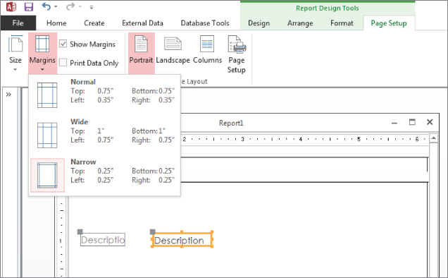
Figure 20.27 Setting a report's margins.
Notice that the Page Setup tab includes options for setting the paper size, the report's orientation (Portrait or Landscape), its margins, and other details. Dropping down either the Size or Margins option reveals a gallery containing common settings for each of these options.
rptProductDisplay is to be a portrait report, which is taller than it is wide. You want to print on letter size paper ( x 11 inches), and you want the left, right, top, and bottom margins all set to 0.25 inch. In Figure 20.27 notice that the Narrow margins option is selected, which specifies exactly 0.25 inch for all four margin settings.
If the margins you need for your particular report are not shown in the Margins options, click Page Setup in the Page Layout group to open the Page Setup dialog box. This dialog box enables you to specify the margins, orientation, and other page-layout specifications.
To set the right border for the Product Display report to  inches, follow these steps:
- Click the right edge of the report body (where the white page meets the gray background). The mouse pointer changes to a double-headed arrow.
- Drag the edge to the
 -inch mark.
If the ruler isn't displayed in the Report Designer, click Ruler from the Size/Space drop down on the Arrange tab.
Placing controls on the report
Access takes full advantage of drag-and-drop capabilities of Windows. The method for placing controls on a report is no exception:
- Click the Add Existing Fields button in the Tools group on the Design tab of the Ribbon. The Field List window appears.
- Choose a control in the Toolbox if you want to use something other than the default control types for the fields.
- Select each field that you want on your report and then drag them to the appropriate section of the Report Design window. Select multiple fields by holding down the Ctrl key as you click fields in the Field List. Depending on whether you choose one or several fields, the mouse pointer changes shape to represent your selection as you drag fields onto the report.
The fields appear in the detail section of the report, as shown in Figure 20.28. Notice that for each field you dragged onto the report, there are two controls. When you use the drag-and-drop method of placing fields, Access automatically creates a Label control with the field name attached to the Text Box control to which the field is bound.

Figure 20.28 The report with several fields added.
Controls are needed for the customer information in the page header section. Before you do this, however, you must resize the page header to leave room for a title you'll add later.
Resizing a section
To make room on the report for the title information in the page header, you must resize it. You resize by using the mouse to drag the bottom of the section you want to resize. The mouse pointer turns into a vertical double-headed arrow as it's positioned over the bottom of a report section. Drag the section border up or down to make the section smaller or larger.
Resize the Page Header section to make it about  inch high by dragging the bottom margin of the page header downward. Use the Controls group on the Design tab of the Ribbon to drag labels to the report. Add two labels to the Page Header section, and enter Product Display as the Caption property of one label, and Collectible Mini Cars for the other.
The labels you just added are unattached; they aren't related to any other controls on the report. When you drag a field from the Field List, Access adds not only a text box to contain the field's data, but also a label to provide an identifier for the text box. Labels that you drag from the Controls group on the Ribbon are unattached and not related to text boxes or any other control on the report.
You may notice the Page Header section expanding to accommodate the Label controls that you dragged into the section. All the fields needed for the Product Display report are now placed in their appropriate sections.
Modifying the appearance of text in a control
To modify the appearance of the text in a control, select the control and select a formatting style to apply to the label by clicking the appropriate button on the Format tab.
To make the titles stand out, follow these steps to modify the appearance of label text:
- Click the newly created report heading Product Display label in the Report Header section.
- Select the Format tab of the Ribbon, and click the Bold button in the Font group.
- From the Font Size drop-down list, select 18.
- Repeat for the Collectible Mini Cars label, using a 12 pt font and Bold. The size of the labels may not fit their displayed text. To tighten the display or to display all the text when a label isn't big enough, double-click any of the sizing handles, and Access chooses an appropriate size for the label.
Figure 20.29 shows these labels added, resized, and formatted in the report's Page Header section.

Figure 20.29 Adding unbound labels to the report.
Working with Text Box controls
So far, you've added controls bound to fields in the tables and unbound Label controls used to display titles in your report. There is another type of Text Box control that is typically added to a report: unbound text boxes that are used to hold expressions such as page numbers, dates, or a calculation.
Adding and using Text Box controls
In reports, Text Box controls serve two purposes:
- They enable you to display stored data from a particular field in a query or table.
- They display the result of an expression.
Expressions can be calculations that use other controls as their operands, calculations that use Access functions (either built in or user defined), or a combination of the two.
Entering an expression in a Text Box control
Expressions enable you to create a value that is not already in a table or query. They can range from simple functions (such as a page number) to complex mathematical computations.
A function is a small program that, when run, returns a single value. The function can be one of many built-in Access functions or it can be user defined.
The following steps show you how to use an unbound Text Box control to add a page number to your report:
- Click in the middle of the Page Footer section, and resize the page footer so that it's
 inch in height.
 - Drag a Text Box control from the Controls group on the Design tab of the Ribbon and drop it into the Page Footer area. Make the text box about three-quarters of the height of the Page Footer section and about
 inch wide.
 - Select the text box's attached label and change its contents to say Page:.
- Select the Text Box control (it says “Unbound”) and enter = Page directly into the text box. Alternatively, you could open the Property Sheet (press F4) and enter = [Page] as the text box's ControlSource property.
- Drag the new Text Box control until it's near the right edge of the report's page, as shown in Figure 20.30. You may want to also move the text box's label so that it's positioned close to the text box. The upper-left handle on the label moves the label independently of the text box.
![Snipped image of Report window displaying textbox controls for Page: and =[Page].](http://images-20200215.ebookreading.net/22/4/4/9781119086543/9781119086543__access-2016-bible__9781119086543__images__c20f030.jpg)
Figure 20.30 Adding a page-number expression in a Text Box control.
Sizing a Text Box control or Label control
You select a control by clicking it. Depending on the size of the control, from three to seven sizing handles appear—one on each corner except the upper-left corner and one on each side. Moving the mouse pointer over one of the sizing handles changes the mouse pointer to a double-headed arrow. When the pointer changes, click the control and drag it to the size you want. Notice that, as you drag, an outline appears indicating the size the Label control will be when you release the mouse button.
If you double-click any of the sizing handles, Access resizes a control to best fit for text in the control. This feature is especially handy if you increase the font size and then notice that the text no longer fits the control.
Note that, for Label controls, the best-fit sizing resizes both vertically and horizontally, although text controls resize only vertically. The reason for this difference is that in Report Design mode, Access doesn't know how much of a field's data you want to display. Later on, the field's name and contents might be radically different. Sometimes Label controls are not resized correctly, however, and have to be adjusted manually.
Before continuing, you should check how the report is progressing. You should also save the report frequently as you make changes to it. You could send a single page to the printer, but it's probably easier to view the report in Print Preview. Right-click the report's title bar, and select Print Preview from the shortcut menu. Figure 20.31 shows a print preview of the report's current appearance. The page header information is at the very top of the page, and the first product record appears below the header.
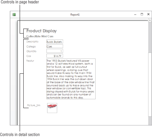
Figure 20.31 A print preview of the report so far.
As you move the mouse over the print preview, the cursor changes to a magnifying glass. Click any portion of the view to zoom in so that you can closely examine the report's layout. Only one record per page appears on the report because of the vertical layout. In the next section, you move the controls around and create a more horizontal layout.
Deleting and cutting attached labels from Text Box controls
To create a more horizontal report, you must move the text-box labels from the Detail section to the Page Header section and reposition the Text Box controls to a tabular layout. Once moved, these controls appear as headings above each column of data and are repeated on each page of the report.
You can easily delete one or more attached controls in a report. Simply select the desired controls and press Delete. However, if you want to move the label to the Page Header section (instead of simply deleting it), you can cut the label instead of deleting it. When removing attached controls, there are three choices:
- Delete only the Label control.
- Cut the Label control to the Clipboard.
- Delete or cut the Label control and the Text Box control.
Oddly enough, you can't simply drag a label from the Detail section to the page header. Dragging an attached label from the Detail section drags its text box along with it. You must cut the label from the Detail section and paste it into the Page Header section.
If you select the Label control and cut it by pressing Ctrl+X, only the Label control is removed. If you select the Text Box control and cut or delete it, the Label and Text Box controls are removed. To cut an attached Label control (in this case, the label attached to the Description text box), follow these steps:
- Click the Close Print Preview button on the Ribbon to exit Print Preview mode.
- Select the Description label in the Detail section.
- Press Ctrl+X (Cut). After you've cut the label, you may want to place it somewhere else. In this example, place it in the Page Header section.
Pasting labels into a report section
It's as easy to cut labels from controls placed in the Detail section and paste them into the page header as it is to delete the labels and create new ones in the page header. Regardless, you now paste the label you cut in the previous steps:
- Click anywhere in or on the Page Header section.
- Press Ctrl+V (Paste). The Description label appears in the page header.
- Repeat for the Quantity in Stock and Cost labels. If you accidentally selected the data Text Box control and both controls are cut or deleted, click the Undo toolbar button, or press Ctrl+Z, to undo the action.
Moving Label and Text Box controls
Before discussing how to move Label and Text Box controls, it's important to review a few differences between attached and unattached controls. When an attached label is created automatically with a Text Box control, it's called a compound control. In a compound control, whenever one control in the set is moved, the other control moves along with it. This means that moving either the label or the text box also moves the related control.
To move both controls in a compound control, select either of the pair of controls with the mouse. As you move the mouse pointer over either of the objects, the pointer turns into a hand. Click the controls and drag them to their new location. As you drag, an outline for the compound control moves with your pointer.
To move only one of the controls in a compound control, drag the desired control by its moving handle (the large square in the upper-left corner of the control). When you click a compound control, it looks like both controls are selected, but if you look closely, you see that only one of the two controls (Text Box or Label) is selected (as indicated by the presence of both moving and sizing handles). The unselected control displays only a moving handle. A pointing finger indicates that you've selected the move handles and can now move one control independently of the other. To move either control individually, select the control's move handle and drag it to its new location.
To make a group selection, click with the mouse pointer anywhere outside a starting point and drag the pointer through (or around) the controls you want to select. A gray, outlined rectangle appears, showing the extent of the selection. When you release the mouse button, all controls the rectangle surrounds are selected. You can then drag the group of controls to a new location.
Make sure you also resize all the controls as shown in the figure. Change the size and shape of the Features Long Text field and the OLE picture field Picture. The OLE picture field displays as a rectangle with no field name in Design view. (It's the bottommost control above the footer in Figure 20.32.)

Figure 20.32 Rearranging the controls on the report.
Place all the controls in their proper position to complete the report layout. Figure 20.32 shows one possible layout of the controls. You make a series of group moves by selecting several controls and positioning them close to where you want them. Then, if needed, you can fine-tune their position by dragging individual controls.
Use Figure 20.32 as a guide to placing controls on the report.
At this point, you're about halfway done. The screen should look something like Figure 20.32. Remember that these screenshots are taken with the Windows screen resolution set to 1,680 x 1050. If you're using a lower resolution, or you have large fonts turned on in the Windows Display Properties (in the Control Panel), you have to scroll the screen to see the entire report.
These steps complete the rough design for this report. There are still properties, fonts, and sizes to change. When you make these changes, you have to move controls around again. Use the designs in Figure 20.32 only as a guideline. How it looks to you, as you refine the look of the report in the Report window, determines the final design.
Modifying the appearance of multiple controls
The next step is to apply bold formatting to all the Label controls in the Page Header section directly above the section separator. The following steps guide you through modifying the appearance of text in multiple Label controls:
- Select all Label controls in the bottom of the Page Header section by clicking them one at a time while holding down the Shift key. Alternatively, click in the vertical ruler immediately to the left of the labels in the Page Header. Access selects all controls to the right of where you clicked in the vertical ruler. There are four Label controls to select (refer to Figure 20.32).
Alternatively, you can drag a bounding box around the Label controls in the page header.
- Click the Bold button on the toolbar. After you make the final modifications, you're finished, except for fixing the picture control. To do this, you need to change properties, which you do in the next section.
Changing Label and Text Box control properties
To change the properties of a Text Box or Label control, you need to display the control's Property Sheet. If it isn't already displayed, perform one of these actions to display it:
- Double-click the border of the control (anywhere except a sizing handle or move handle).
- Select a control and press F4.
- Right-click the control with the mouse and select Properties.
- Press F4 to open the Properties window, and use the drop-down list at the top of the window to select the form or control on the form.
The Property Sheet enables you to look at and edit a control's property settings. Using tools on the Format tab of the Ribbon, such as the formatting windows and text-formatting buttons, also changes the property settings of a control. Clicking the Bold button in the Format tab, for example, sets the control's Font Weight property to Bold. It's usually easier and more intuitive to use the controls on the Format tab of the Ribbon, but many properties are not accessible through the Ribbon. Plus, objects often have more options available through the Property Sheet.
The Size Mode property of an OLE object (bound object frame), with its options of Clip, Stretch, and Zoom, is a good example of a property that is available only through the Property Sheet.
The Image control, which is a bound object frame, presently has its Size Mode property set to Zoom, which is the default. With Size Mode set to Clip, the picture is displayed in its original size and Access either cuts off the picture at the edge of its control or shows extra space around the image. With Size Mode set to Stretch, the image will fit the control frame but may be distorted if the control frame has a different aspect ratio than the image. A Size Mode of Zoom keeps the image's aspect ratio and fits the image inside the control frame. You may find that extra space is shown around the image, but it's usually a good trade-off so the image isn't distorted.
You might consider changing the Border Style property to Transparent. When set to Transparent, no boxes are drawn around the picture and the picture blends into the report's surface. Finally, delete the label bound to the Image control.
The labels for Features and Pictures aren't needed because a user will surely know what data is being presented without them. Select each label and press the Delete key to remove them. Next, reposition the Image control to the right of the Feature control.
These steps complete the changes to your report so far. A print preview of the first few records appears in Figure 20.33. If you look at the pictures, notice how the picture is properly displayed and the product's Features text box now appears across the bottom of each Detail section.

Figure 20.33 The report displayed in Print Preview.
Growing and shrinking Text Box controls
When you print or print-preview controls that can have variable text lengths, Access provides options for enabling a control to grow or shrink vertically, depending on the exact contents of a record. The Can Grow and Can Shrink properties determine whether a Text Box control resizes its vertical dimension to accommodate the amount of text contained in its bound field. Although these properties are usable for any text control, they're especially helpful for Text Box controls.
Table 20.1 explains the acceptable values for these two properties.
Table 20.1 Text Box Control Values for Can Grow and Can Shrink
| Property | Value | Description |
| Can Grow | Yes | If the data in a record uses more lines than the control is defined to display, the control resizes to accommodate additional lines. |
| Can Grow | No | If the data in a record uses more lines than the control is defined to display, the control does not resize. Rather, it truncates the data in the control. |
| Can Shrink | Yes | If the data in a record uses fewer lines than the control is defined to display, the control resizes to eliminate blank space. The Can Shrink property of all controls in the section must be set to Yes before the section can shrink. |
| Can Shrink | No | If the data in a record uses fewer lines than the control is defined to display, the control does not resize to eliminate blank space. |
To change the Can Grow settings for a Text Box control, follow these steps:
- Select the Features Text Box control.
- Display the Property window.
- Click the Can Grow property, click the arrow, and select Yes.
The report is starting to look good, but you may want to see groups of like data together and determine specific orders of data. To do this, you use sorting and grouping.
Sorting and grouping data
You can often make the data on the report more useful to users by grouping the data in informative ways. Suppose that you want to list your products first by category and then by description within each category. To do this, you use the Category and Description fields to group and sort the data.
Creating a group header or footer
Grouping on a field in the report's data adds two new sections—Group Header and Group Footer—to the report. In the following steps, you use the group header to display the name of the product category above each group of records. You won't use the Category group footer in this example because there are no totals by category or other reasons to use a group footer.
Follow these steps to create a Category group header:
- Click the Group & Sort button in the Grouping & Totals group on the Design tab of the Ribbon. The Group, Sort, and Total pane appears at the bottom of the screen.
- Click the Add a Group button in the Group, Sort, and Total area.
- Select Category from the Field List. Access adds Group on Category with A on top in the Group, Sort, and Total area. Access adds Category Header and Category Footer sections to the report's design as soon as you select the Category field for grouping. The Category Header section appears between the Page Header and Detail sections. If you define a group footer, it appears below the Detail section, and above the Page Footer area. If a report has multiple groupings, each subsequent group becomes the one closest to the Detail section. The groups defined first are farthest from the Detail section.
The Group Properties pane (displayed when you click the More button on the group) displays a sentence with each option separated by a comma. The options are drop-down lists or clickable text for setting the property. The options sentence for the Category group contains these choices:
- Group on Category: Determines the field on which to group. You can change this field even after you've set the group field by selecting a different field from the drop down.
- With A on top: Determines the sort order. In this case it's alphabetical. Select With Z on top to reverse the sort.
- By entire value: Groups are separated based on the value in the field. You can also group on the first character of the field, the first two characters of the field, or any number of characters that you type into the Characters box in the drop down.
- With no totals: Determines what totals are displayed in the group header or footer. You can select which field to total and the type of total to display.
- With title: Allows you to specify a title for the group.
- With a header section: Displays the group header section. Choose “without a header section” to hide the header.
- Without a footer section: Hides the group footer section. Choose “with a footer section” to display the footer.
- Do not keep together on one page: Allows the group to be continued on the next page if there is too much information for the current page. Choose “keep whole group together on one page” to start a new page when there is too much information for the current page. Choose “keep header and first record together on one page” to start a new page only when there isn't enough room for the first record.
Click the Less button to hide these options once set. The options above are shown for a grouping on the Category field, which is a text field. Other field types have some of the same options and some different options. Date fields show these options:
- From oldest to newest: Instead of “with A on top” as with text fields, date fields are sorted from oldest to newest. Choose “from newest to oldest” to reverse the sort.
- By quarter: Allows you to group by the entire date, by day, by week, by month, by quarter, by year, or by a custom date or time increment.
The other date field options are the same as for text fields and are not repeated. Numeric fields show these options:
- From smallest to largest: Determines the numeric sort. Choose “from largest to smallest” to reverse the order.
- By entire value: Group by each numeric value individually or by 5s, 10s, 100s, 1,000s, or by a custom interval.
Sorting data within groups
Sorting enables you to determine the order in which the records are viewed on the report, based on the values in one or more controls. This order is important when you want to view the data in your tables in a sequence other than that of your input. For example, new products are added to tblProducts as they're needed on an invoice. The physical order of the database reflects the date and time a product is added. Yet, when you think of the product list, you probably expect it to be in alphabetical order by Product ID, and you want to sort it by Description or the cost of the product. By sorting in the report itself, you don't have to worry about the order of the data. Although you can sort the data in the table by the primary key or in a query by any field you want, there are good reasons to do it in the report. This way, if you change the query or table, the report is still in the correct order.
In the case of the products report, you want to display the records in each category group sorted by description. Follow these steps to define a sort order based on the Description field within the Category grouping:
- Click the Grouping button on the Design tab of the Ribbon to display the Group, Sort, and Total area, if it isn't already open. You should see that the Category group already exists in the report.
- Click the Add a Sort button in the Group, Sort, and Total area.
- Select Description in the Field List. Notice that Sort by defaults to “with A on top.”
- Close the Group, Sort, and Total area by clicking the X in the upper-right corner. The Group, Sort, and Total section should now look like Figure 20.34.

Figure 20.34 The Group, Sort, and Total area completed.
Although you used a field in this example, you can also sort (and group) with an expression. To enter an expression, click the Add a Sort or Add a Group button in the Group, Sort, and Total area, and then click the Expression button at the bottom of the Field List. The Expression Builder dialog box opens, enabling you to enter any valid Access expression, such as in = [RetailPrice]-[Cost].
To change the sort order for fields in the Field/Expression column, simply click the drop-down arrow to the right of the With A on Top button (see Figure 20.34) to display the Sort Order list. Select “with Z on top” from the sort options that appear.
Removing a group
To remove a group, display the Group, Sort, and Total area, select the group or sort specifier to delete, and then press the Delete key. Any controls in the group header or footer will be removed.
Hiding a section
Access also enables you to hide headers and footers so that you can break data into groups without having to view information about the group itself. You can also hide the Detail section so that you see only a summary report. To hide a section, follow these steps:
- Click the section you want to hide.
- Display the section's Property Sheet.
- Click the Visible property and select No from the drop-down list in the property's text box.
Sizing a section
Now that you've created the group header, you might want to put some controls in the section, move some controls around, or even move controls between sections. Before you start manipulating controls within a section, you should make sure the section is the proper height.
To modify the height of a section, drag the top border of the section below it. For example, if you have a report with a page header, Detail section, and a page footer, change the height of the Detail section by dragging the top of the Page Footer section's border. You can make a section larger or smaller by dragging the bottom border of the section.
For this example, change the height of the group header section to  inch by following these steps:
- Move your mouse pointer to the bottom of the Category Header section. The pointer changes to a horizontal line split by two vertical arrows.
- Select the top of the Detail section (which is also the bottom of the Category Header section).
- Drag the selected band lower until three dots appear in the vertical ruler (
 ") and release the mouse button when you have the band positioned. The gray line indicates where the top of the border will be when you release the mouse button.
Moving controls between sections
You now want to move the Category control from the Detail section to the Category Header section. You can move one or more controls between sections simply by dragging the control with your mouse from one section to another or by cutting it from one section and pasting it to another section:
- Select the Category control in the Detail section and drag it up to the Category Header section, as shown in Figure 20.35. You should now perform the following steps to complete the report design.

Figure 20.35 Completing the Group Header section.
- Delete the Category label from the group header.
- Set the Border Style property of the Category control and all the controls in the Page Header to Transparent.
- Change the font size, bold, and font color of the Category control to visually distinguish it from the records below it. Figure 20.35 shows the placement of the controls on the completed report design.
Adding page breaks
Access enables you to force page breaks based on groups. You can also insert forced breaks within sections, except in Page Header and Page Footer sections.
In some report designs, it's best to have each new group begin on a different page. You can achieve this effect easily by using the Force New Page property of a group section, which enables you to force a page break every time the group value changes.
The four Force New Page property settings are:
- None: No forced page break (the default)
- Before Section: Starts printing the current section at the top of a new page every time there is a new group
- After Section: Starts printing the next section at the top of a new page every time there is a new group
- Before & After: Combines the effects of Before Section and After Section
To force a page break before the Category group:
- Click anywhere in the Category header, or click the Category Header bar above the section.
- Display the Property Sheet and select Before Section in the Force New Page property's drop-down list.
Sometimes, you want to force a page break—but not on the basis of a grouping. For example, you might want to split a report title across several pages. The solution is to use the Page Break control from the Controls group of the Ribbon. Drag the Page Break control and drop it on the report where you want a page break to occur each time the page prints.
Improving the Report's Appearance
As you near completion of testing your report design, you should also test the printing of your report. Figure 20.36 shows the first page of the Product Display report. There are a number of things still to do to complete the report.

Figure 20.36 The report is pretty plain and uninteresting at this point.
The report is pretty boring and plain. If your goal is to just look at the data, this report is done. However, you need to do more before you're really done.
Although the report has good, well-organized data, it isn't of professional quality. To make a report more visually appealing, you generally add a few graphic elements like lines and rectangles, and possibly some special effects such as shadows or sunken areas. You want to make sure sections have distinct areas separate from each other using lines or colors. Make sure controls aren't touching each other (because text might eventually touch if a value is long enough). Make sure text is aligned with other text above or below and to the right or left.
Adjusting the page header
The page header contains several large labels positioned far apart from each other. The column headers are small and just hanging there. They could be made one font size larger. The entire page header should be separated from the Detail section by a horizontal line.
If you wanted to add some color to your report, you could make the report name a different color. Be careful not to use too many colors unless you have a specific theme in mind, though. Most serious business reports use one or two colors, and rarely more than three with the exception of graphs and charts. Furthermore, colors are not much use when printed on most laser printers.
Figure 20.37 shows these changes. The Product Display label has been changed to a blue background color with white foreground text. This is done by first selecting the control and then selecting Blue for the background. They've also been placed under each other and left aligned. The rectangle around each of the controls was also properly sized by double-clicking each control's sizing handles.

Figure 20.37 Adjusting controls in the page header.
The next step is to add a nice thick line separating the Page Header section from the Category Group Header section:
- Select the Line tool in the Controls group of the Ribbon.
- Drag a line below the Description and QtyInStock labels, as shown in Figure 20.37.
- Select the line and change the Border Width property to 2 pt on the line's property window.
Creating an expression in the group header
Figure 20.37 also shows that the Category field has been replaced by an expression. If you place the value of the category in the Group Header section, it looks out of place and may not be readily identifiable. Most data values should have some type of label to identify what they are.
The expression ="Category: " & [Category] displays Category: followed by a space and the value of the Category field (such as Category: Cars) in the text box. The & symbol (the concatenation operator) joins strings. Make sure you leave a space after the colon or the value won't be separated from the label. The text control has been bolded and underlined, and the font point size has been increased as well.
You may find that Access complains about a circular reference on the Category text box after you change the control's ControlSource. This happens because the name of the control is Category, and the text box is bound to a field named Category. Access doesn't understand that [Category] in the expression you entered as the ControlSource actually refers to the field, not the text box. (A text box's value can't be based on the text box's contents—that's the definition of circular reference.) The solution is to rename the text box to txtCategory to distinguish it from its bound field.
Follow these steps to complete the expression and rename the control:
- Select the Category control in the Category Group Header section and display the property window for the control.
- Change the ControlSource property to ="Category: " & [Category].
- Change the Name property to txtCategory.
The final formatting step for the Category Header is to change the Border Style property of the txtCategory control to Transparent. You have visually distinguished this control by changing the font, and a border is unnecessary.
Creating a report header
The Report Header section is printed only once for the entire report. The report header is the logical place to put things such as the report's title, a logo, and the print date and time. Having this information in the report header makes it easy for any user of the report to know exactly what's in the report and when the report was printed.
With the report open in Design view, the Ribbon includes a Design tab. Within the Header/Footer group on the Design tab are a number of controls that help you add important features to the report's header and footer.
For example, click the Logo button, and Access opens the Insert Picture dialog box (shown in Figure 20.38) for browsing to an image file to insert as the report's logo. Virtually any image file (JPG, GIF, BMP, and so on) is a candidate for inclusion as the report's logo.

Figure 20.38 Browsing to an image file to use as the report's logo.
The Title button in the Header/Footer group adds the report's name as the report header's title, and positions the edit cursor within the title label to make it easy for you to adjust the report's title.
Finally, the Date and Time button opens the Date and Time dialog box (shown in Figure 20.39). Specify the date and time format you'd like to use for the Date control by selecting the Date and Time control in the Header/Footer group on the Design tab of the Ribbon.
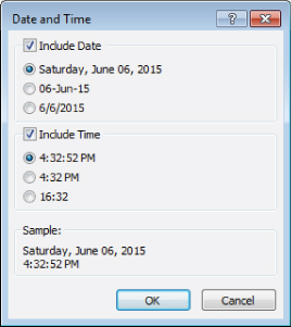
Figure 20.39 Specifying the date and time format.
The completed report in Print Preview is shown in Figure 20.40. The report header in this figure was created in less than a minute using the tools built into Access 2016.

Figure 20.40 The completed report in Print Preview.
As you close the report, Access will prompt you to save the report if you have not yet done so.