
Chapter 15. Web content management
The Web Content Management (WCM) features within Microsoft SharePoint are basically a vast network of capabilities that are centered on content rather than collaboration, in the benefits that they provide both to users and to content creators of sites or systems that take advantage of these features.
A SharePoint site is considered to be a publishing site if the SharePoint Server Publishing feature that is scoped at the site level is active. When you activate this feature manually or by choosing a site template that automatically activates the feature, many changes take place from a site infrastructure perspective. For example, additional libraries and layout templates that are focused heavily on the presentation of content instead of a more collaborative interaction are made available.
Other capabilities that are presentation-focused are device channels that allow a site to be presented differently depending on the type of device that is accessing it, and managed navigation, in which terms are used both to tag content and also to provide users with a way to navigate through menus and URLs by providing friendly URLs that contain these terms. Another very important feature is content aggregation. On collaboration sites, content might not have to be accessed beyond the site itself, but on a publishing site, many sites might need to have their content aggregated into a single view or list so that users can have a menu of items from which to select.
Many of the features and capabilities within the WCM space will be discussed throughout this chapter.
Understanding the WCM features
The WCM features found in SharePoint are designed to provide organizations and individual users with a mechanism to publish content for a group of consumers or readers that is much larger than the group of content creators.
The types of portals or sites that would take advantage of these WCM features are messaging portals such as those used in a corporate intranet, or public-facing sites that serve as a company’s primary Internet presence. Another way to refer to these sites is to call them authoritative or publishing sites, and anything authoritative should include company branding and approval along with the content to ensure that the corporate identity is well represented and accurate. This is much different from other sites found in a SharePoint implementation, which might be more collaborative in nature. Therefore, the features, templates, and processes that a publishing site should have are not appropriate on a collaboration site, and vice versa.
Publishing site templates
As stated earlier in this chapter, a publishing site in SharePoint is simply a site that has the SharePoint Publishing Server feature active. This feature introduces a Pages library that can be viewed as a special document library that stores publishing pages within it. You can use these pages to embed text, images, and other content and then make them accessible to end users. The Pages library is similar to the Wiki Pages library, but with a lot more functionality. Publishing pages use page layouts to present their content in a rich and consistent manner. Other added features include additional Web Parts, found within the Web Part Gallery, that can be used to perform activities such as content rollups.
Additional changes beyond those that the SharePoint Publishing Server feature implements when it is active can be automatically configured. When you use a publishing site template, the template implements additional features and configuration. For example, if you choose the Publishing Site With Workflow site template, approval workflows are configured on libraries within the site during the site provisioning process. This template also restricts all subsites to using the same site template.
The publishing site templates available within the web user interface of SharePoint 2013 on an existing site are:
Publishing Site
Publishing Site With Workflow
You can view this list when you go to Site Content and then choose to create a new subsite. Figure 15-1 shows the Publishing tab displaying the two publishing sites, in addition to the enterprise wiki.

If you wanted to view these same templates by using Windows PowerShell, one way you could do so is to filter the results returned by the Get-SPWebTemplate cmdlet to only return those templates with the word “Publishing” within their titles. This could be accomplished by executing the following code:
Get-SPWebTemplate | Where-Object {$_.Title -like "*Publishing*"} '
| select Name, Title, Description, CompatibilityLevel | Format-List
This code actually returns more than the two publishing sites shown in Figure 15-1; in fact, eight templates are returned. The complete list is shown Table 15-1.
Name | Title | Description | Compatibility level |
CMSPUBLISHING#0 | Publishing Site | A blank site for expanding your website and quickly publishing webpages. Contributors can work on draft versions of pages and publish them to make them visible to readers. The site includes document and image libraries for storing web publishing assets. | 15 |
BLANKINTERNET#0 | Publishing Site | A template that creates a site for publishing webpages on a schedule, with workflow features enabled. By default, only publishing subsites can be created under this site. A document and picture library are included for storing web publishing assets. | 15 |
BLANKINTERNET#2 | Publishing Site with Workflow | A site for publishing webpages on a schedule by using approval workflows. It includes document and image libraries for storing web publishing assets. By default, only sites with this template can be created under this site. | 15 |
BLANKINTERNETCONTAINER#0 | Publishing Portal | A starter site hierarchy for an Internet-facing site or a large intranet portal. This site can be customized easily with distinctive branding. It includes a home page, a sample press releases subsite, a Search Center, and a logon page. Typically, this site has many more readers than contributors, and it is used to publish webpages with approval workflows. | 15 |
CMSPUBLISHING#0 | Publishing Site | A blank site for expanding your website and quickly publishing webpages. Contributors can work on draft versions of pages and publish them to make them visible to readers. The site includes document and image libraries for storing web publishing assets. | 14 |
BLANKINTERNET#0 | Publishing Site | A template that creates a site for publishing webpages on a schedule, with workflow features enabled. By default, only publishing subsites can be created under this site. A document and picture library are included for storing web publishing assets. | |
BLANKINTERNET#2 | Publishing Site with Workflow | A site for publishing webpages on a schedule by using approval workflows. It includes document and image libraries for storing web publishing assets. By default, only sites with this template can be created under this site. | 14 |
BLANKINTERNETCONTAINER#0 | Publishing Portal | A starter site hierarchy for an Internet-facing site or a large intranet portal. This site can be customized easily with distinctive branding. It includes a home page, a sample press releases subsite, a Search Center, and a logon page. Typically, this site has many more readers than contributors, and it is used to publish webpages with approval workflows. | 14 |
The first thing you should notice about the site templates is that they can be grouped into two sets of four templates based on Compatibility Level. If you are not already familiar with levels 14 and 15, they equate to the 2010 and 2013 versions of SharePoint, respectively. The description of each site template can give you a good idea of the degree of extra functionality introduced by selecting one template over another. One additional note about Compatibility Level, as it pertains to sites, is that when you choose to create a new site through the web UI or by using New-SPSite, the default Compatibility Level is 15, which is the 2013 version. By default, you only have the option to create 2010 versions of a site if you elect to use the New-SPSite cmdlet and specify 14 for the Compatibility Level parameter.
Accessing SharePoint publishing files
Because most publishing sites have some level of branding at the site, page, and Web Part level, a lot of files (such as CSS, images, and scripts) can start to accumulate. As a result, it’s important to be able to access these files in a timely fashion. In addition to the already identified branding files that can be found in previous versions of SharePoint, additional files have been introduced in SharePoint 2013. To reduce the amount of time it takes to access the files stored within the Master Page Gallery, you can now access the gallery via a network path.
Mapping to the SharePoint Master Page Gallery
The method you use to map the Master Page Gallery as a network drive on your local machine depends on whether your machine has Windows XP, Windows 8, another Windows-based operating system, or another operating system altogether. If you are using a Windows operating system that is later than Windows XP and up to Windows 8.1, as of this writing, you can use the article at the following URL to learn how you map the Master Page Gallery as a network drive: http://msdn.microsoft.com/en-us/library/jj733519.aspx. If you are on another operating system or are comfortable with how you map paths, then the only important thing to remember is the URL structure to follow. The URL structure is http://<siteURL>/_catalogs/masterpage/. There is really just one prerequisite to being able to successfully create the mapping, and it is security based. You must have at least Designer permission, which is the same permission you need to be able to access the Master Page Gallery through the web UI.
Page layouts
Page layouts in SharePoint are essentially presentation templates that control how the metadata or content stored in a Pages library for a page is presented to a user. In addition to displaying the content stored within the Pages library, a page layout can also include Web Part zones, which allow supplemental content to be exposed through Web Parts.
Understanding the page model
To really grasp the role that master pages, page layouts, and pages play within a publishing site, as well as how they interact with each other, you need to understand what the page model is.
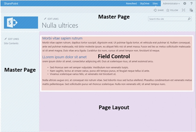
At its lowest level, the page model starts with a master page. A master page contains the common elements that should be displayed on every page for a site. Some of the typical common elements are:
Site logo
Search box
Global navigation
Footer
Content placeholders for page layouts
The next level up is the page layout, which we have already discussed in some detail; however, more detail is needed to help clarify its role in the page model. Page layouts are able to identify what to correctly render where, along with how to render it, through the use of page field controls and their mapping to site columns. A sample code extraction of a page field control found in a page layout is shown in Example 15-1. The mapping is accomplished by using the FieldName parameter of the field control, which needs to have its value set to the internal name of the site column whose content the page field control should display.
<PublishingWebControls:RichHtmlField FieldName="PublishingPageContent"
HasInitialFocus="True" MinimumEditHeight="400px" runat="server"/>
The field control shown in the listing is of type RichHtmlField, which is available under the namespace Microsoft.SharePoint.Publishing.WebControls. There are many other control types found within this namespace, in addition to other control types found in other namespaces. For example, the TaxonomyFieldControl, which is used to expose the value of a managed metadata field or site column, is found in the Microsoft.SharePoint.Taxonomy namespace.
The final layer is the page, which is the content. As mentioned earlier, page field controls on a page layout map to site columns. These site columns are grouped into a content type and made available in a Pages library that it is associated with the page. It is important to note that not all site columns for a page need to be mapped to field controls within a page layout. Because of this, it is best to categorize the site columns for a particular page into one of two groups: those that are used for presentation and metadata and those that are used strictly for metadata. An example of one that is used for presentation would be a site column that is used for storing a news article image or the body for a news article. An example of one that is used strictly for metadata could be one that is used for metadata keywords or audience targeting.
When you add the layers together you get the final rendered page that a user would get. Figure 15-2 shows a rendered SharePoint publishing page broken down by using the page model.
To learn more about SharePoint master pages, pages, and the deployment of each of these, see the section Using pages in SharePoint in Chapter 7.
Creating a new page layout
We have already discussed why a page layout is important for publishing in SharePoint and how it is involved in the page model. This section discusses the options for creating a page layout and then goes into detail on how to control the presentation and editing of a page by using a page layout.
There are more ways to create page layouts in SharePoint 2013 than there were in SharePoint 2010, thanks to the new Design Manager. When you choose to use the Design Manager approach, you will interact with an HTML page when you want to make changes to a page layout, and that HTML page in turn is associated with an .aspx file that SharePoint uses in the page model. When you make a change to the HTML page, this change is then propagated to the associated .aspx file. It is important to remember that this propagation is in one direction only, going from the HTML page to the .aspx file. Because of this, any changes made to the .aspx file that did not first occur in the HTML page will get overwritten when the next change to the HTML page occurs. To learn more about how to create a page layout, see the article “How to: Create a page layout in SharePoint 2013” at http://msdn.microsoft.com/en-us/library/jj822368.aspx.
The approach taken in previous versions of SharePoint, in which only an .aspx file is created and then deployed to a SharePoint site, is still supported. Some developers might be more familiar with this and might prefer it in place of using the Design Manager.
Managing the presentation of page fields
Page fields, as described in the Understanding the page model section earlier in this chapter, are visible through a page layout when you are creating a new publishing page. These fields are associated with a content type, and each page field on a page layout should reference a field within the associated content type. Page fields are able to read and write to a content type field because they too have an assortment of available types. For example, if you needed to expose the Title field for a content type that had a column type of Single Line of Text, you would use a page field with a field type of TextField to support read and write operations on the Title field, as shown in the following code:
<SharePointWebControls:TextField ID="tfTitle" runat="server" FieldName="Title"/>
The TextField uses a SharePointWebControls prefix, which requires a reference as shown in the following code:
<%@ Register Tagprefix="SharePointWebControls" Namespace="Microsoft.SharePoint.WebControls"
Assembly="Microsoft.SharePoint, Version=15.0.0.0, Culture=neutral, PublicKeyToken=71e9bce111e94
29c" %>
A TextField field type is considered a simple field type and can be styled by simply wrapping the page field with a div that has an ID that you can reference by using cascading style sheets (CSS). This allows developers and designers to control the presentation of the content rendered through the controls.
Most field types are considered simple; however, the RichHtmlField is an exception. As its name implies, this field type allows the author to have an experience similar to using a word processor when authoring content within it. A ribbon with a multitude of options is available for managing fonts, paragraphs, and other text-centric functions, as shown in Figure 15-3.

Because of the many options available to the author during the editing experience, the brand or presentation consistency of the content might be at risk if too many liberties are taken with the available options. Because of this, the RichHtmlField field type has properties that can be used to control which of the editing or formatting options should be available to the author. Table 15-2 shows a breakdown of the primary Allow properties that can be used to control the editing and formatting experience.
There are many more properties than those listed in this table, but these are the most common properties needed for content authoring and the editing experience. To view the complete set of properties, see http://msdn.microsoft.com/en-us/library/microsoft.sharepoint.publishing.webcontrols.richhtmlfield_properties.aspx. The following code snippet shows an example of some of these properties being configured for use within a page layout:
<PublishingWebControls:RichHtmlField ID="rhfPageContent" FieldName="PageContent"
HasInitialFocus="True" AllowFonts="True" AllowTextMarkup="False" runat="server"/>
If you compare this code snippet to the previous example for a TextField, you will notice that both controls come from the same namespace. The two Allow properties in this example affect the way the ribbon renders for an author, as shown in Figure 15-4.

In Figure 15-4 you can tell that the ability to choose fonts and pretty much everything else is still there, but the ability to use bold or other text styles is not available.
Working with edit mode panels
An edit mode panel primarily allows a designer or a developer to wrap fields and content within it to control what is visible while an author is editing a page, hence the naming of the control. There are in fact two different modes that a page can be in: display mode and edit mode. Display mode is the only mode that visitors to a site will ever experience, whereas an author will also view the edit mode when creating or modifying a page. The interesting thing about an edit mode panel is that it can be used to control the visibility of content and controls in either display mode or edit mode, even though its name would suggest that its scope is limited to the edit mode. To help explain this, the following code snippet is used to render the text Contoso on the page, but only while the page is in display mode:
<PublishingWebControls:EditModePanel ID="MyEditModePanel" runat="server" PageDisplayMode="Displa
y">Contoso</PublishingWebControls:EditModePanel>
Notice that this is controlled by means of the PageDisplayMode property of the EditModelPanel control. Furthermore, the two available choices are in fact Display and Edit.
Working with Web Part zones
Page fields, as this chapter has just covered, are crucial to authoring content-driven pages. There are, however, many times that the content being authored directly on the page is not the only content that the author would like to use. You might discover a list or a library of documents that you would like to reuse or surface as links on a page. The obvious solution is to use a Web Part to surface the content; other than the RichHtmlField that was discussed earlier, there are no other page fields that support embedding a Web Part. And even then, the author is burdened with how to use HTML markup within a RichHtmlField to control the presentation of multiple Web Parts. Because of this need, requirements should be gathered and Web Parts zones should be identified as part of the solution.
Simply put, a Web Part zone is an area on a page that is dedicated to Web Parts and the ability to add, modify, or remove them. Further, Web Parts have the ability to control such things as the default chrome setting for added Web Parts and also the orientation of added Web Parts, whether they should be stacked vertically or horizontally. The following code snippet shows a simple Web Part zone that sets the orientation of the Web Parts placed inside of it in a horizontal format and sets the default chrome to be BorderOnly:
<WebPartPages:WebPartZone runat="server" Title="First Row"
ID="FirstRow" PartChromeType="BorderOnly" Orientation="Horizontal"><ZoneTemplate></ZoneTemplate></
WebPartPages:WebPartZone>
The namespace used to add a Web Part zone is Microsoft.SharePoint.WebPartPages. The horizontal format is set by using the Orientation property, and the default chrome is set to only show the border for Web Parts that are within the zone by using the PartChromeType property. Figure 15-5 shows how this would look when a page is in edit mode.

Understanding device channels
The number and types of devices that access digital information are forever increasing. This also holds true for accessing information stored inside of SharePoint, whether on a corporate intranet or an Internet site. The device that has been most commonly used for digital information access has been the desktop or laptop computer, but now mobile devices such as phones and tablets are starting to assume almost an equal share. As a result, the way in which information is presented to a user is expected to accommodate whichever device the user chooses. This can be a costly requirement, which might translate to building and maintaining multiple websites; however, this can be greatly alleviated if you have chosen to include SharePoint 2013 in your solution. Device channels, which are a part of the publishing infrastructure, allow you to have a single publishing page that is accessed from the same URL, but that renders differently depending on the type of device that is accessing it. The differences might include optimizations for mobile devices, such as exclusion of larger content or images, simpler navigation, and a touch-centric style. The differences for a high-resolution desktop computer might include multiple navigation menus, rich image rotators, and attractive animations. This is a huge benefit, not only in the initial cost savings, but also for future maintenance and enhancements.
The way this solution is accomplished is by taking advantage of the user agent string that is passed by every browser, regardless of the device, to a page that is being requested and then redirecting the user to the appropriate master page for the device. The information that is passed in this string can be used to determine the browser and its version along with the operating system of the device making the request. If a Windows Phone 8 were to access a page and you viewed the user agent string, you could find the following:
Mozilla/5.0 (compatible; MSIE 10.0; Windows Phone 8.0; Trident/6.0; IEMobile/10.0; ARM; Touch;
NOKIA; Lumia 920)
If you were to view the user agent string for a server running Windows Server 2012, it would look like the following:
Mozilla/5.0 (compatible; MSIE 10.0; Windows NT 6.2; WOW64; Trident/6.0; .NET4.0E; .NET4.0C; .NET
CLR 3.5.30729; .NET CLR 2.0.50727; .NET CLR 3.0.30729; InfoPath.3)
The important thing to note from all of this is that the user agent string is used by device channels to determine what to render for what device. It is not reasonable or cost-friendly to expect website developers to account for all the variances that occur simply due to the device maker, browsers, or even the operating system version. Because of this, device channels can work off of a substring of the user agent string. An important limitation to remember is that a maximum of 10 device channels can exist for a site, so you should plan ahead how to choose to group devices by device channels.
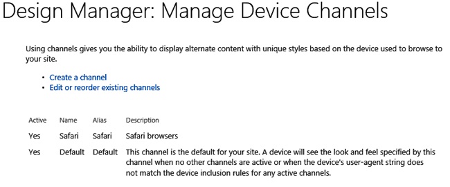
Device channels are accessible through the Device Manager, on the Manage Device Channels page. A device channel is very simple to provision, even though it accomplishes great things. There are only five properties for a device channel; these are shown in Table 15-3.
Field | Required | Description |
Name | True | A friendly or display name of the device channel. |
Alias | True | An internal name of the device channel used when referencing a device channel in code or a device channel panel. |
Description | False | A description or summary of the device channel’s purpose. |
Device Inclusion Rules | True | A value that contains the user agent substring(s); for example, Windows Phone, Chrome, Windows NT, or iPhone. At least one of these values must exist for the device channel to be used. |
Active | False | If this is set to True, the site will begin to use the device channel. |
There is a possibility that a match to more than one device channel could occur. If this happens, the device channel that has the highest order number will be the one used.
After you have at least two device channels, as shown in the example in Figure 15-6, you can configure the redirections to the correct master page.
To configure the master page that each device channel should redirect to, go to the Site Master Page Settings page, found at Site Settings | Master Page, as shown in Figure 15-7, and then simply choose an available master page from the drop-down menu for each of the device channels.

To test whether or not a device channel is redirecting correctly, or to just preview its behavior, you can simply include a query string parameter called DeviceChannel and pass the alias for the device channel you would like to test as its value. Figure 15-8 shows a page being tested with the Safari device channel that was configured in the previous figure. Notice that in place of the seattle master page the oslo master page is being used.

Working with device channel panels
By using device channels, you can redirect users to the correct master page that is targeted for their type of device. This concept alone is powerful, but being able to take it to the next level is where device channel panels come in. A device channel panel is used within a master page or a page layout to wrap content or functionality and target specific device channels. The following code shows a sample device channel panel:
<Publishing:DeviceChannelPanel runat="server" IncludedChannels="Safari">
    <div>Only visible to those devices included in the Safari device channel.</div>
</Publishing:DeviceChannelPanel>
The code is self-explanatory, but it is important to note that the DeviceChannelPanel object is found in the Microsoft.SharePoint.Publishing.WebControls namespace. Also, the IncludedChannels is where you identify which device channels, by their alias, will be able to see what is contained within the DeviceChannelPanel. If you would like to include more than one device channel, the aliases should be comma delimited and passed to the same property.
There are a few different strategies or approaches that you can use device channel panels in. The first is to help lower the number of one-to-one relationships between master pages and device channels. You can use device channel panels to limit the number of master pages by pairing up more device channels to a single master page and then use device channel panels to fine-tune the experience by hiding or showing sections of the master page that each device channel should see. A limitation that needs to be accounted for during the planning phase of device channel panels is that they cannot be used to wrap Web Part zones; however, if a Web Part is embedded within a page layout or master page, it could be wrapped by a device channel panel.
Another strategy is to reduce the size of pages being sent to a mobile device. This is accomplished by directing the server to not render the content found within a device channel panel whose IncludedChannels property does not contain a match to the device channel being used by the current device. This exclusion results in a smaller page than one created by using a CSS approach to hide non-relevant content, which still results in the page being too large and slow for a mobile device.
Understanding managed navigation
Publishing sites built on SharePoint have typically been easy to identify by certain always-present URL indicators. For example /pages is usually found in the URL, indicating that the page being viewed is stored in the Pages library of the site. Some developers might go through the effort of performing URL rewrites to remove the unwanted characters in the URL, but this can be an added effort that most do not want to exert, or that they expect to already be available in a WCM platform. Another point is that the presence of the library’s name in the URL indicates that the physical structure of the site is directly tied to the navigational structure of the site. Forcing the navigational structure and physical site structure to be aligned with one another can cause a lot more work than what was initially planned, because the two do not always line up with one another. Additionally, this will likely cause the same amount of effort when maintenance or structural changes to the site need to be performed.
The good news is that with the advent of SharePoint 2013 we now have the ability to separate the physical and navigational structures of a SharePoint site by using a new type of navigation called managed navigation. The ability to use managed navigation is dependent upon taxonomy, which is found in a Managed Metadata Service (MMS) Application. From this dependency comes two advantages. The first is that we can now have a term set be the global and/or current navigational structure for a site, and the second is that we can now have friendly URLs (FURLs) in place of URLs that have the SharePoint structure injected into them.
Because of the overwhelming advantages of managed navigation over structured navigation for publishing sites, there arises the need to ensure that this capability can be extended and also deployable in a consistent method across environments. To meet these needs there are APIs that Microsoft has made available for managed navigation.
Working with managed navigation APIs
To begin working with the managed navigation APIs, you first need to choose which API you want to use. There are APIs for the following:
Microsoft .NET client-side object model (CSOM)
Microsoft .NET server-side object model (SSOM)
Microsoft Silverlight
JavaScript
Not only can you take advantage of any of these four APIs, but each has been extended and enhanced from the SharePoint 2010 APIs. Some of the common uses for the APIs are to manage the creation and customizations of terms, term sets, and other properties found in an MMS Application that are related to managed navigation.
Later in this chapter we will work through an example of creating a new term set that can be used as a site’s managed navigation. The example will use CSOM using C#. Before we get started, though, we will identify the reference and namespace that are required. The following are the required reference for using the CSOM approach:
Microsoft.SharePoint.Client
Microsoft.SharePoint.Client.Runtime
Microsoft.SharePoint.Client.Publishing
Microsoft.SharePoint.Client.Taxononmy
The first two are standard requirements for any CSOM interactions to even occur. The remaining two, however, are needed to create the new term set through a site. The namespaces needed after the references are included are:
Microsoft.SharePoint.Client
Microsoft.SharePoint.Client.Taxonomy
Microsoft.SharePoint.Client.Publishing.Navigation
Creating a navigational term set
To begin creating a navigational term set by using CSOM, you must begin by gaining context of the site collection that you want to create the term set under and instantiating a TaxonomySession object, as shown in the following code:
//Gain context
ClientContext clientContext = new ClientContext("http://portal.contoso.com");
//Instantiate TaxonomySession
TaxonomySession taxonomySession = TaxonomySession.GetTaxonomySession(clientContext);
taxonomySession.UpdateCache();
//Request TaxonomySession TermStores property
clientContext.Load(taxonomySession, ts => ts.TermStores);
clientContext.ExecuteQuery();
After you have gained access to the TermStores property for the TaxonomySession object, you can select the term store that you will create the term set in. The following code simulates this by using the first term store within the TermStores property:
//Throw error if no Term Stores are found
if (taxonomySession.TermStores.Count == 0)
throw new InvalidOperationException("MMS not found");
//Request first Term Store Name and Working Language Properties
TermStore termStore = taxonomySession.TermStores[0];
clientContext.Load(termStore, ts => ts.Name, ts => ts.WorkingLanguage);
After you have access to the term store, you need to create a new term group for the site collection, and then you can create a term set underneath it, as shown here:
// Create a new Term Group for the Site Collection
TermGroup scTermGroup = termStore.GetSiteCollectionGroup(clientContext.Site, createIfMissing: true);
//Create a new Term Set within the Term Group called "Contoso Site Navigation"
TermSet termSet = scTermGroup.CreateTermSet("Contoso Site Navigation", Guid.NewGuid(), termStore.WorkingLanguage);
//Commit all changes
termStore.CommitAll();
clientContext.ExecuteQuery();
At this point, you have a term group that has been created within the scope of the site collection at http://portal.contoso.com. You have populated this term group with a new term set called Contoso Site Navigation. The next step is to identify the newly created term set as a navigational term set and fill it with a few sample terms:
//Access and edit the term set as if it were associated with the web at "http://portal.contoso.
com"
NavigationTermSet navTermSet = NavigationTermSet.GetAsResolvedByWeb(clientContext, termSet,
clientContext.Web, "GlobalNavigationTaxonomyProvider");
//Set the term set as a navigational term set
navTermSet.IsNavigationTermSet = true;

//Commit changes so far
termStore.CommitAll();
clientContext.ExecuteQuery();

//Create a term for the homepage
NavigationTerm term1 = navTermSet.CreateTerm("Home", NavigationLinkType.SimpleLink, Guid.
NewGuid());
term1.SimpleLinkUrl = "http://portal.contoso.com/";

//Create a term for the default page of the news subsite
NavigationTerm term2 = navTermSet.CreateTerm("News", NavigationLinkType.FriendlyUrl, Guid.
NewGuid());
term2.FriendlyUrlSegment.Value = "news";
term2.TargetUrl.Value = "~site/news/pages/default.aspx";

//Commit all changes
termStore.CommitAll();

//Request the term set's ID property
clientContext.Load(navTermSet, nts => nts.Id);
clientContext.ExecuteQuery();
The final step is to configure the web object for http://portal.contoso.com to start using the navigational term set that has just been created. This is done by the use of the WebNavigationSettings object. This object contains the means to specify the navigation model for a web object, including the ability to switch between structured navigation, which uses the PortalSiteMapProvider, and managed navigation, which uses the TaxonomySiteMapProvider. If managed navigation is used, then you also can dictate the term store and term set that should be used to drive the managed navigation. The following code shows how this can be accomplished:
//Reset the web object to the default settings
WebNavigationSettings webNavSettings = new WebNavigationSettings(clientContext, clientContext.
Web);
webNavSettings.ResetToDefaults();
//Configure the web object to use managed navigation
webNavSettings.GlobalNavigation.Source = StandardNavigationSource.TaxonomyProvider;
//Set the term store and term set to use for managed navigation
webNavSettings.GlobalNavigation.TermStoreId = termStore.Id;
webNavSettings.GlobalNavigation.TermSetId = navTermSet.Id;
webNavSettings.Update(taxonomySession);
//flush the cache
TaxonomyNavigation.FlushSiteFromCache(clientContext, clientContext.Site);

clientContext.ExecuteQuery();
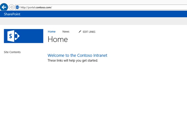
After executing all the code blocks shown within the section, you should have a site that has two navigation nodes visible within the global navigation of the site, as shown in Figure 15-9.
The example shown within this section demonstrates just one of the many possibilities available with the managed navigation APIs. Following this approach to code the creation of a site’s navigation settings along with the initial values allows for a consistent and efficient way to provision sites.
Content aggregation
Content aggregation is a very powerful capability found within the Web Content Management (WCM) features of SharePoint 2013. Its ability to roll up content from across different sites and lists, and now to roll up content from across site collections, web applications, and even other SharePoint farms cannot be underestimated. Of the features available in SharePoint 2010, the most popular Web Part used for aggregation is quite possibly the Content Query Web Part (CQWP). Its popularity stems from its ease of use, the ability that it gives to a power user to surface content queried by its properties, and last but not least, its ability to be branded at the presentation layer. It is not without its shortcomings, mainly its inability to query beyond a single site collection. However, you could say that it is because of this inability that SharePoint 2013 is now equipped with a search-driven Web Part that provides similar ease of use, user empowerment, and the ability to be branded at the presentation layer. This new Web Part is called the Content Search Web Part (CSWP). Both Web Parts can be found in the Web Part Gallery under the Content Rollup category when the correct features have been activated at the site collection and web levels, as shown in Figure 15-10.

For a visual depiction of the boundaries and rollup capabilities of each of these Web Parts, see Figure 15-11.

Deciding between the Content Query and Content Search Web Parts
Simply because the Content Search Web Part (CSWP) can do more does not always mean that it should be used over the Content Query Web Part (CQWP). Careful consideration should be given to requirements and the available infrastructure that supports the SharePoint implementation before making a solution decision.
When considering the requirements, if content must be available only moments after it is authored or approved, the site would not lend itself to the CSWP. In this situation, the CQWP would be the best fit because it can access the content instantly without needing to be crawled and indexed by the Search service. Another situation that would support the CQWP over the CSWP is when the SharePoint implementation is on a small two-server farm topology that needs to support several user requests and other services. This type of topology would not be able to support the constant demand of a search application’s crawl and index component on a highly demanding schedule. However, a situation in which the CSWP is the prime candidate and best choice is when you need to roll up content across site collection, web application, or farm boundaries, as shown in Figure 15-12.

More than what this chapter has covered so far should be considered when choosing the correct rollup Web Part. Figure 15-13 shows a rollup comparison of both the Content Query and Content Search Web Parts broken down by key areas.

As the comparisons play out you can tell that both the Content Query and Content Search Web Parts have an important role in SharePoint 2013 and each has a vital role to play in the success of Web Content Management solutions that involve content rollup.
Working with display templates
If you have spent time branding the results of a Content Query Web Part or a Core Search Result Web Part in SharePoint 2010, you have had the opportunity to experience the benefits and pains of working with Extensible Stylesheet Language for Transformations (XSLT) within SharePoint. The understanding needed to complete even simple branding techniques by using XSLT with these Web Parts requires more than just typical XSL knowledge. XSL is still used within SharePoint 2013 for the Content Query Web Part, but display templates have become the de facto solution for the all search-driven Web Parts. A display template is one of two types:
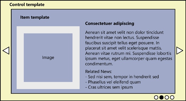
Control template. Called once per Web Part, this type of display template is responsible for the framing of the results being returned (for example, List or Content Rotator).
Item template. Called once per item, this type of display template is responsible for rendering item properties (for example, title, description, image, or other properties).
Figure 15-14 shows how a control template and item template would be used to present results as a content rotator.
Display templates have the following primary categories:
Content Web Parts (Content Search Web Part)
Search (Search Core Result Web Part, search box, and so on)
Filters (search refiners)
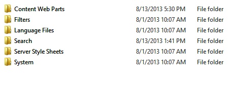
Display templates are stored at the site collection level within a root folder aptly named Display Templates, which is inside the Master Page Gallery. Each of the categories just listed is a folder within the Display Templates folder, as shown in Figure 15-15.
Display templates are made up of two associated files, much like the new HTML page layouts are in the Designer Manager. The files are an HTML file with which developers and designers interact, and an associated JavaScript file that SharePoint uses when the display template is being called. It is important to remember that, as with all other associated files in SharePoint 2013, you should modify the HTML file only. This is because SharePoint updates the JavaScript file whenever there is a change that has been made to the HTML file. So if you make a change directly to the JavaScript file it would work as intended, but you run the risk of having that change be overwritten the next time someone decides to update the HTML file instead.
The code markup within a control template and an item template have some similarities, but there are also some key differences. We will start by looking at a simple control template and then will progress to looking at an item template.
A control template named Control_List.html, which is available out of the box, is shown here:
<html xmlns:mso="urn:schemas-microsoft-com:office:office" xmlns:msdt="uuid:C2F41010-65B3-11d1
-A29F-00AA00C14882">
<head>
<title>List</title>
<!--[if gte mso 9]><xml>
<mso:CustomDocumentProperties>
<mso:TemplateHidden msdt:dt="string">0</mso:TemplateHidden>
<mso:MasterPageDescription msdt:dt="string">This is the default Control Display
Template that will list the items. It does not allow the user to page through items.</
mso:MasterPageDescription>
<mso:ContentTypeId msdt:dt="string">0x0101002039C03B61C64EC4A04F5361F385106601</
mso:ContentTypeId>
<mso:TargetControlType msdt:dt="string">;#Content Web Parts;#</mso:TargetControlType>
<mso:HtmlDesignAssociated msdt:dt="string">1</mso:HtmlDesignAssociated>
</mso:CustomDocumentProperties>
</xml><![endif]-->
</head>

<body>

    <!--
            Warning: Do not try to add HTML to this section. Only the contents of the first
            <div> inside the <body> tag will be used while executing Display Template code. Any
            HTML that you add to this section will NOT become part of your Display Template.
    -->
    <script>
        $includeLanguageScript(this.url, "~sitecollection/_catalogs/masterpage/Display
            Templates/Language Files/{Locale}/CustomStrings.js");
    </script>

    <!--
        Use the div below to author your Display Template. Here are some things to keep in mind:
        * Surround any JavaScript logic as shown below using a "pound underscore" (#_ ... _#)
        token inside a comment.

        * Use the values assigned to your variables using an "underscore pound equals"
        (_#= ... =#_) token.
    -->

    <div id="Control_List">

<!--#_
if (!$isNull(ctx.ClientControl) &&
    !$isNull(ctx.ClientControl.shouldRenderControl) &&
    !ctx.ClientControl.shouldRenderControl())
{
    return "";
}
ctx.ListDataJSONGroupsKey = "ResultTables";
var $noResults = Srch.ContentBySearch.getControlTemplateEncodedNoResultsMessage(ctx.ClientControl);

var noResultsClassName = "ms-srch-result-noResults";

var ListRenderRenderWrapper = function(itemRenderResult, inCtx, tpl)
{
    var iStr = [];
    iStr.push('<li>'),
    iStr.push(itemRenderResult);
    iStr.push('</li>'),
    return iStr.join(''),
}
ctx['ItemRenderWrapper'] = ListRenderRenderWrapper;
_#-->
    <ul class="cbs-List">

            _#= ctx.RenderGroups(ctx) =#_
        </ul>
<!--#_
if (ctx.ClientControl.get_shouldShowNoResultMessage())
{
_#-->
        <div class="_#= noResultsClassName =#_">_#= $noResults =#_</div>
<!--#_
}

_#-->

    </div>
</body>
</html>
When you work through this code, you can tell that it follows the typical HTML markup using HTML, HEAD, BODY, and DIV tags. Let’s start with the code found in the HEAD section. The TITLE element value is important because it is the text that shows up in the control template drop-down box when you are using a search-driven Web Part. The next section is the CustomDocumentProperties section. It has five properties that need to be filled out. Table 15-4 lists each of these properties with descriptions.
The BODY is where you place your design markup. The first section you find should be a script element. This is where you can include external JavaScript by using the $includeScript method or external CSS references by using the $includeCSS method.
After the script element you can finally start to use HTML markup to interact with the results being returned. It is important to note that up until this point in the display template, HTML markup is not supported. A client context object is available by using the ctx object inside the display template. If you would like to use JavaScript within the display template, you must wrap these sections with a “pound underscore” token as shown in the following code:
<!--#_
var jsVariable = "Contoso"
_#-->
When you need to reference a variable declared within a “pound underscore” token, you do so by using an “underscore pound equals” token, as shown in the following code:
<div>_#= jsVariable =#_ </div>
By working through this example you can begin to tell that there are some particulars that you must account for when using display templates, but even accounting for these, the ease of use and the learning curve is far shorter than that of the XSL approach in SharePoint 2010.
The primary difference between an item template and a control template is an additional property called ManagedPropertyMapping found in the CustomDocumentProperties element. This property is only relevant inside an item template, because it is the only template that needs to interact with properties being returned. Furthermore, as the name implies, only managed properties can be used in this property and within a display template. The ManagedPropertyMapping property allows a developer or designer to create properties that are exposed through the tool pane for a search-driven Web Part and also to map default managed properties to them. The following code sample is from the SharePoint native item template named Item_TwoLines.html and shows the ManagedPropertyMapping element:
<mso:ManagedPropertyMapping msdt:dt="string">'Link URL'{Link URL}:'Path','Line
1'{Line 1}:'Title','Line 2'{Line 2}:'','FileExtension','SecondaryFileExtension'</
mso:ManagedPropertyMapping>
We will focus on the section that is specific to Line 1. You first will find ‘Line 1’, which is used to set the display name of the field exposed within the Web Part tool pane, as shown in Figure 15-16.

The next piece that follows is {Line 1}, which is a way to use a variable within the display template that is constant. This is because of the succeeding section after the variable ’Title’. This sets the default value for the Line 1 property, but as you can see in Figure 15-16, a user can select the box to change the mappings. If this were to happen, you would not be able to support this type of dynamic function unless there was at least one constant, hence the {Line 1}.
You can also map multiple values as the default for a property to help alleviate the need to change the mappings. The following code snippet accounts for three of the managed properties that are image-based and applies them to the mapping:
'Picture URL'{Picture URL}:'PublishingImage;PictureURL;PictureThumbnailURL'By using the variable Picture URL, you now have a constant reference that you can use for the remainder of the display template.
There is much more that can be discussed about display templates and how to take advantage of them; however, it is beyond the scope of this book to extend this discussion any further. If you would like to continue reading on this topic, you can visit the MSDN and TechNet sites for additional information.
Understanding cross-site publishing
Cross-site publishing has for the longest time been a want in the SharePoint community. Solutions have been affected because of the requirement to have the majority of the content found within them available for rollups using Web Parts. This resulted in oversized site collections that proved to be difficult when considering upgrades or recovery needs.
Cross-site publishing is really the act of making the content found in one SharePoint site collection reusable across any number of other site collections. This capability has been exposed in SharePoint 2013 through a feature scoped at the site collection level, as shown in Figure 15-17.

From the surface, enabling this feature simply adds an additional link under the list or library settings page for configure catalog settings, as shown in Figure 15-18, though there is a lot more going on than this.

Working with catalogs
When you click the Catalog Settings link for a library or list from the settings page you are intending to make this list or library available as a catalog. There are a few important properties to configure to ensure that the content is exposed in the correct fashion. Figure 15-19 shows the Catalog Settings page.

The first and most important setting is the Catalog Sharing property, which is used to enable the library as a catalog. The next property determines whether or not you enable anonymous access to the catalog. This setting is enabled more often for Internet sites than intranet sites, because that is typically where anonymous access is enabled for a web application and site. The Catalog Item URL Fields property allows you to choose which properties can be used as tokens within the page URL. This has a visual impact on what the user could view as part of the URL to access the content from a consuming site collection. The last property is the Navigation Hierarchy property, which is used to categorize the content via a term set. The important thing to remember is that this term set is exposed through a site column, which is what you actually pick from for the Navigation Hierarchy property, and it must only support single values.
After a catalog has been enabled, a full crawl must take place to surface the library as an option for consumption in other site collections. After this has taken place, you should be able to navigate to the site collection that you would like to consume your catalog from and select the Manage Catalog Connections link under the Site Administration section on the Site Settings page, as shown in Figure 15-20.

From this page you should be able to click Connect To A Catalog and view a list of catalogs that are available, as shown in Figure 15-21.

SharePoint 2013 also has cross-site publishing APIs that can be used to automate the manual process of discovering and connecting to catalogs. By using the server-side approach you can expose a list or library or consume one that has already been enabled as a catalog. If you would like to learn more about this ability, you cam read the cross-site publishing APIs section found at http://msdn.microsoft.com/en-us/library/jj163225.aspx.
Summary
We have covered many topics and capabilities found within the Web Content Management (WCM) feature of SharePoint 2013; however, just as many if not more have escaped the scope of this chapter. The breadth of what SharePoint has to offer in WCM space should be a testament to its ongoing importance to the success of SharePoint and to organizations that take full advantage of its capabilities for their public and internal sites.
You have learned how SharePoint tales advantage of the page model for applying branding and presentation styles through master pages and page layouts to the content that authors create within a special library called the Pages library. You walked through the how developers and designers can lock down the authoring experience through the use of edit panels, managing the presentation of page fields, and using Web Part zones.
We covered the new device channel ability and how you can use it to limit the number of sites needed to handle different devices and the experience and optimizations that you would like each to have.
We discussed content aggregation within SharePoint and the new Content Search Web Part, along with how to style its results by using display templates.
Finally, we wrapped up by discussing the new cross-site publishing capabilities available through the Cross-Site Publishing feature.