Hour 17. Using CSS to Design Navigation
In the previous hour, you learned how to manipulate the appearance of lists and how to use a list for more than just simply presenting a bulleted or numbered set of items. In this lesson, you will learn a few of the many ways to use lists as vertical or horizontal navigation, including how to use lists to create drop-down menus.
The methods explained in this hour represent a very small subset of the numerous and varied navigation methods you can create using lists. However, the concepts are all similar; different results come from your own creativity and application of these basic concepts. To help you get your creative juices flowing, I will provide pointers to other examples of CSS-based navigation at the end of this hour.
How Navigation Lists Differ from Regular Lists
When we talk about using lists to create navigation elements, we really mean using CSS to display content in the way web site visitors expect navigation to look—in short, different from simple bulleted or numbered lists. While it is true that a set of navigation elements is essentially a list of links, those links are typically displayed in a way that makes it clear that users should interact with the content:
• The user’s mouse cursor will change to indicate that the element is clickable.
• The area around the element changes appearance when the mouse hovers over it.
• The content area is visually set apart from regular text.
Older methods of creating navigation tended to rely on images—such as graphics with beveled edges and the use of contrasting colors for backgrounds and text—plus client-side programming with JavaScript to handle image-swapping based on mouse actions. But using pure CSS to create navigation from list elements produces a more usable, flexible, and search-engine friendly display that is accessible by users using all manner and sorts of devices.
Regardless of the layout of your navigational elements—horizontal or vertical—this hour discusses two levels of navigation: primary and secondary. Primary navigation takes users to the introductory pages of main sections of your site; secondary navigation reflects those pages within a certain section.
Creating Vertical Navigation with CSS
Depending on your site architecture—both the display template you have created and the manner in which you have categorized the information in the site—you might find yourself using vertical navigation for either primary navigation or secondary navigation.
For example, suppose you have created a web site for your company and the primary sections are About Us, Products, Support, and Press. Within the primary About Us section, you might have several other pages, such as Mission, History, Executive Team, and Contact Us—these other pages are the secondary navigation within the primary About Us section.
Listing 17.1 sets up a basic secondary page with vertical navigation in the side of the page and content in the middle of the page. The links in the side and the links in the content area of the page are basic HTML list elements.
Listing 17.1 Basic Page with Vertical Navigation in a List


This listing and the example shown in Figure 17.1 provides a starting point for showing you how CSS enables you to transform two similar HTML structures into two different visual displays (and thus two different contexts).
Figure 17.1 The starting point: unstyled list navigation.
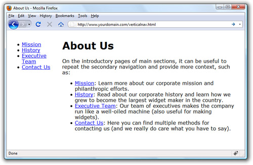
The contents of this page are set up in two <div> elements that sit next to each other: one is given an id value of nav and the other is given an id value of content. The only styles assigned to anything in this basic page are the width, margin, and float values associated with each <div>. No styles have been applied to the list elements.
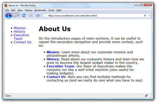
To differentiate between the links present in the list in the content area and the links present in the list in the side navigation, add the following styles to the style sheet:

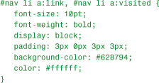
These styles simply say that all <a> links in the <div> with the id of nav have no underline and all <a> links in the <div> with the id of content have no underline and are bold. The difference is shown in Figure 17.2.
Figure 17.2 Differentiating the list elements using CSS.
But to really make the side navigation list look like something special, you have to dig deeper into the style sheet.
Styling the Single-Level Vertical Navigation
The goal with this particular set of navigation elements is simply to present them as a block of links without bullets and with background and text colors that change depending on their link state (regular link, visited link, hovering over the link, or activated link). The first step in the process is already complete: separating the navigation from the content. We have done that by putting the navigation in a <div> with an id of nav.
Next, you need to modify the <ul> that defines the link within the nav <div>. Let’s take away the list indicator and ensure that there is no extra margin or padding hanging around besides the top margin. That top margin is used to line up the top of the navigation with the top of the “About Us” header text in the content area of the page:

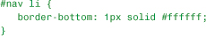
Since the navigation list items themselves appear as colored areas, give each list item a bottom border so that some visual separation of the content can occur:
Now on to building the rest of the list items. The idea is that when the list items simply sit there acting as links, they are a special shade of blue with bold white text (although they are a smaller font size than the body text itself). To achieve that, add the following:
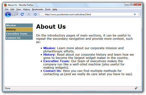
All of the styles used previously should be familiar to you, except perhaps the use of display: block; in the style sheet entry. Setting the display property to block ensures that the entire <li> element is in play when a user hovers his mouse over it. Figure 17.3 shows the vertical list menu with these new styles applied to it.
Figure 17.3 The vertical list is starting to look like a navigation menu.

When the user’s mouse hovers over a navigational list element, the idea is that some visual change takes place so the user knows the element is clickable. This is akin to how most software menus change color when a user’s cursor hovers over the menu items. In this case, we’ll change the background color of the list item and we’ll change the text color of the list item; they’ll be different from the blue and white shown previously.
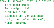
Figure 17.4 shows the results of all the stylistic work so far. By using a few entries in a style sheet, the simple list has been transformed into a visually differentiated menu.
Figure 17.4 The list items now change color when the mouse hovers over them.
Styling the Multi-Level Vertical Navigation
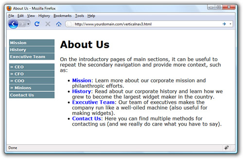
What if your site architecture calls for another level of navigation that you want your users to see at all times? That is represented by nested lists (which you learned about in previous hours) and more style sheet entries. In this case, assume that there are four navigation elements under the Executive Team link. In the HTML, modify the list as follows:

This code produces a nested list under the Executive Team link (see Figure 17.5). The » HTML entity produces the right-pointing arrows that are displayed before the text in the new links.
Figure 17.5 Creating a nested navigation list (but one that is not yet styled well).
The new items appear as block elements within the list, but the hierarchy of information is not visually represented. To add some sort of visual element that identifies these items as sub-navigational elements attached to the Executive Team link, modify the style sheet again to add some indentation.
But before doing that, modify some of the other style sheet entries as well. In the previous section, we added selectors such as #nav ul and #nav li, which indicate “all <ul> in the <div> called nav” and “all <li> in the <div> called nav,” respectively. However, we now have two instances of <ul> and another set of <li> elements with the <div> called nav, all of which we want to appear different from the original set.
To ensure both sets of list items are styled appropriately, make sure that the style sheet selectors clearly indicate the hierarchy of the lists. To do that, use entries such as #nav ul and #nav ul li for the first level of lists and #nav ul ul and #nav ul ul li for the second level of lists. Listing 17.2 shows the new version of style sheet entries and HTML that produces the menu shown in Figure 17.6.
Listing 17.2 Muli-Level Vertical Navigation in a List


Figure 17.6 Creating two levels of vertical navigation using CSS.

The different ways of styling vertical navigation are limited only by your own creativity. You can use colors, margins, padding, background images, and any other valid CSS to produce vertical navigation that is quite flexible and easily modified. If you type CSS vertical navigation in your search engine, you will find thousands of examples—and they are all based on the simple principles you’ve learned in this hour.
Creating Horizontal Navigation with CSS
This hour began with vertical navigation because the concept of converting a list into navigation is easier to grasp when the navigation still looks like a list of items that you might write vertically on a piece of paper, like a grocery list. When creating horizontal navigation, you still use HTML list elements but instead of a vertical display achieved by using the inline value of the display property for both the <ul> and the <li>, use the block value of the display property instead. It really is as simple as that.
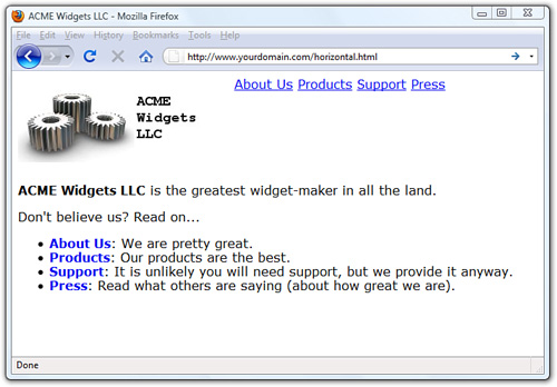
Listing 17.3 shows a starting point for a page featuring horizontal navigation. The page contains two main <div> elements: one for the header and one for the content. The header <div> contains a logo <div> and a navigation <div> floated next to each other. The list that appears in the navigation <div> has a display property value of inline for both the list and the list items. You can see these elements and their placement in Figure 17.7.
Listing 17.3 Basic Horizontal Navigation from a List


Figure 17.7 Creating functional—but not necessarily beautiful—horizontal navigation using inline list elements.
Modifying the display of this list occurs purely through CSS; the structure of the content within the HTML itself is already set. To achieve the desired display, use the following CSS. First, the <div> with the id of nav is modified to be a particular width, display a background color and border, and use a top margin of 85 pixels (so that it displays near the bottom of the logo).

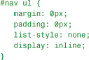
The definition for the <ul> remains the same as in Listing 17.3 except for the changes in margin and padding:
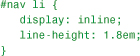
The definition for the <li> remains the same as in Listing 17.3 except it has been given a line-height value of 1.8em:
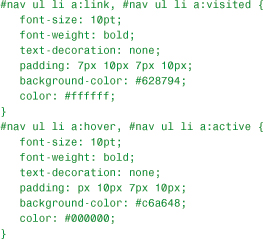
The link styles are similar to those used in the vertical navigation; these entries have different padding values, but the colors and font sizes remain the same:
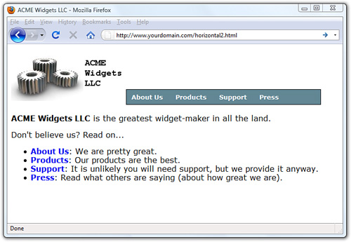
Putting these styles together, you produce the display shown in Figure 17.8.
Figure 17.8 Creating horizontal navigation with some style.
When the user rolls over the navigation elements, the background and text colors change in the same way they did when the user hovered her mouse over the vertical navigation menu. Also, just as you did with the vertical navigation menu, you can use nested lists to produce drop-down functionality in your horizontal menu. Try it yourself!
Summary
In this hour you learned how to use CSS to turn simple HTML unordered lists into horizontal and vertical navigation. By using CSS instead of graphics or JavaScript or other technologies, you will have more flexibility in both the display and maintenance of your site. Throughout this hour you learned that with a few entries in your style sheet, you can turn plain underlined text links into areas with borders and background colors and other text styles. Additionally, you learned how to present nested lists within menus.
Q&A
Q Can I use graphics in the navigation menus as a custom list indicator?
A Yes. You can use graphics within the HTML text of the list item or as background images within the <li> element. You can style your navigation elements just as you style any other list element. The only differences between an HTML unordered list and a CSS-based horizontal or vertical navigation list is that you are calling it that and you are using the unordered list for a specific purpose outside of the body of the text. Along with that, you then style the list to show the user that it is indeed something different—and you can do that with small graphics to accentuate your lists.
Q Where can I find more examples of what I can do with lists?
A The last time I checked, typing CSS navigation in a search engine returned approximately 44 million results. Here are a few starting places:
• A List Apart’s CSS articles at http://www.alistapart.com/topics/code/
• Maxdesign’s CSS Listamatic at http://css.maxdesign.com.au/listamatic/
• Vitaly Friedman’s CSS Showcase at http://www.alvit.de/css-showcase/
Workshop
The workshop contains quiz questions and activities to help you solidify your understanding of the material covered. Try to answer all questions before looking at the “Answers” section that follows.
Quiz
1. When creating list-based navigation, how many levels of nested lists can you use?
2. True or False: using an inline value for the display property produces a horizontal list.
3. When creating a navigation list of any type, can the four pseudoclasses for the a selector have the same values?
Answers
1. Technically, you can nest your lists as deep as you want to. But from a usability standpoint, there is a limit to the number of levels that you would want to use to nest your lists. Three levels is typically the limit—more than that and you run the risk of creating a poorly organized site or simply giving the user more options than they need to see at all times.
2. True, if the display property is provided for the ul and li selectors in the style sheet.
3. Sure, but then you run the risk of users not realizing that your beautiful menus are indeed menus (since no visual display would occur for a mouse action).
Exercises
• Using the techniques shown for a multi-level vertical list, add sub-navigation items to the vertical list created at the end of the chapter.
• Look at the numerous examples of CSS-based navigation used in web sites and find some tricky-looking actions. Using the “view source” function of your web browser, look at the CSS used by these sites and try to implement something similar for yourself.