
Although we’ve covered almost everything there is to cover regarding Ajax, there are still some helpful things to remember when programming your Ajax applications to simplify the process. In this chapter, I will discuss practices and techniques that can eliminate frustration when you are modifying and maintaining a web project, and can make programming faster and easier by reducing the amount of code you need to write.
If you do not feel that you need to know this material, or if you already do know it, great! You can skip ahead to Chapter 23. If not, read on to find ways to give yourself some breaks with your next Ajax application.
Modular coding is just a fancy way to say “breaking the code base into smaller parts.” In terms of an Ajax application, by definition some of the application is broken into parts—namely, client code and server code. You can then break these two components into smaller and more manageable pieces. And the whole point of this?
Modular pieces of code are easier to maintain over time.
Modular code can be programmed more effectively in a group environment.
Modular code can sometimes be reused in other applications.
Sometimes in a rapid development environment, programmers can forget good programming techniques, and instead will focus on getting it done and getting it done fast. But what happens as the applications grow? Or as programmers move on to different positions or leave the company altogether, or maintenance needs to be performed on an existing application? Over time, an application developed with a modular approach is much easier to maintain.
Looking first at the maintenance side of development, you can more effectively troubleshoot code that you’ve broken into pieces. And you can more easily “plug” new code into the existing application without a major code rewrite. The amount of time you can save here can grow exponentially for a company over the years.
As for the actual application development, when a project is sent to a group of programmers for coding, each programmer can get a piece of the program to work on. These pieces can then be combined to create the finished application. There are generally no delays, as programmers do not have to wait for one another to work on their pieces. The functionality of one piece of the application can be stubbed out so that someone can work on pieces that rely on others. As a result, the application should (theoretically) move into production faster and cheaper than the same application coded with a different approach.
Then there is the idea of reuse. If I build an Ajax calendar control that hits a database for one project, there is no reason why someone else in the company could not use that control in another project. Reusing components is a great way to reduce the costs associated with new development. It also ensures that if a change is ever needed to one of these components, the change occurs in only one place.
Figure 22-1 shows a sample of some of the modularization that could exist in an Ajax application. You should notice that the client and server sides of the application are separated and then broken down, even though some of these pieces would belong to the same basic functionality. It is important to separate the jobs of the client and server, as they will most likely be written in different languages. It is never a good idea to wrap different languages into a single component.
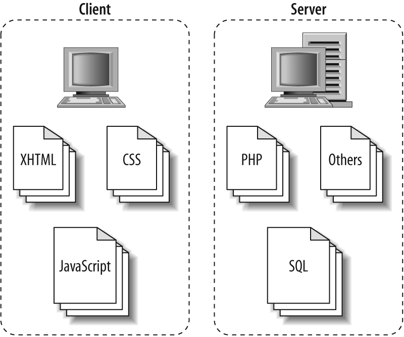
Three obvious components comprise the client side of an Ajax application: XHTML, CSS, and JavaScript. These components represent different pieces of the application, and you should treat them separately, as shown in Figure 22-1.
The XHTML represents the application’s structure, and although it most likely will be contained in one file (per page of the application), you can still break it into separate components. This in itself will not produce any of the advantages of code modularization. However, it will make it easier to modularize things if you rely on a server-side language such as ASP.NET or PHP to create the XHTML. This, in turn, will aid in creating a consistent look and feel to the application without as much programming or code.
Page components are defined (basically) for you by following
the structure of an XHTML document. The page is broken down into a
head and a body, created by the corresponding elements <head> and <body>, respectively. These
elements are then further divided to create a modular page for the
application.
The basic “building blocks” of the head component are:
The page title
Metadata
Style definitions for the page
Scripting for the page
Figure 22-2 shows
the basic components of a typical head component of a web page.
The page does not necessarily need <meta>, <style>, <link>, or <script> elements to be XHTML
1.1-compliant, but more than likely it will have such elements if
it is part of an Ajax application.

Example 22-1 shows how to define these components in XHTML markup for a simple page.
Example 22-1. An example of the typical components of the head in a web page
<head>
    <!-- ---------------------------------------------------------------------- -->
    <!-- The title component for the head component -->
    <title>
        Example 22-1. An example of the typical components of the head in a web page
    </title>
    <!-- ---------------------------------------------------------------------- -->

    <!-- ---------------------------------------------------------------------- -->

    <!-- The metadata component for the head component -->
    <meta http-equiv="content-type" content="text/html; charset=utf-8" />
    <!-- The rest of these <meta> elements should be considered optional -->
    <meta http-equiv="content-language" content="en" />
    <meta name="keywords" content="word1, word2, word3, wordn" />
    <meta name="description"
        content="This is the Example 22-1 metadata description." />
   <meta name="author"
        content="Anthony T. Holdener III [ath3] {[email protected]}" />
    <meta name="copyright" content="Copyright (C) 1999 - 2007. Holdener.com." />
    <meta http-equiv="imagetoolbar" content="no" />
    <!-- ---------------------------------------------------------------------- -->

    <!-- ---------------------------------------------------------------------- -->
    <!-- The style definitions component for the head component -->
    <link type="text/css" rel="stylesheet" media="screen"
        href="include/css/screen.css" />
    <link type="text/css" rel="stylesheet" media="print"
        href="include/css/print.css" />
    <link type="text/css" rel="stylesheet" media="all"
        href="include/css/page_specific.css" />
    <!-- ---------------------------------------------------------------------- -->

    <!-- ---------------------------------------------------------------------- -->
    <!-- The scripting component for the head component -->
    <script type="text/javascript" src="include/js/prototype.js"> </script>
    <script type="text/javascript" src="include/js/scriptaculous.js"> </script>
    <script type="text/javascript" src="include/js/app_specific.js"> </script>
    <!-- ---------------------------------------------------------------------- -->
</head>
The head component of a page isn’t as flexible as the body component can be due to its definition in the World Wide Web Consortium (W3C) XHTML Recommendations. You can break the body into whatever components you feel are best for your application. In most web applications, though, there will at least be a header, footer, and content section for the page.Figure 22-3 shows these components.

Tip
The body components in an Ajax application are defined
with <div> elements, as
<div> is the most
suitable element that can be used in an XHTML document.
Following the basic premise from the CSS Zen Garden, I like to break up my XHTML into smaller pieces.
By breaking up the body of the page into smaller components, you can change the application’s design without (hopefully) impacting the document’s structure. The more components that a designer has to work with, the easier it is to create stylesheets that can utilize the existing structure and not require additional elements. For this reason, I typically break my page into the logical components that will make up the page.
Imagine that you are creating the structure for a page that will have two columns: a sidebar column with navigational and other widgets, and a main column that will hold the content for the page. The header for the page may be divisible based on its complexity—logos, navigation, searching, and breadcrumbs. Every application will be different, but by planning as much as possible, you will make it easier to troubleshoot rendering flaws and create alternative styles for the application. Figure 22-4 subdivides the components in Figure 22-3 into smaller pieces.

Example 22-2 shows the diagram in Figure 22-4 translated into XHTML markup.
Example 22-2. The body component in an Ajax application broken down into small components
<!-- This is a wrapper for all of the components in the body component -->
<div id="bodyWrapper">
    <!-- ----------------------------------------------------------------------- -->
    <!-- This is the body header component for the body component -->
    <div id="bodyHeader">
        <!-- This is the logo component for the header component -->
        <div id="headerLogo"></div>
        <!-- This is the navigation component for the header component -->
        <div id="headerNavigation"></div>
        <!-- This is the breadcrumbs component for the header component -->
        <div id="headerBreadcrumbs"></div>
        <!-- This is the extras component for the header component.  Anything else
             that needs to go in the header can go in this component -->
        <div id="headerExtras"></div>
    </div>
    <!-- ----------------------------------------------------------------------- -->

    <!-- ----------------------------------------------------------------------- -->
    <!-- This is a wrapper for the body content component for the body component -->
    <div id="bodyContentWrapper">
        <!-- This is the sidebar component for the body content wrapper; if this
             is not needed, then do not use it -->
        <div id="sidebarContent">
            <!-- This is the navigation component for the sidebar component -->
            <div id="sidebarNavigation"></div>
            <!-- This is a widget component for the sidebar component -->
            <div id="sidebarWidget1"></div>
            <!-- This is a widget component for the sidebar component -->
            <div id="sidebarWidget2"></div>
            <!-- This is a widget component for the sidebar component -->
            <div id="sidebarWidgetn"></div>
        </div>
        <!-- This is the body content component for the sidebar component.  The
             main content for the page goes into this component -->
        <div id="bodyContent"></div>
    </div>
    <!-- ----------------------------------------------------------------------- -->

    <!-- ----------------------------------------------------------------------- -->
    <!-- This is the body footer component for the body component -->
    <div id="bodyFooter">
        <!-- This is the left side of the body footer component.  If there is no
             need for two components in the body footer, then the CSS can control
             that by only using one of these and not displaying the other -->
        <div id="leftFooterContent"></div>
        <!-- This is the right side of the body footer component -->
        <div id="rightFooterContent"></div>
    </div>
    <!-- ----------------------------------------------------------------------- -->
</div>
The associated CSS for the application will manipulate for rendering all of the components that are created in the body component. Control of the application’s look and feel takes place within these CSS components.
All the CSS files in a web application control the presentation of all the pages in the application. Generally, a developer will want all of these pages to have the same basic look in order to create a feeling of uniformity. Our first step to achieve this was to make the XHTML that comprises the page’s structure more modular, and thus more flexible. Our next step is to do the same with the CSS files, so that developers can more easily maintain the CSS, and therefore, more easily troubleshoot.
The most important reason for modularity of CSS files is to simplify the development and implementation of alternative stylesheets in the application, whether for changing the font size or the theme of the application. It is much simpler for a developer to know that all changes for a site need to be made in one file, instead of having to hunt for the necessary rules to modify them.
To create the most effective modular CSS files, you need to separate the rules into components. In our case, each component will be a separate file. We will separate the CSS files by media type and style property to maximize the effects of modularization.
Separating the CSS files by the different style properties that exist for the presentation layer will simplify the alternate stylesheets in the application. I have come up with an easy list of property types that each rule should fall under: boxes and layout, lists, text, colors and background, and fonts. These types are associated with a different aspect of the presentation layer, and you should group them into separate components. Figure 22-5 shows one way you can group these properties into components.

As you can see from Figure 22-5, I broke the style properties into three distinct components: structure, fonts, and color (which controls theme). Example 22-3 shows the types of CSS rules that would be included in each file (component). In an actual application setting, these would be separated into their respective files, but I have combined them to simplify the example.
Example 22-3. Style rule examples for the different style property components
/* ---------------------------------------------------------------------------- */
/*
 * Style rules found in the structure component of the presentation layer
 */
body {
    margin: 0;
    padding: 5px 10px;
}
a, a:link, a:visited, a:active {
    text-decoration: none;
}

a:hover {
    text-decoration: underline;
}

h3 {
    margin-bottom: .5em;
}

#bodyFooter {
    text-align: center;
}

#bodyHeader {
    border-bottom-style: solid;
    border-bottom-width: 2px;
    z-index: 200;
}
/* ---------------------------------------------------------------------------- */

/* ---------------------------------------------------------------------------- */
/*
 * Style rules found in the fonts component of the presentation layer
 */
body {
    font-family: "Bitstream Vera Serif", "Times New Roman", Times, serif;
    font-size: 1em;
}

a:hover {
    font-style: italic;
}

h3 {
    font-size: 1.9em;
    font-style: italic;
    font-weight: bold;
}

#bodyFooter {
    font-size: .85em;
}

#bodyHeader {
    font-family: "Bitsream Vera Sans", Arial, sans-serif;
    font-style: normal;
}
/* ---------------------------------------------------------------------------- */

/* ---------------------------------------------------------------------------- */
/*
 * Style rules found in the color component of the presentation layer
 */
body {
    background: #fff url(../../images/main_bg.png) repeat-y;
    color: #000;
}

a, a:link, a:visited, a:hover, a:active {
    background-color: transparent;
    color: #559;
}

#bodyHeader {
    border-bottom-color: #559;
}
/* ---------------------------------------------------------------------------- */
To make things easier on the developer, it is a good idea to break out each style property component into its own set of components within the file as separate sections to make it easier to track specific rules. These sections are based on the different types of element selectors. The following shows the breakdown of the sections:
/*
 * Section: Element selectors
 * Example: html, body { . . . }
 */

/*
 * Section: Element pseudoclass selectors
 * Example: a:hover { . . . }
 */

/*
 * Section: Element contextual selectors
 * Example: tr td { . . . }
 */

/*
 * Section: Element child/sibling selectors
 * Example: ul > ol { . . . }
 */

/*
 * Section: Element class selectors, includes pseudoclasses, contextual and
 * child/sibling selectors
 * Example: p.class_name { . . . }
 */

/*
 * Section: Generic class selectors
 * Example: .class_name { . . . }
 */

/*
 * Section: ID selectors, includes pseudoclasses, contextual and child/sibling
 * selectors
 * Example: #id_name { . . . }
 */
Example 22-4 shows what one of the style property components would look like separated into sections. There is no guarantee that any of the given components will have all of the sections included in each and every file. These are just given as a guideline of one way in which you can further break down the stylesheet properties to aid in modularity.
Example 22-4. The structure component further refined into separate sections
/*
 * Section: Element selectors
 * Example: html, body { . . . }
 */
body {
    margin: 0;
    padding: 5px 10px;
}

a {
    text-decoration: none;
}

h3 {
    margin-bottom: .5em;
}

/*
 * Section: Element pseudoclass selectors
 * Example: a:hover { . . . }
 */
a:link, a:visited, a:active {
    text-decoration: none;
}

a:hover {
    text-decoration: underline;
}

/*
 * Section: Element child/sibling selectors
 * Example: ul > ol { . . . }
 */
a > img {
    border-style: none;
}

/*
 * Section: Generic class selectors
 * Example: .class_name { . . . }
 */
.center {
    text-align: center;
}

/*
 * Section: ID selectors, includes pseudoclasses, contextual and child/sibling
 * selectors
 * Example: #id_name { . . . }
 */
#bodyFooter {
    text-align: center;
}

#bodyHeader {
    border-bottom-style: solid;
    border-bottom-width: 2px;
    z-index: 200;
}You can separate CSS files by any of the available CSS media
types that you think is necessary. The following are recognized
CSS media types: all, aural, braille, embossed, handheld, print, projection, screen, tty, and tv. The two that should receive the most
focus in a web application are the print and screen media types.
The idea behind breaking the style property components into components organized by media type is to present the page to the user based on the media that will be used. A good example of these components’ use is when a header with images is to be displayed on the screen but removed when a user goes to print that page.
Example 22-5
gives a good example of some of the differences in rules between
the screen and print media types, showing the print CSS
file for Example 22-4.
One of the big differences is in the units used to specify the
lengths of CSS properties. Screen units are generally relative
units, such as em, ex, and px, whereas print units are absolute
units such as in, cm, mm, pt, and pc. This is a subtle difference between
the media types, but it has a major impact on how each type
presents the page. The other difference is in color. The print media type is generally going to
strip all colors to shades of gray or straight black and white
(unless, of course, a color printer is being targeted).
Example 22-5. The differences in stylesheets between different media types
/*
 * The print media type usually encompasses all three components that are used
 * in the screen media type — structure, fonts, and colors.
 */

/*
 * Section: Element selectors
 * Example: html, body { . . . }
 */
body {
    font-face: "Bitstream Vera Serif", "Times New Roman", Times, serif;
    font-size: 12pt;
}

h3 {
    margin-bottom: 3mm;
}

a {
    background-color: transparent;
    color: #000;
    text-decoration: underline;
}

/*
 * Section: Element pseudoclass selectors
 * Example: a:hover { . . . }
 */
a, a:hover, a:link, a:visited, a:active {
    background-color: transparent;
    color: #000;
    text-decoration: underline;
}


/*
 * Section: Element child/sibling selectors
 * Example: ul > ol { . . . }
 */
a > img {
    border-style: none;
}

/*
 * Section: Generic class selectors
 * Example: .class_name { . . . }
 */
.center {
    text-align: center;
}

/*
 * Section: ID selectors, includes pseudoclasses, contextual and child/sibling
 * selectors
 * Example: #id_name { . . . }
 */
#bodyFooter {
    text-align: center;
}

#bodyHeader {
    border-bottom: 2pt solid #000;
    z-index: 200;
}
The HTML and CSS modularity is beneficial to a developer as she attempts to create more reusable parts. However, it does not show too much about creating modular code, as neither HTML nor CSS is really code. Code deals with functionality, and HTML and CSS are all about presentation. Presentation requires modularity just as much as functionality does, but it does not always get as much emphasis.
With presentation out of the way, now it is time to make the functionality on the client side more modular. We can do this in any number of ways: by creating components based on functionality, by creating components based on the page for which they are meant, or via some other subjective developer-determined type. Obviously, I cannot discuss the last option and code it in a way that is agreeable to everyone. Instead, I’ll talk about creating components based on functionality and page specificity.
Breaking apart code by functionality allows you to pick and choose the components you need for each page of the web application. A good example of this kind of model is the script.aculo.us JavaScript library. script.aculo.us has a main component that you must load to use the rest of the library’s functionality. You then specify which components are to be loaded on each page. For example:
<script type="text/javascript" src="include/js/prototype.js"> </script>
<script type="text/javascript"
    src="include/js/scriptaculous.js?load=effects,dragdrop"> </script>
In this example, only the effects and dragdrop components are loaded into the
page. script.aculo.us has the following components
available:
buildercontrolsdragdropeffectsslider
Tip
Some script.aculo.us components require other components to function properly.
You can use this same idea in any web application. There is a long list of components that could be broken out for any given web application: third-party JavaScript, navigation, Ajax functionality, utility code, Document Object Model (DOM) functionality, effects code, and so on.
In addition to creating components based on functionality, sometimes you will have a little bit of JavaScript code you have written for only a specific page. You should use such instances as opportunities to further modularize your code. You can simply name the component based on the page on which it is used. Figure 22-6 shows a way in which you could structure your JavaScript code directory to accommodate the different JavaScript components.

When page-specific components begin to repeat on two or more pages, you should consider moving the components into a utility component, or some other collection of reusable components. The main thing is to organize your JavaScript code in a manner that will reduce overlap and allow for better reusability.
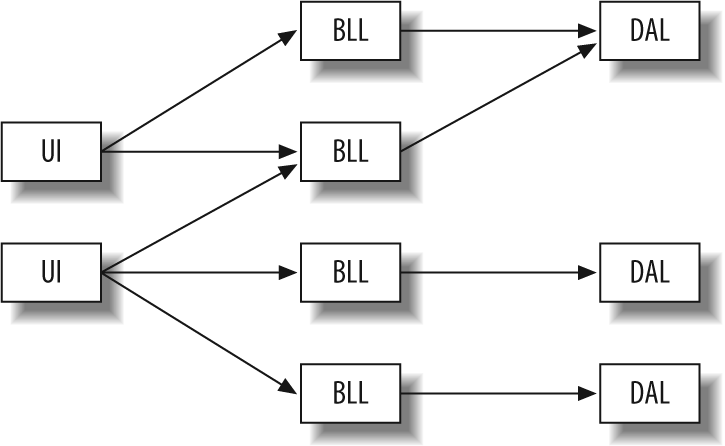
As with the client side, you can break the server side of an Ajax application into separate components. The more reuse you can gain on the server, the faster that server’s response time will be. You can break the server into a simple tiered structure based on these components (commonly called layers in programming books): user interface (UI), business logic layer (BLL), and data access layer (DAL).
The idea behind this approach is simple enough. Generally, the different pages in the application can reuse the UI, as the structure of the pages should remain constant. The content is what changes between application pages. The application’s BLL affects these changes. Different modules in the BLL have the potential of being reused between similar pages, and should be leveraged whenever possible. The BLL is in charge of any functionality that the structure of the application (UI) should not define. Finally, the DAL is used to collect data from whatever data source(s) the application uses. This data is then sent to the BLL for processing and formatting before being pushed to the UI and ultimately presented to the user. Figure 22-7 shows an example of this server-side component-based model.
If the XHTML, CSS, and JavaScript were modularized in some way, as I described earlier in this chapter, you could use the server to present these components to the user. You can break the UI component from the server side of the Ajax application into components that handle the different parts:
- meta.inc
This PHP file includes all of the
<meta>elements for the page.- css.inc
This PHP file includes all of the
<link>and<style>elements for the page.- js.inc
This PHP file includes all of the
<script>elements for the page.- body_header.inc
This PHP file contains all of the markup for the header of the page.
- body_footer.inc
This PHP file contains all of the markup for the footer of the page.
Example 22-6 shows a sample of how that would work.
Example 22-6. An example PHP file that uses modular server-side components to build the structure of a page
<!DOCTYPE html PUBLIC "-//W3C//DTD XHTML 1.1//EN"
    "http://www.w3.org/TR/xhtml11/DTD/xhtml11.dtd">
<html xmlns="http://www.w3.org/1999/xhtml" xml:lang="en" >
    <head>
        <title>
            Example 22-6. An example PHP file that uses modular server-side
            components to build the structure of a page
        </title>
<?php
require_once('include/php/meta.inc'),
require_once('include/php/css.inc'),
require_once('include/php/js.inc'),
?>
    </head>
    <body>
        <div id="bodyWrapper">
<?php
require_once('include/php/body_header.inc'),
?>
            <!— Page content goes here —>
<?php
require_once('include/php/body_footer.inc'),
?>
        </div>
    </body>
</html>Another place on the server side of the application where developers sometimes do not take the opportunity to make their code more modular is when dealing with a SQL database. Having inline code in any part of an application can lead to maintenance headaches down the road—something modular coding prevents. Whenever possible, you should use stored procedures instead of inline SQL code to keep the data separate from the requester. Imagine having to search through all of your server code whenever a change is made to a table in the database. By keeping as much SQL in stored procedures as possible, all of the database functionality stays with the database. All changes happen in one place, and can be planned for accordingly.
Anything that is used on the server side of the Ajax application could be made into a component and modularized. Functionality and page-specific modularization of code (whether it is PHP, ASP.NET, Java, etc.) can be done in a similar way to the JavaScript modularizations. The use of object-oriented fundamentals in your server-side code will aid in this endeavor. All of the popular server-side languages support objects and classes in one way or the other, so the approach taken by one language can be applied to others.
Always keep the client- and server-side component models in mind when creating new Ajax applications. It is not always possible to implement this in existing applications, but the techniques can always be attempted there. Modular code makes any application, desktop or web, easier for developers to understand, maintain, and improve. This is an easy approach to implement and one that any Ajax application developer should want to try.