Want to create complex layouts on your Web pages, beyond what is possible using HTML alone? This chapter shows you how to precisely position text, images, and other elements on your pages using style sheets. Style sheets let you place content at set coordinates within your layout. You can also control the spacing around your page elements, wrap text around images and tables, and even overlap content.

Control Layout 178
Set Width and Height for an Element 180
Use Relative Positioning 182
Use Absolute Positioning 184
Use Fixed Positioning 186
Set Margins 188
Add Padding 189
Wrap Text around Elements 190
Change Vertical Alignment 191
Control the Overlap of Elements 192
Customize a Background Image 194
You can use style sheets to organize text, images, and other elements on your Web page in precise ways. This enables you to create more complicated layouts than those you can create with HTML. Style sheets allow you to specify where in a page to put different types of content by defining coordinates within the browser window. You can also precisely control the space around different elements and even overlap content on your pages.
By combining layout techniques with other CSS features covered in Chapter 10, you can produce pages that look like they were created using a page layout program.
Box Model
The key to understanding layout using style sheets is the "box model" of Web page layout, where each element on a page exists in its own rectangular box. Style sheets let you control the dimensions of the box using height and width attributes, where the box is placed on the Web page, and how the box aligns or overlaps with other boxes on the page.
HTML Block Tags
You define boxes for your content using block-level HTML tags. Block-level tags place new lines before and after the content they enclose. The <P>, <H1>, and <TABLE> tags are examples of block-level tags. The <DIV> tag is a type of generic block-level tag commonly placed around other tags to organize content when using style sheets to determine layout.
Offsetting Content
You can offset content on your Web page from its normal position using top, left, right, and bottom style sheet properties. This allows you to place content in a precise position within the browser window. You can even place content completely outside of the browser window by using a large or negative offset value. You can also overlap content in the browser window by placing an element at the same window coordinates as another element.
Padding and Margins
You can control the space that surrounds content inside each box on your page. Space outside the edge of the box is known as margin (

Floating Content
The float CSS property takes a box out of the normal flow of your page and moves it to the right or left side of the enclosing box. Content that follows then wraps around the floated element. Floating allows you to align images, paragraphs, tables, and other content, similar to how you can align images using the ALIGN attribute in HTML.

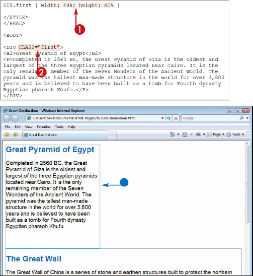
You can use the width and height properties in your style sheet to set the dimensions of your Web page elements. For example, if you want certain paragraphs to take up a fixed amount of space in your page flow, you can apply a style rule as a class. See Chapter 9 to learn more about style sheet classes.
You can also specify a size based on a percentage. Percentage sizes are measured relative to the browser window or enclosing HTML tag. You can use the float property to make page content wrap around a resized element. See "Wrap Text around Elements" for details.

You can specify values in points (pt), pixels (px), millimeters (mm), centimeters (cm), inches (in), picas (pc), x-height (ex), or em space (em).


In this example, borders are turned on to show the dimensions of the content boxes.


In this case, the enclosing box is the
<BODY>tag, so the content is resized based on the browser window dimensions.
Note
What are the em and ex style sheet measures?
The em and ex measures allow you to define sizes on your pages based on the size of the surrounding text. The concept comes from typography, where em represents the width of the capital letter M and ex represents the height of the lowercase x. If you set a style sheet measurement to 2em, text will be twice the size of the normal font. If viewers adjust the font size of their browser, the content sized on your page using em also adjusts. The ex measure works similarly but on a smaller scale.
How do I control what happens to text that extends outside a CSS box?
You can control how text outside a box is handled using the overflow property. Setting the property to visible causes the text to be rendered outside the box. A hidden value hides the text outside the box. Both scroll and auto values display scroll bars for viewing the content, if needed. You can assign the overflow property to the DIV, P, and other block-level tags.
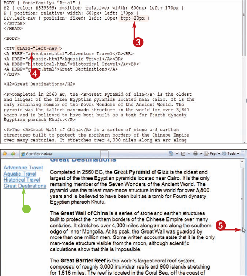
You can apply relative positioning to elements on your Web page to place content relative to other content on the page. If you offset a relatively positioned element using the top, left, right, or bottom property, the element is offset relative to the point where it would normally begin.
For example, setting the left property to 50px adds that much space to the left side of your page content, moving it to the right. Relative is the default setting for the position style property.
In this example, a background color is applied to the paragraphs to show the dimensions of the content boxes.

You can specify values in points (pt), pixels (px), millimeters (mm), centimeters (cm), inches (in), picas (pc), x-height (ex), or em.
Note
You can narrow elements on your page so that they appear within the browser window by setting their dimensions. See "Set Width and Height for an Element."

Note
Can I offset content from the bottom or the right?
Yes, but note that offsetting from the bottom may obscure the page content above the positioned element, and offsetting from the right can move content beyond the left edge of the browser window.
How can I position content outside the browser window?
You can apply a high positive or negative positioning value to the content. For example, you could set the left property to -5000px to move it far to the left, outside of view. You might want to do this for descriptive content that you want search engines to see but that you want to hide from human visitors. Another way to provide descriptive information for search engines is to add metadata. See Chapter 2 for details.
You can apply absolute positioning to place an element at exact coordinates on a page, independent of elements that came before it. The coordinates are determined relative to the box that encloses it. This allows you to precisely fit together boxes of text, images, and other content on a page, like a jigsaw puzzle. You can set the coordinates using the top, left, right,and bottom properties.
Absolute positioning removes an object from the normal flow of page content. Its size and position have no effect on the position of content that follows it.
Note
In this example, absolute positioning is applied to an image using a style sheet class. For more about using classes, see Chapter 9.
Separate multiple style sheet rules with semicolons.
In this example, the image is offset to the left of several paragraphs of text.


The element is offset relative to the enclosing box, which in this example is the browser window.
In this example, the paragraphs are narrowed using a
widthstyle to make space for the image on the right.

Note
How can I apply absolute positioning to an image and a caption?
You can apply absolute positioning to an image and caption text by surrounding both with a single DIV tag. Create a class that defines the absolute coordinates, and then apply it to the DIV tag using the class attribute. For more on using the DIV tag and creating classes, see Chapter 9.
How do I place an image in the bottom right corner of the browser window?
Create a class with absolute positioning similar to that in the example above, but set the bottom and right properties to 0. Apply the class to your image using a DIV tag.
You can apply fixed positioning to place an element at exact coordinates on a page and have it remain fixed while a viewer scrolls. This is one way to keep navigation links visible as visitors view content on a long page. In contrast to relative and absolute positioning, fixed positioning is supported only in newer Web browsers. Using fixed positioning on some page elements but not others can result in content overlapping when the user scrolls. How the elements overlap is determined by the z-index of the page elements. For more information, see "Control the Overlap of Elements."
Note
In this example, fixed positioning is applied to a box of navigation links using a class. For more about using style sheet classes, see Chapter 9.
Separate multiple style rules with semicolons.

In this example, navigation links are fixed to the left of several paragraphs of text. The paragraphs of text are shifted to the right using relative positioning.
The Web browser displays the element with offsets applied. The element is offset relative to the enclosing box, which in this example is the browser window.

Note
How can I ensure that as many browsers as possible display fixed content correctly?
Many earlier versions of Web browsers, such as Internet Explorer 6, do not support fixed positioning. Later versions of Internet Explorer support it, but only if the page has a document type set to strict. (See Chapter 2 for more about document types.) You can set the document type to strict by putting the following code at the top of your page:
<!DOCTYPE HTML PUBLIC "-//W3C//
DTD HTML 4.01 Strict//EN" "http://
www.w3.org/TR/html4/
strict.dtd">
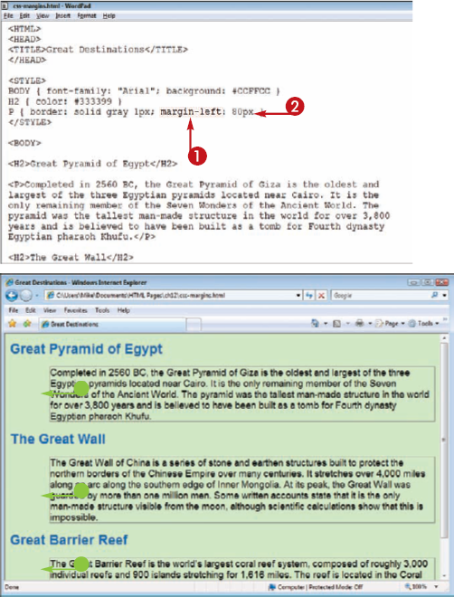
You can control the margins of your Web page elements using the margin properties. You can set margin values for the top, bottom, left, and right margins around a Web page element. The margin is the spacing on the outside of a page element's border, whether or not the border is visible. To control the spacing inside the border, see "Add Padding."
You can set margin sizing using points (pt), pixels (px), millimeters (mm), centimeters (cm), inches (in), picas (pc), x-height (ex), or em space (em).
Typing
margin: and then a spacing value adds that spacing around all sides of an element.The Web browser assigns margins to the Web page element.
In this example, borders are turned on. Margin spacing exists outside an element's border.
Note
See "Add Padding" to learn how to add spacing inside borders.
You can use the padding property to add space around Web page content. Adding padding can be useful for making text elements readable when they abut one another in a page layout. Padding is the spacing on the inside of a page element's border, whether or not the border is visible. To control the spacing outside the border, see "Set Margins."
You can specify padding in points (pt), pixels (px), millimeters (mm), centimeters (cm), inches (in), picas (pc), x-height (ex), or em space (em).
To add padding to just one side, you can type padding-?:, replacing ? with top, bottom, left, or right.
The Web browser uses the assigned padding for the element to which the tag is applied.
In this example, borders are turned on. Padding spacing exists inside an element's border.
Note
See "Set Margins" to learn how to add spacing outside borders.

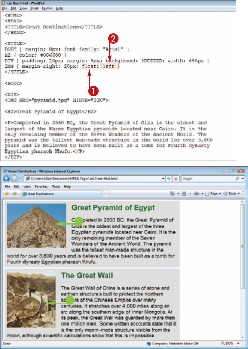
You can use the float property to control how text wraps around the elements on your Web page. The left value floats an element to the left side of the browser window or containing HTML tag, and the right value floats an element to the right side. To ensure proper text wrapping, place the floating element right before the text you want to wrap. By floating several similarly sized elements to the same side, you can achieve the same effect as elements placed in a row of table cells. The float property does not work with elements for which you have assigned an absolute or fixed position.
You can control the vertical positioning of elements on your page using the vertical-align property. You can choose from six vertical alignments: baseline, text-top, text-bottom, middle, top, bottom, sub, and super. When applied to inline elements in your page, the vertical-align property controls how the elements appear relative to the text or other content that comes before and after it. This can be useful for adding text captions to images. When assigned to a table cell, the vertical-align property has an effect similar to the VALIGN HTML attribute. See Chapter 7 for more about VALIGN and tables.
The Web browser displays the element using the assigned vertical alignment.
Note
Learn how to add images in Chapter 5.

You can use style sheets to overlap elements on your pages by positioning them at similar coordinates. You can then control the stack order of those elements, adjusting the z-index property for each element. An element with a higher z-index value appears above an element with a lower z-index value. z-index values can be positive, negative, or zero.
See the "Use Absolute Positioning" section for more about setting the coordinates of a page element.
In this example, two i0mages are overlapped.
Note
For more about creating style sheet classes, see Chapter 9. For more about absolute positioning, see "Use Absolute Positioning."

The Web browser displays content with stack order determined by the z-index values.

Note
How can I make an element transparent so that elements below it show through?
You can make content on your Web page transparent by changing its opacity. However, different browsers recognize different style sheet commands for changing opacity. For Internet Explorer, you can type filter: alpha(opacity=?) in your style rule, replacing ? with a value from 0 to 100. For other popular browsers, you can type opacity: ? in your style rule, replacing ? with a fractional number from 0.0 to 1.0. You can put both properties in a declaration to make the effect compatible with as many Web browsers as possible.
You can place an image as a background on your Web page using style sheets and control how the image repeats. You can make it repeat only horizontally to create a border across the top of your page, or make it repeat only vertically to create a border down the left side. You can also make it not repeat at all. See the tip on the next page for customizing the placement of a nonrepeating background image.
A background image normally repeats both horizontally and vertically to fill the entire page.
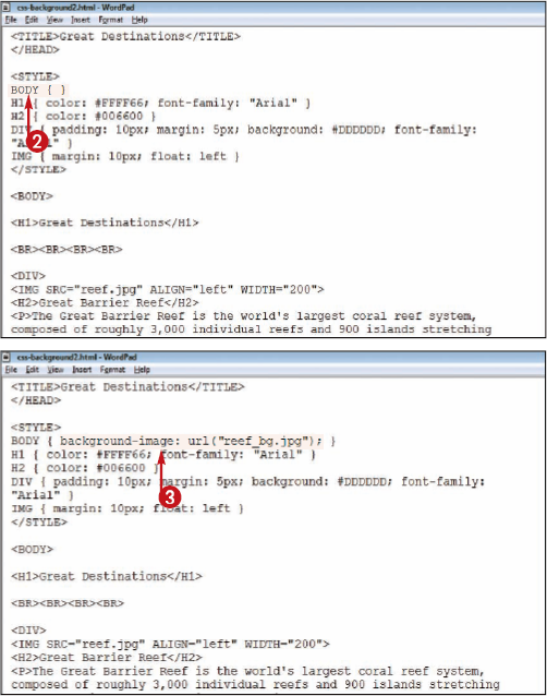
The
repeat-xvalue tiles the image horizontally, whereasrepeat-ytiles the image vertically.The
repeatvalue, which is the default, tiles the image in both directions.The
no-repeatvalue displays the image once.
In this example, text formatted with H1 tags in the body of the page overlays the background.
Note
To add a background image using HTML, see Chapter 5.

Note
How do I create a background image that appears once in the center of my page?
You can assign a no-repeat value to the background-repeat property to place the image once in the background. Then you can specify the location of the image using the background-position property. A center center value places the image in the center of the Web page. You can use percentage values to place the image relative to the entire height and width of the window or numeric values to place it at pixel coordinates. The first value is always the horizontal position, whereas the second value is the vertical.
How do I keep a background image from scrolling with the page?
To control whether or not your background image scrolls with the page content, you can assign a background-attachment property. Assigning a scroll value, which is the default, allows the background image to scroll, whereas fixed keeps the background image fixed as the page content moves. This feature works with the different repeat and positioning settings described in this task.