Chapter 20. Customizing the Presentation of Views and Editors
Much of the “look and feel” of Eclipse applications is defined by the way editor and view tabs are shown. Most of the Eclipse IDE uses native widgets, such as toolbars, dialogs, and menus. There are some Workbench components, however, that use custom widgets. For example, native tab widgets don’t support drag-and-drop reordering, focus highlighting, and Close buttons. As such, Eclipse uses a custom widget called CTabFolder for view and editor tabs.
As you saw in Chapter 19, “Customizing Workbench Windows,” there are many good reasons to customize the look of RCP applications. Changing how editors and views are shown has a significant impact. Fortunately, you can provide your own implementation of view and editor rendering and navigation. If the standard look or behavior does not match your needs, you can change it. This chapter shows you how to use a presentation and how to write your own.
20.1 Presentations
The Workbench uses the term presentation to define the set of Workbench classes that is responsible for managing and displaying editors and views. Presentations do more than paint widgets—they are not just skin for the application. They also provide behavior for widgets. Presentations control the look of tabs—the very fact that tabs are used at all—as well as toolbars, menus, and how parts are dragged from place to place.
Presentations manage stacks of presentable parts such as views and editors. They allow collections of like parts to be stacked together and control the presentation and behavior of the stack. The Workbench may instantiate several presentations for a given page depending on the perspective layout. In essence, each hole that you define in your perspective is filled with a presentation that stacks views or editors in the hole.
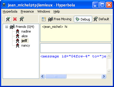
Figure 20-1 shows what Hyperbola would look like if you could remove presentation from the Workbench. This isn’t a mock-up; it is using a presentation that does not do much. The look resembles a perspective in which all views and editors are stand-alone. The most obvious quirk is that the chat editors and Console views no longer show their tabs. From the example you can see that presentations play an important role in the Workbench and in defining the overall look and feel of your application.
Figure 20-1 Hyperbola without a presentation
20.2 Sample Presentations
Eclipse comes with a couple of sample presentations that you can use if the standard presentation is not suitable for your application. They also provide a good example of writing presentations. In this section we show you how to use these existing presentations in your application.
To use an existing presentation, identify your preferred presentation factory as outlined below. First, find the ID for the presentation. This is the ID of its extension to the org.eclipse.ui.presentationFactories extension point. Look for it in the plugin.xml file of the plug-in providing the presentation. An example of the R21 extension is shown here:

Next, set the UI’s presentationFactoryId preference to this ID. You can do this either in the product preference initialization file, as described in Section 13.4, “Adding Help Content,” which is preferred, or in code. Both techniques are shown in the snippets below:
Setting the preference in code effectively overrides the Workbench’s default presentation. Note that the preference must be set before the first Workbench window is created.

20.2.1 The R21 Presentation
The first presentation, called “R21,” provides the look and feel of Eclipse as it was in Eclipse 2.1. The look and feel of Eclipse underwent an overhaul during the development of Eclipse 3.0, but some people still prefer the old presentation. Figure 20-2 shows Hyperbola using the R21 presentation.
Figure 20-2 Hyperbola with the R21 look

If you like the retro look, you can use the R21 presentation plug-in available in the Eclipse SDK in a plug-in called org.eclipse.ui.presentations.r21. The Eclipse team provides this presentation as more of an example than a full-featured presentation. For example, it does not support stand-alone views. To use the R21 presentation, add the org.eclipse.ui.presentations.r21 plug-in to your target and set up the presentation as described previously.
20.2.2 Example Presentations
In addition to the R21 presentation, there is a plug-in that contains example presentations. This plug-in can be found on http://dev.eclipse.org in the /home/cvs/org.eclipse.ui.examples.presentations plug-in. When you check out this project from CVS, have a look in the plugin.xml for the list of registered presentation factories and their IDs.
20.3 Writing a Presentation
Presentations are, of course, entirely customizable. This section guides you through the classes and coding tricks needed to implement a custom presentation. The presentations API is relatively small but quite detailed and involved. We start with a short introduction and then show you how to build your own simple presentation.
Workbench windows delegate the creation of the part stacks to a registered AbstractPresentationFactory. As you saw in the previous section, this is contributed by an extension to the org.eclipse.ui.presentationFactories extension point. The factory to use is identified via the UI’s presentationFactoryId preference.
The factory provides methods for creating the different stack types: stand-alone view, regular view, and editor. Each stack is an instance of a StackPresentation and is assigned a number of parts to show. It is completely up to the stack to decide how to display these parts to the user. The stacks do not create a part’s widgets; they simply define where and how the part is shown.
At creation time, stacks are given a presentation site, an instance of IStackPresentationSite. The site is used to send events and requests from the StackPresentation to the Workbench. The stack presentation site controls stack-related behavior such as dragging and dropping of the stack and minimize/maximize.
Multiple Page Editors
The Workbench provides support for multipage editors where each page is represented by a tab at the bottom of the editor. It is currently not possible to override this behavior with a presentation.
Figure 20-3 shows the primary classes in the org.eclipse.ui.presentations package. To get started, you need to provide two concrete implementations shown in gray: a stack presentation and a presentation factory.
Figure 20-3 Presentation classes

At runtime, when a window is created, the presentation factory is called by the Workbench and asked to create a stack presentation. The factory is straightforward—it simply creates the stack presentation instance providing both a parent composite and an IStackPresentationSite.
Subsequently, the Workbench tells the presentation its bounds (i.e., its size) using setBounds(Rectangle), and the presentation is given a part to show via addPart(IPresentablePart). The simplest presentation ensures that the bounds of the parts it’s showing are set using the IPresentablePart method setBounds(Rectangle), and the part is made visible using the IPresentablePart method setVisible(boolean).
Presentation sites provide helper methods to support dragging and querying the page layout for settings such as whether or not the stack is movable or closable. Presentations should honor these configuration settings.
20.3.1 Widget Hierarchy
A full understanding of widget hierarchy is essential when implementing a presentation. It’s not complicated, but it provides insight into many design points in the presentation APIs. For example, even though the presentation has a method called addPart(IPresentablePart), the presentation does not actually parent the widget related to the presentable part. Instead, the part’s control and toolbar are parented by the Workbench window, as shown in Figure 20-4; that is, the Runtime widget hierarchy of the Workbench does not reflect the presentation class hierarchy. This is to allow reparenting and moving of parts between stacks.
Figure 20-4 Runtime widget parenting

Similarly, a presentation should never reference a presentable part’s control because a part can be shown simultaneously in several stacks. Instead, presentations should call the IPresentablePart method setBounds(Rectangle) and the IPresentablePart method setVisible(boolean) to control the placement of the part’s controls.
The stacks do parent some widgets, however. Normally they create a number of widgets to display tabs or other UI pieces used for inter-part navigation. These parts should be parented by the stack itself.
20.3.2 StackPresentation
A StackPresentation contains the bulk of a presentation’s definition. Its main responsibilities are to control the visibility of its presentation parts, to supply the trim around the presentable parts, and to show the part’s toolbar.
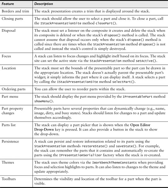
Although most users expect presentations to support the behavior provided by the Workbench’s default presentation, much of that behavior is optional. Your presentation needs to support only the features required by your application. Table 20-1 provides a brief overview of the features provided by the Workbench’s built-in presentation. This is a good guide to what a full-featured presentation should support.
Table 20-1 Workbench’s Default Presentation Features
20.4 Example Presentation
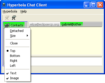
This section illustrates how to code some of the features in Table 20-1 to implement the simple presentation shown in Figure 20-5. Rather than showing all the code here, we highlight the most important parts. The complete version is available in the sample code for this chapter.
Figure 20-5 Hyperbola’s new look
Let’s start by defining the requirements:
• The presentable part tabs must appear at the top of the stack and allow the user to switch between parts. The active part’s tab must be shown in green and the hidden parts shown in white.
• The part tabs must wrap to another line if there are too many parts to show on one line.
• Toolbars and view menus must be supported.
• To close a part, there must be a Close action in the context menu for a tab. In addition, there are actions to customize the look and location of the tabs (e.g., bottom, right, left).
• The user must be able to drag and drop parts from one stack to another and move the stacks around. In this example, layout preferences such as stand-alone and nonclosable are to be ignored.
• The presentation border and trim must be drawn to highlight the active stack.
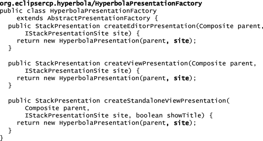
20.4.1 The Presentation Factory
The first thing to do is declare the presentation factory and register it with the org.eclipse.ui.presentationFactories extension point, as shown here:

The implementation of the factory is straightforward—it simply creates the stack presentation instances as shown in the next code snippet. Notice that this is where the stack presentation gets access to the IStackPresentationSite and the Composite, with which it can parent its controls. These are passed to the factory by the Workbench and are simply forwarded to the stack presentations. For simplicity in our example, all the methods return the same StackPresentation. An alternative is to create different types for editors, views, and stand-alone views.
20.4.2 The Stack Presentation
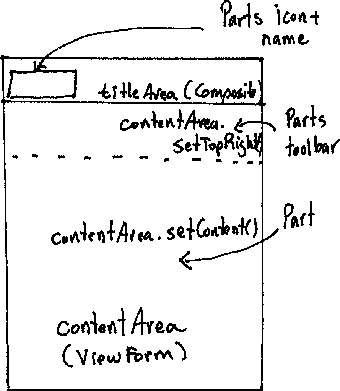
Again, the stack is the meat of any presentation. In our example, the meat is in the HyperbolaStackPresentation class. The main task in creating a presentation is to design its layout and pick the UI widgets needed for switching between presentable parts, showing the part contents, the part toolbar, and any other widgets that appear in the presentation. Figure 20-6 shows a sketch of our example presentation with the widgets that are used to place the different elements of an IPresentablePart. At the top is the titleArea, which contains the tabs that allow switching between parts. This is a simple Composite with a RowLayout that wraps children if necessary. When a part is added to the presentation, a composite that shows the part’s name and icon is added to the titleArea.
Figure 20-6 Design for the example presentation
Note
Using Composites for the tabs is a bit heavyweight; instead, we could have used org.eclipse.swt.widgets.items. Whereas Composites can contain other controls, items can’t. The main reason we used Composites was that the existing SWT layouts work with Composites and not items. We didn’t want to add more complexity to the example by having to write a custom layout. For an example of how to use items, see SWT’s CTabFolder, CTabItem, and CTabLayout.
The contentArea is where the IPresentablePart can be displayed. It’s implemented as a ViewForm, which is a handy SWT class that allows the layout of three controls at the top and one content control below. If an IPresentablePart has a toolbar, it’s shown in the ViewForm’s top right slot.
The bulk of a presentation involves laying out the controls in the presentation and calculating in which area the part should be shown when calling IPresentablePart.setBounds(Rectangle). However, the first thing the presentation does is create the widgets shown in Figure 20-6, adding a dispose listener to the topmost control in the presentation.
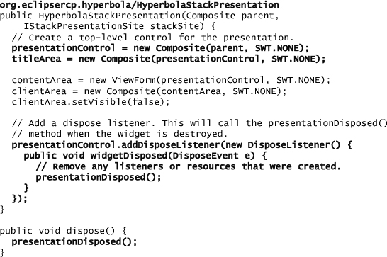
Note here that the presentation has a dispose() method, but it is not guaranteed to be called. Since each presentation creates a top-level control, the disposal of that control indicates that it is safe to clean up any resources held by the presentation. Without this structure, it is very easy to leak presentations as stacks are closed.
The titleArea is used to show view and editor tabs. A simple Composite with a RowLayout is enough here. The tabs that are added as children of the titleArea use the RowLayout’s wrapping behavior.
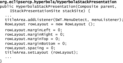
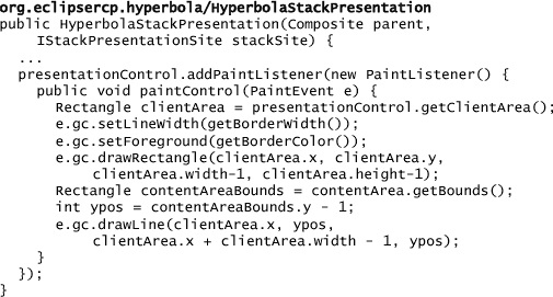
It is standard practice for presentations to draw an outline of the stack area and differentiate the part switching (i.e., tab) area from the area that shows the presentable parts themselves. To do this, a paint listener is added to the topmost control.
20.4.3 Size and Position
When the presentation is told to update its size, it lays out its controls and initializes the bounds for the presentable part, as shown below. The presentable part needs to be told where, relative to the presentation, to draw.
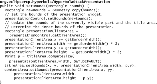
Usually, the presentable part’s placement depends on the other widgets shown in the presentation. In this example, the size of the titleArea dictates the size of the contentArea—the tabs take priority over the part content. The thickness and shape of the border must also be considered.
The setBounds(Rectangle) method gives you full control. The layout can be as complicated or as simple as you need. The only restriction is that only one part can be visible at a time within the same stack. Beyond that, you can put the tabs at the bottom or down the sides; have big tabs, small tabs, no tabs; and so on—you have complete control.
20.4.4 Adding, Selecting, and Removing Parts
Now that the widgets are created and laid out, the presentation has to handle part manipulation. This requires implementations of the following StackPresentation methods: addPart(IPresentablePart), removePart(IPresentablePart), and showPart(IPresentablePart). This example shows presentation parts as rectangles in the title area. Clicking on a rectangle switches to the part associated with that rectangle.
As shown in the next snippet, when a part is added, a PartTab composite is created and parented by the titleArea. The new part is attached to the PartTab and the PartTab is initialized using the image and text from the IPresentablePart. All the PartTab does is add the image and text and decide how to render the tab. As shown here, the PartTab does all of its work in a paint listener:
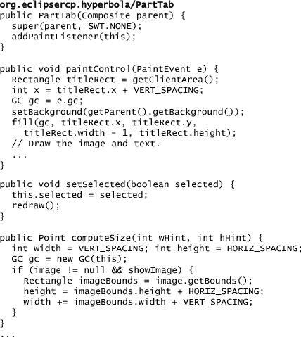
Our PartTab is relatively simple. There are many other properties that could be shown, for example, the part’s content description or busy state. Your presentation can show these and others however you like.
The snippet below shows the creation and initialization of a PartTab when a new part is added. Notice that a property listener is added to the presentation part. This allows the PartTab to be updated when a part property changes. Properties are things such as the part’s text, icon, tool tip, and dirty state—essential data to show in the tab. See IPresentablePart for a complete listing of supported properties.

Tip
Remember to remove listeners when they are no longer needed to avoid memory leaks.
The preceding snippet added a mouse listener to the new tab. This is used to detect when tabs are selected and then to make parts visible. The next snippet shows the listener and highlights the importance of remembering the part with its associated tab. Otherwise, how would you find the part that matches the event?

20.4.5 Menus
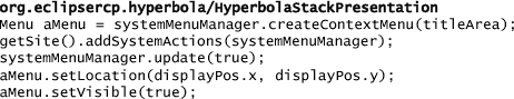
There are three basic menus that should be handled by a presentation: the system menu, the part list menu, and the view pane menu. The system menu normally contains actions related to the presentation; the part list menu should allow the user to navigate between the parts in the stack; and the view pane menu is the menu returned by the IPresentablePart method getMenu().
In our example only the system menu is needed. The presentation is responsible for creating and showing the menu but must allow the IStackPresentation site to add standard actions such as Move, Size, and Detach actions to the menu.
20.5 Summary
In this chapter you learned that presentations are responsible for managing and drawing a stack of views or editors. A presentation instance is created for each stack of views or editors in a perspective. These instances do not actually parent the widgets created for the view or editor; rather, they simply control the size and location of the views and editors in the stack. With an understanding of the basic implementation patterns from Section 20.4 and the responsibilities of a presentation from Table 20-1, you should have enough background to write your own presentation.
The best way to write your own presentation is to start with an existing one, then modify it to suit your needs. There is actually quite a bit more to the implementation than shown here. The full example included in the sample code for this chapter adds support for dragging; closing parts; moving the tabs to the bottom, right, or left of the content area; and much more. It should serve as a good starting point for creating your own presentations. The example presentations in org.eclipse.ui.examples.presentations can also serve as a base for your own presentations.
20.6 Pointers
The presentation API is covered well in this presentation: