Chapter 14
Data-Driven Decision Making: Leveraging Charts, Graphs, and Reports
This chapter covers Objective 4.4 (Given a scenario, apply the appropriate type of visualization) and Objective 4.5 (Compare and contrast types of reports) of the CompTIA Data+ exam and includes the following topics:
 Types of data visualizations
- Types of reports
For more information on the official CompTIA Data+ exam topics, see the Introduction.
This chapter discusses data visualization techniques. It also discusses topics such as static vs. dynamic reports, ad hoc/one-time reports, self-service/on-demand reports, and recurring reports.
Types of Data Visualizations
Data-enabled decision making is vital—particularly in the business world. Businesses run for profit, and insights about what activities will yield maximum profit are essential to business stakeholders. Different parties might be involved in gathering and synthesizing data, making sense of data being collected (via business intelligence), and identifying actionable steps on the basis of insights.
Efficient ways of interacting with information are crucial to the success of any business or organization. Hence, it is vital that information be gathered and synthesized with the help of suitable processes. It is important that outcomes be understood and presented in accessible way.
Many techniques can be used for visualizing data, as discussed in the following sections. Microsoft Excel is one of the most popular tools for generating business charts and graphs, and you will see in this chapter that we have leveraged Microsoft Excel as the software to generate examples of charts and graphs.
ExamAlert
CompTIA Data+ exam focuses on various data visualizations. It is useful to experiment with your own data set and leverage Microsoft Excel to visualize data in various charts and formats and understand how they differ from each other as well as, when one is more useful than other.
To create a graph or a chart in Excel, go to Insert > Charts, as shown in Figure 14.1.

Figure 14.1 Creating Charts and Graphs in Microsoft Excel
Line Charts
A line chart (also known as a line graph) shows a set of points (of information) connected by a continuous segment of line. Line charts are usually used to show how information varies over a time period.
Note
Line charts are mostly used to depict trends.
Figure 14.2 shows an example of a line chart.
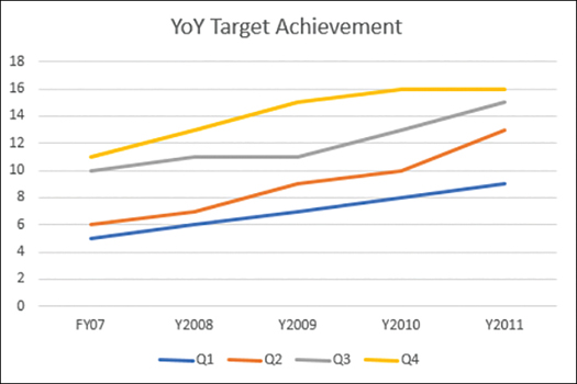
Figure 14.2 Line Chart Showing YoY Target Achievement
This chart is built on the data shown in Table 14.1.
TABLE 14.1 Sales Data by Quarter, Y2007–Y2011 (in $M)
Quarter | Y2007 | Y2008 | Y2009 | Y2010 | Y2011 |
|---|---|---|---|---|---|
Q1 | 5 | 6 | 7 | 8 | 9 |
Q2 | 6 | 7 | 9 | 10 | 13 |
Q3 | 10 | 11 | 11 | 13 | 15 |
Q4 | 11 | 13 | 15 | 16 | 16 |
In this line chart, the x-axis shows quarters (that is, Q1, Q2, Q3, and Q4) in a financial year, and the y-axis displays the target achieved during each of these quarters. The individual data points that are connected by the line are known as markers. The line connects the markers in a dot-to-dot fashion.
Fun Fact
You can create your very own line charts in Microsoft Excel. All you need to do is create a table with values in it and then go to Insert > Charts and select the type of chart you want to make. It’s as easy as a few clicks.
Pie Charts
The pie chart is one of the oldest and most basic chart types used for data visualization. A pie chart, also known as a circle chart, resembles a pie with slices that represent data categories and together make up the whole pie, totaling 100%. The size of each slice is proportionate to its value. Pie charts are ideal for making comparisons and visualizing proportions. Because pie charts tend to be very basic, they are appropriate for giving an overview of data splits and for key takeaways.
Figure 14.3 shows a pie chart based on Table 14.1 for Q1 across all years.

Figure 14.3 Pie Chart in Microsoft Excel
Bubble Charts
A bubble chart is an extension of a scatter plot graph (discussed in the next section). In a bubble chart, each dot represents a single data point, and the value of the variable for every point is indicated by the size of the dot. The bubble chart in Figure 14.4 shows sales revenue across Q1 and Q3 for the sample data from Table 14.1.
Figure 14.5 shows the selections you use to draw scatter charts (discussed in the next section) and bubble charts in Microsoft Excel. As mentioned earlier, you can draw multiple other charts as well by selecting Insert > Charts.

Figure 14.4 Bubble Chart Showing Sales Numbers Across Q1 and Q3

Figure 14.5 Drawing Bubble Charts in Excel
Scatter Plots
A scatter plot, which is very similar to a bubble chart, represents information for two variables, displayed using points plotted against vertical and horizontal axes. A scatter plot is usually used to determine the relationship between two variables. Figure 14.6 shows a scatter plot for the data from Table 14.1.

Figure 14.6 Scatter Plot
Bar Charts
A bar chart, also known as a bar graph, categorizes information into a graphic with bars of different lengths, where the length of a vertical bar is relative to the quantity or amount of the information it represents. Along with the pie chart, the bar chart is one of the oldest and simplest visualization methods. To interpret a bar chart, you consider the length of the bar for each category in order to find its value. Figure 14.7 shows a bar chart based on the information from Table 14.1.

Figure 14.7 Bar Chart
Bar charts can be oriented both horizontally and vertically. Figure 14.7 shows an example of a horizontal bar chart.
Histograms
A histogram represents the data distribution over a defined period or a continuous interval period. This type of visualization is useful for presenting a particular occurrence frequency; in other words, it shows how many times a specific value occurs.
Figure 14.8 shows a histogram based on the data from Table 14.1.

Figure 14.8 Histogram
What’s the difference between a bar chart and a histogram? Well, a bar chart and a histogram are very similar except that a histogram groups numbers into ranges, and there are no gaps between the bars in a histogram.
Histograms are typically used to show results of continuous data, such as:
 The number of students in an educational institution
- Sales numbers over quarters
- Heights
- Weights
- BMIs
A histogram always looks “backward” in time and never projects forward.
Waterfall Charts
A waterfall chart visualizes data by denoting how a value is modified as it moves between two points and is impacted by various factors, such as time. Such a chart helps identify the net change in a specific value between two points. A waterfall chart is different from a bar chart as it depicts all of the unique elements that lead to that net change and visualizes them individually. This helps the observer understand how a value has declined or grown over a specific period.
Figure 14.9 shows a waterfall chart depicting sales revenue, based on the data from Table 14.1.

Figure 14.9 Waterfall Chart
In Figure 14.9, you can see that, from right to left, the values form a waterfall shape—hence the name of the visual. A key element of a waterfall chart is that the beginning point of each bar is the ending point of the previous bar.
Heat Maps
A heat map is a visualization that uses color to show differences in information. Heat maps use colors to communicate values and make it simple for observers to determine trends quickly and get a comparative view of a dataset.
Note
In Microsoft Excel, a heat map is generated based on values in cells, and minimal values are assigned closer to red, whereas maximum values are closer to green. Figure 14.10 shows a heat map in Microsoft Excel based on the data from Table 14.1.

Figure 14.10 Heat Map
If you’re keen to generate your own heat map, you can go to Home > Conditional Formatting > Color Scales in Excel (see Figure 14.11).
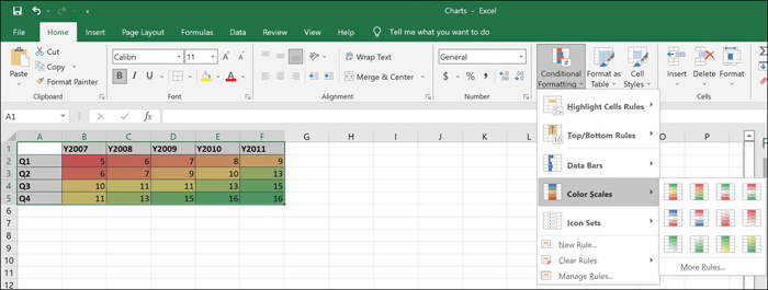
Figure 14.11 Creating a Heat Map in Excel
Geographic Maps
Geographic map data visualizations, also known as choropleth maps or thematic maps, provide a novel way to show comparative values across states, countries, or regions. A geographic map uses shading, color, and other patterns to visualize the relevant mathematical values across geographic areas. The color of each location on the map is in proportion to its corresponding data values. A geographic map shows how a variable is different from one area to the next. To see an example of this type of visualization, consider the data in Table 14.2.
TABLE 14.2 U.S. State Data for Sales Revenue (in Millions of Dollars)
State | Revenue |
|---|---|
California | 50 |
Hawaii | 10 |
Indiana | 20 |
Virginia | 40 |
Figure 14.12 shows a geographic map created based on the data from Table 14.2.

Figure 14.12 Geographic Map for Sales Revenue Across U.S. States
In this case, the geographic map was generated using the built-in function Maps under Insert > Maps > Filled Map, as shown in Figure 14.13.

Figure 14.13 Generating a Geographic Map in Excel
Tree Maps
Tree maps are used to capture data values in a hierarchical structure and present the information visually. A tree map is a series of rectangles, with the tree’s branches represented by rectangles and any sub-branches represented by smaller rectangles, each of which represents a proportionate data value.
A larger rectangle shows the division of information in the tree and can be broken into smaller rectangles so that, when a quantitative value is assigned to a field, its size is displayed in proportion to that quantity and to the other quantities (in a part-to-whole relationship) within the parent category.
Figure 14.14 shows a tree map for sales revenue across the years 2007 through 2011, based on the data from Table 14.1.

Figure 14.14 Tree Map of Sales Revenue
Stacked Charts
A stacked chart, also known as a stacked bar graph, is an extension of a bar chart in which each bar is divided into a number of sub-bars stacked together. A bar is drawn for each level of the categorical variable, and the bar’s length indicates the numeric value of the variable. Figure 14.15 shows an example of a stacked chart.

Figure 14.15 Stacked Chart
This chart is based on the data from Table 14.1. As you can see, the quarterly achievements for each year are stacked together and shown as a categorical representation with clear demarcations across Q1–Q4. This visualization provides an easier-to-read and easier-to-understand view of information than would a bar chart with four bars for each year.
Note
While stacked bar charts look great, they can be hard for audiences to interpret. A stacked bar chart provides a good first look at data, giving a basic idea of year-over-year performance. To get a more granular view of the same data, you can break down each year separately and use a regular bar chart to compare quarters across each year.
Infographics
An infographic, or information graphic, is a visual illustration of data that makes it easier to understand information, often in a fun way. Infographics tend to combine otherwise disparate images, data, and text to tell a compelling story that is easy for stakeholders to understand. Infographics provide a very user-friendly way to view trends and patterns. Figure 14.16 shows an example of an infographic about smart home features.
Many online services can create infographics for you, such as:
- Vista: https://create.vista.com/create/infographics/ (which was used to create Figure 14.16)

Figure 14.16 Smart Home Infographic
Word Clouds
A word cloud, also known as a tag cloud, is a visual in which text content is shown in a random graphic manner. As a general rule, the more frequently a specific word is mentioned in a dataset, the larger it appears in the word cloud.
Word clouds are frequently used as eye-catching graphics. In addition to being larger than other words in a word cloud, key words may look bolder and may leverage a color scheme that indicates their frequency. Figure 14.17 shows a word cloud based on sales key words.

Figure 14.17 Word Cloud Based on Frequently Used Sales Terms
Note
This word cloud was created using the free online service at https://worditout.com/word-cloud/create. Many other online services can be used to create word clouds. Go ahead and give it a go at one or more of the following:
Reports
Reports in the context of decision making should be viewed through the lens of analytics as a tool for getting better insights about past, present, and future data to drive decisions as well as optimize the performance of an organization. Reports usually bring together various sources of information that can be used across strategic and operations decision making.
Following are some of the key aspects of creating reports:
- It is important to know your target audience. If you don’t, your reports may not be as relevant as you think they are.
- It is important to consider defining the key performance indicators (KPIs) and key data points used in the report.
- It is important to leverage pertinent data sources.
- It is important to create reports that are easy to understand and that clearly communicate key highlights.
- A report should show clear outcomes and related actionable objectives.
The sections that follow describe the various reports that you can leverage for data-driven decision making.
Static Reporting
As the name suggests, static reports are static in nature and offer insights about data or trends at a point in time or during a specific time period. With static reports, decisions can be made based on data from a particular day, month, or year. Essentially, static reports help examine data points and key information from the past to drive future decision making. For example, during a sales campaign, the number of respondents who responded to the campaign and the features they liked most in a newly launched product could be presented in a static report that would help guide the product owners and other stakeholders to ensure that they incorporate the in-demand features in the upcoming release of the product. In simpler words, static reports help examine the data points and key information in the past to drive future decision making.
Static reports can be saved in many formats, including PDF, Excel, and Word files. Figure 14.18 shows a static report that details sales achievements for fiscal year 2021.

Figure 14.18 Static Report Showing Sales Revenue
Note
This static report was created using https://create.piktochart.com/.
Static reports are typically archived after their initial use. However, they can be used later to analyze trends such as sales trends across previous years and to provide direction for things that can be improved in the upcoming year.
Dynamic Reports
In contrast to a static report, a live report portrays information about events as they happen (similar to streaming movie). For example, your personal wearable health device shows you real-time data such as your heartbeat and calories burned during your daily run; this is a form of live reporting. While live reporting is useful at an individual level or perhaps even at a team level, not all live reporting is useful at corporate and leadership levels.
ExamAlert
Static, dynamic, ad-hoc, and self-service, and other reports are a key topic in CompTIA Data+ exam. Be sure to understand the use cases of such reports.
Dynamic reporting is a mashup of static reporting with elements of live reporting. Dynamic reports are usually graphical outlays that combine live and static reporting elements so that an observer can click through links to the different types of data needed—on demand. For example, the dynamic report in Figure 14.19 shows a Q1 sales performance report with live data on projections for the upcoming week.

Figure 14.19 Dynamic Report for Sales Performance
Note
This dynamic report was created using https://create.piktochart.com/.
Table 14.3 describes the key differences between static and dynamic reports.
TABLE 14.3 Static vs. Dynamic Reports
Characteristic | Static Reports | Dynamic Reports |
|---|---|---|
Key purpose | A static report presents data at a point in time for future decision making. | A dynamic report offers both data at a point in time and real-time insights. |
Usability and intuitiveness | Information is mostly text based, and a lack of interactive functions makes deriving insights slower. Moreover, static reports are useful for a shorter period due to the content being relevant for a particular period. | A dynamic report is created using static information as well as stimulating visuals based on KPIs to improve storytelling. It is possible to reuse dynamic reports by updating live content and customizing the content and functionality. |
Accessibility | Static reports are generally delivered via emails or distribution lists, and users need access to their corporate email address to get the insights. | Users can log in to the relevant dashboard from anywhere, across their corporate devices or their own devices, to immediately get insights. |
Ad Hoc/One-Time Reports
Ad hoc reporting, sometimes also called one-time reporting, helps users generate reports on the fly such that they don’t have to wait for reports to be generated to answer business questions immediately. For example, if you’re about to walk into a leadership meeting and want to be equipped with updated sales revenue or performance data for the past 2 weeks, you won’t want to wait for a standard quarterly analysis report but would want to generate a one-time report to augment the discussion.
Some of the professions/industries where ad hoc reporting is commonly used are:
- Sales
- Recruitment
- Retail
- Education
- Healthcare
Ad hoc reports are not a substitute for other reports; rather, they should be seen as augmenting to the recurring (static or dynamic) daily, weekly, or monthly reports. Business users should be able to use ad hoc reports to improve the data-driven decision-making process.
Self-Service/On-Demand Reports
As the name suggests, self-service, or on-demand, reports can be generated by end users without any intervention from IT or analysts. Ad hoc reporting is a very good example of self-service reporting.
Users can leverage business intelligence tools to generate self-service reports, which reduce the workload for IT, provide cost savings, save time, and empower users to create their own reports rather than chase down someone to generate reports for them. End users (including executives) can customize reports as they like in order to tell a particular story and put things into perspective. Now, this is user empowerment!
Recurring Reports
Recurring reports are reports that are scheduled and generated based on predetermined KPIs. These reports are useful in that they save time and cost because they are run at known intervals, such as weekly, fortnightly, or monthly, and users can rely on these reports to come in so they can go about getting insights from these reports. Recurring reports may be either sent to specific email addresses or distribution lists, depending on the report content and at the report owner’s discretion. For example, whereas a sales revenue report might be sent to all VPs and executives, a performance report might be shared with all sales staff.
There are three categories of recurring reports—compliance, risk and regulatory, and operational reports—as detailed in Table 14.4.
TABLE 14.4 Compliance, Risk and Regulatory, and Operational Reports
Characteristic | Compliance Reports | Risk and Regulatory Reports | Operational Reports |
|---|---|---|---|
Function | These reports help ensure that all required steps are being taken to be fully compliant with local standards. | Regulatory reports are used to share data with local/relevant authorities to showcase that everything is in order as per the required regulatory provisions. | These reports enable insights to processes and efficiencies that can be looked into for optimizing ongoing operations. Operational reports are also known as key performance indicator (KPI) reports. |
What they offer | These reports enable risk management based on the extra measures required for compliance. | These reports enable the various departments in an organization to share their insights on various regulatory aspects and to reduce risk by following guidance from previous findings. | These reports help line-of-business stakeholders get better insights into their daily operations and what can be done to increase performance and optimize processes for maximum output. |
Tactical/Research Reporting
In a research report, a researcher reports findings on a topic of interest such that readers of the report can understand the outcomes in a straightforward manner. These reports are commonly used in science, medicine, education, and other fields.
Tactical reporting is focused on more immediate goals related to improving operational metrics. These reports focus on associations with operational tasks that are performed in groups or individually to realize strategic outcomes.
When you combine tactical and research reporting, you get tactical research. For example, an organization may have data analysts compare products from competitors, including pricing and the sales figures a class of products is achieving as compared to the parent company. In this case, the analysts may be conducting a tactical pricing comparison while researching key factors for increased sales of competitive products.
What Next?
If you want more practice on this chapter’s exam objectives before you move on, remember that you can access all of the Cram Quiz questions on the Pearson Test Prep software online. You can also create a custom exam by objective with the Online Practice Test. Note any objective you struggle with and go to that objective’s material in this chapter.