
Hour 15. Lattice Graphics
What You’ll Learn in This Hour:
![]() How to create simple lattice graphics
How to create simple lattice graphics
![]() How to show structure in data using groups and panels
How to show structure in data using groups and panels
![]() How to create custom graphics
How to create custom graphics
![]() How to control styles and legends
How to control styles and legends
In the previous two hours, you saw how to create graphics using either the base graphic system or the ggplot2 package. In this hour, we will look at a third way of creating graphics: using the lattice package. This graphic system is well suited to plotting highly grouped data, with the code designed to closely resemble the modeling capabilities of R that we’ll need later in Hour 16, “Introduction to R Models and Object Orientation.”
In this hour, we’ll look at how to create simple lattice graphics, building up to more fine control of styling and the creation of highly customized plots.
The History of Trellis Graphics
As mentioned in Hour 1, “The R Community,” the R language can be considered an implementation of the S language, originally developed at AT&T Bell Labs. A good analytic software needs strong graphical capabilities, so the base graph system was created (the evolution of which was described in Hour 13, “Graphics”).
During the 1990s, researchers at AT&T designed a new graphic system, whose evolution is detailed in books such as the landmark 1993 book Visualizing Data by William Cleveland. Following the release of the book, William Cleveland and Rick Becker evolved the system, eventually implementing the ideas in the S language. They named the graphic system “trellis” because the display style (panels arranged in regular grids) reminded the authors of garden trelliswork.
The Lattice Package
The lattice package in R, which can be thought of as a port of the S Trellis graphic system, was created by Deepayan Sarkar of the University of Wisconsin. Like ggplot2, it is based on Paul Murrell’s grid package and therefore requires the grid add-on package. One of the design aims of lattice was to be, as far as possible, backward compatible with code created in trellis, although a number of significant changes were made.
Like trellis, the lattice system is designed primarily for the visualization of multivariable datasets. The prominent design feature is the arrangement of graphics in a series of “panels,” set out in a regular grid, with each “panel” graphing a subset of the data. This provides strong capabilities, in particular, for understanding how a response depends on a range of explanatory variables.
Creating a Simple Lattice Graph
Because lattice is a recommended package, the first thing we need to do is to load the package, providing access to its capabilities. We can do this using either the library or require function:
> # Load the lattice package
> require(lattice)
Loading required package: lattice
To create a lattice graphic, we need three things:
![]() A lattice plotting function
A lattice plotting function
![]() A formula specifying the relationship between variables to create
A formula specifying the relationship between variables to create
![]() The data to plot, typically contained in a data frame
The data to plot, typically contained in a data frame
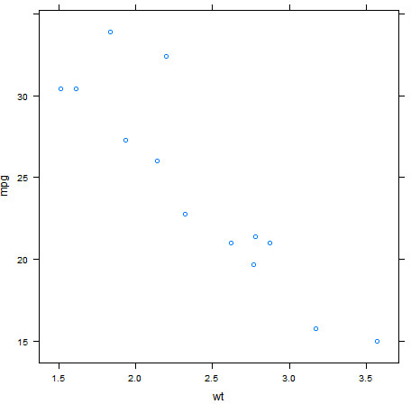
For our lattice plotting function, let’s start with xyplot, which allows us to create a scatter plot. To define the relationship between variables to graph, we use the ~ symbol in the form (Y axis ~ X axis). As with the previous hour, let’s start by creating a scatter plot of mpg vs. wt using the mtcars data frame.
> xyplot( mpg ~ wt, data = mtcars )
The resulting plot can be seen in Figure 15.1.

Here, we specified the data frame containing our data using the data argument, and we specified mpg ~ wt as the relationship to visualize.
Note: Working with Vectors
Like ggplot2 functions, we can specify vector data inputs to our lattice function, so the preceding command could be replaced by xyplot(mtcars$mpg ~ mtcars$wt). However, it is more common to specify the name of the data frame using the data argument so that we can refer to variables directly.
Lattice Graph Types
Unlike qplot from the ggplot2 package, which selects the most appropriate graph type to create, with the lattice package we specify the graph type we want based on the function we select. In the preceding example we used the xyplot function to create a scatter plot, but there are many others to choose from. A complete list of lattice graph functions can be seen in Table 15.1.

Note that there are four types of lattice graph functions: univariate, bivariate, 3D, and data. When we choose a lattice graph function, the type of function we use determines the structure of the formula we must use to specify the plotting variables.
Univariate Lattice Graphics
The lattice package contains two univariate graphic functions that allow us to plot a single variable. We specify the variable we want to plot using a formula that only has a variable on the right, such as ~ mpg. Let’s see a simple example using the histogram function. The created histogram can be seen in Figure 15.2.
> histogram( ~ mpg, data = mtcars )

Tip: Controlling Binning
As with other implementations (such as hist or geom_histogram), a default binning mechanism is used. With the histogram function we can specify the number of bins to use with the nint argument.
The densityplot function allows us to produce a density plot of a single variable. Let’s see a densityplot of the wt variable. The resulting density plot can be seen in Figure 15.3.
> densityplot( ~ wt, data = mtcars )

Tip: Controlling the Points
The default behavior with densityplot is to add “jittered” points along the X axis indicating the positions of the observations. Although this is highly useful, we can control (or suppress) these points using the plot.points argument to densityplot, which accepts four possible inputs, as listed in Table 15.2.

Bivariate Lattice Graphics
The lattice package contains five bivariate graph functions: qq, barchart, xyplot, bwplot, dotplot, and strippplot. As seen with the earlier xyplot example, we specify the relationship with a two-sided formula with the structure Y ~ X. When you are using these functions, it is important to understand which variables are (by default) placed on the Y axis (specified by the left side of the formula) and which variables are placed on the X axis (specified by the right side of the formula). These variables are listed in Table 15.3.

From Table 15.3 we can see that for the functions bwplot, dotplot, stripplot, and barchart, the factor variable is by default on the Y axis. Let’s see an example using dotplot with our mtcars data, this time looking at how the miles per gallon (mpg) varies based on the number of carburetors (carb). The output can be seen in Figure 15.4.
> dotplot( carb ~ mpg, data = mtcars )

Note: The Use of Factor Axes
In the preceding example, we specified carb as the (factor) variable on the Y axis. In fact, carb is a numeric variable. Where a factor is expected, the provided variable will be converted to a factor.
Transposing the Axes
We previously noted that the functions bwplot, dotplot, stripplot, and barchart specify the categorical variable on the Y axis and the numeric variable on the X axis. This is based on the design in the book Visualizing Data by William Cleveland, but this behavior may be unexpected. For example, boxplots are more commonly produced with the numeric variable on the Y axis and the categorical variable on the X axis. Each of these functions has the argument horizontal, which, by default, is set to TRUE (producing “horizontal” charts). We can instead set the value of horizontal to FALSE to create vertical charts, but we also need to change the order of the variables in the formula (with the categorical variable on the X axis). Let’s see an example using the bwplot function. The resulting plot can be seen in Figure 15.5.
> bwplot( mpg ~ carb, data = mtcars, horizontal = FALSE )

3D Lattice Graphics
The lattice graph functions cloud and wireframe can be used to plot 3D scatter plots and surfaces, respectively. When you’re specifying the variables to graph, your formula should be of the format Z ~ X * Y, with the Z variable used as the “height” of the plot. Let’s use the cloud function to create a 3D scatter plot of some variables from our mtcars data, which can be seen in Figure 15.6.
> cloud( mpg ~ wt * hp, data = mtcars)

An alternative way to provide data for a 3D lattice graph function is in the form of a matrix. When a matrix is provided, the lattice graph functions will use the rows and columns of the matrix as the X and Y axes, and use the value in each cell as the height of the plot. Let’s see an example using the internal volcano matrix, which contains topological information for Maungawhau, one of 50 active volcanoes in the Auckland volcanic field. This time we’ll use the wireframe function to create a 3D surface plot. The resulting 3D plot can be seen in Figure 15.7.
> dim(volcano) # Dimensions of the volcano matrix
[1] 87 61
> wireframe( volcano, shade = TRUE )

Tip: Controlling the Color Shading
Note the use of the shade argument in this example, which specifies that color shading should be used on our 3D surface using an illumination model with a single light source. We can additionally control the colors used with the shade.colors.palette argument, and the light source itself using the light.source function. For more information, see the help file for the panel.3dwire function (?panel.3dwire).
When creating 3D graphics in this way, you’ll often want to control the perspective of the graph—in other words, the view point from which you are looking at the graph. For example, in the previous graph we cannot really see the crater of the volcano, but we could rotate the graph so we’re looking at the other side of the volcano. We can achieve this using the screen argument, which accepts a list with elements x, y, and z specifying the rotation to apply. Let’s use the screen argument to view the volcano from a different perspective so we can see the crater. This can be seen in Figure 15.8.
> wireframe( volcano, shade = TRUE,
+ screen = list(x = -60, y = -40, z = -20))

“Data” Lattice Graphics
Two lattice graph functions can be used to graph the structure of a data frame: splom and parallelplot. To use these functions, we specify the data frame in a one-sided formula (~Data). Let’s first look at the splom function, which creates a scatter-plot matrix (analogous to the pairs function seen in previous hours). Instead of using the whole dataset, we’ll select four columns from the mtcars data to plot. In Figure 15.9, we can see that each of our four variables are plotted against each other in a matrix of scatter plots:
> splom( ~ mtcars[,c("mpg", "wt", "cyl", "hp")])

Tip: The pairs Function
The pairs function is the base graphics equivalent of the splom function, and can also produce a scatter-plot matrix of our data.
Plotting Subsets of Data
All lattice graph functions contain a subset argument that allows you to filter the data as you’re plotting. This is useful for plotting sections of the data without having to create a filtered dataset before plotting. Let’s see an example of this, where we’ll create a scatter plot of mpg vs. wt using only manual cars (where am == 1). The resulting plot can be seen in Figure 15.10.
> xyplot( mpg ~ wt, data = mtcars, subset = am == 1 )
Graph Options
As with base and ggplot2 graphics, each of the lattice graphics listed in Table 15.1 accepts common graph options that control aspects of the graph. The option names generally follow the conventions used in the graphics package.

Titles and Axes
First, let’s use arguments such as main, xlab, and xlim to control our plot titles and axes, as seen in Figure 15.11. For now, we’ll use the xyplot function, but this works for all lattice graph functions.
> xyplot(mpg ~ wt, data = mtcars, main = "Miles per Gallon vs Weight",
+ xlab = "Weight (lb/1000)", ylab = "Miles/(US) Gallon",
+ xlim = c(1, 6), ylim = c(10, 40))
Plot Types and Formatting
As with the graphics system, we can use the type argument to control the type of (scatter) plot created and use arguments such as col and lwd to control the style of the elements graphed, as seen in Figure 15.12. For this example, let’s use a different dataset—we’ll use the cranlogs package to extract data on package downloads. First, let’s install the cranlogs package from CRAN:
> install.packages ("cranlogs")

Next, let’s load the library and download some data using the cran_downloads function. For this exercise, we’ll download the CRAN logs for lattice and ggplot2 over the last month:
> library(cranlogs)
> cranData <- cran_downloads(packages = c("lattice", "ggplot2"), when = "last-month")
> head(cranData)
date count package
1 2015-07-30 2100 lattice
2 2015-07-31 1804 lattice
3 2015-08-01 858 lattice
4 2015-08-02 874 lattice
5 2015-08-03 2234 lattice
6 2015-08-04 2991 lattice
Now we’ll create a scatter plot of the number of downloads (count) vs. date for the lattice package.
> xyplot(count ~ date, data = cranData, subset = package == "lattice",
+ main = "Lattice package downloads over the last month",
+ ylab = "Number of Downloads", xlab = "Date",
+ type = "b", col = "red", lwd = 2, cex = 2, pch = 16)
Caution: Background Colors of Plot Characters
Using the base graphic system, we can use plot characters with filled backgrounds using pch values 21 to 25. When we use these plot characters, we use the bg argument to control the background color of each plot symbol. In lattice, we can also use pch values 21 to 25, but the argument for controlling the background color is fill instead of bg.
Multiple Variables
When we use the lattice graph functions, we can choose to plot multiple variables. We achieve this by specifying multiple variables in the formula of the format Y1 + Y2 ~ X1 + X2. By default, this will superimpose the variables onto the same plot using different colors for each variable, as see in Figure 15.13. In this example, we are plotting Miles per Gallon (mpg) on the Y axis vs. two X axes: Displacement (disp) and Gross Horsepower (hp).
> xyplot(mpg ~ disp + hp, data = mtcars, auto.key = TRUE, pch = 16, cex = 2)
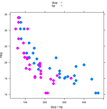
Caution: Mismatched legend
In this example, we used the pch and cex arguments to make the plot clearer. We also use the auto.legend argument to automatically create a legend for the plot that indicates that the disp variable is represented with blue points and the hp variable is represented with pink points. Although this allows us to identify each variable, notice that the legend doesn’t completely match the plot (the legend shows empty circles). Later in this hour, you’ll see how to fix this issue.
As you can see in Figure 15.13, the two variables on the X axis (disp and hp) appear superimposed on the same graph, and the color of the plotting symbols allows us to distinguish between the two variables. We can use the outer argument to control whether the multiple variables should be represented as groups on the same plot (the default behavior) or should be split into separate plots. We can specify that separate plots should be created by specifying outer = TRUE, as shown in Figure 15.14.
> xyplot(mpg ~ disp + hp, data = mtcars, pch = 16, cex = 2, outer = TRUE)

As you can see, the two graphs are produced in separate “panels,” each with the same X and Y axis scales. This is very similar to the “facets” you saw in Hour 14, “The ggplot2 Package for Graphics.” You’ll see more on panels later in this hour.
Groups of Data
If we have groups in our data, we can represent them by varying plot aspects using the groups argument. Let’s start with a simple example using our mtcars data. Here, we will plot mpg vs. wt, but vary the color of the plot based on the number of cylinders (cyl) using the groups argument. This can be seen in Figure 15.15.
> xyplot(mpg ~ wt, data = mtcars, groups = cyl,
+ pch = 16, cex = 2, auto.key = TRUE)

If we use a grouping variable together with multiple variables, the outer argument is set to TRUE, such that the multiple variables are split into panels. This can be seen in Figure 15.16, where we group by cyl but also use multiple X axis variables:
> xyplot(mpg ~ disp + hp, data = mtcars, groups = cyl,
+ pch = 16, cex = 2, auto.key = TRUE)

FIGURE 15.16 Scatter plot with multiple X axes plotted in different “panels” and the plot grouped by cyl
Note: Plot Layout
When we create graphs in multiple panels, such as in this example, the layout of the plots is determined based on the size of the plot device available. For example, in RStudio, we may see different panel layouts by resizing the plot window. We can control the layout of panels explicitly using the layout argument. This argument also allows us to create multiple pages of plots when our partitioning variable has a high number of levels.
Tip: More Control of the Legend
The auto.key argument can, instead, accept a list of settings. This can be used to further control the format and placement of the legend. For example, we can place the legend on the right side of the plot with auto.key = list(space = "right").
Using Panels
As you’ve seen already in this hour, the lattice package is able to create graphics in separate “panels.” We can specify a variable to be used to partition our data into panels directly in the formula. To achieve this, we simply append a | symbol to our formula and specify the variable by which to partition the graph. Let’s first revisit the data we downloaded that compared recent downloads of the lattice and ggplot2 packages. A simple plot of count versus date can be seen in Figure 15.17.
> xyplot(count ~ date | package, data = cranData, type = "o")

As you can see, the plot is now partitioned into two separate panels based on the package variable. The axis scales are the same for each panel, with the levels of the package variable (“ggplot2” and “lattice”) displayed at the top of each plot.
Tip: Alternating Axis Ticks
The default behavior of lattice is to alternate the tick marks between panels, which explains why the X axis ticks appear at the top of the graph for the “lattice” panel. We can control this behavior with the alternating attribute of the scales argument, which is described further in the help file for the xyplot function.
Controlling the Strip Headers
Let’s see another simple example, where we’ll attempt to create a plot of Miles per Gallon (mpg) vs. Weight (wt) partitioned on levels of cylinder (cyl). This can be seen in Figure 15.18.
> xyplot( mpg ~ wt | cyl, data = mtcars,
+ main = "Miles per Gallon vs Weight by Number of Cylinders")

In Figure 15.18 we created a graph containing three panels, corresponding to the three levels of the cyl variable. However, the labels at the tops of each panel (the “strip headers”) are not correctly formed. Instead, the text “cyl” is repeated for each strip header, along with some darker orange segments. The strip header labeling worked in the previous example (Figure 15.17) but not this example because of the class of the partitioning variable. In Figure 15.17, the partitioning variable (package) was a factor variable. In this more recent example (Figure 15.18), the partitioning variable (cyl) is a numeric variable. To ensure the strip headers are correct for our data, we need to ensure our partitioning (or “by”) variables are factors. We can use the factor function directly to fix this, as seen in Figure 15.19.
> xyplot( mpg ~ wt | factor(cyl), data = mtcars,
+ main = "Miles per Gallon vs Weight by Number of Cylinders")

FIGURE 15.19 Scatter plot of miles per gallon vs. weight partitioned by number of cylinders (fixing headers)
Tip: More Control of the Strip Header
We can further control the strip headers in one of two ways:
![]() Using the
Using the factor function to further define labels and the order of levels
![]() Using the
Using the strip argument to the lattice functions
More information on the factor function can be found in the factor help file (?factor). More information on the use of the strip argument can be found in the help file for the strip.default function (?strip.default).
Multiple “By” Variables
In the preceding examples, we used a single “by” variable to create a partitioned plot. If we want to use more than one variable, we list them separated by the asterisk (*) symbol. Therefore, if we want to create a plot of Miles per Gallon (mpg) vs. Weight (wt) partitioned on levels of cylinder (cyl) and Automatic/Manual indicator (am), we include both cyl and am in the formula. This can be seen in Figure 15.20. Here, instead of providing am directly as a factor, the ifelse function is used to create a variable containing the values “Automatic” and “Manual.”
> xyplot( mpg ~ wt | factor(cyl) * ifelse(am == 0, "Automatic", "Manual"),
+ data = mtcars, cex = 1.5, pch = 21, fill = "lightblue",
+ main = "Miles per Gallon vs Weight
by Number of Cylinders and Transmission Type")

FIGURE 15.20 Scatter plot of miles per gallon vs. weight partitioned by number of cylinders and transmission type
Panel Functions
Each lattice graph function operates in a similar fashion. First, the data is partitioned based on the formula specified, and the panels are created based on the number of partitions to be plotted. Then, the data for each panel is passed to a “panel function” that draws each subset of data. The panel function is specified with the panel argument to each lattice function. The default panel function for each lattice graph function follows a specific naming convention: panel.functionName. Therefore, the default panel function for xyplot is panel.xyplot. The panel.xyplot help file lists the arguments to panel.xyplot as follows:
panel.xyplot(x, y, type = "p", groups = NULL, pch, col, col.line, col.symbol,
font, fontfamily, fontface, lty, cex, fill, lwd, horizontal = FALSE, ...,
grid = FALSE, abline = NULL, jitter.x = FALSE, jitter.y = FALSE, factor = 0.5,
amount = NULL, identifier = "xyplot")
Note that the first two arguments are x and y, corresponding to the X and Y data to plot for each panel. Let’s further explore the workings of the panel functions using a simple example. Here, we will re-create our plot of mpg vs. wt by cyl, but will replace the default panel function (panel.xyplot) with a simple function of our own. The resulting graph is shown in Figure 15.21.
> myPanel <- function(x, y, ...) {
+ cat("Panel Function Called!
")
+ }
> xyplot( mpg ~ wt | factor(cyl), data = mtcars, panel = myPanel)
Panel Function Called!
Panel Function Called!
Panel Function Called!

FIGURE 15.21 Empty (!) scatter plot of miles per gallon vs. weight partitioned by number of cylinders
In this example, we have replaced the default panel function with myPanel, which prints a short message but does nothing else. In particular, note that myPanel does nothing with x and y (that is, no graph elements are produced). The result is that our call prints our simple message three times, one for each panel of data drawn. Because myPanel performs no graphing, each panel is left empty.
Let’s change the myPanel function now so that it performs some graphical routines. We can achieve this be reinserting the panel.xyplot function call within myPanel. The resulting graph can be seen in Figure 15.22.
> myPanel <- function(x, y, ...) {
+ panel.xyplot(x, y, ...)
+ }
> xyplot( mpg ~ wt | factor(cyl), data = mtcars, panel = myPanel)

Now the plot is again created, but this time xyplot is using our myPanel function to pass the inputs on to panel.xyplot.
Using Other Panel Functions
Now that we have xyplot using our panel function, we may choose to alter the graph created in each panel. A simple way to do that is to include other “panel” functions. Let’s use the apropos function to list all the available panel.* functions:
> apropos("^panel")
[1] "panel.3dscatter" "panel.3dwire" "panel.abline"
[4] "panel.arrows" "panel.average" "panel.axis"
[7] "panel.barchart" "panel.brush.splom" "panel.bwplot"
[10] "panel.cloud" "panel.contourplot" "panel.curve"
[13] "panel.densityplot" "panel.dotplot" "panel.error"
[16] "panel.fill" "panel.grid" "panel.histogram"
[19] "panel.identify" "panel.identify.cloud" "panel.identify.qqmath"
[22] "panel.levelplot" "panel.levelplot.raster" "panel.linejoin"
[25] "panel.lines" "panel.link.splom" "panel.lmline"
[28] "panel.loess" "panel.mathdensity" "panel.number"
[31] "panel.pairs" "panel.parallel" "panel.points"
[34] "panel.polygon" "panel.qq" "panel.qqmath"
[37] "panel.qqmathline" "panel.rect" "panel.refline"
[40] "panel.rug" "panel.segments" "panel.smooth"
[43] "panel.smoothScatter" "panel.spline" "panel.splom"
[46] "panel.stripplot" "panel.superpose" "panel.superpose.2"
[49] "panel.superpose.plain" "panel.text" "panel.tmd.default"
[52] "panel.tmd.qqmath" "panel.violin" "panel.wireframe"
[55] "panel.xyplot"
The set of panel functions available includes the default panel functions for each of the lattice graph functions listed in Table 15.1 (such as panel.histogram and panel.bwplot). However, there are many other panel functions listed that we can use to perform alternative behaviors within each panel. As a simple example, let’s use the panel.abline function to add vertical and horizontal reference lines as the median x and y points in each panel. We can achieve this by specifying the h and v inputs to panel.abline, as seen next. The output can be seen in Figure 15.23.
> myPanel <- function(x, y, ...) {
+ medX <- median(x, na.rm = TRUE) # Median of X values
+ medY <- median(y, na.rm = TRUE) # Median of Y values
+ panel.abline(v = medX, h = medY, lwd = 2, col = "red") # Add reference lines
+ panel.xyplot(x, y, ...) # Draw the points
+ }
> xyplot( mpg ~ wt | factor(cyl), data = mtcars, panel = myPanel, pch = 16)

FIGURE 15.23 Scatter plot of miles per gallon vs. weight by number of cylinders with reference lines at the medians
There are many other panel.* functions we could use in a similar manner. A selection of these are listed in Table 15.4.

Using Other Panel Functions
In the previous section you saw a range of “panel” functions we can use to customize our graphics. Let’s have a closer look at a few of the panel functions mentioned:
> panel.points
function (...)
lpoints(...)
<bytecode: 0x0efed2c8>
<environment: namespace:lattice>
> panel.text
function (...)
ltext(...)
<bytecode: 0x0f80702c>
<environment: namespace:lattice>
> panel.lines
function (...)
llines(...)
<bytecode: 0x2f2a1acc>
<environment: namespace:lattice>
Many of the panel.* functions use low-level graph calls to add elements to the graph. These are “lattice” equivalents of the low-level graph functions you saw in Hour 13. Table 15.5 lists a few of these low-level graph functions.

Let’s see an example using the ltext function to add some text in each panel. Here, we’ll use the lm function to fit a linear regression line in each panel and use ltext to report the intercept and slope. The resulting graph can be seen in Figure 15.24.
> myPanel <- function(x, y, ...) {
+ myLm <- lm(y ~ x) # Fit a linear regression line
+ panel.abline(myLm, col = "red") # Add the regression line
+ panel.xyplot(x, y, ...) # Draw the points
+ params <- paste(c("Intercept:", "Slope:"), # Parameters
+ signif(coef(myLm), 3), collapse="
")
+ ltext(max(x), max(y), params, adj = 1, cex = .8) # Add text to plot
+ }
> xyplot( mpg ~ wt | factor(cyl), data = mtcars, panel = myPanel, pch = 16)

FIGURE 15.24 Scatter plot of miles per gallon vs. weight by number of cylinders with linear regression line
This example correctly calculates and prints the parameters of the regression line. In this example, we used the maximum X and Y positions to place the text, which doesn’t produce a good output. We could “hard-code” the positions of the text, but then we’ll not be able to reuse our code if the data changes. We can resolve this issue by passing another variable to the panel function directly, as discussed next.
Passing Additional Arguments
In the previous example, we saw that positioning the text is difficult. Let’s resolve this by passing the positions as additional arguments to the lattice call. If we list these also as inputs to the panel function, the arguments will be available to us. Here we’ll specify inputs xPos and yPos to the panel function and pass them directly into our high level xyplot call. The result can be seen in Figure 15.25.
> myPanel <- function(x, y, xPos, yPos, ...) {
+ myLm <- lm(y ~ x) # Fit a linear regression line
+ panel.abline(myLm, col = "red") # Add the regression line
+ panel.xyplot(x, y, ...) # Draw the points
+ params <- paste(c("Intercept:", "Slope:"), # Parameters
+ signif(coef(myLm), 3), collapse="
")
+ ltext(xPos, yPos, params, adj = 1, cex = .8) # Add text to plot
+ }
> xyplot( mpg ~ wt | factor(cyl), data = mtcars, panel = myPanel, pch = 16,
+ xPos = max(mtcars$wt), yPos = max(mtcars$mpg))

FIGURE 15.25 Scatter plot of miles per gallon vs. weight by number of cylinders with linear regression line (and label justified on the plot)
Controlling Styles
Earlier, in Figure 15.13, you saw the use of the auto.key argument to automatically add a legend to our graphics. However, you also saw that the style of the legend didn’t directly reflect the styling used in the plot. Let’s see another simple example of this by adding a grouping variable to our plot. Figure 15.26 shows the resulting plot, where the plot character is varied based on the transmission type.
> xyplot( mpg ~ wt | factor(cyl), data = mtcars,
+ pch = c(15, 16), col = c("navy", "orange"),
+ groups = ifelse(am == 0, "Auto", "Manual"), auto.key = TRUE)

FIGURE 15.26 Scatter plot of miles per gallon vs. weight by number of cylinders grouped by transmission type
In this graph, we specify that the two groups levels should be represented by specific colors (navy and orange) and plot characters (filled squares and filled circles). The plot seems to be created correctly, but the styles in the legend produced do not match.
This situation occurs because the styling of lattice graphics is controlled by underlying stylesheets (or “themes”). When the auto.key option is set, the legend is constructed based on these underlying styles and not by the style parameters used in the lattice call.
Previewing the Styles
We can see the styles currently in use for lattice graphics using the show.settings function. This function produces a set of graphics to visualize the range of styles in use, as seen in Figure 15.27.
> show.settings()

From this visualization, we can see a number of the characters shown in the preceding figures. Here are some examples:
![]() The
The histogram[plot.polygon] style matches the style of the histogram we created in Figure 15.2.
![]() The
The dot.[symbol, line] style matches the style of the dot plot we created in Figure 15.4.
![]() The
The strip.background style controls the color of the strip header on each plot. The default color is the light orange color on the bottom of this visualization, but the second level (the pale green) was seen when we used multiple by variables in Figure 15.20.
![]() The
The superpose.symbol style shows the default plot symbols and colors, which are also the ones used to create the legend (blue open circle, pink open circle).
Creating a Theme
The styles themselves are stored as nested lists of vectors. To create a theme, it is easiest to create a copy of the existing styles and then alter specific aspects of them. We can create a copy of the current styles using the trellis.par.get function, as shown here:
> myTheme <- trellis.par.get() # Get the list of styles
> names(myTheme) # Look at the element names
[1] "grid.pars" "fontsize" "background" "panel.background"
[5] "clip" "add.line" "add.text" "plot.polygon"
[9] "box.dot" "box.rectangle" "box.umbrella" "dot.line"
[13] "dot.symbol" "plot.line" "plot.symbol" "reference.line"
[17] "strip.background" "strip.shingle" "strip.border" "superpose.line"
[21] "superpose.symbol" "superpose.polygon" "regions" "shade.colors"
[25] "axis.line" "axis.text" "axis.components" "layout.heights"
[29] "layout.widths" "box.3d" "par.xlab.text" "par.ylab.text"
[33] "par.zlab.text" "par.main.text" "par.sub.text"
> myTheme$superpose.symbol # Look at the superpose.symbol element
$alpha
[1] 1 1 1 1 1 1 1
$cex
[1] 0.8 0.8 0.8 0.8 0.8 0.8 0.8
$col
[1] "#0080ff" "#ff00ff" "darkgreen" "#ff0000" "orange" "#00ff00" "brown"
$fill
[1] "#CCFFFF" "#FFCCFF" "#CCFFCC" "#FFE5CC" "#CCE6FF" "#FFFFCC" "#FFCCCC"
$font
[1] 1 1 1 1 1 1 1
$pch
[1] 1 1 1 1 1 1 1
Once we have our styles, we can update the elements we need. For example, let’s change the default styles for the points. Let’s also change the default color of the strip header:
> ss <- myTheme$superpose.symbol # Extract the superpose.symbol element
> names(ss) # Names of the superpose.symbol element
[1] "alpha" "cex" "col" "fill" "font" "pch"
> ss$col # Current colors
[1] "#0080ff" "#ff00ff" "darkgreen" "#ff0000" "orange" "#00ff00" "brown"
> ss$col <- c("orange", "navy", "green", "red", "grey") # Update plot colors
> ss$pch <- c(16, 15, 17, 18, 19) # Updated plot symbols
> myTheme$superpose.symbol <- ss # Update the styles
> myTheme$strip.background$col # Current strip header color
[1] "#ffe5cc" "#ccffcc" "#ccffff" "#cce6ff" "#ffccff" "#ffcccc" "#ffffcc"
> myTheme$strip.background$col <- c("lightgrey", "lightblue", "lightgreen")
We can use the show.settings function to check the changes we’ve made to our stylesheet. The changes above can be seen in Figure 15.28.
> show.settings(myTheme)

Using a Theme
Now we can use our theme to create with our plot using the par.settings argument. This way, the styles in the plot and legend will match. To see this, let’s use our previous example, but this time using our new theme. The resulting plot can be seen in Figure 15.29.
> xyplot( mpg ~ wt | factor(cyl), data = mtcars, par.settings = myTheme,
+ groups = ifelse(am == 0, "Auto", "Manual"), auto.key = TRUE)

FIGURE 15.29 Scatter plot of miles per gallon vs. weight by number of cylinders grouped by transmission type (using custom stylesheet)
Tip: Overwriting Default Settings
In the last section we created a new theme and used it in our graph with the par.settings argument. If instead we wanted to overwrite the default theme globally, we can use the trellis.par.set function as follows: trellis.par.set(theme = myTheme). Unlike ggplot2 this change only applies to current active devices, so care must be taken when exporting to multiple devices.
Summary
The lattice package provides a rich set of graphic functions that are particularly useful for visualizing relationships in grouped data. In this hour, you saw how to create simple lattice graphics and control the appearance of the graph using standard options. You also saw how the grouping and, in particular, panel capabilities of lattice can help you to better explore levels of information in your data. With base graphics, ggplot2, and lattice, R has an incredible array of graphical capabilities to suit the needs of the R user community.
A. This is a difficult question to answer. A familiarization with the base graphic system is strongly recommended, because it is still (perhaps) a preferred system to create highly bespoke graphics. There are also elements of base graphics that are reflected throughout ggplot2 and lattice. Beyond that, it is good advice to learn at least one of ggplot2 or lattice. In terms of capability, the ggplot2 and lattice packages have almost 100% overlap, so when choosing between them it’s a question of style and future direction. Lattice is an older system, and those users familiar with the S-PLUS Trellis capabilities may find it a more natural fit. However, ggplot2 is the more modern implementation, with more support and documentation and more ongoing development.
Q. Can I stop each panel having the same X and Y axis limits?
A. Yes. The scales argument to each lattice graph allows you to control a number of aspects of the axes, including the relationship between them. The scales argument itself takes a list of controls, which can include an element called relation that controls the relationship between axes. In particular, relation = "same" is the default, whereas relation = "free" specifies that each panel can be drawn on a different scale.
Q. What does the latticeExtra package do?
A. The latticeExtra package extends the lattice package, adding many new features. Notable features include the addition of new plot types, new panel functions (including one with a transparent smoother), and more styles.
Q. How do I control the ordering of panels?
A. There are two ways to control the panel order. First, the order of panels will reflect the order of levels in the “by” variables. By default, the order of the levels will be alphabetical, so a variable may have levels ordered “High > Low > Medium.” The factor function can help you order the levels correctly. The other thing to note is that, by default, panels are positioned on the device from the bottom left to the top right. If you wish to change this, you can use the as.table input to the lattice functions. Setting as.table = TRUE will result in panels positioned from the top left to the bottom right.
Q. Can I place more than one graph on the same page?
A. Yes. Each lattice graph can be saved as an object and then placed on a page using the print.trellis function. For more information, see the print.trellis help file.
Workshop
The workshop contains quiz questions and exercises to help you solidify your understanding of the material covered. Try to answer all questions before looking at the “Answers” section that follows.
Quiz
1. How do you specify the variables to plot with a univariate lattice graph function?
2. Which lattice function creates a scatter-plot matrix of a data frame?
3. How do you specify multiple “by” variables for a lattice graph?
4. What argument can be used to automatically add a legend?
5. How can you customize the content in each graph panel?
Answers
1. You use a one-sided formula, such as histogram( ~ Y).
2. The splom function can be used to create a scatter-plot matrix of a data frame.
3. You specify multiple “by” variables with the * symbol. For example, to partition a plot of Y vs. X by variables BY1 and BY2, you would specify the formula as Y ~ X | BY1 * BY2.
4. You can use the auto.key argument to add a legend, although care must be taken to ensure the styles match that of the plot.
5. You can create a “panel” function and then provide it as the panel input to a lattice graph function.
Activities
1. Using the airquality data frame, create a histogram of the Wind variable.
2. Create a scatter plot of Ozone vs. Wind using the xyplot function. Add titles and change the style of the plotting symbol.
3. Extend this example by varying the color of the plotting symbol by Month. Add a legend to your plot.
4. Change this graph so that, instead, each Month of data is produced in a separate panel.
5. Use a panel function to add a linear regression line to each panel.