
9. Working with Pivot Tables

In this chapter, you discover one of Excel’s best analytical tools—the Pivot Table. A pivot table is an analysis tool that enables you to create an interactive view of your data, called a pivot table report. The topics covered in this chapter include the following:
→ Rearranging and adding a pivot table data
→ Applying numeric formats and summary calculations
→ Showing and hiding data items
With a pivot table report, you can quickly and easily categorize your data into groups, summarize large amounts of data into meaningful information, and perform a variety of calculations in a fraction of the time it takes to do it by hand. The real power of a pivot table report is that you can interactively drag and drop fields within your report, dynamically changing your perspective and recalculating totals to fit your current view.
A pivot table is composed of four areas: the Values area, the Rows area, the Columns area, and the Filters area.
The Values area is the area that calculates and counts data. The Rows area displays the unique field values down the rows of the left side of the pivot table. The Columns area displays the unique field values across the top of the pivot table. The Filters area is an optional set of one or more drop-downs at the top of the pivot table.
Creating a Pivot Table
Before you create a pivot table, you should ask two questions; “What am I measuring?” and “How do I want to see it?” The answers to these questions can give you some guidance when determining in which areas to place your data fields.
The goal for the example is to show dollar sales by market, which requires a Sales field and a Market field. Markets go down the left side of the report and dollar sales are calculated next to each market.
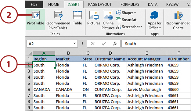
1. Click any single cell inside your data table.
2. Click the PivotTable command on the Insert tab on the Ribbon.
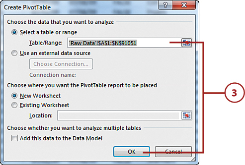
3. This activates the Create PivotTable dialog box. Specify the location of your source data and then click the OK button.
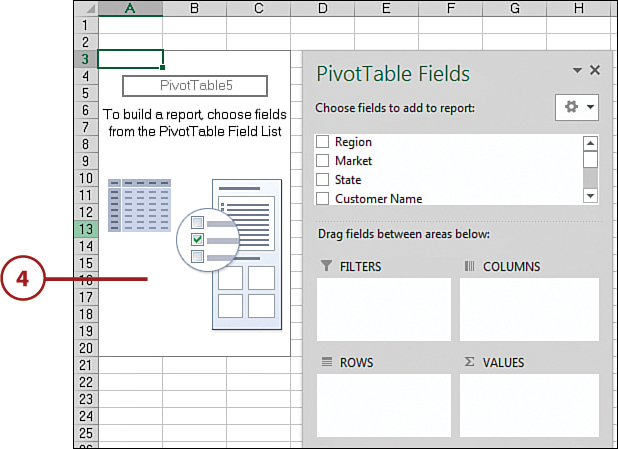
4. Observe that you have an empty pivot table report on a new worksheet. Next to the pivot table, you see the PivotTable Fields pane.
Pivot Table Default Location
In the Create PivotTable dialog box, the default location for a new pivot table is New Worksheet. This means your pivot table is placed in a new worksheet within the current workbook. You can change this by selecting the Existing Worksheet option and specifying the worksheet on which you want the pivot table to be placed.
5. Find the Market field in the field selector, and place a check next to it. The Market field is automatically placed in the Rows area of the pivot table.
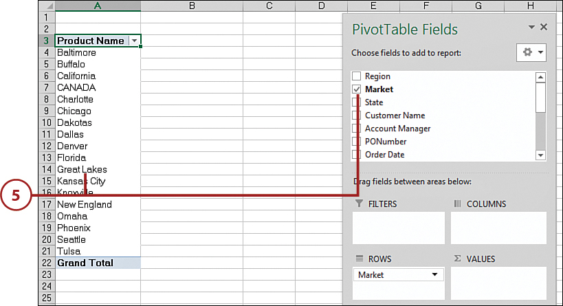
6. Scroll down the list of PivotTable fields, and find the Sale Amount field. Place a check next to it; the Sale Amount field is automatically placed in the Values area.

7. Click someplace other than your pivot table to make the PivotTable Fields pane disappear. Observe your first pivot table.

How Excel Knows Where to Place Data
Placing a check next to any field that is non-numeric (text or date) automatically places that field into the rows area of the pivot table. Placing a check next to any field that is numeric automatically places that field in the values area of the pivot table.
Activating the PivotTable Fields Pane
The PivotTable Fields pane typically activates when you click anywhere on your pivot table. If clicking the pivot table doesn’t activate the PivotTable Fields pane, you can manually activate it by right-clicking anywhere inside the pivot table and selecting Show Field List.
Rearranging a Pivot Table
The nifty thing about pivot tables is that you can add as many layers of analysis as made possible by the fields in your source data table. For instance, if you want to show the dollar sales each market earned by product category, you could simply drag the Product Category field to the Columns area.
1. Click anywhere on your pivot table to reactivate the PivotTable Fields pane.

2. Find the Product Category field, click it, and drag it to the Columns area in the PivotTable Fields pane.
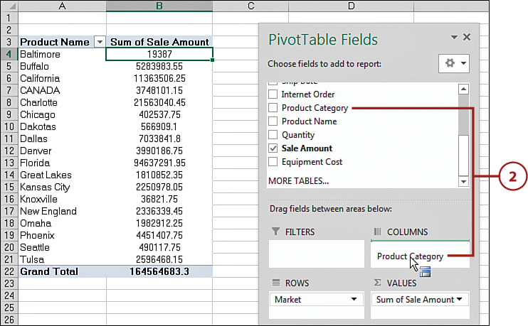
3. Click someplace other than your pivot table to make the PivotTable Fields pane disappear, and your pivot table now shows a matrix style view.

Dragging Fields from One Area to Another
You’re not limited to dragging fields only from the field list. You can drag fields from one area to another. For example, you can drag the product category field from the Columns area to the Rows area. This is a fairly powerful benefit because it enables you to experiment with the look and feel of your pivot table reports.
Adding a Report Filter
Often, you’re asked to produce reports for one particular region, market, product, and so on. Instead of working hours and hours building separate reports for every possible analysis scenario, you can leverage pivot tables to help create multiple views of the same data. For example, you can do so by creating a region filter in your pivot table.
1. Click anywhere on your pivot table to reactivate the PivotTable Fields pane.

2. Find the Region field, click it, and drag it to the Filters area in the PivotTable Fields pane.

3. Your pivot table now has a filter drop-down for Region.

Using a Field’s Context Menu to Move It
In addition to dragging, you can also move a field into the different areas of the pivot table by clicking the black triangle next to the field name and then selecting the wanted area.
4. After you have a report filter on your pivot table, you can click the filters drop-down and select the wanted data item.

5. Now the pivot table responds by showing you only the data for the selected item.

Selecting Multiple Data Items
When you click the filters drop-down to select a data item, you can see the check box labeled Select Multiple Items. Clicking this check box enables you to select more than one data item to filter your report by.
Refreshing Pivot Table Data
When you create a pivot table, Excel takes a snapshot of your data source and stores it in a pivot cache. A pivot cache is a special memory container. This is what your pivot table connects to. That’s right; your pivot table report is essentially a view that gets its data solely from the pivot cache. This means that your pivot table report and your data source are disconnected.
The benefit of working against the pivot cache and not your original data source is optimization. Any changes you make to the pivot table report, such as rearranging fields, adding new fields, or hiding items, are made rapidly and with minimal overhead.
However, because your pivot table works from a snapshot of your data source, any changes you make to your data are not picked up by your pivot table report until you take another snapshot. This is called “refreshing” your pivot table.
1. Right-click anywhere in your pivot table.
2. Select the Refresh option.

The PivotTable Tools Contextual Tab
When you click your pivot table, Excel activates the PivotTable Tools contextual tabs. There, you see an Analyze tab and a Design tab. Click the Analyze tab and choose the Refresh command. These tabs expose a variety of commands you can use to manage and work with pivot tables.
Adding Pivot Table Data
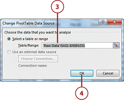
Sometimes, the data source that feeds your pivot table changes in structure. For example, you might have added or deleted rows or columns from your data table. These types of changes affect the range of your data source, not just a few data items in the table. In these cases, performing a simple Refresh of your pivot table won’t do. You must update the range being captured by the pivot table.
1. Click anywhere in your pivot table to activate the PivotTable Tools contextual tabs.
2. Select the Change Data Source command in the Analyze tab.

3. The Change PivotTable Data Source dialog box activates. Supply the new data range for the pivot table in this box.
4. Click OK to confirm the change. Your pivot table automatically refreshes to show the newly referenced data.
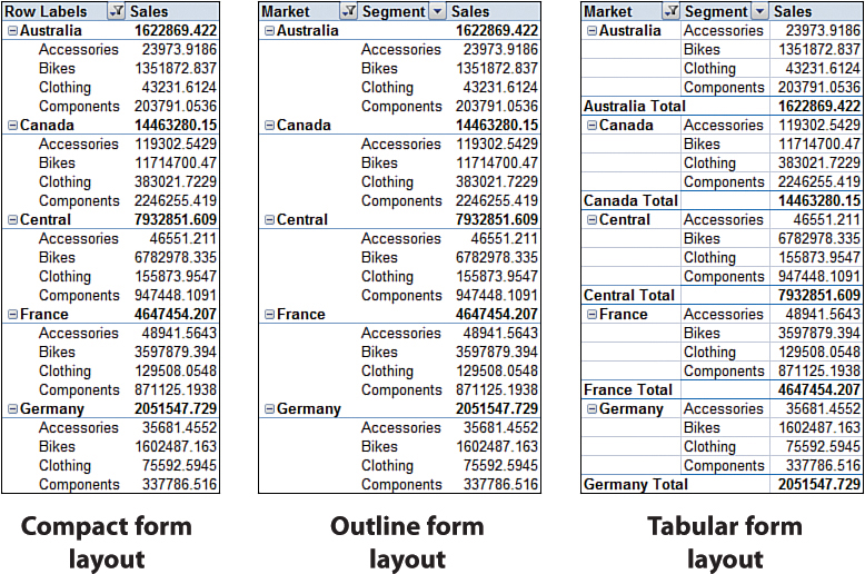
>>>Go Further: Changing the Pivot Table Layout
Customizing Field Names
Every field in your pivot table has a name. The fields in the rows, columns, and filters areas inherit their names from the data labels in your source table. The fields in the Values area are given a name, such as Sum of Sale Amount. Often you might prefer another name for your fields. For instance, you might want your Value field called Total Sales instead of Sum of Sale Amount.
1. Right-click the field Sum of Sale Amount.
2. Select Value Field Settings.

3. Enter the new name in the Custom Name input box, and click OK to confirm.

4. Note that the name of your pivot field changed.
Pivot Field Naming Restriction
You cannot rename a pivot field to the same name used in your source table. For example, if you try to rename Sum of Sale Amount as Sale Amount, you get an error message because there’s already a Sale Amount field in the source data table.
To get around this, you can name the field and add a space to the end of the name. Excel considers Sale Amount (followed by a space) to be different from Sale Amount. This way you can use the name you want, and no one will notice it’s any different.
Applying Numeric Formats to Data Fields
You can format numbers in pivot tables to fit your needs (that is, you can format them as currency, percentage, or number). You can easily control the numeric formatting of a field using the Value Field Settings dialog box.
1. Right-click any value within the target field. For example, if you want to change the format of the values in the Total Sales field, right-click any value under that field.
2. Select Value Field Settings.

3. Click the Number Format button in the Value Field Settings dialog box.
4. Use the Format Cells dialog box to apply the number format you want, just as you normally would on your spreadsheet. Click OK.

5. After you set the formatting for a field, the applied formatting persists even if you refresh or rearrange your pivot table.

Getting to Field Settings from the Ribbon
You can also get to the Value Field Settings dialog box via the Ribbon. Simply click the Field Settings command on the Analyze tab.
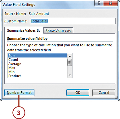
Changing Summary Calculations
When creating your pivot table report, Excel, by default, summarizes your data by either counting or summing the items. Instead of Sum or Count, you might want to choose functions, such as Average, Min, Max, and so on. You can easily change the summary calculation for any given field by taking the following actions:
1. Right-click any value within the target field.
2. Select Value Field Settings.

3. Choose the type of calculation you want to use from the list of calculations in the Value Field Settings, and then click OK to confirm.

4. Note that the pivot table now shows your chosen calculation.
Showing and Hiding Data Items
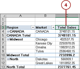
A pivot table summarizes and displays all the records in your source data table. However, there might be situations in which you want to inhibit certain data items from being included in your pivot table summary. In these situations, you can choose to hide a data item. In terms of pivot tables, hiding doesn’t just mean preventing the data item from being shown on the report, but hiding a data item also prevents it from being factored into the summary calculations. For example, you can hide the Canada market to see only sales for U.S. markets.
1. Click the drop-down for the field you are filtering, in this case, the Market field.
2. Remove the check from the data item you want hidden. In the example, Canada is being removed so that only U.S. sales are calculated. Click OK.

3. After the filter has been applied, the Canada market is hidden, and the grand total has recalculated to show the total of U.S. markets only.

Clear Applied Filters
To return a pivot field to its normal unfiltered state, right-click any value for that field, and select Filter, Clear Filter from field name (where field name is the name of the field you’re working with). To clear all the filters in the pivot table at one time, go to the Analyze tab, click the Clear command, and then click Clear All.
Sorting Your Pivot Table
By default, items in each pivot field are sorted in ascending sequence based on the item name. Excel gives you the freedom to change the sort order of the items in your pivot table. Like many actions you can perform in Excel, there are dozens of different ways to sort data within a pivot table. The easiest way is to apply the sort directly in the pivot table.
1. Right-click any value within the target field.
2. Select Sort.
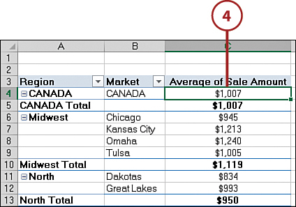
3. Select your sort direction. In the example, the data is sorted on Total Sales with the largest numbers at the top.

4. Note that the pivot table now sorts the values per your instructions.

Sorting Persists in a Pivot Table
When you sort data in a standard worksheet, it’s actually a one-time event. Therefore, if you add data to your data table after sorting, you need to sort again. In a pivot table, however, the sorting persists. If new data is introduced to a sorted pivot table, the new value is automatically sorted and based on the sort rules you implement. You do not need to reapply the sort.