Lesson 4: Using Simple Controls
In this lesson, you will:
• Define the user interface (UI) for the e-commerce FlexGrocer application
• Use simple controls such as the Image control, text controls, and CheckBox control
• Define the UI for the checkout screens
• Use the Form container to lay out simple controls
• Use data binding to connect controls to a data model
In this lesson, you will add user interface elements to enable the customer to find more details about the grocery items and begin the checkout process. An important part of any application is the user interface, and Adobe Flex contains elements such as buttons, text fields, and radio buttons that make building interfaces easier. Simple controls can display text and images and also gather information from users. You can tie simple controls to an underlying data structure, and they will reflect changes in that data structure in real time through data binding. You’re ready to start learning about the APIs (application programming interfaces) of specific controls, which are available in both MXML and ActionScript. The APIs are fully documented in the ActionScript Language Reference, often referred to as ASDoc, which is available at http://help.adobe.com/en_US/FlashPlatform/reference/actionscript/3/index.html.
The Flex framework has many tools that make laying out simple controls easier. All controls are placed within containers (see Lesson 3, “Laying Out the Interface”). In this lesson, you’ll become familiar with simple controls by building the basic user interface of the application that you will develop throughout this book. You’ll also learn about timesaving functionality built into the framework, such as data binding and capabilities of the Form layout container.

FlexGrocer with Image and text controls bound to a data structure
Introducing Simple Controls
Simple controls are provided as part of the Flex framework and help make rich Internet application development easy. Using controls, you can define the look and feel of your buttons, text, combo boxes, and much more. Later in this book, you’ll learn how to customize controls to create your own unique look and feel. Controls provide a standards-based methodology that makes learning how to use them easy. Controls are the foundation of any RIA.
The Flex SDK includes an extensive class library for both simple and complex controls. All these classes can be instantiated via an MXML tag or as a standard ActionScript class, and their APIs are accessible in both MXML and ActionScript. The class hierarchy comprises nonvisual classes as well, such as those that define the event model, and it includes the display attributes that all simple controls share.
You place the visual components of your Flex application inside containers, which establish the size and positioning of text, controls, images, and other media elements (you learned about containers in the previous lesson). All simple controls have events that can be used to respond to user actions, such as clicking a button, or system events, such as another component being drawn (events will be covered in detail in the next lesson). You will learn in later lessons how to build your own events. Fundamentally, events are used to build easily maintainable applications that reduce the risk that a change to one portion of the application will force a change in another. This is often referred to as building a “loosely coupled” application.
Most applications need to display some sort of text, whether it be static or dynamically driven from an outside source like an XML file or a database. Flex has a number of text controls that can be used to display editable or noneditable text:
• Label: You have already used the Label control to display text. The Label control cannot be edited by an end user; if you need that functionality, you can use a TextInput control.
• TextInput: The TextInput control is used for data input. It is limited to a single line of text.
• RichText: The RichText control is used to display multiple lines of text, but is not editable and does not display scroll bars if the text exceeds the available screen space.
• TextArea: The TextArea component is useful for displaying multiple lines of text, either editable or noneditable, with scroll bars if the available text exceeds the available screen space.
All text controls support HTML 1.0 and a variety of text and font styles.
 Note
NoteAll four text controls mentioned here support Adobe’s Flash Text Engine and some of the controls (RichText and RichEditableText) support even more advanced layout using the Text Layout Framework (TLF). While you will not be using TLF as part of the application in this book, many new and interesting features are available with TLF. You can learn about TLF on Adobe’s open source site: http://opensource.adobe.com/wiki/display/tlf/Text+Layout+Framework.
To populate text fields at runtime, you must assign an ID to the control. Once you have done that, you can access the control’s properties; for example, all the text controls previously mentioned have a text property. This property enables you to populate the control with plain text using either an ActionScript function or inline data binding. The following code demonstrates assigning an ID to the label, which enables you to reference the Label control in ActionScript:
<s:Label id="myLabel"/>
You can populate any text control at runtime using data binding, which is denoted by curly bracket syntax in MXML. The following code will cause the yourLabel control to display the same text as the myLabel control in the previous example:
<s:Label id="yourLabel" text="{myLabel.text}"/>
Also, you can use data binding to bind a simple control to underlying data structures. For example, if you have XML data, which might come from a server-side dataset, you can use data binding to connect a simple control to the data structure. When the underlying data changes, the controls are automatically updated to reflect the new data. This provides a powerful tool for the application developer.
The Flex framework also provides a powerful container for building the forms that we will cover in this lesson. The Form container allows developers to create efficient, good-looking forms with minimal effort. Flex handles the heading, spacing, and arrangement of form items automatically.
Displaying Images
In this exercise, you will display images of grocery products. To do this, you must use the Image control to load images dynamically. The Image control can load JPG, GIF, SWF, and PNG files at runtime. If you are developing an offline application that will not access the Internet, you can use the @Embed directive to include the Image control in the completed SWF file.
- Open the FlexGrocer.mxml file that you created in the previous lesson.
If you didn’t complete the previous lesson, you can import the Lesson04/start files. Please refer to the appendix for complete instructions on importing a project should you skip a lesson or if you have a code issue you cannot resolve.
- Switch Flash Builder to Design view by clicking the Design View button.

- Be sure that the Components view is open. If it’s not, choose Window > Components.

- Select the Image control from the Controls folder and drag the control between the Milk and 1.99 Label controls you already added.

When you drag the Image control from the Components view to the container, Flash Builder automatically adds the MXML to place the Image control on the screen and positions it where you drop it.
- Be sure that the Flex Properties view is open. If it’s not, choose Window > Properties.
The Flex Properties view shows important attributes of the selected component—in this case, the Image control. You can see the
Sourceproperty, which specifies the path to the Image file. The ID of the Image control references the instance created from the<s:Image>tag or Image class in ActionScript. - Click the Source folder icon and navigate to the assets directory. Select the dairy_milk.jpg image and click Open.
The image you selected is displayed in Design view. The
sourceproperty is also added to the MXML tag. - Click the Scale Mode drop-down menu and change the value to
letterbox.In an ideal world, all the images that you use in the application would be a perfect size, but this is not always the case. Flex can scale the images in two ways. You can choose letterbox to keep the aspect ratio of the original images correct even as their size is adjusted, or you can choose stretch to distort the images to make them fit into any given width and height.

- Switch back to Source view and notice that Flash Builder has added an
<s:Image>tag as well as the attributes you specified in the Flex Properties window.
letterboxis the default selection if you don’t choose a Scale Mode. So, if you didn’t explicitly choose it from the drop-down list and instead left it as the default, you may not see it in your code. Feel free to add it or just understand that difference going forward.As you can see, it is easy to switch between Source view and Design view, and each one has its advantages. Notice as you switch back to Source view that the Image tag you were working on is now highlighted.

- In the
<s:Image>tag that you added, insert an@Embeddirective to the Image control.<s:Image includeIn="State1" scaleMode="letterbox" source="@Embed('assets/dairy_milk.jpg')"/>
The
@Embeddirective causes the compiler to transcode and include the JPG in the SWF file at compile time. This technique has a couple advantages over the default of loading the image at runtime. First, the image is loaded at the start of the application, so the user doesn’t have to wait for the image to load before displaying when it is needed. Also, this technique can be useful if you are building offline applications that do not need to access the Internet because the appropriate images are included in the SWF file and will be correctly displayed when needed. Remember, though, that using this technique greatly increases the size of your SWF file. - Save, compile, and run the application.

You should see that the Image and Label controls and button fit neatly into the layout container.

Building a Detail View
In this exercise, you will use a rollover event to display a detailed state of the application. You will explore different simple controls to display text and review how application states work.
- Be sure that you are still in Source view in Flash Builder. Near the top of the file, locate the
<s:states>block, which contains definitions for the State1 and cartView states. Add a new state definition named expanded.<s:State name="expanded"/>
You will define this third state for the application to show details of a product.
- Switch to Design view, set the state selector to expanded, and drag a VGroup from the Layout folder of the Components view into the application. (To position this correctly, you should drag the VGroup into the gray area below the existing white background.) In the Properties view, verify that the In state’s value is expanded, the X value is 200, and the Width value is 100 percent. Remove the Y and Height values so that the fields are blank.

This new VGroup needs to be a child of the main application. Sometimes, positioning items correctly can be difficult in Design view, so switch to Source view and ensure the VGroup is positioned correctly. It should be just above the closing
</s:Application>tag, so the end of the file reads like this:</s:VGroup>
</s:HGroup>
<s:VGroup includeIn="expanded" width="100%" x="200">
</s:VGroup>
</s:Application> - Switch back to Design view. Ensure that the expanded state is selected in the States view. Drag an instance of the RichText control from the Controls folder of the Components view into the new VGroup you created in the previous step.

The RichText control enables you to display multiple lines of text, which you will need when you display the product description that will ultimately come from an XML file. You will use data binding in the next section to make this RichText control functional. For now, you are just setting up the layout.
- Drag an instance of the Label control from the Components view to the bottom part of the VGroup container you created. Populate the
textproperty with the words Certified Organic.Later on, you will modify the
visibleproperty of this component so the contents of thetextproperty are displayed only when a grocery item is certified organic.
- Drag another instance of the Label control from the Components view to the bottom part of the VGroup container you created. Populate the
textproperty with the words Low Fat.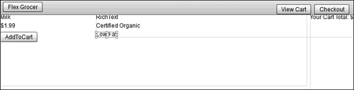
Later, you will set the
visibleproperty of this label totrueif the grocery item is low fat, orfalseif it is not. - Switch back to Source view. Notice that Flash Builder has added the RichText and the two Label controls you added in Design view.
Note that all the code created in Design view is displayed in Source view.
- Locate the
<s:RichText>tag in the expanded state and set thewidthproperty to50%.<s:RichText text="RichText" width="50%"/>
- Find the
<s:Image>tag that is displaying the milk image. Add amouseOverevent to the tag that will change thecurrentStateto expanded. Remove theincludeInattribute.<s:Image scaleMode="letterbox"
source="@Embed('assets/dairy_milk.jpg')"
mouseOver="this.currentState='expanded'"/>mouseOversimply means that when the user rolls the mouse anywhere over the dairy_milk.jpg Image tag, the ActionScript will execute. In this ActionScript, you are referring to the expanded state, which you created earlier in this lesson.If you had left the
includeInattribute in the image tag, the milk image would appear only in the initial state of State1. Therefore, when you mouse over the image and switch it to the expanded state, the milk bottle image will disappear. By removing theincludeInattribute, you are instructing the application to allow this image to be used in all states. - In the same
<s:Image>tag, add amouseOutevent that will change thecurrentStateback to the initial State1 state.<s:Image scaleMode="letterbox"
source="@Embed('assets/dairy_milk.jpg')"
mouseOver="this.currentState='expanded'"
mouseOut="this.currentState='State1'"/>When the user moves the mouse away from the dairy_milk.jpg image, the detailed state no longer displays, and by default the application displays only the images and labels for the control, which is expressed with an empty string.
- Save and run the application.
When you roll the cursor over the milk bottle image, you see the RichText and Label controls you created in the expanded state.

Using Data Binding to Link a Data Structure to a Simple Control
Data binding enables you to connect controls, such as the text controls that you have already worked with, to an underlying data structure. Data binding is incredibly powerful because if the underlying data changes, the control reflects the changes. For example, suppose you create a text control that displays the latest sports scores; also suppose it is connected to a data structure in Flex. When a score changes in that data structure, the control that the end user views reflects the change. In this exercise, you will connect a basic data structure in an <fx:Model> tag to simple UI controls to display the name, image, and price for each grocery item. Later in the book, you will learn more about data models, the effective use of a model-view-controller architecture on the client, and how to connect these data structures with server-side data.
- Be sure that FlexGrocer.mxml is open, and add an
<fx:Model>tag after the comment in the<fx:Declarations>tag pair at the top of the page.The
<fx:Model>tag allows you to build a client-side data model. This tag converts an XML data structure into a format that Flex can use. - Directly below the opening
<fx:Model>tag and before the closing<fx:Model>tag, add the following XML data structure. Your<fx:Model>tag should look as shown:<fx:Model>
<groceries>
<catName>Dairy</catName>
<prodName>Milk</prodName>
<imageName>assets/dairy_milk.jpg</imageName>
<cost>1.20</cost>
<listPrice>1.99</listPrice>
<isOrganic>true</isOrganic>
<isLowFat>true</isLowFat>
<description>Direct from California where cows are happiest!</description>
</groceries>
</fx:Model>You have defined a very simple data structure inline inside an
<fx:Model>tag. - Assign the
<fx:Model>tag an ID ofgroceryInventory. The first line of your<fx:Model>tag should look as shown:<fx:Model id="groceryInventory">
By assigning an ID to the
<fx:Model>tag, you can reference the data with dot syntax. For example, to access the list price of the item, you could usegroceryInventory.listPrice. In this case, that would resolve to 1.99. - Switch Flash Builder to Design view.
You can set up bindings between elements just as easily in Design view as you can in Source view.
- Select the RichText control in the expanded state and be sure that the Flex Properties view is open. Modify the
textproperty to{groceryInventory.description}.Data binding is indicated by the curly brackets {}. Whenever the curly brackets are used, you use ActionScript instead of simple strings. Effective use of data binding will become increasingly important as you begin to work with server-side data.

- Save and run the application.
You should see the description you entered in the data model when you roll the cursor over the grocery item.
Using a Form Layout Container to Lay Out Simple Controls
Forms are important in most applications that collect information from users. You will be using the Form container to enable shoppers to check out their products from the grocery store. The Form container in Flex will handle the layout of the controls in this form, automating much of the routine work. With a Form container, you can designate fields as required or optional, handle error messages, and perform data checking and validation to be sure the administrator follows designated guidelines. A Form container uses three tags: an <s:Form> tag, an <s:FormHeading> tag, and an <s:FormItem> tag for each item on the form. To start, the checkout form will be built into a separate application, but later in the book, it will be moved into the main application as a custom component.

- Create a new MXML application in your current project by choosing File > New > MXML Application. Name the application Checkout, and choose spark.layouts. BasicLayout as the Layout for the new application. Then click Finish.

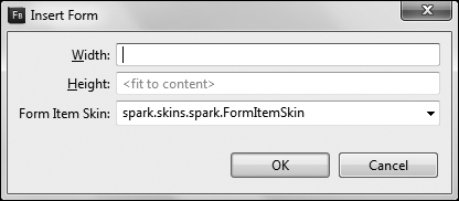
- Switch to Design view, and drag a Form from the Layout folder of the Components view to the top left of the window. A dialog box will appear asking for the Width and Height of the form. Leave the default values and click OK.
- Drag a FormHeading component from the Layout folder in the Components view into the newly created form. Double-click the FormHeading, and change it to Customer Information.

A FormHeading is just a specialized label for Forms.
- Drag a TextInput control from the Controls folder of the Components view and drop it just below the FormHeading. The TextInput and a label to the right of the TextInput both appear. Double-click the label and change it to Customer Name.
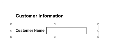
When adding controls to a form in Design view, Flash Builder automatically surrounds the control in a FormItem, which is why a label is appearing to the left of the control. If you switch to Source view, you can see the FormItem surrounding the TextInput. Back in Design view, notice how the left edge of the text input’s label is aligned with the left edge of the FormHeading. As noted earlier, this is a feature of the Form and FormHeading classes, and it allows these items to always maintain the left alignment, regardless of the size of the FormItem labels.
- Drag four more TextInputs to the form from the Components view. Change the labels of these to Address, City, State, and Zip. Drag a button below the last TextInput, and set its label to be an empty string (simply remove the default text). Click the button and change the button’s text to Continue.
Due to the Form layout, selecting a discrete control such as the Button can be difficult. In this case, it is easiest if you attempt to click the very left side of the button. Remember, if you can’t accomplish the desired effect in Design view, you can always do so in Source view.

Each control is surrounded in its own FormItem and has its own label. Since you don’t need a label next to the Continue button, you simply clear the text from the label on that form item.
- Save and run the application.
What You Have Learned
In this lesson, you have:
• Learned how to load images at runtime with the Image control (pages 81–84)
• Learned how to display blocks of text (pages 85–87)
• Learned how to link simple controls to an underlying data structure with data binding (pages 88–89)
• Learned how to build user forms with a minimum of effort using the Form container (pages 89–92)