
4. New Layout and Style Techniques with CSS3
CSS level 3 (CSS3) is the latest iteration of the CSS specification. Building on previous variations, CSS3 brings new features that you can implement in the latest browsers to improve the look, usability, accessibility, and performance of your web pages. CSS is not HTML5, we know this, and you need to know this, but we have included this chapter because they often go hand in hand and we are showing you just some of the possibilities available with CSS3 so you can make your new HTML5 websites look fantastic. In this chapter, you will learn about responsive web design with media queries, custom fonts, gradients, transitions, transformations, and, finally, animations. We are not covering all the new features of CSS3; we are simply scratching the surface of what is available.
Intermediate Recipe: Creating a Responsive Design with CSS3 Media Queries
Mobile browsing is ever on the rise, and some estimate it will take over desktop browsing within five years. CSS3 Media Queries gives you the ability to target specific screen widths, heights, and even orientation, so you can target smartphones like the iPhone or Android phone, as well as new tablet devices like the iPad, all with CSS. Table 4.1 shows the version of each browser that supports CSS3 Media Queries.
Table 4.1 CSS3 Media Queries Device and Browser Support

In the past, you may have used JavaScript to detect a mobile phone and deliver a separate style sheet or redirect the user to a specific mobile site. Or you might have used JavaScript to detect when a browser has been resized and then change some of the styles to adapt the layout. We have always had the basics of media queries, because we have always been able to target for screen or print:
<link rel="stylesheet" href="screen.css" media="screen" />
<link rel="stylesheet" href="print.css" media="print" />
But now you can be more sophisticated using CSS3 Media Queries. Listing 4.1 shows a quick example.
Listing 4.1 Simple Media Query Example
<link rel="stylesheet" media="screen and
(max-device-width: 480px)" href="smartphone.css" />
<link rel="stylesheet" media="screen and
(min-width: 480px)" href="screen.css" />
Listing 4.1 asks the device whether its horizontal resolution is 480 pixels wide or less. If so, then here you presume it is a smartphone and load smartphone.css. You then ask to see whether the resolution is at least 480 pixels wide; if it is, then you can use a different style sheet. Potentially, you could have several different media queries as you attempt to target all different types of devices, resolutions, and screen orientation. You might have style sheets for smartphones, smartphones with a landscape orientation, Android screen sizes, the iPad, the iPad with portrait orientation, browsers with resolutions of less than 800 pixels wide, or browsers with wide-screen resolutions. There is really no limit on how precise you can be.
So, you need a good way of organizing all your separate queries. Bear in mind you will already have all your main style sheets as well. Using the approach in Listing 4.1 would mean there are a lot of HTTP requests in the head tag.
Alternatively, you can include the media queries inside a CSS file, as shown in Listing 4.2, using @media.
Listing 4.2 Media Queries Inside a CSS File
body {background: black; color: #fff; font: normal 62.5%/1.5 tahoma, verdana, sans-serif;}
h1 {font-size: 2em;}
p {font-size: 1.4em;}
/* styles for smartphones and very small screen resolution */
@media only screen and (min-width: 320px) and (max-width: 400px)
{
body {background: blue;}
}
/* styles for screen resolutions bigger than smartphones but smaller or equal to 1024px */
@media only screen and (min-width: 401px) and (max-width: 1024px)
{
body {background: red;}
}
/* styles for screen resolutions for a very wide resolution */
@media only screen and (min-width: 2000px)
{
body {background: green;}
}
In Listing 4.2 we have changed the background color depending on the screen resolution. All the media queries are part of the same CSS document, so it is important to make sure you keep the CSS document organized; it is likely you will have hundreds of line of code for your default design and then additional CSS for the media queries. Depending on your site setup, it might be easier to edit a media query type, for example adjusting min-width: 2000px to min-width: 2500px, inside a CSS file rather than inside the HTML of all your pages.
Using the and syntax, you can combine different queries. You can target several features: width, height, device-width, device-height, orientation, aspect-ratio, device-aspect-ratio, color, color-index, monochrome, resolution, scan, and grid. Along with the recognized media types of all, braille, embossed, handheld, print, projection, screen, and speech, you can combine these to target several different types of devices and sizes simultaneously. It is worth noting that max-device-width is the screen size of the device (like an iPhone), whereas max-width is the width of the viewing area only (such as a browser window); see the differences in the following code:
/* devices smaller than 480px; mobiles, iPhone and normal screens */
@media handheld and (max-width: 480px), screen and (max-device-width: 480px), screen and (max-width: 480px) {
/* styles go here */
}
/* layout for iPad in landscape mode */
@media only screen and (min-device-width: 768px) and (max-device-width: 1024px) and (orientation: landscape) {
/* styles go here */
}
Tip
In the following code listings, we have used some different types of CSS selectors. The first is an attribute selector, used on header[role=banner], and the second is the pseudoclass selector, nth-xx(), used in several cases, such as section:nth-of-type(1). Attribute selectors are not new in CSS3, but with new ARIA-Roles, they give you more selector flexibility with CSS. There are plenty of new CSS3 selectors, including nth-child() and nth-of-type(). Using these new selectors means you can do away with using classes on many elements. For example, using nth-of-type(), you can select every other table row or list item. For more information on this, we recommend reading http://quirksmode.org/css/nthchild.html.
Many of these new selectors do not work in older versions of Internet Explorer, so we recommend using Selectivizr (http://selectivizr.com), an easy-to-use JavaScript utility that makes Internet Explorer understand the new CSS selectors.
Figure 4.1 uses the example HTML markup from Chapter 2 for a news site. Listing 4.3 provides the condensed HTML. The CSS code in Listing 4.4 is for the default layout, as shown in Figure 4.1.
Figure 4.1 The news site with default CSS

Listing 4.3 Condensed HTML for the News Site
<body>
<header role="banner">
<hgroup></hgroup>
</header>
<nav></nav>
<section> <!-- this section is repeated three more times -->
<article>
<header></header>
<img alt="thumbnail" src="box-100x100.gif" />
<p></p>
</article>
</section>
<aside></aside>
</body>
Listing 4.4 CSS for Default Screen Layout
<style>
* {margin: 0; padding: 0;}
body {background: #fff; color: #000; font: normal 62.5%/1.5 "Palatino Linotype", "Book Antiqua", Palatino, serif; margin: 0 auto; width: 1260px}
header, nav, section, article, footer, aside {display: block;}
header[role=banner] {margin: 10px 0 20px; text-align: center;}
header[role=banner] h1 {background: url(logo.gif) top center no-repeat;font-size: 5em; padding: 100px 0 0; text-transform: uppercase;}
header[role=banner] h2 {font-style: italic;}
header, nav {clear: both; width: 100%;}
nav {border-bottom: 1px dotted #ccc; padding-bottom: 20px; text-align: center;}
nav li {display: inline;}
nav li a {font-size: 1.4em; padding: .5em;}
section {float: left; margin: 0 0 0 10px; padding: 10px; width: 345px;}
section h1 {margin: 0 0 10px;}
section article {margin: 0 0 10px;}
section article header p {font-size: 1em; font-weight: bold; margin: 0 0 10px;}
section article img {float: left; margin: 0 5px 5px 0;}
section:nth-of-type(1) {clear: both; margin: 0 0 10px; min-height: 200px; padding: 1% 1% 1% 30%; position: relative; width: 69%;}
section:nth-of-type(1) article {margin: 0;}
section:nth-of-type(1) article img {float: none; height: 200px; left: 0; position: absolute; top: 10px; width: 360px}
section:nth-of-type(2) {margin-left: 0;}
aside {float: right; margin-left: 10px; width: 130px;}
aside img {border: 1px solid #ccc; display: block; margin: 0 auto 10px;}
footer {clear: both;}
h1 {font-size: 2em;}
p {font-size: 1.4em;}
</style>
Figure 4.2 shows the layout on a smaller screen size, using the media query from Listing 4.5.
Figure 4.2 The news site at a reduced screen size

Listing 4.5 CSS for a Reduced Screen Size
/* styles for screen resolutions bigger than smartphones but smaller or equal to 1280px */
@media only screen and (min-width: 481px) and (max-width: 1259px)
{
body {width: 800px;}
section {margin: 0 0 0 10px;}
section:nth-of-type(1), section {clear: none; float: left; padding: 10px; width: 375px;}
section:nth-of-type(1) article img {float: left; height: auto; position: relative; width: auto;}
section:nth-of-type(2) {margin-left: 10px;}
section:nth-of-type(3) {clear: both; margin-left: 0;}
aside {clear: both; float: left; width: 100%;}
aside img {float: left; margin: 0 10px 0 0;}
}
Finally, Listing 4.6 has the necessary CSS media query for a display on a smartphone or if the browser has been reduced dramatically, as shown in Figure 4.3. Essentially, all we have done with just a few lines of additional CSS is to hide and resize a few elements from the screen at smaller sizes.
Figure 4.3 The news site on a smartphone

Listing 4.6 CSS for a Smartphone
/* styles for smartphones and very small screen resolution */
@media only screen and (max-width: 480px), only screen and (max-device-width: 480px) {
body {width: 100%;}
header[role=banner] h1 {background-image: url(logo-small.gif); font-size: 3em; padding: 50px 0 0;}
section:nth-of-type(1), section {margin: 0 0 10px; min-height: inherit; padding: 0 1%; width: 98%;}
header[role=banner] h2, img, section article p, aside {display: none;}
section h2 a {border-bottom: 1px dotted #999; display: block; text-decoration: none;}
nav, section article:last-of-type h2 a {border: none;}
}
Sensible Usage
Although you can create separate styles for different devices and screen sizes, the question is, should you always use media queries? They can no doubt be useful on desktop computers and laptops, but the mobile landscape has been changing for some time. More modern smartphones like the iPhone and Android devices come with browsers that are almost identical to desktop-powered browsers, so they can handle most things, and the interactivity of the device allows the user to pinch and zoom their way around a website with relative ease.
Using media queries generally means you show/hide content depending on the screen size. Many websites such as http://youtube.com, http://facebook.com, http://cnn.com, and http://nfl.com all detect that the user is using a handheld device and redirect the user to mobile-specific versions of their sites. The reason they do this is because their sites are content heavy with lots of data, pictures, videos, ads, Flash, and all sorts of things. If these sites just used media queries on smartphones, then the smartphone would still have to download all of this data even if the user could not see it. So, whether you need just new styles or a completely separate mobile site depends on your content, but if you just need to change the layout and add a few niceties, then you should probably use CSS3 Media Queries. For some excellent uses of CSS3 Media Queries, have a look at http://mediaqueri.es.
Targeting the iPhone and Android Devices
If you have used media queries to target the iPhone or Android devices, you may notice that they do not pick up the CSS changes for small screens. This is because modern smartphone browsers are powerful, and by default they display a web page the same as the page would be displayed on a desktop browser. Then the browser scales down the website to fit the small screen, which can often result in small text and images, so the user has to zoom in to read and browse. You can force the browser to use the width of the device as the width of the viewing area, also known as the viewport. The following code goes in the head tag:
<meta name="viewport" content="width=device-width; initial-scale=1.0; " />
Beginner Recipe: Using Custom Fonts with @font-face
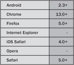
Although not exactly new to CSS3, @font-face has had a resurgence under the CSS3 banner, and there are now plenty of options for the web designer and developer when it comes to choosing and implementing fonts on websites. Table 4.2 shows the version of each browser that supports @font-face.
Table 4.2 @font-face Device and Browser Support

Note
@font-face was included in the CSS2 specification in 1998; however, it was pretty much unused because of poor browser implementation, font file type confusion, and a concern about the legalities and licensing issues of using fonts. Internet Explorer version 4 even supported custom fonts albeit only in EOT format.
Using @font-face, you can embed your own font with just a few lines of CSS. Figure 4.4 is using a font called Anagram (more on where to get fonts from later) for the h1, though it can be used for any element.
Figure 4.4 Custom font displayed using @font-face

Listing 4.7 shows the necessary code for Figure 4.4 and provides an example of @font-face in its simplest use. You name the font Anagram in font-family, though you can call it whatever you want, and you will be referencing it again later; see the h1 font values. In the @font-face declaration, the src for the font is in the same directory as the HTML page; you can put it in a different directory if you wanted.
Listing 4.7 @font-face in Its Simplest Form
<style>
@font-face {
font-family: Anagram;
src: url('anagram.ttf'),
}
h1 {
font-family: Anagram, Tahoma, Verdana, sans-serif;
font-size: 9em;
}
</style>
<header role="banner">
<hgroup>
<h1>Loads of News</h1>
<h2>Bringing you all kinds of news!</h2>
</hgroup>
</header>
File Formats and the Cross-Browser Fix
Listing 4.7 uses only a .ttf (TrueType/OpenType) font file. Unsurprisingly, there are cross-browser implementation issues. There are several different font file formats:
• Embedded OpenType (.eot)
• OpenType PS (.otf)
• TrueType/OpenType (.ttf)
• SVG (.svg)
• WOFF (.woff)
WOFF is the new web standard for typefaces. Internet Explorer versions 8 and older need an .eot font, but Internet Explorer 9 will support the new WOFF format. And although Safari has supported .ttf for some time, only recently has the iPhone and iPad started supporting the .ttf format; previously, they needed a .svg font. So, what you need to do is deliver the same font but in different formats. To do that, you either need to convert the fonts yourself or use a tool like Font Squirrel at http://fontsquirrel.com. The @font-face Generator allows you to upload fonts and then convert them to different formats. It also generates the necessary CSS that enables the font to work across the different browsers, as shown in Listing 4.8.
Listing 4.8 Cross-Browser @font-face
@font-face {
font-family: 'AnagramRegular';
src: url('type/Anagram-webfont.eot'),
src: url('type/Anagram-webfont.eot?#iefix') format('embedded-opentype'),
url('type/Anagram-webfont.woff') format('woff'),
url('type/Anagram-webfont.ttf') format('truetype'),
url('type/Anagram-webfont.svg#webfontCiw7vqzS') format('svg'),
}
In Listing 4.8, you reference four different formats of the same font. It might be worth organizing your fonts in a separate folder like you do for images. The previous code order is used to make Internet Explorer behave and also fixes a bug in Android. There have been several iterations of the previous code, but as browsers develop, more issues have been found. The previous code is currently supplied by Font Squirrel when you generate a fonts package, but of course it is subject to change in the future.
Type Services
Finding the right typeface can be difficult. Finding one that can be used legally on the web can be even more so. Font Squirrel allows you to convert fonts to the various necessary formats. To do so, you must tick a box that says “Yes, the fonts I am uploading are legally eligible for web embedding.” If you tick this and are not completely sure, then you could open yourself up to some legal issues.
If you need a free font, then we suggest looking through the type library on Font Squirrel because not only does the site offer a font generator, but its main focus is providing fonts that are completely free for commercial use. Also, they do not just put any free font on there; they make sure the fonts are of high quality. Font Squirrel is not the only place to get free web fonts, but when searching elsewhere, be aware of the legalities.
Another alternative for free fonts is the Google Font Directory (http://code.google.com/webfonts). Using the API available, it is incredibly easy to use the fonts they offer. Because the fonts are hosted by Google, the loading times will be minimal. All you need to do with the Google fonts is find a font and choose “Use this font.” It gives you the HTML and CSS you need, additionally offering extra font weights if the font has them. The HTML code provided to put in the head tag is similar to this:
<link href='http://fonts.googleapis.com/css?family=Yanone+Kaffeesatz' rel='stylesheet' >
And Google gives you the font name to put in your CSS font stack:
h1 {font-family: 'Yanone Kaffeesatz', arial, serif;}
It is that easy.
You will have noticed in the previous examples that after declaring the custom font, we list some web-safe fonts such as font-family 'Yanone Kaffeesatz', arial, serif. We provide a fallback font in case anything goes wrong in retrieving the custom font. There could be a problem with a server, and the browser might be unable to retrieve the custom font we want, so using font stacks, we provide a fallback to a font we know is available. Font stacks should always be provided when using CSS font-family.
If Font Squirrel or the Google Font Directory cannot provide the font you are looking for, then other services are available. Because licensing has been an issue for years, many of the major font foundries have started to either create their own framework to allow you to legally and securely use their fonts or have partnered with a third party that helps deliver these fonts.
Services such as FontDeck and TypeKit enable you to register and choose from a range of fonts, all of which have been tweaked for improved legibility on the screen. FontDeck and TypeKit deliver the fonts in slightly different ways, but setting up, choosing, and activating fonts is a breeze on both services. Both services have free accounts with some limitations, and both offer various pricing packages.
Intermediate Recipe: Making Buttons with CSS Gradients and Multiple Backgrounds
You can use CSS3 gradients to make nice subtle gradients or some wacky, hideous ones. You do not have to create images, and the gradients are scalable, so once you get the hang of them, it is much less hassle than having to create, edit, and re-create images, because you can do it all with code. Table 4.3 shows the version of each browser that supports CSS3 gradients.
Table 4.3 Gradient Device and Browser Support

Listing 4.9 has the code for a basic white-to-black gradient, as shown in Figure 4.5.
Figure 4.5 A simple CSS3 linear gradient
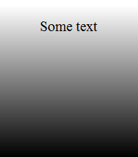
Listing 4.9 Simple CSS Linear Gradient
div {
height: 200px;
width: 200px;
background: url(gradient.gif); /* for browsers that can't do gradients */
background: -moz-linear-gradient(white, black);
background: -webkit-linear-gradient(white, black);
background: -linear-gradient(white, black);
}
First, the gradient type (linear or radial) is set, followed by brackets that contain the start and stop colors of the gradient. You will notice that the code has four different declarations. The first is the fallback color if the browser does not support CSS3 gradients; -moz-linear-gradient is for Mozilla (Firefox) browsers; -webkit-gradient is for WebKit (Safari and Chrome) browsers; and the final background declaration is the official CSS3 gradient syntax, but no browser currently supports it.
Note
In 2008, WebKit was the first engine to start using gradients, and it used its own syntax style. As CSS gradients became more popular, Mozilla implemented syntax much closer to that of the official specification. However, in January 2011, it was announced that WebKit will change its gradient syntax and start using the same style as Mozilla and the official specification, which is great news for everyone, because the original WebKit syntax was more complicated and not standards-based. This book uses the new WebKit syntax.
Listing 4.10 uses input buttons with a combination of attribute selectors, box shadow, border-radius, multiple backgrounds, and CSS gradients to achieve the effects in Figure 4.6. In the background property, you separate multiple background styles using a comma. So, first you have the image you want to use, and then you set the gradient styles. If the gradient styles were used first, it would overlap the image.
Figure 4.6 CSS3 button gradients

Listing 4.10 Gradient Effects for Buttons
input {
border: none;
-webkit-box-shadow: 0 1px 5px rgba(0, 0, 0, .4);
box-shadow: 0 1px 5px rgba(0, 0, 0, .4);
-webkit-border-radius: 10px;
border-radius: 10px;
cursor: pointer;
color: #fff;
font: bold 1.2em Arial, Helvetica, sans-serif;
margin: 0 10px 0 0;
padding: 10px 10px 10px 30px;
text-shadow: 0 2px 2px rgba(0, 0, 0, 0.25);
}
input[type="submit"] {
background: url(accept.png) 8px 55% no-repeat #91BD09;
background: url(accept.png) 8px 55% no-repeat, -webkit-linear-gradient(#91BD09, #578730);
background: url(accept.png) 8px 55% no-repeat, -moz-linear-gradient(#91BD09, #578730);
background: url(accept.png) 8px 55% no-repeat, -linear-gradient(#91BD09, #578730);
}
input[value="Cancel"] {
background: url(cross.png) 8px 55% no-repeat #b53109;
background: url(cross.png) 8px 55% no-repeat, -webkit-linear-gradient(#b53109, #540303);
background: url(cross.png) 8px 55% no-repeat, -moz-linear-gradient(#b53109, #540303);
background: url(cross.png) 8px 55% no-repeat, -linear-gradient(#b53109, #540303);
}
input[type="reset"] {
background: url(error.png) 8px 55% no-repeat #f0bb18;
background: url(error.png) 8px 55% no-repeat, -webkit-linear-gradient(#f0bb18, #a46b07);
background: url(error.png) 8px 55% no-repeat, -moz-linear-gradient(#f0bb18, #a46b07);
background: url(error.png) 8px 55% no-repeat, -linear-gradient(#f0bb18, #a46b07);
}
You can do much more than a single fade between two colors. Using a stop, you can add multiple colors to your gradient, as shown in Figure 4.7. Stops are added after each comma and can have a position at which they start, as shown in Listing 4.11.
Figure 4.7 CSS3 gradients with multiple stops

Listing 4.11 shows the code used to make the left image in Figure 4.7. The gradient is becoming more complicated, but essentially each comma starts a new gradient section, and you pass it the values of a color and then a percentage at where to start it.
And you can angle the gradient by changing declarations such as left and left top, as shown in Listing 4.11, which gives the right image in Figure 4.7.
Listing 4.11 Gradients with Multiple Stops
div {
height: 200px;
width: 200px;
background-color: #000;
background: -moz-linear-gradient(45deg, #000000 0%, #FFFFFF 25%, #000000 50%, #FFFFFF 75%, #000000 100%);
background: -webkit-linear-gradient(45deg, #000000 0%, #FFFFFF 25%, #000000 50%, #FFFFFF 75%, #000000 100%);
background: -linear-gradient(45deg, #000000 0%, #FFFFFF 25%, #000000 50%, #FFFFFF 75%, #000000 100%);
}
There are lots of options with CSS3 gradients, including creating radial gradients, so we recommend trying some of the gradient generators to get your creative juices flowing:
• http://colorzilla.com/gradient-editor
• http://westciv.com/tools/radialgradients/index-moz.html
• http://display-inline.fr/projects/css-gradient/
Intermediate Recipe: Enhancing a Site with Transformations and Transitions
Previously, web developers needed to use JavaScript or a plug-in such as Flash to achieve effects and animations on a web page. But now you can do things like rotate and resize HTML elements using just CSS. Because no browser has yet to take up the official CSS syntax, you need to add CSS for each vendor. This means you will have duplicate CSS, but it needs to be done for the time being, and it is not really too much extra work. Table 4.4 shows the version of each browser that supports transformations and transitions.
Table 4.4 CSS Transformation and Transition Device and Browser Support
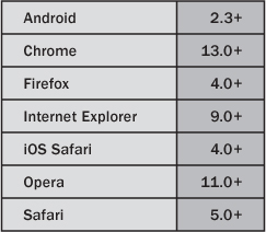
Figure 4.8 shows a rotation transform applied to a figure.
Figure 4.8 An image and text rotated using CSS

To create the effect in Figure 4.8, you apply the transform property with a rotate value to the figure and the h1. As shown in Listing 4.12, you have to use several vendor CSS prefixes to get the effect working in WebKit, Mozilla, and Opera. There is a -ms- prefix, even though at the moment the IE9 beta does not support transform effects; we hope by the time you are reading this book, it will.
* {
margin: 0;
padding: 0;
}
body {
font: normal .9em Arial, Helvetica, sans-serif;
position: relative;
padding: 30px 10px 10px 75px;
width: 600px;
}
h1 {
left: -100px;
position: absolute;
top: 160px;
text-align: left;
-webkit-transform: rotate(270deg);
-moz-transform: rotate(270deg);
-o-transform: rotate(270deg);
-ms-transform: rotate(270deg);
transform: rotate(270deg);
}
figure {
background: #fff;
border: 1px solid #BFBFBF;
-webkit-box-shadow: 2px 2px 4px rgba(0,0, 0, 0.3);
-moz-box-shadow: 2px 2px 4px rgba(0,0, 0, 0.3);
box-shadow: 2px 2px 4px rgba(0,0, 0, 0.3);
display: block;
float: right;
margin: 20px 20px 50px 50px;
padding: 5px;
text-align: center;
-webkit-transform: rotate(10deg);
-moz-transform: rotate(10deg);
-o-transform: rotate(10deg);
-ms-transform: rotate(10deg);
transform: rotate(10deg);
}
figcaption {
clear: both;
display: block;
font-weight: bold;
padding: .5em 0;
}
p {
margin: 0 0 1em;
}
<h1>This is the page title</h1>
<p>Pellentesque habitant morbi tristique sen......</p>
<figure>
<img alt="Sandy beach" src="beach.jpg" />
<figcaption>
The view from our hotel room
</figcaption>
</figure>
<p>Pellentesque habitant morbi tristique sen......</p>
Figure 4.8 uses the rotate function of CSS transform property, but there are several others you can use: translate, scale, and skew. Listing 4.13 shows example code needed to implement these effects (do not forget to add the browser-specific prefixes). The code shows transform effects in use on text, but they can be applied to any element, including body.
Listing 4.13 More CSS Transform Options
h1 {transform: translate(100px, 200px)}
h1 {transform: skew(40deg);}
h1 {transform: scale(2);}
/* You can also chain them together in a single declaration: */
h1{transform: translate(100px, 200px) skew(40deg) skew(2) rotate(40deg);}
You can also do transitions and animations. There is a difference between CSS transitions and CSS animations. A transition is the transitioning between two states fired by a mouseover (:hover) or mouseclick (:active). CSS animations are timeline animations that can run on their own.
Transitions have been available for quite some time in WebKit, and Mozilla and Opera now implement CSS transitions; sadly, at the moment, IE does not. Transitions use the transform property shown earlier and can be applied on :hover or :active. Instead of instantly changing the values of an element when you hover on it, you can animate to those new values using the CSS transition property. Figure 4.9 shows a basic example of a normal text link.
Figure 4.9 Text link with hover effect
Figure 4.10 shows the mid-transition effect and the final effect of the link background fading to blank and the text fading to white on a mouse hover. It is hard to get this effect across in a printed black-and-white book, so we urge you to try this in a browser.
Figure 4.10 Transition effects
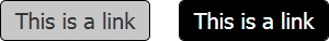
Listing 4.14 shows the code for this mouse hover effect. The color change you want to animate to is on the :hover. Without any transition, it would immediately change colors on :hover, but to get a fade effect, you use the transition property (and the vendor prefixes for WebKit, Mozilla, and Opera). Here is the key piece of CSS you need: transition: all 1s ease-in. Here you are telling the browser to animate all the properties (background and color), to use the ease-in timing function, and that the total duration of the transition is one second (1s). You can optionally include a delay value such as transition: all 1s ease-in, which delays the start of the transition and delays the element reverting to its default state.
Listing 4.14 Animated Color Change on Mouse Hover
a {
background: #fff;
border-radius: 5px;
display: block;
float: left;
padding: 5px;
text-align: center;
width: 125px;
-webkit-transition: all 1s ease-in;
-moz-transition: all 1s ease-in;
-o-transition: all 1s ease-in;
transition: all 1s ease-in;
}
a:hover {
background: #000;
color: #fff;
}
So, you can achieve small, subtle effects with transitions, but you can also use them to enhance the user experience of a page. Take the thumbnail photo gallery in Figure 4.11 as an example. Using the code in Listing 4.15, with a combination of rotate and scale, you create a nice hover effect to show the image at its full size, without the need of JavaScript, as shown in Figure 4.12.
Figure 4.11 Photo gallery before transitions

Figure 4.12 Photo gallery image on mouse hover

Listing 4.15 Animated Image Zoom on Mouse Hover
img {
background: #fff;
border: 1px solid #BFBFBF;
display: block;
float: left;
height: 125px;
margin: 0 10px 0 0;
padding: 5px;
width: 125px;
-webkit-box-shadow: 2px 2px 4px rgba(0,0, 0, 0.3);
-moz-box-shadow: 2px 2px 4px rgba(0,0, 0, 0.3);
box-shadow: 2px 2px 4px rgba(0,0, 0, 0.3);
-webkit-transition: all 1s ease-in-out;
-moz-transition: all 1s ease-in-out;
-o-transition: all 1s ease-in-out;
}
img:hover {
-webkit-transform: rotate(10deg) scale(2);
-moz-transform: rotate(10deg) scale(2);
-o-transform: rotate(10deg) scale(2);
-ms-transform: rotate(10deg) scale(2);
transform: rotate(10deg) scale(2);
}
With a bit more CSS, using the :after pseudoelement and the CSS content property, you can show the alt tag of the image when the image is zoomed in. The code is in Listing 4.16 and extends the code in Listing 4.15. This CSS shows the alt of the img on :hover, adding further information to the photo gallery. You could achieve this effect in other browsers using JavaScript, and even though we have very briefly mentioned the :after pseudoelement, we encourage you to read more about it (and the :before pseudoelement), which can be used in many creative ways in web development. Currently, this effect works only on images in Opera, so if you have Opera, give the code a whirl.
Listing 4.16 Display alt Text on Image Hover
img {
position: relative;
}
img:hover {
z-index: 2;
}
img:hover:after {
content: attr(alt);
display: block;
position: absolute;
bottom: -45px;
left: 0;
z-index: 2;
text-align: center;
}
Advanced Recipe: Creating Animations with CSS
Unlike transitions, animations do not require activation from a mouseover or mouse-click effect. Currently, animations are available only in the WebKit browser and the latest version of Firefox, but using various JavaScript techniques, you can achieve animations in other browsers. Table 4.5 shows the version of each browser that supports CSS animation.
Table 4.5 CSS Animation Device and Browser Support
For a basic example, you will move an image from the left side of the screen to the right and rotate it as it is moving. It’s a bit pointless showing a screenshot of this, so open Chrome, Firefox, or Safari and give the code in Listing 4.17 a go.
/* CSS */
div {
float: left;
height: 100%;
position: relative;
width: 100%;
}
img {
position: absolute;
-webkit-animation-name: moveIt;
-webkit-animation-duration: 5s;
-webkit-animation-iteration-count: infinite;
-webkit-animation-timing-function: linear;
-moz-animation-name: moveIt;
-moz-animation-duration: 5s;
-moz-animation-iteration-count: infinite;
-moz-animation-timing-function: linear;
animation-name: moveIt;
animation-duration: 5s;
animation-iteration-count: infinite;
animation-timing-function: linear;
}
@-webkit-keyframes moveIt {
from {
left: 0;
-webkit-transform:rotate(0deg);
}
to {
left: 100%;
-webkit-transform:rotate(360deg);
}
}
@-moz-keyframes moveIt {
from {
left: 0;
-moz-transform:rotate(0deg);
}
to {
left: 100%;
-moz-transform:rotate(360deg);
}
}
keyframes moveIt {
from {
left: 0;
transform:rotate(0deg);
}
to {
left: 100%;
transform:rotate(360deg);
}
}/* HTML */
<div>
<img src="beach.jpg" width="250" height="188" alt="Beach">
</div>
On the img selector are four animation CSS properties. They are duplicated because they have to explicitly target -webkit-, -moz-. And finally, you include the non-browser-specific property names for the day that all browsers support CSS animations:
• -webkit/moz-animation-name: The name of the animation you want to use
• -webkit/moz-animation-duration: How long the animation will last
• -webkit/moz-animation-iteration-count: How many times the animation will repeat
• -webkit/moz-animation-timing-function: The type of animation; choose from ease, linear, ease-in, ease-out, ease-in-out, and a custom cubic-bezier
Next, you define the animation @-webkit/moz-keyframes MoveIt. This is a simple animation so you start with a from property and end with a to value. In these properties, you are using normal CSS to move the image and also rotate it. You can change nearly any CSS property in these animations so there is a lot of potential here.
You can do more than simply using from and to properties; you can also set keyframes using percentages, which gives you greater flexibility. Figure 4.13 shows a banner that sits in the top-right corner of a page. Using the code in Listing 4.18, the background color fades smoothly between colors, with the keyframes set every 25 percent of the animation timeline.
Figure 4.13 Background color being animated

p {
background: #000;
color: #fff;
font: bold 20px Tahoma, Geneva, sans-serif;
padding: 10px;
position: absolute;
right: -65px;
text-align: center;
top: 75px;
width: 300px;
-webkit-transform: rotate(45deg);
-moz-transform: rotate(45deg);
-o-transform: rotate(45deg);
-ms-transform: rotate(45deg);
transform: rotate(45deg);
-webkit-animation-name: glow;
-webkit-animation-duration: 5s;
-webkit-animation-iteration-count: infinite;
-webkit-animation-timing-function: ease-in;
-webkit-backface-visibility: hidden;
-moz-animation-name: glow;
-moz-animation-duration: 5s;
-moz-animation-iteration-count: infinite;
-moz-animation-timing-function: ease-in;
animation-name: glow;
animation-duration: 5s;
animation-iteration-count: infinite;
animation-timing-function: ease-in;
}
@-webkit-keyframes glow {
0% {
background: #F00;
}
25% {
background: #06C;
}
50% {
background: #000;
}
75% {
background: #06C;
}
100% {
background: #F00;
}
}
@-moz-keyframes glow {
0% {
background: #F00;
}
25% {
background: #06C;
}
50% {
background: #000;
}
75% {
background: #06C;
}
100% {
background: #F00;
}
}
keyframes glow {
0% {
background: #F00;
}
25% {
background: #06C;
}
50% {
background: #000;
}
75% {
background: #06C;
}
100% {
background: #F00;
}
Tip
Transitions and animations have numerous uses. They not only add nice effects to web pages but also help designers and developers, who can create and tweak them quickly. We have shown only basic examples in this chapter to whet your appetite, so it is up to you to get creative. However, with great power comes great responsibility, so try not to go overboard with all the different effects because they can quickly turn a nice site into a tacky site. Too many transitions and animations may also affect the performance of the browser. We suggest spending time searching the Internet for examples and examining the way other designers and developers have used CSS3 to improve websites.
Summary
You have learned about a few of the new CSS features in this chapter: Media Queries, fonts, gradients, transformations, transitions, and animations. There are many more features than the features we have described; we have really only scratched the surface. There are countless possibilities for what you can achieve with these new features. If you are interested in CSS, then we suggest you do further research and study because there many other techniques and suggested practices when using some of these new features. Go exploring, and have fun playing with CSS.