
5. HTML5 Web Forms
In this chapter, you will learn about HTML5 web forms and the new functionality now available to web developers. Of course, not all these new features are fully supported by all browsers, but as you will see in the recipes throughout this chapter, the new features degrade nicely. There are more than ten new input types and several new attributes to choose from, along with some new CSS tricks you can use to create forms.
Validation
Even though there are several new input types, without a doubt the biggest new feature is the built-in form validation HTML5 offers. Previously, you had to use server-side code like PHP or C# to check the contents of the submitted form and then return the page and display the errors to the user. Or you had to use some fancy JavaScript to check the contents of the data entered on the fly and tell the user whether there were any errors.
With HTML5, form validation is easy; you can provide inline validation and feedback for the users when they try to submit the form, which leads to forms being easier to complete and increases the chances of correct information being submitted. Of course, you will need some server-side code to actually process the form to its destination.
In the recipes throughout this chapter, we are adding a required attribute to most of the form elements; this is so when you test them, you can see what, if any, validation messages the browsers show. This attribute tells the browsers that the form cannot be sent without the element being completed.
HTML 4 Input Types
Very briefly we will mention the form elements that have been used for years in web development. These are still fundamental and perfectly valid form elements and are not being replaced. They will still be used widely in HTML5 and form development.
Essentially, you have the form element, a fieldset (fieldset is an element for grouping related fields in a form), and common form elements, which give you the form controls shown in Figure 5.1.
Figure 5.1 Pre–HTML5 form controls

Listing 5.1 provides the HTML for Figure 5.1. Note that an unordered list (ul) and list items (li) have been used to format this form. This is not the only way to organize a form, but it means you do not have to use the unnecessary <br/> in this code.
Listing 5.1 Page with Different form Elements
<form>
<fieldset>
<legend>Fieldset legend - a caption/title for this set of fields</legend>
<ul>
<li><label for="normal">Normal input box</label> <input id="normal" type="text" value="a 'normal' input box" /></li>
<li><input id="checkbox" type="checkbox" /> <label for="checkbox">I'm a checkbox</label></li>
<li><input id="radio" type="radio" /> <label for="radio">I'm a radio button</label></li>
<li><label for="file">Upload</label> <input id="file" type="file" /></li>
<li><label for="password">Password</label> <input id="password" type="password" value="mypassword" /></li>
<li><label for="textarea">Textarea</label> <textarea id="textarea" rows="5" cols="40">This is a textarea</textarea></li>
<li><label for="select">Select</label>
<select id="select">
<option>Option 1</option>
<option>Option 2</option>
<option>Option 3</option>
<option>Option 4</option>
</select></li>
<li><input type="submit" value="Submit" /></li>
<li><input type="reset" value="Reset" /></li>
</ul>
</fieldset>
</form>
There are several new input types in HTML5 that are useful for creating forms or updating old forms. They will make your job as a developer easier but will also help the user enter correct data.
Beginner Recipe: Creating a Form to Collect Contact Information
Listing 5.2 uses three of the new input types to gather user contact information: email, tel, and url. Take a look at the code; the input types are highlighted in bold and are discussed further in the sections that follow.
Listing 5.2 Contact Form with New HTML5 form Elements
<form>
<fieldset>
<legend>Contact information</legend>
<ul>
<li>
<label for="email">Email</label>
<input required type="email" id="email" name="email" />
</li>
<li>
<label for="tel">Telephone number</label>
<input required type="tel" id="tel" name="tel" />
</li>
<li>
<label for="url">Website</label>
<input required type="url" id="url" name="url" />
</li>
</ul>
<input type="submit" value"Submit this" />
</fieldset>
</form>
input type="email"
The email input type tells the browser that the content of this field should look like an email address. In Listing 5.3, we have put a required attribute on the email input. This will tell compatible browsers to examine the contents of this field before submitting the form. It does not check to see whether the email address actually exists.
<form>
<label for="email">Email</label>
<input required type="email" id="email" name="email" />
<input type="submit" />
</form>
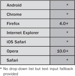
Table 5.1 email Input Type Device and Browser Support

With browsers developing faster and faster, trying to stay ahead of the curve and of each other, there are differences in how each handles validation. The tests in Table 5.2 highlight the differences in how browsers handle forms, form validation, and feedback. Earlier, the validation messages are different from what is shown in the tests. Also notice that "test@test" is valid in Firefox but not Opera, which is the most striking difference between the two browsers.
Table 5.2 email Input Type Validation Tests

At the time of writing, using the previous example in Chrome or Safari, there is no browser validation.
Note
You may be wondering whether you can style the form feedback. Well, the answer is, sort of. We will discuss CSS later in this chapter.
input type="tel"
Like the new search input type, the tel input type renders as a normal text field (see Figure 5.2). It accepts any character in this field, not just numbers, because phone numbers can have non-numeric characters such as + or (. If you wanted to force the field to accept only numbers, then you can use pattern, which is described later in this chapter.
Figure 5.2 The input type="tel" element in Opera. It looks like a normal input text field.
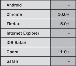
Table 5.3 tel Input Type Device and Browser Support

input type="url"
A common requirement on a web form, such as a comments form on a blog, is to ask the user for the URL of their own website. Asking for a URL is now nice and easy in HTML5, as Listing 5.4 shows.
<label for="url">Website</label><input required type="url" id="url" name="url" />
Table 5.4 url Input Type Device and Browser Support
This input type expects the content to be a valid URL. Again, like the email type, it does not check whether it actually exists (you could do this with some additional script). A traditional URL would be a web address, such as http://mysite.com. Firefox 4.0b7 does not allow mysite.com or www.mysite.com; it requires the address to include the http://. Opera 11, however, converts mysite.com automatically into http://mysite.com, which is valid and allows the form to be submitted.
Most of the time, the content of this field will be http://mysite.com; however, it will also accept other types of URLs:
• ftp://user:password@server
• javascript:window.alert (be careful of this; you might want to write your own validation to not allow any JavaScript to be submitted)
• file://server/path
• tel:12345
Because of these additional URL types, at the moment the form would validate with hello:world. This is because most browsers have their own URL types, such as Firefox, which has about:config. So, at the moment, anything with a colon in the URL will validate. This may change down the line as browsers refine their validation methods.
Beginner Recipe: Creating a Search Form with input type="search"
input type="search" expects a search term. It looks like a normal text field because essentially it is just a normal text field. There is nothing special about it really, but it helps browsers know it is a search field. Listing 5.5 shows how you would use it in a search control.
Listing 5.5 The search Input Type
<form role="search">
<label for="search">Search term</label>
<input required type="search" id="search" name="search" />
<input type="submit" value="Go" />
</form>
Table 5.5 search Input Type Device and Browser Support

An interesting addition for WebKit browsers (such as Safari and Chrome) is that you can add the results attribute, which gives a little extra functionality:
<label for="search">Search term</label>
<input required type="search" results="5" id="search" name="search" />
This code results in the search item shown in Figure 5.3. Notice the magnifying glass icon being added to the input, which would, if there were any, display previous search terms. Unfortunately, you cannot yet style such results using CSS or JavaScript. Safari currently hijacks the design of the search input, but you can override that with –webkit-appearance: none in your CSS.
Figure 5.3 The input type="search" element with WebKit browser–specific detail and information

Beginner Recipe: Creating Calendar and Time Controls
A common issue web developers have to deal with is how to create calendar widgets that allow the users to pick a date from a calendar so they do not have to enter the date themselves. Creating a widget has always required JavaScript, but that is going to change. In this recipe, you will look at the various new input types that create different calendar controls, and for browsers that do not provide a calendar widget, refer to Chapter 3, where we offer a couple of fallback solutions.
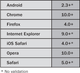
Table 5.6 datetime Input Type Device and Browser Support

input type="datetime"
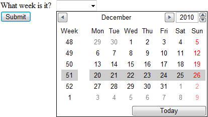
What will surely become a fan favorite is the new datetime input type. It remains to be seen what some of the major browser vendors will decide to do with this input type, but Opera natively generates a superb calendar/date picker widget, as shown in Figure 5.4.
Figure 5.4 The input type="datetime" element in Opera 11 provides the user with a calendar date picker.

Previously, you would have used JavaScript to provide such a complex control. Because browsers can now handle this, it could allow for integration with other services, such as connecting to your Facebook events calendar or your Outlook calendar. Also, because the browser is handling the calendar, if your system is set up in another language, it will display that language (Novembre in Italian, for example), unlike, for instance, the jQuery datepicker (http://docs.jquery.com/UI/Datepicker).
input type="datetime-local"
Almost identical to the previous datetime input, datetime-local generates a calendar with the subtle difference that there is no “UTC” label on the right side, so there is no time zone attached to it (see Figure 5.5).
Figure 5.5 The input type="time" element displayed in Opera 11
input type="date"
Figure 5.6 shows that the date input type is similar to the datetime input type shown in Figure 5.4, but here the control does not display a time option.
Figure 5.6 The input type="date" element displayed in Opera 10.63

input type="time"
The time input type allows the user to enter a time in 24-hour format. Currently, only Opera has browser support for this element. Figure 5.7 shows how this input looks in Opera.
Figure 5.7 The input type="time" element displayed in Opera 10.63
In this input, the user can either type in the number themselves, such as 22:11, or they can use the buttons supplied by Opera to scroll through the times.
input type="month"
The month input type displays the calendar shown in Figure 5.4 but allows only for months to be selected. The value of the input is then YYYY-MM. In Figure 5.8, the month of December is selectable. You can also select the previous or next month.
Figure 5.8 The input type="month" element displayed in Opera 10.63

input type="week"
Very similar to the date and month input types, week allows the user to select only a week of a year. The value of the input is YYYY-W00. In Figure 5.9, the week is selectable, and it provides the week number in the left column.
Figure 5.9 The input type="week" element displayed in Opera 10.63
Placing Restrictions on Dates and Times
There are two new attributes, min and max, which we will mention again later in this chapter; they can be used to control and restrict the dates or times of the widgets. For a date, if you wanted to make sure the user could not pick a date in the past, you could add a min attribute value in the following format: YYYY-MM-DD. It would be the same for the max attribute value to stop users selecting a date too far in the future. For the time input type, the format would be HH:MM.
Beginner Recipe: Creating a Number Picker
The number input type is used to enter a number. It accepts only numbers; otherwise, it will return a validation error. It allows the min, max, and step attributes so you can limit the number range to suit your information needs. The step attribute allows you to specify the increment values that can be entered.
Table 5.7 Number Picker Device and Browser Support

Using the code in Listing 5.6, Opera creates a control that allows the user to cycle through numbers (see Figure 5.10). The number can be negative, and unless you specify a minimum or maximum, the number can be infinitely high. Using the step attribute, you can be more precise with the numbers. Figure 5.10 allows the user to step through the numbers, 0 to 10 (the min and max) in steps of 0.5. So, they can choose 0, 0.5, 1, 1.5, and so on. The user can either use the controls provided or type in a number.
Figure 5.10 The input type="number" element displayed in Opera 11
Listing 5.6 number Input Type with Steps
<input min="0" max="10" step="0.5" required type="number" id="number" name="number" />
Because you specified the step range, anything outside of that will cause validation errors. So, entering 9.99 in Figure 5.11 is not allowed.
Figure 5.11 The input type="number" element with a invalid number (only 0.5 or full numbers are allowed in this example)

Beginner Recipe: Creating a Slider (Without the Need for JavaScript)
The range input type generates a slider control. It has no text area for the user to type into, and like the number input type, it can use the min, max, and step attributes.
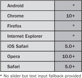
Table 5.8 Slider Device and Browser Support
Some possible uses of the range input type could be a “rate my whatever” section of a page or a form, or it could be used to control volume on a video or audio player.
In Listing 5.7, you will just look at the HTML needed to produce a basic range input, though in a later chapter you will learn how to make it a functioning volume control.
Listing 5.7 The range Input Type
<label for="range">Volume</label>
<input min="0" max="10" step="0.5" required type="range" id="range" name="range" />
We have limited control over how this slider looks because at the moment the controls are browser-specific. However, you can apply a height and width to the range control. If you specify a height that is larger than the width, the volume control will render vertically instead of its default horizontal layout.
At the time of writing, Opera, Chrome, and Safari support this input type, as shown in Figure 5.12. The main difference is that Opera by default shows the increments.
Figure 5.12 The input type="range" in Opera 11 (left) and Chrome 7 (right)
Beginner Recipe: Creating a Color Picker
As Figure 5.13 shows, <input type="color"> provides the user a choice of some basic colors with the options of entering a hex value (#12ff00) or using a color picker, similar to what is used in many software packages. The only desktop browser that currently supports this useful input type is Opera 11 (although the new BlackBerry browsers support the color picker as well).
Figure 5.13 The input type="color" in Opera 11

Table 5.9 Color Picker Device and Browser Support

Beginner Recipe: Displaying Results with the output Element
The output element uses JavaScript to display results, usually from a calculation or from a script. It could be calculator or, using the code in Listing 5.6, to add a little extra functionality to a page such as displaying the first name of the user. It can be a self-closing tag if you don’t need any additional content to appear inside it, so you have the option of <output/> or <output></output>.
Table 5.10 output Element Device and Browser Support

An example, as shown in Figure 5.14, would be to give the value of the range input type as the slider is being dragged. The default value is blank, but when the user moves the slider, the output value is changed and displayed to the user in real time. Listing 5.8 has the code for this job.
Figure 5.14 The output element used to display the value of the range input type in Opera 11.
Listing 5.8 The output Element
<label for="range">Volume</label><input min="0" max="10" step="0.5" value="2" required type="range" id="range" name="range" />
<output onforminput="value=range.value"></output>
Beginner Recipe: Using Form Placeholder Text
As you saw earlier, there are lots of new input types for you to play with, but you also have plenty of new attributes you can use alongside the new input types to improve your forms.
Placeholder text is the text displayed inside a text field when the form loads. When a user clicks or tabs into the field, it disappears. Usually, it provides a hint about what to type in the field, or it suggests the type of format that should be entered. An example would be a search form that says “Search this site” or, as you saw with the url input type, a hint that suggests the user start their URL with http://. Figure 5.15 shows an example.
Figure 5.15 The placeholder attribute in Chrome, before and after the field is activated
Previously, this required JavaScript to achieve this effect, but now you can sit back and let the browser do it for you.
There are accessibility issues with placeholder text because currently the color of the text is by default a light gray, which is not of sufficient contrast with the default background color. You can override the text color in Mozilla and WebKit browsers by using the following CSS:
input::-webkit-input-placeholder {color: red;}
input:-moz-placeholder {color: red;}
Table 5.11 placeholder Attribute Device and Browser Support

Beginner Recipe: Creating an Autocomplete Feature with list and datalist
datalist is a new element in HTML5. Combined with the list attribute, it is used to provide a predefined list of options (see Figure 5.16), making the process of creating a list seem like an autocomplete form. Users don’t necessarily have to choose from the predefined options; they can type their own answer if they wanted.
Figure 5.16 The datalist element used to provide autocomplete options in Firefox 4
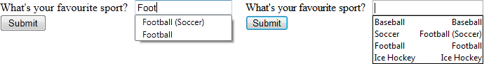
Table 5.12 datalist Element Device and Browser Support
The code for a datalist (displayed in Listing 5.9) is similar to a select element. However, with a select element, the user cannot type their own option if they need to do so. There is no such issue with datalist. Using the list attribute, you associate a normal input (it could be a url, email, search, or tel type as well).
<label for="sport">What's your favourite sport?</label>
<input list="sportlist" type="text" id="sport" name="sport" />
<datalist id="sportlist">
<option label="Baseball" value="Baseball" />
<option label="Football (Soccer)" value="Soccer" />
<option label="Football" value="Football" />
<option label="Ice Hockey" value="Ice Hockey" />
</datalist>
In the previous example are four autocomplete options. Only Firefox and Opera currently show the autocomplete options, and they do it slightly differently: Firefox shows only options that are similar to what has been typed, while Opera shows the whole list when the field is active.
The datalist could be generated from a database or an Ajax call (similar to Google search engine autocomplete feature), providing the user with, say, the top 10 common answers to the question. The beauty of this new element and attribute is that if the user is using a browser that does not render this HTML5 element, doesn’t have JavaScript, or there is a Ajax connection issue, the form controls render like a normal text box, and the user can type away as normal.
Beginner Recipe: Tracking the Completion of a Task with the progress Element
The new progress element is for tracking the status and completion of a task. It could be used to display the progress of a download, such as downloading a file or loading data from an Ajax call, for example.
The progress element has two optional attributes:
• value: The value attribute represents how much of the task (in percent) has been completed.
• max: The max attribute represents the total amount required to complete the task. Both the value and max content should be displayed inside the progress element so the user has feedback on the completion state.
In Chrome, the following code gives you the progress element shown in Figure 5.17. The progress bar also glows, which is a nice touch.
<p>You are downloading a very important file, please wait.</p>
<progress value="45" max="100"><span>45</span>% complete</progress>
Figure 5.17 The progress element in Chrome

In browsers that do not support the progress element, you get the result shown in Figure 5.18 (screenshot from Firefox 3.6).
Figure 5.18 The fallback display for browsers that do not support the progress element

The idea behind this is that the green (or blue, depending on the OS and browser version) bar, or the text visual, would update live so the user knows how much time has elapsed and how much time still remains.
Table 5.13 progress Element Device and Browser Support

Beginner Recipe: Measuring with the meter Element
The meter element is used to display a measurement, such as a temperature, or to display a fractional value.
It has six possible attributes:
• min: The minimum allowed value. If there is no min attribute, then the value is given as zero. You can use negative numbers if you want.
• max: The maximum allowed value.
• value: This is the actual value and must be present when using meter.
• low: This is the low part of the value.
• high: This is the high part of the value range.
• optimum: This is the optimum value. Its value must be between the min and max. However, its value can be greater than the value of the high attribute.
The following are some basic examples:
<p>Your score is: <meter value="2">2 out of 10</meter></p>
<p>Your score is: <meter value="91" min="0" max="100" low="40" high="90" optimum="100">A+</meter></p>
The meter element (shown in Figure 5.19) can be used to describe the current status of hard drive space:
<meter min="0" value="512" max="1024">You are using exactly 50% of your hard drive space</meter>
Figure 5.19 The meter element in Chrome
Table 5.14 meter Element Device and Browser Support

Beginner Recipe: Jumping to a form Element When the Page Loads
The autofocus attribute gives you the chance to focus a form control when the page loads. If it was focused on an input or a textarea, the user could start typing as soon as the page loads. If the field you are automatically focusing on has placeholder text, then it will be emptied because the text cursor is in the field. Previously, you would have had to use JavaScript to perform an autofocus task. The autofocus attribute is a Boolean attribute, so it is either on or off. Figure 5.20 shows an example.
Figure 5.20 The autofocus attribute used on a text field in Safari

Table 5.15 autofocus Attribute Device and Browser Support

The autofocus attribute should be used with caution. Automatically making the page jump/scroll down to content isn’t the best usability practice because users with a mobile device, with a screen reader, or with low screen resolution will miss the, perhaps relevant, content above it. It is recommended that autofocus be used on pages where the form element is the main content such as a contact page or, as shown in Figure 5.17, a search site (like the form on Google.com, which does in fact have autofocus but delivered via JavaScript). Listing 5.10 shows the code used to produce Figure 5.17.
Listing 5.10 autofocus on a search Input Type
<label for="autofocus">Search the site</label>
<input autofocus required type="search" id="autofocus" name="autofocus" />
autofocus should be used only once per page. Interestingly, if you have several fields on a page, all with autofocus, Opera, Chrome, and Safari put the autofocus in the last field, while Firefox uses the first.
Beginner Recipe: Allowing Multiple Entries
The multiple attribute allows users to enter more than one value in a particular field. It can be used on any input type, so it could be used to create a “Send to friend” form or an email app, allowing the user to enter multiple email addresses in the To, Cc, and Bcc fields.
Table 5.16 multiple Attribute Device and Browser Support

Uploading multiple files is another example. Previously, this would have needed JavaScript or server-side code to detect when a file has been chosen and then display another upload option. But using the code in Listing 5.11, now you can do it in HTML5.
Listing 5.11 Allowing Multiple File Uploads
<label for="upload">Upload some files</label>
<input multiple type="file" id="upload" name="upload" />
Currently, only Firefox 4, Safari, and Chrome support this new attribute. Safari and Chrome display the number of files chosen. In the example shown in Figure 5.21, three files have been chosen. Firefox 4 does not automatically display how many files have been chosen; instead, it lists the full file paths inside a text box, separated by a comma, something like “C:fileone.doc, C:filetwo.pdf.”
Figure 5.21 The multiple attribute used on a file input in Safari
Beginner Recipe: Basic Validation with the required Attribute
The required attribute has been used in many examples in this chapter. If the attribute has been used, the browser will not attempt to submit the form if the required fields are empty. In browsers that support this attribute, if required fields are empty, an error will be shown, as shown in Figure 5.22.
Figure 5.22 Error message for an incomplete required field in Opera 11

Table 5.17 required Attribute Device and Browser Support

Tip
Alongside the required attribute, you can also add aria-required="true", as follows, which will improve accessibility on form elements. You may be interested to know that WordPress uses this by default for its comment form.
<input aria-required="true" required type="text" id="name" name="name" />
Intermediate Recipe: Writing Your Own Validation Rule
Even though HTML5 has built-in validation, you can set your own rules using the pattern attribute and regular expressions.
Table 5.18 pattern Attribute Device and Browser Support

As an example, you have seen that the url input type accepts various types of URLs. You may want to stop that and force the user to start with http://. You can do this with a custom regular expression.
The regular expression used in Listing 5.12 validates only URLs that start with either http:// or https://. It also accepts subdomains and querystrings, so http://you.site.com/search.aspx?=test is valid content, but a mailto: address is not.
Listing 5.12 pattern Attribute with Regular Expression
<input required pattern="(http|https)://([w-]+.)+[w-]+(/[w- ./?%&=]*)?" type="text" id="url" name="url" />
Regular expressions can be tricky and can quickly get complicated, so depending on how confident you are, it may be best to keep them as simple as possible. And if you get stuck, there are countless answers on the Internet.
Beginner Recipe: Limiting User Input
Form entries in HTML5 can now be limited if applicable through various attributes.
step
The step attribute can be used on number, range, and time input types. It specifies the incremental steps in the numbers the input can take. See Listing 5.10 earlier in this chapter (with number input type) for an example.
Table 5.19 step Attribute Device and Browser Support

min, max
Seen on the meter element and on input types number and range, the min and max attributes set the allowed range of values on the element. These are not required attributes, and you can use either min or max, or both. These set validation rules, and the form will not submit if the min or max value is not within the range. These can be used on date and time input types to constrict the user from picking a certain value, such as on an events calendar or for searching between dates.
Table 5.20 min, max Attributes Device and Browser Support

formnovalidate, novalidate
If you have a form but you do not want to use the browser validation, then you can use the attribute formnovalidate or novalidate. Using one of these might be particularly useful if you want to save the current state of the form rather than submit, for example, if the site has a large form or if at the current stage of the process you are not concerned with validating the data because the user has other stages to complete before final submission.
Table 5.21 formnovalidate, novalidate Attribute Device and Browser Support
You can put a novalidate on the form element, and when the form is submitted, the form will ignore any incorrect formats or empty fields:
<form novalidate>
You can also put a formnovalidate attribute on any individual form element. For example, you could put it on a url input type, and the browser would ignore validation on this element (although why you would go to the effort of using a url input type and then ignoring validation is questionable).
Intermediate Recipe: Customizing and Styling the Form
One of the first thing designers ask is, “Can I style the new elements?” Well, sort of. Although you can’t change how the date picker looks because it is generated by the browser (this might change in the future), you can style how the input boxes look, such as border, font, and background color, because there are CSS3 tricks you can use to style the different states of your HTML5 fields.
The code in Listing 5.13 generates what you see in Figure 5.23; notice the different field states. The fields start off orange with an asterisk image since they are required. When the field is active but is empty or contains invalid content, the box is red with an error image displayed. If the content is good, then the field changes to green with a tick image. All this without JavaScript!
Figure 5.23 CSS3 used to target different states of form fields

Listing 5.13 New CSS3 Options for form Elements
<style>
* {margin: 0; font: 13px tahoma, verdana, sans-serif; padding: 0;}
form {padding-top: 10px; width: 310px;}
li {clear: both; list-style-type: none; margin: 0 0 10px;}
label {display: block; float: left; margin: 0 10px 0 0; padding: 5px; text-align: right; width: 100px}
input {background-position: 3px 5px; background-repeat: no-repeat; border-radius: 5px; padding: 5px 5px 5px 25px; width: 155px;}
input:focus {outline: none;}
input:invalid:required {background-image: url(asterisk.png); box-shadow: 0px 0px 5px #f0bb18; border: 2px solid #f0bb18;}
input:focus:invalid {background-image: url(invalid.png); box-shadow: 0px 0px 5px #b01212; border: 2px solid #b01212;}
input:valid {background-image: url(accept.png); border: 2px solid #7ab526;}
input[type=submit] {background: #7ab526; border: none; box-shadow: 0px 0px 5px #7ab526; color: #fff; cursor: pointer; float: right; font-weight: bold; padding-left: 5px; width: auto;}
</style>
<ol>
<li><label for="tel">Tel:</label><input placeholder="eg: 012345" required type="tel" id="tel" name="tel" /></li>
<li><label for="website">Website:</label><input required type="url" id="website" name="website" /></li>
<li><label for="email">Email:</label><input required type="email" id="email" name="email" /></li>
<li><input type="submit" value="Send the form" /></li>
</ol>
We will not cover all the new CSS options, but in Figure 5.20 we have used the following psuedoclasses from the CSS3 Basic User Interface Module (www.w3.org/TR/css3-ui):
• :valid: A form element receives this class when its contents are valid according to the element type and the validation.
• :invalid: If the form element has incorrect content, then the invalid class is applied.
• :required: Any form element that has this attribute will be assigned this class.
Error Messages
We hope you have been following along with the previous examples and have noticed that error messages are displayed differently in Opera and Firefox. Opera displays a wobbly red error message, while Firefox shows a calmer yellowish error message. At the moment, you are unable to change how these errors are displayed because they are generated by the browser. This might change in the future because it is currently under discussion whether to make them editable with CSS. So, although you might bemoan that the error messages look horrible or do not meet your lovely brand guidelines, the error messages will be consistent in a browser, so it is arguably a usability win because users will come to expect these error styles when using their browser of choice.
Although you cannot yet change the style of the errors, you can change the error message text using JavaScript and the setCustomValidity() method. Listing 5.14 has an example that overrides the default error message when incorrect content has been added.
Listing 5.14 An HTML5 Sign-Up Form
<form>
<label for="email">Email</label><input oninput="check()" type="email" id="email" name="email" />
<input type="submit"/>
</form>
<script>
function check() {
var emailInput = document.getElementById("email");
emailInput.setCustomValidity("This is not valid. Please fix it.");
}
</script>
Advanced Recipe: Putting It All Together to Make a Sign-Up Form
Now that you have learned about all the new HTML5 form features, let’s put a few of them together, along with some CSS, to see how the new features can create a sign-up form. The HTML and CSS in Listing 5.15 provides the result in Figure 5.24.
Figure 5.24 A sign-up form in Opera 11 created with some HTML 4 elements, new HTML5 form elements, and CSS

So, in Figure 5.24, we have used the tel, date, url, number, text, email, color, and range input types. Also used on a couple of occasions is the datalist element, though we could have alternatively used select, but on this form we want people to type in their job titles or countries. Toward the end of the form, the range input type has been used and along with it the output element. All the elements that have data we need to capture have the required attribute, which will trigger built-in browser validation. And to make it look a bit nicer, we have added some new CSS3 selectors to target the required, valid, and invalid states of the elements.
Listing 5.15 A Robust Sign-Up Form
<!DOCTYPE html>
<html lang="en">
<head>
<meta charset="utf-8">
<title>Big signup form</title>
<style>
* {margin: 0; padding: 0;}
body {background: #fff; color: #000; font: normal 62.5%/1.5 tahoma, verdana, sans-serif;}
h1 {font-size: 2.9em; font-weight: bold; margin: 1em 0 1em 10px;}
form {padding: 0 10px; width: 700px;}
legend {left: -9999px; position: absolute;}
fieldset {border: 1px solid #ccc; border-radius: 5px; float: left; padding: 10px; width: 320px;}
fieldset:nth-of-type(1) {margin-right: 10px;}
li {clear: both; list-style-type: none; margin: 0 0 10px;}
label, input {font-size: 1.3em;}
label {display: block; padding: 0 0 5px; width: 200px}
input {background-position: 295px 5px; background-repeat: no-repeat; border: 2px solid #ccc; border-radius: 5px; padding: 5px 25px 5px 5px; width: 285px;}
input:focus {outline: none;}
input:invalid:required {background-image: url(asterisk.png); box-shadow: none;}
input:focus:invalid {background-image: url(invalid.png); box-shadow: 0px 0px 5px #b01212; border: 2px solid #b01212;}
input:valid:required {background-image: url(accept.png); border: 2px solid #7ab526;}
input[type=date], input[type=number] {background-position: 275px 5px; text-align: left;}
input[type=color], input[type=range] {padding-right: 5px;}
input[type=range]:before{content: "1";}
input[type=range]:after{content: "10";}
div#range label {font-weight: bold;}
output {font-size: 1.3em; font-weight: bold; display: block; text-align: center;}
div {clear: both; float: left; margin: 10px 0; text-align: center; width: 100%;}
div label {width: 100%;}
input[type=submit] {background: #7ab526; border: none; box-shadow: 0px 0px 5px #7ab526; color: #fff; cursor: pointer; font-size: 3em; font-weight: bold; margin: 20px auto; padding: 15px; width: auto;}
input[type=submit]:hover {box-shadow: 0px 0px 25px #7ab526; }
</style>
</head>
<body>
<h1>Sign up for our amazing product. It's amazing.</h1>
<form>
<fieldset>
<legend>Personal info</legend>
<ol>
<li><label for="name">Name</label><input autofocus required type="tel" id="name" name="name" /></li>
<li><label for="birthday">Birthday</label><input required type="date" id="birthday" name="birthday" /></li>
<li><label for="website">Website</label><input placeholder="http://mysite.com" pattern="(http|https)://([w-]+.)+[w-]+(/[w- ./?%&=]*)?" type="url" id="website" name="website" /></li>
<li><label for="job">Job</label><input list="joblist" required type="text" id="job" name="job" />
<datalist id="joblist">
<option label="Space Cowboy" value="Space Cowboy">
<option label="International Playboy" value="International Playboy">
<option label="Web developer" value="Web developer">
<option label="Web designer" value="Web designer">
<option label="Jack of all trades" value="Jack of all trades">
</datalist>
</li>
<li><label for="salary">Approx. annual salary</label><input placeholder="&$" required min="0" step="1000" type="number" id="salary" name="salary" /></li>
</ol>
</fieldset>
<fieldset>
<legend>Contact info</legend>
<ol>
<li><label for="address1">Address line 1</label><input required type="text" id="address1" name="address1" /></li>
<li><label for="address2">Address line 2</label><input required type="text" id="address2" name="address2" /></li>
<li><label for="country">Country</label><input list="countrylist" required type="text" id="country" name="country" />
<datalist id="countrylist">
<option label="Canada" value="Canada">
<option label="United Kingdom" value="United Kingdom" >
<option label="USA" value="USA">
</datalist>
</li>
<li><label for="tel">Tel</label><input placeholder="eg: 012345" type="tel" id="tel" name="tel" /></li>
<li><label for="email">Email</label><input required type="email" id="email" name="email" /></li>
</ol>
</fieldset>
<div id="personalise">
<h2>Personalise your profile</h2>
<label for="color">Choose a page color</label>
<input type="color" id="color" name="color" />
</div>
<div id="range">
<label for="excited">Finally, on a scale of 1 to 10, how excited are you about HTML5 forms?</label>
<input min="1" max="10" step="0.5" type="range" id="excited" name="excited" />
<output onforminput="value=excited.value + ' / 10'"></output>
<input type="submit" value="Sign up" />
</div>
</form>
</body>
</html>
Summary
In this chapter, you learned about all the new input types and, if they are fully supported, how they work in the browsers. These new input types, along with the new built-in native validation and new CSS features in good browsers, makes creating forms and providing feedback to the user much easier. Though there is a long way to go before all the browsers catch up, one day—ideally soon—you will not have to rely on JavaScript to create useful features such as date pickers, sliders, and validation. All the new input types, such as email, tel, and date, all “work” in browsers by, at the very least, showing a text field, so there is no excuse to not start using them.