
CHAPTER TWO
REFRAMING OUR THINKING
Historically, drawing has been perceived as an inherited talent. We grew up under the impression that in order to draw, we must be able to create an accurate representation of the objects in the environment around us. Being able to take a blank canvas or sheet of paper and draw an accurate representation of a complex image takes a tremendous amount of talent, and those who have figured out how to do it well are true artists. That said, this perception of drawing has hindered our ability as adults to try it for ourselves.
One of the best ways to get started with drawing is to jump in and start. Let's first create a few drawings. Bear with me through this, because it will take a few minutes to get through. Incidentally, this is an exercise introduced by Manuel Lima, which we like to share with attendees of our data visualization workshops, and it is based on the work of Santiago Ortiz and his article “45 Ways To Represent Two Quantities.” Please locate and grab the nearest pen and paper. I want you to think about two numbers in Figure 2.1.

How many ways can you represent these values? Take a few minutes to think about it and jot down a few ideas in your sketchpad. There's no wrong answer to this question. This exercise is meant to inspire divergent thinking. Just as in digital product design and UX, we often explore many concepts and ideas for solving the same problem. We're going to apply that same thinking in this exercise and come up with many ways to visualize these two values.
Try to come up with a new drawing every minute. There's no wrong answer to this. If you think your idea will work, try it. You'll be surprised at what you come up with toward the end of the exercise. Jot down a few ideas, then turn the page.
There are endless ways to represent these values. Here are a few of my own explorations. I started by representing 7 and 14 using alternate characters, such as the Roman numerals displayed in Figure 2.2.

Another familiar way to represent these values is to use a series of ticks and slashes. Each slash represents a multiple of 5 as depicted by Figure 2.3. If you enjoy board games as much as I do, you'll recognize that this is a common way to keep score in some games.

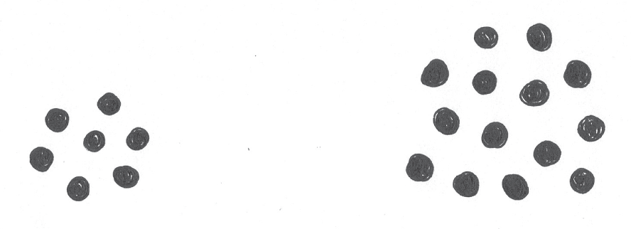
In Figure 2.4, I turned the lines into something more abstract, like points. I used basic Gestalt principles to create a visual grouping of the dots. The first cluster has seven points. The second cluster has 14.
So what do you think? Here's another example—instead of using points, l used basic shapes, like the interlocking triangles displayed in Figure 2.5.
Now, let's think about the relationship between the two numbers. I considered using basic elements, such as lines of varying lengths. One line might be half the length of the other, since half of 14 is 7, as depicted by Figure 2.6. I even combined them into one shape that is split in half as shown in Figure 2.7.


I thought about representing these values as time. I depicted 700 and 1400 hours by drawing a clock as you see in Figure 2.8. This might seem a bit edgier and abstract, but it still works. What do you think?
Looking at these examples, we can probably agree that they're all unique. That said, these divergent concepts all have more in common than you might think. I'm going to go out on a limb and guess that all of your drawings can be distilled down to the same basic shapes and marks. These basic shapes and marks are part of a primitive visual vocabulary we developed for describing the two values. In this chapter, we will take a closer look and break down each example from the exercise.

BREAKING IT DOWN
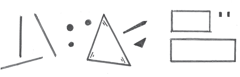
I've distilled all of my representations of 7 and 14 down to the collage of shapes pictured in Figure 2.9. Take a look at the elements within the collage. Can you find them in the exercise examples? Let's take a closer look.
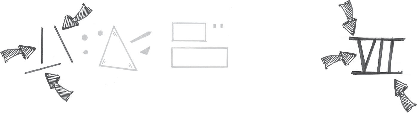
The Roman numerals were made up of connected lines. The arrows in Figure 2.10 point to the basic shapes and marks in the collage that I used to draw the Roman numeral.
I drew clusters of points, one consisting of seven points and the other consisting of 14. The arrows in Figure 2.11 highlight the elements used in this representation of the two values. In this case, a point was reused multiple times.

In one case, I drew a primitive set of shapes. I used a set of 7 and 14 interlocking triangles to represent the two values, as depicted in Figure 2.12.

When visualizing the relationship between 7 and 14, I drew two boxes, as shown in Figure 2.13. The second is half the length of the first, representing the two values. I added some shading to my boxes to give the drawing some energy and flair; however, that wasn't necessary.

I think you get the idea. Can you find the shapes used in the clock drawing in Figure 2.14. These basic lines, points, and shapes are part of a basic vocabulary of a primitive visual language I developed to represent the values of 7 and 14.

I'd like to encourage you to think about how you might combine the shapes in Figure 2.15 in other ways to represent the values of 7 and 14. If you put your mind to it, you'll find that the possibilities are endless.

INTRODUCING THE SYSTEM
When it comes to drawing digital experiences, drawing is a means to an end. It serves its purpose in the product development process. You can use it to bring clarity to your own ideas, and you can use it as a tool for development, alignment, collaboration, and sharing. It's a valuable tool that supports the ultimate outcomes we're striving to achieve. It doesn't take talent to draw well enough to accomplish these things within your team, and as demonstrated by the Squiggle Birds exercise in Chapter 1, “Why Draw?,” anyone can draw.
During the first 15 years of my professional career, I started to realize that I was reusing the same basic symbols to draw my digital product ideas. You may have realized the same when analyzing your drawings of the quantities 7 and 14. While I thought my drawings were utter trash (I was professionally trained as an artist), I noticed I received a lot of compliments from my design colleagues on how well my drawings were crafted and how well they communicated my ideas.
It became apparent that my system for drawing was effective. Later in my career, I started researching this idea of drawing as a system. As I started researching the topic, I realized several authors and scholars have billed drawing as a visual language. Languages are examples of systems, and I realized my hypotheses and assumptions of my own work were leading me somewhere.
As I continued looking into this, I came across the research and writings of Dr. Neil Cohn, founder of Visual Language Lab and author of The Visual Language of Comics (Bloomsbury Academic, 2014). Dr. Cohn validated a lot of my own thoughts in how I approached drawing in my day-to-day work. He proposes that drawings are made up of visual vocabulary that possess a regularized and/or iconic meaning among a group of people. In our case, we're working with people who design and build digital products.
Assuming our visual language is UX or digital product design, our drawings will be made up of shapes that resemble the elements we interact with in most apps. As depicted by Figure 2.16, some of these elements might be screen-based, including form fields, buttons, check boxes, mouse cursors, lists, tables, and charts.
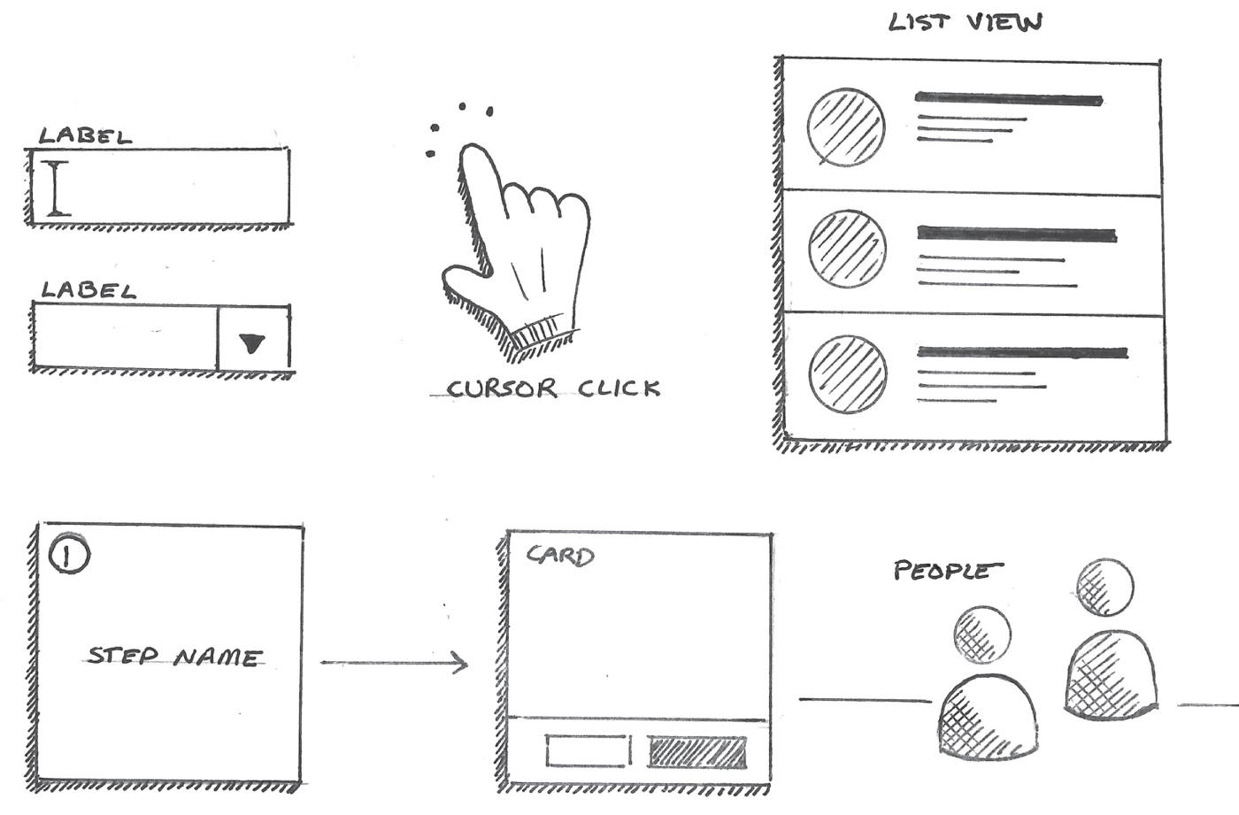
In other cases, as also depicted in Figure 2.17, we'll need to draw non-screen-based elements to tell a story about our idea. This might include basic people figures, devices, and an assortment of diagrams that will enable us to organize our thoughts and research. This is the start of our drawing system. Now, let's compare drawing to another system, one that I think is more fun.

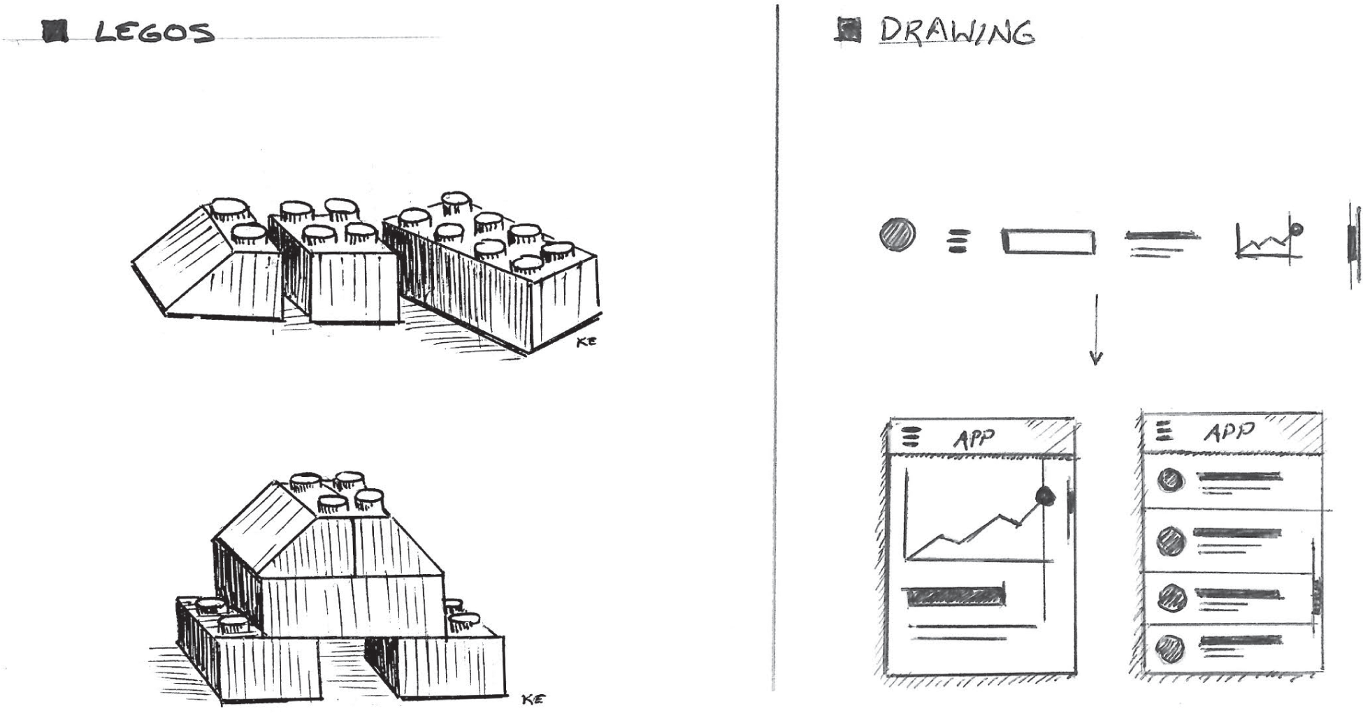
I like to compare drawing to a popular construction toy. Legos were a huge part of my childhood. In fact, I had 56 Lego sets fully constructed in my parents' basement. The space was a maker's dream. In fact, in the 1980s, did you know that Lego actually called itself Lego System? That is because they are indeed a system. Did you know that you can combine 6 standard 4x2 Lego bricks (Figure 2.18) in over 915 million combinations (Eilers, 2005)?

Lego offers several standard brick types in varying configurations. Each brick has its own purpose. There are 1x1, 2x1, 2x2, 3x2, and 4x2 configurations. Brick shapes may include cylinders, squares, rectangles, and triangles. These pieces can be combined in infinite ways to build any sort of model we can dream up. When we see the end result, we experience the model as a whole—the sum of the parts, as shown in Figure 2.19.

A great product drawing should enable us to focus on the solution as a whole—the sum of the parts. Now, let's think about the very primitive icons, shapes, and symbols that we might use to represent the basic UI elements found in our digital products. If we think about these elements as our Lego bricks, as suggested in Figure 2.20, we can combine them in infinite ways to share and collaborate on any digital product idea, just as we can combine Lego bricks in infinite ways to make any model we wish.
I think we can all get behind these metaphors and consider drawing a system. If I asked you to think about how to break a product drawing into some basic, reusable, Lego brick-like parts, you might have difficulty in doing so. You might have the same feeling people get when sitting in front of a blank canvas attempting to draw a real-world object. Once you know what to look for, it becomes easy.
COMMON DRAWINGS
I'm going to share a few common UX drawings in a style that has worked for me, and I'll break them down into their metaphorical Lego bricks. If you create and build digital experiences, then you'll likely use these drawings in your day-to-day work with your product team. Here are a few types of drawings nearly every digital product design process includes. In fact, if you work in the field, you've probably already seen them. Let's take a look at what they're used for and then how they can be deconstructed.
Site Maps
Site maps are similar to mind maps. Their top-down hierarchical layout helps us understand proposed navigation schemes and the organization of content. In Figure 2.21 we see a mapping of the screens that make up a mobile health tracking app.

This diagram is made up of boxes and lines. In this case, I used a texture made up of vertical lines to highlight screens with read-only content. The squares without fill textures represent pages that require user input. We'll discuss shading and textures later in Chapter 6, “Illustrating Light, Motion, and Other Concepts.” I used an inverted triangle to represent the starting point of the diagram. If you can draw the elements in Figure 2.22, you can draw a site map.

Journey Maps, Flow Charts, and Sequential Diagrams
Sequential diagrams can be used to map processes, journeys, and systems. In design, we use them to visualize journeys and tasks that are completed by users. Any journey, sequence, or process can be visualized using a sequential diagram.
We can use sequential diagrams to capture any process, even simple everyday processes. Let's start with a simple one. The photos in the next three figures loosely depict the process for preparing sweet potatoes. We usually start by rinsing the potatoes, as shown in Figure 2.23. We peel and chop the potatoes as suggested in Figure 2.24. Finally we coat in olive oil, season, and place them in the oven in Figure 2.25.


A process diagram as depicted in Figure 2.26 can be used to depict all the steps in this same process as depicted in Figures 2.23, 2.24, and 2.25.


When we're redesigning a digital product, we usually start by mapping the current journeys in completing a task or achieving a goal within the app. The maps are then used to identify pain points in that journey. They highlight opportunities for removing or combining steps and eliminating people's pain points within the process. This map provides a guide for creating a new and improved journey that will provide direction for our product's redesign.
Going back to the fitness app we looked at a moment ago in Figure 2.21, let's map how an athlete might look up and modify details on a recent run automatically tracked by the fitness app. It might look something like the process diagram we see in Figure 2.27.

These diagrams are made up of boxes, arrows, repeating lines, and sometimes icons. A shape or symbol should be included to provide a clear starting point in this picture. The elements we used for this diagram are displayed in Figure 2.28.
Mind Maps
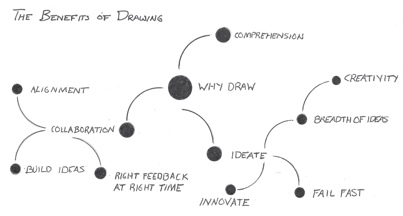
Mind maps are a great way to organize information. Product design teams typically use them to organize ideas, thoughts, and research. These maps especially work well when organizing the information hierarchically because they resemble a tree-like structure. Figure 2.29 depicts an alternate representation of the mind map I created for Chapter 1. It maps and categorizes the benefits of drawing.
If you look at the mind map in Figure 2.30, you'll see that it is simply a cluster of points connected by lines. If you're not comfortable with drawing, points and lines are some of the easiest things to draw.

Digital Products, Screens, Interfaces, and Components
We often draw interfaces and screens that will be available in our new product. In Figure 2.31 you can see a few sample interface drawings. The drawing on the left likely represents a screen that's part of a mobile app. The drawing on the right represents a screen that is part of a desktop dashboard. At first glance, these drawings may seem complex. Can you break them down into their fundamental elements?

The basic shape containing the drawing mirrors the shape of the device's screen that will display our app. As highlighted in Figure 2.32, we typically use boxes to represent rectangular devices, and we use circles to represent other devices like watches.

Interface elements within the screen layout are made up of basic shapes, points, and lines. Let's take a look at the examples in Figure 2.33. We can use thick lines to represent headlines. Blocks of thinner lines might represent text as depicted in the left and center drawings in Figure 2.33. Boxes with an X can be used to represent an image or icon as illustrated in the center drawing in Figure 2.33. Combinations of boxes are used to represent form inputs and buttons as depicted by the drawing on the right in Figure 2.33. We will cover more specifics in later chapters.

The collection of diagrams and drawings displayed in Figure 2.34 represent the majority of drawings you'll need to create with your team.

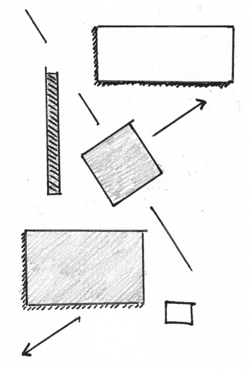
If we were to take inventory of all the shapes and elements we used in these drawings, you'll notice they have a lot in common. They can all be distilled down into the same set of basic shapes and lines displayed in Figure 2.35. Even with shading, some of the shapes in the figure are essentially a variation on a theme. These are the building blocks of your visual library.

When you can distill a drawing down into these basic forms, you'll find that drawing is much more approachable, and you'll pick it up more quickly. You'll spend less time thinking about how to draw the picture and more about the idea it represents.
Next, let's take a closer look at the marks we make on the paper in order to draw these common elements.