
Chapter Four
Slide Design
Best Practices
Abstract
The slides in your presentation will set the tone of your presentation. Investing the time in making quality, simple, and precise slides will help ensure your effectiveness in teaching the jury about your evidence. This chapter will help you determine which information you should keep and which information you should toss when preparing your slides for court room presentation.
Keywords
Court room presentation; Effective slide; Presentations; Slide design; Technical evidence
• The importance of planning your slides and slide deck
• The value of simplicity
• Leveraging the power of visuals
• Creating a consistent look and feel
• Creating proper charts and graphs
• Using color and fonts effectively
Introduction
The slides you use to support your testimony matter, and matter in a huge way. The slides can confuse, distract or frustrate the jury, or they can pave the way to comprehension and retention. Done well, they can be a real asset. Done poorly, they will only make your tough job even more difficult. The good news is that you can learn to create slides that truly help the jury understand and retain the key parts of your testimony. This chapter will take you through the key principles of slide design.
Commit the Time to Planning and Preparing Your Slides and Slide Deck
As you’ve no doubt heard, “Failing to plan is planning to fail.” That old axiom holds very true for slide design. When developing a slide deck, many people mistakenly dive right in and begin building their presentation in the software of their choice. It’s much better to slow down, take an “old school” approach, and start the process using pencil and paper. Instead of the computer, start with outlines, storyboards, notecards, white board, or Post-it notes (Reynolds, Prepare: Garr Reynolds, n.d.).
Start the planning process by answering this question: When you leave the witness stand, what do you want the jury to understand and ultimately remember? To answer those questions accurately and fully, you will need to consult with the attorney(s) you are working with and identify the following:
• Scope of testimony
• Key pieces of evidence and artifacts
• Technical concepts that need to be explained
As you make that determination, keep in mind that the jury will quite likely only be able to understand and retain the fundamentals of any technical explanations you make. That’s no slight to the men and women of the jury, that’s just being realistic. Going much beyond the basics will be a risk.
People all too often see design as being concerned entirely with how something looks.
It’s not. Good design goes far beyond decoration. Sure, aesthetics plays a role, but good design is about so much more. Good design includes the following:
• Accounts for the jury’s strengths and weaknesses
• Brings clarity
• Is the result of hard work, hard choices, deep thoughts, and lots of revision
The design addresses not only how your slide deck looks, but more importantly how it helps the jury understand the information you’re presenting.
Good design can also help establish your credibility with the jury. People make instant judgments about the design of your slides, which impacts your credibility as an expert (Lidwell, 2010).
Practice Simplicity
Arguably, simplicity could be the most important principle of good slide design. Simplicity is essential for a couple of critical reasons. First, simplicity helps bring clarity to your slides and testimony (Reynolds, Design: Garr Reynolds, n.d.). Simplifying your slides and technical explanations makes the evidence accessible. In contrast, slides and testimony that’s overly complex won’t be understood and will either be ignored or even misinterpreted. Second, simplicity ensures that the slides and your testimony aren’t actually creating a barrier between the jury and the evidence.
Keep in mind that simplicity isn’t simple or easy to achieve. It requires hard work, empathy for the jury and the challenges they face, attention to detail, and a willingness to make hard choices.
It’s important to understand what simplicity is and is not. Simplicity isn’t “dumbing down” the content of your testimony. It’s merely making the content accessible to the men and women on the jury.
Restraint is absolutely critical to achieve simplicity in your slides and explanations. The old saying that “less is more” couldn’t ring more true in this context. Restraint separates professionals from amateurs. Adding text and graphics is easy, it’s making the hard choices to cut or exclude information that often proves the most challenging. As each slide is built, you should exclude or eliminate every nonessential element (text, graphic, or animation) that you can. If you can’t articulate how it helps the jury understand or retain your testimony, get rid of it. At all times, the slides should help the jury, never get in their way. Cutting is a critical part of the development process. You should cut concepts and details that don’t serve a legitimate purpose. You should cut slides that don’t add real value for the jury, helping them do the hard work they’ve been asked to do. Words and graphics should also be mercilessly cut until just the essential remains.
“Busy” or cluttered slides only obscure the real meaning of your testimony, often distracting and or frustrating the jury.
Sometimes it’s hard to resist the doubt that creeps in as a result of cutting. It’s a natural tendency for an expert to want to be extremely thorough, including as much as detail as possible. The problem is that too much detail and nuance can quickly overwhelm most jurors.
Unlike the old tried and true expression of “less is more,” many people mistakenly do see less as “less.” This can manifest itself in not just the slide design but in the content itself. In regard to the content, the amount of material covered continues to swell resulting in an overwhelmed jury.
From a design perspective, it comes down to the use of whitespace and the amount of text and visual elements on each slide. Some people are uncomfortable when large portions of the slide aren’t filled with text or graphics. They may see unused space as a missed opportunity to cover more material. Good design recognizes the value of whitespace and uses it appropriately on each and every slide. Whitespace is our ally as we use our slides to teach the jury. Whitespace lets the other elements “breathe” and gives them the room they need to really communicate with the jury.
Slides that are fully crammed actually hurt you rather than help it. Complex slides, those with lots of texts and images, can overwhelm the jurors. They will have a very difficult time trying to decipher the slide and listen to your testimony. Their comprehension will definitely suffer.
Carefully consider every word and graphical element on each slide. Is the slide effective without it? If so, get rid of it. Fig. 4.1 clearly shows just how bad it can get. This slide was actually included in a briefing delivered to Gen. Stanley McChrystal in the summer of 2009. The slide was intended to convey the complexity of the American military strategy in war in Afghanistan. Mission accomplished.
“When we understand that slide, we’ll have won the war,” General McChrystal dryly remarked, one of his advisers recalled, as the room erupted in laughter.
Imagine trying to listen to the speaker while trying to sort out what this slide is trying to convey. A tall order indeed. The amount of visual “noise” in this slide is deafening.
Simplicity ensures your slides have a high signal to noise ratio. This ratio compares the relevant elements and information to those that are irrelevant. A low signal-to-noise ratio results in the degradation of the message (Reynolds, 2007).
Cut all the text you can, then cut some more. Cut the amount of text on each slide to the absolute minimum. Despite what many people think, your slides don’t need complete sentences. The words on the slides support and reinforce your narration, not replace it.
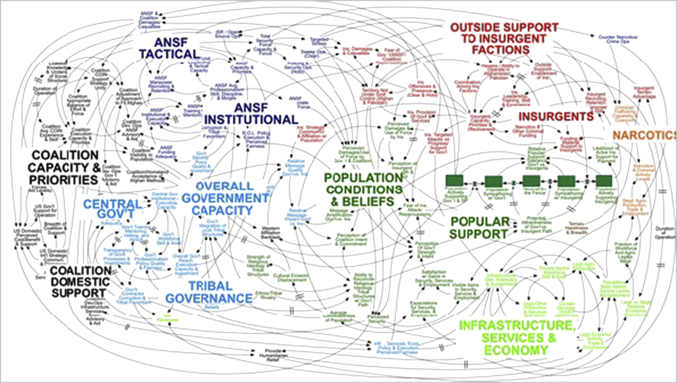
Figure 4.1 A vivid example of complexity in a slide (Bumiller, 2010).
Dr. John Medina, a developmental molecular biologist and author of Brain Rules, had this to say about how inefficient text is in a PowerPoint presentation:
Professionals everywhere need to know about the incredible inefficiency of text-based information and the incredible effects of images. Burn your current PowerPoint presentations and make new ones
Medina (n.d.).
A slide deck is not a document, at least not one in the traditional sense. As such, the rules of grammar don’t apply. Cutting text can be tough. It feels counterintuitive because it destroys the complete sentences we’re accustomed to writing. To many, the text-filled slides serve as a security blanket and script. They become too dependent on the slides. This dependency can be broken through time and effort spent planning, preparing, and practicing your presentation. At most, the slides should act as a hint or prompt. They should never be used as a teleprompter, with the content being read word for word.
Bullet points are terribly boring and should be avoided if at all possible. If you do decide to use bullets, use them sparingly. The best use of bullets is often as a summary of the key points at the end of the section or the presentation itself.
Modern presentation software includes a wide array of animation options. Every element on the slide can “come alive” in a seemingly limitless number of ways. Your text and images can “fly,” “swivel,” “zoom,” “bounce,” and “boomerang” into view. Just because you can, certainly doesn’t mean you should. If you decide to use animation, do so sparingly. To keep things consistent, limit the number of different types of animation. Pick one and stay with it. Avoid extreme animations and keep things subtle. Choose “fades” or dissolves over “boomerangs” and “bounces.”
Leverage the Power of Visuals
The picture superiority effect tells us that we should use images to “improve the recognition and recall of key information” (Lidwell, 2010). Use only high-quality graphics on each slide. Avoid using “cheesy” clip art and other cartoonish images (Reynolds, Design: Garr Reynolds, n.d.). You can take your own photos and screenshots or you can buy high-quality stock photos. Don’t try to stretch the images to fit the slide. Common graphic and image formats (such as .jpg, .png, and .gif) are classified as raster graphics. Raster images are pixel based and don’t resize well. When you try to resize a raster image by grabbing the side and stretching it, it becomes distorted.
Your slides will be most effective when the words and images work together. They should complement one another and support the same message or point. This sounds easy in theory but can be difficult to execute well, primarily because different people can interpret the same thing in different ways.
Use a Consistent Look and Feel
Your slide deck should have a consistent visual look and feel (i.e., theme) (Reynolds, Design: Garr Reynolds, n.d.). This visual theme consists of the fonts, background, colors, and layout. The presentation software you use likely comes with a large assortment of themes to choose from. While these default themes do provide the desired consistency, they also do little to help engage the jurors. The problem is that these templates are used over and over, to the point that the odds are that everyone has seen them. Using the “same old, same old” slide templates certainly isn’t going to help you keep the jury engaged.
So, what can you do? You can create your own from scratch or you can purchase professionally developed templates.
Use the Right Chart
When done properly, charts and graphs can provide a very effective means to communicate data.
Essentially, there are basically four types of charts and graphs used in presentations: pie charts, vertical bar graphs, horizontal bar graphs, and line charts. Pie charts are excellent for showing percentages. Vertical bar charts illustrate change in quantity over time. If you want to compare quantities, a horizontal bar chart is an effective choice. Lastly, a line chart is effective at showing trends.
A major trap to avoid when building a chart or graph is trying to convey too much detail or information. Charts and graphs loaded down with details can become almost unintelligible, essentially negating their value.
Use Color Appropriately
Color is another important element of good design. Color can improve engagement as well as evoke emotion. Learning to use color well can significantly improve your slide deck. Colors can be grouped into two broad categories: warm and cool. Warm colors are red, yellow, orange, or some combination of those three. In contrast, cool colors are blue, green, purple, or some of those combined.

While we’re on the topic of color, it’s a good point to mention backgrounds. The color you choose for your background is very important. It can have a huge impact on the legibility of your slides. In short, there needs to be a sufficient amount of contrast between the background and the elements you place on top of it. In venues with low light, it’s best to use a slide deck with a dark background. In courtrooms with better lighting, use a white background.
Limit the Number of Fonts
You shouldn’t use more than two different fonts in your slide deck; doing so helps keep the look and feel of your slides consistent. The type of fonts you choose can help or hurt the legibility of your text; therefore you must choose them wisely. Fonts can be classified as either serif or sans serif. A serif font is the small projections or flourishes at the ends of a letter. A sans serif font is one without those small projections (Fig. 4.2 and Table 4.1).
Generally, san serif fonts are the better choice for presentations. The reason being, the serifs can actually vanish because of the comparatively low resolution of most projectors. This is particularly true for those seated farthest away from the screen.
Conclusion
Fortunately, good slide design is a skill that can be learned. Good slide design starts with planning. Don’t fall into the trap of diving directly into the presentation software and building your slide deck “on the fly.” You should start by identifying the scope of testimony, the key pieces of evidence and artifacts, and the technical concepts that need to be explained.

Every effort should be made to simplify your slides and your testimony. This objective should never be the “dumbing down” of your presentation. The goal is and always should be to make your technical evidence accessible to the trier of fact, be it a judge or jury.
Visuals are an extremely powerful weapon in our arsenal that we can use to educate the jury. Research tells us that visuals increase recognition and recall.
Your slide deck should have a consistent look and feel from the first slide to the last. The consistent look and feel includes such elements as colors, fonts, layout, and animation.
Charts and graphs can be a fantastic way to convey and compare data. However, to actually leverage their power, it’s critical to use the right chart or graph for the data in question. One chart or graph does not fit all types of data or comparisons.
..................Content has been hidden....................
You can't read the all page of ebook, please click here login for view all page.