Chapter 12
Approaching Data Visualization
This chapter covers Objective 4.1 (Given a scenario, translate business requirements to form a report) of the CompTIA Data+ exam and includes the following topics:
 Data content
- Filtering
- Views
- Date range
- Frequency
- Audience to report
For more information on the official CompTIA Data+ exam topics, see the Introduction.
This chapter explores business reports and looks at report data content, filtering content according to the audience or persona, report views, the data range for a report, frequency of report generation/delivery, and the audiences for different reports.
Business Reports
In the past few years, business stakeholder insights have been driven primarily by PowerPoint presentations or PDF files. These were helpful as the right metrics could be visualized in very sophisticated PowerPoint presentations and later shared as PDF files. As data today is increasingly growing in volume, static reporting, such as presenting metrics in a PowerPoint, is no longer the best option as the stakeholders want to get the latest and greatest insights into business activities—sales, marketing, IT, supply chain, and more.
Business reports and dashboards can visualize data in real time, and specific metrics can be visualized to match the interest of the audience. The high-level objectives of data visualization are as follows:
 Data visualization makes it possible to show meaningful insights in a graphical way.
- Data visualization is an effective tool for communicating relevant, measurable information across an organization.
- Visualizations can be modified based on the business requirements (such as using line charts instead of bar charts).
Data visualization involves design, development, and application of information in a graphical manner. Data visualization makes it simpler to understand business events, trends, patterns, and insights into key decisions. Visualizations in reports and dashboards move away from the noise generated by gigabytes of data and make it simple to understand information using charts, graphs, and pictures.
Chapter 13, “Exploring the Different Types of Reports and Dashboards,” as well as Chapter 14, “Data-Driven Decision Making: Leveraging Charts, Graphs, and Reports,” build on this chapter and further explore how reports and dashboards ensure that stakeholders are getting the insights they want in an easy-to-consume and intuitive manner.
Note
This chapter is contextualized to an organization driving business insights based on sales reporting and dashboards. All the examples in this chapter refer to a sales context.
Report Content
A business report can be broadly categorized as a formal report or an informal report, depending on the content as well as the audience. A formal report contains far more detail on findings and observations than an informal report, which might just summarize the findings for an at-a-glance read.
Let’s consider an example of a formal report. Say that you have a quarterly sales forecast report that looks at the performance of the sales team and provides insights into how the products or solutions are doing in the market. Figure 12.1 gives insights about this report.
Note
The report shown in Figure 12.1 is available at https://public.tableau.com/app/profile/tableau.for.sales.analytics/viz/SalesForecastDashboard_2/QuarterlyForecastDashboard.
As you can see, this dashboard has various textual and graphical sections that give insights about:
- The current state of the business
- Business forecasts based on prior results
- The existing transactional or nontransactional pipeline
- Deals that will grow in size

Figure 12.1 Quarterly Sales Forecast Formal Report
A report can be broadly categorized as an analytical report or an informational report, based on the content. An analytical report offers analysis on a topic and may also offer recommendations. An informational report provides factual information.
Figure 12.1 shows an analytical report for a sales leader that acts as an analytical tool displaying past, present, and future data to efficiently track and optimize the sales performance of the organization. An example of an informational report would be an IT asset report that outlines the types of assets in the inventory.
For the content of a report, the following key aspects should be considered:
- The most important factors are the business problem being solved and the audience. Unless the business problem is well defined and the type of audience (such as CXO, executives, IT managers, or engineers) is well known, the report is not going to be useful to any stakeholders.
- Next, it’s important to consider the sources of data that will be leveraged to generate the report. Some sources might be flat files, enterprise resource planning (ERP) data, customer relationship management (CRM) data, social media data, and marketing campaigns.
Note
The data in a report could be from various sources and would be used for strategic decision-making, operational, or information purposes.
- Another important aspect of reports is to visualize the right key performance indicators (KPIs). Choosing KPIs that align well with specific organizational goals helps in measuring organizational progress accurately, and it also helps in spotting trends that are useful for streamlining processes. For example, sales reports would focus on sales volume and number of new sales as KPIs, whereas IT reports would focus on number of cases resolved and customer satisfaction as KPIs.
- Report contents should be actionable; that is, they should give stakeholders greater insights and lead them to clear next steps. Actionable reports enable a progressive data-driven business environment.
- A good report should have a clear and crisp story with a clear narrative for stakeholders to drive decision making. Creating a dashboard makes more sense than generating a static report as all the pertinent information is presented on a single screen. Moreover, a dashboard allows stakeholders to interact with graphs and charts. (Chapter 13 provides more information about dashboards.)
Note
There’s much more to a report than just its content. It is important to consider colors, fonts, styles, placement of graphs, and other factors that are discussed in Chapter 13.
Filters
The word filter typically implies something that isolates unwanted information (or noise) from desired information. This also applies to filters in a report (or dashboard). Filters in a report can be very useful for showing only the data of interest and filtering out the irrelevant information. They can be used to ensure that stakeholders are looking at data that’s relevant to them rather than looking at things that might be irrelevant and distracting.
Note
Remember that reports and dashboards are useful only when the audience derives value—that is, facts, analytics, next steps, and recommendations—from them.
Let’s consider an example. Figure 12.2 shows a sales pipeline dashboard that includes the various sales stages, deal sizes, and representative progress, among other data. Let’s focus on the filters available in the top right and the stage data per the representative.
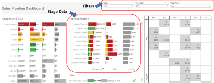
Figure 12.2 Sales Pipeline Dashboard
Note
The sales dashboard example shown in Figure 12.2 was taken from https://public.tableau.com/app/profile/tableau.for.sales.analytics/viz/SalesPipelineDashbaord/PipelineDash.
Given that the sales manager is only keen to look at the deal data by representative, where the stage is either select or commit, let’s choose those filters. After selecting these filters, the dashboard looks as shown in Figure 12.3.

Figure 12.3 Sales Pipeline Dashboard: Filters and Focus Insights
As you can see, the filters enable the sales manager to focus only on the data of interest. This helps the manager focus on key findings and on what’s happening right now as well as what performance is expected from each sales representative.
The filters available in reports or dashboards depend on the reporting or dashboarding (or business intelligence [BI]) applications being used. Most applications allow basic or advanced filtering—for example, choosing all filters or just some filters or using keywords such as contains, starts with, or is. It is common to use date filters where the date range can be defined as the preceding and next dates within which values can be filtered. For example, in Salesforce reports, you can set relative date values by using the following filters:
Date equal to THIS YEAR
Date less or equal to TODAY
In addition, range filters can be used to filter attached values, such as to filter deals between a value of $10,000 and a value of $50,000.
Views
When you’re out in nature, traveling places with family, views are what you’re looking for. However, your definition of a view that’s beautiful might differ from your family members’ definitions, depending on their interest. Everyone may have a unique perspective on what they want to see and explore. This is similar to how different people feel about views in reports.
ExamAlert
Views are an important topic and CompTIA Data+ may have questions on views.
In the context of a report or a dashboard, a view is something that you create to show data aspects pertinent to a topic of interest that you or your audience are keen to explore. A database view is a stored query that can help pull in data from tables as well as other views. A database view represents part of the database but does not actually store any data.
Views can be helpful in the following ways:
- A view can contain only a subset of the data that is of relevance to the audience to prevent users from having them mine through tons of information. Different views allow stakeholders to understand the data and derive conclusions faster. For example, a sales manager view may contain more high-level information than a sales person view that contains detailed information.
- Views are helpful for abstracting information that it is not to be shared. For example, a sales manager might not want to distribute all information to everyone and can create views that limit access to the information for different teams. You can also create views by geography, and you can allow or disallow specific roles to specific views.
In Tableau, for example, you can create views as custom private or public, and the custom private views are hidden from everyone except the people they are shared with. When using an online report or dashboard, a sales manager can create multiple custom views and share only the relevant views with her team. As an example, Figure 12.4 shows a variety of views and the type of data the sales manager is abstracting vs. sharing with others.

Figure 12.4 Sales Report: Views
Date Range
Say that it’s the end of the quarter, and you are a sales manager, trying to put together information on the performance of your team for the quarter. You have the data from the past few quarters and would like to work with data across just last quarter. To get the relevant information, you need to filter the data by date range or specified time frame, as was discussed earlier in this chapter.
Note
If a report was generated some time ago, the data shown in the report may be out of date. It is ideal to refresh such reports.
When working with dates, you can work with the following elements:
- Calendar year: You can get information on the whole year, January to December.
- Month: You can get insights for a whole month.
- Week: You can get insights for a whole week.
- Day: You can get insights on per-day basis.
All BI platforms make it possible to show data by date ranges to get pertinent insights. For example, as shown in Figure 12.5, you can set up date ranges by using filters in Power BI.

Figure 12.5 Date Range Filter in Power BI
Note
The sample dashboard shown in Figure 12.5 is available at https://docs.microsoft.com/en-us/power-bi/create-reports/sample-datasets#sales--returns-sample-pbix-file.
You can apply a much more granular filter by editing the report and adding a calendar filter for better insights by quarter and month, as shown in Figure 12.6.
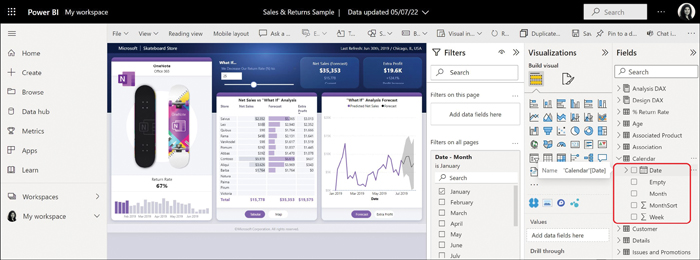
Figure 12.6 Calendar Filter
By applying the calendar filter, the sales manager can see the results by quarter and month, as shown in Figure 12.7.

Figure 12.7 Insights for Sales Across Date Ranges
Frequenc
Frequency can be categorized in two ways:
- Reporting frequency (or frequency of report generation/delivery)
- Frequency of data updates in reports
These two categories, while independent, are related. Let’s look more closely.
It is crucial that reports be delivered to the intended audience within a certain timeframe so that the end users can make informed decisions. For example, a sales report that doesn’t reach management by the time their review meeting occurs is not useful as it does not serve the intended purpose. Hence, the timing of a report as well as the frequency at which it should be generated is important. Understanding when the audience requires a report and how often it needs the report would help remove any ambiguity from the report generation process.
It is also important to consider the channel(s) via which the report will be delivered, such as by email, IM, Slack, or any other medium that your organization may use (see Chapter 13). You can have the recipients subscribe to reports or create an email alias for all recipients and mail them the reports every day or week, as appropriate.
How do you know how often a report should be refreshed? The simple answer is to match the refresh frequency of the data source(s) so that as soon as the data is refreshed at the source, you refresh the report with updated data. It’s a good idea to send out updated reports to the intended recipients right away so the users don’t rely on obsolete reports.
You can set the refresh frequency to hourly (which is recommended for sales data), daily (which is recommended for transactional data), weekly, or monthly. Figure 12.8 shows the refresh frequency settings in Tableau.
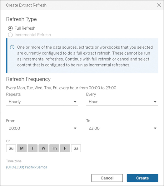
Figure 12.8 Tableau Refresh Frequency
Audience for Reports
Reports can be brief or verbose, depending on the audience. It is important to think about who your audience is and focus on how to cater to the target audience. Here are some questions that might be helpful:
- Who is the key audience that you would want to read the report?
- What might be the key reasons users would have for reading the report?
- What topics and key findings would be of interest to the audience?
- Will the audience be able to understand all sections in the report or key findings in the dashboard?
- What are the key takeaways from the report for the audience?
Once the basics are out of the way, you can start looking at audience types. You can possibly categorize audiences in three major categories:
- Primary audience: Also known as the target audience, the primary audience consists of people who would want to read the report. Your primary audience should ideally understand everything that the report articulates about the subject matter. For example, for sales leaders, the report would revolve around targets, quotas, achievement, performance, new business, growth business, and so on. However, for IT leadership, the report would be focused on current software and hardware management, issue resolution, new deployments, workload migration activities, and so on.
- Secondary audience: The secondary audience consists of people who would want to read the report but who might not have direct alignment with the report and may work in a different line of business than the primary audience. For example, marketing might be the secondary audience for a sales report because they would not have a direct connection with sales data but would be expected to work with sales teams on lead generation and marketing campaigns.
- Tertiary audience: The tertiary audience consists of people who do not have any direct relationship with a report but who are indirectly impacted or benefitted by the report content. They might not even read the report and may be informed by the primary or secondary audience about decisions based on findings in the report. For example, administrative staff might be asked to set up meetings or arrange events based on instructions from the primary (sales management) or secondary (marketing team) audience.
Various audience personas fit into these audience categories and are benefitted by a report. Here are the key audience personas:
Note
Many of these audience personas and their reporting requirements are described in detail in Chapter 13.
- Executives: Executives are primary audience members, and a report for them should focus on high-level information rather than drilling down into details. Executives appreciate summary information about the organization’s performance and what actions help uplift growth or customer base. An executive report can just be a one-pager with all facts and recommendations in a minimal space.
- Leadership: Leadership is part of the primary audience. Leadership reports are meant for directors, vice presidents, CIOs, and anyone else who is a layer between executives and managers. These leaders need more detailed insights into organizational activities than do executives. They need insights into what will help with growth in acquiring new customers and the projection of business performance.
- Managers: Managers are the people who are managing lines of business; they look at business performance and need much more detailed insights than do executives and leadership; they need details, for example, on employee productivity, customer satisfaction, and inventory. Managers are usually part of the primary audience in an organization.
- IT/operations: These are the folks who manage the information technology (IT) systems and operations. They are very hands-on, interacting with systems and internal employees of the organization who use these systems. For reporting, they are good candidates for very detailed reporting that outlines the issues, new technology being deployed, new software, licenses, cloud consumption, and so on. IT/operations teams are part of the primary audience.
- Developers: Developers are an interesting audience as they are only interested in details pertinent to the applications they have launched or are going to launch. These details might focus on the number of connections, scaling out/in, resource consumption, customer profiles leveraging the application, and so on. Developers can be part of the primary or secondary audience, depending on the type of organization.
- Data engineers/scientists: Data engineers and data scientists are very keen on looking at results from data crunching and making sense of what is working well for their analysis, charts and graphs, and equations. Data engineers/scientists are usually the primary audience in a data-driven organization.
- Marketing: The marketing team is usually a secondary audience that uses organizational reports to direct the marketing function in driving sales or business generation activities.
- Administrative: The administrative teams are typically part of the tertiary audience and may be engaged, for example, to set up follow-ups to meetings or to arrange meetings with key organizational leaders to drive initiatives.
More details on report content and presentation of the content to various audiences are provided in Chapters 13 and 14.
A report can be shared with distribution lists across an organization for maximum reach. If there are existing distribution lists, a link to a dashboard or report can be shared on these lists; alternatively, a report summary (such as for executives) can be shared directly as a PDF over a distribution list. If a distribution list does not exist, the IT team can create one specifically either for the audience persona (executives, marketing, administration, and so on) or for business units, as needed.
What Next?
If you want more practice on this chapter’s exam objective before you move on, remember that you can access all of the Cram Quiz questions on the Pearson Test Prep software online. You can also create a custom exam by objective with the Online Practice Test. Note any objective you struggle with and go to that objective’s material in this chapter.