12. Exporting Charts for Use Outside of Excel
Presenting Excel Charts in PowerPoint or Word
Although Excel is a great place for you to create charts, you might need to share charts with others, either in PowerPoint, as Word documents, as web pages, as PDF documents, or simply as graphic files.
Excel 2010, Word 2010, and PowerPoint 2010 share the same charting engines. This makes it possible to copy and paste charts from one application to the other without the unpredictability that often happened when moving charts from Excel 2003 to PowerPoint 2003.
There is a dizzying array of options for how to paste the chart in PowerPoint or Word. Each option offers different advantages and potential disadvantages.
The new Paste Options menu works appears in PowerPoint 2010 and Word 2010 offering five paste alternatives in addition to the regular paste. Paste Special offers nine more choices bringing the total paste choices to fifteen. Further, some of those 15 choices behave differently if you are saving to a document that will be saved in compatibility mode.
When you are trying to decide which paste method to use, consider some of the questions listed below.
Do you want the PowerPoint or Word chart to respond to data changes in the Excel file?
If this is important to you, then use Paste, Paste Special, Paste Link, Microsoft Excel Chart Object. Every time that you open the PowerPoint presentation, you will be given the opportunity to update the charts with data from the source Excel file.
If you want to have the ability to refresh the chart to get new data, then select the default Paste option.
The chart will keep the data at the time of the paste, but you have the ability to use Chart Tools Design, Refresh to retrieve the current data from Excel.
If you absolutely do not want the chart in PowerPoint to change when the underlying data changes, you can use one of the Embed options from the Paste Options menu or Paste as Picture.
Do you love the formatting in Excel or do you want the chart to take on the look and feel of the Word or PowerPoint document?
A default paste will allow your chart to change in response to theme changes in the PowerPoint or Word document. This is probably the best choice, as the chart will look like it is part of the other document.
However, you might really want to keep those custom colors that you lovingly created in Excel. In those cases, you will want to use the K or F choices in the Paste Options menu. K will Keep Source Formatting and Embed Workbook. F will keep Source Formatting and Link Workbook.
If you really want the PowerPoint chart to keep up with formatting changes in the Excel chart, the only option is to select Paste, Paste Special, Paste Link, Microsoft Excel Chart Object. With this option, you will not have the ability to edit the chart in PowerPoint or Word. Your only choice is to update the link. This is the only option that will bring formatting changes from Excel to the Word or PowerPoint document.
Will the PowerPoint file and the Excel file stay in the same locations?
Say that you are creating a PowerPoint presentation. When you are making the presentation, will PowerPoint still have access to your Excel file? Alternatively, are you sending the PowerPoint presentation to your boss who will be presenting from another computer?
If the PowerPoint presentation has access to the original Excel file, all of your options are available and can be used.
But, if the PowerPoint file will be used on a different computer, you might want to consider choosing the K or H options from the Paste Options menu. These choices will embed the entire workbook in the PowerPoint presentation.
As you can imagine, there are disadvantages to this, including the following:
• The PowerPoint file size increases by the size of the Excel file.
• There are privacy concerns. Even if your chart is based on one tiny 40-cell range on Sheet1, your boss can double-click the chart and access all of the data anywhere in the workbook.
• When you embed the workbook, any changes made to the original workbook will not update the chart.
If you are concerned about privacy and the workbook contains sensitive data, then you should paste the chart as a picture or as a screen clipping. This will get a snapshot of the current chart but the person using the PowerPoint or Word document will not be able to see any other data in the workbook.
In addition, if you are concerned about privacy and you want the chart to keep the formatting of the target PowerPoint document, you should consider re-creating the chart in PowerPoint.
Do you want to have access to the Office 2010 charting tools in the target document?
When you use Paste as Picture or Paste as Link, you will lose the ability to edit and format the chart in Word or PowerPoint. Well, if you paste as picture, you do have access to the Picture Tools Format tab, so you can add a fancy border. You will not have access to the Charting Tools Format, Layout, and Design tabs.
The following sections compare the various methods for getting a chart from Excel to PowerPoint.
Copying a Document from Excel and Pasting to PowerPoint Sets Up an As-Needed Link
Copying a chart as a live chart linked to the original workbook is the easiest method of getting a chart from Excel to PowerPoint. You basically just copy the chart from Excel and paste it to PowerPoint.
With this method, you have full access to all the Charting Tools tabs in PowerPoint. You can customize the chart to match the theme of the PowerPoint presentation, and you can choose new layouts, styles, and so on.
The data remains linked to the original workbook. If you change the workbook and later open the PowerPoint presentation, the chart reflects the new numbers from the Excel workbook.
NOTE
This feature works only if the PowerPoint presentation still has access to the original Excel file. Otherwise, PowerPoint shows a static version of the last-known numbers in the chart.
The simplest method is to copy the chart from Excel and Paste the chart into PowerPoint. Excel then sets up what I will call a weak link between the presentation and the Excel workbook.
This method has the following pros and cons:
Pro: If you want to change the formatting of the chart in PowerPoint, you have full access to the charting tabs.
Pro: By default, the chart will respond to changes in the theme of the PowerPoint presentation. You will have a chart that has the same look and feel of the rest of the presentation.
Con: By default, you will lose your original colors from the Excel chart. To overcome this, use the F option from the Paste Options menu – Keep Source Formatting and Link Data.
Con: Any subsequent changes to the formatting of the Excel chart will never appear in the PowerPoint chart. You can force PowerPoint to get data changes, but you will never get the formatting changes. To overcome this problem, see Setting up a Link, below.
Con: This method does not work perfectly with documents stored in compatibility mode. Changes to the theme will not affect the linked chart.
Pro: The PowerPoint file size remains small. Excel does not embed the entire workbook in the PowerPoint file.
Pro: You have icons on the Charting Tools Design tab to either refresh the data or edit the data. Provided that the original Excel file is still available in the original folder, the workbook is opened and current data is used to redraw the chart. If the Excel workbook has been moved or renamed, you can use the File, Information, Related Files to change the linked location.
Con: If the original workbook is not available, you cannot refresh data in the chart. However, this only becomes an issue if someone clicks on the Refresh icon in the Charting Tools Design tab. If you are doing a presentation and stay away from that icon, you will successfully present using a cached version of the Excel chart.
Pro: Although there is a link between the PowerPoint document and the Excel workbook, you will not be nagged with Information Bar warnings that there are links in the document.
Neutral: If data in the underlying Excel workbook changes, the new data will not automatically appear in the PowerPoint presentation. You have to explicitly click Charting Tools Design, Refresh Data.
To copy the chart, you follow these steps:
- Open both PowerPoint and Excel.
- In Excel, select the chart.
- Press Ctrl+C or click the Copy icon on the Home tab.
- Switch to PowerPoint by pressing Alt+Tab.
- Paste by pressing Ctrl+V or clicking the Paste icon on the Home tab to perform a default paste.
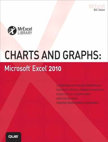
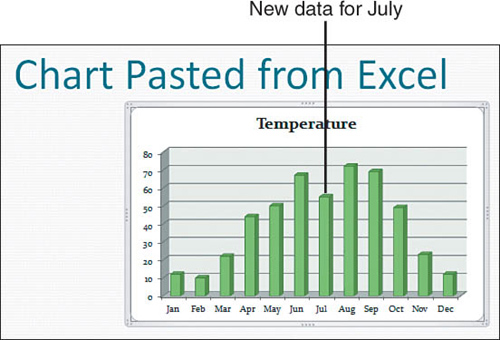
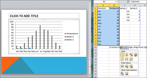
The chart fills the text area of the slide. The data stays the same, but the theme colors and effects are changed to reflect the active theme in the destination slide show. The Chart Tools ribbon icons are available, as shown in Figure 12.1.
By using the default paste, you have set up a weak link between the Excel workbook and the PowerPoint slide. With this link, you have the best of both worlds; you can keep the original data in the PowerPoint chart, or you can get new data from Excel.
Figure 12.1 Copying and pasting is the simplest method for getting a chart from Excel to PowerPoint.
To illustrate, consider this example:
1. Close the PowerPoint presentation.
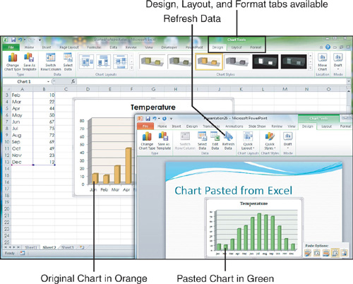
2. In the Excel workbook, change the data in the chart. In Figure 12.2, the temperature for July has been adjusted to 55 degrees.
3. In the Excel workbook, use Page Layout, Theme to choose a new theme.
4. In the Excel workbook, change some other aspect of the chart, such as varying the colors by point (see Figure 12.2).
5. Save the Excel workbook.
Figure 12.2 Change the chart in Excel.
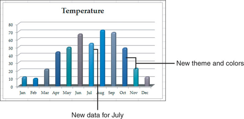
7. Open the PowerPoint presentation. No warning appears in the information bar that a link is present. You are not asked to update the links. The original chart is presented with the original data (see Figure 12.3). Even though a link appears, you can run the slide show without ever needing the original Excel file.
Figure 12.3 The chart appears with the original data.
8. Click the chart in PowerPoint. The Chart Tools tabs appear.
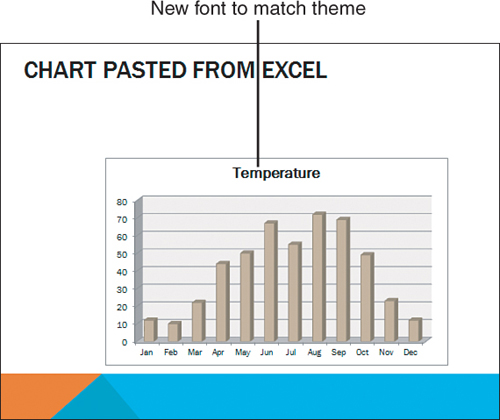
9. On the Chart Tools Design tab, select Refresh Data. As shown in Figure 12.4, the chart is updated to show the lower temperature for July. While the data is updated, none of the other formatting changes appear in the chart. The chart is still green and the colors of the columns do not vary by point.
Figure 12.4 Use Refresh Data to bring in new data from Excel without changing the formatting.
10. In PowerPoint, choose a new theme from the Design tab. The colors, fonts, and effects used in the chart are updated to match the theme in PowerPoint (see Figure 12.5).
Figure 12.5 The chart has data from Excel but matches the theme from PowerPoint.
As you can see, the default is pretty cool: You have the ability to get new data from Excel, but the formatting will match the destination PowerPoint presentation.
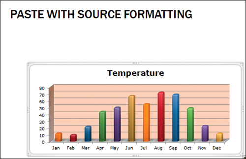
Copying and Pasting While Keeping Original Formatting
The previous method set up a link to the data stored in the Excel workbook. However, all of the colors and effects used in the original chart were lost when you pasted to PowerPoint or Word.
There are times where you might want to keep the colors from the original workbook. The Paste Options menu offers the F shortcut – to Keep Source Formatting and Link Data.
Like the previous method, you still have the ability to keep the original data or to refresh the chart and get the new data.
Unlike the previous method, the original colors and effects stay with the chart in PowerPoint. The chart will not respond to Theme changes in PowerPoint.
You still have access to Chart Tools tabs in PowerPoint to change the colors in the chart.
TIP
You will be surprised to learn that like the previous method, refreshing the chart does not bring over any formatting changes that happened in the original workbook.
To copy the chart while keeping the original formatting, you follow these steps:
- Open both PowerPoint and Excel.
- In Excel, select the chart.
- Press Ctrl+C or click the Copy icon on the Home tab.
- Switch to PowerPoint by pressing Alt+Tab.
- Open the Paste drop-down on the Home tab. Select the third icon for Keep Source Formatting and Link Data (F). The chart will be pasted with the original formatting.
TIP
Alternatively, for step 5, you can press Ctrl+V, then Ctrl alone, then the letter F (see Figure 12.6).
Figure 12.6 Set up a refreshable link to the data, but keep the formatting at the time of the paste.
CAUTION
The source formatting options will copy the chart formatting at the time of the paste. If you later change formatting in the Excel file, those formatting changes will never show up in the PowerPoint version of the chart. If you need the PowerPoint chart to show formatting changes made in Excel, then you should use the steps in Pasting as a Link to Capture Future Excel Formatting Changes.
Pasting as Link to Capture Future Excel Formatting Changes
The default methods for pasting in Excel do not set up a link to the current formatting in the Excel workbook. If you want to be able to change formatting in Excel and have those formats carry through to PowerPoint or Word, you will want to use Paste Special and set up a Paste Link.
This method has the following pros and cons:
Con: You need to have access to the Excel file if you want to show the current formatting.
Con: You will be nagged about updating links every time you open the PowerPoint file.
Pro: This method works with files stored in compatibility mode.
Pro: Formatting changes to the original Excel file show up in the PowerPoint file.
Con: If you change the theme in the PowerPoint presentation, the formatting of the linked chart will not change.
To set up a linked chart, follow these steps:
- Open both PowerPoint and Excel.
- In Excel, select the chart.
- Press Ctrl+C or click the Copy icon on the Home tab.
- Switch to PowerPoint by pressing Alt+Tab.
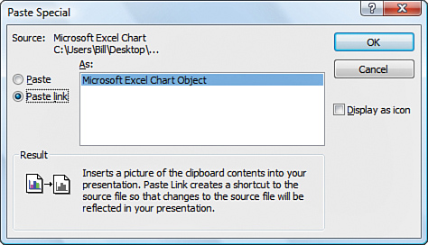
- On the Home tab, open the Paste drop-down. Select Paste Special. PowerPoint displays the Paste Special dialog.
- On the left side of the dialog, select Paste Link. You now have only one option; Microsoft Excel Chart Object (see Figure 12.7). Click OK.
A copy of the original chart appears in PowerPoint. You do not have access to the Chart Tools, but you do have access to the Drawing Tools Format tab. You can use this tab to add a border around the chart.
The link set up with this option is the strongest link of any in this chapter. You can switch to Excel, change some data, and change some formatting. When you switch back to PowerPoint, the data and formatting changes will appear in the chart.
TIP
If you make changes to the Excel file while the PowerPoint workbook is closed, you will be prompted to update the links when you later open the PowerPoint presentation.
Figure 12.7 Bypass the Paste Options menu and go to Paste Special to set up the only link that can capture future formatting changes to the Excel chart.
Copying a Chart as a Live Chart Linked to a Copy of the Original Workbook
The problem with a straight copy and paste is that the PowerPoint slide and the original Excel workbook must remain on the same computer to maintain the link. If you plan to distribute the PowerPoint file to others, you can copy the chart along with the entire workbook.
To copy the chart, you follow these steps:
- Open both PowerPoint and Excel.
- In Excel, click the chart.
- Press Ctrl+C or click the Copy icon on the Home tab.
- Switch to PowerPoint by pressing Alt+Tab.
- Paste by pressing Ctrl+V.
- An icon appears at the lower-right corner of the pasted chart. Hover over the icon, and a drop-down arrow appears. Choose either the first icon for Keep Source Formatting and Embed Workbook or the second icon for Use Destination Theme and Embed Workbook.
One advantage of this method is that you can send the PowerPoint presentation to any recipient whose computer has Office 2007. The recipient can right-click the chart, select Edit, and see the entire Excel workbook. If that person makes changes to the assumptions in the workbook, the chart updates. The recipient also has full access to the Charting Tools tabs in PowerPoint.
However, the main advantage of this method is also a disadvantage. Even though you paste a single chart, Office 2010 embeds the entire workbook. This can create privacy concerns if the workbook contains sensitive data on other worksheets or file size concerns if you have millions of cells on other worksheets in the workbook.
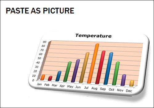
Copying a Chart as a Picture
You can paste a picture of a chart in a PowerPoint slide. The picture is initially the same size as the chart in the Excel worksheet. Instead of having access to the Charting Tools tab, you only have access to the Picture Tools tab. The Picture Tools tab might allow you to change the chart to grayscale or a monochrome color, but you do not have access to the rich chart formatting tools.
To paste a chart as a picture, you copy the chart in Excel. On the PowerPoint slide, you can perform either of the following tasks:
• Press Ctrl+V to paste the chart. Press Ctrl again to open the Paste Options menu. Select the final icon to Paste as Picture.
• Select the drop-down arrow on the Paste icon in the PowerPoint Home tab. Select Paste Special and then those to paste the picture as PNG, GIF, JPEG, bitmap, Enhanced Metafile, or Windows Metafile.
• Show the Excel chart in Excel. Switch to PowerPoint. Use Insert, Screen Clipping and draw a rectangle around your chart in Excel.
The Paste Special dialog is shown in Figure 12.8.
After the chart is pasted as a picture, you can use any of the settings on the Picture Tools Format tab to apply a frame, bevel, shadow, or reflection to the chart. Figure 12.9 shows a bevel, a shadow, and a bit of perspective angle.
Figure 12.8 You can choose a picture format in the Paste Special dialog.
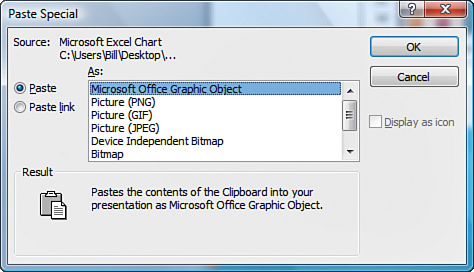
Figure 12.9 The picture formatting tools offer interesting possibilities but do not have the flexibility of the charting tools.
Creating a Chart in PowerPoint and Copying Data from Excel
Creating a chart in PowerPoint and copying data from Excel may seem to be the most tedious method, but it has the advantage of getting a completely editable chart into PowerPoint without the need to copy an entire workbook into the PowerPoint file.
You follow these steps to create the chart:
1. In PowerPoint, select New Slide from the Home tab. A new slide appears, with six icons in the center of the slide (see Figure 12.10).
2. Click the Chart icon in the center of the slide.
3. Choose a chart type and click OK. You see your PowerPoint slide on the left and a new Excel worksheet on the right. The worksheet is called Chart in Microsoft Office PowerPoint - Microsoft Excel (see Figure 12.11).
4. Click the original Excel workbook in the taskbar.
5. Highlight your source data and press Ctrl+C to copy it to the Clipboard.
6. Click the new workbook in the taskbar. Click in cell A1 and press Ctrl+V to paste the data. Your data will probably cover a smaller or larger range of data than the default dataset. If your dataset is smaller, remnants of the default dataset will appear outside your paste area, as shown in Figure 12.12.
Figure 12.10 When you insert a new slide in PowerPoint, six icons appear in the center of the slide.
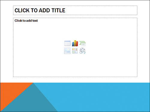
Figure 12.11 PowerPoint creates a new workbook with default data.
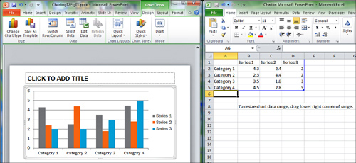
Figure 12.12 You paste your data over the default data.
7. A blue outline appears around A1:D13. Grab the blue handle in the corner of Cell D13 and drag the handle to match the size of your pasted data.
8. Click the maximize button in the title bar of the PowerPoint application to return to PowerPoint.
You’ve now created a new chart in PowerPoint. The chart can be edited using the Chart Tools tabs. You’ve also minimized the size of the Excel data that must travel with the PowerPoint file.
Presenting Charts on the Web
You can export a chart to appear on a Web page. This technique is one way to make a PNG version of your chart.
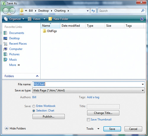
You follow these steps to create an HTML page with a chart:
- Save your Excel file as an Excel file.
- If your chart is embedded on a worksheet, click the chart. On the Design tab, select Move Chart. Choose to move the chart to a new sheet.
- Click the File menu to open the backstage view. Click Save As.
- In the Save As dialog that appears, select Web Page (*.htm; *.html) from the Save As Type drop-down.
- At the bottom of the Save As dialog, change Entire Workbook to Chart.
- Specify a filename, such as
MyChart.html. - Click Save. Excel displays the Publish as Web Page dialog, as shown in Figure 12.13. Click Publish.
Figure 12.13 Save the chart as HTML.
If you browse to the selected path, you will find your HTML file and also a new folder. In the preceding example, the folder would be called MyChart_files. This folder contains a PNG version of your chart.
Exporting Charts to Graphics
The steps in the preceding section are a convoluted way of creating a PNG version of a chart. If you don’t mind typing a bit of VBA code, you can export the active chart quickly.
Using VBA to Export Charts as Images
VBA is the macro language behind Excel. Although Chapter 13, “Using Excel VBA to Create Charts,” takes a more in-depth look at VBA, this section takes a quick peek into using VBA to convert charts to graphics files.
If you want to display the VBA Editor, try pressing Alt+F11.
NOTE
A few modern keyboards have repurposed the Function keys for other purposes, so Alt+F11 might not work for you.
If Alt+F11 doesn’t get you to the VBA editor, you need to display the Developer tab in the Ribbon. If this tab is not on your computer, select the File menu to open the backstage view. Select Options from the left navigation. In the Excel Options dialog, select Customize Ribbon from the left navigation. In the right list box, select the Developer box. When the Developer tab is available, you can display the Visual Basic Editor using the Visual Basic icon on the Developer tab.
- Switch to Excel.
- Select a chart.
- Switch back to Visual Basic.
- Press Ctrl+G to display the Immediate window.
- Type the following line of code and then press
Enter:ActiveChart.Export “C:MyChart.JPG”, “JPG”.
Of course, you can specify any path and filename instead of the name shown in the preceding code snippet. The file type can be GIF, JPG, or any other graphics filter installed on your computer’s copy of Office.
Using Snag-It or Office 2010 Screen Clipping to Capture Charts
Screen capture tools such as Snag-It from Camtasia and the Insert Screen Clipping feature of Microsoft Office 2010 allow you to capture a specific region of the screen.
Snag-It allows you to specify an output file type of BMP, GIF, JPG, PCX, PNG, TGA, or TIF. You can also specify a higher resolution, suitable for printing using Snag-It.
The new Insert Screen Clipping feature in Office 2010 makes it easy to capture a region of a screen as a graphic in another application.
To grab a screen clipping using the Office 2010 Screen Clipping feature, follow these steps:
- Open both Excel and PowerPoint or Word or OneNote.
- In PowerPoint, navigate to the slide where you want the screen clipping to appear.
- Switch to Excel. Make sure that the chart is visible in the screen. The screen clipping feature will grab from the most recent “other” application, so you want to make sure the chart is on the active worksheet of the Excel application immediately before switching back to PowerPoint.
- Switch to PowerPoint. On the Insert tab, click the Screenshot drop-down. Ignore the thumbnails of the open applications and instead select the Screen Clipping menu item.
- You should see a grayed-out version of the Excel window take up your whole screen. Using your mouse, draw a rectangle around the chart. When you release the mouse, you will switch back to PowerPoint and the chart will be inserted as a picture.
![]() To see a demo of the screen clipping tool, search for “MrExcel Charts 12” at YouTube.
To see a demo of the screen clipping tool, search for “MrExcel Charts 12” at YouTube.
Converting to XPS or PDF
PDF is the ubiquitous Portable Document Format from Adobe. XML Paper Specification (XPS) is the newer open-source competitor from Microsoft.
To save a chart as a PDF file, follow these steps:
- Select a chart in Excel.
- Select the File menu to open Backstage View.
- In the left navigation, select Share.
- In the left panel of the Share Backstage View, select Create PDF/XPS Document.
- In the right panel of the Backstage View, select Create a PDF/XPS.
- In the Publish and PDF or XPS dialog, select PDF from the Save As Type list box.
- Specify a filename.
- Click Publish. The selected chart will be created as a single-page PDF file.
Next Steps
In Chapter 13, you will learn how to use VBA macros to automate the creation and formatting of charts. VBA is a macro language that has been in Excel for over a decade; you can use it to automate repetitive tasks.