
3. Creating Charts That Show Trends
Choosing a Chart Type
You have two excellent choices when creating charts that show the progress of some value over time. Because Western cultures are used to seeing time progress from left to right, you are likely to choose a chart where the axis moves from left to right—whether it is a column chart, line chart, or area chart.
NOTE
The new Sparklines feature is another way to show trends with tiny charts. See Chapter 9, “Using Sparklines, Data Visualizations, and Other Nonchart Methods.”
Column Charts for Up to 12 Time Periods
If you have only a few data points, you can use a column chart because they work well for 4 quarters or 12 months. Within the column chart category, you can choose between 2-D and 3-D styles. To highlight one component of a sales trend, you can use a stacked column chart.
NOTE
This book recommends not using pyramid charts or cone charts because they distort your message. For an example, see the “Lying with Shrinking Charts” section in Chapter 14, “Knowing When Someone Is Lying to You With a Chart.”
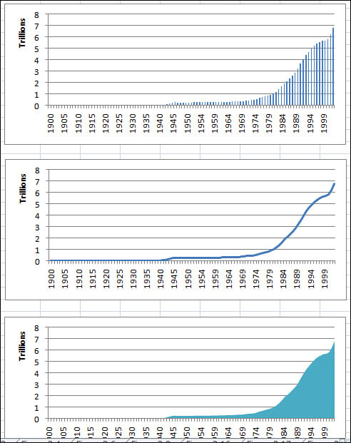
Line Charts for Time Series Beyond 12 Periods
When you get beyond 12 data points, you should switch to a line chart, which can easily show trends for hundreds of periods. Line charts can be designed to show only the data points as markers or data points can be connected with a straight or smoothed line.
Figure 3.1 shows a chart with only nine data points, which that a column chart is meaningful. Figure 3.2 shows a chart of 100+ data points. With this detail, you should switch to a line chart in order to show the trend.
Figure 3.1 With 12 or fewer data points, column charts are viable and informative.
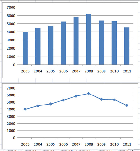
Figure 3.2 When you go beyond 12 data points, it is best to switch to a line chart without individual data points. The middle chart in this figure shows the same dataset as a line chart.
Area Charts to Highlight One Portion of the Line
An area chart is a line chart where the area under the line is filled with a shading or color. This can be appropriate if you want to highlight a particular portion of the time series. If you have fewer data points, adding drop lines can help the reader determine the actual value for each time period.
High-Low-Close Charts for Stock Market Data
If you are plotting stock market data, use stock charts to show the trend of stock data over time. You can also use high-low-close charts to show the trend of data that might occur in a range such as when you need to track a range of quality rankings for each day.
Bar Charts for Series with Long Category Labels
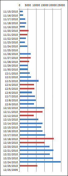
Even though bar charts can be used to show time trends, they can be confusing because readers expect time to be represented from left to right. In rare cases, you might use a bar chart to show a time trend. For example, if you have 40 or 50 points that have long category labels that you need to print legibly to show detail for each point, then consider using a bar chart. Another example is illustrated in Figure 3.3, which includes sales for 45 daily dates. This bar chart would not work as a PowerPoint slide. However, if it is printed as a full page on letter-size paper, the reader could analyze sales by weekday. In the chart in Figure 3.3, weekend days are plotted in a different color than weekdays to help delineate the weekly periods.
Figure 3.3 Although time series typically should run across the horizontal axis, this chart allows 45 points to be compared easily.
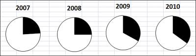
Pie Charts Make Horrible Time Comparisons
A pie chart is ideal for showing how components that add up to 100% are broken out. It is difficult to compare a series of pie charts to detect changes from one pie to the next. As you can see in the charts in Figure 3.4, it is difficult for the reader’s eye to compare the pie wedges from year to year. Did market share increase in 2008? Rather than using a series of pie charts to show changes over time, use a 100 percent stacked column chart instead.
Figure 3.4 It is difficult to compare one pie chart to the next.
100 Percent Stacked Bar Chart Instead of Pie Charts
In Figure 3.5, the same data from Figure 3.4 is plotted as a 100 percent stacked bar chart. Series lines guide the reader’s eye from the market share from each year to the next year. The stacked bar chart is a much easier chart to read than the series of pie charts.
Figure 3.5 The same data presented in Figure 3.4 is easier to read in a 100 percent stacked bar chart.

Understanding Date-Based Axis Versus Category-Based Axis in Trend Charts
Excel offers two types of horizontal axes in a trend chart. Having the proper setting can ensure that your message is accurate.
If the spacing of events along the time axis is uniform, it does not matter whether you choose a date-based axis or a text-based axis because the results will be the same. When this occurs, it is fine to allow Excel to choose the type of axis automatically.
However, if the spacing of events along the time axis is haphazard, you definitely want to make sure that Excel uses a date-based axis.
Accurately Representing Data Using a Time-Based Axis
Figure 3.6 shows the spot price for a certain component used in your manufacturing plant. To find this data, you downloaded past purchase orders for that product. Your company doesn’t purchase the component on the same day every month; therefore, you have an incomplete dataset. In the middle of the dataset, a strike closed one of the vendors, spiking the prices from the other vendors. Your purchasing department had stocked up before the strike, which allowed your company to slow its purchasing dramatically during the strike.
Figure 3.6 The top chart uses a text-based horizontal axis: Every event is plotted an equal distance from the next event. This leads to the shaded period being underreported.
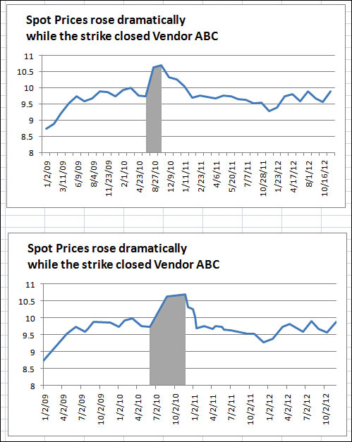
In the top chart in Figure 3.6, the horizontal axis is set to a text-based axis, and every data point is plotted an equal distance apart. Because your purchasing department made only two purchases during the strike, it appears the time affected by the strike is very narrow. The bottom chart uses a date-based axis. In this axis, you can see that the strike actually lasted for half of 2010.
NOTE
To learn how to highlight a portion of a chart as shown in Figure 3.6, see “Highlighting a Section of Chart by Adding a Second Series,” later in this chapter.
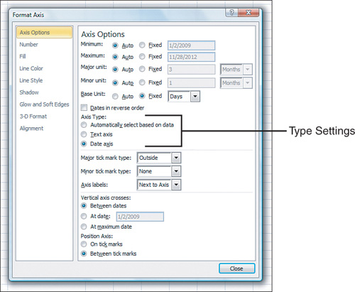
Usually, if your data contains dates, Excel defaults to a date-based axis. However, you should always check to make sure Excel is using the correct type of axis. A number of potential problems force Excel to choose a text-based axis instead of a date-based axis. For example, Excel will choose a text-based axis when dates are stored as text in a spreadsheet and when dates are represented by numeric years. The list following Figure 3.7 summarizes other potential problems.
To explicitly choose an axis type, follow these steps:
- Right-click the horizontal axis and select Format Axis.
- In the Format Axis dialog box that appears, select the Axis Options category.
- As appropriate, choose either Text Axis or Date Axis from the Axis Type section (see Figure 3.7).
Figure 3.7 You can explicitly choose an axis type rather than letting Excel choose the default.
A number of complications that require special handling can occur with date fields. The following are some of the problems you might encounter:
• Dates stored as text—If dates are stored as text dates instead of real dates, a date-based axis will never work. You have to use date functions to convert the text dates to real dates.
• Dates represented by numeric years—Trend charts can have category values of 2008, 2009, 2010, and so on. Excel does not naturally recognize these as dates, but you can trick it into doing so. Read “Plotting Data by Numeric Year” near Figure 3.15 in this chapter.
• Dates before 1900—If your company is old enough to chart historical trends before January 1, 1900, you will have a problem. In Excel’s world, there are no dates before 1900. For a workaround, read “Using Dates Before 1900” around Figure 3.16.
• Dates that are really time—It is not difficult to imagine charts in which the horizontal axis contains periodic times throughout a day. For example, you might use a chart like this to show the number of people entering a bank. For such a chart, you need a time-based axis, but Excel will group all of the times from a single day into a single point. See “Using a Workaround to Display a Time-Scale Axis” near Figure 3.19 for the rather complex steps needed to plot data by periods smaller than a day.
Each of these problem situations is discussed in the following sections.
Converting Text Dates to Dates
If your cells contain text that looks like dates, the date-based axis will not work. The data in Figure 3.8 came from a legacy computer system. Each date was imported as text instead of as dates.
Figure 3.8 These dates are really text, as indicated by the apostrophe before the date in the formula bar.
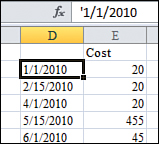
This is a frustrating problem because text dates look exactly like real dates. You may not notice that they are text dates until you see that changing the axis to a date-based axis has no effect on the axis spacing.
If you select a cell that looks like a date cell, look in the formula bar to see whether there is an apostrophe before the date. If so, you know you have text dates (refer to Figure 3.8). This is Excel’s arcane code to indicate that a date or number should be stored as text instead of a number.
Understanding How Excel Stores Dates and Time
On a Windows PC, Excel stores dates as the number of days since January 1, 1900. For a date such as 2/17/2011, Excel actually stores the value 40,591, but it formats the date to show you a value such as 02/17/2011.
On a Mac running Mac OS, Excel stores the dates as the number of days since January 1, 1904. The original designers of the Mac OS were trying to squeeze the OS into 64K of ROM. Because every byte mattered, it seemed unnecessary to add a couple lines of code to handle the fact that 1900 is not a leap year. Excel for the Mac adopted the 1904 convention. On a Mac, 2/17/2011 is stored as 39,129.
CAUTION
Selecting a new format from the Format Cells dialog does not fix this problem, but it may prevent you from fixing the problem! If you import data from a .txt file and choose to format that column as text, Excel changes the numeric format for the range to be text. After a range is formatted as text, you can never enter a formula, number, or date in the range. People try to select the range, change the format from text to numeric or date, and hope this will fix the problem—but it doesn’t. After you change the format, you still have to use a method described in the “Converting Text Dates to Real Dates” section, later in this chapter, to convert the text dates to numeric dates.
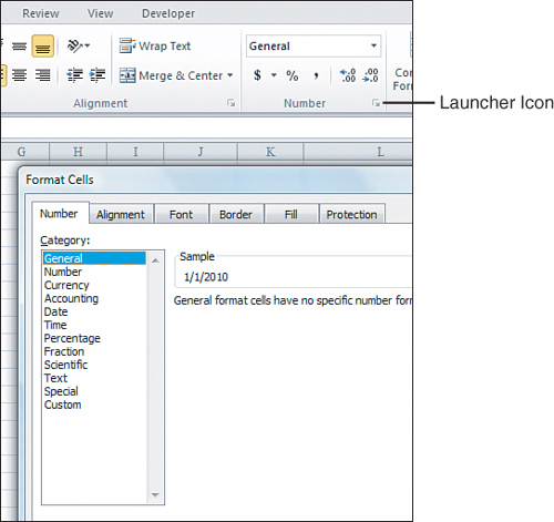
However, it is still worth changing the format from a text format to General, Date, or anything else. If you do not change the format, and then insert a new column to the right of the bad dates, the new column inherits the text setting from the date column. This causes your new formula (the formula to convert text to dates) to fail. Therefore, even though it doesn’t solve your current problem, you should select the range, click the Dialog Launcher icon in the lower-right corner of the Number group on the Home tab, and change the format from Text to General. Figure 3.9 shows the Dialog Launcher icon.
Figure 3.9 Many groups on the ribbon have this tiny More icon in the lower-right corner. Clicking this icon leads to the legacy dialog box.
Excel for Windows, which needed to be compatible with Lotus 1-2-3, adopted the 1900 convention. As demonstrated in the next case study, the 1900 convention incorrectly made 1900 a leap year.
Excel provides a complete complement of functions to deal with dates including functions that convert data from text to dates and back. Excel stores times as decimal fractions of days. For example, you can enter noon today as =TODAY()+0.5 and 9 a.m. as =TODAY()+0.375. Again, the number format handles converting the decimals to the appropriate display.
Converting Text Dates to Real Dates
The DATEVALUE function converts text that looks like a date into the equivalent serial number. You can then use the Format Cells dialog to display the number as a date.
The text version of a date can take a number of different formats. For example, your international date settings might call for a month/day/year arrangement of the dates. Figure 3.10 shows a number of valid text formats that can be converted with the DATEVALUE function.
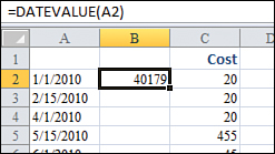
Figure 3.11 shows a column of text dates. Follow these steps to convert the text dates to real dates:
1. Insert a blank Column B by selecting cell B1. Select Home, Insert, Insert Sheet Columns. Alternatively, you can use the Excel 2003 shortcut Alt+I+C.
2. In cell B2, enter the formula =DATEVALUE(A2). Excel displays a number in the 40,000 range in cell B2. You are halfway to the result (see Figure 3.11). You still have to format the result as a date.
3. Double-click the fill handle in the lower-right corner of cell B2. Excel copies the formula from cell B2 down to your range of dates.
Figure 3.10 The DATEVALUE function can handle any of the date formats in Column J.
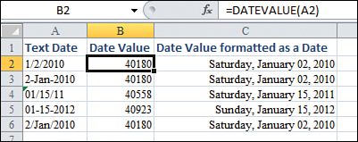
Figure 3.11 The result of the DATEVALUE function is a serial number.
TIP
The fill handle is the square dot in the lower-right corner of the active cell indicator.
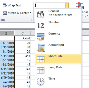
4. Select Column B2. On the Home tab, select the drop-down at the top of the Number group and choose either Short Date or Long Date. Excel displays the numbers in Column B as a date (see Figure 3.12). Alternatively, you can press Ctrl+1 and select any date format from the Number tab.
5. To convert the live formulas in Column B to be static values, while the range of dates in Column B is selected, press Ctrl+C to copy. Press Ctrl+V to paste. Press Ctrl to open the Paste Options dialog. Press V to paste as values.
6. Delete the original column A.
TIP
If some of the dates appear as #######, you need to make the column wider. To do so, double-click the border between the column B and column C headings.
Figure 3.12 Choose a date format from the Number drop-down on the Home tab.
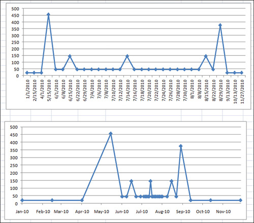
After converting the text dates to real dates, insert a line chart with markers. Excel automatically formats the chart with a date-based axis. In Figure 3.13, the top chart reflects cells that contain text dates. The bottom chart uses cells in which the text dates have been converted to numeric dates.
Figure 3.13 When your original data contains real dates, Excel automatically chooses a more accurate date-based axis. The bottom chart reflects a date-based axis.
![]() To watch a video of converting text dates to dates, search for “MrExcel Charts 3” at YouTube.
To watch a video of converting text dates to dates, search for “MrExcel Charts 3” at YouTube.
TIP
There are other methods for converting the data shown in Figure 3.11 to dates. Here are two methods:
Method 1: Select any empty cell. Press Ctrl+C to copy. Select your dates. On the Home tab, select Paste, Paste Special. In the Paste Special dialog, choose Values in the Paste section and Add in the Operation section. Click OK. The text dates will convert to dates.
Method 2: Select the text dates and then, on the Data tab, select Text to Columns, and then click Finish.
Converting Bizarre Text Dates to Real Dates
When you rely on others for source data, you are likely to encounter dates in all sorts of bizarre formats. For example, while gathering data for this book, I found a dataset where each date was listed as a range of dates. Each date was in the format 2/4-6/11. I had to check with the author of the data to find out if they meant February 4th through 6th of 2011 or if they meant February 4th through June 11th. They meant the former.
Used in combination, the functions listed below can be useful when you are converting strange text dates to real dates:
• =DATE(2011,12,31)—Returns the serial number for December 31, 2011.
• =LEFT(A1,2)—Returns the two leftmost characters from cell A1.
• =RIGHT(A1,2)—Returns the two rightmost characters from cell A1.
• =MID(A1,3,2)—Returns the third and fourth characters from cell A2. You read the function as “return the middle characters from A1, starting at character position 3, for a length of 2.”
• =FIND(“/”,A1)—Finds the position number of the first slash within A1.
Follow these steps to convert the text date ranges shown in Figure 3.14 to real dates:
Figure 3.14 A mix of LEFT, RIGHT, MID, and FIND functions parse this text to be used in the DATE function.
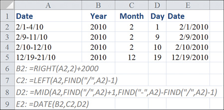
1. Because the year is always the two rightmost characters in column A, enter the formula =RIGHT(A2,2) in cell B2.
2. Because the month is the leftmost one or two characters in column A, ask Excel to find the first slash and then return the characters to the left of the slash. Enter =FIND(“/”,A2) to indicate that the slash is in second character position. Use =LEFT(A2,FIND(“/”,A2) to get the proper month number.
3. For the day, either choose to extract the first or last date of the range. To extract the first date, ask for the middle characters, starting one position after the slash. The logic to figure out whether you need one or two characters is a bit more complicated. Find the position of the dash, subtract the position of the slash, and then subtract 1. Therefore, use this formula in cell D2:
=MID(A2,FIND(“/”,A2)+1,FIND(“-”,A2)-FIND(“/”,A2)-1)
4. Use the DATE function as follows in cell E2 to produce an actual date:
=DATE(B2,C2,D2)
Plotting Data by Numeric Year
If you are plotting data where the only identifier is a numeric year, Excel does not automatically recognize this field as a date field.
For example, in Figure 3.15 data is plotted once a decade for the past 50 years and then yearly for the past decade. Column A contains four-digit years such as 1960, 1970, and so on. The default chart shown in the top of the figure does not create a date-based axis. You know this to be true because the distance from 1960 to 1970 is the same as the distance from 2000 to 2001.
Listed here are two solutions to this problem:
• Convert the years in column A to dates by using =DATE (A2,12,31). Format the resulting value with a yyyy custom number format. Excel displays 2005 but actually stores the serial number for December 31, 2005.
• Convert the horizontal axis to a date-based axis. Excel thinks your chart is plotting daily dates from May 13, 1905, through July 2, 1905. Because no date format has been applied to the cells, they show up as the serial numbers 1955 through 2005. Excel displays the chart properly, even though the settings show that the base units are days.
Using Dates Before 1900
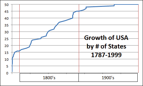
In Excel 2010, dates from January 1, 1900 through December 31, 9999 are recognized as valid dates. However, if your company was founded more than a demisesquicentennial before Microsoft was founded, you will potentially have company history going back before 1900.
Figure 3.16 shows a dataset stretching from 1787 through 1959. The accompanying chart would lead the reader to believe that the number of states in the United States grew at a constant rate. This inaccurate statement would cause Mr. Kessel, my eighth-grade geography teacher, to give me an F for this book.
Figure 3.15 Excel does not recognize years as dates.
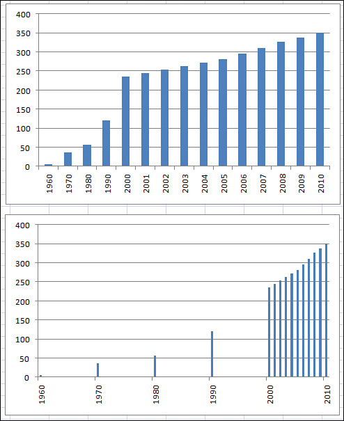
Figure 3.16 Dates from before 1900 are not valid Excel dates. A date-based axis is not possible in this case.
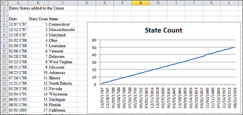
As mentioned previously, formatting the chart to have a date-based axis will not work because Excel does not recognize dates before 1900 as valid dates. Possible workarounds are discussed in the next two subsections.
Using Date-Based Axis with Dates Before 1900 Spanning Less Than 100 Years
In Figure 3.17, the dates in Column A are text dates from the 1800s. Excel cannot automatically deal with dates from the 1800s, but it can deal with dates from the 1900s.
Figure 3.17 Transforming the 1800s dates to 1900s dates and clever formatting allows Excel to plot this data with a date axis.
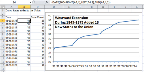
One solution is to transform the dates to dates in the valid range of dates that Excel can recognize. You can use a date format with two years and a good title on the chart to explain that the dates are from the 1800s. However, keep in mind that this solution fails when you are trying to display more than 100 years of data points.
To create the chart in Figure 3.17, follow these steps:
- Insert a blank Column B to hold the transformed dates.
- Enter the formula
=DATE(100+RIGHT(A4,4),LEFT(A4,2),MID(A4,4,2))in cell B4. This formula converts the 1836 date to a 1936 date. - Select cell B4. Press Ctrl+1 to open the Format Cells dialog. Select the date format 3/14/01 from the Date category on the Number tab. This formats the 1936 date as 6/15/36. Later, you will add a title to indicate that the dates in this column are from the 1800s.
- Double-click the fill handle in cell B4 to copy the formula down to all cells.
- Select the range B3:C17.
- From the Insert tab, select Charts, Line, 2-D Line, Line.
- From the Layout tab, select Legend, No Legend.
- Right-click the vertical axis along the left side of the chart and select Format Axis from the context menu.
- In the Format Axis dialog that appears, on the Axis Options page, select the Fixed option button next to Minimum and enter a fixed value of
20. - Without closing the Format Axis dialog, click the dates in the horizontal axis in the chart. Excel automatically switches to formatting the horizontal axis, and the settings in the Format Axis dialog redraw to show the settings for the horizontal axis. In the Axis Type section, select Date Axis. Click Close to close the dialog box.
- From the Layout tab, select Chart Title, Centered Overlay Title.
- Click the State Count title. Type the new title
Westward Expansion<enter>During 1845-1875 Added 13<enter>New States to the Union. Click outside the title to exit Text Edit mode. - Click the title once. You should have a solid selection rectangle around the title. On the Home tab, click the Decrease Font Size button. Click the Left Align button.
- Carefully click the border of the title. Drag it so the title appears in the top-left corner of the chart.
- Select the dates in B4:B17. Press Ctrl+1 to access the Format Cells dialog. On the Number tab, click the Custom category. Type the custom number format
‘yy. This changes the values shown along the horizontal axis from m/d/yy format to show a two-digit year preceded by an apostrophe.
The result is the chart shown in Figure 3.17. The reader may believe that the chart is showing dates in the 1800s, but Excel is actually showing dates in the 1900s.
Using Date-Based Axis with Dates Before 1900 Spanning More Than 100 Years
Microsoft Excel 2010 doesn’t do well with large datasets that span 100+ years. Although I managed to create a date-based axis covering 630 years with 10 data points, a dataset covering 102 years and 40 points cannot display a date-based axis.
However, as Figure 3.18 shows, it is possible to create this chart. To do so, you must transform the date axis into a scale that shows months, hide the axis, and then add your own axis using text boxes. These steps are not for the faint of heart.
First, you need to transform the dates from the 1800s to the 1900s. Next, you will transform the dates spanning 172 years into a range where each month in real time is represented by a single day. This results in a time span of 6 years. You then need to use care to completely hide the labels along the horizontal axis and replace them with text boxes showing the centuries. Lastly, you add a new data series to draw vertical lines at the change of each century.
To create the chart in Figure 3.18, follow these steps:
1. Insert new Columns B and C.
2. In cell B4, enter the formula =DATE(113+RIGHT(A4,4),LEFT(A4,2),MID(A4,4,2)). This transforms the dates from 1787 to a valid Excel date in 1900. Format this cell with a short date format.
3. In cell C4, type the formula =(YEAR(B4)-1899)*12+MONTH(B4) to calculate a number of months. Format this cell as a short date. This formula now reduces 172 years into 172x12 into 2,064 days, where each day represents 1 month of real time.
4. Select cells B4:C4 and double-click the fill handle to copy the formula down to your range of data. The dates in Column B span 1900 to 2072. The dates in Column C span 1900 to 1907. Although the relative position of the data points is correct, you have to hide the axis labels that Excel draws in for the horizontal axis. Therefore, it would be helpful to draw in vertical lines to show where the axis switches from the 1700s to the 1800s. Then draw another line to show where the axis switches from the 1800s to the 1900s.
Figure 3.18 This chart appears to show a date-based axis that spans 200+ years.
5. Insert a new Column E to hold the data for the second series. This series contains just two nonzero points: one at 1800 and one at 1900. Enter the heading Divide Line in cell E3.
6. Look through the dates in Column A. Insert a new row before the first date in the 1800s. In this new row, enter 01/01/1800 in Column A. Copy the formulas in Columns B and C. In Column D, copy the point from the row above. In Column E, enter the value 50. This draws a single vertical bar from the horizontal axis up to a height of 50.
7. Repeat step 6 to add a new data point for January 1, 1900, and January 1, 2000.
8. Select C4:E55.
9. From the Insert tab, select Charts, Line, Line.
10. On the Layout tab, select Legend, None.
11. Right-click the numbers along the vertical axis and then select Format Axis. Change the Maximum option button to Fixed and enter the value 50. This changes the vertical axis to show from 0 to 50.
12. On the Layout tab, use the Current Selection drop-down to select Series. Note that there are now only two data points selected in the chart.
13. On the Design tab, select Change Chart Type. Select the first icon in the column section—for a clustered column chart. This draws narrow columns—actually lines—at 1800 and 1900 on the chart. Note that the chart type change affects only the second series because you selected the Divide Line series in step 12.
14. Click the labels along the horizontal axis. These labels show wrong dates such as 1/23/02. On the Home tab, from the Font Color drop-down select a white font. This causes the axis labels to disappear.
15. On the Insert tab, click the Text Box icon. On the chart, draw a text box from the 1800 line to the 1900 line, just below the horizontal axis. The mouse pointer changes into a crosshairs as you draw. Make sure the vertical line in the crosshairs corresponds to the vertical dividing lines. After you create the text box, a flashing cursor appears inside the text box.
16. Type 1800s. Click the edge of the text box to change it from a dashed line to a solid line.
17. While the text box is selected, select Center Align from the Home tab. Select Vertical Center Align. Select Increase Font Size from the Home tab.
18. While the text box is still selected, select Format, Shape Outline, Black on the Layout tab in order to outline the text box.
19. Click the text box and start to drag to the right. After you start to drag, hold down the Shift key to constrain the movement to the right. Hold down the Ctrl key to make an identical copy of the text box. When the left edge of the new text box is aligned with the vertical line at 1900, release the mouse button.
TIP
You must start dragging before you hold down the Ctrl+Shift keys. Microsoft interprets Ctrl-click as the shortcut to select an object’s container.
20. Click in the text box and change the text from 1800s to 1900s.
21. On the Layout tab, select Chart Title, Centered Overlay Title. When the title Chart Title appears, it is selected.
22. Click inside the Chart Title text area to enter Text Entry mode. Overwrite the default text in the title by typing Growth of USA, press Enter, type by # of States, press Enter, and type 1787-1999.
23. Click the border of the chart title to exit Text Entry mode.
24. Drag the chart title to a new location in the lower-right corner of the chart.
The result is a chart that appears to show a line chart that spans 217 years. The line is scaled appropriately using a date-based axis.
Using a Workaround to Display a Time-Scale Axis
The developers who create Microsoft Excel are careful in the Format Axis dialog box to call the option a date axis. However, the technical writers who write Excel Help refer to a time-scale axis. The developers get a point here for accuracy because Excel absolutely cannot natively handle an axis that is based on time.
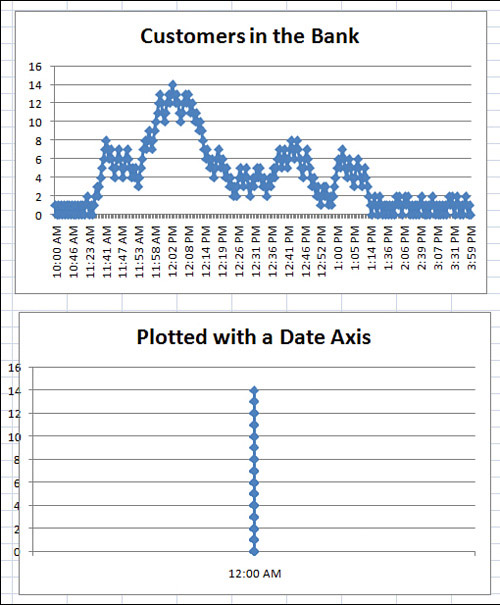
A worksheet in the download files is used to analyze queuing times. In Column A, it logs the time that customers entered a busy bank. Times range from when the bank opened at 10 a.m. until the bank closed at 4 p.m.
After you enter planned staffing levels in Column C, the model calculates when the customer will move from the queue to an open teller window and when he or she will leave the window based on an average of three minutes per transaction.
Data in Columns I:M record the number of people in the bank every time someone enters or leaves. This data is definitely not spaced equally. Only a few customers arrive in the 10:00 hour, while many customers enter the bank during the lunch hour.
The top chart in Figure 3.19 plots the number of customers on a text-based axis. Because each customer arrival or departure merits a new point, the one hour from noon until 1 p.m. takes up 41 percent of the horizontal width of the chart. In reality, this 1-hour period merits only 16 percent of the chart. This sounds like a perfect use for a time-series axis, right? Read on for the answer.
The bottom chart is an identical chart where the axis is converted to show the data on a date-based axis. This is a complete disaster. In a date-based axis, all time information is discarded. The entire set of 300 points is plotted in a single vertical line.
Figure 3.19 Excel cannot show a time-series axis that contains times.
The solution to this problem involves converting the hours to a different time scale (similar to the 1800s date example in the preceding section). For example, perhaps each hour could be represented by a single year. Using numbers from a 24-hour clock, the 10:00 hour could be represented by 2010 and the 3:00 hour could be represented by 2015.
In this example, you manipulate the labels along the vertical axis using a clever custom number format. A few new settings on the Format Axis dialog ensure that an axis label appears every hour.
NOTE
In the original chart, a time appeared in Column I, and a formula in Column L simply copied this time so that it would be adjacent to the customer count in Column M. In step 1, the transformation formula is applied to Column L.
Follow these steps to create a chart that appears to have a time-based axis:
1. In cell L2, enter the following formula to translate the time to a date:
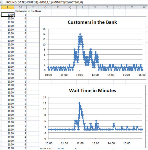
=ROUND(DATE(HOUR(I2)+2000,1,1)+MINUTE(I2)/60*365,0)
Because each hour will represent a single year, the years argument of the DATE function is =HOUR(I2)+2000. This returns values from 2010 through 2013. The other arguments in the date function are 1 and 1 to return January 1 of the year. Outside the date function, the minute of the time cell is scaled up to show a value from 1 to 365, using MINUTE(I2)/60*364. The entire formula is rounded to the nearest integer because Excel would normally ignore any time values.
2. Select cell L2. Double-click the fill handle to copy this formula down to all the data points. The result of this formula ranges from January 1, 2010, which represents the customer who walked in at 10 a.m., to 12/25/2015, which represents the customer who walked in at 3:57 p.m.
3. Select cells L1:M303.
4. From the Insert tab, select Charts, Line, Line with Markers.
5. On the Layout tab, select Legend, None. (After studying Software Quality Metrics (SQM) data for Excel 2007, surely Microsoft realizes that 500 million people instantly turn off the legend in every chart that has a single data series.)
6. Right-click the labels along the horizontal axis and select Format Axis to display the Format Axis dialog box, where you make the following selections:
In the Axis Type section, select Date Axis.
For Major Unit, select Fixed, 1 Years.
For Minor Unit, select Fixed, 1 Days.
For Base Unit, select Fixed, Days.
Click Close to close the Format Axis dialog.
7. Return to the transformed dates in Column L. Select L2:L303.
8. Press Ctrl+1 to display the Format Cells dialog. On the Number tab, select the Custom category. A custom number format of yy would display 10 for 2010 and 15 for 2015. Instead, use a custom number format of yy”:00”. This causes Excel to display 10:00 for 2010 and 15:00 for 2015, which is fairly sneaky, eh?
As you see in Figure 3.20, the chart now allocates one-sixth of the horizontal axis to each hour. This is an improvement in accuracy over either of the charts in Figure 3.19. The additional chart in Figure 3.20 uses a similar methodology to show the wait time for each customer who enters the bank. If my bank offered 12-minute wait times, I would be finding a new bank.
Figure 3.20 These charts show the number of customers in the bank and their expected wait times.
Communicate Effectively with Charts
A long time ago, a McKinsey & Company team investigated opportunities for growth at the company where I was employed. I was chosen to be part of the team because I knew how to get the data out of the mainframe.
The consultants at McKinsey & Company knew how to make great charts. Every sheet of grid paper was turned sideways, and a pencil was used to create a landscape chart that was an awesome communication tool. After drawing the charts by hand, they sent off the charts to someone in the home office who generated the charts on a computer. This was a great technique. Long before touching Excel, someone figured out what the message should be.
You should do the same thing today. Even if you have data in Excel, before you start to create a chart, it’s a good idea to analyze the data to see what message you are trying to present.
The McKinsey & Company group used a couple of simple techniques to always get the point across:
• To help the reader interpret a chart, include the message in the title. Instead of using an Excel-generated title such as “Sales,” you can actually use a two- or three-line title such as “Sales have grown every quarter except for Q3, when a strike impacted production.”
• If the chart is talking about one particular data point, draw that column in a contrasting color. For example, all the columns might be white, but the Q3 bar could be black. This draws the reader’s eye to the bar that you are trying to emphasize. If you are presenting data on screen, use red for negative periods and blue or green for positive periods.
The following sections present some Excel trickery that allows you to highlight a certain section of a line chart or a portion of a column chart. In these examples, you will spend some time up front in Excel adding formulas to get your data series looking correct before creating the chart.
TIP
If you would like a great book about the theory of creating charts that communicate well, check out Gene Zelazny’s Say It with Charts Complete Toolkit. Gene is the chart guru at McKinsey & Company who trained the consultants who taught me the simple charting rules. While Say It with Charts doesn’t discuss computer techniques for producing charts, it does challenge you to think about the best way to present data with charts and includes numerous examples of excellent charts at work. Visit www.zelazny.com for more information.
Using a Long, Meaningful Title to Explain Your Point
If you are a data analyst, you are probably more adept at making sense of numbers and trends than the readers of your chart. Rather than hoping the reader discovers your message, why not add the message to the title of the chart?
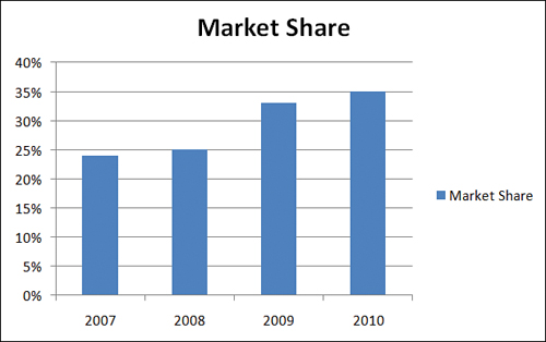
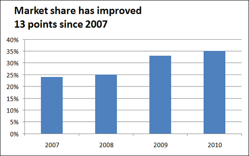
Figure 3.21 shows a default chart in Excel. Both the legend and title use the “Market Share” heading from cell B71. These words certainly do not need to be used twice on the chart.
Figure 3.21 By default, Excel uses an unimaginative title taken from the heading of the data series.
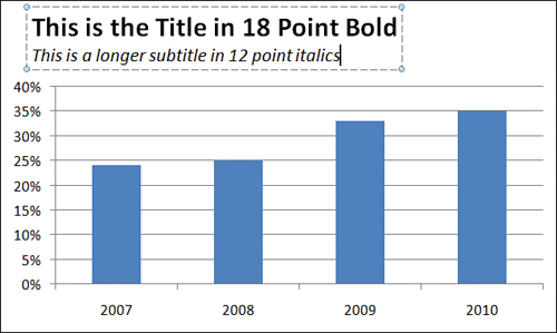
Follow these steps to remove the legend, add data labels, and add a meaningful title:
- From the Layout tab, select Legend, None, and then select Data Labels, Outside End.
- Click the title in the chart. Click again to put the title in Edit mode.
- Backspace to remove the current title. Type
Market share has improved, press Enter, and type13 points since 2007. - To format text while in Edit mode, you would have to select all the characters with the mouse. Instead, click the dotted border around the title. When the border becomes solid, you can use the formatting icons on the Home tab to format the title. Alternatively, right-click the title box and use the Mini toolbar to format the title.
- On the Home tab, select the icon for Align Text Left, and then click the Decrease Font Size button until the title looks right.
- Click the border of the chart title and drag it so the title is in the upper-left corner of the chart.
The result, shown in Figure 3.22, provides a message to assist the reader of the chart.
Resizing a Chart Title
The first click on a title selects the title object. A solid bounding box appears around the title. At this point, you can use most of the formatting commands on the Home tab to format the title. Click the Increase/Decrease Font Size buttons to change the font of all of the characters. Excel automatically resizes the bounding box around the title. If you do not explicitly have carriage returns in the title where you want the lines to be broken, you are likely to experience frustration at this point.
Figure 3.22 Use the title to tell the reader the point of the chart.
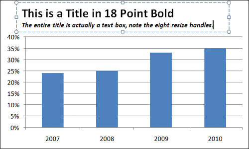
When you have the solid bounding box around the title, carefully right-click the bounding box and select Edit Text. Alternatively, you can left-click a second time inside the bounding box to also put the title in Text Edit mode. Note that the dashed line in the bounding box indicates the title is in Text Edit mode. Using Text Edit mode, you can select specific characters in the title and then move the mouse pointer up and to the right to access the mini toolbar and the available formatting commands. You can edit specific characters within the title to create a larger title and a smaller subtitle, as shown in Figure 3.23.
CAUTION
When you click a chart title to select it, a bounding box with four resizing handles appears. Actually, they are not resizing handles even though they look like it, which means that you do not have explicit control to resize the title. It feels like you should be able to stretch the title horizontally or vertically, as if it was a text box, but you cannot. The only real control you have to make a text box taller is by inserting carriage returns in the title. Keep in mind that you can insert carriage returns only when you are in Text Edit mode.
Figure 3.23 By selecting characters in Text Edit mode, you can create a title/subtitle effect.
You cannot move the title when you are in Text Edit mode. To exit Text Edit mode, right-click the title and select Exit Edit Text or simply left-click the bounding box around the title. When the bounding box is solid, you can click anywhere on the border except the resizing handles and drag to reposition the title.
Deleting the Title and Using a Text Box
If you are frustrated that the title cannot be resized, you can delete the title and use a text box for the title instead. The title in Figure 3.24 is actually a text box. Note the eight resizing handles on the text box instead of the four resizing handles that appear around a title. Thanks to all these resizing handles, you can actually stretch the bounding box horizontally or vertically.
To create the text box shown in Figure 3.24, follow these steps:
1. From the Layout tab, delete the original title by choosing Chart Title, None. Excel resizes the plot area to fill the space that the title formerly occupied.
Figure 3.24 Instead of a title, this chart uses a text box for additional flexibility.
2. Select the plot area by clicking some whitespace inside the plot area. Eight resizing handles now surround the plot area. Drag the top resizing handle down to make room for the title.
3. On the Insert tab, click the Text Box icon.
4. Click and drag inside the chart area to create a text box.
5. Click inside the text box and type a title. Press the Enter key to begin a new line. If you do not press the Enter key, Excel word-wraps and begins a new line when text reaches the right end of the text box.
6. Select the characters in the text box that make up the main title and use either the mini toolbar or the tools on the Home tab to make the title 18 point, bold, and Times New Roman.
7. Select the remaining text that makes up the subtitle in the text box and use the tools on the Home tab to make the subtitle be 12 point, italics, Times New Roman.
Microsoft advertises that all text can easily be made into WordArt. However, when you use the WordArt drop-downs in a title, you are not allowed to use the Transform commands found under Text Effects on the Drawing Tools Format tab. When you use the WordArt menus on a text box, however, all the Transform commands are available (see Figure 3.25).
A text box works perfectly because it is resizable and you can use WordArt Transform commands. If you move or resize the chart, the text box moves with the chart and resizes appropriately.
Highlighting One Column
If your chart title is calling out information about a specific data point, you can highlight that point to help focus the reader’s attention on it as shown in Figure 3.26. Although the tools on the Design tab do not allow this, you can achieve the effect quickly by using the Format tab.
To create the chart in Figure 3.26, follow these steps:
Figure 3.25 Using a text box instead of a title allows more formatting options.
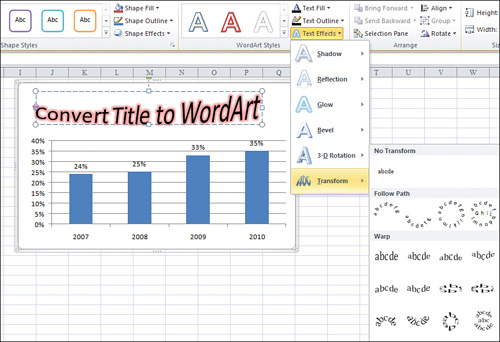
Figure 3.26 The column for Friday is highlighted in a contrasting color and it is also identified in the title.
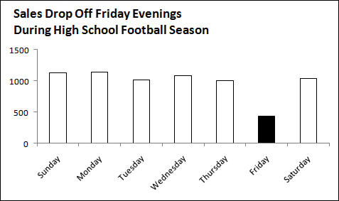
1. Create a column chart by selecting Column, Clustered Column from the Insert tab.
2. Click any of the columns to select the entire series.
3. On the Format tab, select Shape Fill, White. At this point, the columns are invisible. Invisible bars are great for creating waterfall charts, which is discussed in Chapter 4, “Creating Charts That Show Differences.” However, in this case, you want to outline the bars.
4. From the Format tab, select Shape Outline, Black. Select Shape Outline, Weight, 1 point. All your columns are now white with black outline.
5. Click the Friday column in the chart. The first click on the series selects the whole series. A second click selects just one data point. If all the columns have handles, click Friday again.
TIP
If you accidentally click outside the series, you might inadvertently deselect the series. Click back on the series to re-select it.
6. From the Format tab, select Shape Fill, Black.
7. On the Layout tab, turn off the legend and the gridlines.
8. Type a title, as shown in Figure 3.26, pressing Enter after the first line of the title. On the Home tab, change the title font size to 14 point, left aligned.
9. Right-click the numbers along the vertical axis and select Format Axis. Change Major Unit to Fixed, 500.
The result is a chart that calls attention to Friday sales.
Replacing Columns with Arrows
Columns shaped like arrows can be used to make a special point. For example, if you have good news to report about consistent growth, you might want to replace the columns in the chart with arrow shapes to further indicate the positive growth.
Follow these steps to convert columns to arrows:
- Create a column chart showing a single series.
- In an empty section of the worksheet, insert a new block arrow shape. From the Insert tab, select Shapes, Blck Arrows, Up Arrow. Click and drag in the worksheet to draw the arrow.
- Select the arrow. Press Ctrl+C to copy the arrow to the Clipboard.
- Select the chart. Click a column to select all the columns in the data series.
- Press Ctrl+V to paste the arrow. Excel fills the columns with a picture of the block arrow.
- If desired, select Format Selection from the Format tab. Reduce the gap setting from 150 percent to 75 percent to make the arrows wider.
The new chart is shown in the bottom half of Figure 3.27. After creating the chart, you can delete the arrow created in step 2 by clicking the arrow and pressing the Delete key.
Highlighting a Section of Chart by Adding a Second Series
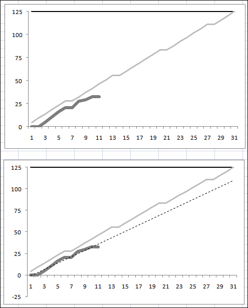
The chart in Figure 3.28 shows a sales trend over one year. The business was affected by road construction that diverted traffic flow from the main road in front of the business.
The title calls out the July and August time period, but it would be helpful to actually highlight that section of the chart. Follow these steps to add an area chart series to the chart:
1. Begin a new series in Column C, next to the original data. To highlight July and August, add numbers to Column C for the July and August points, plus the previous point, June. In cell C7, enter the formula of =B7. Copy this formula to July and August.
2. Click on a blank area inside of the chart. A blue bounding box appears around B2:B13 in the worksheet. Drag the lower-right corner of the blue bounding box to the right to extend the series to include the three values in Column C. Initially, this line shows up as a red line on top of a portion of the existing blue line.
Figure 3.27 Arrows can be used to emphasize the upward growth of sales.
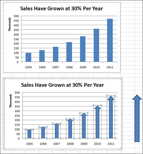
Figure 3.28 Highlight the road construction months in the chart to emphasize the title further.
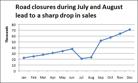
3. On the Layout tab, use the Current Selection drop-down to select Series 2, which is the series you just added.
4. While Series 2 is selected, select Design, Change Chart Type. Select the first area chart thumbnail. Click OK. Excel draws a red area chart beneath the line segment of June through August.
5. On the Format tab, use the Current Selection drop-down to reselect Series 2. Open the Shape Fill drop down. Choose a grey fill color. The 4th row, 1st column offers a tooltip f White, Background 1, Darker 25% and is suitable.
The top chart in Figure 3.29 shows the gray highlight extending from the horizontal axis up to the data line for the two line segments. Alternatively, you can replace the numbers in Column C with 70,000 to draw a gray rectangle behind the months, as shown in the bottom chart in Figure 3.29.
Figure 3.29 A second series with only three points is used to highlight a section of the chart.

Changing Line Type Midstream
Consider the top chart in Figure 3.30. The title indicates that cash balances improved after a new management team arrived. This chart initially seems to indicate an impressive turnaround. However, if you study the chart axis carefully, you see that the final Q3 and Q4 numbers are labeled Q3F and Q4F to indicate that they are forecast numbers.
It is misleading to represent forecast numbers as part of the actual results line. It would be ideal if you change the line type at that point to indicate that the last two data points are forecasts. To do so, follow these steps:
1. Change the heading above Column B from Cash Balances to Actual.
2. Add the new heading Forecast in Column C.
3. Because the last actual data point is for Q2 of 2011, move the numbers for Q3 and Q4 of 2011 from Column B to Column C.
4. To force Excel to connect the actual and the forecast line, copy the last actual data point (the 7 for Q2) over to the Forecast column. This one data point—the connecting point for the two lines—will be in both the Forecast and Actual columns.
Figure 3.30 It is not clear in the top chart that the last two points are forecasts.
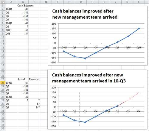
5. Change the last two labels in Column A from Q3F to just Q3 and from Q4F to just Q4.
6. Click the existing chart. A bounding box appears around B2:B9. Grab the lower-right blue handle and drag outward to encompass B2:C9. A second series is added to the chart as a red line.
7. On the Layout tab, select Legend, Legend at Right.
8. Click the red line. In the Format tab, you should see that the Current Selection drop-down indicates Series “Forecast.”
9. Select Format, Shape Outline, Dashes and then select the fourth dash option. The red line changes to a dashed line.
10. While the forecast series is selected, select Design, Change Chart Type. Select a chart type that does not have markers.
11. The chart title indicates that a new management team arrived, but it does not indicate when the team arrived. To fix this, change the title to indicate that the team arrived in Q3 of 2010.
12. On the Insert tab, select Shapes, Line. Draw a vertical line between Q2 and Q3 of 2010, holding down the Shift key while drawing to keep the line vertical.
13. While the line is selected, on the Format tab, select Shape Outline, Dashes and then select the fourth dash option to make the vertical line a dashed line. Note that this line is less prominent than the series line because the weight of the line is only 1.25 point.
The final chart is shown at the bottom of Figure 3.30.
Adding an Automatic Trendline to a Chart
In the previous example, an analyst had created a forecast for the next two quarters. However, sometimes you might want to allow Excel to make a prediction based on past results. In these situations, Excel offers a trendline feature in which Excel draws a straight line that fits the existing data points. You can ask Excel to extrapolate the trendline into the future. If your data series contains blank points that represent the future, Excel can automatically add the trendline. I regularly use these charts to track my progress toward a goal or trendline.
The easiest way to add a trendline is to build a data series that includes all the days that the project is scheduled to run. In Figure 3.31, Column A contains the days of the month and Column B contains 125 for each data point. Therefore, Excel draws a straight line across the chart showing the goal at the end of the project. Column C shows the writing progress I should make each day. In this particular month, I am assuming that I will write an equal number of pages six days per week. Column D, which is labeled Actual, is where I record the daily progress toward the goal.
The chart is created as a line chart with the gridlines and legend removed. The trendline is formatted as a lighter gray. The actual line is formatted as a thick line. The top chart in Figure 3.31 shows the chart before the trendline is complete. Notice that the thick line is not quite above the progress line.
Figure 3.31 In the top chart, the actual line is running behind the target line, but it seems close.
To add a trendline, follow these steps:
- Right-click the series line for the Actual column. Select Add Trendline.
- The Format Trendline dialog offers to add exponential, linear, logarithmic, polynomial, power, or moving average trendlines. Select a linear trendline.
- In the Trendline Name section, either leave the name as Linear (Actual) or enter a custom name such as Forecast.
- When forecasting forward or backward for a certain number of periods, leave both of those settings at
0because this chart already has data points for the entire month. There are also settings where Excel shows the regression equation on the chart. Add this if you desire. - Right-click the trendline to select it. On the Format tab, select Shape Outline, Dashes and then select the fourth dash option. Also, select Shape Outline, Weight, 3/4 point.
The trendline is shown at the bottom of Figure 3.31. In this particular case, the trendline extrapolates that if I continue writing at the normal pace, I will miss the deadline by 15 pages or so.
CAUTION
Excel’s trendline is not an intelligent forecasting system. It merely fits past points to a straight line and extrapolates that data. It works great as a motivational tool. For example, the current example shows that it would take a few days of above-average production before the trendline would project that the goal would be met.
Showing a Trend of Monthly Sales and Year-to-Date Sales
In accounting, sales are generally tracked every month. However, in the big picture you are interested in how 12 months add up to produce annual sales.
The top chart in Figure 3.32 is a poor attempt to show both monthly sales and accumulated year-to-date (YTD) sales. The darker bars are the monthly results, while the lighter bars are the accumulated YTD numbers through the current month. To show the large YTD number for November, the scale of the axis needs to extend to $400,000. However, this makes the individual monthly bars far too small for the reader to be able to discern any differences.
The solution is to plot the YTD numbers against a secondary vertical axis. My preference is that after you change the axis for one series, you should also change the chart type for that series. Follow these steps to create the bottom chart in Figure 3.32:
1. Left-click one of the YTD bars to select the YTD series. Right-click the selected series and select Format Data Series. Excel displays the Format Data Series dialog.
Figure 3.32 The size of the YTD bars obscures the detail of the monthly bars.
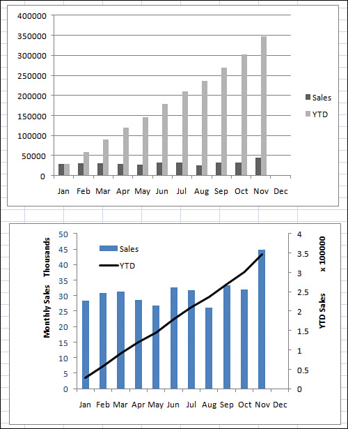
2. In the Format Data Series dialog, select Secondary Axis in the Plot Series On section of the Series Options page. Click Close. Excel creates a confusing chart, where the YTD numbers appear directly on top of the monthly numbers, obscuring any monthly numbers beyond August.
3. Excel deselects the series when you change the chart type. Reselect the YTD series by clicking the YTD line.
4. On the Format dialog, select Shape Outline, Black to change the YTD line to black.
5. From the Layout tab, turn off the gridlines by selecting Gridlines, None.
6. From the Layout tab, select Axes, Primary Vertical Axis, Show Axis in Thousands.
7. From the Layout tab, select Axis Titles, Primary Vertical Axis Title, Rotated Title. Type Monthly Sales and press Enter.
8. From the Layout tab, select Axis Titles, Secondary Vertical Axis Title, Rotated Title. Type YTD and press Enter.
9. Right-click the numbers on the secondary vertical axis. Select Format Axis. In the Scaling section, select 100,000.
10. Click the legend and drag it to appear in the upper-left corner of the plot area.
11. Click the plot area to select it. Drag one of the resizing handles on the right side of the plot area to drag it right to fill the space that used to be occupied by the title.
12. To present your charts in color, change the color of text in the primary vertical axis to match the color of the monthly bars. To change the color, click the numbers to select them. Use the Font Color drop-down on the Home tab to select a color such as blue. This color cue helps the reader realize that the blue left axis corresponds to the blue bars.
The resulting chart is shown at the bottom of Figure 3.32. The chart illustrates both the monthly trend of each month’s sales and the progress toward a final YTD revenue number.
Understanding the Shortcomings of Stacked Column Charts
In a stacked column chart, Series 2 is plotted directly on top of Series 1. Series 3 is plotted on top of Series 2, and so on. The problem with this type of chart is that the reader can’t tell whether the total is increasing or decreasing. The reader might not also be able to tell if Series 1 is increasing or decreasing. However, because all the other series have differing start periods, it is nearly impossible to tell whether sales in Series 2, 3, or 4 are increasing or decreasing. For example, in the top chart in Figure 3.33, it is nearly impossible for the reader to tell which regions are responsible for the increase from 2004 to 2009.
Stacked column charts are appropriate when the message of the chart is about the first series. In the lower chart in Figure 3.33, the message is that the acquisition of a new product line saved the company. If this new product line had not grown quickly, the company would have had to rely on aging product lines that were losing money. Because this message is about the sales of the new product line, you can plot this as the first series so the reader of the chart can see the impact from that series.
Using a Stacked Column Chart to Compare Current Sales to Prior-Year Sales
The chart in Figure 3.34 uses a combination of a stacked column chart and a line chart. The stacked column chart shows this year’s sales, broken out into same-store sales and new-store sales. In this case, the same-store sales are plotted as the first series in white. The new-store sales are the focus and are plotted in black.
The third series, which is plotted as a dotted line chart, shows the prior-year sales. While the total height of the column is greater than last year’s sales, there is some underlying problem in the old stores. In many cases, the height of the white column does not exceed the height of the dotted line, indicating that sales at same store are down.
The process of creating this combination chart involves a few steps during which the chart looks completely wrong. During those steps, overlook the chart and keep progressing through the steps, as follows:
1. Set up your data with months in Column A, old-store sales for this year in Column B, new-store sales for this year in Column C, and last year’s sales in Column D.
Figure 3.33 In the top chart, readers are not able to draw conclusions about the growth of the three regions located at the top of the chart.
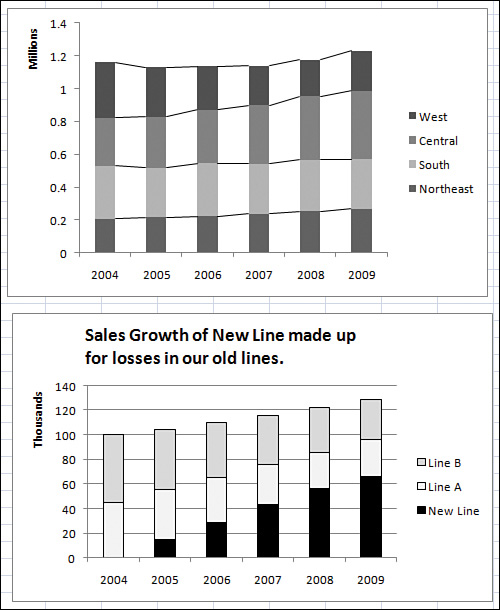
Figure 3.34 Current-year sales are shown as a stacked column chart, with last year’s sales as a dotted line.

2. Select cells A1:D13 and create a stacked column chart. Initially, Excel stacks prior-year sales on top of the other sales, and you have a chart that is not remotely close to the expected outcome.
3. Click the top bar to select the third series. Select Design, Change Chart Type, Line Chart. An important distinction here is that the first two series are plotted as stacked charts. The third series is plotted as a regular line, not as a stacked line.
4. Use the Format tab to format the third series as a dotted line. Format the colors of the first two series as shown in Figure 3.34.
Shortcomings of Showing Many Trends on a Single Chart
Instead of using a stacked column chart, you might try to show many trendlines on a single line chart, which can be confusing. For example, in the top chart in Figure 3.35, the sales trends of five companies create a very confusing chart.
Figure 3.35 Instead of using a single chart with five confusing lines, compare your company to each other competitor in smaller charts.
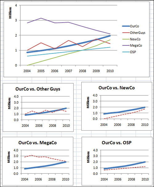
If the goal is to compare the sales results of your company against those of each major competitor, consider using four individual charts instead, as shown at the bottom of Figure 3.35. In these charts, the reader can easily see that your company is about to overtake the long-time industry leader MegaCo, but that quick growth from NewCo might still cause you to stay in the second position next year.
Next Steps
In Chapter 4, you will learn about charts used to make comparisons, including pie, radar, bar, donut, and waterfall charts.