
In some circumstances, we might want to change the look and feel of Qt’s built-in widgets. We may only want to do some minor customizations to tweak the aesthetics slightly, or we may wish to implement an entirely new style, to give our application or suite of applications a unique and distinctive appearance. In either case, there are three main approaches to redefining the look of Qt’s built-in widgets:
We can subclass the individual widget classes and reimplement their paint and mouse event handlers. This gives complete control but involves a lot of work. It also means that we must go through all of our code and Qt Designer forms and change all occurrences of Qt widget classes to use our subclasses.
We can subclass
QStyleor a predefined style such asQWindowsStyle. This approach is very powerful; it is used by Qt itself to provide a native look and feel on the different platforms it supports.Starting with Qt 4.2, we can use Qt style sheets, a mechanism inspired by HTML CSS (Cascading Style Sheets). Since style sheets are plain text files that are interpreted at run-time, no knowledge of programming is required to use them.
We have already covered the techniques required for the first approach, in Chapters 5 and 7, although our emphasis was on creating custom widgets. In this chapter, we will review the last two approaches. We will present two custom styles: the Candy style, specified as a style sheet, and the Bronze style, implemented as a QStyle subclass (see Figure 19.1). To keep the examples to a manageable size, both styles focus on a carefully chosen subset of Qt’s widgets.

Qt style sheets are strongly inspired by CSS but adapted to work on widgets. A style sheet consists of style rules that affect the rendering of a widget. These rules are specified as plain text. Since style sheets are parsed at run-time, we can easily experiment with different designs by specifying a style sheet for a Qt application using the -stylesheet file.qss command-line option, by using Qt Designer’s style sheet editor, or by embedding a QTextEdit inside our application during development.
Style sheets are applied on top of the currently active QStyle (e.g., QWindowsVistaStyle or QPlastiqueStyle).[*] Because creating style sheets doesn’t involve any subclassing, they are ideal for minor customizations to existing widgets. For example, suppose we want to use yellow as the background color of all QLineEdits in an application. This could be accomplished using the following style sheet:
QLineEdit {
    background-color: yellow;
}
In CSS-speak, QLineEdit is called a selector, background-color is an attribute, and yellow is a value.
For this kind of customization, using style sheets produces more reliable results than fiddling with the widget’s palette. This is because a QPalette’s entries (Base, Button, Highlight, etc.) are used differently by different styles. For example, QWindowsStyle uses the Base palette entry to fill the background of a read-only combobox, whereas QPlastiqueStyle uses the Button entry for this purpose. Furthermore, certain styles use hard-coded images to render certain elements, by-passing the palette entirely. In contrast, style sheets guarantee that no matter which QStyle is active, the colors specified will be the ones used.
QApplication::setStyleSheet() sets a style sheet for the entire application:
qApp->setStyleSheet("QLineEdit { background-color: yellow; }");We can also set a style sheet on a widget and its children using QWidget::setStyleSheet(). For example:
dialog->setStyleSheet("QLineEdit { background-color: yellow; }");If we set the style sheet directly on a QLineEdit, we can omit both the QLineEdit selector and the braces:
lineEdit->setStyleSheet("background-color: yellow;");So far, we have set only a single property on a single class of widget. In practice, style rules are often combined. For example, the following rule sets the foreground and background colors of six widget classes and their subclasses:
QCheckBox, QComboBox, QLineEdit, QListView, QRadioButton, QSpinBox {
    color: #050505;
    background-color: yellow;
}
Colors can be specified by name, by an HTML-style string in #RRGGBB format, or by an RGB or RGBA value:
QLineEdit {
    color: rgb(0, 88, 152);
    background-color: rgba(97%, 80%, 9%, 50%);
}
When using color names, we can use any name that is recognized by the QColor::setNamedColor() function. For RGB, we must specify a red, a green, and a blue component, each on a scale of 0 to 255 or 0% to 100%. RGBA additionally lets us specify an alpha value as the fourth component of the color, which corresponds to the color’s opacity. Instead of a uniform color, we can also specify a palette entry or a gradient:
QLineEdit {
    color: palette(Base);
    background-color: qlineargradient(x1: 0, y1: 0, x2: 1, y2: 1,
                                      stop: 0 white, stop: 0.4 gray,
                                      stop: 1 green);
}
The three types of gradients described in Chapter 8 (p. 184) are available as qlineargradient(), qradialgradient(), and qconicalgradient(). The syntax is explained in the style sheet reference documentation.
Using the background-image property, we can specify an image for the background:
QLineEdit {
    color: rgb(0, 88, 152);
    background-image: url(:/images/yellow-bg.png);
}
By default, the background image is rooted in the top-left corner of the widget (excluding any margin specified using margin) and is repeated horizontally and vertically to fill the entire widget. This can be configured using the background-position and background-repeat attributes. For example:
QLineEdit {
    background-image: url(:/images/yellow-bg.png);
    background-position: top right;
    background-repeat: repeat-y;
}
If we specify both a background image and a background color, the background color will shine through the semi-transparent areas of the image.
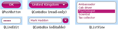
So far, all of the selectors we have used have been class names. There are several other selectors that we can use; they are listed in Figure 19.2. For example, if we want to use specific foreground colors for OK and Cancel buttons, we can write
Table 19.2. Style sheet selectors
Selector | Example | Matched Widgets |
|---|---|---|
Universal |
| Any widget |
Type |
| Instances of a given class, including subclasses |
Class |
| Instances of a given class, excluding subclasses |
ID |
| Widgets with the given object name |
Qt property |
| Widgets with certain properties set to given values |
Child |
| Widgets that are direct children of the given widgets |
Descendant |
| Widgets that are descendants of the given widgets |
QPushButton[text="OK"] {
    color: green;
}

QPushButton[text="Cancel"] {
    color: red;
}
This selector syntax works for any Qt property, although we must bear in mind that style sheets don’t notice when a property changes behind their back. Selectors can also be combined in various ways; for example, to select all QPushButtons called “okButton” whose x and y properties are 0 and that are direct children of a QFrame called “frame”, we can write
QFrame#frame > QPushButton[x="0"][y="0"]#okButton {
    ...
}
In an application that presents large forms with lots of line editors and comboboxes, such as those used by various bureaucracies, it is common to use a yellow background color for mandatory fields. Let’s suppose that we want to apply this convention to our application. First, we would start with this style sheet:
*[mandatoryField="true"] {
    background-color: yellow;
}
Although there is no mandatoryField property defined anywhere in Qt, we can easily create one by calling QObject::setProperty(). Starting with Qt 4.2, setting the value of a non-existent property dynamically creates that property. For example:
nameLineEdit->setProperty("mandatoryField", true);
genderComboBox->setProperty("mandatoryField", true);
ageSpinBox->setProperty("mandatoryField", true);
Style sheets are not only useful for controlling colors. They also let us perform various adjustments to the size and position of widget elements. For example, the following rules can be used to increase the size of checkboxes and radio button indicators to 20 × 20 pixels, and ensure that there are 8 pixels between the indicator and the associated text:
QCheckBox::indicator, QRadioButton::indicator {
    width: 20px;
    height: 20px;
}
QCheckBox, QRadioButton {
    spacing: 8px;
}
Notice the selector syntax for the first rule. Had we written only QCheckBox instead of QCheckBox::indicator, we would have specified the dimensions of the entire widget instead of those of the indicator. The first rule is illustrated in Figure 19.3.

Subcontrols such as ::indicator can be styled in much the same way as widgets. Figure 19.4 lists some of the subcontrols supported by Qt.
Table 19.4. The most common customizable subcontrols
Subcontrol | Description |
|---|---|
| A checkbox, radio button, checkable menu item, or checkable group box’s indicator |
| A push button’s menu indicator |
| A menu, menu bar, or status bar item |
| A spin box or scroll bar’s up button |
| A spin box or scroll bar’s down button |
| A spin box, scroll bar, or header view’s up arrow |
| A spin box, scroll bar, header view, or combobox’s down arrow |
| A combobox’s drop-down arrow |
| A group box’s title |
In addition to subcontrols, a style sheet can refer to specific widget states. For example, we may want to render the checkbox’s text in white when the mouse hovers over it by specifying the :hover state:
QCheckBox:hover {
    color: white;
}
States are signified by using a single colon, whereas subcontrols are signified by using two colons. We can list several states one after another, each separated by a colon. In such cases, the rule will apply only when the widget is in all the specified states. For example, the following rule is applied only if the mouse is hovering over a checked checkbox:
QCheckBox:checked:hover {
    color: white;
}
If we want the rule to apply when any of the states is true, we can use multiple selectors, using commas to separate them:
QCheckBox:hover, QCheckBox:checked {
    color: white;
}
Logical negation is achieved by using an exclamation mark:
QCheckBox:!checked {
    color: blue;
}
States can be combined with subcontrols:
QComboBox::drop-down:hover {
    image: url(:/images/downarrow_bright.png);
}
Figure 19.5 lists the style sheet states that are available.
Table 19.5. Some of the widget states accessible to style sheets
State | Description |
|---|---|
| The widget is disabled |
| The widget is enabled |
| The widget has input focus |
| The mouse is hovering over the widget |
| The widget is being pressed using the mouse |
| The button is checked |
| The button is unchecked |
| The button is partially checked |
| The widget is in an open or expanded state |
| The widget is in a closed or collapsed state |
| The widget is “on” |
| The widget is “off” |
Style sheets can also be used together with other techniques to perform more complex customizations. For example, suppose we want to position a tiny “erase” button inside a QLineEdit’s frame, to the right of the QLineEdit’s text. This involves creating an EraseButton class, and placing it on top of the QLineEdit (e.g., using layouts), but also reserving some space for the button, so that the typed-in text cannot collide with the erase button. Doing this by subclassing QStyle would be inconvenient, because we would have to subclass every style in Qt that might be used by the application (QWindowsVistaStyle, QPlastiqueStyle, etc.). Using style sheets, the following rule does the trick:
QLineEdit {
    padding: 0px 15px 0px 0px;
}
The padding property lets us specify the top, right, bottom, and left padding of the widget. The padding is inserted between the QLineEdit’s text and its frame. For convenience, CSS also defines padding-top, padding-right, padding-bottom, and padding-left, for when we want to set only one padding value. For example:
QLineEdit {
padding-right: 15px;
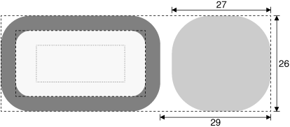
}Like most Qt widgets that are customizable using style sheets, QLineEdit supports the box model depicted in Figure 19.6. This model specifies four rectangles that affect the layout and rendering of a styled widget:
The contents rectangle is the innermost rectangle. This is where the actual contents of the widget (e.g., the text or image) is painted.
The padding rectangle encloses the contents rectangle. It takes into account any padding specified using the
paddingproperty.The border rectangle encloses the padding rectangle. It reserves space for the border.
The margin rectangle is the outermost rectangle. It encloses the border rectangle and takes into account any specified margin.

For a plain widget with no padding, no border, and no margin, the four rectangles coincide exactly.
We will now present a style sheet that implements a custom style called Candy. Figure 19.7 shows a selection of Candy-styled widgets. The Candy style defines a custom look and feel for QLineEdits, QListViews, QPushButtons, and QComboBoxes, using the box model presented in Figure 19.6. We will present the style sheet piece by piece; the entire style sheet is available as qss/candy.qss in the Candy example’s directory supplied with the book’s examples.
The widgets are used in the dialog shown in Figure 19.1. The dialog itself has a background image set by the following rule:
QDialog {
    background-image: url(:/images/background.png);     [R1]
}
The following rule sets the color and font attributes for QLabels:
QLabel {
    font: 9pt;
    color: rgb(0, 0, 127);                              [R2]
}
The next rule defines the look of the dialog’s QLineEdit and of its QListView:
QLineEdit,
QListView {
    color: rgb(127, 0, 63);
    background-color: rgb(255, 255, 241);
    selection-color: white;                             [R3]
    selection-background-color: rgb(191, 31, 127);
    border: 2px groove gray;
    border-radius: 10px;
    padding: 2px 4px;
}
To make the QLineEdit and QListView really stand out, we have specified custom foreground and background colors for normal and selected text. In addition, we have specified a gray 2-pixel-wide “grooved” border with the border attribute. Instead of using border, we could have set border-width, border-style, and border-color individually. We can round a border’s corners by specifying a border-radius, and we have done so here using a radius of 10 pixels. Figure 19.8 provides a schematic representation of the effects of our changes to the widgets’ border and padding attributes. To ensure that the widget’s contents don’t collide with the border’s rounded corners, we specify an internal padding of 2 pixels vertically and 4 pixels horizontally. For QListViews, the vertical padding doesn’t look quite right, so we override it as follows:
QListView {
    padding: 5px 4px;                                   [R4]
}
When an attribute is set by several rules that have the same selector, the last rule is the one that is applied.
For styling QPushButtons, we will use a completely different approach. Instead of drawing the button using style sheet rules, we will use a ready-made image as the background. Also, to make the button scalable, the button background is defined using the CSS border image mechanism.
Unlike a background image specified using background-image, a border image is cut into a 3 × 3 grid, as shown in Figure 19.9. When filling the background of a widget, the four corners (cells A, C, G, and I in the diagram) are taken as is, whereas the other five cells are stretched, or tiled, to fill the available space.

Border images are specified using the border-image property, which requires us to specify an image file name and the four “cuts” that define the nine cells. The cuts are defined as pixel distances from the top, right, bottom, and left edges. A border.png border image with cuts at 4, 8, 12, and 16 pixels from the top, right, bottom, and left edges would be specified as
border-image: url(border.png) 4 8 12 16;
When using a border image, we must also set the border-width attribute explicitly. Normally, border-width should correspond to where the cuts fall; otherwise, the corner cells will be stretched or shrunk to fit the border-width. For the border.png example, we would specify the border widths as follows:
border-width: 4px 8px 12px 16px;
Now that we know how the border image mechanism works, let us see how it is used for styling Candy QPushButtons. Here are the rules that define how push buttons are rendered in their normal state:
QPushButton {
    color: white;
    font: bold 10pt;
    border-image: url(:/images/button.png) 16;
    border-width: 16px;                                   [R5]
    padding: -16px 0px;
    min-height: 32px;
    min-width: 60px;
}
In the Candy style sheet, the four cuts for a QPushButton’s border image are located at 16 pixels from the edges of a 34 × 34 pixel border image, as shown in Figure 19.10 (a). Because the four cuts are uniform, we only need to write “16” for the cuts and “16px” for the border width.
In the QPushButton example shown in Figure 19.10 (b), the border image cells corresponding to D, E, and F were dropped because the resized button was not tall enough to need them, and cells B and H were horizontally stretched to occupy the extra width.

The standard use of a border image is to provide a border around a widget, with the widget inside the border. But we have subverted the border image mechanism and used it to create the background of the widget itself. As a result, cell E has been dropped, and the padding rectangle has height 0. To make some room for the push button’s text, we specify a vertical padding of -16 pixels. Figure 19.11 illustrates the situation. If we had used the border image mechanism to define an actual border, we probably wouldn’t want the text to collide with it—but because we are using it to create a scalable background, we want the text to go on top of it rather than inside it.

Using min-width and min-height, we set the minimum size of the push button’s contents. The values chosen here ensure that there is enough room for the border image corners and that an OK button is made a bit wider than necessary, to make it look better next to the Cancel button.
The preceding QPushButton rules apply to all push buttons. We will now define a few extra rules that apply only when buttons are in certain states.
QPushButton:hover {
    border-image: url(:/images/button-hover.png) 16;           [R6]
}
When the mouse pointer hovers over a QPushButton, the :hover state evaluates to true and the specified rule overrides any other rule that has a less specific selector. Here, we use this technique to specify a slightly brighter image as the border image, to obtain a nice hover effect. The other QPushButton attributes that were specified earlier continue to apply; only the border-image attribute changes.
QPushButton:pressed {
    color: lightgray;
    border-image: url(:/images/button-pressed.png) 16;         [R7]
    padding-top: -15px;
    padding-bottom: -17px;
}
When the user presses a push button, we change the foreground color to light gray, we use a darker border image, and we move the push button’s text down one pixel by tweaking the padding.
Our final style rules will customize the appearance of QComboBoxes. To show off the control and precision we can achieve using style sheets, we will distinguish between read-only and editable comboboxes, as Figure 19.12 shows. Read-only comboboxes are rendered as a QPushButton with a down arrow on the right, whereas editable comboboxes are made up of a QLineEdit-like component and of a small rounded button. It turns out that we can reuse most of the rules that we have already defined for QLineEdits, QListViews, and QPushButtons.

The rule that defines the look of a
QLineEditcan be used to style editable comboboxes:QComboBox:editable, QLineEdit, QListView { color: rgb(127, 0, 63); background-color: rgb(255, 255, 241); selection-color: white; [R3´] selection-background-color: rgb(191, 31, 127); border: 2px groove gray; border-radius: 10px; padding: 2px 4px; }
The rules that define the look of a
QPushButtonin its normal state can be extended to apply to read-only comboboxes:QComboBox:!editable, QPushButton { color: white; font: bold 10pt; border-image: url(:/images/button.png) 16; [R5´] border-width: 16px; padding: -16px 0px; min-height: 32px; min-width: 60px; }
Hovering over a read-only combobox or over the drop-down button of an editable combobox should change the background image, just like it already does for
QPushButton:QComboBox:!editable:hover, QComboBox::drop-down:editable:hover, QPushButton:hover { border-image: url(:/images/button-hover.png) 16; [R6´] }
Pressing a read-only combobox is like pressing a
QPushButton:QComboBox:!editable:on, QPushButton:pressed { color: lightgray; border-image: url(:/images/button-pressed.png) 16; [R7´] padding-top: -15px; padding-bottom: -17px; }
Reusing rules R3, R5, R6, and R7 saves time and helps keep our styling consistent. But we have not defined any rules that will draw the drop-down buttons, so we will create these now.
QComboBox::down-arrow {
    image: url(:/images/down-arrow.png);                       [R8]
}
We provide our own down arrow image so that it is a bit larger than the standard arrow.
QComboBox::down-arrow:on {
    top: 1px;                                                  [R9]
}
If the combobox is open, the down arrow is moved down one pixel.
QComboBox * {
    font: 9pt;                                                [R10]
}
When the user clicks a combobox, it displays a list of items. Rule R10 ensures that the combobox’s pop-up (or any other child widget) doesn’t inherit the larger font size that applies to the combobox by rule R5´.
QComboBox::drop-down:!editable {
    subcontrol-origin: padding;
    subcontrol-position: center right;
    width: 11px;                                              [R11]
    height: 6px;
    background: none;
}
Using the subcontrol-origin and subcontrol-position attributes, we position the drop-down arrow vertically centered on the right-hand side of the padding rectangle used by read-only comboboxes. In addition, we also set its size to correspond to the size of the button’s contents, the 11 × 6 pixel down-arrow.png image, and we disable its background because our drop-down button only consists of the drop-down arrow.
QComboBox:!editable {
    padding-right: 15px;                                      [R12]
}
For read-only comboboxes, we specify a right padding of 15 pixels to ensure that the text shown in the combobox doesn’t overlap with the drop-down arrow. Figure 19.13 shows how these dimensions interact with each other.

For editable comboboxes, we need to configure the drop-down button so that it looks like a tiny QPushButton:
QComboBox::drop-down:editable {
    border-image: url(:/images/button.png) 16;
    border-width: 10px;
    subcontrol-origin: margin;
    subcontrol-position: center right;                        [R13]
    width: 7px;
    height: 6px;
}
We specify button.png as the border image. However, this time, we specify a border width of 10 pixels instead of 16, to scale the image down a bit, and specify a fixed size of the contents of 7 pixels horizontally and 6 pixels vertically. Figure 19.14 shows a schematic of what we have done.

If the combobox is open, we use a different, darker image for the drop-down button:
QComboBox::drop-down:editable:open {
    border-image: url(:/images/button-pressed.png) 16;        [R14]
}
For editable comboboxes, we specify a right margin of 29 pixels to provide space for the drop-down button, as shown on Figure 19.15:
QComboBox:editable {
    margin-right: 29px;                                       [R15]
}
We have now finished creating our Candy style sheet. The style sheet is about 100 lines long, and makes use of a few custom images. The result is a highly distinctive dialog.
Creating a custom style using style sheets can involve quite a lot of trial and error, especially for those who have not used CSS before. One of the main challenges with style sheets is that CSS conflict resolution and cascading don’t always give intuitive results. For further details, see the online documentation at http://doc.trolltech.com/4.3/stylesheet.html. This describes Qt’s style sheet support and provides links to the CSS specification.
The QStyle class was introduced with Qt 2.0 to provide a means of encapsulating an application’s look and feel. Classes such as QWindowsStyle, QMotifStyle, and QCDEStyle implemented the look and feel for the platforms and desktop environments on which Qt ran at the time. Qt 4.3 provides eight styles, in addition to the QStyle abstract base class and the convenience base class QCommonStyle. Figure 19.16 shows how they relate to each other.

For Qt developers, the QStyle architecture makes it possible to develop a custom look and feel by subclassing QStyle or one of the existing styles. We can perform minor customizations on an existing style (e.g., QWindowsStyle), or we can develop an entire custom style from scratch.
The QStyle API consists of functions for drawing graphical elements (drawPrimitive(), drawControl(), drawComplexControl(), etc.) and for querying the style (pixelMetrics(), styleHint(), hitTest(), etc.). The QStyle member functions typically take a QStyleOption object that holds both general information about the widget to be drawn (such as its palette) and widget-specific information (e.g., the text of a button). The functions also take an optional pointer to a QWidget, to cater to situations when the QStyleOption doesn’t provide all the necessary information.
Suppose we want to create a MyPushButton class, which would look like a standard Qt push button but without deriving from QPushButton. (This example is rather contrived, but it will help us to clarify the relationship between widgets and styles.) In the MyPushButton paint event handler, we would set up a QStyleOption (actually, a QStyleOptionButton) and call QStyle::drawControl() as follows:
void MyPushButton::paintEvent(QPaintEvent * /* event */)
{
    QPainter painter(this);

    QStyleOptionButton option;
    option.initFrom(this);
    if (isFlat())
        option.features |= QStyleOptionButton::Flat;
    option.text = text();

    style()->drawControl(QStyle::CE_PushButton, &option, &painter,
                         this);
}
The QStyleOption::initFrom() function initializes the fundamental member variables that represent a widget, such as rect, state (enabled, focused, etc.), and palette. Member variables specific to QStyleOptionButton must be initialized manually. In the MyPushButton example, we initialize features and text and let icon and iconSize take their default values.
The QWidget::style() function returns the appropriate style for drawing the widget. The style is normally set for the entire application using QApplication::setStyle(), but it is also possible to override it for individual widgets using QWidget::setStyle().
The drawControl() function is reimplemented by the various QStyle subclasses to draw QPushButton and other simple widgets. A typical implementation might look like this:
void QMotifStyle::drawControl(ControlElement element,
                              const QStyleOption *option,
                              QPainter *painter,
                              const QWidget *widget) const
{
    switch (element) {
    case CE_CheckBox:
        ...
    case CE_RadioButton:
        ...
    case CE_PushButton:
        if (const QStyleOptionButton *buttonOption =
                qstyleoption_cast<const QStyleOptionButton *>(option)) {
           // draw push button
        }
        break;
        ...
    }
}
The first parameter, element, indicates the type of widget to draw. If the type is CE_PushButton, the style attempts to cast the option parameter to QStyleOptionButton. If the cast is successful, it draws the push button described by QStyleOptionButton. The cast from const QStyleOption * to const QStyleOptionButton * is performed using qstyleoption_cast<T>(), which returns a null pointer if option doesn’t point to a QStyleOptionButton instance.
Instead of relying on the QStyleOption, a QStyle subclass may also query the widget directly:
case CE_PushButton:
    if (const QPushButton *button =
            qobject_cast<const QPushButton *>(widget)) {
       // draw push button
    }
    break;
The drawback with this version is that the style code is tied to QPushButton and thus cannot be used to render, say, a MyPushButton. For this reason, the built-in QStyle subclasses use the QStyleOption parameter whenever possible to obtain information about the widget to draw, and resort to using the QWidget parameter only if that is the only thing that will provide the required information.
In the rest of this section, we will review the code for the Bronze style shown in Figure 19.17. The Bronze style features round buttons with a gradient background, unconventional placement of spin box buttons, extravagant checkmarks, and a “brushed bronze” background. To implement this, it uses advanced 2D graphics features such as antialiasing, semi-transparency, linear gradients, and composition modes.

Here is the BronzeStyle class definition:
class BronzeStyle : public QWindowsStyle
{
    Q_OBJECT

public:
    BronzeStyle() {}

    void polish(QPalette &palette);
    void polish(QWidget *widget);
    void unpolish(QWidget *widget);
    int styleHint(StyleHint which, const QStyleOption *option,
                  const QWidget *widget = 0,
                  QStyleHintReturn *returnData = 0) const;
    int pixelMetric(PixelMetric which, const QStyleOption *option,
                    const QWidget *widget = 0) const;
    void drawPrimitive(PrimitiveElement which,
                       const QStyleOption *option, QPainter *painter,
                       const QWidget *widget = 0) const;
    void drawComplexControl(ComplexControl which,
                            const QStyleOptionComplex *option,
                            QPainter *painter,
                            const QWidget *widget = 0) const;
    QRect subControlRect(ComplexControl whichControl,
                         const QStyleOptionComplex *option,
                         SubControl whichSubControl,
                         const QWidget *widget = 0) const;
public slots:
    QIcon standardIconImplementation(StandardPixmap which,
                                     const QStyleOption *option,
                                     const QWidget *widget = 0) const;
private:
    void drawBronzeFrame(const QStyleOption *option,
                         QPainter *painter) const;
    void drawBronzeBevel(const QStyleOption *option,
                         QPainter *painter) const;
    void drawBronzeCheckBoxIndicator(const QStyleOption *option,
                                     QPainter *painter) const;
    void drawBronzeSpinBoxButton(SubControl which,
                                 const QStyleOptionComplex *option,
                                 QPainter *painter) const;
};
When creating a custom style, we usually base it on an existing style so that we don’t have to do everything from scratch. For this example, we chose QWindowsStyle, the classic Windows style. Even though the Bronze style doesn’t look much like the Windows style, there is a large body of code in QWindowsStyle and its base class QCommonStyle that can be reused as is to implement just about any style we can imagine. This is why QMacStyle is derived from QWindowsStyle even though they look very different.
BronzeStyle reimplements several public functions declared by QStyle. The polish() and unpolish() functions are called when the style is installed or uninstalled. They make it possible to tweak the widgets or the palette. The other public functions are either query functions (styleHint(), pixelMetric(), subControlRect()) or functions that draw a graphical element (drawPrimitive(), drawComplexControl()).
BronzeStyle also provides a public slot called standardIconImplementation(). This slot is discovered by Qt using introspection and is invoked when necessary as though it had been a virtual function. Qt sometimes uses this idiom to add functions that should have been virtual without breaking binary compatibility with earlier Qt 4 releases. It is expected that Qt 5 will replace the standardIconImplementation() slot with a standardIcon() virtual function.
The BronzeStyle class also declares a few private functions. These will be explained after we have covered the public functions.
void BronzeStyle::polish(QPalette &palette)
{
    QPixmap backgroundImage(":/images/background.png");
    QColor bronze(207, 155, 95);
    QColor veryLightBlue(239, 239, 247);
    QColor lightBlue(223, 223, 239);
    QColor darkBlue(95, 95, 191);

    palette = QPalette(bronze);
    palette.setBrush(QPalette::Window, backgroundImage);
    palette.setBrush(QPalette::BrightText, Qt::white);
    palette.setBrush(QPalette::Base, veryLightBlue);
    palette.setBrush(QPalette::AlternateBase, lightBlue);
    palette.setBrush(QPalette::Highlight, darkBlue);
    palette.setBrush(QPalette::Disabled, QPalette::Highlight,
                     Qt::darkGray);
}
One of the outstanding characteristics of the Bronze style is its color scheme. No matter what colors the user has set on their window system, the Bronze style has a bronze appearance. A custom style’s color scheme can be set up in one of two ways: We can ignore the widget’s QPalette and draw everything using our favorite colors (bronze, light bronze, dark bronze, etc.), or we can reimplement QStyle::polish(QPalette &) to adjust the application’s or widget’s palette and then use the palette. The second approach is more flexible because we can override the color scheme in a subclass (say, SilverStyle) by reimplementing polish().
The concept of polishing is generalized to widgets. When a style is applied to a widget, polish(QWidget *) is called, allowing us to perform last-minute customizations:
void BronzeStyle::polish(QWidget *widget)
{
    if (qobject_cast<QAbstractButton *>(widget)
            || qobject_cast<QAbstractSpinBox *>(widget))
        widget->setAttribute(Qt::WA_Hover, true);
}
Here, we reimplement polish(QWidget *) to set the Qt::WA_Hover attribute on buttons and spin boxes. When this attribute is set, a paint event is generated when the mouse enters or leaves the area occupied by a widget. This gives us the opportunity to paint a widget differently depending on whether or not the mouse is hovering over it.
This function is called after the widget has been created and before it is shown for the first time, using the current style. It is then only ever called if the current style is dynamically changed.
void BronzeStyle::unpolish(QWidget *widget)
{
    if (qobject_cast<QAbstractButton *>(widget)
            || qobject_cast<QAbstractSpinBox *>(widget))
        widget->setAttribute(Qt::WA_Hover, false);
}
Just as polish(QWidget *) is called when a style is applied to a widget, unpolish(QWidget *) is called whenever the style is dynamically changed. The purpose of unpolish() is to undo the effects of the polish() so that the widget is in a state to be polished by the new style. Well-behaved styles try to undo what they did in their polish() function.
A common use of polish(QWidget *) is to install our style subclass as an event filter on a widget. This is necessary for some more advanced customizations; for example, QWindowsVistaStyle and QMacStyle use this technique to animate default buttons.
int BronzeStyle::styleHint(StyleHint which, const QStyleOption *option,
                           const QWidget *widget,
                           QStyleHintReturn *returnData) const
{
    switch (which) {
    case SH_DialogButtonLayout:
        return int(QDialogButtonBox::MacLayout);
    case SH_EtchDisabledText:
        return int(true);
    case SH_DialogButtonBox_ButtonsHaveIcons:
        return int(true);
    case SH_UnderlineShortcut:
        return int(false);
    default:
        return QWindowsStyle::styleHint(which, option, widget,
                                        returnData);
    }
}
The styleHint() function returns some hints about the look and feel provided by the style. For example, we return MacLayout for SH_DialogButtonLayout to signify that we want QDialogButtonBox to follow the Mac OS X guidelines, with OK to the right of Cancel. The return type of styleHint() is int. For the few style hints that cannot be represented as integers, styleHint() provides a pointer to a QStyleHintReturn object that can be used.
int BronzeStyle::pixelMetric(PixelMetric which,
                             const QStyleOption *option,
                             const QWidget *widget) const
{
    switch (which) {
    case PM_ButtonDefaultIndicator:
        return 0;
    case PM_IndicatorWidth:
    case PM_IndicatorHeight:
        return 16;
    case PM_CheckBoxLabelSpacing:
        return 8;
    case PM_DefaultFrameWidth:
        return 2;
    default:
        return QWindowsStyle::pixelMetric(which, option, widget);
    }
}
The pixelMetric() function returns a dimension in pixels that is used for a user interface element. By reimplementing this function, we affect both the drawing of the built-in Qt widgets and their size hints.
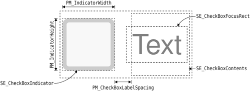
We return 0 for PM_ButtonDefaultIndicator because we don’t want to reserve any extra spacing around default buttons (the default is 1 pixel in QWindowsStyle). For checkboxes, PM_IndicatorWidth and PM_IndicatorHeight control the size of the indicator (usually a small square), and PM_CheckBoxLabelSpacing controls the spacing between the checkbox indicator and the text to its right (see Figure 19.18). Finally, PM_DefaultFrameWidth defines the width of the line used around QFrame, QPushButton, QSpinBox, and many other widgets. For other PM_xxx values, we inherit the pixel metric value from the base class.
QIcon BronzeStyle::standardIconImplementation(StandardPixmap which,
        const QStyleOption *option, const QWidget *widget) const
{
    QImage image = QWindowsStyle::standardPixmap(which, option, widget)
                   .toImage();
    if (image.isNull())
        return QIcon();
    QPalette palette;
    if (option) {
        palette = option->palette;
    } else if (widget) {
        palette = widget->palette();
    }
    QPainter painter(&image);
    painter.setOpacity(0.25);
    painter.setCompositionMode(QPainter::CompositionMode_SourceAtop);
    painter.fillRect(image.rect(), palette.highlight());
    painter.end();

    return QIcon(QPixmap::fromImage(image));
}
As explained earlier, Qt invokes the standardIconImplementation() slot to obtain the standard icons that should be used in user interfaces. We call the base class’s standardPixmap() to obtain the icon and try to give it a slight blue tint, to make it blend in with the rest of the style. The tinting is achieved by drawing a 25% opaque blue color on top of the existing icon. By using the SourceAtop composition mode, we make sure that the existing transparent areas stay transparent, instead of becoming 25% blue and 75% transparent. We describe composition modes in the “High-Quality Rendering with QImage” section of Chapter 8 (p. 195).
void BronzeStyle::drawPrimitive(PrimitiveElement which,
                                const QStyleOption *option,
                                QPainter *painter,
                                const QWidget *widget) const
{
    switch (which) {
    case PE_IndicatorCheckBox:
        drawBronzeCheckBoxIndicator(option, painter);
        break;
    case PE_PanelButtonCommand:
        drawBronzeBevel(option, painter);
        break;
    case PE_Frame:
        drawBronzeFrame(option, painter);
        break;
    case PE_FrameDefaultButton:
        break;
    default:
        QWindowsStyle::drawPrimitive(which, option, painter, widget);
    }
}
Qt calls the drawPrimitive() function to draw “primitive” user interface elements. These elements are typically used by several widgets. For example, PE_IndicatorCheckBox is used by QCheckBox, QGroupBox, and QItemDelegate to draw a checkbox indicator.
In the Bronze style, we reimplement drawPrimitive() to provide a custom look to checkbox indicators, push buttons, and frames. For example, Figure 19.19 shows the structure of a QPushButton which the Bronze style must handle. The drawBronzeCheckBoxIndicator(), drawBronzeBevel(), and drawBronzeFrame() functions are private functions that we will review later.

For PE_FrameDefaultButton, we simply do nothing, because we don’t want to draw an extra frame around default buttons. For all other primitive elements, we simply forward the call to the base class.
void BronzeStyle::drawComplexControl(ComplexControl which,
                                     const QStyleOptionComplex *option,
                                     QPainter *painter,
                                     const QWidget *widget) const
{
    if (which == CC_SpinBox) {
        drawBronzeSpinBoxButton(SC_SpinBoxDown, option, painter);
        drawBronzeSpinBoxButton(SC_SpinBoxUp, option, painter);

        QRect rect = subControlRect(CC_SpinBox, option,
                                    SC_SpinBoxEditField)
                     .adjusted(-1, 0, +1, 0);
        painter->setPen(QPen(option->palette.mid(), 1.0));
        painter->drawLine(rect.topLeft(), rect.bottomLeft());
        painter->drawLine(rect.topRight(), rect.bottomRight());
    } else {
        return QWindowsStyle::drawComplexControl(which, option, painter,
                                                 widget);
    }
}
Qt calls the drawComplexControl() function to draw widgets that consist of multiple subcontrols—notably QSpinBox. Since we want to give a radically new look to QSpinBox, we reimplement drawComplexControl() and handle the CC_SpinBox case.
To draw a QSpinBox we must draw the up and down buttons and the frame around the entire spin box. (The structure of a QSpinBox is shown in Figure 19.20.) Since the code required for drawing an up button is almost identical to that for drawing a down button, we have factored it out into the drawBronzeSpinBoxButton() private function. The function also draws the frame around the entire spin box.

QSpinBox uses a QLineEdit to represent the editable part of the widget, so we don’t need to draw that part of the widget. However, to cleanly separate the QLineEdit and the spin box buttons, we draw two light brown vertical lines at the edge of the QLineEdit. The QLineEdit’s geometry is obtained by calling subControlRect() with SC_SpinBoxEditField as the third argument.
QRect BronzeStyle::subControlRect(ComplexControl whichControl,
                                  const QStyleOptionComplex *option,
                                  SubControl whichSubControl,
                                  const QWidget *widget) const
{
    if (whichControl == CC_SpinBox) {
        int frameWidth = pixelMetric(PM_DefaultFrameWidth, option,
                                     widget);

        int buttonWidth = 16;

        switch (whichSubControl) {
        case SC_SpinBoxFrame:
            return option->rect;
        case SC_SpinBoxEditField:
            return option->rect.adjusted(+buttonWidth, +frameWidth,
                                         -buttonWidth, -frameWidth);
        case SC_SpinBoxDown:
            return visualRect(option->direction, option->rect,
                              QRect(option->rect.x(), option->rect.y(),
                                    buttonWidth,
                                    option->rect.height()));
        case SC_SpinBoxUp:
            return visualRect(option->direction, option->rect,
                              QRect(option->rect.right() - buttonWidth,
                                    option->rect.y(),
                                    buttonWidth,
                                    option->rect.height()));
        default:
            return QRect();
        }
    } else {
        return QWindowsStyle::subControlRect(whichControl, option,
                                             whichSubControl, widget);
    }
}
Qt calls the subControlRect() function to determine where the subcontrols of a widget are located. For example, QSpinBox calls it to determine where to place its QLineEdit. It is also used when reacting to mouse events, to find out which subcontrol was clicked. In addition, we called it ourselves when implementing drawComplexControl(), and we will call it again from drawBronzeSpinBoxButton().
In our reimplementation, we check whether the widget is a spin box, and if this is the case, we return meaningful rectangles for the spin box’s frame, edit field, down button, and up button. Figure 19.20 shows how these rectangles relate to each other. For the other widgets, including QPushButton, we rely on the base class’s implementation.
The rectangles we return for SC_SpinBoxDown and SC_SpinBoxUp are passed through QStyle::visualRect(). Calls to visualRect() have the following syntax:
visualRect(direction, outerRect, logicalRect)
If the direction is Qt::LeftToRight, then logicalRect is returned unchanged; otherwise, logicalRect is flipped with respect to outerRect. This ensures that graphical elements are mirrored in right-to-left mode, which is used for languages such as Arabic and Hebrew. For symmetric elements such as SC_SpinBoxFrame and SC_SpinBoxEditField, flipping would have no effect, so we don’t bother calling visualRect(). To test a style in right-to-left mode, we can simply pass the -reverse command-line option to an application that uses the style. Figure 19.21 shows the Bronze style in right-to-left mode.

This completes our review of the public functions reimplemented from QWindowsStyle. The next four functions are private drawing functions.
void BronzeStyle::drawBronzeFrame(const QStyleOption *option,
                                  QPainter *painter) const
{
    painter->save();
    painter->setRenderHint(QPainter::Antialiasing, true);
    painter->setPen(QPen(option->palette.foreground(), 1.0));
    painter->drawRect(option->rect.adjusted(+1, +1, -1, -1));
    painter->restore();
}
The drawBronzeFrame() function was called from drawPrimitive() to draw a PE_Frame primitive element. This is used to draw the frame around a QFrame (or a subclass, such as QTreeView) when the frame shape is QFrame::StyledPanel. (The other frame shapes, such as Box, Panel, and VLine, are drawn directly by QFrame without going through the style.)
The frame we draw is an antialiased 1-pixel-wide outline around the widget, using the palette’s foreground brush (available through the QStyleOption’s palette member variable). Since the rectangle is antialiased and is located on an integer coordinate, the resulting effect is a blurred 2-pixel-wide outline, which is precisely what we want for the Bronze style.
To ensure that we leave the QPainter in the same state as we got it, we call save() before we call setRenderHint() and setPen(), and call restore() at the end. This is necessary because Qt optimizes drawing by reusing the same QPainter to draw several graphical elements.
The next function we will study is drawBronzeBevel(), which draws the background of a QPushButton:
void BronzeStyle::drawBronzeBevel(const QStyleOption *option,
                                  QPainter *painter) const
{
    QColor buttonColor = option->palette.button().color();
    int coeff = (option->state & State_MouseOver) ? 115 : 105;

    QLinearGradient gradient(0, 0, 0, option->rect.height());
    gradient.setColorAt(0.0, option->palette.light().color());
    gradient.setColorAt(0.2, buttonColor.lighter(coeff));
    gradient.setColorAt(0.8, buttonColor.darker(coeff));
    gradient.setColorAt(1.0, option->palette.dark().color());
We start by setting up the QLinearGradient that is used to fill the background. The gradient is light at the top and dark at the bottom, and goes through intermediate shades of bronze in between. The intermediate steps at 0.2 and 0.8 contribute to giving the button a fake 3D effect. The coeff factor controls how much of a 3D look the button should have. When the mouse hovers over the button, we use 115% as the coeff to make the button rise up slightly.
    double penWidth = 1.0;
    if (const QStyleOptionButton *buttonOpt =
            qstyleoption_cast<const QStyleOptionButton *>(option)) {
        if (buttonOpt->features & QStyleOptionButton::DefaultButton)
            penWidth = 2.0;
    }
The Bronze style uses a 2-pixel-wide outline around default buttons and a 1-pixel-wide outline otherwise. To find out whether the push button is a default button, we cast option to a const QStyleOptionButton * and check its features member variable.
    QRect roundRect = option->rect.adjusted(+1, +1, -1, -1);
    if (!roundRect.isValid())
        return;

    int diameter = 12;
    int cx = 100 * diameter / roundRect.width();
    int cy = 100 * diameter / roundRect.height();
We define some more variables that will be used below to draw the button. The cx and cy coefficients specify how rounded we want the push button corners to be. They are computed in terms of diameter, which specifies the rounded corners’ desired diameters.
    painter->save();
    painter->setPen(Qt::NoPen);
    painter->setBrush(gradient);
    painter->drawRoundRect(roundRect, cx, cy);

    if (option->state & (State_On | State_Sunken)) {
        QColor slightlyOpaqueBlack(0, 0, 0, 63);
        painter->setBrush(slightlyOpaqueBlack);
        painter->drawRoundRect(roundRect, cx, cy);
    }

    painter->setRenderHint(QPainter::Antialiasing, true);
    painter->setPen(QPen(option->palette.foreground(), penWidth));
    painter->setBrush(Qt::NoBrush);
    painter->drawRoundRect(roundRect, cx, cy);
    painter->restore();
}
Finally, we perform the drawing. We start by drawing the background using the QLinearGradient that we defined earlier in the function. If the button is currently pressed (or is a toggle button in its “on” state), we draw a 75% transparent black color on top of it to make it a bit darker.
Once we have drawn the background, we turn on antialiasing to obtain smooth rounded corners, we set an appropriate pen, we clear the brush, and we draw the outline.
void BronzeStyle::drawBronzeSpinBoxButton(SubControl which,
        const QStyleOptionComplex *option, QPainter *painter) const
{
    PrimitiveElement arrow = PE_IndicatorArrowLeft;
    QRect buttonRect = option->rect;
    if ((which == SC_SpinBoxUp)
            != (option->direction == Qt::RightToLeft)) {
        arrow = PE_IndicatorArrowRight;
        buttonRect.translate(buttonRect.width() / 2, 0);
    }
    buttonRect.setWidth((buttonRect.width() + 1) / 2);

    QStyleOption buttonOpt(*option);

    painter->save();
    painter->setClipRect(buttonRect, Qt::IntersectClip);
    if (!(option->activeSubControls & which))
        buttonOpt.state &= ~(State_MouseOver | State_On | State_Sunken);
    drawBronzeBevel(&buttonOpt, painter);

    QStyleOption arrowOpt(buttonOpt);
    arrowOpt.rect = subControlRect(CC_SpinBox, option, which)
                    .adjusted(+3, +3, -3, -3);
    if (arrowOpt.rect.isValid())
        drawPrimitive(arrow, &arrowOpt, painter);
    painter->restore();
}
The drawBronzeSpinBoxButton() function draws the up or down button of a spin box, depending on whether which is SC_SpinBoxDown or SC_SpinBoxUp. We start by setting up the arrow to draw on the button (a left or a right arrow) and the rectangle in which we draw the button.
If which is SC_SpinBoxDown (or which is SC_SpinBoxUp and the layout direction is right-to-left), we use a left arrow (PE_IndicatorArrowLeft) and we draw the button in the left half of the spin box’s rectangle; otherwise, we use a right arrow and we draw the button in the right half.
To draw the button, we call drawBronzeBevel() with a QStyleOption that correctly reflects the state of the spin box button we want to draw. For example, if the mouse is hovering over the spin box but not over the spin box button corresponding to which, we clear the State_MouseOver, State_On, and State_Sunken flags from the QStyleOption’s state. This is necessary to ensure that the two spin box buttons behave independently of each other.
Before we perform any drawing, we call setClipRect() to set the clipping rectangle on the QPainter. This is because we want to draw only the left or right half of a button bevel, not the entire button bevel.
Finally, at the end, we draw the arrow by calling drawPrimitive(). The QStyleOption used to draw the arrow is set up with a rectangle that corresponds to the spin box button’s rectangle (SC_SpinBoxUp or SC_SpinBoxDown) but is a bit smaller, to obtain a smaller arrow.
void BronzeStyle::drawBronzeCheckBoxIndicator(
        const QStyleOption *option, QPainter *painter) const
{
    painter->save();
    painter->setRenderHint(QPainter::Antialiasing, true);

    if (option->state & State_MouseOver) {
        painter->setBrush(option->palette.alternateBase());
    } else {
        painter->setBrush(option->palette.base());
    }
    painter->drawRoundRect(option->rect.adjusted(+1, +1, -1, -1));

    if (option->state & (State_On | State_NoChange)) {
        QPixmap pixmap;
        if (!(option->state & State_Enabled)) {
            pixmap.load(":/images/checkmark-disabled.png");
        } else if (option->state & State_NoChange) {
            pixmap.load(":/images/checkmark-partial.png");
        } else {
            pixmap.load(":/images/checkmark.png");
        }

        QRect pixmapRect = pixmap.rect()
                                 .translated(option->rect.topLeft())
                                 .translated(+2, -6);
        QRect painterRect = visualRect(option->direction, option->rect,
                                       pixmapRect);
        if (option->direction == Qt::RightToLeft) {
            painter->scale(-1.0, +1.0);
            painterRect.moveLeft(-painterRect.right() - 1);
        }
        painter->drawPixmap(painterRect, pixmap);
    }
    painter->restore();
}
Although the drawBronzeCheckBoxIndicator() code might look complex at first sight, drawing a checkbox indicator is actually quite simple: We draw a rectangle using drawRoundRect(), and we draw the checkmark using drawPixmap(). The complications arise because we want to use a different background color when the mouse hovers over the checkbox indicator, because we distinguish between normal checkmarks, disabled checkmarks, and partial checkmarks (for tri-state checkboxes), and because we flip the checkmark in right-to-left mode (by flipping the QPainter’s coordinate system).
We have now completed the implementation of our Bronze QStyle subclass. In the screenshots shown in Figure 19.17, a QDateEdit and a QTreeWidget are shown, both of which use the Bronze style even though we have not written any code specifically for them. This is because QDateEdit, QDoubleSpinBox, and some other widgets are all “spin boxes”, and so make use of the Bronze style code for rendering themselves; similarly, QTreeWidget and all other widget classes that are derived from QFrame get the custom look defined by the Bronze style.
The Bronze style presented in this section can easily be used in an application, by linking it in and calling
QApplication::setStyle(new BronzeStyle);
in the application’s main() function. Widgets that aren’t handled explicitly by the Bronze style will have a classic Windows look. Custom styles can also be compiled as plugins and used afterwards in Qt Designer to preview forms using that style. In Chapter 21, we will show how to make the Bronze style available as a Qt plugin.
Although the style developed here is only about 300 lines of code, be aware that developing a fully functional custom style is a major undertaking that typically requires 3000 to 5000 lines of C++ code. For this reason, it is often easier and more convenient to use Qt style sheets whenever possible, or to use a hybrid approach, combining style sheets and a custom QStyle. If you plan to create a custom QStyle, implementing styles and style-aware widgets is covered in depth in the document http://doc.trolltech.com/4.3/style-reference.html.
[*] Style sheets are not supported for QMacStyle in Qt 4.3. It is expected that this will be addressed in a future release.